8 typography trends set to make waves in 2024
Shapeshifters, pixels, scribbles and Art Nouveau – these are the type trends to look out for in the coming year.
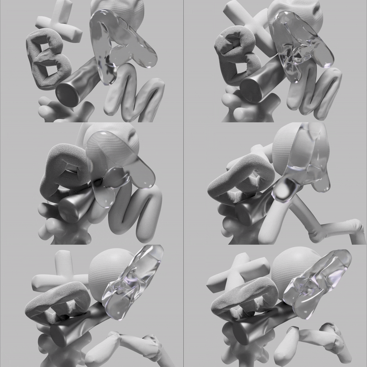
Will 2024 be a tale of two types? As many typographers are harnessing new technology to innovate and enhance their craft, others are going back to basics.
On one hand, we're seeing digital tools advancing at lighting speed and creative ideas running wild, with unconventional fonts, letters in motion and type in AR. On the other hand, a backlash against AI is giving rise to an increase in handwritten styles. In between there are many other trends bubbling up from maximalist to pixelated, art deco to 3D.
Whether you’re seeking inspiration for your next project or looking to stay ahead of the curve, here, in no particular order, typographers, designers and other industry experts highlight the typography trends to watch in 2024. For inspiration in other creative areas, also see our illustration trends and graphic design trends for the coming year.
01. Multidimensional
“At the core of 3D typography’s popularity is its ability to infuse textual elements with depth, dimension and vitality,” says Astrid Stavro, creative director, design consultant and president of the International Society of Typographic Designers (ISTP). “3D type seamlessly transitions from sleek and modern designs to retro and nostalgic aesthetics, accommodating a diverse range of styles and enabling a wide spectrum of creative expression. Whether experienced through interactive websites or immersive augmented reality platforms, the enveloping realism it offers is compelling.”
John Randall, senior graphic designer for Magpie Studio agrees that it’s an exciting time for multidimensional typography. “As we navigate deeper into the vast expanse of digital design, propelled by the imminent era of spatial computing, and with the widespread availability of open source 3D software such as Blender, there has never been a more opportune moment to embrace 3D typography.
“This evolution allows for a seamless fusion of digital content into our physical surroundings, presenting a compelling prospect for typographic elements to take centre stage in 2024, spanning from brandmarks to communication, emojis and avatars.”
Randall notes several noteworthy 3D typographic projects at the forefront including Microsoft’s Fluent Emoji, an animated 3D emoji system , and Brandpad’s identity for post-brand-design suite Brand Activation Management (BAM), which “showcases a groundbreaking approach that elevates the expressive and emotive dimensions of written communication and reactions”, he says (shown at top of page).
Get the Creative Bloq Newsletter
Daily design news, reviews, how-tos and more, as picked by the editors.
“Anticipating the trajectory of this craft in the upcoming year is an exhilarating prospect, with boundless possibilities for interaction with typography emerging, especially when considering the integration with headsets and augmented reality (AR) technology. The convergence of design innovation and technological advancements promises to redefine the way we perceive and engage with typography in 2024 and beyond.”
02. Antique appeal
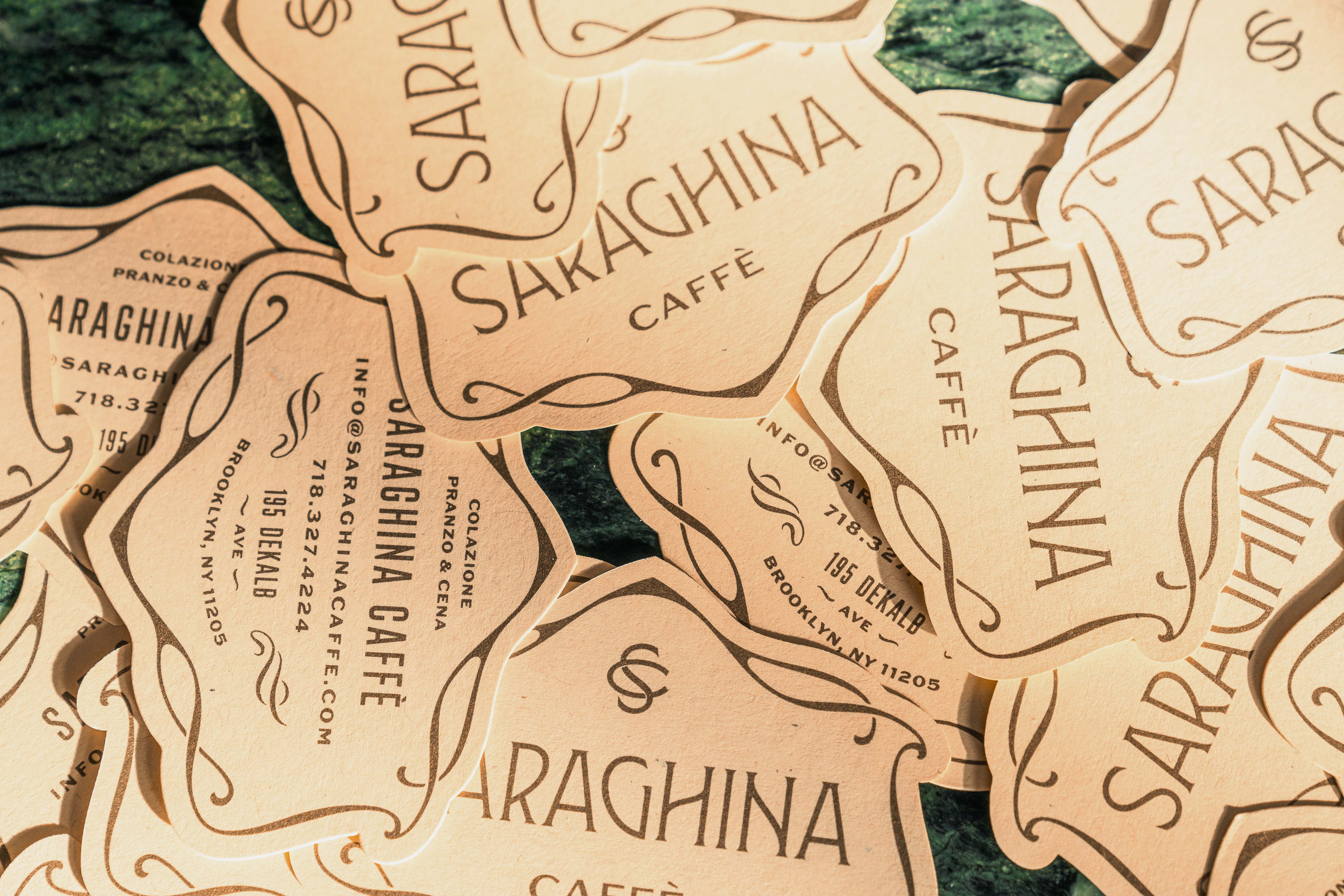
“Over the last two-to-three years we’ve seen a gradual move away from the geometric sans serifs that dominated branding, advertising, and tech in the 2010s. Type, like fashion, often swings in a pendulum from one extreme to another, as forward-thinking designers reject what is common in the mainstream and go the other direction,” says Stephen Coles, co-founder of type review site Typographica and typography archive Fonts In Use. “So, what replaces the sterile, machine-made type of the previous era are types from the other end of the spectrum. These are often quirky serifs, scripts and display faces that are warm, wispy, and wobbly.”
Curved baselines; ornate loops; decorative grandeur with artisan flair. This trend sees fonts inspired by the past and yet not replicas, but stylish homages to classic styles.
“Many of these trendy new types are inspired by designs at the turn of the 19th-to-20th century when Art Nouveau and Jugendstil artists were inspired by organic forms in reaction to an increasingly mechanical world. What I’m looking for in 2024 is whether type designers and graphic designers start to incorporate ideas from the latter end of that movement, such as the Vienna Secession, which marked the beginning of modernism, without losing that connection to the hand-made.”
03. The digital influence in motion
Video credit: Identity for Art Souterrain's Voies-Voix Résilientes (Resilient Voices-Pathways), designed by Paprika using Oldschool Grotesk Air
“From my perspective, I see that everybody (brands, agencies, companies, designers, etc) is trying to play catch up and understand the vast capabilities of AI in generating designed artefacts, including logos, AI-painted typography, and more,” says Dina Benbrahim, Moroccan multi-disciplinary creative and founder and director of Hello Departures. “The question is how can we embrace and collaborate with this technology to make our creative process more efficient than ever before?”
Benbrahim points to research by consultancy Wunderman Thompson, which found that 51 percent of people worldwide have already tried or are interested in using generative AI tools. “There is no point in fearing that AI will jeopardise human creativity,” she adds. “However, as we move forward with it, ethical questions are certainly going to be a bigger debate.”

Coles agrees that although AI is having an effect on all areas of design and creativity, the influence it will have on typography is yet to play out in full. “Despite the explosion of AI in other creative fields, I am not sure we’ll see a lot of it used specifically for type and lettering in 2024, as ML-generated text isn’t yet as consistent and convincing as illustration and photography,” he says. “Sure, there will be some examples, but most will stick out like a sore thumb. It’s coming though! Probably in 2025.”
Instead, he predicts further digital experimentation via motion. “We’ll also see more use of the variable font format, both in animation but also in concert with dynamic software and layouts where the technology has an advantage over traditional static fonts.”
Motion is a trend that Starvo also sees coming to the fore next year. “Brands have transitioned fully into the digital realm, unlocking countless possibilities while increasing the demand for animation and motion,” she says.
“Animated typography is revolutionising our interaction with words. Motion has the capability to convey emotion dynamically and transform a basic message into a captivating story. Whether it's through animated logos, digital signage, kinetic typography in videos, or interactive text elements on websites, moving type captures attention. This transformation of static displays into dynamic showcases creates unique and immersive brand experiences.”
04. Handwritten
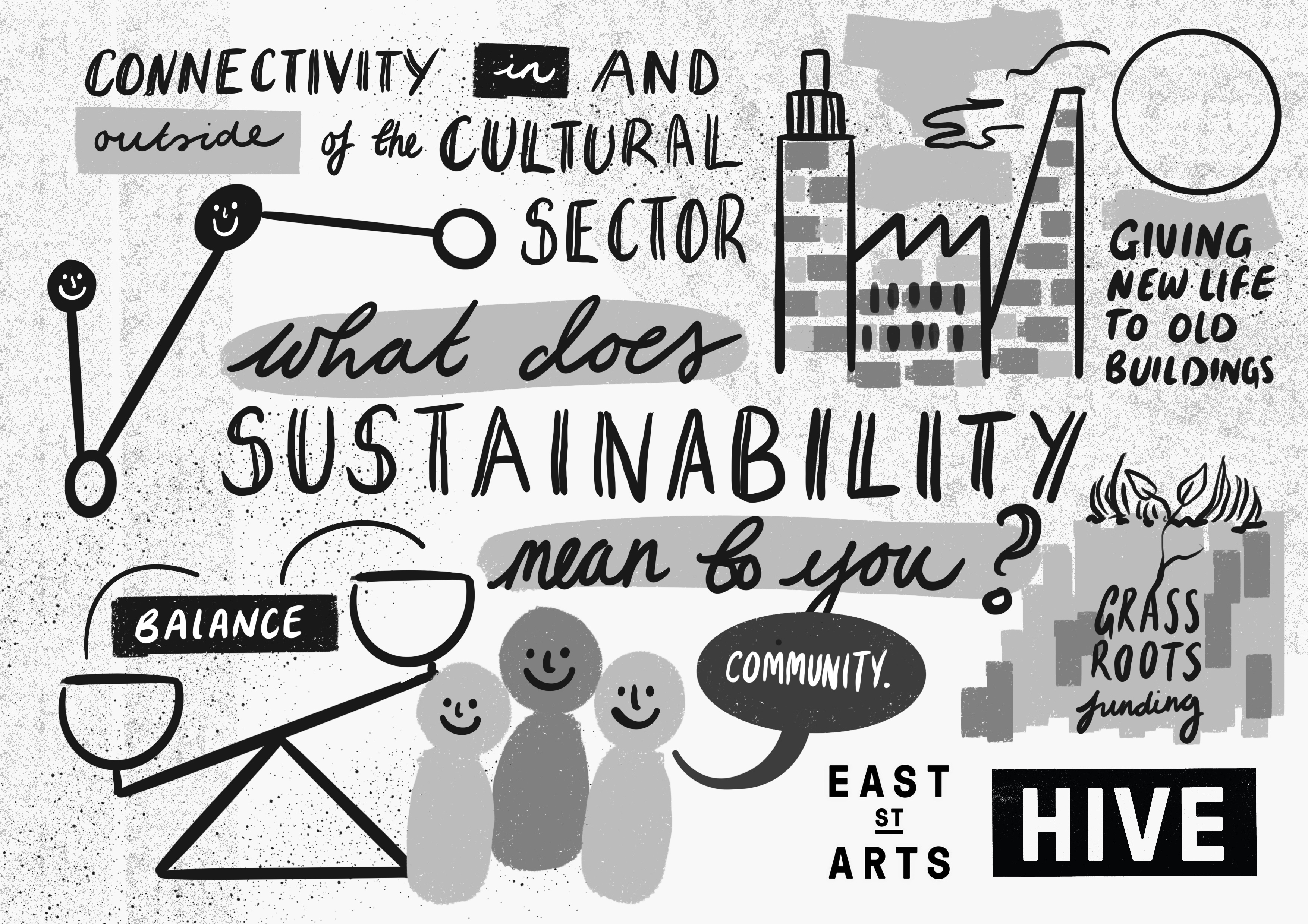
The tactile quality of low-tech, analogue production methods, hand-rendered with that element of humanness, including rewards and mistakes, is something many creatives are returning to.
“Note-like typography is going to continue making a scene within the design world. Scribbled fonts with loops and flourishes will contrast the enduring presence of no-nonsense serif,” says Abigail Baldwin, director at creative studio Buttercrumble. “Text resembling handwritten notes provides a human touch and feels more intimate. It evokes warmth and charm, especially when used across digital media."
She has also found that visual note-taking has inspired their work recently – the image above was created during a conference when scribbling.
05. Maximalist and variable
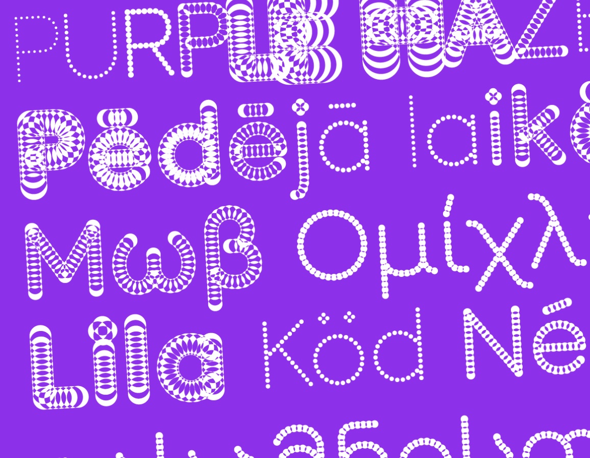
More is more with this next trend, encompassing both maximalist, decorative, bold and unusual styles, alongside font families that include a much broader array of options. Forget minimal, and think high-contrast, stroke variation, tastefully overindulgent at times and legibility not being a major concern – from wonky and wavy to brutal and blunt.
“Offering multiple styles and weights in a single file, the versatility and efficiency of variable will continue to grow,” Stavro says.
Namrata Goyal, type designer and consultant based in India, agrees. “Typography enthusiasts look for juicing out the maximum from their purchased font licences. They want a family that can do it all with multiple styles – beyond just the usual weight, width and italics.” she says.
“Increasingly, font designers are also dipping their toes into styles and letter-shapes that may even be considered by the more serious typographers as a bit ‘extra’, and flamboyant in some cases. But, with colour fonts and variable font technology support, one can’t keep themselves from exploring.”
“There’s always a moment of wonderment to see some of these used well,” Goyal continues, pointing to Purple Haze by Font Spectrum as an example. “Most of these font families include some version of a ‘readable-regular’, to provide the typographer with a greater range of typographic choices.”
06. Custom type
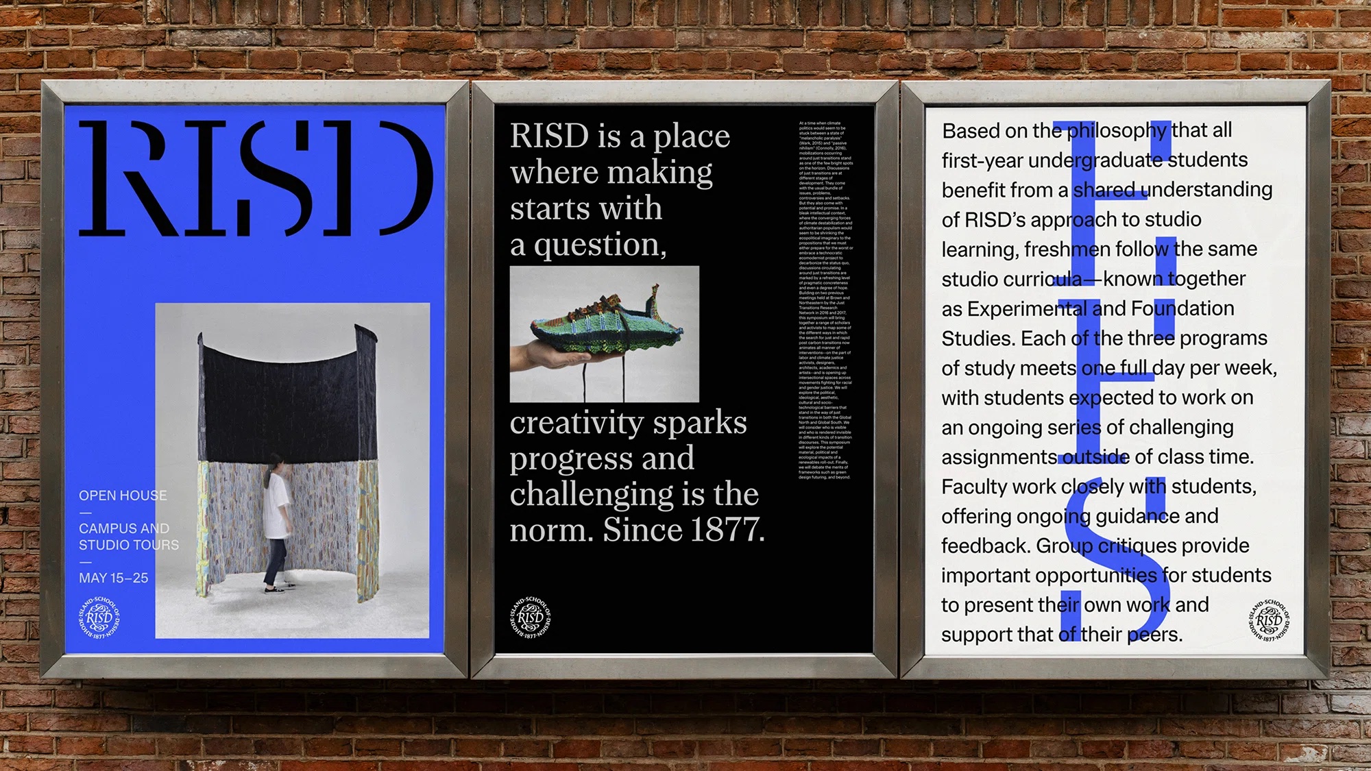
With rebrands increasing in frequency, Stavro says custom typefaces will be valuable assets in defining and revitalising new visual identities.
“In today’s globalised world, where uniformity is on the rise, the importance of uniqueness and individuality has become more pronounced. Consumers seek authenticity, and brands must effectively communicate their messages in a way that resonates with their audience while staying true to their identity," she explains.
“While custom brand typefaces are not a novel concept, their popularity is growing. Maintaining brand recognition and consistency across various media channels on a global scale is critical. A custom typeface serves as a powerful tool to convey a brand’s identity consistently across different mediums, sizes, and languages.
“Beyond conveying personality, a well-crafted typeface contributes to immediate brand recognition, becoming an integral extension across multiple touch-points. Custom typefaces offer an ownable, versatile and efficient way for brands to establish a distinct and cohesive presence in a highly competitive landscape.”
Jonny Aldrich, co-founder and managing director of London-based branding and packaging design agency Deuce Studio, has also seen an uptick in clients looking for something more bespoke. "There has been a massive rise in custom fonts for large clients," he says. "Essentially, as soon as you start paying £30,000 or more for a font license, you may as well look into a custom font made for your brand."
07. Pixelated
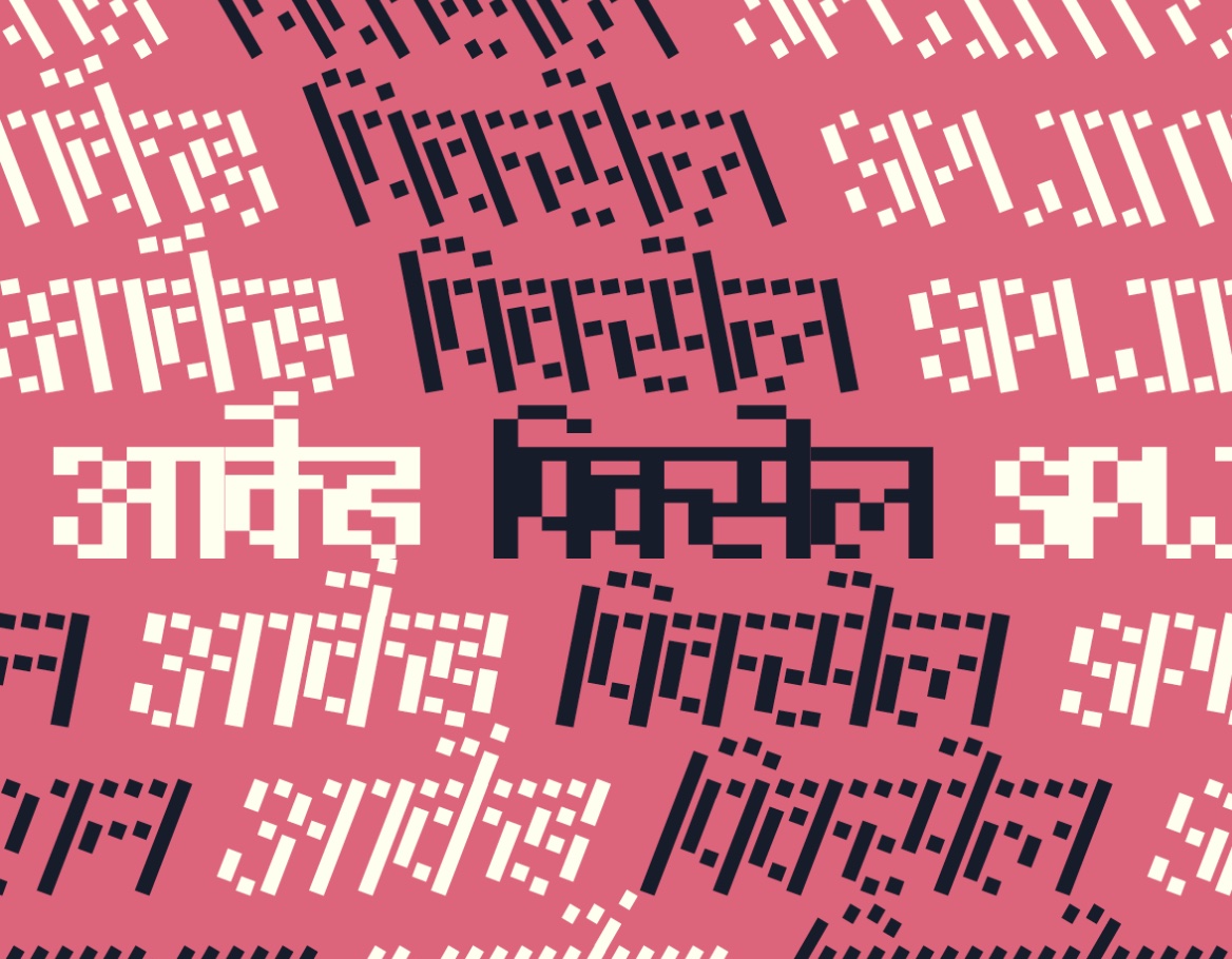
“Pixel fonts or 8-bit fonts were originally created for low-res screens, stripping letter-shapes to the basics to help with readability,” designer Goyal says. “Then the typography of arcade games added an element of play and (later) a layer of nostalgia to pixel fonts, especially for the millennials that saw the beginning of video games.
Goyal highlights examples including Splinter, which “covers a massive number of styles in a variable design space”, she says. And Ikat, “a study and a modern take on 8-bit letterforms”. Both include Devanagari and Latin glyphs.
“Today, these fonts are being researched and designed for display and small-text sizes and complex script systems. Since low-res screens are not a constraint anymore, the shapes simply add contrast and fun to the typography. With a slow rise in new font releases in this genre lately, I see their usage rising too.”
08. Unconventional
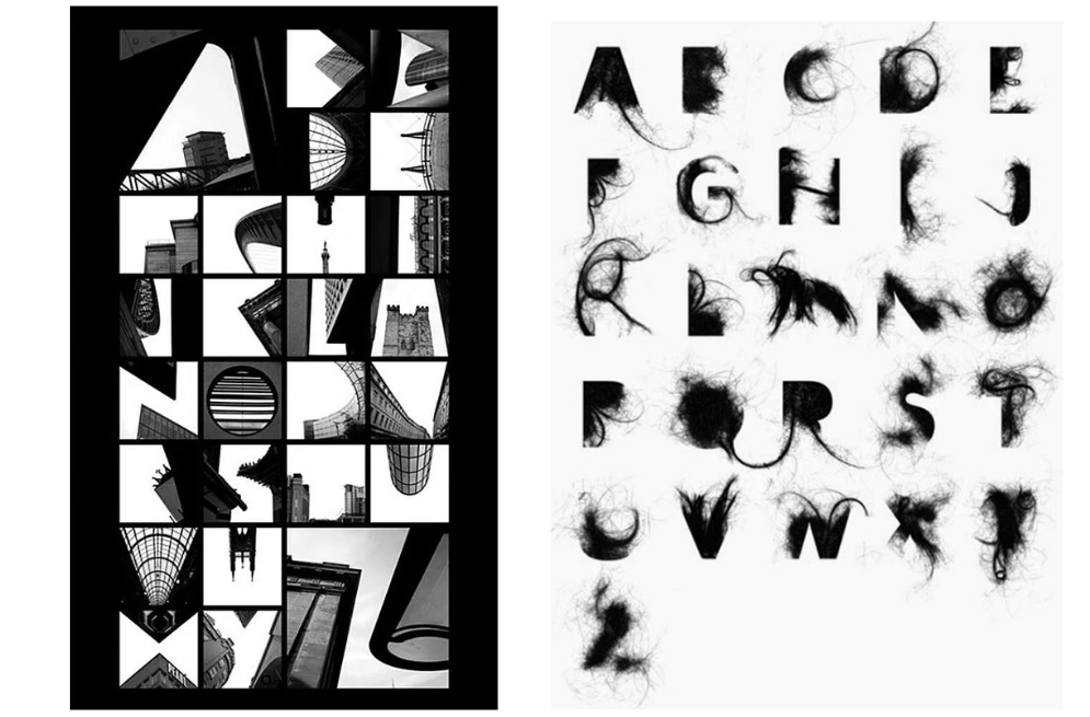
It’s time to shake off traditions, habits and rules and go with the flow, says Coles. “I think we’ll continue to see type and lettering that celebrates irregularity and unpredictability,” he says, “but perhaps with stronger, bolder, straighter lines that generally hold up better in a variety of contexts, such as small text and mobile screens,”
This trend is all about controlled loss of control, taking an experimental exploration – and by breaking away from structures, new possibilities in typography will open up.
Video credit: Hanne Fossaa Eriksen
For more on type, see our typography glossary, typography tutorials or visit last year's type trends to see what's changed.

Thank you for reading 5 articles this month* Join now for unlimited access
Enjoy your first month for just £1 / $1 / €1
*Read 5 free articles per month without a subscription

Join now for unlimited access
Try first month for just £1 / $1 / €1

Antonia Wilson is a freelance writer and editor. Previous roles have included travel reporter for the Guardian, and staff writer for Creative Review magazine, alongside writing for The Observer, National Geographic Traveller, Essentialist and Eco-Age, among others. She has also been a freelance editor for Vogue and Google, and works with a variety of global and emerging brands on sustainability messaging and other copywriting and editing projects — from Ugg and Ferragamo to Microsoft and Tate Galleries.
