Getting more from the grid
Explore how grids can enhance your designs, and why breaking the rules is sometimes for the best.

As a student of design, I didn’t have much time for grid theory. I perceived grids as being restrictive and counter to the aspirations of an emerging designer. As a practising designer, however, I quickly learned the benefits they offer and the hidden beauty they can contain.
Let's have a look at how to get more from the grid than you'd imagined. We'll particularly look at using the grid for typographical design, but the principles work for designs with images, too.
Since the 14th century, the basis of the grid has changed little. Early religious texts contain text set in vertical columns, punctuated by images and embellished with drop capitals and marginalia (additional text annotations) – much like modern-day publications and magazines.
A grid can be used on a single design, for example a poster design, or over a series of pages such as in a book or brochure design.
The grid structure

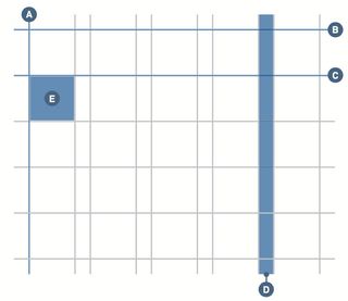
In simple terms, a grid is a structure for the arrangement of text and image on a page or screen. Much like scaffolding on a building, this grid is formed primarily of vertical and horizontal guides that create columns for text and images. These are marked as A and B in the image above.
Additional ‘hanging lines’ (C) set key positioning points for text and images to align to, much like the alignment of paintings in a gallery setting. Inter-column space, or gutters (D), dictate the amount of breathing, or white space, around text and images. The use of both vertical and horizontal lines creates patterns or fields, often called modules (E), which can be populated by text and images.


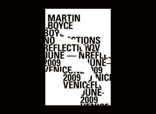
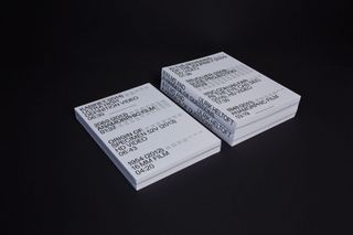
There are two main structures for a basic grid layout: the symmetrical approach (image 1 in the gallery above), where each page is a mirror copy of the opposite page, and the asymmetrical approach (image 2) favoured by modernist designers. The latter is arguably more active, with the basic grid structure implying horizontal movement and pace.
Get the Creative Bloq Newsletter
Daily design news, reviews, how-tos and more, as picked by the editors.
Additionally, text and images can be placed on angles, at either 45 degrees (as in image 3) or at a combination of 60 and 30 degrees (see image 4).


Finally, to effectively work with a grid type, images need to have a relationship to a baseline grid, which effectively anchors items. With type design, text can be cross-aligned, with varying type sizes occupying some or all of the lines of the baseline grid.
For example, if you have a 12pt baseline grid, the default type size and leading configurations of 10pt on 12pt leading, 20pt on 24pt leading and 40pt on 48pt leading will all fit to the same grid, cross-aligning and bringing a sense of structure to a design as the human eye looks for order and pattern.
Embracing the grid
The grid should be used to aid the placement, order, hierarchy and structure of design elements, whether the design is for the printed page, online or even
for environmental applications.
Many designers have actively embraced the grid as part of their practice; not only as a tool to inform where to place an item of text or image, but also as a mechanism for design thinking about why to place an item in a particular place. The grid should be seen as part of the process of how we design, and not simply as a tool for desktop publishing.
For example, International Typographic Style (often called Swiss Style) – which originated in the 1920s in Germany, Russia and the Netherlands and rose to fame during the 1950s in Switzerland – saw proponents such as Josef Müller-Brockmann consolidate theories into a manifesto indicating that the grid is a tool for thought, and should be used to systemise, to clarify and to reduce content to its essentials.
Breaking the rules
In his classic reference book, Graphic Design as a Second Language, Bob Gill asks: ‘Have you ever seen autumn leaves, after they have fallen to the ground, arrange themselves in a boring composition? I haven’t. What about pigeons stopping in a pavement square?’
Gill’s observation is correct: the world is an incredibly interesting and diverse place, and the potential danger with a grid or system is that it can mediate spontaneous creativity and indeed the element of chance. Therefore a grid should be seen as a guide, not an absolute rule.
The grid is a structure: a vessel to hold content. Having the courage to break that restriction can result in more dynamic and creative work.
Using measurement

Arguably the most confusing element of designing a grid is understanding that you are often dealing with two sets of measurements that don’t naturally belong together.
Point size and leading are generally set in points, as is the baseline grid. However, most publications, and indeed printing presses, predominantly use millimetres. For this reason, programs such as InDesign CC have seemingly odd default settings. For example, margins by default are set at 12.7mm with a gutter measurement of 4.233mm.
If you convert these to the points system, you get a much more logical set of values: 30pt margins with 12pt gutter. For this reason, when initially designing a grid, it is worth giving extra consideration to how you make the two systems compatible.
One approach is to create a grid that has a border to compensate for the irregular measurement, leaving you with a text block in the centre that has a rational points measurement. Alternatively, a page size built around a logical division of points can be used.
Grids in practice
In practice, grids offer designers an underpinning structure to their work, essentially taking the guesswork out of design. If carefully considered, these grids can have the spontaneity of the falling autumn leaves or pigeons, while implying a satisfying sense of order and hierarchy.
Arguably, the best design work occurs when there is a certain amount of tension between control and freedom. When a designer has a sound understanding of grids and editorial structure, and also incorporates a sense of artistic, more intuitive flair into their work, truly great things are created.
This article was originally published in Computer Arts magazine. Subscribe here.
Related articles:

Thank you for reading 5 articles this month* Join now for unlimited access
Enjoy your first month for just £1 / $1 / €1
*Read 5 free articles per month without a subscription

Join now for unlimited access
Try first month for just £1 / $1 / €1