A new year means if not out with the old, then at least in with the new. And that means it's the perfect opportunity to refresh your portfolio. To take a moment to check the fundamentals are in order, ensure it's up-to-date and includes only your best work, and there are no lurking errors that need to be fixed.
Once all that's done, it's time to think about new tweaks and changes you can make to keep things looking fresh as we enter a new decade. In this article, we look at some of the latest trends in portfolio design that you can use to get your own portfolio looking razor-sharp in 2020.
For some best-in-class inspiration, check out some of our favourite portfolio examples. Plus, here's some top tips for what to include on your portfolio website.
01. Break the grid
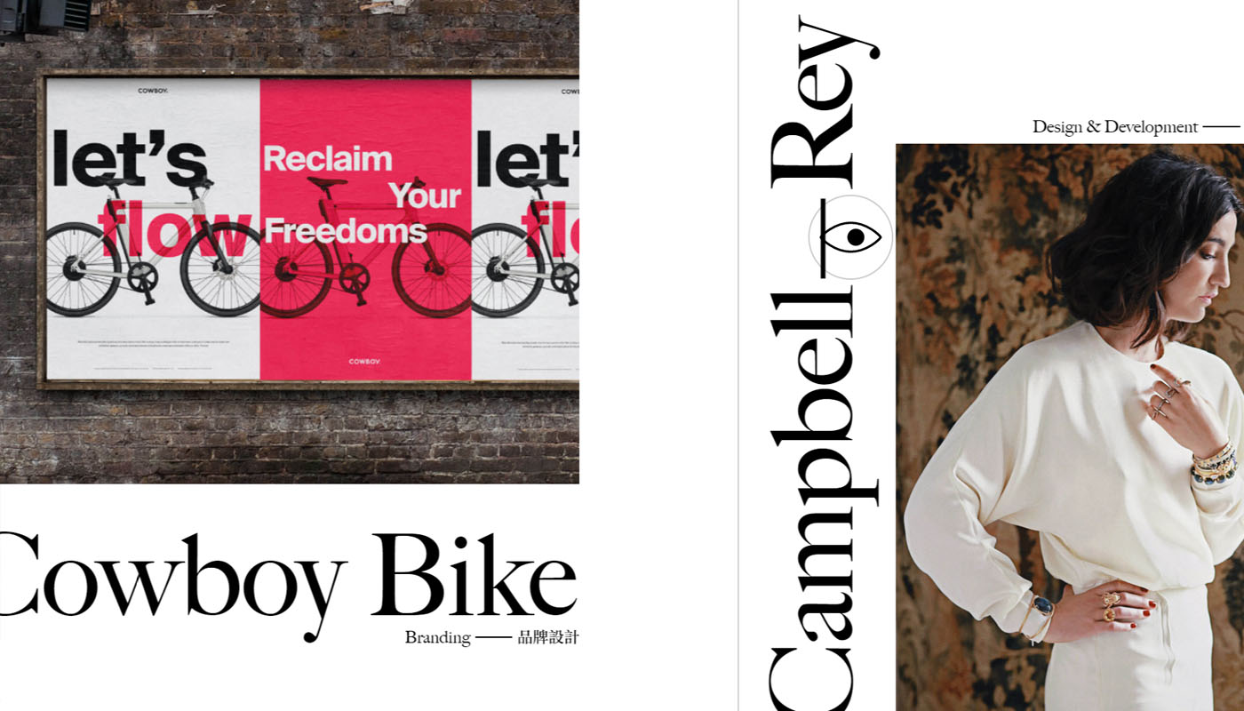
Offering a fresh and unexpected layout will grab a visitor's attention from the outset and shows your creativity. One great way to do that is to break free from conventional layouts with more open composition, asymmetrical grids or unusual text orientations that surprise the viewer.
The horizontal, asymmetrical design of New York-based designer Kwok Yin Mak's portfolio includes menus in unusual places, moving elements, cursor effects and information spread all over the site. It leaves visitors surprised and even slightly disorientated at first, but in a very pleasing way that encourages you to explore more.
Looped horizontal scrolling allows you to take in the whole site easily, white space keeps it clean, and clicks take you zipping across the page. The effect is all the more arresting for the beautiful blend of English and Chinese text in different orientations, showing how a bilingual site can work.
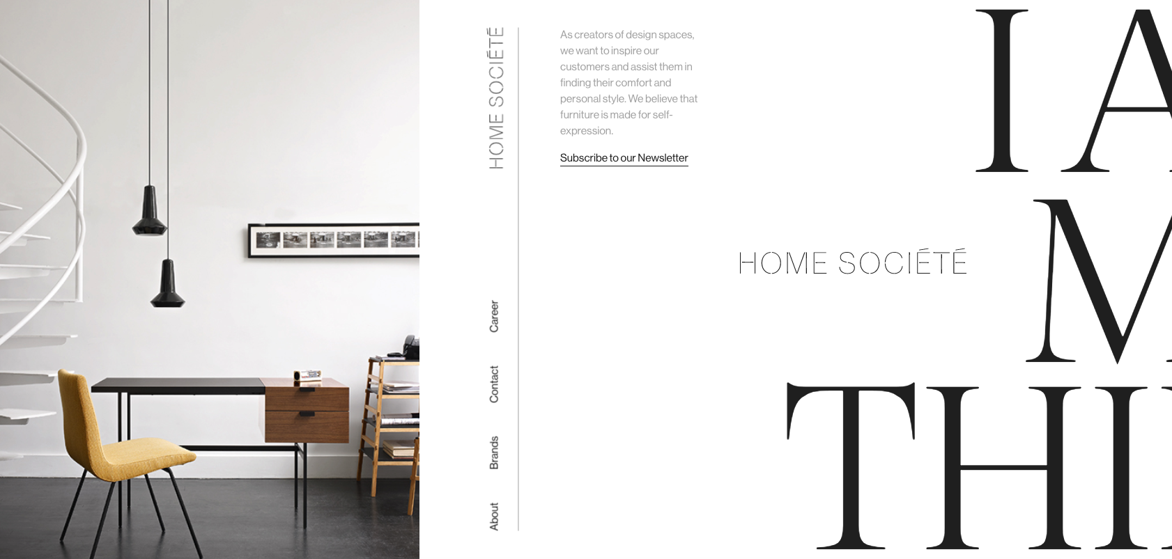
If you like this style, the business site Home Societe provides another inspiring example of how a horizontal, asymmetrical layout can make a big impact. For a more conventional approach but with elements of asymmetry, agency site Wokine uses a split screen to generate interest.
Get the Creative Bloq Newsletter
Daily design news, reviews, how-tos and more, as picked by the editors.
02. Go bold
No designer could have failed to note the popularity of big and bold colours and type in 2019. It’s a trend set to continue in the new year and with many prospects looking to emulate the style, it makes sense to show you speak the language. Beefed up type and saturated colours helps shout your portfolio claims loud and proud.
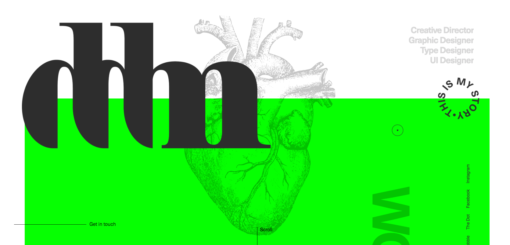
Graphic designer Danilo De Marco makes maximum impact with large Neue Haas Unica type, which switches from black to electric green when the cursor moves over it. Tobias Ahlin uses big one-word headlines to clearly demarcate different the sections of his portfolio, and digital designer Thibaud Allie uses hugely oversized type that's impossible to ignore.
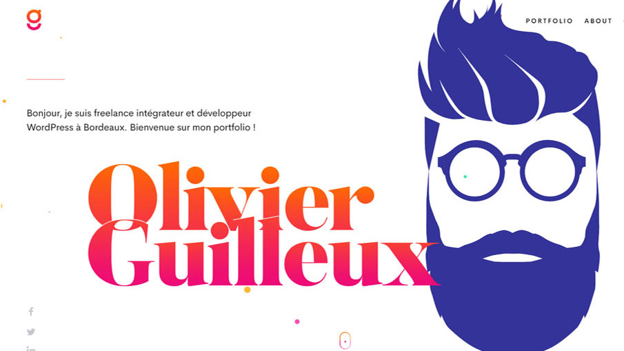
Olivier Guilleux puts the focus on his name with big type and a colour gradient, but also a bold image of his own face – we love the animated quiff that blows in the wind. Elsewhere, web designers like interactive developer Vincent Saisset are giving bold display text even more character with 3D, animated or manipulated fonts that make the letters seem alive.
03. Cut straight to the goods
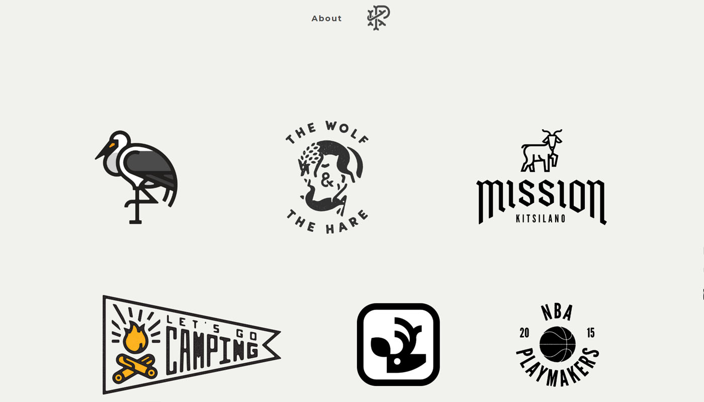
The online world is a crowded space. We can sometimes feel we're in a virtual arms race of clever text and cursor effects. So sometimes a simple and straight-to-the-point approach can make viewers sit up and take notice. For a portfolio, that means showing the best examples of your work upfront. While flashy effects can make an impact, sometimes getting straight to the goods can be a relief for a prospective client.
Illustrator and visual designer Peter Komierowski‘s portfolio takes us straight to a simple single-page collection of the logos he’s designed. It might feel like a cold introduction, but there's a link to the About section, where we find a natural-looking photograph and a down-to-earth personal description. The portfolio works well because it shows us what Peter does first, and if we like what we see and want to know more, it's backed up with a presentation that makes him seem like a guy we'd like to work with.
04. Create a video
In 2020, audiences want information more quickly than ever, which means video content is fast becoming a must for communication in any field. Creating a showreel is an obvious choice for animators and motion designers, even if it’s simply an embedded video like this showreel by Derek Panke. But designers of all kinds can take advantage of the power of video.
It can make an impact on a portfolio as a background behind text as shown by Dan Paris, while agency showreels are becoming increasingly cinematic. French agency Septime Creation's showreel runs through UI designs for everything from video games to finance, accompanied by a bombastic film trailer soundtrack.
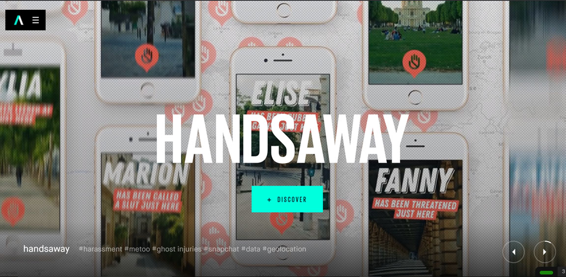
For UI designers, video can show the experience of their work in a way that screenshots can’t capture. But still graphics can also be effectively presented in a showreel, like in this annual recap by 3rd floor shown above. Video is also a way to tell your story, where you’ve been and how you’ve evolved, or how you work in an engaging way, like in this example from Beauvoir.
05. Combine elements in collages
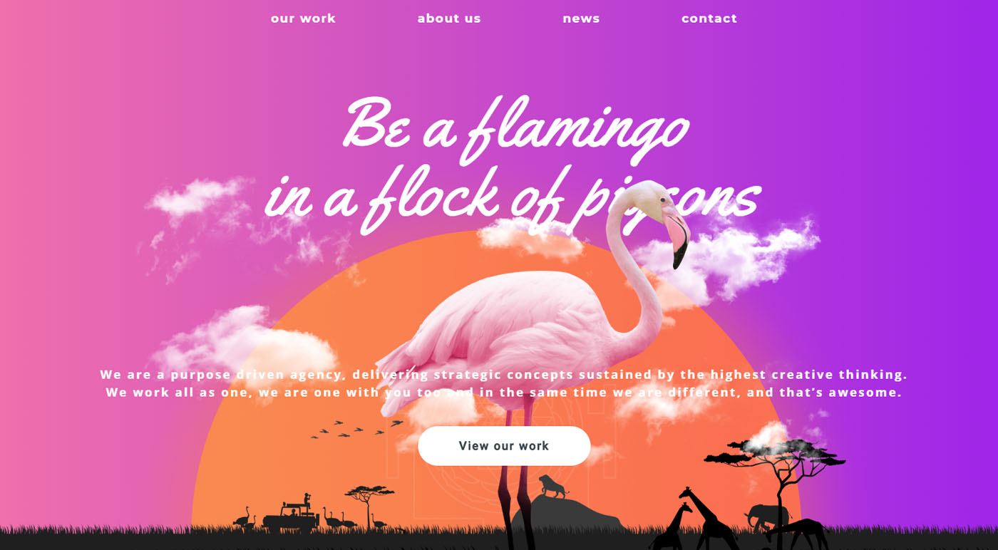
Flat design has been huge in recent years, and the trend now is to combine it with more realistic 3D imagery. Including this combination of elements in your portfolio is a great way to refresh things and show you're on trend for 2020.
Russian agency Brand Affair uses the combination to stand out from the other animals out there, with 3D images of a flamingo, a giraffe and a chameleon floating on a flat background. Web design duo Dose Media offer more subtle edits on the image of themselves on their portfolio site.
06. Add a strong personal message
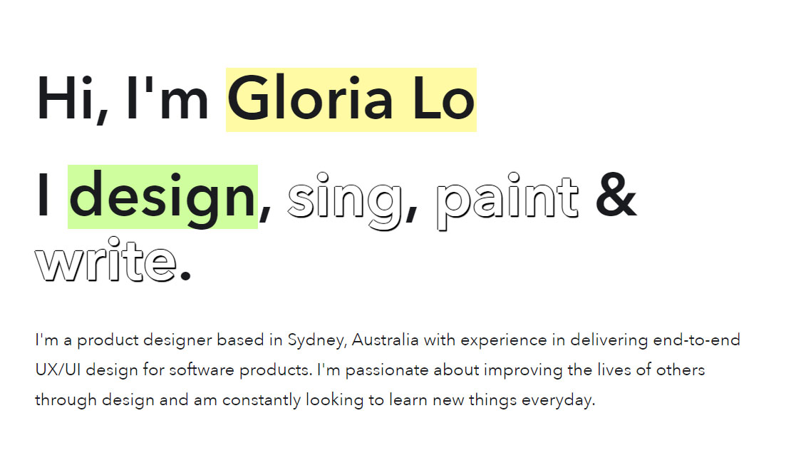
Competition for the best design roles is so intense now that in 2020 you need to stand out not only in visual presentation but also in personality. More designers are opting for more personal pitches that sell their character, interests and story as well as their creative talents. If you can, say something about your ethos, attitude or overall world vision, to get hired for how you create as well as what you create.
UI designer Vera Chen‘s profile uses a small text intervention to make a clear statement about how she sees her work: "I create better experience for users people". With her portfolio's simple colour palette and ample white space, the statement stands out.
Frontend developer Iuri de Paula talks us through his CV step by step, and Gloria Lo makes an interactive statement by turning the four key verbs that describe what she does into links to different sections of her portfolio. Done with humour or simplicity, a meaningful personal introduction can make a memorable impact.
07. Go progressive
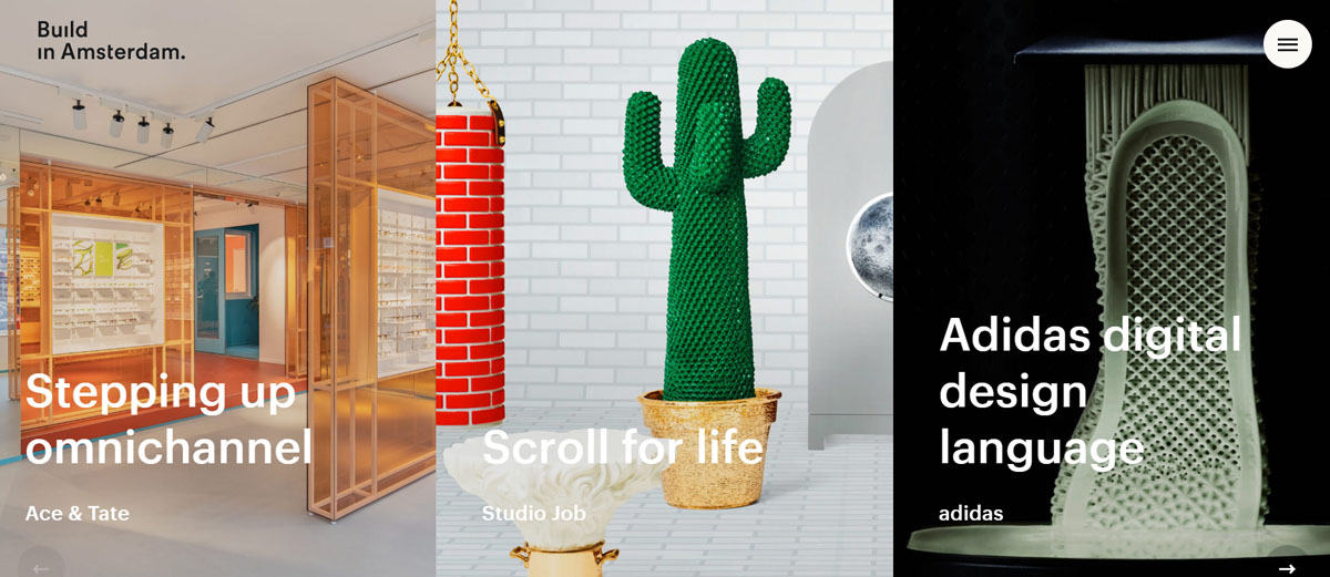
It takes more work than building a standard responsive website, but for web designers in particular, 2020 may be the moment to consider making your profile a progressive web application. Touted by many as the future of the internet, progressive web apps (PWAs) are lightning fast and beautifully engaging.
PWAs run on web technologies (HTML, CSS, JavaScript) like regular web apps but use JavaScript Service workers to provide the high performance and rich experience of native mobile apps, including almost instant feature likes push notifications and other extras that deliver great UX. Sticky headers and floating menus and navigation buttons can make your site more engaging as well as easy to use.
The other advantage is that with more prospective clients opting for DIY drag and drop site builders, offering PWAs is a way to stay ahead. And there’s no better way to show a client why they should consider a PWA for their own website than being able to say "my website is a PWA", and providing it as an example of what can be done.
Digital agency Build in Amsterdam’s PWA portfolio site offers the sleek user experience of a native app in which the case study feels like you're entering a new portal. Web designer Daniel Spatzek's portfolio site incorporates many of the elements mentioned above, including big type, a strong personal message and a surprising layout. The fact the site is a super smooth PWA makes the experience all the more impressive for visiting prospective clients.
Read more:

Thank you for reading 5 articles this month* Join now for unlimited access
Enjoy your first month for just £1 / $1 / €1
*Read 5 free articles per month without a subscription

Join now for unlimited access
Try first month for just £1 / $1 / €1

Joe is a regular freelance journalist and editor at Creative Bloq. He writes news, features and buying guides and keeps track of the best equipment and software for creatives, from video editing programs to monitors and accessories. A veteran news writer and photographer, he now works as a project manager at the London and Buenos Aires-based design, production and branding agency Hermana Creatives. There he manages a team of designers, photographers and video editors who specialise in producing visual content and design assets for the hospitality sector. He also dances Argentine tango.
