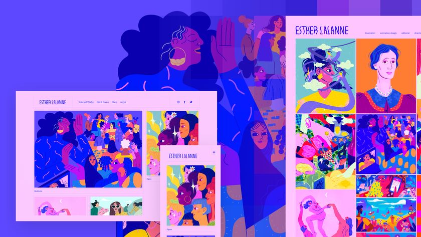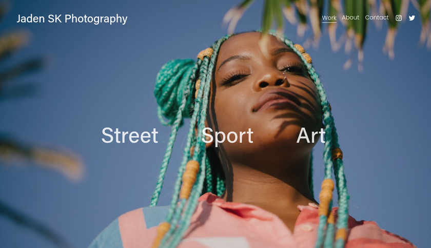
Applying for a job in the design world can be a frustrating business. You’re certain in your own mind that you could ace this role; why can’t employers just take you at your word? In reality, nobody is ever going to take you on, or even invite you in for an interview, until you’ve first wowed them with a knockout design portfolio.
But what if you're already pretty happy with your portfolio and creative resume and you're still not getting interviews? What you're probably looking for is that extra something that makes you stand out from the crowd.
To find out what the people doing the hiring want, we asked two experts: Eddie Opara, partner at Pentagram, and Lou Hunter, creative director at Superunion, about what they are looking for in a portfolio, and how you can transform yours from good to great.
Eddie Opara
What do you look for in a portfolio?
There are some fundamental things. I’m looking for craftsmanship. Are the fundamental aspects of craft there, in terms of typography, composition, art direction, and so on? And equally importantly, I’m looking to see whether your work has solved the challenge you were presented with.
Beyond that are the added plusses; the things that take your work to another level. That you’ve extended your approach in regards to that composition, in a different way than people might have expected. That there’s a sense of energy and dynamic to the work, depending on what the work is and what the context was. And from my point of view, I’m also looking for experimentation; the idea that you’re not scared to take a leap of faith.

I’m not looking for every portfolio I see to tick every one of these boxes. Some designers are just ‘anchors’, with a very degree of high craftsmanship. They may base their principles on minimalism, simplicity, function before form, and you really need these kind of designers. But then you have that other kind of designer, who can bring an entirely different aspect to it. I believe you need a balance between the two; I call it the rough with the smooth. As long as I get the balance in the end, then that’s fine.
Is there anything that's generally lacking in the portfolios you see?
There’s a key element that I don’t really see any more, and that’s process. How did you come up with the work? Did you write about it, did you query yourself, where’s the research towards it? I was always told to show my workings, how I plied everything together, the rationale behind it, and you don’t get that any more. Or at least, I haven’t seen it for quite some time.
Get the Creative Bloq Newsletter
Daily design news, reviews, how-tos and more, as picked by the editors.
So I want to know: what were the failures? What were the successes? Why did you choose this particular approach over another one? I want to see that you have really thought about these things, especially if you struggled with it but then found a solution. That tells me more about you than just a final piece of work.
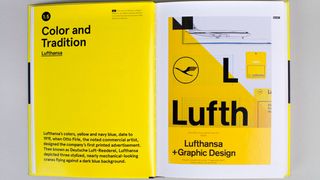
It’s not that designers don’t think about these things, it’s that they don’t seem to write about them in their portfolios any more. When I actually sit down and have a conversation with people, they usually do start talking about process.
I can settle for that, but I’d love to see more of that in the portfolio. I want to see the great narrative that one can show; that graphic design is not just this ‘Instagram’ piece of work. There’s a lot of shit that went into this. Did it instantaneously arrive there? Of course it didn’t! So what was the process, what are the challenges, what are the conversations you had? How did you fundamentally get there?
What about the design and layout of the portfolio?
What’s problematic is that everybody’s using the same system. Where’s the fun in every portfolio having the same look and feel? I find that to be quite upsetting. Is there another way you can think of to show your work?
Right now, we live in a time of image. It’s a cacophony, it’s imbued our retinas and our brains, and to a certain degree we’re tired of it, but it keeps coming. So I do notice the homogenisation of work that’s occurring. I’m not the only one who’s talked about this. If I see that in your portfolio, I worry: is this particular designer going to constantly do that?
So I’d advise people: even if it was an idea that was rejected, show it. Show who you are rather than what you want people to think that you are. That’s really important. We always say that design is about solving problems, you constantly hear this. Graphic design is an artistic, creative profession. So use your portfolio to express yourself. Try, anyway.
Any more advice for a great portfolio?
When I’ve done portfolio reviews at conferences, or schools, I’ll ask: have you travelled? Have you left your home town, county, city state, country? If so, did you go to any studios to hang out and talk to people? If the answer’s no, that’s one of the things that you’ve got to do. You’ve got to stretch your mindset. It’s a diversity of thought; that’s what makes a good designer.
Lou Hunter

How should you approach the design of a portfolio?
The work is the hero, so you’re showcasing the projects that you’ve done, and you want that work to sing. But that said, you want that work to sing in a beautiful way. If you’re applying for a design job, you want people to feel like your portfolio has been designed, rather than, ‘Here are some images and here’s some copy.’ You want it to feel a bit more crafted, because that’s your craft.
You don’t want it be overdesigned, of course. The majority of portfolios we see are fairly clean and simple, which normally works best. But you need to pay close attention to detail. For example, if you have a paragraph of copy with a little widow – one word on its own – and then you talk about having a passion for typography, no one’s going to believe you. It’s little things like that which make the difference.
Should you include personal work?
I think that’s a great idea, I really do. Because often you’ll have a fantastic idea, but in the world of commercial design sometimes it doesn’t end up the way you first imagined it, for any number of reasons. So, yes I think showing personal work in your portfolio that demonstrates how you think about ideas, your approach to work and so on, alongside your client work, is a great way to show off the other things that you can do. You don’t want it to dominate, but including some personal pieces can be a nice way to talk about things you enjoy, and demonstrates you’re someone with a bit of passion.
How can you make your portfolio stand out?
When I get a portfolio, I want to feel that the person who’s sending it loves their portfolio. Because it’s something that represents you as a person. If I look at something and I get that sense that someone’s proud to share that, that’s what I’m looking for, essentially, whatever level you’re at, whether that’s at the junior level or at the design director level.
How do you achieve that?
I think it’s largely about putting in the time and effort. In truth, people can tell when a designer has lavished care and attention on a portfolio, rather than just chucked some work in a layout and that’s it. There’s a consideration to the length and the projects that are included, it’s not too dense, and it’s almost like you’re telling the story of yourself. If a portfolio has that feeling, it definitely becomes more engaging.
Lead image by Thomas Burden.
This article originally appeared in issue 279 of Computer Arts, the world's best-selling design magazine. Buy issue 279 or subscribe here.
Read more:

Thank you for reading 5 articles this month* Join now for unlimited access
Enjoy your first month for just £1 / $1 / €1
*Read 5 free articles per month without a subscription

Join now for unlimited access
Try first month for just £1 / $1 / €1
Tom May is an award-winning journalist and editor specialising in design, photography and technology. Author of the Amazon #1 bestseller Great TED Talks: Creativity, published by Pavilion Books, Tom was previously editor of Professional Photography magazine, associate editor at Creative Bloq, and deputy editor at net magazine. Today, he is a regular contributor to Creative Bloq and its sister sites Digital Camera World, T3.com and Tech Radar. He also writes for Creative Boom and works on content marketing projects.
