Behind the scenes of Toy Story 4
Pixar reveals the CG tools and artistry that went into the latest instalment of the Toy Story universe.
It was nearly a quarter of a century ago that audiences got a glimpse of the future of animated feature films, when Pixar unveiled the world's first fully CG animated movie Toy Story in 1995. Since then, the technology – and artistry – behind Pixar's many releases has soared to new levels.
All that technology, artistry and storytelling ability is there on the screen in one of the best 3D movies in recent years: director Josh Cooley's Toy Story 4, which now sees Woody, Buzz Lightyear and a host of other characters out in a much wider world. It's a film that, thanks to Pixar's increased firepower (including the physically based path-tracing architecture now in RenderMan), was simply not achievable before.
Read on to find out how the studio made some of the most complicated scenes and characters in Toy Story 4, including the antique store, the carnival, the opening rain storm, and Bo Peep's exquisite porcelain surface.
Inside the antique store

The antique store is a massive environment, full of props, furniture and tons of atmosphere like floating dust particles. It's here where Woody reunites with Bo Peep, while also having to rescue a new member of the toy family, Forky, after facing off against the store's long-time doll resident, Gabby Gabby.
"We're in this antique store for probably a third of the film," outlines Pixar supervising technical director Bob Moyer, who likens himself to the visual effects supervisor on Toy Story 4. "It's like one super set that we're in, with different set pieces within it. The tricky thing was, there are no walls – the entire thing is just made out of props and furniture, and so there's nowhere where you can say, 'Oh, I'm closing this portion of the set off, and I don't have to worry about how it plays in the future sequences.' We had a lot of negotiation and planning to figure out how all the different parts would fit together."
The other challenge of the store was that it represented a place where both humans and toys exist. "So," notes Moyer, "you need to believe that when you see something in the human world, that we've actually designed it and detailed it out all the way down to a toy scale. Woody is 15 inches high, but we have a character in the film who's about maybe an inch tall, Giggle McDimples. So we really needed to believe, in all those sequences and all those action points, whether you're going through the aisles or behind the shelves, that every single part of the antiques mall was done to a 'macro' level. We had a lot of interplay of trying to make things look good from a distance and also things looking good super-close up, where you'd see dust and procedurally generated cobwebs, for instance."
To help realise the vast amount of geometry and detail in the antique store, and the entire film, Pixar relied on rendering in RenderMan, which is now at version 22.5 and features the RIS physically based path-tracing architecture. They also looked to a machine learning de-noiser that came from Disney Research Zurich. "One of the challenges we've had the last couple films is, because we've switched to that very photorealistic, all ray-traced render in RenderMan," details Moyer, "is that just inherently cranks up your lighting times and your rendering times, especially if you have a lot of glass, if you have a lot of practical light sources, or you have a lot of reflections. These are all the things that are in the antique store. And if we wanted to see how, in camera, all the set work and all this camera work and all this lighting was all coming together, we had to render a lot earlier, and a lot more often."
Get the Creative Bloq Newsletter
Daily design news, reviews, how-tos and more, as picked by the editors.
"The de-noiser was so good," continues Moyer, who says the de-noiser was simply known as the 'DRZ de-noiser', "it actually cut our render times down by about a third or a half, and we were able to make it so that we could render almost film quality for some sequences almost every weekend."
Carnival time

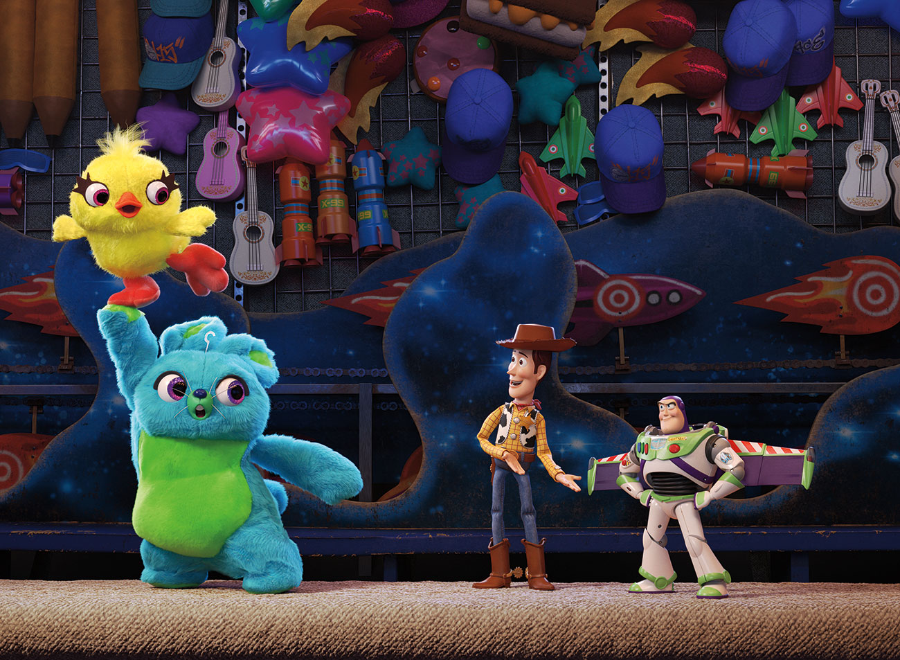
Across the street from the antique store is a carnival area, where the toys get into more shenanigans. For Pixar, the carnival needed to come alive at night with rides and booths, and that was aided by having bright and animated neon lights, around 40,000 of them.
"For the lights," explains Moyer, "we had one of our artists set up animation sequences in Houdini, say a good half a dozen per ride or per booth that we could choose from. We had certain animation cycles that the director could, either per shot or per sequence or across the film, choose an energy level from. And then as we had an action sequence, we'd have them very active. If we wanted to quiet them down, we could do that, too."
"We actually worked to make sure that the lights were exactly the correct calibration relative to the sun's source, relative to a fluorescent bulb across the film, and that meant that the lighting team actually had an exposure control in their setups," adds Moyer. "They could change an exposure. If it was a daylight exposure, the lights would seem very dim, but if they had a dark exposure, suddenly the lights would be the main source of illumination in the scene. And that just made it so that all that played really well together and went screamingly fast through our lighting department."
Rain rescue
The opening of the film is a rescue scene set nine years ago, when Woody and his toy friends save the remote-controlled car character, RC, from being washed away in a rainstorm. It relied on heavy fluid effects simulations. Says Moyer: "Josh Cooley really wanted us to play up the fact that it's actually just a normal rainstorm, and even Andy runs outside during it, so for humans, it's nothing. But for a toy, it could be the most dangerous thing in the world. The gutters are flooding. Each raindrop feels like a little minor explosion.
"Our effects and lighting departments worked very tightly to come up with a palette of different rain effects – splashes, the drops themselves, levels of fog. It was important to allow for interaction, with the rain pouring down over objects on the set. Our artists would dress it out per shot to try to give the feeling relative to camera and the toy scale of how that action was going to get played up."
Pixar relied on Houdini for the water sims, which ported into its in-house animation software Presto, with lighting then carried out in Katana. "For this film, too," states Moyer, "it was one of our first real uses of Houdini Engine. It helped lighting and effects have a really tight loop as they were developing the shots."
Character effects

Although Pixar strove to keep the characters of Toy Story 4 within the Toy Story world that audience members knew so well, the studio did use the latest tools and techniques to add and enhance character details. Two new toys in the mix, the carnival plush toys Ducky and Bunny, have fluorescent fur, representing a particular kind of challenge for the team, notes Moyer.
"We try to keep our albedo levels below a certain threshold or otherwise the lighting starts kind of blowing up. And the problem with fluorescents is that you're actually taking UV light and making it feel even brighter, and so we had to crank up the knob on those guys a little hotter than we would've probably technically felt safe about. And then we spent a lot of time after that balancing out and trying to figure out clean-up so that they weren't sending what we call fireflies everywhere, which are super hot spots around on the set."
Another brand-new character is Forky, central to the plot, made by Bonnie out of a spork and items like pipe cleaners for arms and googly eyes. "The thing is," says Moyer, "he actually was made out of more materials and things than most of our other characters. Woody is basically plastic and cloth. Even Ducky and Bunny were pretty much just plastic and fur. But Forky was made up out of all these different things.
"Animation then really leaned into Forky. They said, 'Let's make this feel like a toy that's hand constructed, and almost like Bonnie is there animating it herself.' So they really animated the pipe cleaners to feel like pipe cleaners, and his googly eyes to rotate and never quite focus. There were a lot of technical challenges in Forky to give something that felt really simple, but actually had a lot of complexity in how animation could work with him."

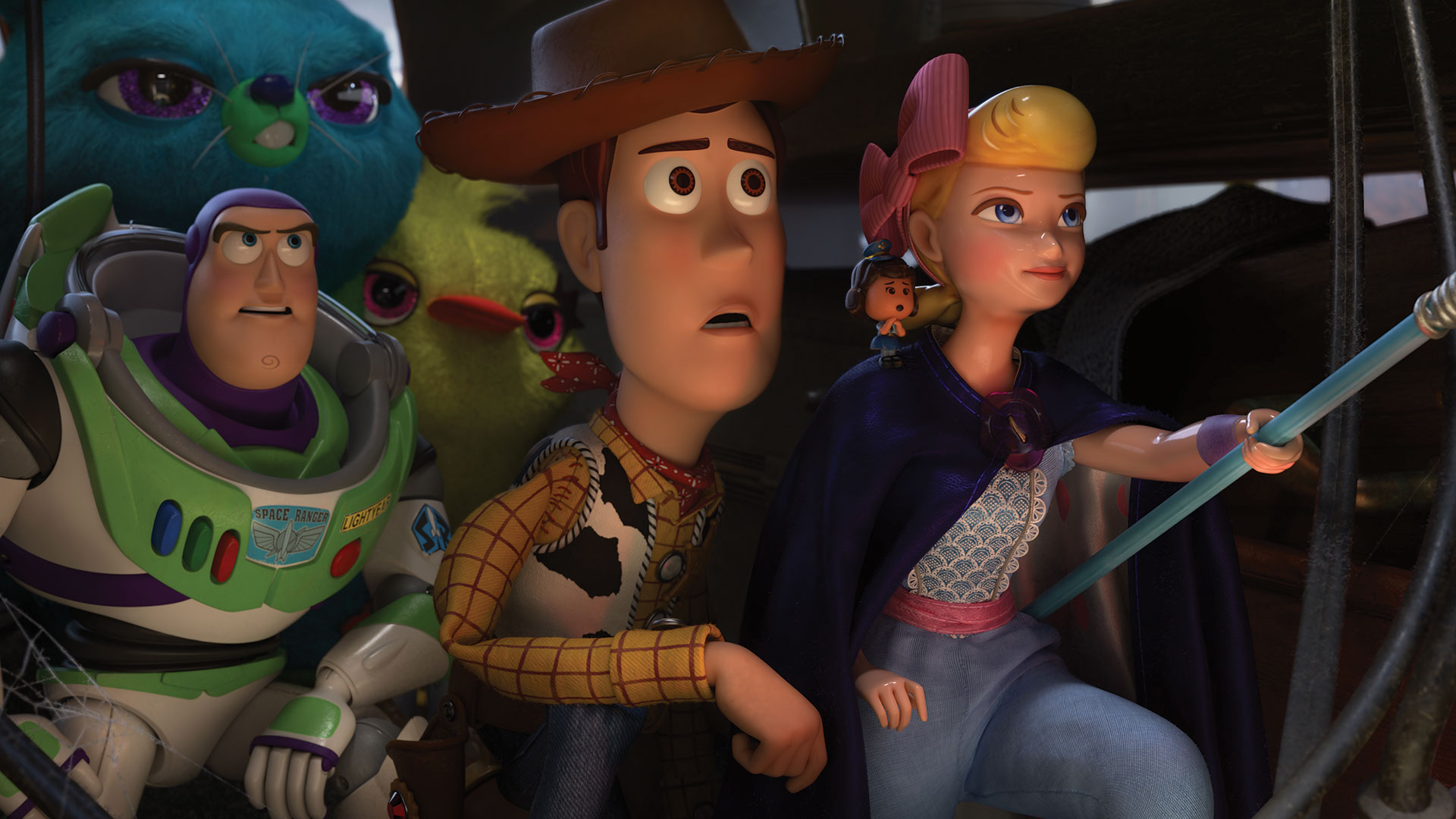
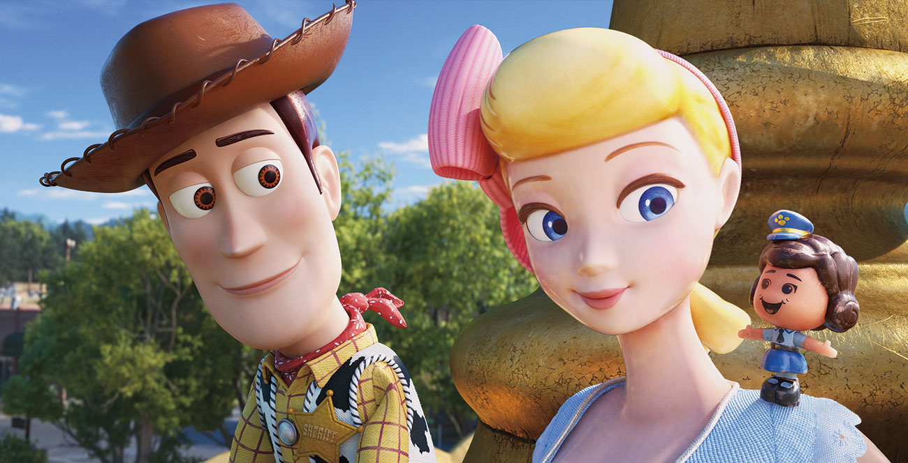
New tools and techniques allowed Toy Story 4's artists to re-visit the character Bo Peep and bring her to life in a way that had not been seen before, especially her porcelain qualities. "Our shading team spent a lot of time developing a porcelain shader that would give that real depth of material that you're feeling on her," says Moyer.
"Porcelain, of course, is a clay with a glaze on top, and it tends to be that, with a little bit of age or even if it wasn't fired quite right, you get this crazing effect, which are these little hairline cracks on the surface. Eventually they pick up dirt, and so we wrote a new shader that did that crazing effect so it would actually model the light interaction with the cracks to keep that depth of field, or that depth within the glaze. We then used that effect creatively to imply how Bo Peep has been through the wringer a little bit, and hasn't been shy, and hasn't been up on a shelf the whole time, which was kind of a really fun but subtle effect."
Pixar actually instituted something across the show called 'Team Bo', made up of story artists, animators, characters, TDs, tailoring, shading, rigging and other artists, who collaborated on Bo Peep. "For example," says Moyer, "one of the things they had to deal with was the simulation for her cloak. It used to be her dress in the original films, but now she's turned it into something that works for her in her new world. So it can flip inside out. It can get rolled up into a ball. She uses it sometimes to hide, and they had all these very technical shots of making it feel and work like something that's really nice, small and hand stitched, and this very simple Superman movement to it that they worked with animation on. And I just think the work on Bo in simulation is some of the best in the entire film."
This article was originally published in issue 250 of 3D World, the world's best-selling magazine for CG artists. Buy issue 250 here or subscribe to 3D World here.
Related articles:

Thank you for reading 5 articles this month* Join now for unlimited access
Enjoy your first month for just £1 / $1 / €1
*Read 5 free articles per month without a subscription

Join now for unlimited access
Try first month for just £1 / $1 / €1

Ian Failes is a VFX journalist, who has written for a number of creative titles, including fxguide, Cartoon Brew, VFX Voice, 3D Artist, 3D World, Thrillist, Syfy, Inverse, Digital Arts, MovieMaker, Empire Magazine Australia, Develop, Rolling Stone and Polygon. Ian now runs befores & afters, a brand-new visual effects and animation online magazine.
