The best TV logos often need to be crafted with more than just a static design in mind. TV show logos are often incorporated into opening sequences, which often require movement or effects of some kind.
As well as representing the TV series in print graphics, they announce the start of each episode, evoking an immediate response for the viewer and building excitement for what's to come. The best TV logos build the brand and story of a TV show and, of course, they also provide a great opportunity for merchandise.
Below, we've chosen 12 iconic TV show logos that through clever design perfectly convey the mood of each show, conveying meaning about the content and themes of the programme. For more iconic screen logos, take a look at our pick of the best horror movie logos.
01. Stranger Things logo
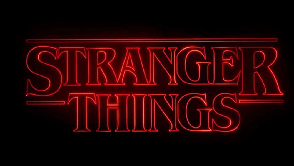
Created by Jacob Boghosian, the Stranger Things logo has an evocative retro feel thanks to the way it draws on old movie posters and Stephen King book covers from the period in which the hit Netflix series is set. The logo design was incorporated into the series's title sequence by Imaginary Forces (see below)
The Stranger Things font is ITC Benguiat. Boghosian made modifications, including kerning to connect some of the letters, while he also stretched the letters vertically and reshaped some of them to better fit next to each other. The result is a design that feels like it could have been made in the 1980s but works perfectly in a contemporary opening sequence, making this TV show logo an instant classic.
02. Game of Thrones logo
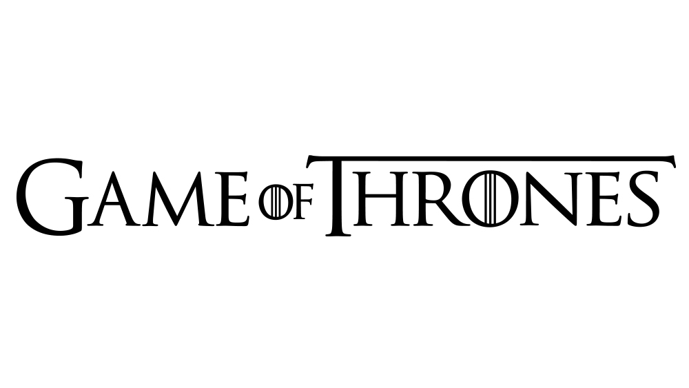
Game of Thrones is another of the biggest television hits in recent years, and its logo is the perfect fit for the epic saga based on George Martin’s novels. Developed from the Trajan Pro typeface, the wordmark adds details that enhance the fantasy feel, with the vertical lines inside the 'O' and the elongated horizontal bar of the letter 'T'. The 'G' and 'T' are enlarged and the 'of' reduced, a classic technique used in designs for titles.
In the title sequence, the wordmark appears against a circular badge featuring four animals’ heads, representing the Stark, Lannister, Targaryen and Baratheon houses of the Game of Thrones world.
Get the Creative Bloq Newsletter
Daily design news, reviews, how-tos and more, as picked by the editors.
03. The Muppet Show logo

Next on our list of the best TV show logos is a design that goes further back. Slapstick, absurdist, satirical, outrageous and above all, very funny, the Muppet Show was years ahead of its time. So much so that in the 1970s, American networks wouldn’t touch it, and its producers had to come to British company ATV to get it made.
Based on an old-time variety format, the programme’s whimsical logo is delightfully infused with the spirit of vaudeville. Combining a sense of the ornate with the cartoonish, its design nicely mirrors the conflict within the show’s conceit; between high-minded aspiration and hilarious failure. You can trace the evolution of the various Muppet Show logos here.
04. The M*A*S*H logo
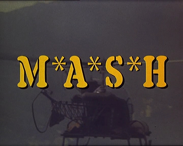
It’s rare to see M*A*S*H on our screens these days, but for decades its reruns were rarely off the air. This spin-off from the 1970s comedy movie was set during the Korean War but screened at the time of Vietnam, and its anti-authority, anti-war message echoed the mood of many Americans. Plus it was damned hilarious.
The title logo for the TV show makes use of custom stencil lettering and trademark asterisks (which were absent from the movie’s wordmark) to convey a clear sense of military officialdom; the source of much of the show’s comedic antagonism. Oh, and in case you were wondering, the letters stand for Mobile Army Surgical Hospital.
05. The Cheers logo

Anyone who watched TV in the 1980s will be familiar with the Cheers logo, promising half-an-hour of deceptively witty humour in the guise of lowbrow bar-room banter. It was designed by Castle Bryant Johnsen, a three-person LA studio which also designed title sequences for Roseanne, Moonlighting, The X-Files and Frasier.
Combining elements of Victorian and Art Nouveau typography, the painterly design combines the look of a vintage hand-lettered bar sign, completed with a swopping flourish reminiscent of baseball team logos (perhaps a nod to the main character, Sam, being a retired baseball star). The letters themselves are derived from the typefaces Candice (for the ‘C’) and Flamenco Inline (for the rest). You can learn more about its creation here.
06. The Friends logo

1990s comedy Friends wasn’t just a successful show, it broke the sitcom mould. Rather than revolving around a family home or workplace, it followed a group of wayward twentysomethings struggling to find their way in the world. Less about character or story development than the chemistry between its hip young actors, it was the perfect show for the rootless ‘Generation X’.
The opening titles feature an anarchic sequence, in which the characters goof off around a fountain with colourful umbrellas, to a track by The Rembrants. The artfully scrawled, handwrittten Friends logo mirrors their sense of fun and abandonment, while the six coloured dots separating the letters replicate the colours of the six umbrellas used in the scene.
07. The X-Files logo
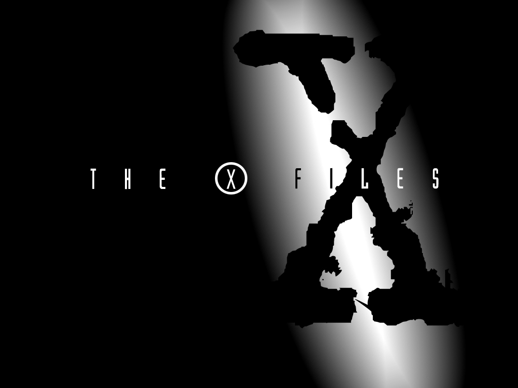
Another mould-breaking 1990s show, The X-Files was the thinking person’s sci-fi, revolving around two FBI agents investigating paranormal and extraterrestrial phenomena. It was a huge hit, spanning nine seasons and two feature films, and returned to on our screens for a tenth season in 2016.
Its beautiful logo, designed by the show’s creator Chris Carter, makes brilliant use of a large, distressed figure ‘X’, uncovered by a spotlight in the pitch dark, to denote the shady, secretive nature of their FBI unit. This main graphic element is then bisected by the full title, set in a sleek, modern font that adds a note of sophistication to proceedings, and with the circle around the ‘X’ adding a further touch of mystery.
08. Buffy the Vampire Slayer logo
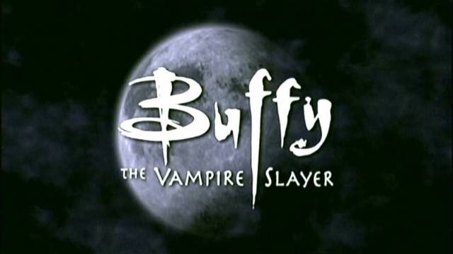
Long before Twilight, Buffy the Vampire Slayer summoned the spirit of teen angst and gave it the corporeal form of vampires, demons and other monsters, with which its reluctant titular hero had to constantly battle. The seething violence at the heart of the show is mirrored in its logo, with stylishly brutal lettering that conveys the feeling of ancient script.
Incorporating a ‘stake’ motif within the opening letter, and with the ‘f’s conveying a sword and dagger respectively, there’s a real sense of menace to this design, leaving viewers in no doubt that Buffy is not your typical teen drama. It was created by graphic artist Margo Chase of Chase Design, whose clients include Cher and Madonna, and who also designed the logo for the Buffy spin-off, Angel.
09. 24 logo
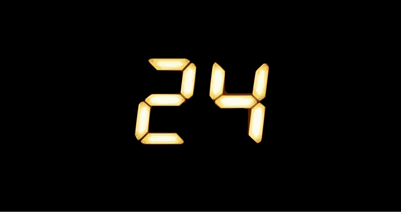
Bringing us, in real-time, 24 hours in the life of counterterrorism agent Jack Bauer, 24 was one of those early 2000s shows that inspired the idea that ‘TV is the new film’.
Throughout each episode, a countdown clock ticks menacingly on the screen, reminding us of the latest impending disaster and ramping up the tension. The logo simply casts the show’s title in those same glowing LCD numbers; a masterstroke demonstrating that the simple ideas are so often the best.
10. Lost logo

The complex and increasingly fantastical tale of the survivors of an air crash on an unknown island, Lost was a show designed for water-cooler discussion, as fans earnestly debated what in the heck was going on.
In many ways a metaphor for the post-Cold War era, Lost reflected the fear that America had lost its way in the world as all the old certainties vanished. Its title sequence echoes that sense of anxiety, as the distant, ghostly logo floats through a dark, empty space, accompanied by a discordant, ominous sound, going in and out of focus. This hauntingly effective 15-second sequence was developed by JJ Abrams, co-creator of the show, who created it on his laptop.
11. Mad Men logo
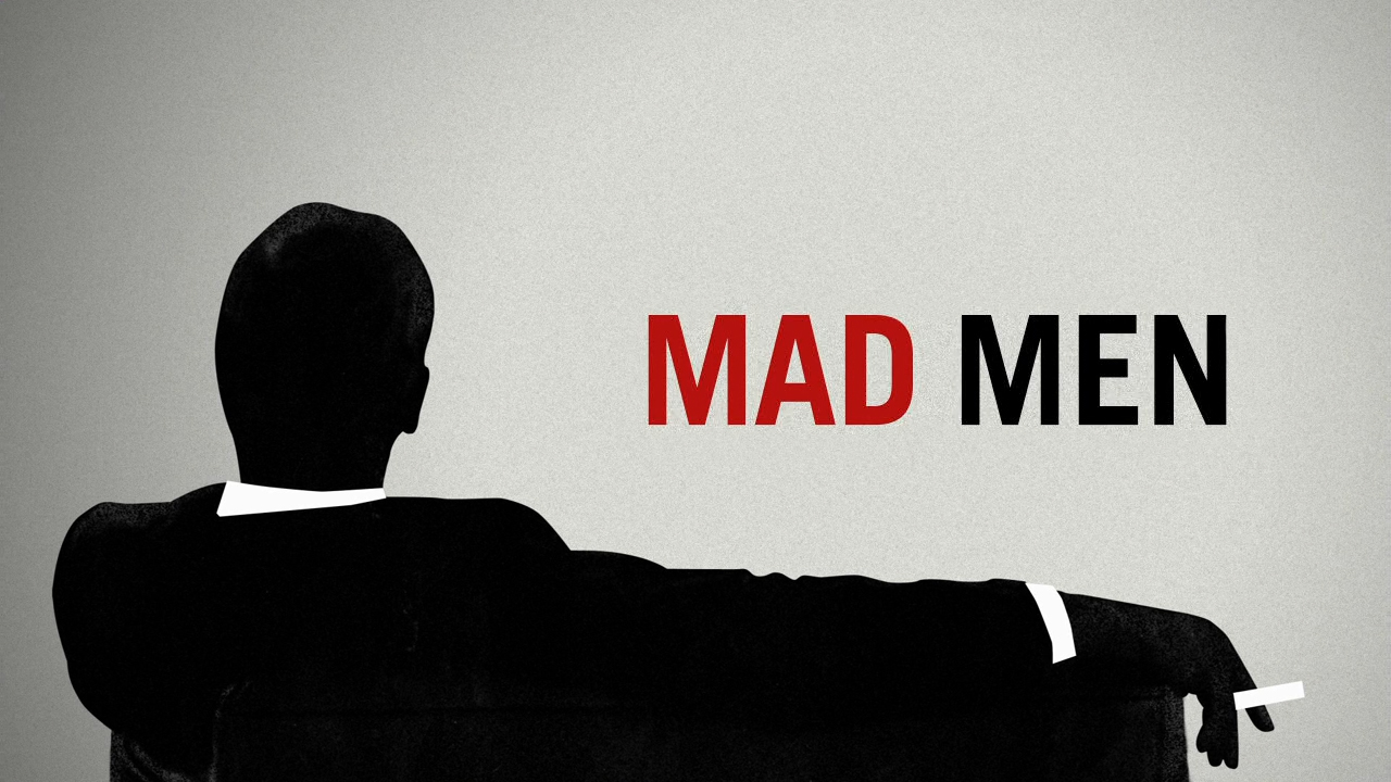
Mad Men was to creative agencies what Life on Mars was to cops; a fond look back to a time when big characters and big ideas ruled the roost, great work was done and political correctness was just a twinkle in the future’s eye.
One of the few blockbuster shows to ever portray branding work seriously, you’d expect it to have great branding of its own, and you weren’t disappointed. Cast in the Helvetica-style font Swiss 721 Heavy, with a punchy red-white colour palette, this sans-serif logo is swilling with Don Draper-style confidence, and hits the right sweet spot between nostalgia and modern sensibilities.
12. Breaking Bad logo
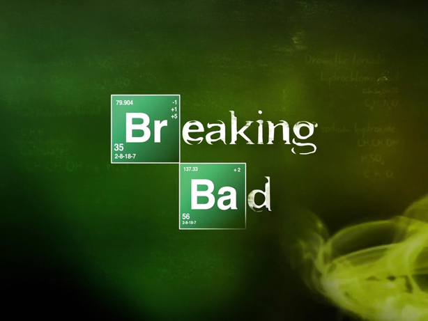
The hit of the decade, Breaking Bad was the unlikely story of a high school chemistry teacher, Walter White, who turns to the meth trade to pay for his cancer treatment. With hard science playing a pivotal role in the drama, applying the periodic table treatment to its logo and opening titles was a stroke of genius.
The chemical symbols are cast in a clean and clear font, symbolising the purity and stability of science, while the rest of the words appear in distressed and fragmented letters that convey how broken up Walter’s sense of self becomes as he descends into the rabbit hole of criminality.
(In case you were wondering: the chemical elements denoted, Bromine and Barium, are not used in the manufacture of meth. However, the title sequence does feature the chemical formula for methamphetamine, C10H15N, along with the number 149.24, its molecular weight.
Fans loved the logo, which adorns countless T-shirts and other merchandise, and it inspired a number of brilliant design tributes. And as the ultimate accolade, the show’s main actor Bryan Cranston got it tattooed on his ring finger on the final day of shooting.
If you'd like to explore more iconic logo design, check out our selection of the best logos of all time. Or if you are in need of some ideas for a new logo, head over to our guide to how to design a logo.

Thank you for reading 5 articles this month* Join now for unlimited access
Enjoy your first month for just £1 / $1 / €1
*Read 5 free articles per month without a subscription

Join now for unlimited access
Try first month for just £1 / $1 / €1

Tom May is an award-winning journalist and editor specialising in design, photography and technology. Author of the Amazon #1 bestseller Great TED Talks: Creativity, published by Pavilion Books, Tom was previously editor of Professional Photography magazine, associate editor at Creative Bloq, and deputy editor at net magazine. Today, he is a regular contributor to Creative Bloq and its sister sites Digital Camera World, T3.com and Tech Radar. He also writes for Creative Boom and works on content marketing projects.
- Joe FoleyFreelance journalist and editor
