Beginning today and running until 16 October, the London Film Festival is back in town. Showing more than 300 films, documentaries and shorts from around 50 countries, this prestigious international event is now entering its 60th year. So it’s great opportunity to look back over six decades of festival posters, and pick out our favourites.
You can see more of the designs here, and there’s even the opportunity to buy a poster, canvas print or frame print of your favourites.
Disagree with our top 10 choices? Feel free to make your case in the comments below.
01. 1957
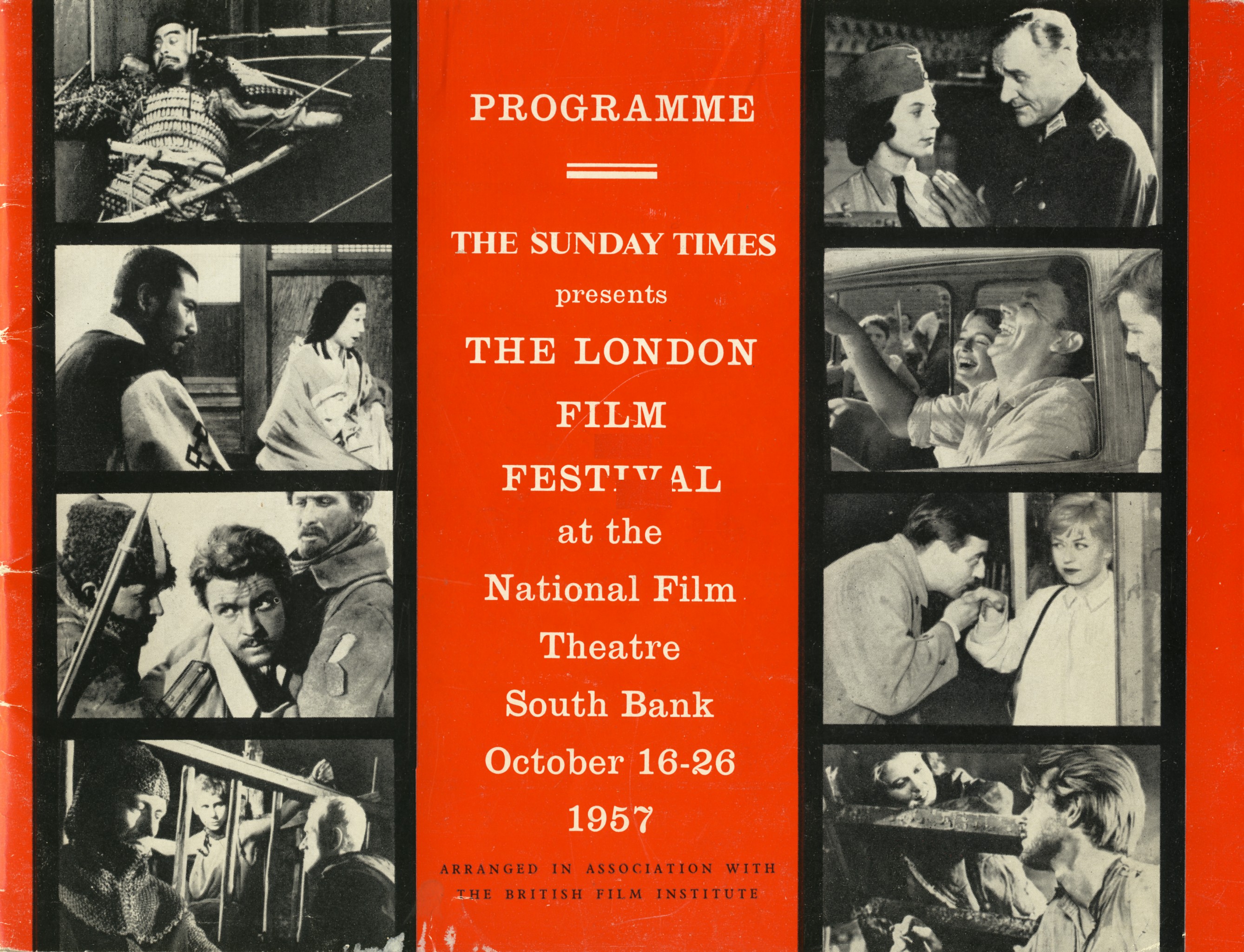
At a dinner party at the home of Sunday Times film critic Dilys Powell, guests including British Film Institute director James Quinn were bemoaning the lack of a film festival in the UK capital. Thus was born the London Film Festival, which launched in 1957 at the BFI’s National Film Theatre (now BFI Southbank). It showed 15 movies, all international; the first was Kurosawa’s Throne of Blood.
While reflecting the relative visual formality of the time, the poster for the inaugural festival is still striking, with an attention-grabbing red background and use of a film-reel graphic to display stills from eight of the films, conveying the concept instantly and effectively.
02. 1960
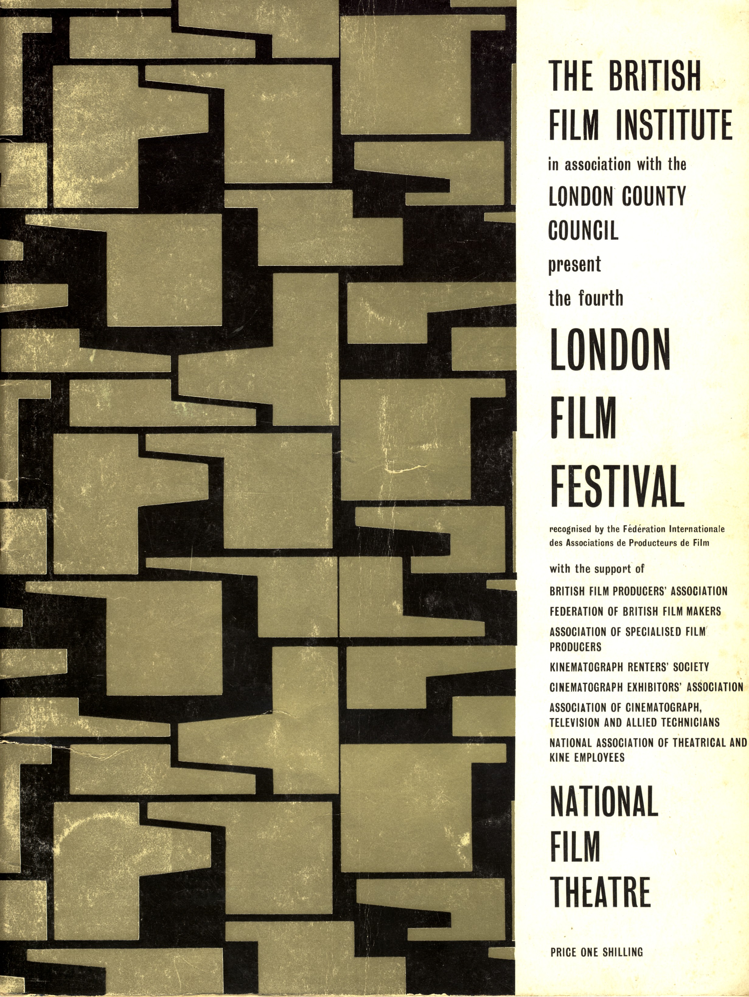
By 1960, films from the continent continued to dominate the LFF, such as François Truffaut’s Shoot the Pianist and Michelangelo Antonioni’s L’Avventura. But this fourth festival was also the first to feature a British film, Karel Reisz’s now-iconic Saturday Night and Sunday Morning.
The design of its posters was progressing too. This beautiful abstract creation reflects a new sense of artistic confidence that was germinating in the capital, which would propel it to become the centre of the cultural world over the decade to come.
Get the Creative Bloq Newsletter
Daily design news, reviews, how-tos and more, as picked by the editors.
03. 1965
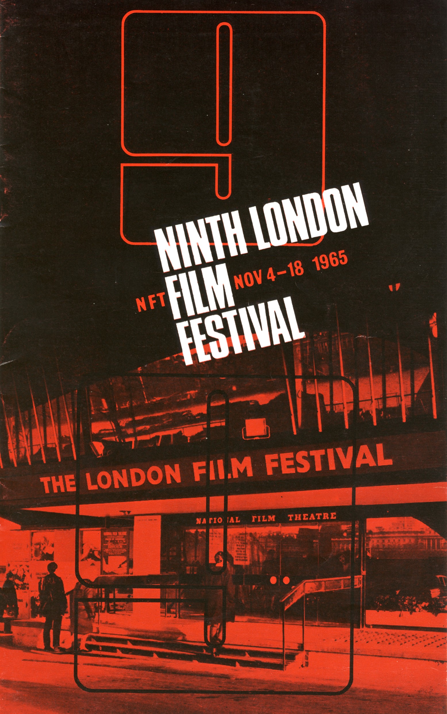
By the mid-Sixties the times were a’changing, even in conservative Britain. With homosexuality just a couple of years away from being decriminalised, the 1965 Film Festival screened its first (albeit subtly) gay movie, the Canadian feature Winter Kept Us Warm.
Elsewhere, director Jean-Luc Godard, the darling of the counterculture movement, had three director credits at the event, in the form of Alphaville, Pierrot le Fou and Six in Paris. At this point, London was very much swinging, and this cool poster design made great use of a colour filter and dramatic typography to give the event the up-to-the-minute, cutting-edge feel it deserved.
04. 1972
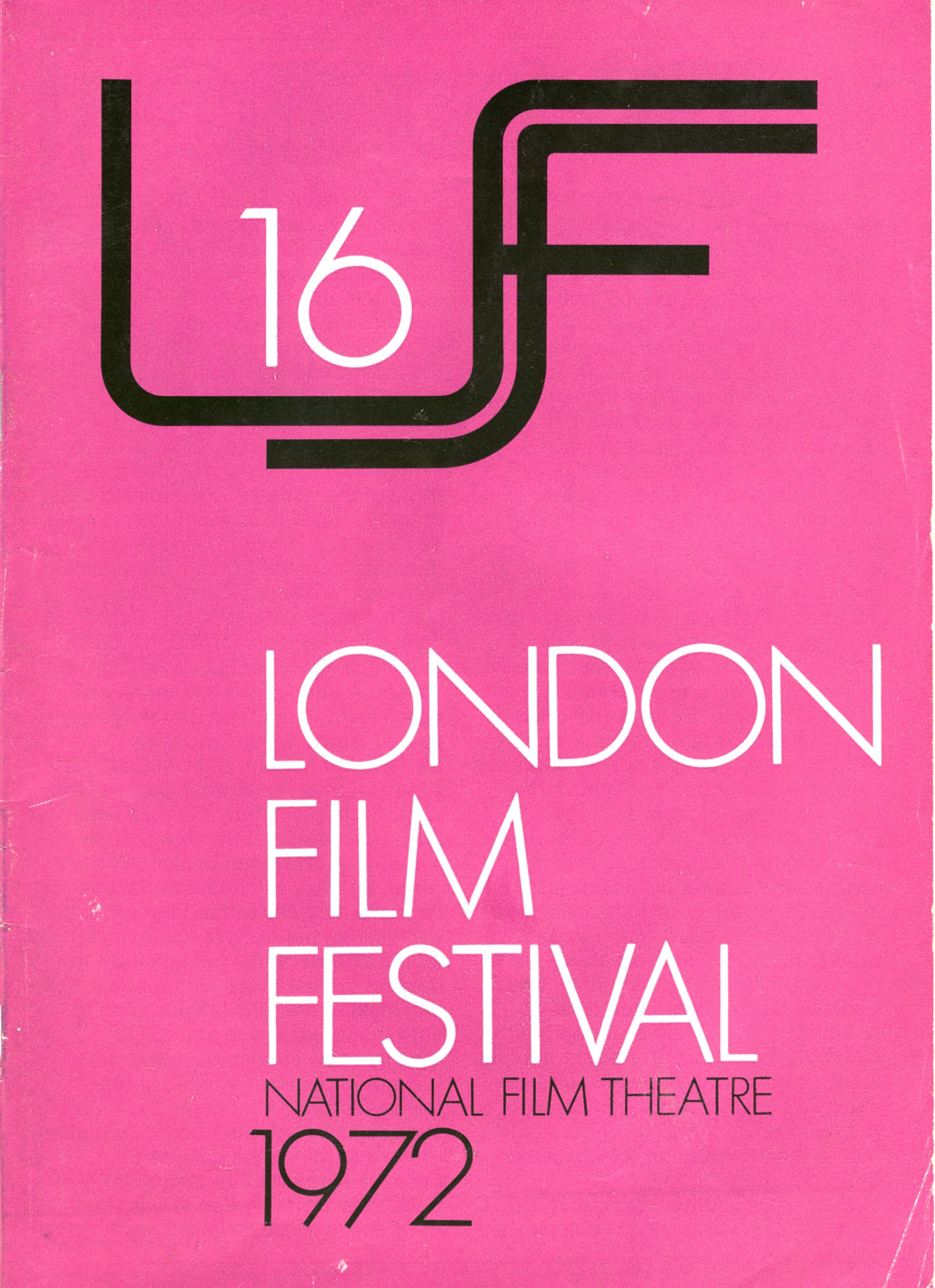
As it entered its third decade, the festival had firmly established itself as a place where unknown films could be discovered and become wider hits. At the 1970 event, for example, only seven of the 28 films screened had UK distribution, giving exposure to directors like David Lynch and Werner Herzog. With the LFF becoming so well known, it was no longer necessary to cram a ton of information into its marketing, making possible wonderfully minimalist, type-led designs like this one for the 16th Festival in 1972.
05. 1975
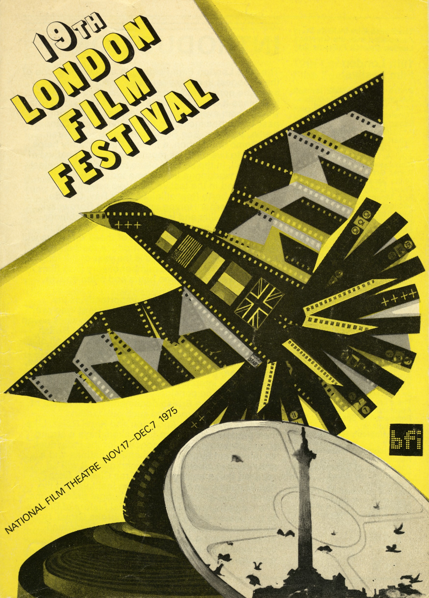
As the Seventies progressed, the Festival began to expand in size and diversity under the directorship of Ken Wlaschin, and became a place where restricted films such as The Texas Chain Saw Massacre in 1974 and Walerian Borowczyk’s The Beast in 1975 found a home (they could still only be shown to BFI members). This stunning collage for the 19th festival cleverly incorporates the many aspects of the event: reels and film-can representing movie-making; flags reflecting its international nature; and the silhouette of Nelson’s Column its London setting.
06. 1981
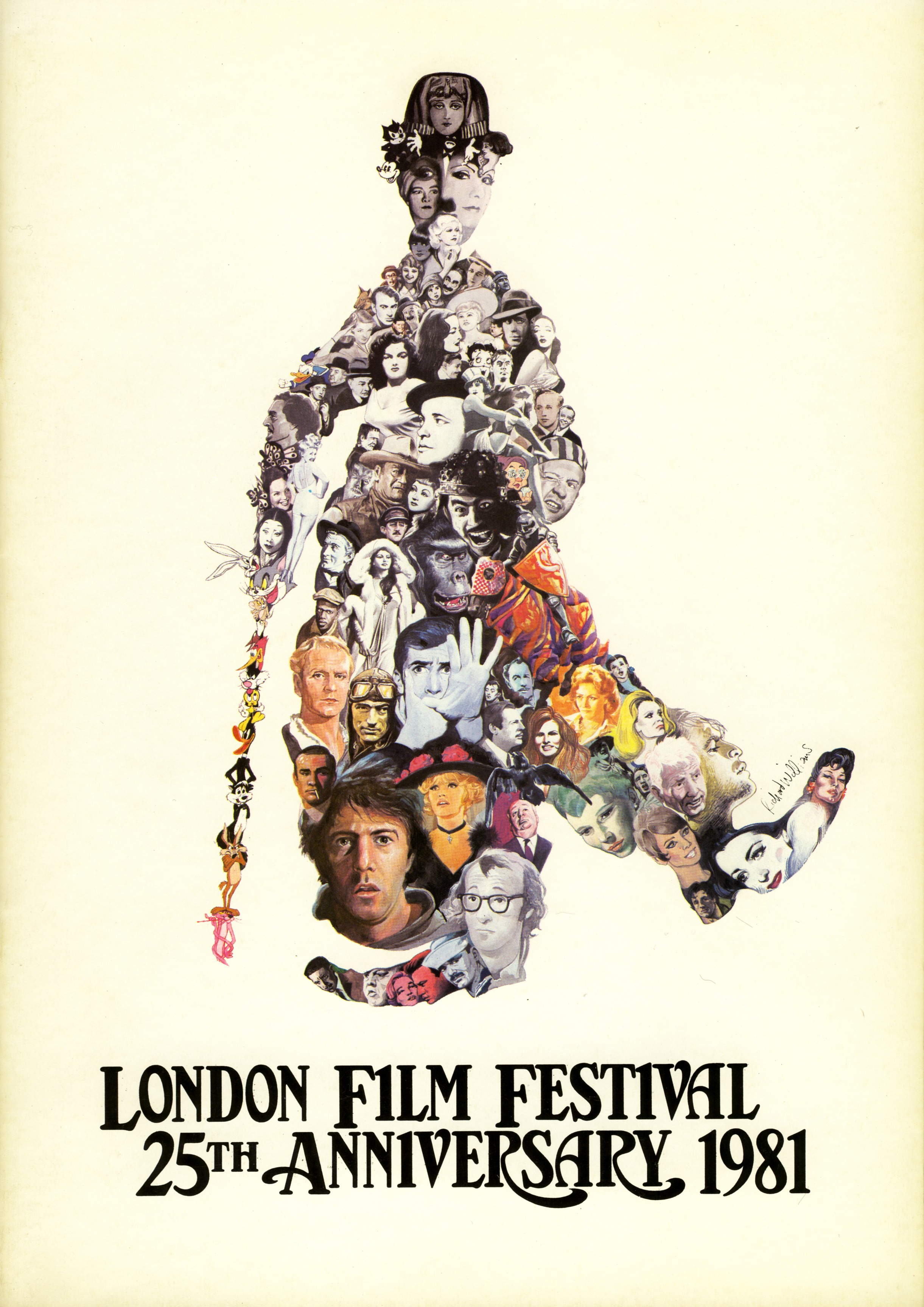
As the Seventies turned into the Eighties, the movie industry saw the rise of star power, with big names becoming increasingly important for a film’s success, and star salaries rocketing accordingly. The poster for the 25th London Film Festival in 1981 reflects this renewed fascination with screen idols past and present. Its gorgeous illustration features an array of faces every contemporary audience member would recognise, in a clever collage that combines theme to recreate London’s famous son, Charlie Chaplin.
07. 1984
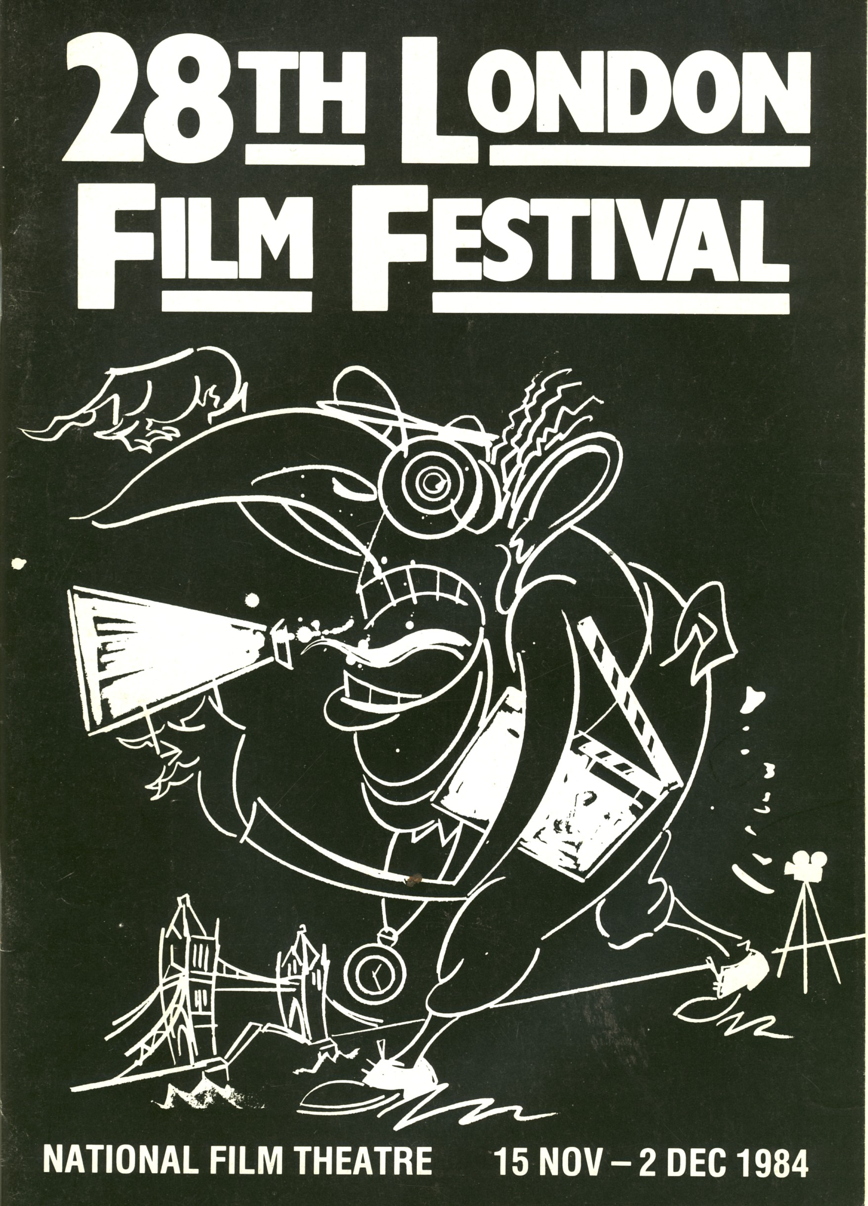
In the Eighties, film critic Derek Malcolm took over directorship of the festival, the same year that Sheila Whitaker became head of programming at the BFI’s National Film Theatre, and the event continued to broaden its horizons. Throughout the decade, the LFF took a chance on many off-the-wall films now seen as classics, from The Long Good Friday to American Werewolf in London and in 1984, Joe Dante’s Gremlins. That year’s poster design was similarly edgy: a stark, chalkboard-style doodle by master cartoonist Gerald Scarfe. Instantly attention-grabbing and fitting the spiky mood of the mid-Thatcher period, it nonetheless manages to subtly incorporate the LFF’s eternal themes of London and film-making.
08. 1995

Throughout the decades, the LFF posters have made great use of the film reel as visual metaphor, and that was certainly the case with this eye-catching (pun intended) design for the 39th festival in 1995. With the event now reaching its mature years, and becoming an established date in London’s cultural calendar, there’s a formal, professional tone to this design compared to some of the more freewheeling creations of the 1960s-1980s.
09. 2003
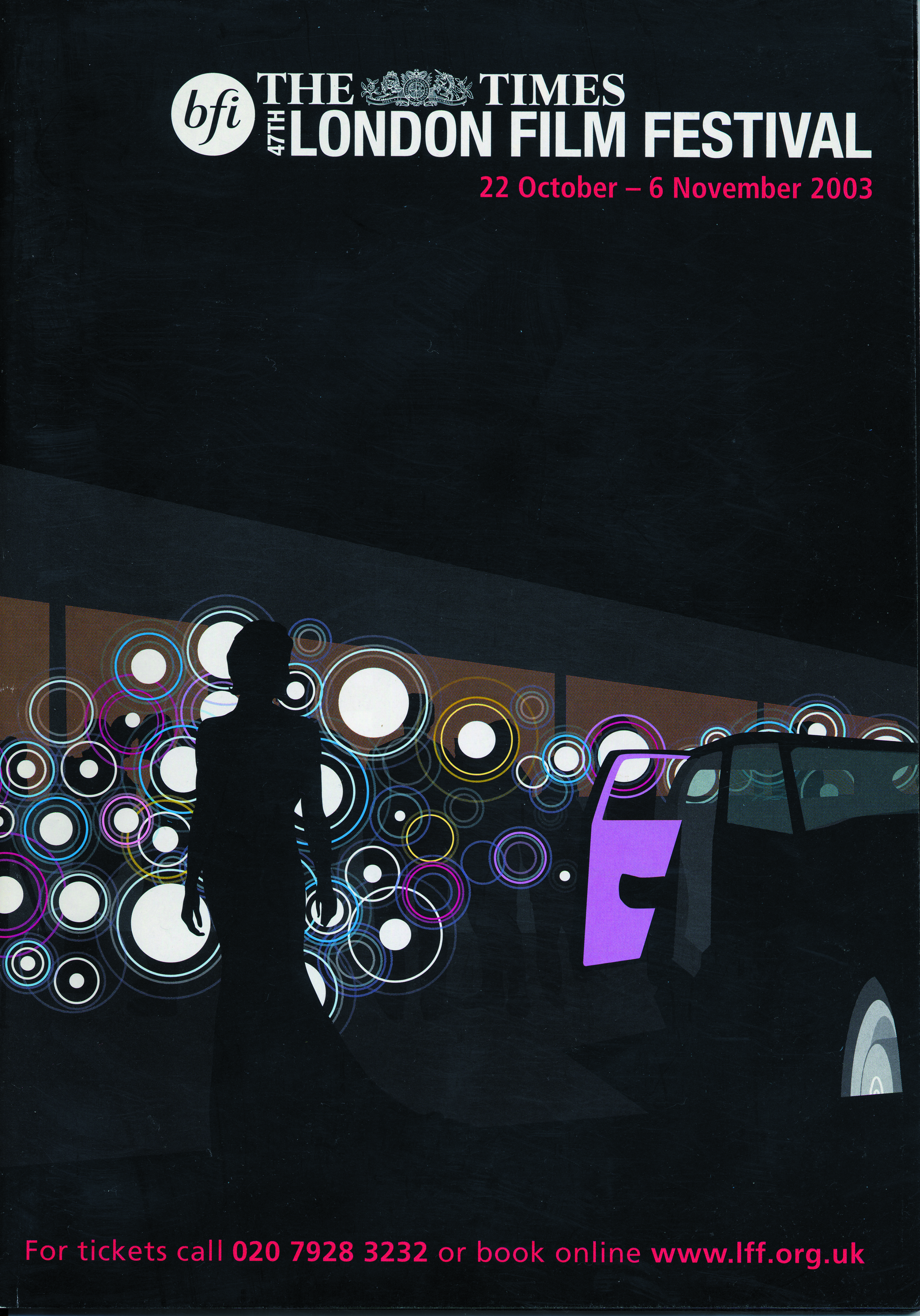
By the late 1990s, the Festival was expanding its activities even further, increasing the number of venues, both in London and across the UK. Sandra Hebron assumed the directorship of the LFF in 2003, and for the first time incorporated ‘BFI’ into the festival’s title. This poster for that year makes brilliant use of bright colour, geometric art and minimal type to project a fresh and forward-facing view for the unfolding century.
10. 2008
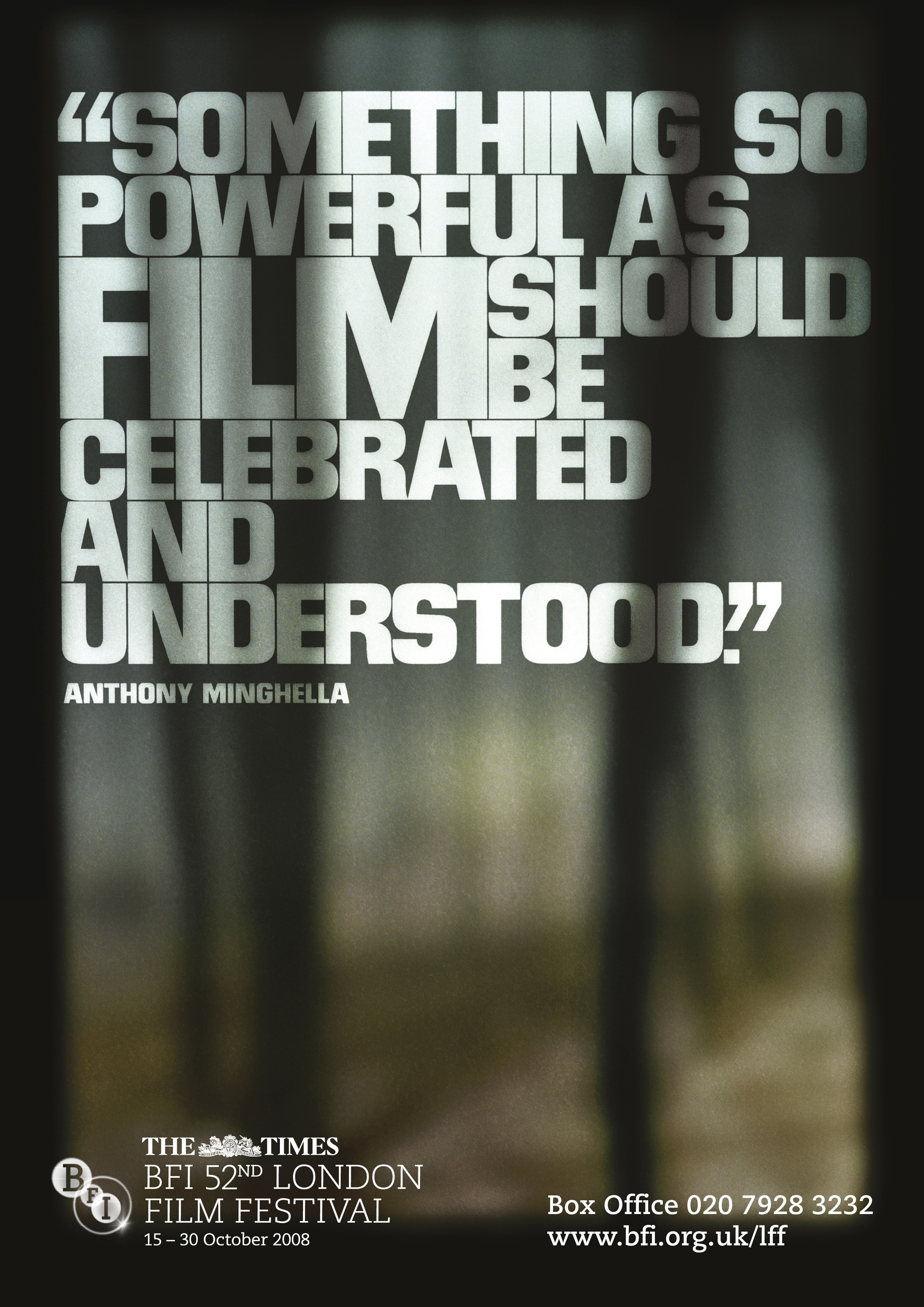
In 2008, the Festival line-up included Hunger, the feature debut of Steve McQueen, who went on to direct 12 Years a Slave and will receive the BFI Fellowship at this year’s event. In 2008 there was not one but a series of posters, each giving the same distinctive typographical treatment to a quote from a famous film-maker. Other choice quotes came from David Lynch (“Life is very complicated and so I think films should allowed to be too”) and Jonas Mekas (“Movies can be private and personal… everyone has their own”).
You can see more of the London Film Festival poster designs, and order printed copies, here.

Thank you for reading 5 articles this month* Join now for unlimited access
Enjoy your first month for just £1 / $1 / €1
*Read 5 free articles per month without a subscription

Join now for unlimited access
Try first month for just £1 / $1 / €1

Tom May is an award-winning journalist and editor specialising in design, photography and technology. Author of the Amazon #1 bestseller Great TED Talks: Creativity, published by Pavilion Books, Tom was previously editor of Professional Photography magazine, associate editor at Creative Bloq, and deputy editor at net magazine. Today, he is a regular contributor to Creative Bloq and its sister sites Digital Camera World, T3.com and Tech Radar. He also writes for Creative Boom and works on content marketing projects.
