The pro's guide to creating memorable business cards
Boss your brand: Your essential crash course for crafting the perfect business card.
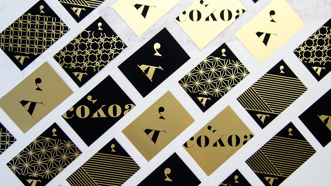
A well-designed business card is more than just an extension of your brand. It’s an opportunity to make a lasting impression with prospective clients, drive new conversations, and attract exciting new career possibilities.
Get it right, and your business card is a powerful self-promotion tool. But get it wrong and it doesn’t matter how much time you put into the design: your card will likely be taking a one-way trip to the bin.
So what’s the secret to creating a memorable business card? How can you make sure yours stands out for the right reasons? And what are the common creative pitfalls to avoid?
From essential information to include, to best-practice design rules and pro tips for preparing for print, we bring you everything you need to know to craft the perfect business card. Need great typography? Here are the best free script fonts around.
01. Choose the right size
Before you jump into designing your business card, you need to choose your canvas. The most common business card size is 3.5 x 2 inches (89 x 51mm) if you’re in the US, or 3.37 x 2.12 (85 x 55 mm) in the UK. That’s roughly the size of a debit or credit card – which means it’ll fit into a wallet or purse.
A more unusual shape can be a good way to differentiate your business card from others, but just remember that if it doesn’t fit into someone's pocket, it’s more likely to end up in the bin.
02. Business card design dos and don’ts
Once you know what size business card you’re designing, it’s time for the fun part: the creative. A brilliant business card will delight and engage viewers – but there are some classic design pitfalls you need to avoid. Follow these best-practice tips to make your business cards sing…
Get the Creative Bloq Newsletter
Daily design news, reviews, how-tos and more, as picked by the editors.
Do: start the creative process with your key information
You want to get the most out of your canvas, so always start with the core information you want to communicate – usually your name, job title, phone number, email address and website – and design out from there.
Think about how you can use the space creatively to best communicate these details, as well as showcase your design skills or signature style.
Don’t: over share
Don't put your personal Facebook or Instagram accounts on your business cards – prospective clients don’t care what you had for breakfast, or that you went hiking at the weekend. Only include social accounts if they’re professional.
Do: tailor your business cards
Economies of scale might suggest you should design and print one business card for everyone, but think about your client base. If you’re pitching for typographic work, your business card shouldn’t look the same as a business card you’d give to a web design client, for example.
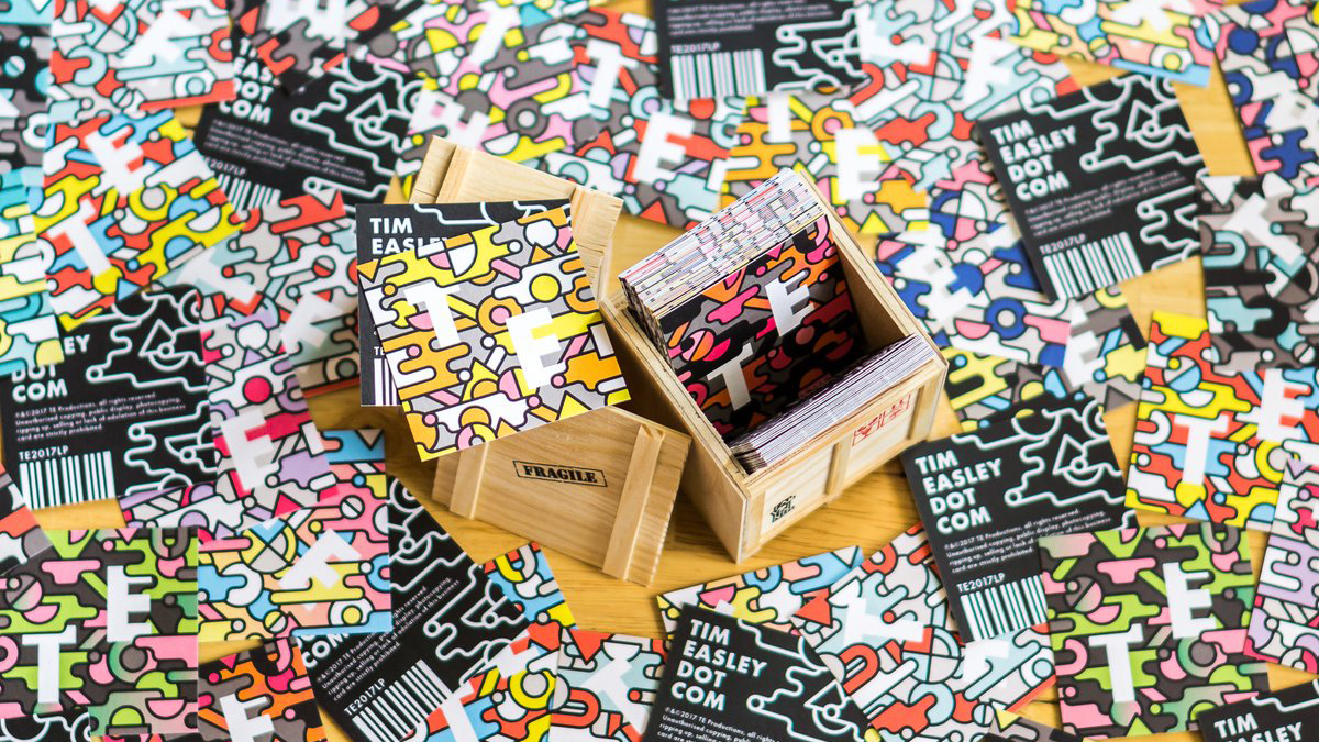
One handy service to look into is Printfinity from print and design company moo.com, which lets you print a different design on every card – for no extra cost. Think of it as a portfolio in your pocket: you can showcase your best work in different fields to different prospective clients.
Do: print on both sides
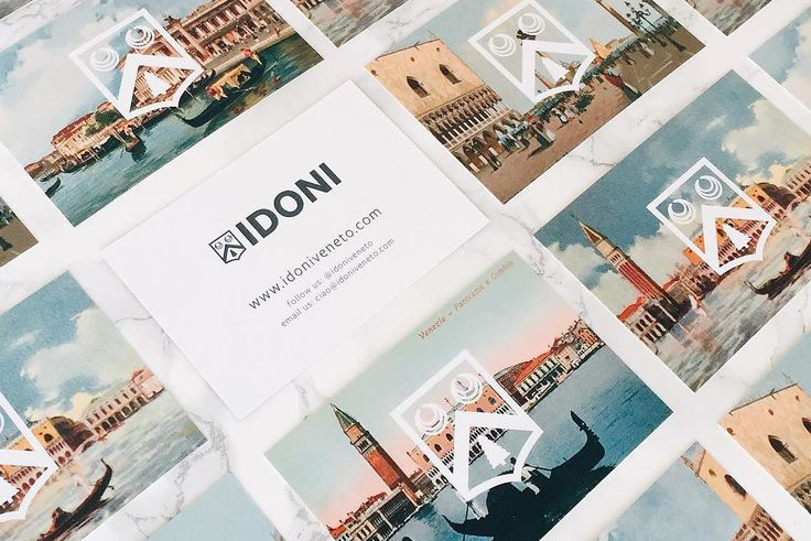
Never be tempted to save money by only printing on one side. Whether you opt to run your logo, showcase a piece of work from your portfolio or create a custom design that highlights your style, the other side of your business card plays a crucial role in attracting attention – so don’t neglect it.
To that end, always make sure full-colour printing on both sides of your business cards is included in any quote you get from a printer.
Don’t: include borders
It might look slick on a screen, but it's best to avoid having a border on your business cards. If the card isn't perfectly cut, any misalignment in the trim will be instantly shown up.
Do customise
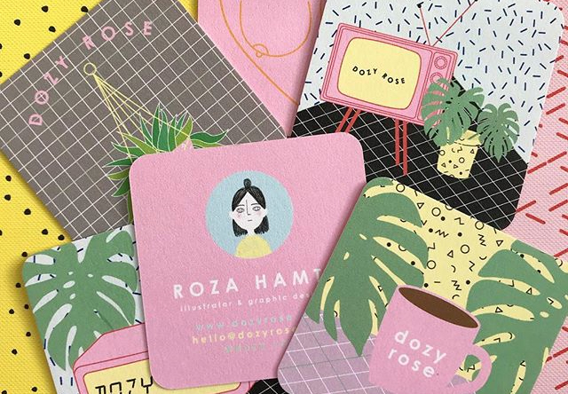
Subtle design decisions – such as choosing between square or rounded corners, or adding a coloured seam – offer an effective way to make your business cards stand out for the right reasons, and help prospective clients remember you.
Don’t rely on gimmicks
When it comes to customisation, remember that less is nearly always more. Business cards are designed to go in wallets, purses or pockets, as we've already said. Unusual shapes or materials might seem like an easy win for standing out from the crowd, but they can be difficult to store – which makes them more likely to be thrown out.
In addition, gimmicky cards run the risk of distracting viewers from the important part: who you are and what you do. Unless you're confident that your unusual idea is really good – and we mean really, really good – don't do it.
03. Choose the right stock
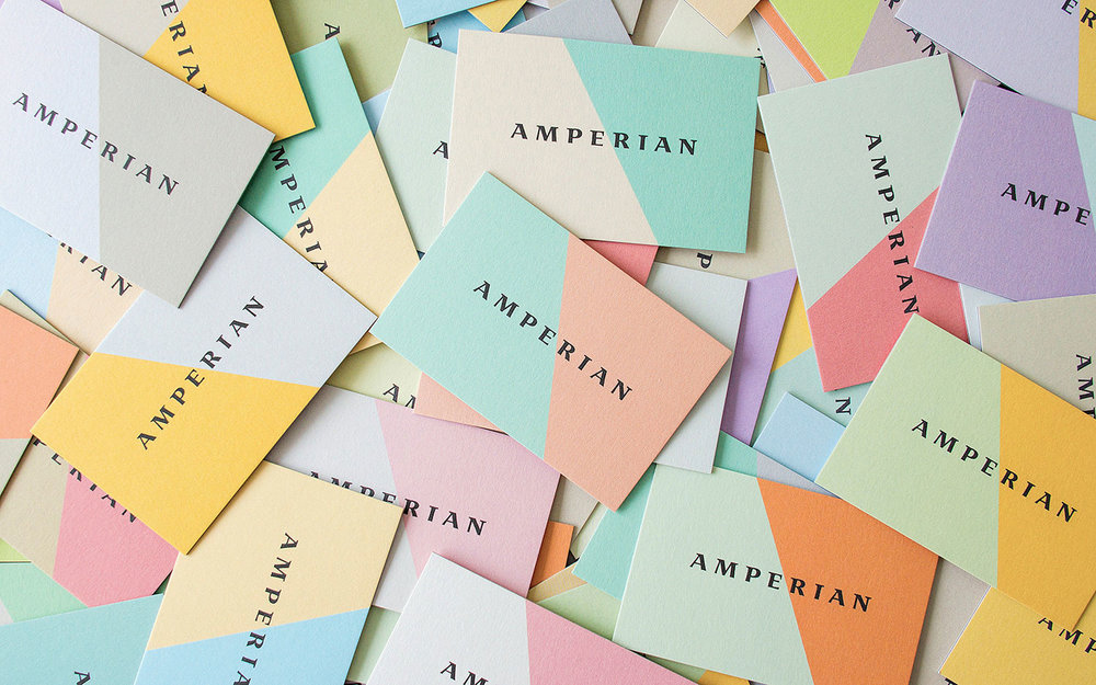
While there's a huge variety of paper stock to pick from, your decision should be influenced by your colour palette, the impression you want to make and your budget. So what stock should you go for? Here's what you need to know...
Thick card stock denotes quality and feels professional, so always aim for 300 gsm/14 point and above. Silk and gloss finishes feel polished and contemporary, and work particularly well for portfolio-style business cards that show examples of your work on one side.
Colours look brighter on silk or gloss than they do on matte stock, too, because the ink doesn’t absorb into the fibres. However, matte stock can lend sophistication and elegance to your brand, and textured stock can bring an upscale feel.
04. Stand out with a special finish

Gold foils, spot gloss and other special finishes aren’t just a smart move if you’re pitching to luxury or high-end clients. Used correctly, they’ll elevate your brand – and make your business card more memorable.
Our best advice is to treat foil as its own colour: remember that it will be printed on top of your design, obscuring anything beneath it. Also, make sure your design includes some tolerance for mis-registration – the printing process requires heat and pressure, and registration can vary by around 1mm.
Gloss, meanwhile, is a fantastic way to accent subtle details or enhance certain colours in your design (apart from dark, solid colour).
Whatever you do, don’t go wild. The most effective business cards exercise restraint with special finishes – less is always more. And always make sure the finish reflects your brand. Never use a special finish for the sake of it.
05. Print checklist: essential rules to follow
Designing your own business cards is the ultimate brief. But it’s surprisingly easy to lose sight of the finer details when you’re your own client, so before you go to print, ask yourself whether you’ve covered the points below.
(And yes, we know some of these sound obvious. You'd be amazed at how many times even the most professional designer forgets to include their website details or email address.)
Here's your essential business card print checklist.
- Ensure your name, email address and phone number are clearly displayed
- Include your website, and add your logo if you have one
- Is it legible? Main text should be above 8pt
- Use a clean typeface; avoid thin or light fonts
- Go easy on decorative or script fonts
- Triple-check your spelling and grammar
- Is your kerning perfect?
- Keep important text 5mm from the trim
- Provide a 3mm-5mm bleed – check with your printer
- Work at 300dpi for best image reproduction
- Stick to CMYK unless you’re working only with spot colours
Want to simplify the printing process even more? Try print and design company moo.com: you’ll find a host of fun, affordable, easy-to-use tools for transforming your designs into premium business cards that will turn heads – for the right reasons.
MOO also offers a unique 'MOO promise', which means the team will do everything they can to make sure you love your business cards. If they spot a design error, they’ll let you know and fix the issue for free. And if you aren’t completely satisfied when your order arrives, they’ll fix the problem or give your money back.
Don't forget: you’ll also find a wealth of stunning business card inspiration from professional creatives on MOO’s blog and Instagram space, both of which are over-flowing with first-class examples of business card brilliance.
Related articles:

Thank you for reading 5 articles this month* Join now for unlimited access
Enjoy your first month for just £1 / $1 / €1
*Read 5 free articles per month without a subscription

Join now for unlimited access
Try first month for just £1 / $1 / €1

Julia is editor-in-chief, retail at Future Ltd, where she works in e-commerce across a number of consumer lifestyle brands. A former editor of design website Creative Bloq, she’s also worked on a variety of print titles, and was part of the team that launched consumer tech website TechRadar. She's been writing about art, design and technology for over 15 years.
