The NFL logo: a history
We look at the history of the NFL logo, from its origins right through to the present day.
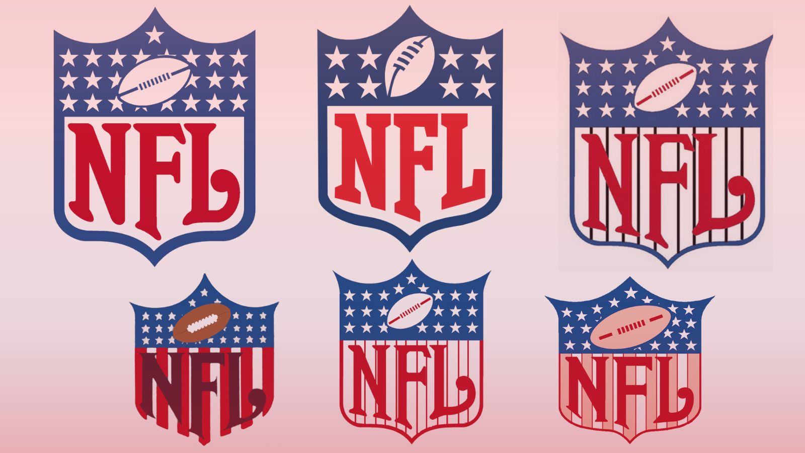
Logos have always been a big part of the history of the National Football League, better known as the NFL. Since the formation of the NFL in 1920, a huge part of every team’s identity has been their logos, featuring colourful characters and striking designs. There are plenty of blogs and YouTube videos out there that chart the fascinating evolution of all the logos of the teams in the NFL.
But what of the NFL logo itself? The distinctive shield-and-stars design that’s associated with the NFL has been in place more or less since the beginning, but it has changed over the years, evolving into the distinctive form that’s blasted from TV screens and billboards across the USA today. The changes are subtle, but interesting, and in this piece we’re going to take a deeper dive into how the logo has evolved. If you’re as obsessed with logos as we are, take a read of our definitive ranking of the best logos.
This is a slightly more contentious topic than you might think, as records of the early days of the NFL logo are quite spotty, and there's a lot of misinformation being spread around online. Two invaluable sources of aid for putting this piece together have been Chris Creamer at sportslogos.net and Paul Lukas and his excellent site Uni-Watch, as well as the YouTube channel TPS.
So, let’s crack on and take a look at the complete history of the NFL logo. If this inspires you to get designing for yourself, check out our guide to the best logo designer.
The first NFL logo (probably): from the 1940s, or maybe 1930s, to 1952
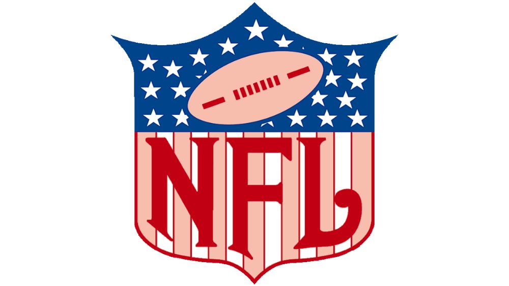
We apologise for how hopelessly vague that heading is – but the fact is that no one is quite sure when the NFL started using this logo. In 2008, when the modern NFL announced a revamp of its logo (more on that later), their best guess was that this original logo had been first used ‘around 1940’. Meanwhile, the folks at sportslogos.net reckon it could have been used as early as 1930.
It also appears to be a mystery who designed it – according to Uni-Watch’s Paul Lukas, writing for ESPN, no designer has ever been credited. What’s remarkable though is that whoever this designer was – they nailed it. Almost all of the key elements of this logo are still in place today – the stars, the ball, the red/white/blue colour scheme, the serif block lettering of ‘NFL’, and the escutcheon-like shield design. Sometimes, you get it right the first time.
The brief was clearly to make the logo resemble the American flag as much as possible. Unnamed designer, whoever you were, we can safely say you fulfilled that brief. Mission accomplished.
Get the Creative Bloq Newsletter
Daily design news, reviews, how-tos and more, as picked by the editors.
The literal phase: around 1953-1958
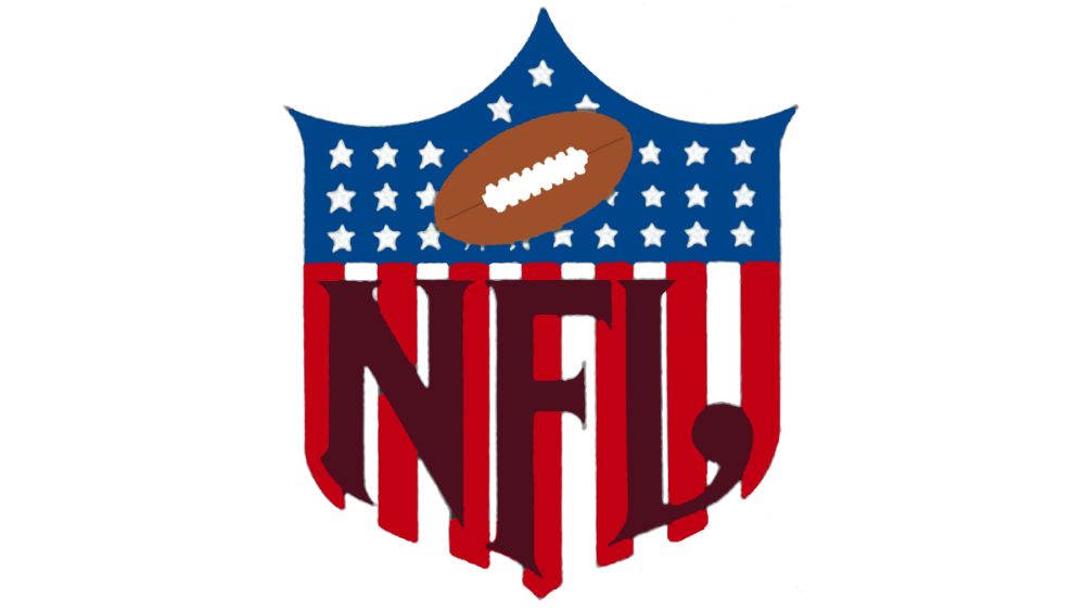
‘But what if it looked even *more* like a flag,’ one NFL executive in the early 1950s asked, possibly just after being accused of harbouring communist sympathies. The designer of this revamped version rose to that brief. Gone are the subtle outlined red stripes, replaced by the solid block-colours of Old Glory.
This change has necessitated altering the letter colour of the ‘NFL’ lettering from red to a rather severe dark brown – a change that wouldn’t last long, and would never be repeated. However, many of the changes made to the typography here would last until 2008, including the much more pronounced ball terminal on the ‘L’. In-keeping with the new theme of being as literal as possible, the stylised red football is also gone, and in its place is a rather skeuomorphic brown ball with white stitching.
The pinstripe era: late 1950s to early 1960s
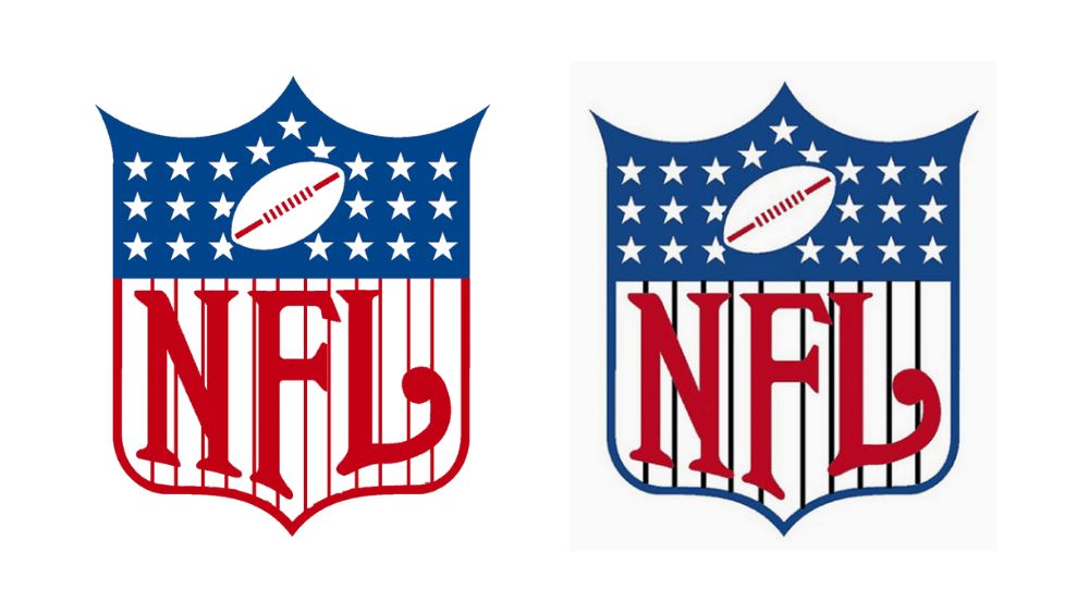
It is generally agreed that the NFL logo went through a pinstripe phase (didn’t we all) from the late 1950s to the early 1960s, though the precise dates are uncertain. There are a couple of different variants listed online as the version of the NFL logo from this period – one with black stripes, one with red. In both cases, the lettering can happily change back to its distinctive red.
It’s also time to talk about the stars. The first version of the logo had around 20 visible stars, depending on how generous you are with what you count as a star. On the realistic version it was around 26 (again, it depends a bit on what you count) and here it’s 22. In subsequent versions this would later stabilise to 25 stars. The actual American flag currently has 50 stars, and at the time these logos were being designed, would have had somewhere between 47 and 50, depending on the year. So what was the rationale behind the number of stars on the NFL logo?
The short answer: ¯\_(ツ)_/¯
When the 2008 revamp was announced, the NFL’s then-director of brand and creative operations Jaime Weston said, "After researching the shield's origins, the designers could find no reason for 25 stars.’"
Look, when we said that records of the early days of the NFL logo are spotty, we really weren’t kidding.
Bye-bye stripes: from 1960s to 1983
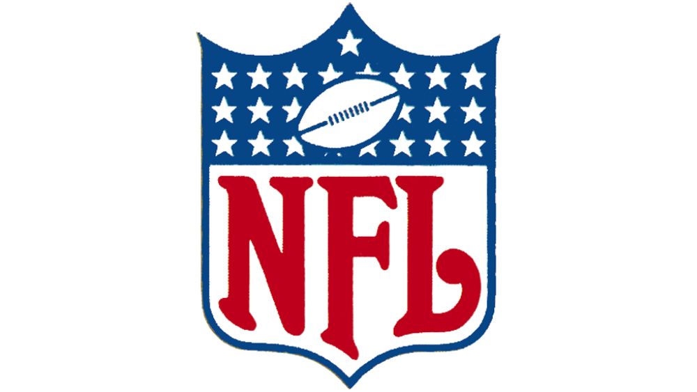
At some point in the mid 20th Century, the NFL elected to remove the stripes from its logo, making the resemblance to the US flag a little more subtle (though not a lot).
Many sources – including, for whatever reason, the NFL themselves – like to claim that the stripeless version of the logo made its debut in 1984. However, some sterling detective work by Paul Lukas at Uni-Watch uncovered a stripeless version appearing on posters and ticket stubs as early as 1964. And it could well have appeared even earlier than that.
This version is also generally much cleaner than previous ones, adding a consistent slim blue border rather than a red border on just the lower half. The stars have also been straightened out, and the red ball stitching has been made blue to maintain the separation of colour between the two halves. All this helps the letters ‘NFL’ stand out much more boldly – and the lettering has been thickened a little to further accentuate this effect.
Tidying up: 1984-2007
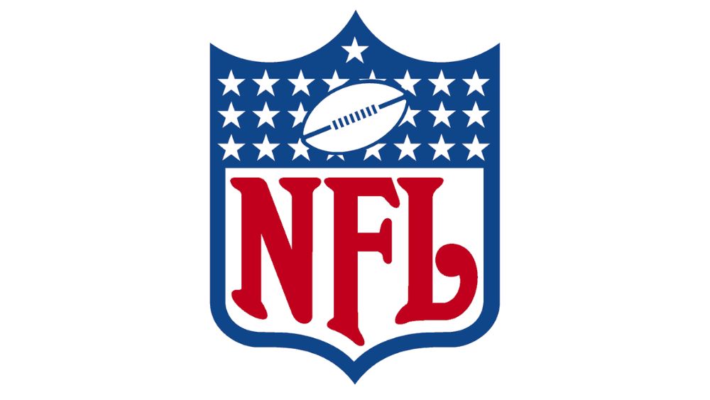
Even though this version of the logo endured for 23 years, there’s not a huge amount to say about it compared to the previous one. The most obvious change is that the blue border around the edge has been considerably thickened, truncating the long tail of the ‘F’ that was making it look a bit gothic in the previous version.
Also, the straightening of the stars in the stripeless era means that while you can’t see 25 visible stars, you can use their regimented rows to extrapolate that that’s how many there are in total, including ones wholly concealed by the ball.
The modern revamp: 2008-present
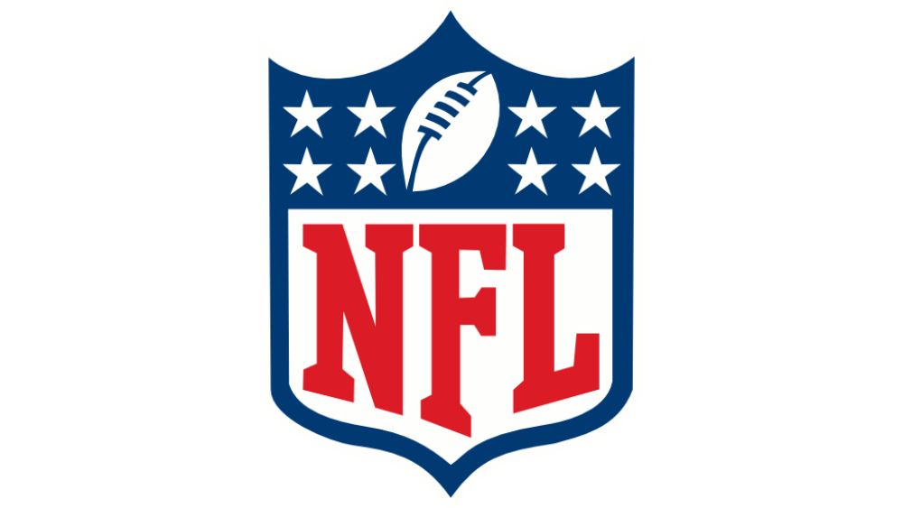
And finally, here it is! The much-teased redesign from 2008, which is still the league’s official logo today. At first glance it’s not too different from the 1984 version – the font has been cleaned up, finally removing that ball terminal on the ‘L’ for a more modern look. The football has also been positioned more diagonally, with some perspective used to suggest it is pointed slightly towards the viewer.
But the big change, of course, is the stars. We’ve gone from 25 stars that don’t appear to mean anything (and are partially concealed by the ball), to eight clearly visible stars that denote the eight divisions of the NFL. At long last, it’s simple, clean, and actually meaningful. Lovely stuff.
Whatever the future holds for the NFL, it seems safe to say that the classic shield design will endure. Like we said, sometimes designers really do get it right first time.
For more on logos, see our best sports logos and best NFL logos pieces, or dive into more logo histories with the history of the Apple logo, the Twitter logo and the Nickelodeon logo.

Thank you for reading 5 articles this month* Join now for unlimited access
Enjoy your first month for just £1 / $1 / €1
*Read 5 free articles per month without a subscription

Join now for unlimited access
Try first month for just £1 / $1 / €1

Jon is a freelance writer and journalist who covers photography, art, technology, and the intersection of all three. When he's not scouting out news on the latest gadgets, he likes to play around with film cameras that were manufactured before he was born. To that end, he never goes anywhere without his Olympus XA2, loaded with a fresh roll of Kodak (Gold 200 is the best, since you asked). Jon is a regular contributor to Creative Bloq, and has also written for in Digital Camera World, Black + White Photography Magazine, Photomonitor, Outdoor Photography, Shortlist and probably a few others he's forgetting.
