It’s obvious that marketing campaigns for the same movie are going to vary across different parts of the world. And the history of movie poster designs has thrown up some dramatic examples. The official Hollywood versions aren't always as good as they should be (in fact, last year we asked if movie posters were in a design crisis), so you might not be all that surprised to find that some foreign posters for Hollywood movies manage to improve on the original.
However, for every great example is another that shows a little less care, or misses the point. And there are some movie posters that are just plain ugly. Here, we take a lot at some of the best examples of movie posters worldwide, and a few of the worst.
Click the icon in the top-right of each poster to enlarge it.
The good
Historically, local distributors have been given free reign to promote Hollywood movies in national markets however they see fit. Here are some of the most artful and compelling examples from the last five decades of movie history.
Whatever Happened to Baby Jane? (1962): Cuba
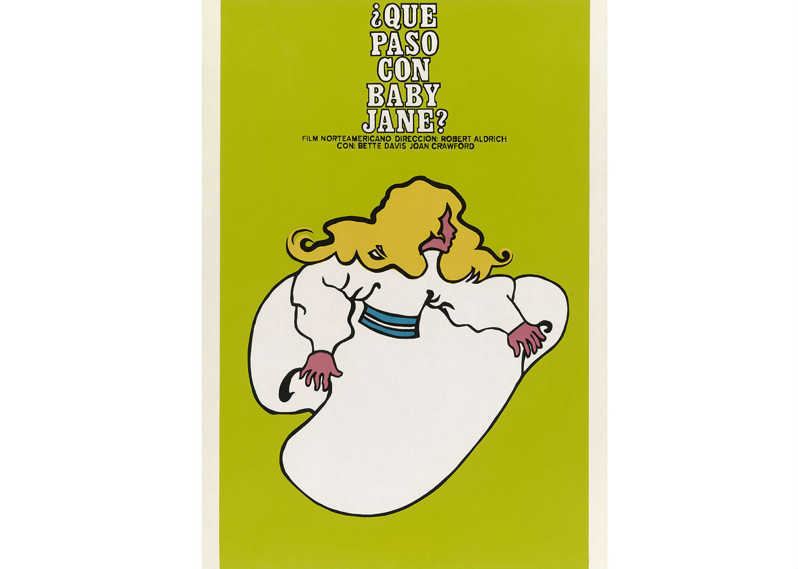
Following the story of an ageing former actress who holds her paraplegic ex-movie star sister captive, 1962’s 'Whatever Happened to Baby Jane?' attracted most attention in the States for bringing together two actresses who were bitter rivals: Joan Crawford and Bette Davis.
The US movie poster, understandably, focused on this controversy. But in Cuba, cinema-goers were less interested in the gossip than the film itself, and so poster designer René Azcuy got to create something very different.
This beautiful design was recently on display at the Pasadena Museum of California Art, as part of an exhibition titled From Hollywood to Havana: Five Decades of Cuban Posters Promoting U.S. Films.
Get the Creative Bloq Newsletter
Daily design news, reviews, how-tos and more, as picked by the editors.
The Godfather (1972): Cuba
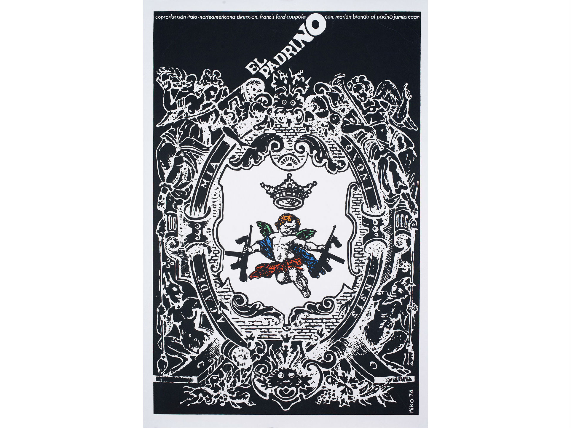
Another Cuban design that’s still feted and collected decades on, this movie poster for Francis Ford Coppola’s mafia classic beautifully combines its themes of tradition, family, religion and deadly violence. It was the creation of graphic designer Antonio Pérez González Ñiko, who was also broadly instrumental in the creation of Cuban revolutionary posters in the 1960s and 1970s.
Jaws (1975): Czechoslovakia
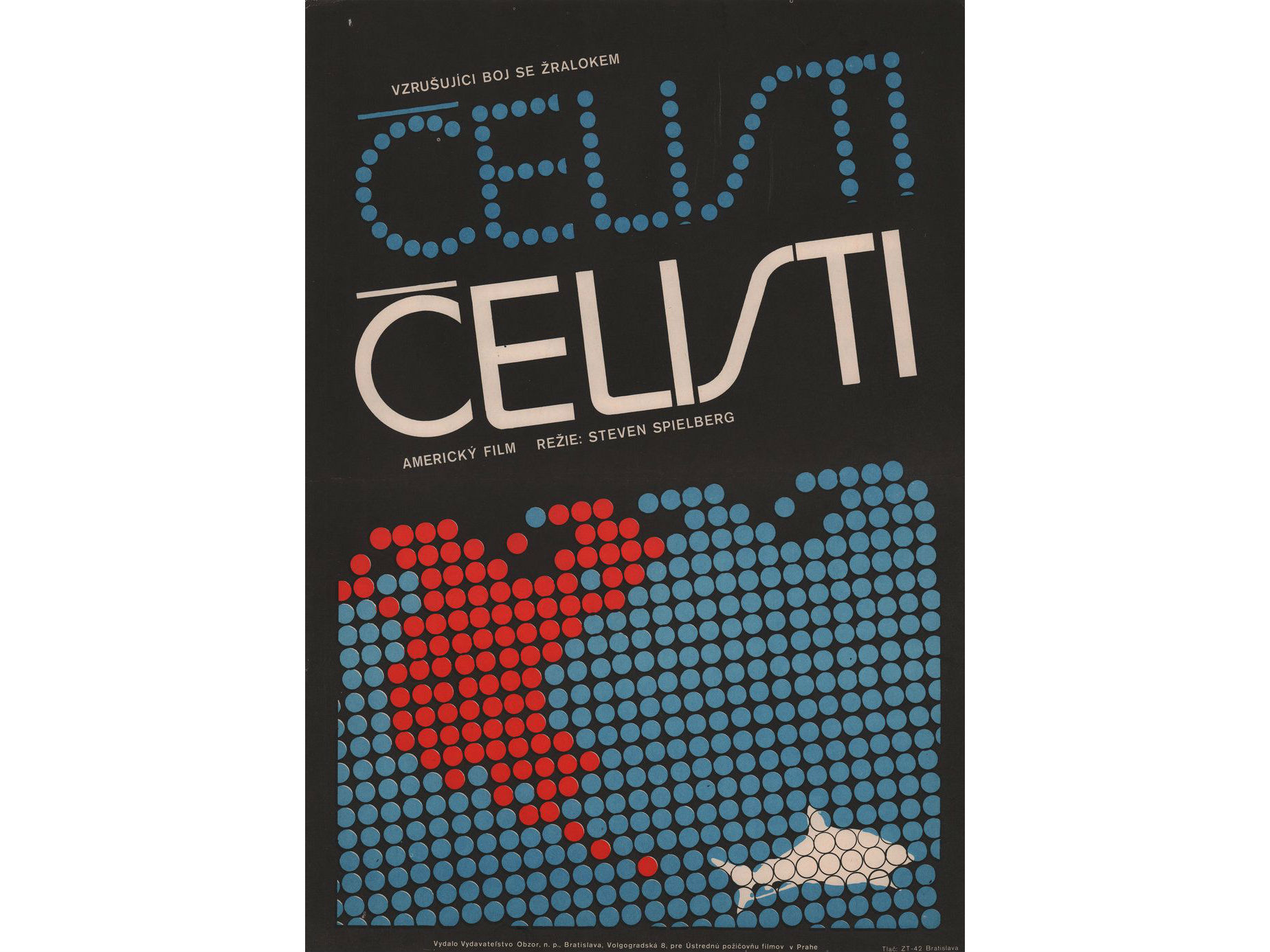
Back in the days of the Cold War, the modern day Czech Republic and Slovakia were one nation under Communist rule. With every aspect of life under strict government control, local artists were tasked with creating promotional posters for movie screenings in a way that complied with Soviet art, often without actually seeing the film in question.
Many of the posters they produced were laughingly bad, but history records a few real gems, such as this pointillism-inspired take on Spielberg’s classic 1975 shark tale, Jaws. We love the cool minimalism of the graphic, and the subtle use of typography to suggest the passage of the deadly creature through the water.
Star Wars (1977): Russia
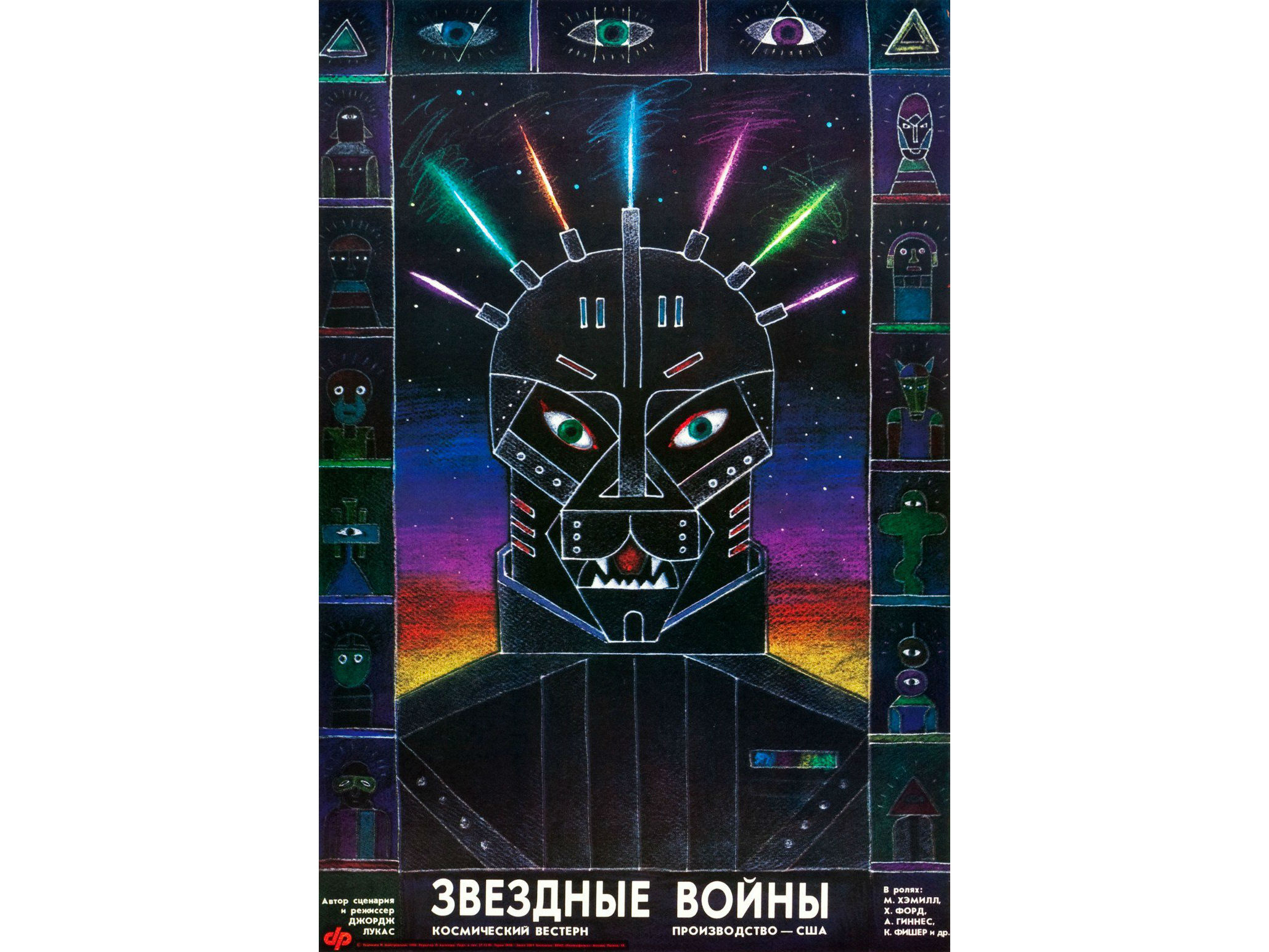
Another Communist-era movie poster, this Russian poster for the first Star Wars movie, by Yuri Bokser and Alexander Chantsev, bears very little relation to the actual film. But at the same time, it’s a stunningly beautiful and eye-catching piece of surrealism that certainly conveys the sinister feel of the main villain, even if it’s way off base representationally (spoiler alert: Darth Vader is not a cat).
Carrie (1976): Spain
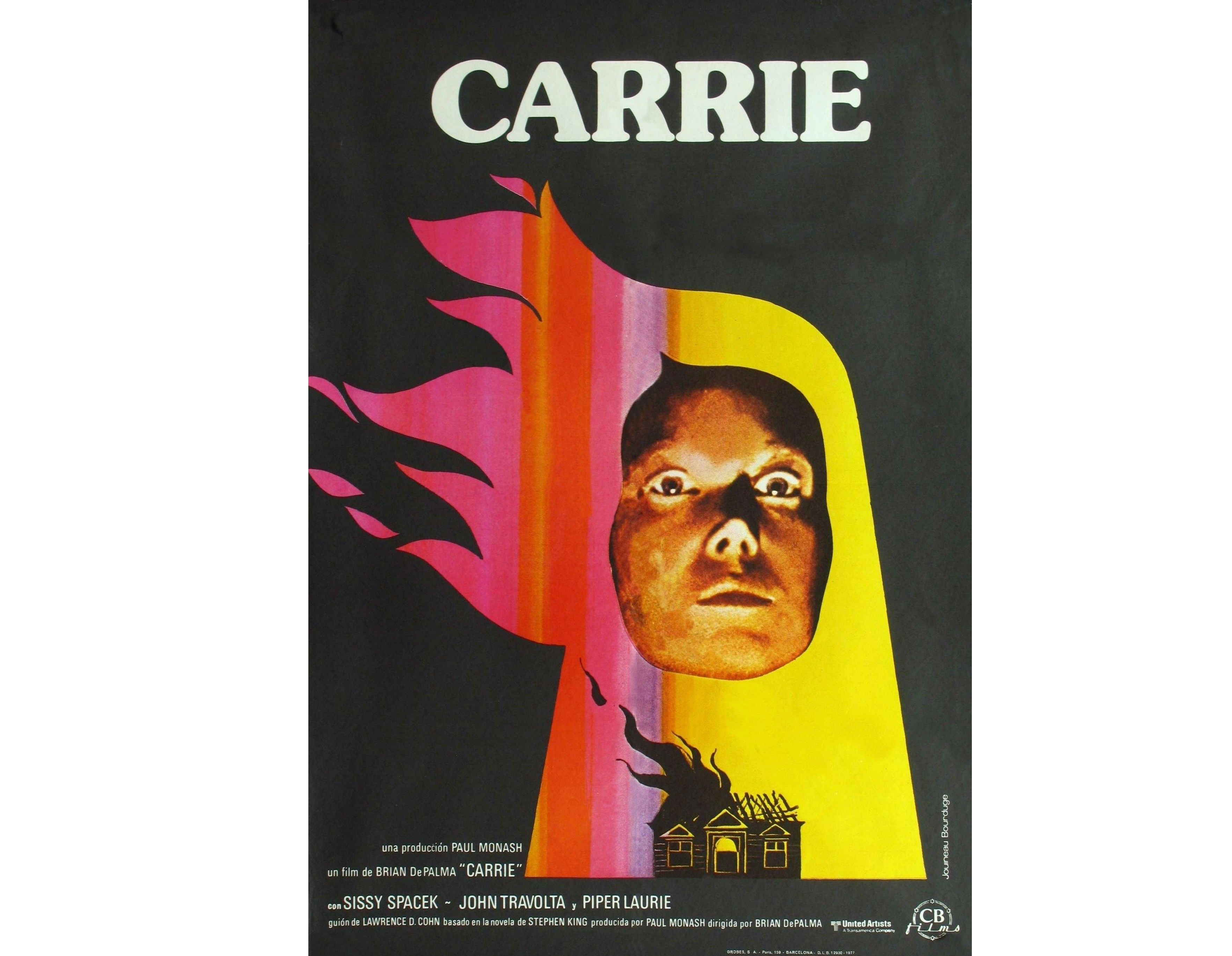
1976’s Carrie was a groundbreaking horror based on a Stephen King novel that beautifully translated teenage angst into supernatural gore and violence. While the US movie poster aimed to shock and sensationalise, this design for the Spanish market takes a subtler, and thus much more engaging approach. Beautifully composed, and with an original and eye-catching colour palette, this design was created by acclaimed French poster artist Jouineau Bourduge.
The Terminator (1984): Poland
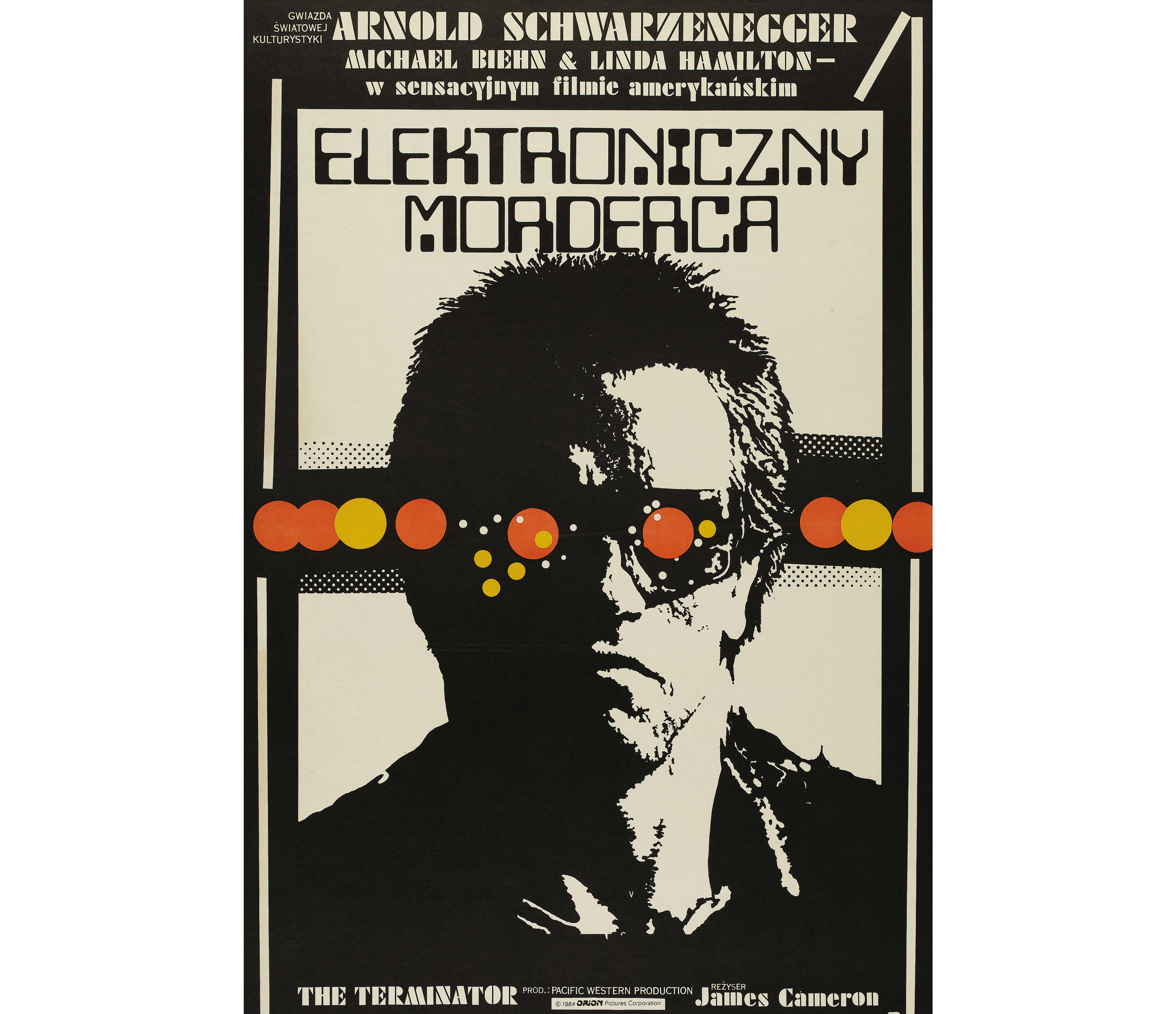
The so-called 'Polish School' of movie posters during the 1950s-1980s was responsible for some incredible artwork, but typically they were way over the top and bore little relation to the film itself.
This classic design by Jakub Erol, however, is an exception. Its combination of stark monochrome simplicity, neo-futurist font and a splash of colourful surrealism all adds up to an evocative design that brilliantly conveys the atmosphere of the first Terminator movie.
Short Circuit 2 (1988): Poland
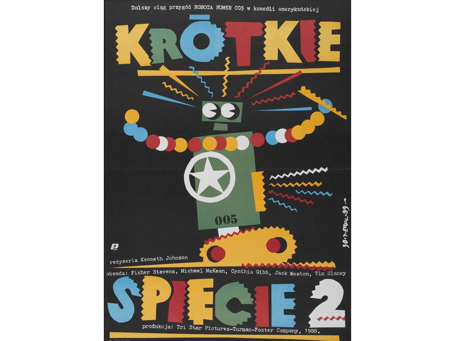
Short Circuit 2 is a delightfully cheesy 1980s romp about a man and his robot, but in retrospect the official US movie poster looks a little shabbily put-together. Much more to our tastes is this gorgeous creation by Jakub Erol, which takes the vibrant energy of the kids’ movie and puts it through an Eastern European art filter. Okay, the end result is slightly bonkers but hey, the film is too.
The Sixth Sense (1999): Japan
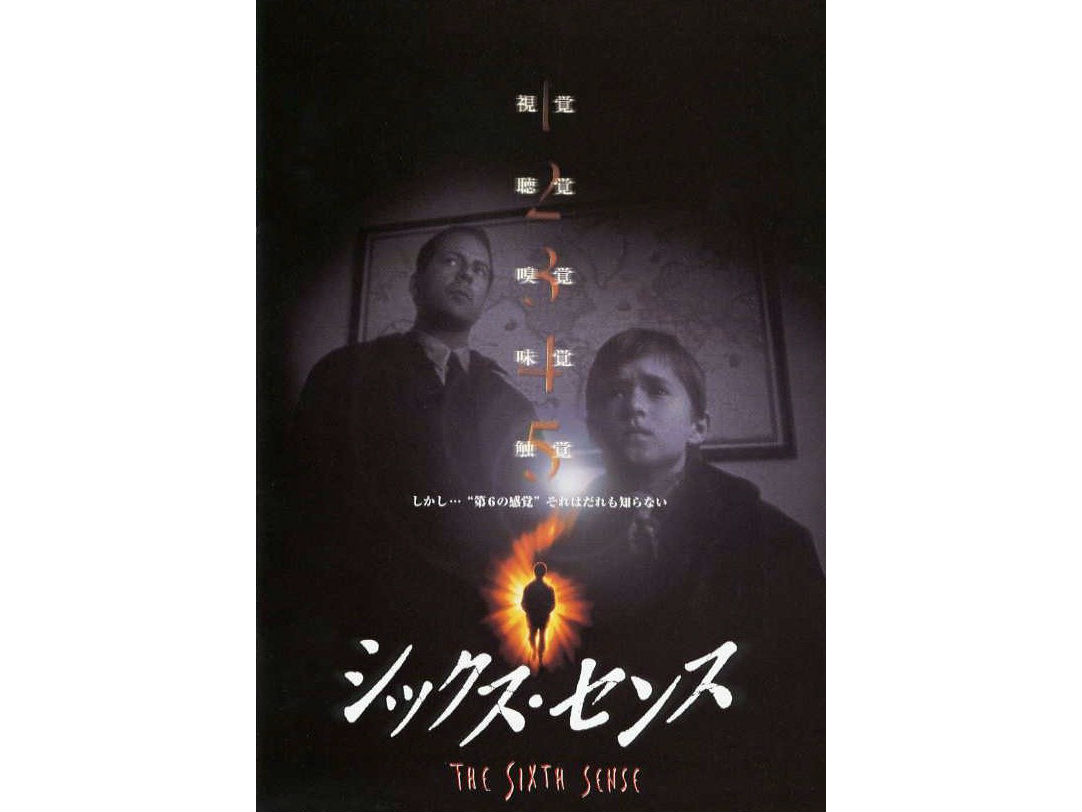
Japanese movie fans continually complain that the domestic versions of American movie posters are clunkily done, with too much text, and often missing the point of the movie, or trying to sell it in a way that its content doesn’t justify.
Here’s a rare exception, though, in the movie poster to promote M Night Shyamalan's spooky 1990s classic.
It arguably improves on the US version, by combining the main graphic with a fuzzy, black and white image and a creepy countdown device in a way that (much like the film itself) summons the tropes of the Japanese horror tradition.
Sex and the City (2008): Poland
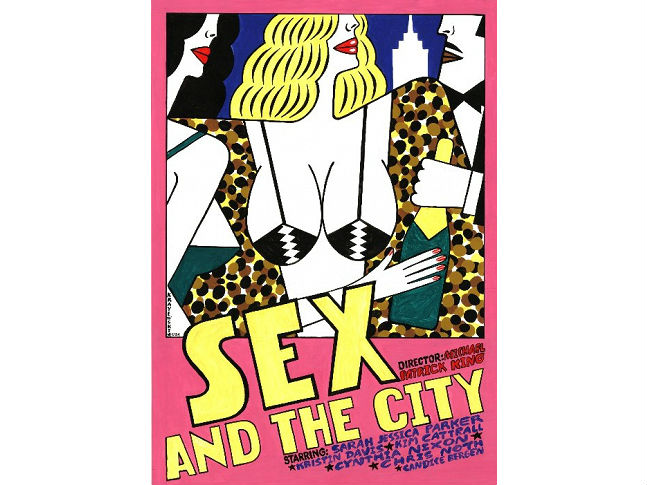
One of the biggest TV hits of the 1990s, US sitcom Sex and the City moved to the big screen in the 2000s, and the movie was promoted in suitably glamorous, glitzy and over-the-top style. Poster designer Andrzej Krajewski, however, stripped all that back for the Polish audience, creating this bawdy design, infused with a subtle echo of Cubism, which has since become a collectors’ item.
Ant-Man (2015): Russia
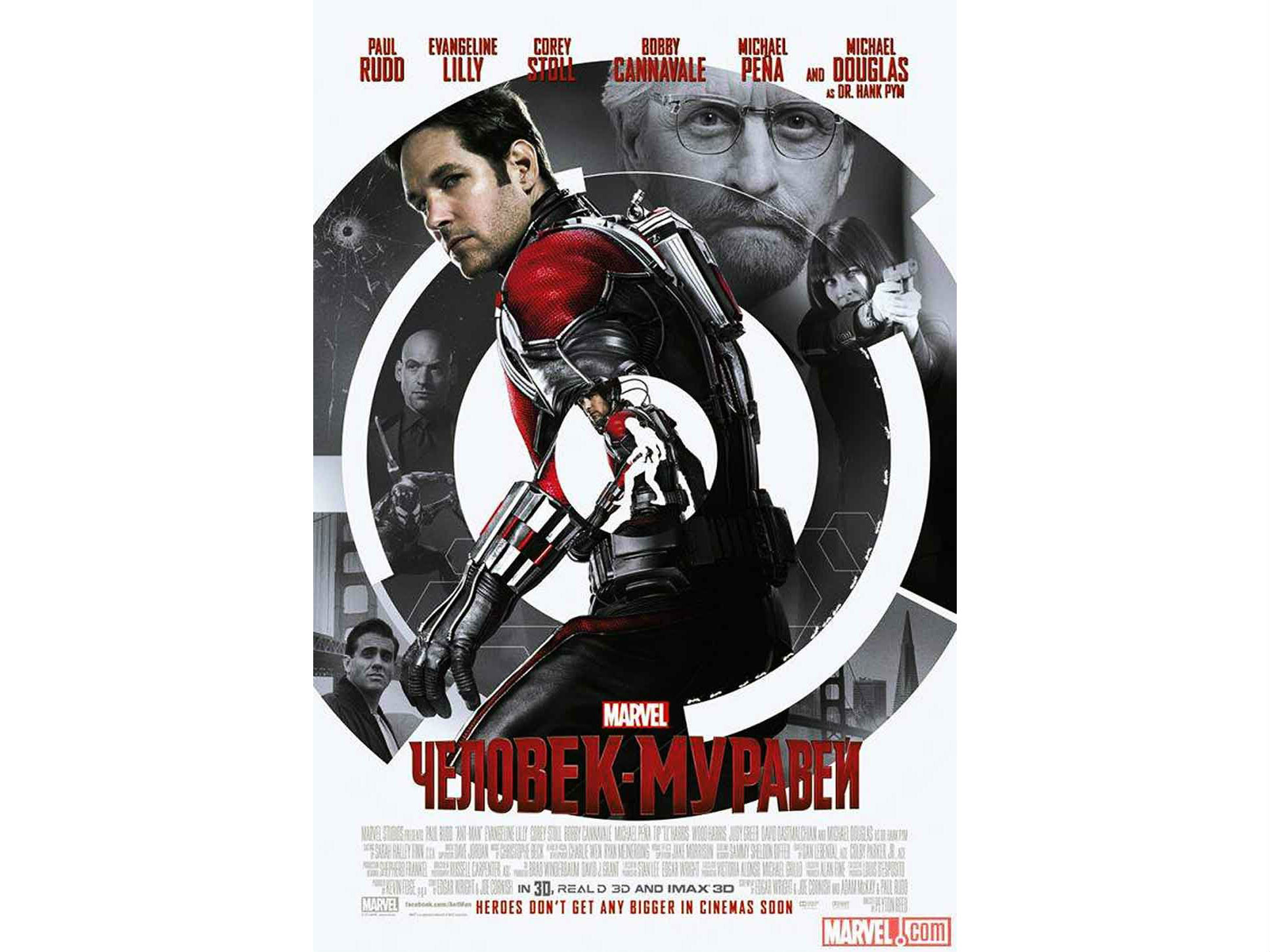
Following a man who can shrink down to molecular size, Ant-Man is challenging to explain to the uninitiated in a single visual shot. This Russian poster takes an original approach, featuring successive shrinking versions of Ant-Man in a way that echoes the tradition of the matryoshka (Russian stacking dolls). It combines this with monochrome background images of the other main characters, and overall the design manages to pack in a huge amount of detail within a simple, geometric whole.
Kong: Skull Island (2017): Japan

When you go to see a movie like Kong: Skull Island, the latest reboot of the King Kong franchise, you’re looking for one thing: to disengage your brain and enjoy a couple of hours of fast-paced, breathless action.
While the original US movie posters were quite muted and restrained, this hand-drawn Japanese design goes all-out and packs in as much explosive monster mayhem as you could ever expect in one image.
In the wrong hands, this could have ended up a chaotic mess, but legendary Japanese artist Yuji Kaida has fused all the elements together into a perfect whole that’s fizzing with kinetic energy; a truly OTT masterpiece.
The bad
At Creative Bloq, we're all about celebrating good design, and not generally in the habit of slagging off fellow creatives. That said, though, there are couple of examples of bad movie posters we couldn't help but include in our list...
Ghostbusters (1984): Czechoslovakia
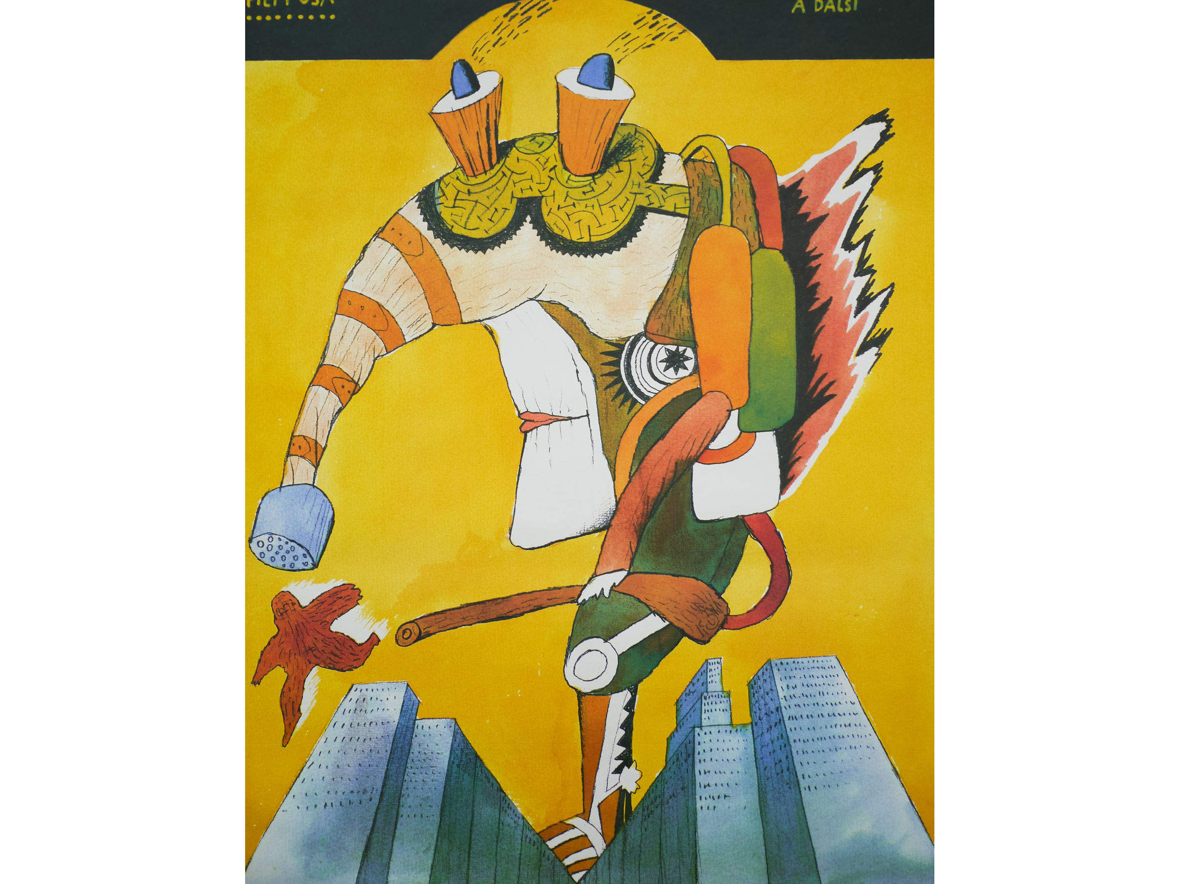
A true 1980s classic, Ghostbusters was a fun comedy about a group of New Yorkers who fight ghosts like the Stay Puft Marshmallow Man. Behind the Iron Curtain in Czechoslovakia, art director Petr Poš presumably didn’t get a chance to see it before creating this hauntingly surreal, sinisterly kitsch poster, which looks absolutely zero per cent like the film it’s supposed to represent.
12 Years a Slave (2013): Italy

12 Years a Slave is an adaptation of the 1853 slave narrative memoir by Solomon Northup. The main character, played by Chiwetel Ejiofor, appears in almost every scene. But you wouldn’t be able to tell that from the Italian poster, which minimises him in favour of a giant picture of Brad Pitt, whose role in the film is minor.
This poster, and a similar one featuring Michael Fassbender, attracted a storm of controversy online; another of the actors, Lupita Nyong’o, boycotted the Italian premiere in protest; and the Italian distributors quickly apologised and withdrew the offending marketing material.
It’s not the only foreign movie poster to attract complaints about so-called ‘whitewashing’: the Chinese poster for Star Wars: The Force Awakens generated similar controversy for minimising black actor John Boyega.
The ugly
However good the film is, some promotional material is just offensive to the eyes. We'll round off our list of global movie posters with a couple of the most egregious examples.
American Werewolf in London (1981): Japan
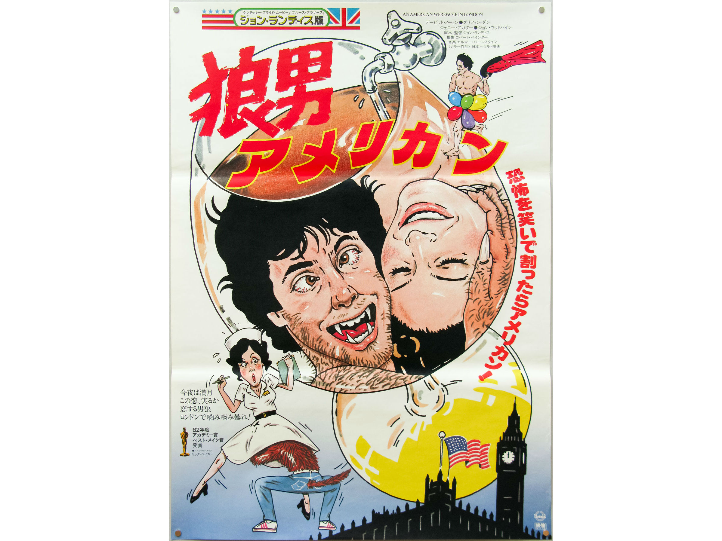
An American Werewolf in London was a horror comedy by John Landis about two US students, David and Jack, who are attacked by a werewolf while on a backpacking holiday in England.
It’s a classic movie that received critical acclaim across the board, and is considered a milestone in the comedy horror genre for its innovative makeup and effects.
It deserved much better, in short, than this Japanese poster, with its crazed, cartoon stylings that are more suggestive of the basest forms of manga porn.
Muppet Movie (1979): Poland
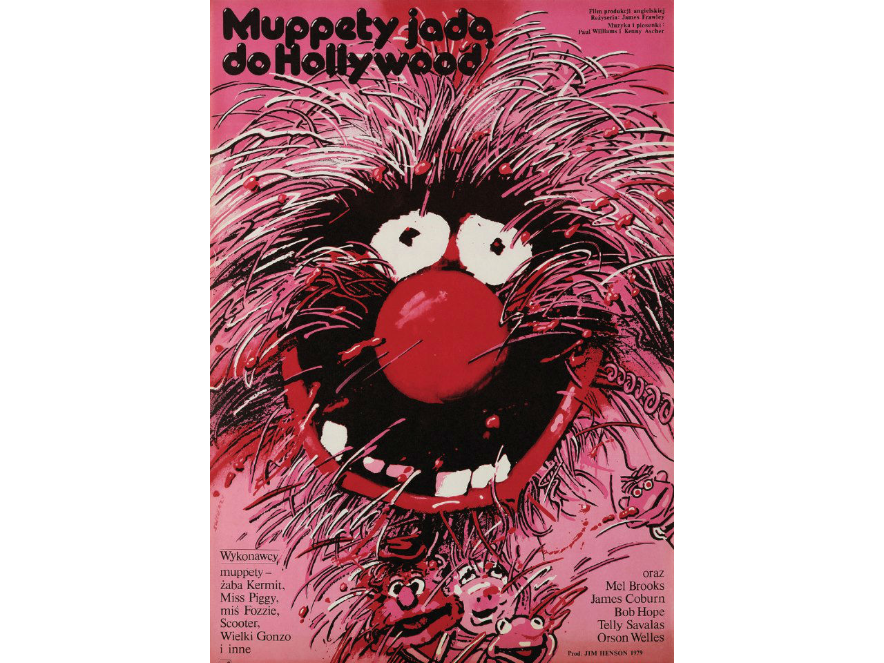
"Mummy! The monster is scaring me! Make it stop! Make it STOP!!!"
Related articles:

Thank you for reading 5 articles this month* Join now for unlimited access
Enjoy your first month for just £1 / $1 / €1
*Read 5 free articles per month without a subscription

Join now for unlimited access
Try first month for just £1 / $1 / €1

Tom May is an award-winning journalist and editor specialising in design, photography and technology. Author of the Amazon #1 bestseller Great TED Talks: Creativity, published by Pavilion Books, Tom was previously editor of Professional Photography magazine, associate editor at Creative Bloq, and deputy editor at net magazine. Today, he is a regular contributor to Creative Bloq and its sister sites Digital Camera World, T3.com and Tech Radar. He also writes for Creative Boom and works on content marketing projects.
