Social media logos are seen by hundreds of millions of people every day. That means that it's easy to upset a lot of people if you make changes. As a result, most social media companies consider very carefully before they rebrand and hone their logo design before setting it live. However, Elon Musk has just turned that received wisdom on its head with the overnight Twitter rebrand to X and the use of logo that he crowdsourced in a couple of hours.
Musk has said that the X logo will "evolve" over time (we would expect so considering the current logo is a generic Unicode character that can't be copyrighted). Twitter's live rebrand is an extreme example, but many social media logos have evolved significantly despite the platforms being around for a relatively short time, and the changes have sometimes been just as unpopular.
Below we look at the history of the best social media logos and consider what they tell us about the art of logo design and the latest logo trends? (see our guide to logo design to learn more about what makes a successful logo).
The history of the best social media logos
01. The Facebook logo
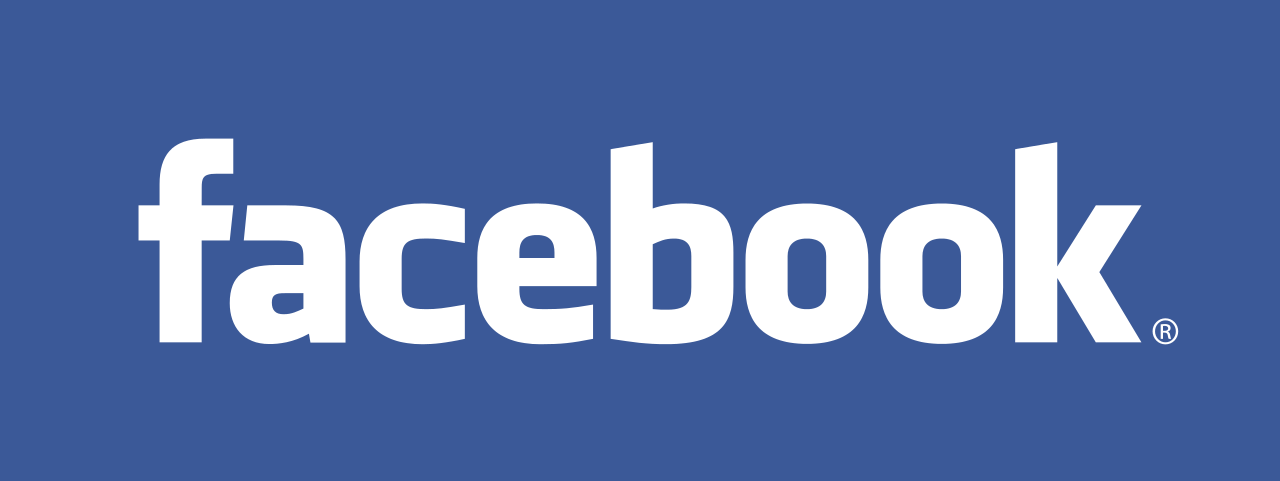
We'll start with Facebook, as an example of how to do it right. Facebook began as a Harvard University networking site originally called 'Facemash' and then 'Thefacebook'. Once it had been renamed 'Facebook', founder Mark Zuckerberg hired Mike Buzzard of Cuban Council to design a professional looking identity.
His logo design, shown above, was a modification of the typeface Klavika, which was designed by Eric Olson. Buzzard oversaw the project, and type and graphic designer Joe Kral completed the type modifications and final wordmark.
The distinctive hue was chosen due to the fact that Zuckerberg has a form of colour-blindness called deuteranopia, which means that blue is the only colour he can distinguish easily.
The wordmark was clean, clear, distinct and scalable. By getting it right first time, Facebook was able to keep the same logo intact for the next decade. And this proved invaluable, as the platform expanded its scope across the world at exponential pace.
Get the Creative Bloq Newsletter
Daily design news, reviews, how-tos and more, as picked by the editors.
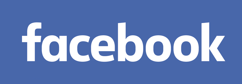
Since then, Facebook has only had to make major changes to its logo once, in 2015 (shown above). And even then, most users probably didn't spot the alterations.
A collaboration behind Facebook's in-house team and Eric Olsen, the 2015 version involved subtle but important tweaks, to give the logo a more friendly and up-to-date look, including the change to a single-deck 'a' and a stem on the letter 'b'.
Of course, as the public has moved from computers to smartphones, the app icon has become more important than its workmark. Earlier this year, then, it was no surprise to see this logo redesigned too.
This new design, shown above, saw the older square background being replaced with a more approachable circular one, and a switch from Facebook's traditional blue to the more vibrant gradient of its Messenger icon.
In summary, when it comes to its logos, Facebook has done everything right. It brought in professionals at the outset, and trusted them to do a good job. It then held back from any changes at all for a decade, and made only minor tweaks, again in concert with the pros.
As a result, Facebook has been able to grow to the global behemoth that strides the planet today, while maintaining near-total design consistency over time. The parent company has since rebranded as the more all-encompassing Meta, with its own logo, to differentiate itself from one particular product and more broadly define its remit, which now also includes AI and VR as well as social media.
Lesson learned: Invest in getting your logo right first time, and you'll be set for decades. While it's tempting to dash off something quick and dirty when you're in 'startup mode', getting the professionals to do a proper job will pay off in the long term.
02. Twitter / X

Compared with Facebook, Twitter has taken a much more varied approach to its logo design. This perhaps reflects a lack of clear business vision for the platform. (Although it's been around since 2006, Twitter was only able to turn a profit in 2018, and a decline in users has been exacerbated since Elon Musk bought the platform in 2022).
As we mention in our full article on the Twitter logo history, one of the first logo designs, shown above, was the creation of Swedish graphic designer Linda Gavin, who was given just one day to develop the design. It spelt out the company name in fun, child-like letters, which evoked an image of friendliness and inclusivity.
A second logo in 2006, shown above, saw the debut of the well-known bird icon. Over the next few years saw further variants of said bird, released in 2006, 2007, 2009 and 2012, including one drawn by the company's co-founder, Biz Stone.
Each featured a similar shade of blue, but each was quite different. And things started to get a little bit cluttered and confused as a result, because whenever you saw a link to Twitter on someone's website, you didn't know which of them it would be, or if the site owner had just drawn their own version entirely.
Things got a bit more orderly in 2012, with the introduction of the now-familiar simplified and streamlined silhouette, shown above, which has become the consistent icon for Twitter ever since.
Based on a mountain bluebird, the wings are made up of three overlapping circles, and it's this innate sense of geometric balance that has made this Twitter icon, created by in-house designer Doug Bowman, so beloved and successful.
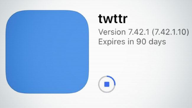
So what on earth was Twitter thinking when, earlier this year, they announced a new prototype version featuring a simple blue square as its new 'logo'?
"The bird flew away from the app icon representing: Simplicity," tweeted Biz Stone. "Blue sky thinking. We’re re-working. Not there yet; hence, no logo. Bold and a little weird."
Before anyone panicked too much, we were reassured that this was NOT the new Twitter logo, but some kind of experiment. But suffice to say, no one was impressed, and it just seemed to heighten the sense that Twitter has no clear way forward.

Twitter wasn't the world's largest social network by any means, but it had built up a strong brand, even giving birth to its own vocabulary ('to tweet', the 'Twittersphere'). Elon Musk has recently thrown that out overnight, renaming the platform as X and adopting the Unicode character 𝕏 as its logo. As if it couldn't get any more chaotic, the logo was changed to a beefier design and then changed back again overnight as Musk tinkers with the branding in full public view.
Lesson learned: From the Twitter logo, we learned that the first and most important step in designing a successful logo is to understand the fundamental goals of the business and the strategies aimed at achieving them. Conversely, a visual identity that's all over the place suggests that maybe the underlying business is, too.
Has Musk's Twitter rebrand changed that? On the face of it, Musk's approach goes against all the conventional wisdom of branding. He seems to be making every design decision on the fly, which only adds to the impression that his company is in complete chaos and has no vision.
Comments from Musk suggest that his idea is to use Twitter as the basis for the creation of a new 'everything app' along the lines of China's WeChat, which provides finance and payment solutions as well as messaging.
It's true that such a dramatic transformation could merit a revolution in branding, but alienating users, causing some of them to leave the platform, seems a strange way to do that. A revolution doesn't need to be shambolic. The new logo is even the same colour as Instagram's new rival, Threads. Only time will tell if Musk actually has a plan, for now the rebrand seems to be costing the company.
03. Instagram
In terms of user enthusiasm, global reach and profitability, Instagram was the social media success story of the last decade. And its sense of clarity and purpose has been clearly reflected in the thoughtful evolution of its logo design.
Launched in 2010, Instagram's first logo was a wordmark, which itself has been through a number of iterations over the years. But for a platform that's always been centred around the smartphone, it's the icon that's been most important to its branding identity.
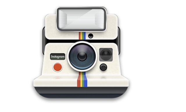
CEO and co-founder Kevin Systrom designed the original icon, shown above. It looks like an old-style Polaroid camera, which he later admitted had nothing to do with what Instagram was actually offering as a service.
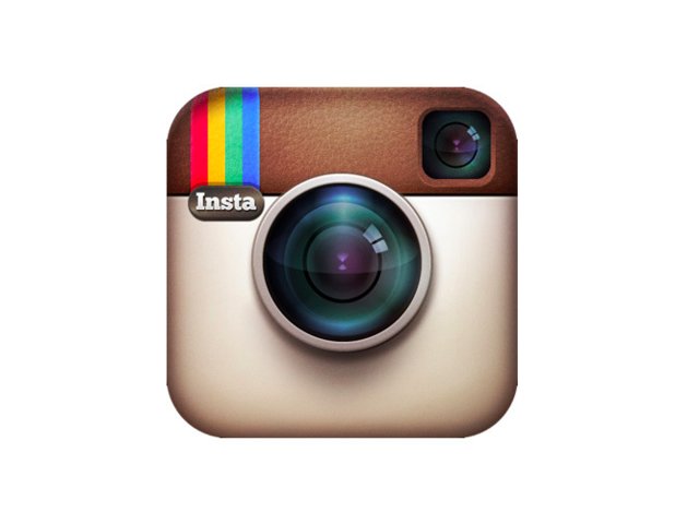
Shortly afterwards, then, he enlisted help from Cole Rise, a professional designer and photographer, and one of the app's beta testers, to craft a new design. After a number of iterations over a six-month period, they finally settled on Rise's camera icon (shown above).
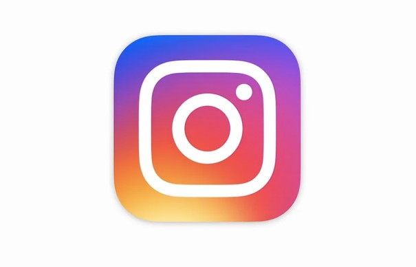
This stayed in place until 2016, when Instagram released a new, dramatically minimalist design (above), which had been created in-house over a nine-month period.
As mentioned previously, social media users don't like change, particularly when it's this dramatic. And unsurprisingly, a lot of people went berserk, leading the New York Times to dub the event The Great Instagram Logo Freakout of 2016.
But looking back now, it seems like a necessary move.
Skeuomorphism is now firmly out of favour in the logo world, and with almost every other web service simplifying their logo design, Instagram would have looked pretty old-hat if it had kept its detailed, 3D camera icon. Especially considering that the camera itself, as a separate device, is rapidly becoming irrelevant in the eyes of high-end smartphone users (see our best camera phones if you're looking to upgrade yours).
Lesson learned: The broad current trend is to simplify and minimise your logo design over time. It's safest to do this gradually, but if you have a strong product and passionate following, you might get away with ripping off the Band-Aid in one go (also see our full article on the Instagram logo history).
04. Pinterest
Pinterest is another social media platform that's only made one, relatively subtle change to its logo over the years.
Launched in 2010, Pinterest soon found a lucrative niche in acting as a virtual pinboard for people's favourite images. And its 'P' icon – which transforms the first letter of its name into a pin – was perfectly designed to convey the essence of its offering.
Combined with the phrase 'Pin it', this clever design (shown above) makes it instantly clear what the platform is about, and how to use it.
So when Pinterest eventually redesigned their logo in 2017, it was a smart move to leave the icon entirely untouched.
Instead, the focus was solely on the wordmark, which was redesigned using a modified version of Neue Haas Grotesk, to look cleaner and more business-like.
Lesson learned: A logo doesn't always have to explain or illustrate your service... but if you can find a way to do so visually, then you're on to a winner.
05. YouTube
The YouTube logo history over the years is another example of how a beloved logo can be imperceptibly improved, by streamlining and simplifying it over time. It's difficult to remember a time when no one knew what YouTube was, but when the service, created by former PayPal employees Chad Hurley, Steve Chen, and Jawed Karimon, launched on Valentine's Day 2005, that was exactly the situation.
And so the original logo, shown above, helped people get there quicker by placing the word "Tube" inside a red rounded rectangle, representing a television.
This logo, designed using Alternate Gothic number two, remained unchanged until 2011, when a new design with a flatter rectangle (shown above) was introduced, in a darker shade of red.
In a world where the bulky CRT televisions of older were rapidly being replaced by sleek flatscreens, the removal of the 3D gradient was a sensible move, keeping the logo looking fresh and modern without requiring radical change.
The logo was refreshed once more, but with only minor changes, in 2013 and 2015. In 2017, though, the original 2005 logo received its first major overhaul.
This design, created in house, finally dropped the TV shape surrounding 'Tube' and moving it to one side, providing space for a cleaner and clearer wordmark.
The new logo (shown above) was created specifically to be a more flexible design that works better across a variety of devices, including tiny screens. As YouTube explained in a blog post: "When room is limited (say on a smartphone) you can use the brightened up Icon as an abbreviated Logo, which will be seen more easily and read more clearly."
It also featured a new bespoke typeface, and the new rectangle was coloured in #FF0000, “a really pure red that goes to the RGB of video”.
In short, YouTube's logo has seen a natural, restrained and well thought-through evolution over time. And it's perhaps significant that none of its updates have led to the usual kind of online gnashing and wailing that others on this list have provoked.
Lesson learned: It's good to update and refine your logo over time – and if you do it slowly, subtly and for good reasons, users are more likely to stay on side.
06. Medium

If you want to see a contrast with the natural and often imperceptible evolution of YouTube's logo, just check out the uncomfortable steps back and forth made by Medium.
Medium was launched in 2012 by Evan Williams, previously co-founder of Blogger and Twitter. He initially saw it as a way for people to publish writings and documents longer than Twitter's 140-character (now 280-character) maximum.
On launch, it sported a logo based around a monochrome, slab-serif M, using the Stag typeface (shown above). As a platform aimed at writers, this simple, uncluttered serif, reminiscent of typewriters and print, made a clear and bold statement.
In 2015, however, Medium's then art director Erich Nagler, said in a blog post that this design had not proved particularly extensible.
"It served us well through our first few years, but as Medium has grown and evolved, the logo has begun to feel flat, impenetrable, blunt, and not to be toyed with," he explained. "It is also not particularly distinctive, either. In short, our M no longer captured or conveyed what Medium has become."
Medium worked with type designer Rod Cavazos of PSY/OPS to develop a new concept: "that our logo could be made of a series of interconnected ideas or shapes that, when joined together, form a new thought. A logo that flows, unfurls, and builds like a great and memorable conversation... The result is a custom set of letters that beautifully picks up on the angles and spirit of the logo, without becoming too harsh or overly geometric."
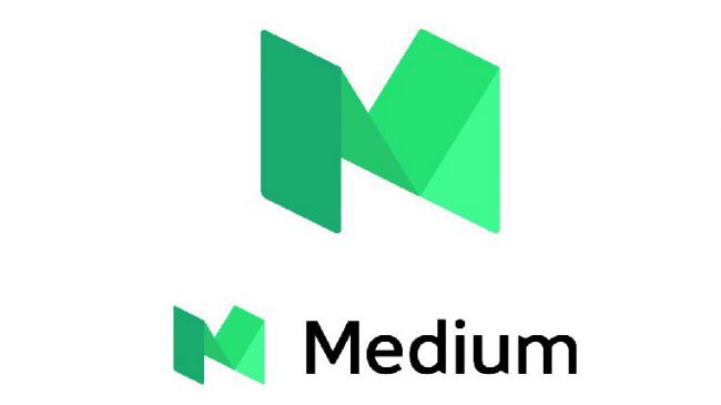
There may have been some logic to this lengthy explanation (you can read the full post here). But the resulting logo, shown above, was not enthusiastically received, to say the least.
The mint colour – more associated with financial apps than anything else – was baffling. The folded paper imagery looked clunky and awkward. The clear visual link with writing was gone. Even the kerning was questionable.
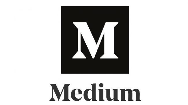
So it's perhaps not surprising that a mere two years later, Medium took a sharp right turn and released another new logo (shown above), which looked strikingly similar to the original.
A collaboration between Manual and Medium's in-house team, this elegant and mature design looks very much like a direct evolution from the original, almost if the 2015 identity had never happened. Less a redesign, perhaps, than an 'undesign'.
Lesson learned: If you're going to abandon all your brand equity and introduce a completely new logo, you'd better make darn sure you get it right. And if the explanation of your new designs sounds complicated and overwrought, it's a good sign that you probably haven't.
07. Snapchat
We'll end this article as we started: with a social media logo that was pretty much nailed at the outset, and has thus only needed two evolutionary tweaks since.
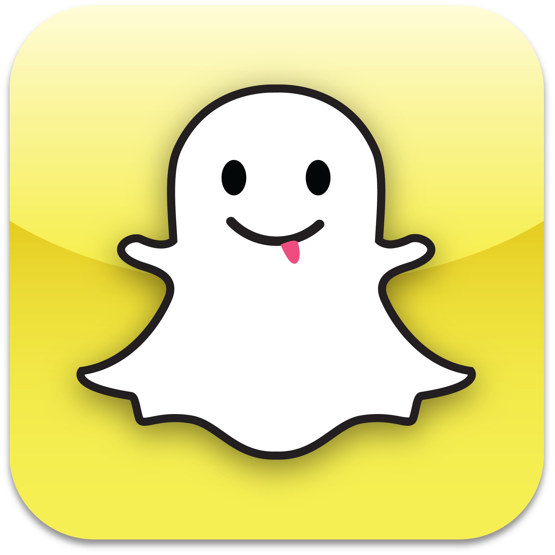
The genius of Snapchat, launched in 2011, was to allow users to send photos or videos that disappear after a certain amount of time. And so the idea of a logo based around a ghost (shown above) was a slam dunk.
Company founder Evan Spiegel drew it on his computer in his dorm bedroom, before the company even had a name. A rap fan, he was inspired by the Wu-Tang Clan rapper Ghostface Killah, and the logo is now known internally at the company by the nickname Ghostface Chillah.
Spiegel picked yellow because it was a colour no other popular app seemed to be using. His simple design was easy to identify, even on tiny screens, and overall the design has proved a great example of the maxim 'If it ain't broke, don't fix it'.
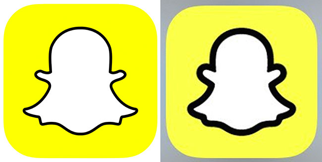
In fact, until very recently, there had been only major update. In 2013, the year Snapcat debuted Stories, it launched the redesigned logo shown above (left).
Removing the cartoon face helped to streamline the logo and make it work better at small sizes. Snapchat also changed the colour to Pantone 100% Yellow, which can't fail to be spotted at great distance and fits the young demographic of its core audience perfectly.
In 2019, Snapchat upset many by updating its ghost icon, outlining it more than previously with a thicker black line. This makes total sense from an accessibility point of view, the icon is now easier to see. But that didn't stop people getting angry.
Lesson learned: Start with a strong concept that ties in with the core appeal of your app, and you stand a good chance of creating a logo design that will last the course. Although of course, if you do change it, expect outrage (on social media, naturally).

Thank you for reading 5 articles this month* Join now for unlimited access
Enjoy your first month for just £1 / $1 / €1
*Read 5 free articles per month without a subscription

Join now for unlimited access
Try first month for just £1 / $1 / €1

Tom May is an award-winning journalist and editor specialising in design, photography and technology. Author of the Amazon #1 bestseller Great TED Talks: Creativity, published by Pavilion Books, Tom was previously editor of Professional Photography magazine, associate editor at Creative Bloq, and deputy editor at net magazine. Today, he is a regular contributor to Creative Bloq and its sister sites Digital Camera World, T3.com and Tech Radar. He also writes for Creative Boom and works on content marketing projects.
- Joe FoleyFreelance journalist and editor
