The designer’s guide to using colour in branding
Boost brands, influence behaviour and convince your clients.
Colour sells. Whether you’re working with a product, service or space, the ‘right’ combinations of colours can influence how someone feels, thinks and behaves – with powerful results.
According to a study by Loyola University Maryland, colour is registered by the brain before either images or typography. The same study found that colour can increase brand recognition – logo design, for example – by up to 80 per cent.
So why, then, is brand colour so often dictated by the personal preferences of a client or committee? What are the ‘right’ combinations, and how can designers sidestep subjective debates to harness the power of colour more effectively in branding projects?
Colour theory in branding
When it comes to harmonious colour combinations, it helps to know the basics – so read out quick refresher of colour theory (and the colour wheel).
But what does it mean in practice? How relevant, really, is traditional colour theory for designers when it comes to branding?
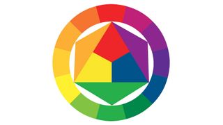
According to Jonny Naismith, creative lead at Moving Brands New York, colour theory can provide a useful starting point when deciding the palette for a new branding project, but there are a lot of other factors involved too. “For us, these types of relationships can help generate ideas – particularly when extending out from a core, identifiable colour,” he says.
“However, in the early stages of projects, we’re often looking for varied points of reference. In a saturated market, it’s becoming harder to truly ‘own’ a colour, so we try to employ far-flung points of references to help surprise or create something memorable and unexpected. This could come from working with real materials, spending time photographing subjects or browsing the local bookshop.”
Get the Creative Bloq Newsletter
Daily design news, reviews, how-tos and more, as picked by the editors.
Moving Brands’ designers also employ a number of tools during the exploration process, he adds, including Adobe’s colour scheme generator, Colour CC (formerly Kuler); Pantone’s Studio app, which converts photography into a selection of swatches; and a tool called Colorable, to ensure colour combinations are in line with Web Content Accessibility Guidelines (WCAG).

Interbrand’s executive creative director Sue Daun agrees that colour theory is useful, but says that it doesn’t play a formal part in the global brand agency’s creative process.
“While many of these systems are intuitively used, it’s more about the need of the brand and the attitude we’re trying to convey – as opposed to following a system rigidly,” she explains.
Daun says that there isn’t a fixed formula at the brand firm for considering colour, because every job – and brand – is different.
“Clients commission work for different reasons, whether that’s growth, new directions, new audiences, redefined purpose or simply modernisation,” she reasons, explaining that Interbrand aims to unpack the brands it works on, and reframe them with purpose.
Colour ideas in the design process
“Every design element is considered with the same intensity, because in combination, they form a graphic equaliser to convey just the right level of distinction, relevance and authenticity for the brand’s new face.”
However, just because Interbrand doesn’t have a set formula for working with colour, doesn’t mean there isn’t a process for arriving at the perfect palette. “Very early on we ideate around the brand personality, and this builds an initial hypothesis in the minds of the designers,” Daun explains.
“The development process is then about defining not just the core colours, but the proportions used, the way they are used or what they are used for. Every decision focuses the final story to one of clarity and cohesion.”

Global brand strategy firm Siegel+Gale takes a similar approach. Finding the right colour palette starts with the same key questions asked during the wider branding process: what does the brand want to stand for? And how does it want any touchpoint across its brand journey to deliver that experience?
Siegel+Gale’s designers work closely with strategists to answer these questions, rapidly prototyping holistic brand ideas and core thoughts, and beta-testing brand ideas to ensure concepts work in the real world. “These are early messaging ideas, communications opportunities and experiential concepts,” explains Steven Owen, executive creative director (EMEA) at Siegel+Gale.
“As we build these, we explore how they come to life: the visual language they may adopt; the tone of voice they might consider. Colour exploration is a vital part of this process. Each brand idea should have a different tone or personality, and subsequently, each route might use colour in a different way.”
Exactly how specific colours are chosen, however, is more arbitrary: “It’s a bit like asking how Siegel+Gale take their showers in the morning,” Owen laughs. “I’m sure we all have different methods and orders in which we wash the parts of our bodies, but the important point is: we all come to work clean.”
Colour psychology
One reason why colour theory, in traditional form, might not be so helpful to the branding process, is the fact that it was originally designed for artists and painters, and lacks the psychological and behavioural insights required for creating a brand that connects.
That’s according to Karen Haller, a leading authority in the field of applied colour psychology. “There’s so much more to colour than the colour wheel,” she says. “To really understand how to use colour to its full effect, you need to include the psychology of colour: how it influences us on a mental, physical and emotional level,” she explains.

Haller warns there’s a lot of pop psychology around. “Many people get colour psychology, colour symbolism, and their personal colour association all mixed up together, which is why it’s easy to dismiss colour as being subjective,” she explains. “But they are three different things – and it’s important to understand why.”
Colour symbolism refers to the use of colour in culture, and the conscious associations we’re conditioned to make. In China, for example, red can symbolise good luck, while white often represents death.
In Muslim countries, there are certain products that aren’t designed in green because it represents the prophet Muhammad, but some Islamic banks might use this colour in their logos in order to convey trust.
Personal colour association, meanwhile, relates to the memories or experiences of an individual. “You might like terracotta because you were in Tuscany,” says Haller, “or a certain red because it reminds you of your favourite bike as a child.”
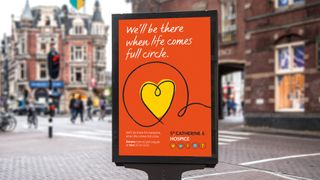
If a client has ever said your colour scheme looks like their daughter’s bedroom – which has happened to Naismith at Moving Brands – or you’ve watched a meeting descend into endless debate, you’ll know the hurdles that personal colour association can bring into the branding process.
But some of these can be avoided. Unlike the previous two definitions, colour psychology relates to the subconscious way colour can affect how we think, feel and behave. And according to Haller, these reactions aren’t as subjective as might be believed.
Individual interpretations of a colour can vary (you might see a certain red as exciting; another person might see it as aggressive), but when psychology is combined with the study of tonal colour groups, reactions can be predicted with surprising accuracy.
The holy grail of colour
Haller isn’t the only one to take this line. In the ’80s, colour psychologist Angela Wright identified links between patterns of colour and patterns of human behaviour. She found that all colours can be classified into one of four tonal groups, and that mathematical relationships underpin the shades and tones within each group. In other words, Wright actually proved objective colour harmony.
Wright went on to develop the Colour Affects System, which identifies links between the four colour groups and four basic personality types, based on original research involving Aristotle, Newton and German writer Johann Wolfgang von Goethe.
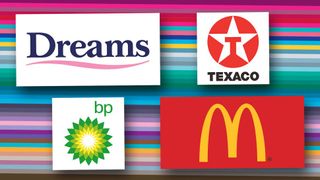
Crucially, Wright found that colour schemes drawn from a single group always harmonise, no matter which personality type is interpreting them; while schemes that mix groups create disharmony. In addition, each personality type has a natural affinity with one colour family, meaning that people react even more positively to palettes crafted from ‘their’ colours.
Theoretically, then, if designers can establish which psychological colour family best conveys a brand’s message, it’s possible to create a colour palette that truly engages its audience – as long as every hue used in all brand communication is drawn from that same group.
“There are millions wasted by companies struggling with subjective, endless expensive debates about colour, and it’s usually decided on the basis of rank,” says Wright. “But objective colour harmony is underpinned by mathematics. If you stick within the groups, everyone can understand the message,” she explains.
Ask the right questions
So how do you get to a final colour scheme? As with any branding project, it’s about asking the right questions to get to the core of the brand.
For Laurie Pressman, vice president of the Pantone Color Institute, these include: what does your brand stand for? What message do you want to convey, and how can colour help you tell the story? Who is the consumer?
And if you’re targeting a global audience, will local cultural meanings be ascribed to the colours used – does the palette need to be modified to reflect this?
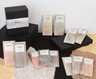
Pressman adds that it’s key to look at what it is about the brand – including colour – that will prompt a ‘buy’ response in the targeted consumer, and to know where colour trends fit in. “Ask whether you should use a more unusual colour story,” she says. “Will the colours separate you from your competition? It’s important to be unique.”
“We often look at the competitive landscape,” agrees Naismith. “This helps to identify potential gaps or opportunities beyond colour.”
London-based SomeOne, too, surveys the competitive sector to establish the norm and find the gaps. To test its schemes, the studio starts by visualising applications, before doing print tests, and then accessibility and usability tests for digital projects.
“We’ve built a bespoke cloud-based brand tool to test colour compliance,” says partner Laura Hussey. “Branding’s never finished, so we embed this in guidelines. As it adapts and changes, so does the colour system.”
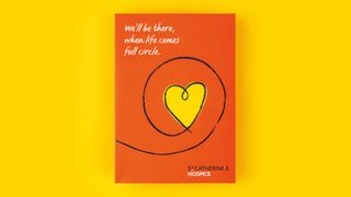
The other key aspect to choosing the right colour scheme is knowing how colours work with each other. “There are thousands of greens,” points out Haller.
“You have to understand what every tone of every colour means, in the context of how you’re using it. Then, if you really tap into who the brand is – if you know its story and authentic personality – the colours to use will be clear. Who a brand is will dictate which colours, tones, combinations and proportions to use to convey – on a subconscious level – what the words are saying on a conscious level.”
Whatever you do, she warns, don’t confuse standing out in the market with shouting. “For a long time, to make a brand stand out, designers have been using really bright colours, but it’s the equivalent of shouting.
"All of a sudden everyone was using magenta pink, it was like: ‘Hello, look at me!’ You might stand out, but is that colour actually saying what your brand is about? You must be giving the right message.”
The key, as always, is to be authentic. “People have an emotional connection with colour first. Then we take in the shapes, the logo, and we read the words,” says Haller. “If we sense a mismatch, it’s the colour we don’t believe, despite the beautifully crafted words.”
This article originally appeared in issue 266 of Computer Arts, the world's leading graphic design magazine. Subscribe to Computer Arts here.
Related articles:

Thank you for reading 5 articles this month* Join now for unlimited access
Enjoy your first month for just £1 / $1 / €1
*Read 5 free articles per month without a subscription

Join now for unlimited access
Try first month for just £1 / $1 / €1

Julia is editor-in-chief, retail at Future Ltd, where she works in e-commerce across a number of consumer lifestyle brands. A former editor of design website Creative Bloq, she’s also worked on a variety of print titles, and was part of the team that launched consumer tech website TechRadar. She's been writing about art, design and technology for over 15 years.
