When it comes to creating an Olympic brand and logo design, things don't always go according to plan, as the organisers of the Tokyo 2020 Games found out.
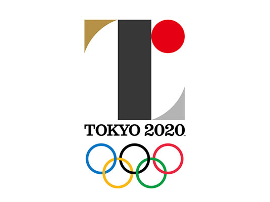
In July 2015, the first official logo for the event was launched, in both static and animated form. Abstract and minimal, this logo, designed by graphic designer Kenjiro Sano, incorporated a 'T' for Tokyo and the red sun of the Japanese flag. But despite the careful stage-managing of the launch, things quickly spiralled out of control.
The following month, Belgian designer Olivier Debie filed a plagiarism lawsuit – which he dropped in January this year, citing prohibitive legal costs – claiming the design copied key elements of a T-shaped logo he created in 2011 for Belgium's Theatre de liege. He even published the two designs side-by-side online to make the similarities clear, and the image was quickly picked up by the global press and shared by audiences around the world.
Abstract and minimal, the original logo incorporated a 'T' for Tokyo and the red sun of the Japanese flag
Japanese officials initially defended the logo against Debie's claims, going so far as to release Sano's original blueprint to the press. But when further plagiarism allegations surfaced, claiming that Sano's initial submission resembled work by German typographer Jan Tschichold, the embarrassment proved too much and the logo was swiftly withdrawn.
The organisers then took the unusual step of holding a national design competition to create its replacement, which saw nearly 15,000 submissions. The four finalists were unveiled in april, and the public was invited to vote for their favourite.
And the winner is...

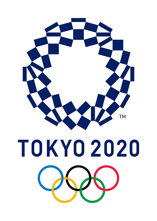
Two weeks later, the winning design (shown here) was announced. The logo was created by Asao Tokolo, a 46-year-old artist who is known for his intricate, mathematical motifs. Entitled the Harmonized chequered emblem, the new, indigo-blue logo features a traditional Japanese pattern known as ichimatsu moyo, which first became popular in the edo period (1603–1867) and is associated with traditional 'Kabuki' theatre.
Composed of three varieties of rectangular shapes, the design "represents different countries, cultures and ways of thinking" – according to an official statement.
Get the Creative Bloq Newsletter
Daily design news, reviews, how-tos and more, as picked by the editors.
With the Paris 2024 Olympic committee accused of plagiarising a logo from British consulting agency 4 Global, and Wolff Olins' cartoonish, bright-pink London 2012 olympics logo continuing to attract opprobrium to this day, it seems the path to Olympic branding is rarely an easy one. But however history treats this new Tokyo 2020 logo, at least the host nation can't get angry. After all, they voted for it.
This article was originally published in Computer Arts magazine issue 254.

Thank you for reading 5 articles this month* Join now for unlimited access
Enjoy your first month for just £1 / $1 / €1
*Read 5 free articles per month without a subscription

Join now for unlimited access
Try first month for just £1 / $1 / €1

Tom May is an award-winning journalist and editor specialising in design, photography and technology. Author of the Amazon #1 bestseller Great TED Talks: Creativity, published by Pavilion Books, Tom was previously editor of Professional Photography magazine, associate editor at Creative Bloq, and deputy editor at net magazine. Today, he is a regular contributor to Creative Bloq and its sister sites Digital Camera World, T3.com and Tech Radar. He also writes for Creative Boom and works on content marketing projects.
