The complete guide to SVG
Discover why you should be using Scalable Vector Graphics and how to design and implement them.
Sign up to Creative Bloq's daily newsletter, which brings you the latest news and inspiration from the worlds of art, design and technology.
You are now subscribed
Your newsletter sign-up was successful
Want to add more newsletters?

Five times a week
CreativeBloq
Sign up to Creative Bloq's daily newsletter, which brings you the latest news and inspiration from the worlds of art, design and technology.

Once a week
By Design
Sign up to Creative Bloq's daily newsletter, which brings you the latest news and inspiration from the worlds of art, design and technology.

Once a week
State of the Art
Sign up to Creative Bloq's daily newsletter, which brings you the latest news and inspiration from the worlds of art, design and technology.

Seasonal (around events)
Brand Impact Awards
Sign up to Creative Bloq's daily newsletter, which brings you the latest news and inspiration from the worlds of art, design and technology.
SVG filters and effects

Filters in SVG are usually created inside the <defs> element and given an ID for referencing later, this can be as an attribute on an SVG element or defined in CSS.
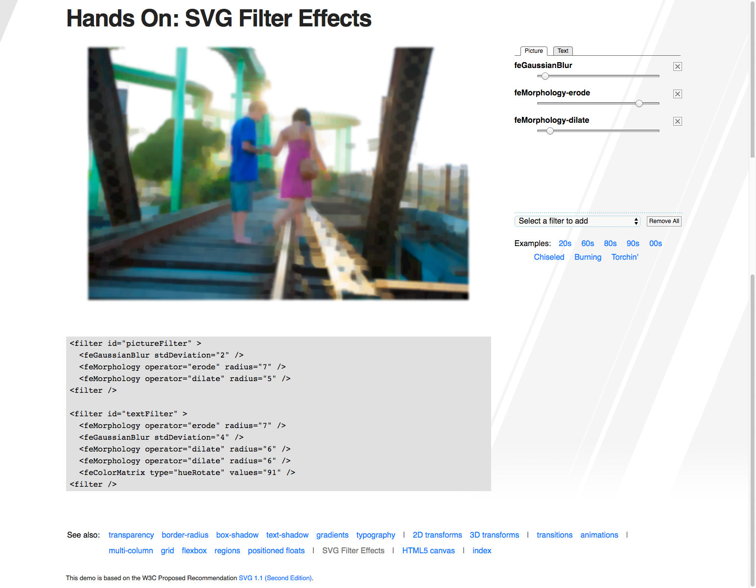
Filters in SVG are powerful and can be used to produce some truly stunning effects! In order to use a filter in SVG we use the <filter> element. Inside of this element we have a number of tools available to us; Blend, Colour Matrix, Component Transfer, Composite, Convolve Matrix, Diffuse Lighting, Displacement Map, Flood, Gaussian Blur, Image, Merge, Morphology, Offset, Specular Lighting, Tile and Turbulence. These are called filter primitives. An SVG filter is made up using a number of these filter primitives.
A filter primitive has one or two inputs and one output. For the input we have a number of options available to us to due to browser support the main two are:
- SourceGraphic The whole source graphic (can be text, shapes, path, etc), another element inside SVG complete with colours, fills and other styles.
- SourceAlpha Only the opaque parts of the alpha channel from the source graphic (essentially the element but filled black without any styles).
We'll take a look at a few of the filter primitives available to us below and cover basic usage. Filters in SVG can be complicated, we'll only be covering the basics.
Blur
The blur filter primitive can be used to apply blurring to an element. The filter primitive is created using the <feGaussianBlur> element and the amount of blurring is controlled using the stdDeviation attribute.
<feGaussianBlur stdDeviation="25" />
Offset
The offset filter primitive can be used to position elements at an offset of their source. The filter primitive is created using the <feOffset> element and controlled using the dx and dy attributes. These attributes specify the x and y amounts of the offset. This filter is often combined with blurring to create a drop shadow.
Sign up to Creative Bloq's daily newsletter, which brings you the latest news and inspiration from the worlds of art, design and technology.
<feOffset dx="15" dy="15" />
Colour Matrix
The colour matrix filter primitive can be used to perform a number of colour transformations. The filter primitive is created using the <feColorMatrix> element and controlled using the type and values attributes.
<feColorMatrix type="hueRotate" values="171" />
Turbulence
The turbulence filter primitive can be used to generate noise and artificial textures. The filter primitive is created using the <feTurbulence> element and controlled using a number of attributes.
<feTurbulence type="turbulence" baseFrequency="0.05" numOctaves="2" result="turbulence"/>
Morphology
The morphology filter primitive can be used to erode or dilate an element. The filter primitive is created using the <feMorphology> elements and is controlled using the operator and radius attributes. This filter is often used for thinning or flattening.
<feMorphology operator="erode" radius="1"/>
<feMorphology operator="dilate" radius="1"/>
How to create a filter
01. Find the moon
In order to apply our filter once we've created it, we need to find the moon in the DOM. We find the correct element using devtools, then apply a class name to it.
<circle class="the-moon" .../>02. Create the filter
Inside the defs tag we can create our filter using the filter element. Inside of our filter, we'll use the feTurbulence element to generate our noise.
<filter id="noise" y="0" x="0">
 <feTurbulence stitchTiles="stitch" baseFrequency=".75" type="fractalNoise" />
</filter>
03. Create a pattern element
In order to use our noise filter as a fill for an element, we create a pattern element. We create this inside of the defs tag making sure to give the pattern a unique ID.
04. Drawing the pattern
Inside of our pattern element we need to crate some two rectangles. We'll start by creating the background.
<pattern ...>
 <rect width="100%" height="100%" fill="white" />
</pattern>
05. Finish the pattern
After our background rectangle we create a second one this time applying the filter and changing the opacity.
<pattern ...>
 ...
 <rect width="100%" height="100%" filter="url(#noise)" opacity=".9" />
</pattern>
06. Apply pattern to the moon
Now we've created the filter and applied it to our pattern, the only thing left to do is apply it to our chosen element. In this case we'll apply it using CSS but we could just as easily apply the filter inline.
.the-moon {
fill: url(#moon-texture); }
Next: Add animation to SVG
Current page: SVG filters and effects
Prev Page Writing SVG for the web Next Page Add animation to SVG
Steven is a digital creative from Stockton-on-Tees, UK. An experienced Head of UX, Steven has written a number of articles on web design and front-end development, as well as delivering a talk at CSSConf Budapest on the potential of CSS animations. He is currently Head of UX at Aero Commerce.
