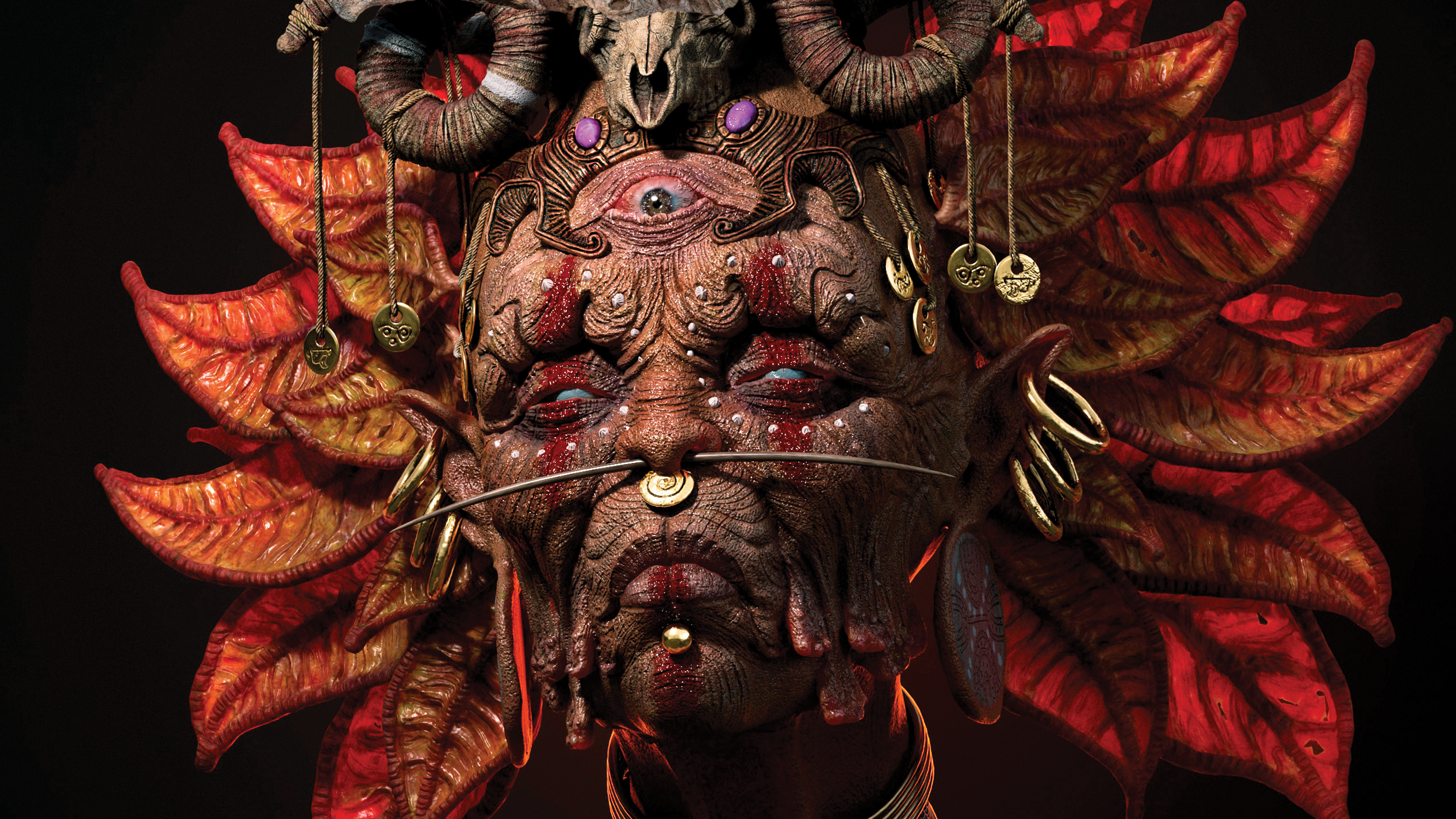
When it comes to creating the perfect portfolio, the most important thing is to get the fundamentals right. That is, include only your best work, provide suitable context and background detail, update it regularly, and above all, proofread everything thoroughly.
However, that doesn’t mean you shouldn't take note of the latest portfolio trends, and take inspiration from them, where appropriate, to make your portfolio even better. We're not talking blindly copy them, of course, but there’s no harm in seeing what other creatives have done with their portfolio sites (see these amazing design portfolios for inspiration), and see what it sparks in your own imagination.
In this article, we look at some of the biggest portfolio trends of 2019, which seem sure to influence portfolio design throughout 2020 and beyond. (Note that the last three on the list are highly technical, and we wouldn't suggest they're vital additions to any portfolio by any means... but they sure are fun, at least.)
01. Pushing the boundaries of type
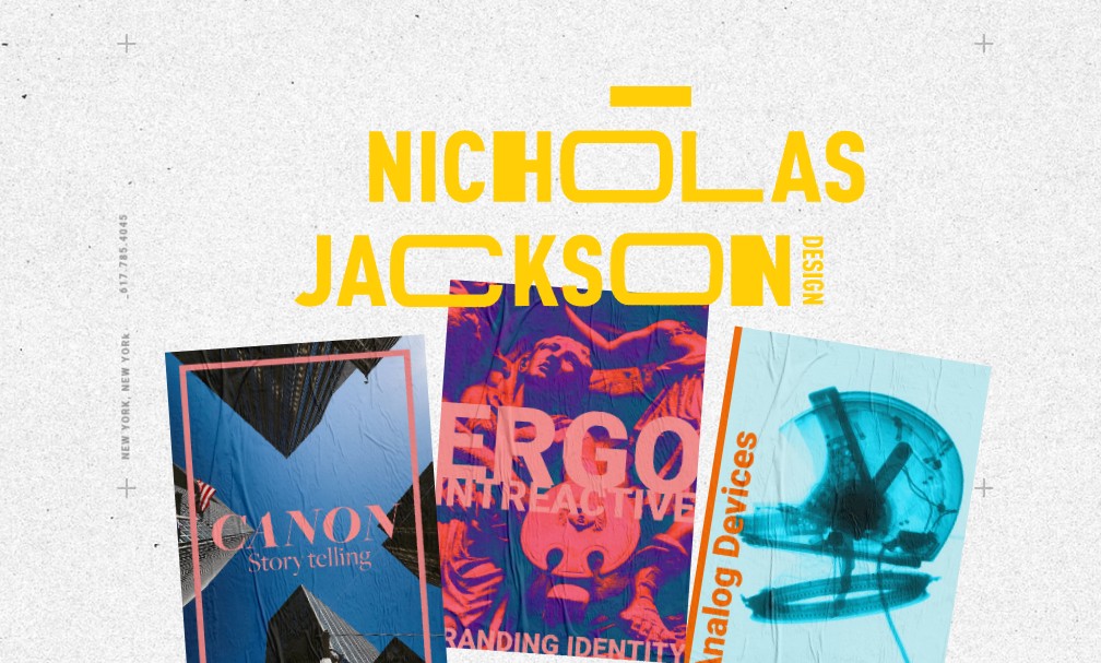
The sea of sameness when it comes to web and app design in general seems to have created a backlash when it comes to designers’ portfolio sites. In 2019, we’ve been seeing a lot more art direction and attempts to break out of the straitjacket of the standard portfolio site layout. Most strikingly, there’s been a lot more innovation and imagination shown when it comes to typography.
For digital and UX designers, there’s been a virtual arms race to come up with the most boundary-pushing type effects. Especially eye-catching examples include the mesmerising undulating type of Italian creative developer Myles Nguyen’s site; the wild font distortions on the portfolio of French front-end developer Martin Laxenaire; and the beautifully unexpected ways the main headline moves on scrolling through the site of French interactive developer Vincent Saïsset.
But it’s not just about clever uses of coding. More broadly, we’re seeing a renaissance of inventive and original typography across the board when it comes to portfolios. This is evidenced, for instance, on the portfolio sites of Thibaud Allie, an independent art director and digital designer based in Paris; Caleb Barclay, a consultant product designer in Arizona; Nicholas Jackson, a creative director in New York; and Davide Perozzi, a creative developer based in Germany.
02. A sense of fun
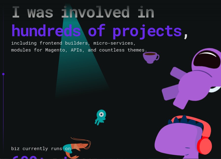
For many, the portfolio remains a serious and business-like proposition, but in 2019 we’ve been seeing an increasing number of creatives bringing a sense of fun to their sites. That might appear in the form of humorous microcopy, such as the ever-changing, tongue-in-cheek headings representing French digital brand strategist Alban Mezino, a supremely silly loading screen, such as on the portfolio of Italian artist and designer Dino Balliana, or colourful cartoon stylings, such as those of Iuri de Paula, a creative frontend developer, designer and illustrator based in Berlin.
Get the Creative Bloq Newsletter
Daily design news, reviews, how-tos and more, as picked by the editors.
It may be just a single element, such as the incogruous looking, wavy pencil line on the portfolio of Dutch designer Dennis Snellenberg, or the comically stretching cursor on the site of New York-based art director Igor Mahr. Conversely, some portfolio sites are comedic from start to finish, from the Windows OS parody of Brazilian web developer Leandro Gabriel and the retro-gaming themed portfolio of Petero Ravec, a front-end developer based in Slovakia.
A note of caution, though. Everybody likes a bit of fun, but as a tool for your business, humour should be treated especially carefully. In all honestly, splash of comedy is as likely to put off a prospective client or collaborator as it is to attract them… unless it’s done really REALLY well, of course.
03. A strong personal pitch
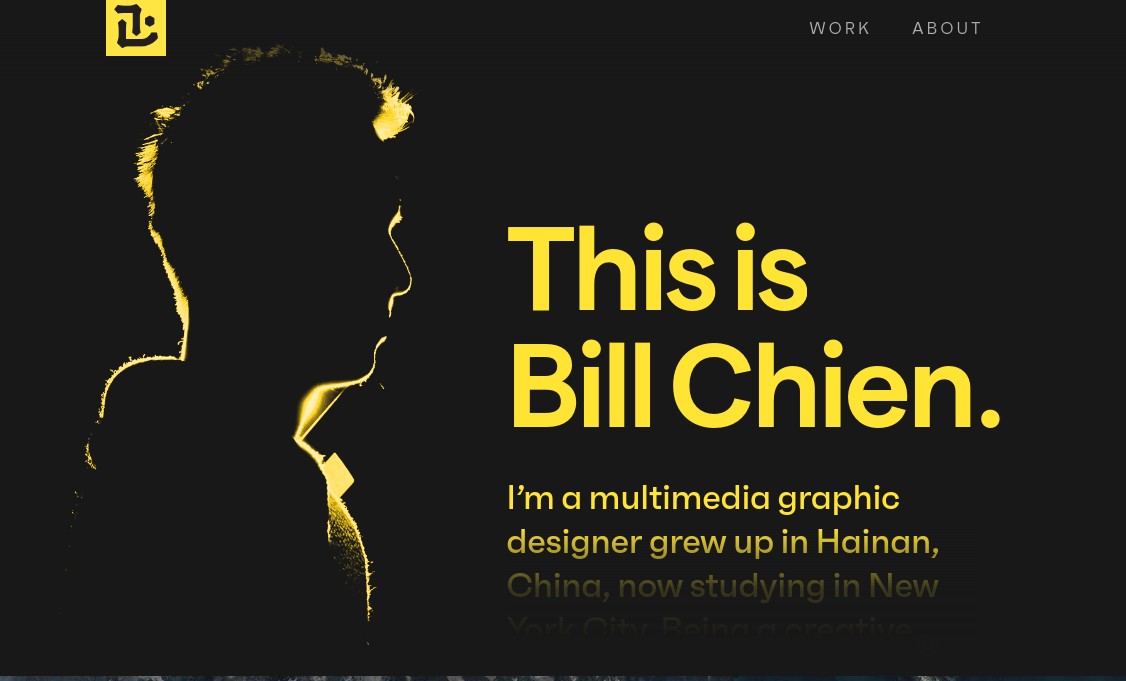
There’s never been more competition for the best design roles. And perhaps in reflection of that, in 2019 we’re seeing creatives raising their game when it comes to selling their services on their portfolio site. Gone are the days when a lazy ‘About me’ description such as “I make things” would suffice. Nowadays, the portfolio site is becoming less an online business card, and more a full-blooded pitch for why you should hire its creator.
Fitting this mould perfectly are creative UI developer Priya Tyagi, multimedia graphic designer Bill Chien, product designer Patryk Kopec and designer and front-end developer Juraj Molnár, to name but a few. Each of these portfolios harnesses a generous use of white space and a simple colour palette, to better focus attention on their finely honed personal pitch.
04. Crazy tricks with animated cursors
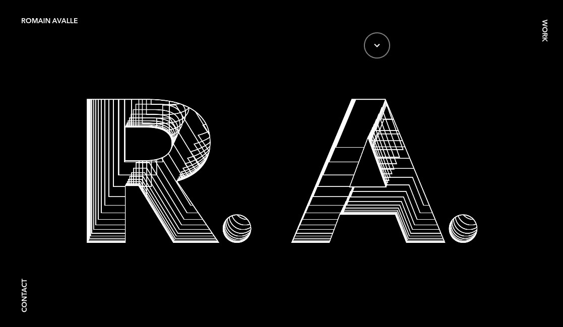
We have to admit, we’re not entirely sure why this has become such a big deal. But we’d be remiss if we didn’t mention that the animated cursor has been a huge trend in digital designers’ portfolio sites in 2019. As far as we’re concerned, though, there’s no practical or useful reason to include this device, it’s purely about showing off your coding skills. Keeping that in mind, here some impressive examples...
The animated cursor of Orlando-based product designer Jesus Sandrea casts fiery red trails, while Danish front-end developer Jacob Frederiksen’s can be used to distort his homepage’s main image to entertaining effect. Ukranian web designer Vladimir Gruev’s lets you spin a cube, and Paris-based developer Romain Avalle’s allows you to manipulate 3D type. Then of course, there’s the spotlight effect, of which cool examples can be spotted on the portfolio sites of London-based UI/UK designer Joseph Berry, Japanese web designer Muramoto Meguru and interactive art director Martin Ehrlich.
These animated cursors are all great fun, but again, we’d stress that from a functionality point of view, we don’t really see the point... other than showcasing that you can create the effect itself. So if creating animated cursors is something that floats your boat, then knock yourself out, but otherwise we don’t see this as a trend most of us need to follow in 2020.
05. CNN-style rolling text
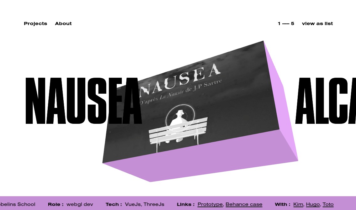
Here’s another popular trend that’s arguably more about fun than functionality: in 2019, we’ve seen countless portfolio sites employ the kind of rolling text you associate with 24-hour news channels. Why? Because, just as moving images attract the eye much more powerfully than non-moving ones, the same principle applies to animated versus static text.
This device might be used to detail your personal stats and skills, as on the portfolio sites of French interactive developer Antonin Riviere, London-nased UX/UI designer Joseph Berry and Paris-based motion designer Alex Thery. Alternatively, it might contain the main project headline, as on the site of creative developer Pierre Mouchan. Another variation on this style is revolving circular text, as seen on the portfolios of French art director Matt VBRG and Ecuadorian designer JayWrkr. While probably the most effective use of the device we’ve seen is to convey one simple message (“Looking for roles in Copenhagen”) at the bottom of Guardian designer Zef Cherry's homepage.
Are we being curmudgeonly when we say we think this fad, while entertaining, is probably going to be a short-lived one? Perhaps. But as with animated cursors, we do feel that this is one trend most of us can live without in 2020.
06. Eye-catching image transitions
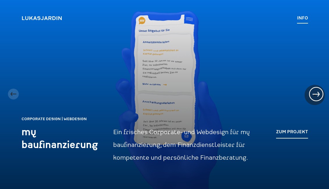
In this day and age, many UX designers have a problem. Their skills are in huge demand to create user-focused, commercially successful websites and apps, but often by necessity, the screenshots from these services can be a little... well... boring looking. To add some visual panache, then, many are experimenting with cool visual tricks to bring dull static images to life.
These include, for example, undulating effects on hover, on the portfolio site of Hadrien Mongouachon, a creative freelance developer based in France; and beautifully grotesque distortions when switching between pages on the site of German graphic and web designer Lukas Jardin. We can also enjoy subliminal flashes when hovering over the project titles on Russian frontend developer Georgii's portfolio; clockface-style slideshow transitions courtesy of Paris-based digital designer Camille Pawlack; and the bizarrely eyecatching headshot transitions on scroll created by Italy-based developer Francesco Michelini.

Thank you for reading 5 articles this month* Join now for unlimited access
Enjoy your first month for just £1 / $1 / €1
*Read 5 free articles per month without a subscription

Join now for unlimited access
Try first month for just £1 / $1 / €1

Tom May is an award-winning journalist and editor specialising in design, photography and technology. Author of the Amazon #1 bestseller Great TED Talks: Creativity, published by Pavilion Books, Tom was previously editor of Professional Photography magazine, associate editor at Creative Bloq, and deputy editor at net magazine. Today, he is a regular contributor to Creative Bloq and its sister sites Digital Camera World, T3.com and Tech Radar. He also writes for Creative Boom and works on content marketing projects.
