The biggest design successes of the decade (and what they teach us)
What you can learn from 5 design triumphs.
Good design might be innovative, influential or memorable. Great design will be all three, and the best design contains the secrets of its own success. Each of the following designs is not only successful in its own right, but also contains clear lessons that we can benefit from when approaching our own work.
Whether it’s nurturing creative relationships to get the best results, daring to take risks, or simply remembering to retain the fun, these projects show how to make work that matters….
01. Blackstar album cover
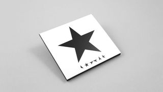
Jonathan Barnbrook’s extraordinary album sleeve design for David Bowie’s final album in 2016 was the culmination of a 15-year creative partnership, and a perfect example of how nurturing creative relationships over a period of time can yield increasingly rich results.
Barnbrook’s previous work on The Next Day had earned the wrath of Bowie fans, distraught to see a brutally redacted old album cover but for Blackstar, Barnbrook and Bowie executed an even more controversial design, stripping away everything on the new album sleeve title except for a large black star and sequence of smaller, mysteriously broken stars. Was it a code? What did it say? What could it mean? And why was one Britain’s foremost typographers eliminating type (and the artist) from the sleeve?
Such radical (and impactful) design was only possible because Bowie and Barnbrook had developed such a deep understanding of each other. "Mutual respect," Barnbrook explained when we asked him what the key to such a long a fruitful relationship was. "You both need to value each other’s role and understand that the sum of both of you is the important thing. Many jobs fail because one side doesn’t respect the other."
Creating a media sensation as well as concluding a legendary creative partnership, the Blackstar album sleeve demonstrated the benefits of client and designer working hand in hand. "Each job is a partnership," Barnbrook explains, "not a war to get your own way".
02. Agatha Christie stamps
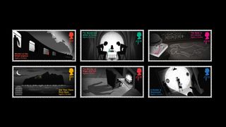
Marking the centenary of Agatha Christie’s first crime novel and the 40th anniversary of her death, this set of stamps for the Royal Mail was a perfect showcase for the playful design ethos of Studio Sutherl&. The exquisite details and clever print techniques earned rave reviews and awards in 2017 – including a prestigious D&AD Yellow Pencil – and established the tiny studio (comprised of ‘just’ industry legend Jim Sutherland and ex-The Partners designer Rosey Trickett) as the smartest, coolest creatives around.
Get the Creative Bloq Newsletter
Daily design news, reviews, how-tos and more, as picked by the editors.
Sutherland has admitted that he loves to create work that looks effortless. “Often it’s a question of removing layers until you are left with the fundamental idea,” he told Computer Arts magazine last year, and the story-based stamps are both wonderfully immediate and devilishly sophisticated. The genius of them is that the idea is honed down to the purest form (wonderfully executed by illustrator Neil Webb) and sprinkled with wit (check out the hidden clues scattered around the stamps).
Profiled in the iconic A Smile in The Mind, Sutherland revealed the principle behind all this work: "If you put thought and joy into a project, the person at the other end gets some of that back." These beautiful stamps perfectly show how it’s possible to take that initial, playful fun of brainstorming all the way through to the final, sublime execution.
03. SPIN/Adventures in Typography
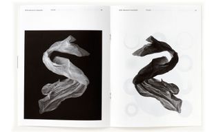
When Unit Editions’ experimental type magazine was launched back in 2017, it instantly became the coolest design publication of the year. And it says a great deal about about the talent involved – SPIN and industry heavyweight Adrian Shaughnessy – that this slim, black and white title became so hot, despite being a seemingly random collection of visual thoughts about typography that admits it's "teetering on the edge of legibility".
Last year’s follow up issue, delivered even more radical experiments to a growing audience of enthusiastic readers. But how does a journal of beautiful failures, become a sell-out title in an environment of print decline and magazine closures?
"All Unit Editions books are made with passion," Shaughnessy explains, when asked what made Adventures in Typography so popular. "Our first assessment of a title is – is this a publication we’d like to see in print? Only after we’ve answered that question do we consider its sales potential. The only thought was to make a publication that was genuinely different and genuinely experimental." SPIN’s Tony Brook was equally adamant that the project should be "born out of enthusiasm rather than commercial or practical imperatives".
The devoted fanbase eagerly anticipating issue three proves that passionate, beautiful work will almost always find its audience.
04. Uber rebrand

The recent Uber rebrand by Wolff Olins garnered just the right mix of professional peer grumbles and blogosphere cynicism to guarantee huge media coverage, a welcome bonus for the (then) beleaguered taxi company.
But critics who bemoaned the seemingly ubiquitous redesign redux (san-serif, wordmark only) missed the point of the brief, which was to create “a holistic brand system to accommodate everything from bikes, to tuk-tuks and flying cars,”
Creating a shared language that would work across the 660 plus Uber cities across the world is more than setting old and new logos side by side, it’s about understanding how the brand will be experienced.
Utterly functional and flexible, the Uber app logo immediately looks as if has always been around (and always will be), while the fresh typography by MCKL Type Foundry brilliantly adapts to messaging and branding across all languages and orientations. The 'U' of Uber is also used as a container to house wonderful photographs related to the brand.
Judging the redesign based on a still image of the Uber logo is as pointless as reviewing a movie based on a single frame: it’s the fluid interaction between the design and the public that matters, and here, the Uber redesign is a wonderful masterclass in how to understand your real-world application. Old-school logo designers may feel non-plussed, but to watch the logo and branding in action is to see corporate design delivered to the highest standard.
Read more about the initial reaction to the Uber rebrand here.
05. 1984 book cover
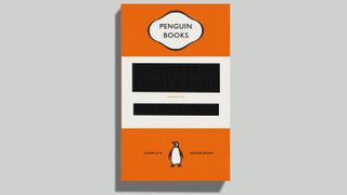
Penguin’s legendary book covers have become part of our shared design DNA: pioneering work by Jan Tschichold and Romek Marber in the '50s and '60s was largely responsible for a revolution in editorial design.
But more recent work at Penguin has been equally influential, most notably the designs of David Pearson. His stunning Great Ideas series celebrated language itself through stunning typography, treating book lovers with respect and letting them share in the experience of discovering a new title. "I often try to slow down the process of looking and reading," he tells us. "The hope is that people will stay a while and start to build a relationship with what they see."
His famously reductionist cover for George Orwell’s 1984 – a blank book cover with redacted title – shows Pearson at his brilliant best: playful, daring and most importantly, true to the theme of the book he was designing.
"You can push people too far and they will ultimately leave frustrated," he admits, "but if you can judge it right, the reader will become an active part of the process and the exchange becomes much more meaningful and memorable."
Pearson's smart design for smart readers has been as influential as anything in Penguin’s illustrious history, and since leaving to set up his own agency Pearson has further enhanced his enviable portfolio while refining his underlying philosophy. "Ultimately, it's about treating people with respect; inviting them in and not trying to prescribe their thought processes."
Read more:

Thank you for reading 5 articles this month* Join now for unlimited access
Enjoy your first month for just £1 / $1 / €1
*Read 5 free articles per month without a subscription

Join now for unlimited access
Try first month for just £1 / $1 / €1
Mark Wynne is an art director and designer with more than 20 years' experience in the publishing industry. He's been responsible for art directing and rebranding several popular magazine titles, including Official PlayStation Magazine and cult videogame title EDGE, and he was also Art Editor for Computer Arts magazine. Mark is one of Creative Bloq's go-to experts for all things related to design and branding.
