Around the start of this decade, a round-up of 'best website designs' would have be dominated by big budget creations, full of clever tricks, beautiful animations and wow-factor effects. But the world has moved on since then.
With so much of the internet's commercial activity having shifted from websites to social media, innovative web design is less about showing off and more about quietly delivering great user experiences. And this more often to be found in smaller projects, online experiments, and sites built for fun, than in slick and polished corporate work.
In this post, we look at six websites, all launched this year, which may have gone under your radar, but which nonetheless showcase some inspired and innovative approaches to web design. Plus we hear from their creators about how they were put together, and what they've learned as a result.
For more web inspiration, take a look at our favourite WordPress websites, and our pick on the best minimalist site designs.
01. Phil Coffman
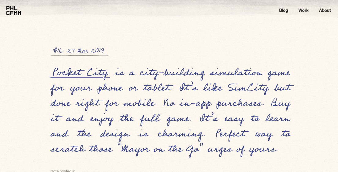
If we had a pound for every time we’ve heard a web designer say “I really need to get around to redesigning my blog,” we’d be millionaires. So hats off to Phil Coffman, a designer living in Austin, Texas, for actually dong so. But a bonus, he’s done a spectacularly inventive and original job of it too.
Combining handwriting and newspaper cutout-style type, with an earthy background that resembles ageing, physical paper, this is one of the best blog designs we’ve seen in years. And that’s partly a testament to the amount of work Coffman put into it.
“This design follows many previous failed attempts,” he admits. “Designing for myself is possibly my least favourite thing to do. as I struggle massively from indecision and unrealistic expectations I place on myself. In the end, this concept won out because I wanted to dive back into textures, hand-drawn elements, and an overall art direction that’s more of a personal journal than a polished publication.”
Get the Creative Bloq Newsletter
Daily design news, reviews, how-tos and more, as picked by the editors.
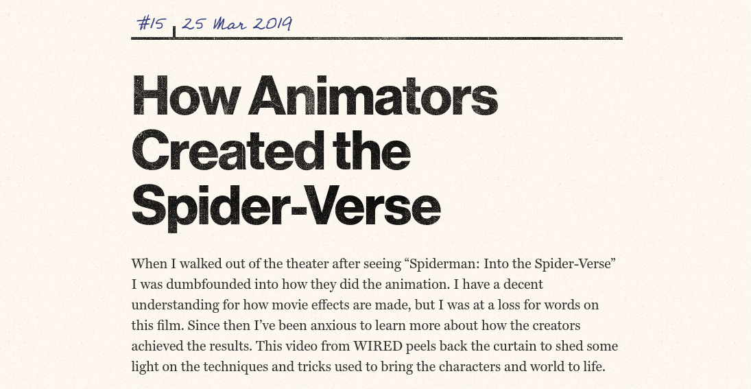
Putting the concept into action also involved some technical challenges, he adds. “It took a bit of trial and error to get the textured effect looking the way I wanted on the post titles and black lines,” Coffman explains. “I knew CSS had the ability to use text as a clipping mask but I hadn’t spent much time digging into how to properly pull it off.”
Once he’d worked through the steps of applying the correct combination of CSS declarations, he faced the challenge of sourcing and prepping the right mix of textures. “This required finding textures with the right amount of wear and personality without causing issues with text legibility," he notes.
The image lock-ups were also a "fun challenge" for Coffman. "I landed on using CSS Grid to establish the skeleton for the markup, fiddling with the grid template to give me enough flexibility with positioning the figure and figure caption, while maintaining the same aspect ratio from the mobile layout to desktop.”
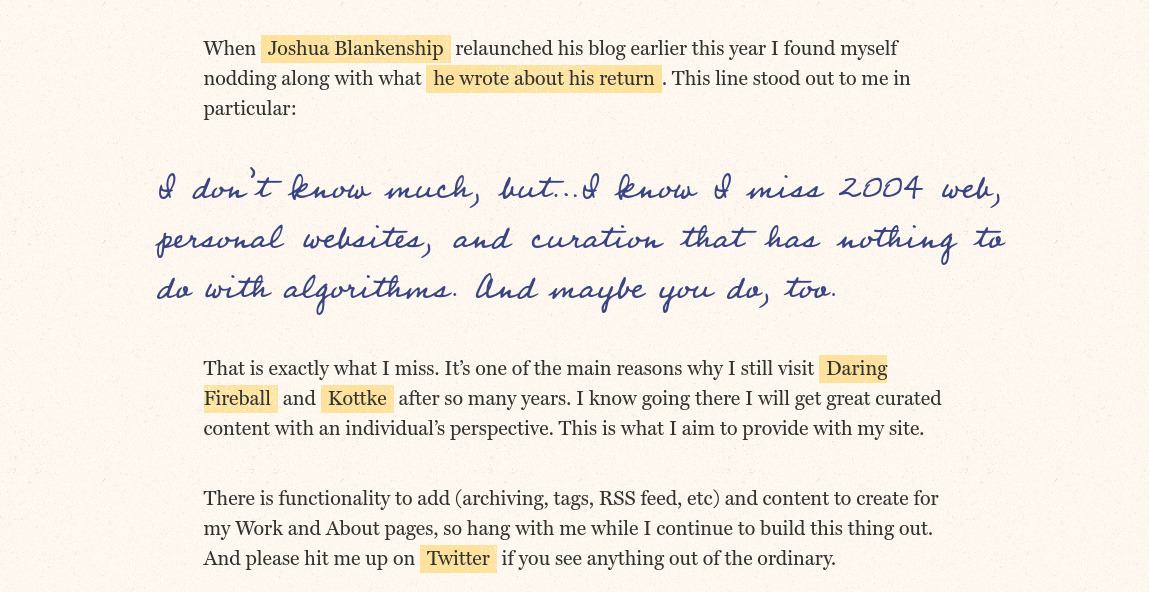
For the typography, he settled on Neue Haas Grotesk for the titles and smaller sans-serif elements, Miller for the body text and Professor for the hand-written script.
“The key to this concept is the interplay between the hand-written font and sans and serif fonts,” he explains. “I felt that in order for the hand-written font to work I needed a sans and serif which were more straightforward or familiar, rather than ones which had a lot of personality of their own.”
02. The Boolean Game
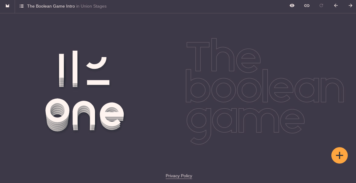
The Boolean Game is a fun browser game that teaches you how to use boolean operations in Adobe Illustrator, Sketch, Figma, and other vector editors. Creator Mark MacKay explains how it came about.
“I've been building design games for some years now, and I subconsciously collect things which I find challenging to convert into educational games,” he says. “This idea had been floating around for some time, and then I saw paper.js had a library to perform them: mathematically it's well beyond my ability. So I did a quick test and saw that it could be fun.”
While paper.js does the heavy lifting of the vector work for the site, MacKay also used anime.js for the animations, growler.js for the sound, and d3-color to manage the colour scheme.
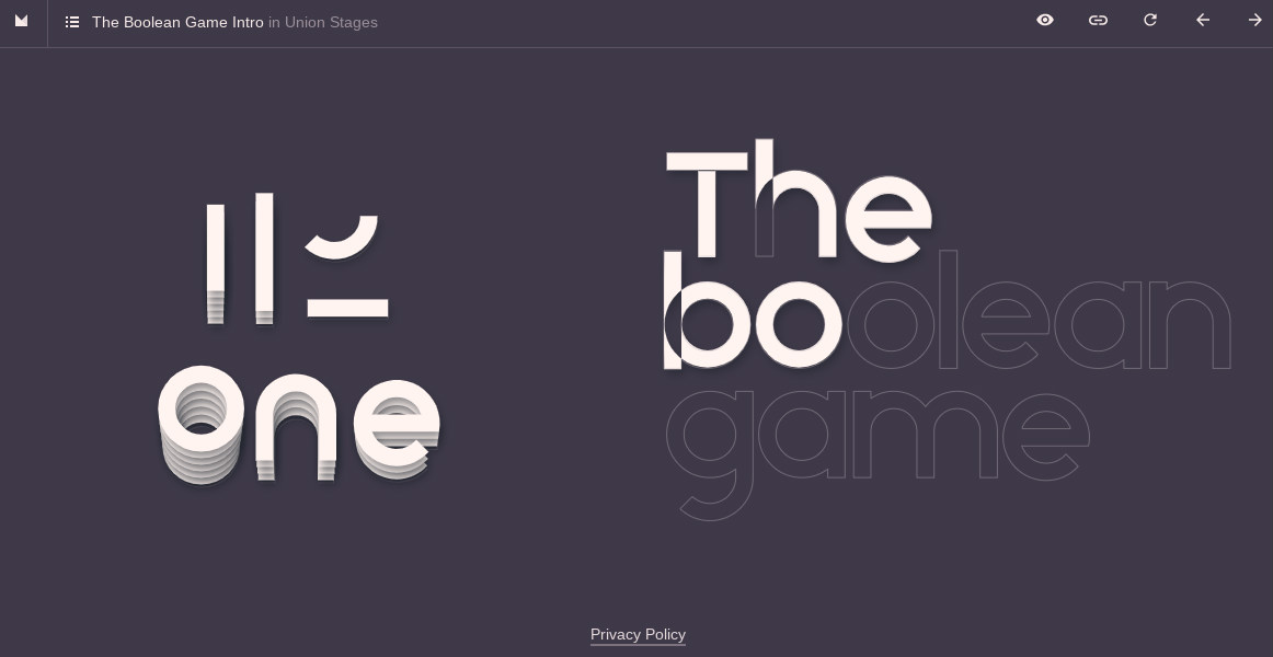
The main technical challenge was making it work on all devices, from phones to desktop, he continues. “This proved to be immensely challenging because you have to resize vectors and change the layout depending on the orientation. If I had chosen a fixed seen size, it would have probably taken me one month instead of three to get the project out the door.”
And interestingly, those three months taught him some important lessons about using dev tools.
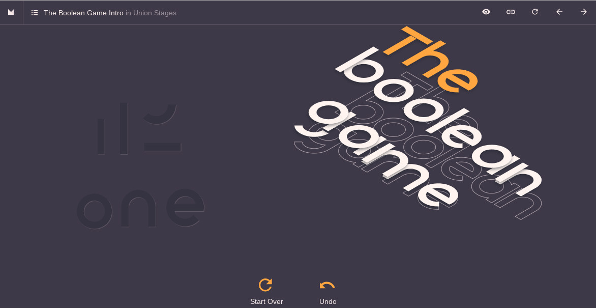
“The development ecosystem is optimised for very different things than what a solo creative designer-developer needs,” he explains. “It's as if you had the task of building a bridge and it's just assumed you'll have crane operators, pre-built concrete structures, steamrollers and so on. But if you simply need people to cross a stream, a simple hand build wooden structure will do.
“I say this because I used to feel inadequate for not knowing React, NPM, testing, ‘best practices’, etc. Now I understand I must optimise for my own flow and enjoyment. Dev tools and practices tend to be oriented towards reliability, collaboration and modularity, which are very different constraints.”
03. The Gyllenhaal Experiment
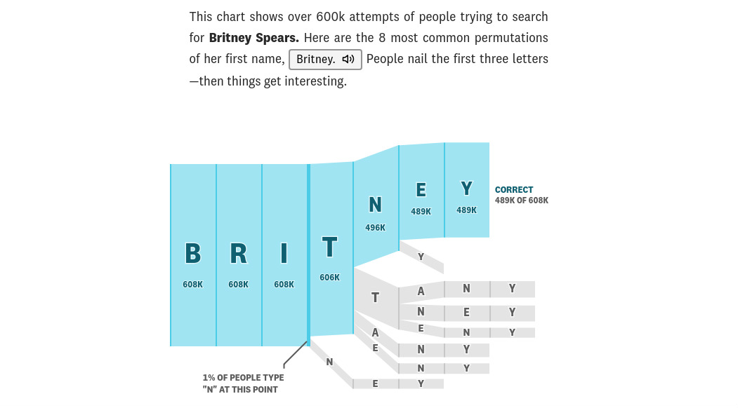
One of the best examples of data visualisation we’ve seen in some time, The Gyllenhaal Experiment is the brainchild of Russell Goldenberg and Matt Daniels of digital publication The Pudding.
“We’d seen this story about Colin Morris' analysis of self-identified Reddit misspelling,” explains Goldenberg. “And thought there was more that could be done with the idea of visualising the flow of how people spell.”
“We honed in on using celebrity names such as Jake Gyllenhaal, since they were quite prominent and not something in your typical spelling bee. We also knew we wanted to make something interactive to see real-time feedback of the spelling flows, so we fused those thoughts together to create a spelling bee-esque interactive visualisation."
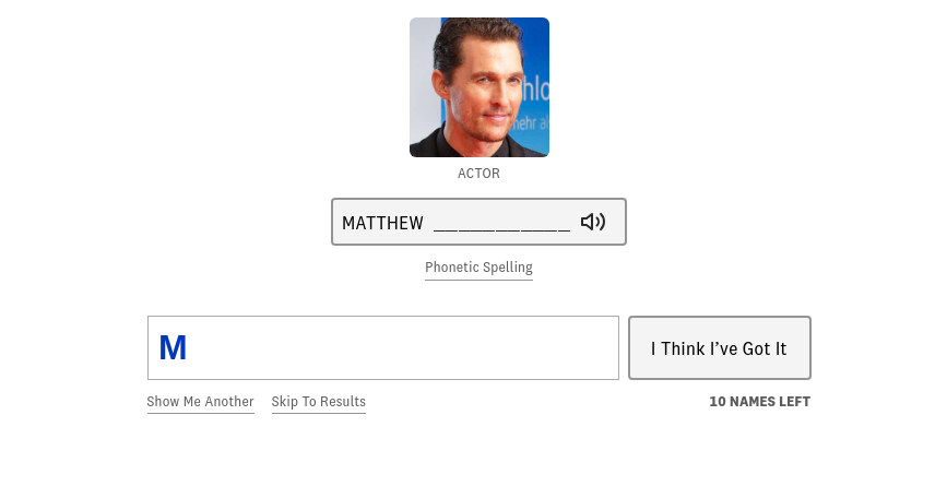
The pair relied on JavaScript and primarily the D3.js library for most of the visualisation, as well as using Firebase for the storage of user results.
“The biggest challenge by far was rendering the flow diagrams,” says Goldenberg. “Although it is technically a sankey diagram, we had to do a lot of custom stuff to get the paths rendering properly and not overlapping.”
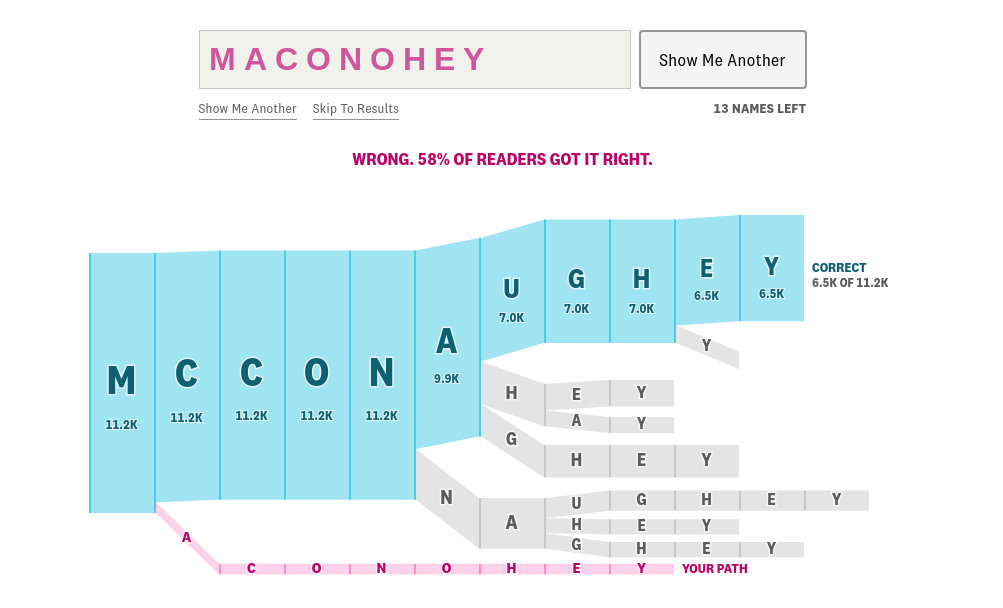
In the course of building the site, the biggest surprise was learning quite how many different ways people spell names. “There were over 800 ways people tried to spell Matthew Mcconaughey for instance.
"From a development standpoint, there were lots of user flows to consider, from all sorts of variations to how they could answer a question, to handling different states (eg. did they return to the site having already answered?). Knowing all the possible states ahead of time was crucial to the development and design going smoothly.”
04. JSConf 2019

It's a real headache for web conference organisers. You don't want to spend your whole time working on your website when you could be focusing your energies on planning your event and making it the best you can be. But stick up a simple cookie cutter site, and people are going to wonder how much you know about the subject your conference is discussing.
Somehow, the organisers of JSConf EU seem to have squared that circle. Because not only is their conference universally praised and admired, but their website, which is built on the static site generator wintersmith, is pretty amazing too. Not because it's full of clever tricks - it isn't - but because it focuses on the fundamentals and delivers on every front, from ease of use to the relevance of its content.
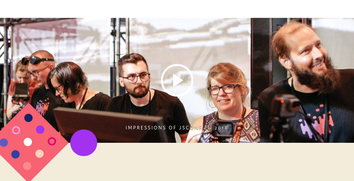
Plus it's fast – super-fast. As Malte Ubl explains in this blog post: "I’ve spent a completely unreasonable amount of time trying to make it be the fastest conference website in the world." (He's not sure if he's succeeded, but so far no one has invalidated his claim).
It helps that Ubi is the creator of AMP, a web component library for making reliably fast websites. He's used the jSConf website as his playground to try out new techniques; and they certainly seem to have worked; the site works beautifully on every device we've tried it on.
You can take a deep dive into the clever ways Ubi has achieved this, from optimising font performance to dead code elimation, here.
05. Design Titles
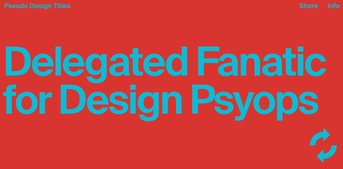
Who says web design can’t be fun? Not Xtian Miller and Boris Crowther, who’ve created this hilarious job title generator, Design Titles, which parodies some of the sillier monickers some web designers seem to go under these days.
Design-wise, it’s not a complex site: it does one thing and does it very well, and there’s an awful lot to be said for that.
“It really started as an inside joke,” explains Miller. “For better or worse, titles within the creative industry have developed a mercurial nature, causing inconsistency in their definition as they continually evolve.
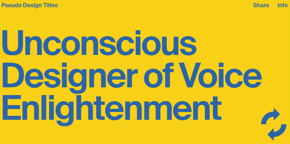
"As a result, many designers have gotten creative with their titles to sound more relevant or to avoid being pigeon-holed. The official titles don’t cut it, so they’ll come up with pseudo ones for their portfolios and social bios. The real goal of the website was to create a visual, fun way of getting this long-standing joke out of our system.”
The site was built with static HTML, CSS and JS, with Gulp for development workflow automation and Sass for CSS preprocessing. The generator function and algorithm were made entirely from scratch in Vanilla JavaScript.
The biggest technical challenge was getting the algorithm of the shuffle function just right, adds Miller. “We had to continually tweak it to a point where it wasn't too repetitive, and you had as good a chance of getting a perfectly normal title as you did an absurd one. The more you use it, the more ludicrous (or serious) it gets. It may look simple, but it took a lot of testing to finesse the algorithm.”
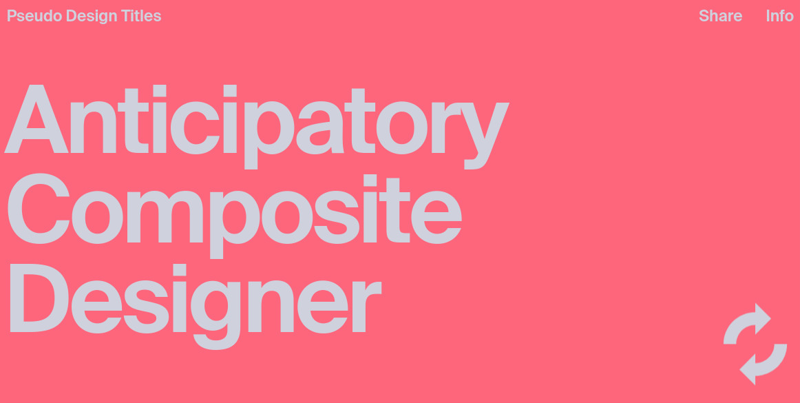
Looks-wise, the duo we were inspired by the International Typographic Style, but more specifically Vignelli's NYC subway design system for layout and typography.
“When you go all in on that style you're somewhat aware of the influence, authority and objectivity behind it, which we felt was ironic for this whole concept,” says Miller.
“We wanted the title to be as obnoxiously large as possible - fitting the viewport - to emphasise its importance, and used modern colour pairings for impact and variety. The colour randomisation was a simple solution to take away the monotony of shuffling, and it sort of goes along nicely with how each title carries its own persona.”
06. Captain Marvel
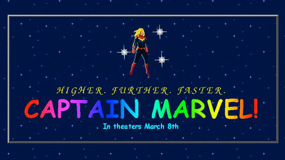
The latest Marvel movie, Captain Marvel, takes place in the 1990s, and so this hilarious promotional site perfectly recreates the look and feel of what the web looked like in that decade.
Younger people may be shocked by how basic and clunky it looks, but those of a certain age will get a nostalgic rush to see the neon fonts, cheesy animations, bad photo crops, guestbook and hit counter, which all used to be part and parcel of early website design.
There’s even an authentic 'Spot the Skrull' game that asks you to decide whether someone is a human or secretly a shape-shifting alien in disguise. Yes kids, this was what cutting edge movie promotion in the late 20th century was all about.
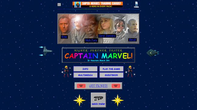
Of course, under the hood, the site is not totally authentic. While Marvel's director of software engineering Lori Lombert joked that "We built this in FrontPage and host it Angelfire", it's actually been constructed using modern CSS and JavaScript, so a 1995 browser like Netscape Navigator wouldn't have known what to do with it. Not to mention that its 10MB size would have taken forever to download on dial-up via a screechy AOL modem.
That said, for anyone who remembers the thrill of watching their first web page download in the 1990s, this is a real treat. Parody is something that might look easy, but is actually incredibly hard to get right. So for Lombert and her team to absolutely nail the little details in this way is a great achievement, and reminds us in these days of soulless digital utility that the web can still be a fun and anarchic place.
Read more:

Thank you for reading 5 articles this month* Join now for unlimited access
Enjoy your first month for just £1 / $1 / €1
*Read 5 free articles per month without a subscription

Join now for unlimited access
Try first month for just £1 / $1 / €1

Tom May is an award-winning journalist and editor specialising in design, photography and technology. Author of the Amazon #1 bestseller Great TED Talks: Creativity, published by Pavilion Books, Tom was previously editor of Professional Photography magazine, associate editor at Creative Bloq, and deputy editor at net magazine. Today, he is a regular contributor to Creative Bloq and its sister sites Digital Camera World, T3.com and Tech Radar. He also writes for Creative Boom and works on content marketing projects.
