This year has seen many businesses streamlining their websites and thinking more than ever about the user experience and how this can generate conversions. Despite much promotion and commercial activity moving to social media, companies are still looking at ways they can use the more tailored experience of a website to catch the user’s attention and imagination and showcase their products or services in an eye-catching way.
For help improving your own designs, see our web design tools and check out our mobile website design tips. In the meantime, here are eight websites that caught our attention this year, and a look at what they did right.
01. Apple
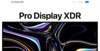
Apple knows that a picture is worth a thousand words, and many thousands more conversions. Its website has been at the forefront of one of the major trends we’ve seen this year: a move towards going big. Really big. In Apple's case, huge crystal-clear close-up shot of products are accompanied by equally large display text in San Francisco Pro to offer drool-worthy presentations of the brand’s products.
Throw in a neat scroll-controlled zoom out effect that takes you out from extreme close-ups, and the page provides an undeniably impressive overview of both the brand’s products’ aesthetic features and of what they can do. Apple knows that users spend less time on websites than they did in the past and that they’ll leave if a site lacks a message, and here the message is crystal clear: 'Admire our products and see what they can do'.
02. Pitch
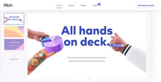
Pitch's website makes a sharp presentation, which is crucial since presentation software is this new company’s product. The site is even designed so that scrolling out from the landing page reveals the first screen to be the initial page in a presentation. It’s a clever interactive device that makes it clear from the outset what the product is about, while a bold sans serif headline gets our attention and a distinct colour palette makes this new brand quickly identifiable.
Keep scrolling and the fun illustrations and clay-look animation complement the UX rather than slowing it down. There’s a lot going on, but still plenty of white space to let the different elements stand out. The illustrations makes the brand feel down-to-earth and thoroughly contemporary. In fact, we’re sure that the combination of flat design and 3D isometric elements is going to be a major trend in the year to come.
03. Lemonade
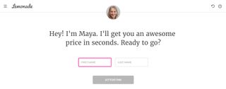
What makes this site for US insurance company Lemonade really stand out is the game-changing use of a conversational user interface (CUI) to offer innovative and effective interaction. Maya, as she’s called, shows how far chatbots have come, and where they’re heading. She interacts on a human level and gathers information efficiently to drive conversions, taking users through each stage in the process and providing insurance quotes in just a few minutes.
Get the Creative Bloq Newsletter
Daily design news, reviews, how-tos and more, as picked by the editors.
The transitions are smooth, with clearly labelled answer forms, making Maya an engaging, forward thinking kind of interface that we’re sure to see more of next year. Elsewhere, the site’s bold headline of ‘Forget Everything You Know About Insurance’ is also elegantly backed up by well-placed pink action buttons that put the focus firmly on the UX.
04. Essentially Geared Wine Co
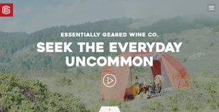
Many of the most eye-catching websites this year feature background videos showing their products or services being used. The best videos don’t require sound and hook the viewer quickly, while large, short headlines avoid video and copy competing for the viewer’s attention. Essentially Geared Wine Co.'s choice of video looks good and is very functional, showing us how the company’s wine in a can may be enjoyed everywhere from the city to wild camping. Scroll down and the message is backed up with bold, colourful images and texts showing each product in the range and even making quick suggestions for which foods and experiences to pair each of them with.
05. The Frontier Within - Thorne
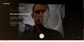
Interaction can make a website truly stand out, and this site designed by Active Theory is an engaging example of the possibilities out there. The Frontier Within is a promotional campaign for Thorne, a nutritional supplements company. It’s also a whole digital experience that combines storytelling with biometrics and produces graphics of particles that move when you drag the cursor over them.
The experience is personalised from the outset, with the site asking for your name and to take a photograph. Each step leads towards an interaction that measures and beautifully depicts data from the visitor’s own respiratory, circulatory and nervous system to present an internal view of the human body. The developers used a custom C++ OpenCV to allow accurate face tracking, while the website detects the GPU being used to provide a scalable version appropriate to your device’s capabilities.
06. Cities talk back – Lyft
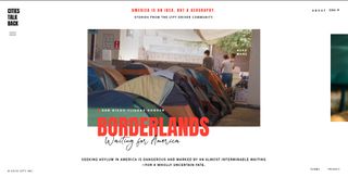
This capsule site from Lyft, a US ride hailing company, shows that websites can still aim to be about more than making quick conversions and that there is still a place for engaging original longer-form content when presented in a compelling way. The site tackles the timely issue of immigration in the US and gives a voice to some of the immigrant drivers who work for the company through a series of documentary films that are exquisitely presented by Hello Monday. It does so via an easily navigable platform with smooth hover menus and scroll triggered transitions.
07. Seriously unsweetened
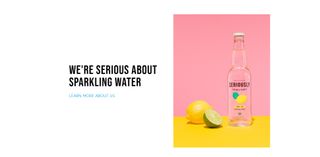
We think Seriously Unsweetened is bang on trend with its website’s bright but earthy colours and clean design with huge amounts of white space. The site is so seriously minimalist that it does only three things. It tells you the brand’s story, it shows you the brand’s products (and makes them look great) and it provides a way to get in touch, and each of the three messages is clearly communicated with a headline in Bebas Neue.
Created on a Squarespace template, the site is minimalist but fun with main image and colours popping off the page, while the visual flow is eminently scannable, proving that in web design, less really can be more.
08. Oasen
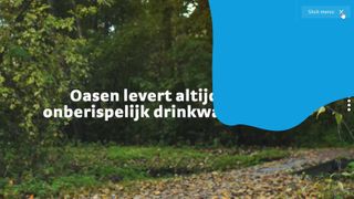
This website for Dutch not-for-profit drinking water provider Oasen is nothing revolutionary in terms of design, but we love the way it shows that even a utility company can add a little personality into its site while maintaining appropriate seriousness.
From the dripping loading animation to the splashes that accompany moves from one screen or menu to another, and the subtle liquid effect on the buttons that ripple when you move the cursor over them, the site is full of little micro-interactions that make the company seem warm and approachable. These interactions don't obscure what the company does or harm the navigability of the site – which is proved by the fact that we can understand what each section is about despite not being able to read Dutch.
Read more:

Thank you for reading 5 articles this month* Join now for unlimited access
Enjoy your first month for just £1 / $1 / €1
*Read 5 free articles per month without a subscription

Join now for unlimited access
Try first month for just £1 / $1 / €1
Joe is a regular freelance journalist and editor at Creative Bloq. He writes news, features and buying guides and keeps track of the best equipment and software for creatives, from video editing programs to monitors and accessories. A veteran news writer and photographer, he now works as a project manager at the London and Buenos Aires-based design, production and branding agency Hermana Creatives. There he manages a team of designers, photographers and video editors who specialise in producing visual content and design assets for the hospitality sector. He also dances Argentine tango.
