It may seem like those New Year's hangovers were just a moment ago. But time is racing on, and we're already a third of the way through 2019. Yikes!
We thought it a good time to look back through some of the most notable rebrands of the year, and assess them in the cold light of day. Now the dust has settled and the new designs are out in the real world, what do we think of them? How do you think these new rebrands compare to our pick of the best logos ever?
In this post, we've brought together five of the big name rebrands we reckon have been most successful. And for a bit of fun, we've also added a couple at the end that we feel have been pretty disastrous.
Did we miss out your favourites (or least favourites)? If so, hit us up on the Twitters via @creativebloq and let us know!
01. Staples
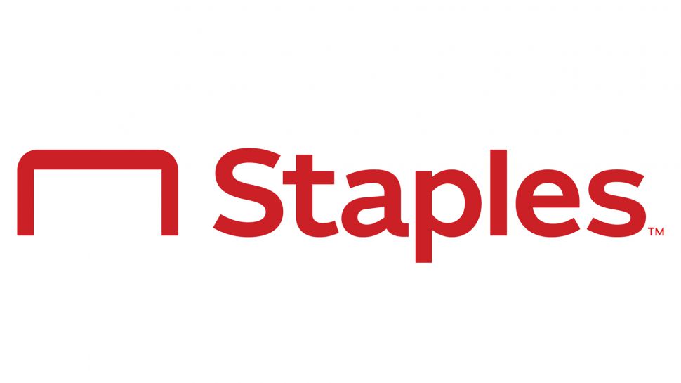
We never expected that the rebrand to most excite us in 2019 would come from an office supply retailer. But this new logo for the American multinational is a great example of how to clean up and modernise your identity while maintaining its best qualities.
The wonky-staple graphic in the old logo (below) was fun and quirky, but was starting to look seriously dated. The new geometric icon, which can be seen as representing both a staple and a desk, is much more in keeping with today’s more sleek and minimal logo trends. And it’s cleanly incorporated into the new wordmark, creating a much more professional look overall than the old design.
The wordmark itself strikes a good balance between friendly and business-like. With a new font and wider structure, the text has also gone from all-caps to sentence case and the bright primary colour has been suitably toned down to look less "shouty" and more grown-up.
Get the Creative Bloq Newsletter
Daily design news, reviews, how-tos and more, as picked by the editors.
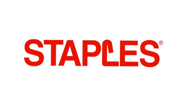
All these elements adds up to a design that “just works”: a thoughtfully evolution of the Staples logo that will serve it well in a rapidly changing world.
But it isn't just the logo that's changed. The rebrand as a whole is pretty far-reaching, with Staples' main strategy to position itself as a ‘worklife fulfillment company’ (hashtag #WorkLifeSolutions).
Most notably, this includes the launch of five private label brands: Tru Red (pens, notebooks and other office basics); NXT Technologies (wireless chargers and other gadget accessories); Coastwide Professional facility supplies); Union & Scale (furniture and office decor); and Perk (breakroom supplies).
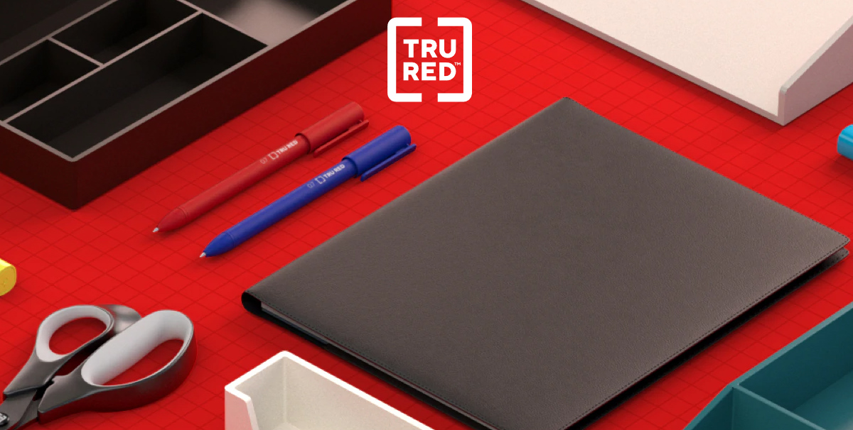
It’s a strategy that’s worked for rivals such as Target, and so it seems like a smart, base-covering move on Staples’ part too. A final plank of the 2019 rebrand is an enhancement of Staples’ digital offering, focused on The Loop, an online product solutions guide, as well as a website redesign.
Whether all this works in a super-competitive and rapidly evolving retail environment remains to be seen, of course. But it certainly adds up to a cohesive and considered strategy.
02. City of Paris
Paris has a new logo and identity. It's important to note that this is not to promote tourism, but to represent the city government of Paris.
As with the previous design, its icon is based on the ‘nave’: a historical boat symbol. While non-Parisians might think that odd considering it's not a coastal city, it's actually been a symbol of the capital for over a thousand years, so certainly makes sense from the point of view of locals.
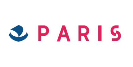
A quick comparison between the new (above) and old (below) designs makes it clear that this latest version, created by Paris branding agency Carre Noir, is superior on almost every front.
The single stroke emblem combines both a sense of movement and stability at the same time; a pretty neat trick to pull off. The single naval colour nicely evokes the city’s motto, ‘Fluctuat Nec Mergitur’ (‘Fluctuates but never sinks’).
The all-caps wordmark, set in Montserrat, is supremely confident, and a welcome improvement on its predecessor’s overdone spacing and weird broken ‘S’. And overall, the whole design just sings elegance and authority.
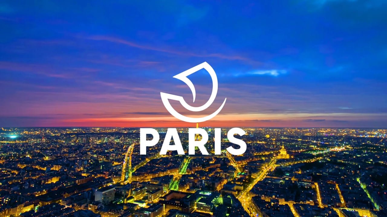
If you look hard enough, there’s also an attempt at typographic personality, with a hidden smile in the connecting line of the ‘A’. We’re not entirely convinced that was necessary, but either way, it certainly doesn’t detract from the effect as a whole.
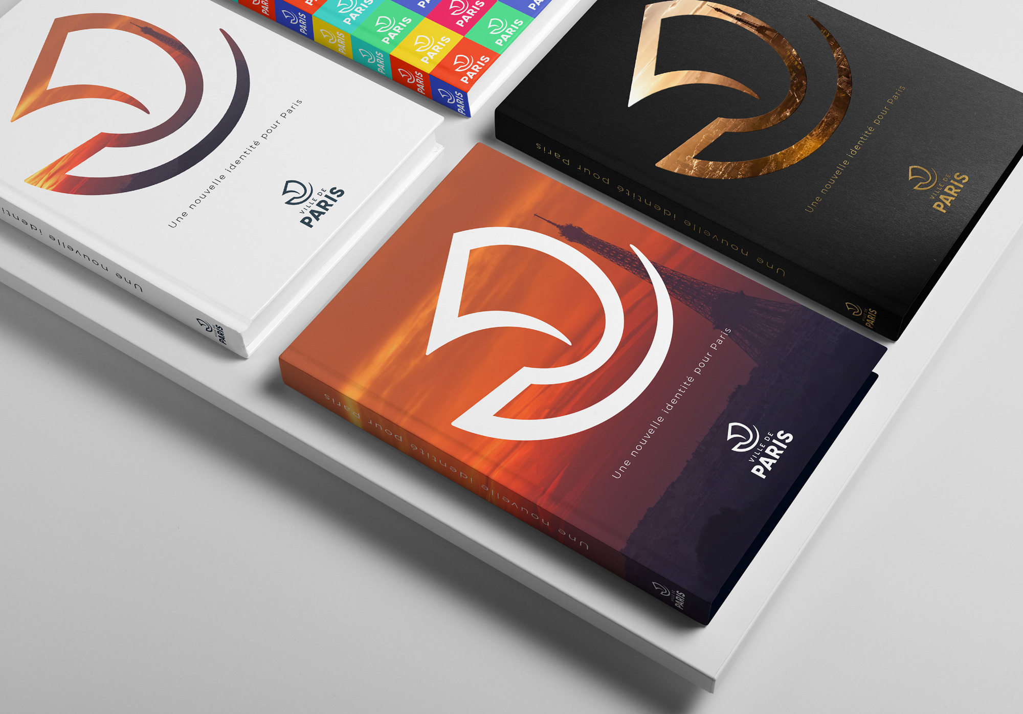
Away from the logo itself, the emblem also has a convincing life of its own. It acts as an excellent frame to the brand’s visual collateral as a whole - from books and T-shirts to apps and web pages – adding a sense of vibrancy while maintaining a premium feel and maintaining a consistent brand feel throughout.
03. WNBA
Established in 1996, The Women's National Basketball Association (WNBA) is a professional basketball league in the United States that’s currently composed of 12 teams.
There was a great sense of dynamic tension to its previous logo (below), designed in 2013 by The Original Champions of Design, and this new version, created by Sylvain Labs, wisely builds on that design rather than trying to completely reinvent it.
The main change is to the silhouetted figure of a player reaching for the basket. In the previous design, as in the main NBA logo, that figure was drawn inside a box. Simply by removing said box, the new design evokes a fresh sense of energy and freedom, in keeping with the internal motto behind the rebrand – “This is basketball on our terms.”
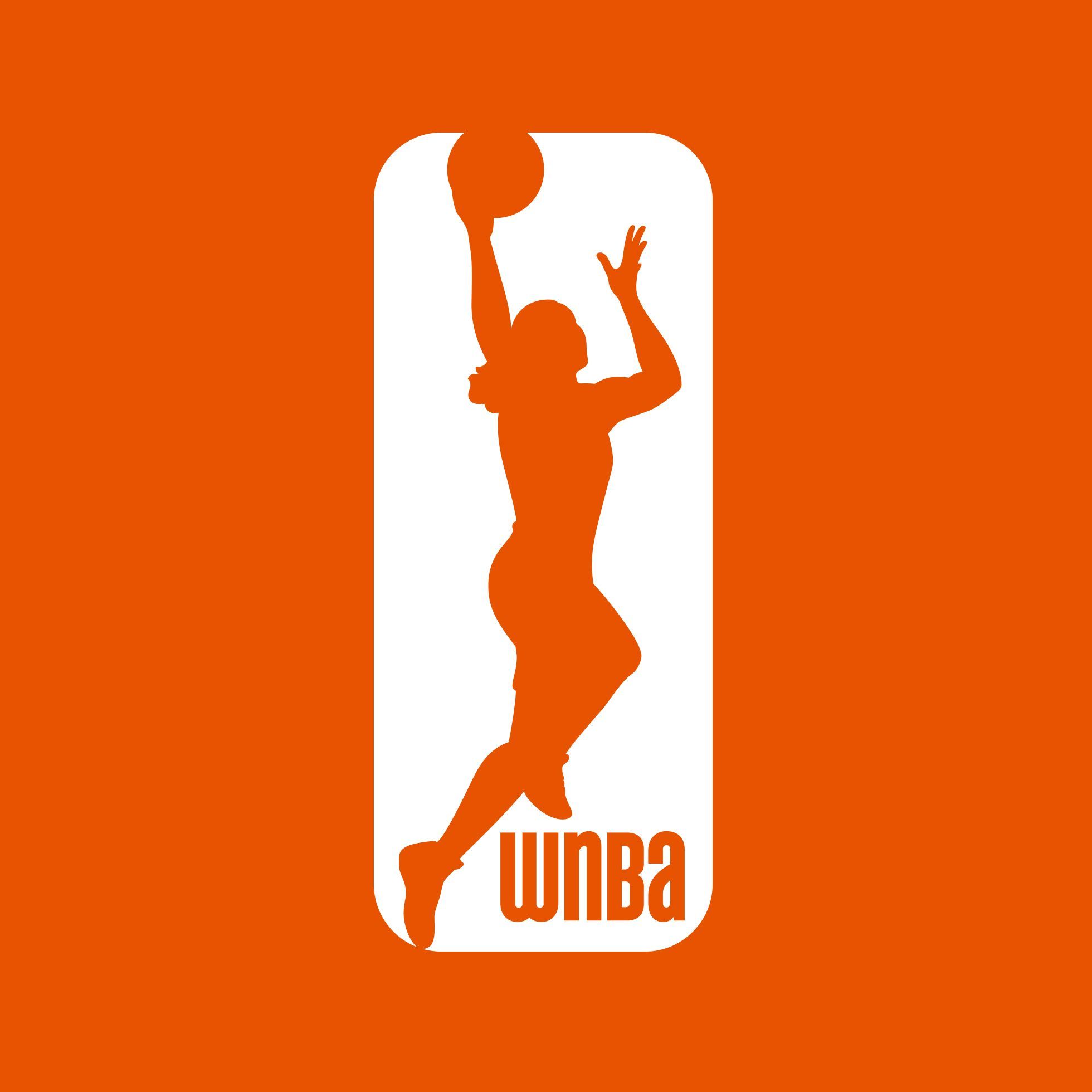
Beyond this, the silhouette has been significantly redrawn, with the body forming cleaner lines that are almost balletic, while still clearly representing the sport. The wordmark, meanwhile, is now more dominant and switches from unicase to all-caps, generating an overall sense of authority and confidence.
The wideset nature of the text has raised a few eyebrows, and it's certainly unusual. But to our eyes, it just works, bringing a sense of uniqueness and individualism to the design and rescuing it from potential blandness.
04. Discovery
In 2019, the TV market has never been so competitive. And while Netflix, Amazon and Disney have been grabbing most of the business headlines, Discovery has not been sitting idly by, most recently in talks with the BBC about a new global natural history partnership.
So the wildlife channel’s latest rebrand is intriguing, as much for what it signifies about its future direction as its design smarts. Its new logo certainly joins the trend, dominant across recent years, for gradually simplifying brand logos. Gone is the photorealistic Earth of the old logo (below). The planet has now been miniaturised, made monochrome, and more cleanly incorporated into the capital ‘D’, so it’s able to work much better at a range of sizes.
The wordmark, in a new sans-serif font, is both beefier and sleeker than its predecessor, too; a real typographical double-whammy.
Our favourite thing about this rebrand, however, is the creative use of the open ‘D’ in marketing material for the channel. Used as a framing device for Discovery’s stunning photography, it works brilliantly, as the example below shows.
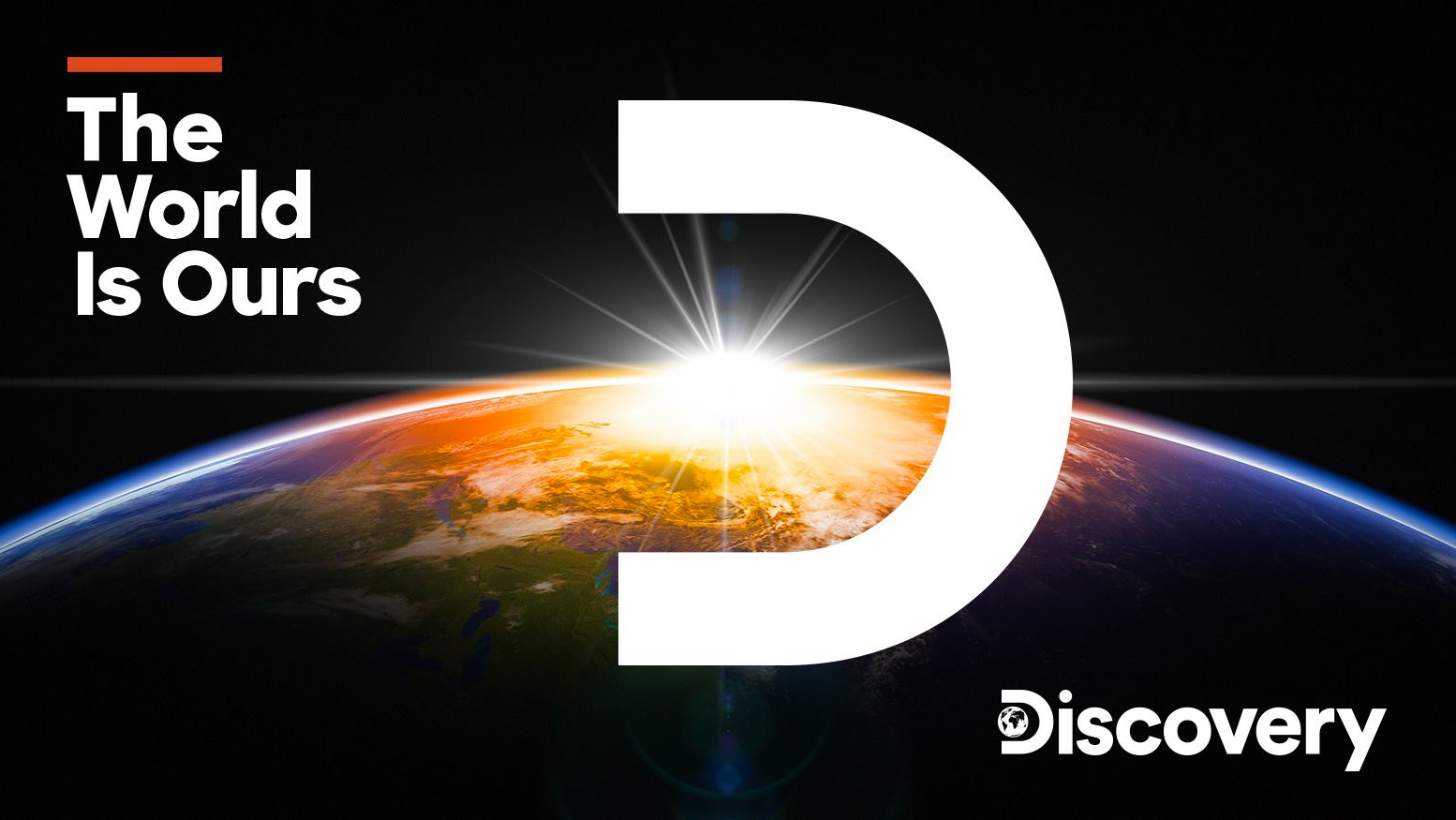
On some branding collatorel, meanwhile, the letter D and globe alone are used as a kind of shortcut logo. This is very effective as well, and points to how flexible and extensible the design system behind this rebrand truly is.
05. OFFF
OFFF is an annual series of three-day journey of conferences, workshops, activities and performances that have been bringing creative inspiration to Barcelona for almost two decades now.
There’s a sense of openness and experimentation to the festival that’s appropriate for an event focused on creativity. Recently, though, the organisers started to feel that as a result, OFFF had lost the coherence of its visual presence, both, online and onsite.
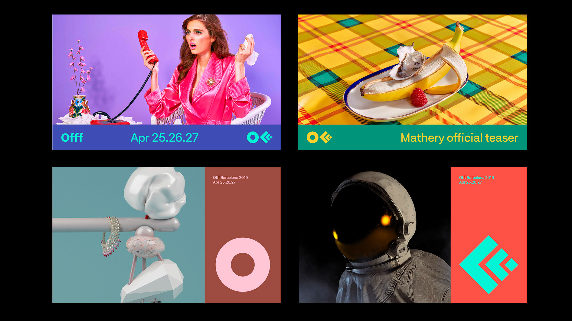
So for 2019 it's had a new, all-encompassing identity designed by local agency Crowd Studio, and they’ve essentially reinvented the brand from the ground up. At the centre of the rebrand is a cleaner and simpler logo (above), which abstracts the already minimal ‘FFF’ icon from old logo (below) one step further, into two simple chevrons and a diamond.
Attention-grabbing, superbly functional and yet still easily recognisable, it’s a necessary step that’s been executed perfectly. With a new and well-thought-out grid system that brings a sense of order and cohesion to everything from posters to the website and promo video, this adds up to a successful rebrand.
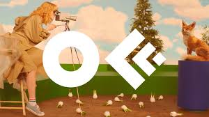
Above all, the festival now has an identity where all visual assets work together in harmony, rather than fight each other, while retaining that beloved yet indefinable OFFF ‘vibe’.
And now two of the worst...
Not every rebrand goes according to plan. Here are a couple of examples we feel that every designer can learn from, for all the wrong reasons.
06. Marianne Williamson
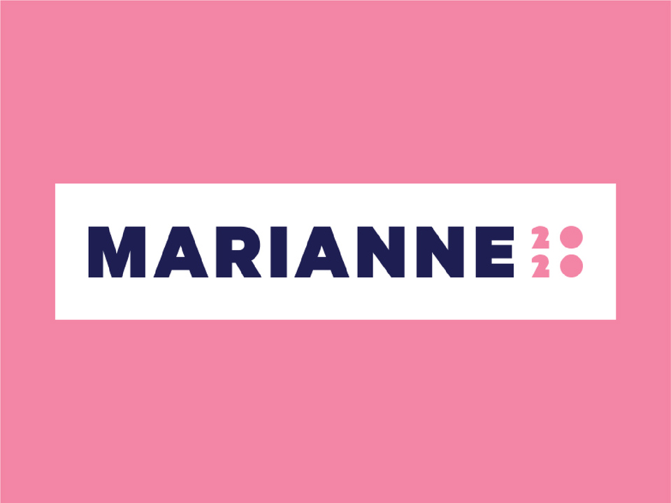
With 20+ candidates currently vying for America's attention in the fight to become the Democratic Presidential nominee, you need powerful branding to help you stand out from the crowd. Particularly if you're author and spiritual adviser Marianne Williams, who doesn't exactly have the name recognition of a Bernie Saunders or a Joe Biden.
So it's a shame her team have let her down on this occasion. While her previous 'personal brand' (below) clearly needed reinventing for a mainstream audience, we feel her new super-pink branding is a clear misstep.

In the right hands, pink can be a powerful colour - just look at the work of Swedish design studio Snask. And you could see why Williams would want to visually stress the significance of being a female candidate in a post-Hillary era.
However, it's a colour that has to be handled carefully. If its use is too unsubtle, it just shows a lack of imagination and a resort to stereotype; something that Labour's pink bus, which aimed to target female voters during the 2015 election campaign, attracted a lot of criticism for.
Beyond this colour choice, the design as a whole comes across as bland, sterile and uninspiring, suggesting a lack of confidence and ambition. And that is certainly not what you want in a candidate for the world's most powerful job.
07. WW
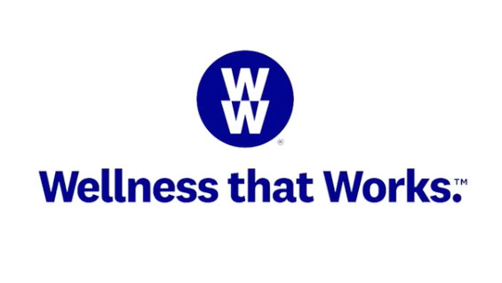
What's WW, you may ask? It's what Weight Watchers is now calling itself, following a controversial rebrand that was launched late last year, and has been rolling out across 2019, alongside a new slogan, "Wellness that works".
As we reported when the new name and logo were first released, designers far and wide felt it was a wrong move. In the words of Alex Paxton, for example, "That new #WeightWatchers rebrand is ridiculous. They don't actually expect people to call it #WW do they? Or did they just think nobody would say the name of the company out loud? "DOUBLE YOU DOUBLE YOU" #RebrandFail".
Designers hate new rebrand? Big deal; they'll soon get used to it, right? Unfortunately for the company, on this occasion this was just a taste of things to come.
The more the new branding rolled out, the worst it's been for their bottom line, leading to an earning forecast in February than was less than half the level Wall Street expected, and a 35 per cent plunge in the value of their shares.
Since then, the company has subtly started adding back-references to its previous brand identity. For example, their social media, logo and website now say “WW (Weight Watchers Reimagined)". Surely it can only be a matter of time before this disastrous rebrand is phased out completely?
Related articles:

Thank you for reading 5 articles this month* Join now for unlimited access
Enjoy your first month for just £1 / $1 / €1
*Read 5 free articles per month without a subscription

Join now for unlimited access
Try first month for just £1 / $1 / €1

Tom May is an award-winning journalist and editor specialising in design, photography and technology. Author of the Amazon #1 bestseller Great TED Talks: Creativity, published by Pavilion Books, Tom was previously editor of Professional Photography magazine, associate editor at Creative Bloq, and deputy editor at net magazine. Today, he is a regular contributor to Creative Bloq and its sister sites Digital Camera World, T3.com and Tech Radar. He also writes for Creative Boom and works on content marketing projects.
