The animation secrets of Pixar's Luca
Discover how Pixar's Luca was brought to the screen.
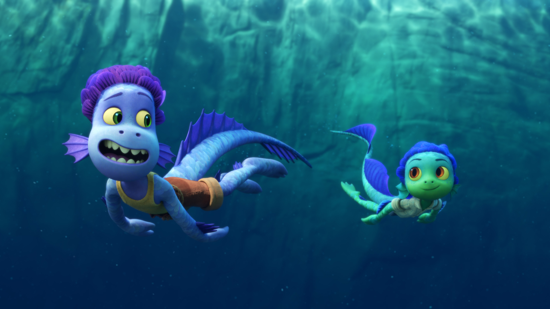
Pixar's Luca combines a coming-of-age story on the picturesque Italian Riviera with the richly imagined fantasy of underwater creatures living peacefully below the idyllic watery surface. To tell the story of Luca and his newfound best friend, Alberto, and their double life above and below the surface, Pixar had to employ a wealth of cutting edge animation techniques. You can see previous examples of groundbreaking 3D movies here.
In this article, we explore several ways that Pixar's Luca was brought to the screen. From expert research to character design techniques and 3D effects, you'll find plenty of behind the scenes insight and artistic inspiration. So what are you waiting for? Dive in and discover the movie magic of Pixar's Luca. Pixar fans can also find out how to save 15% on a yearly Disney+ subscription here.
Exploring Italian myths
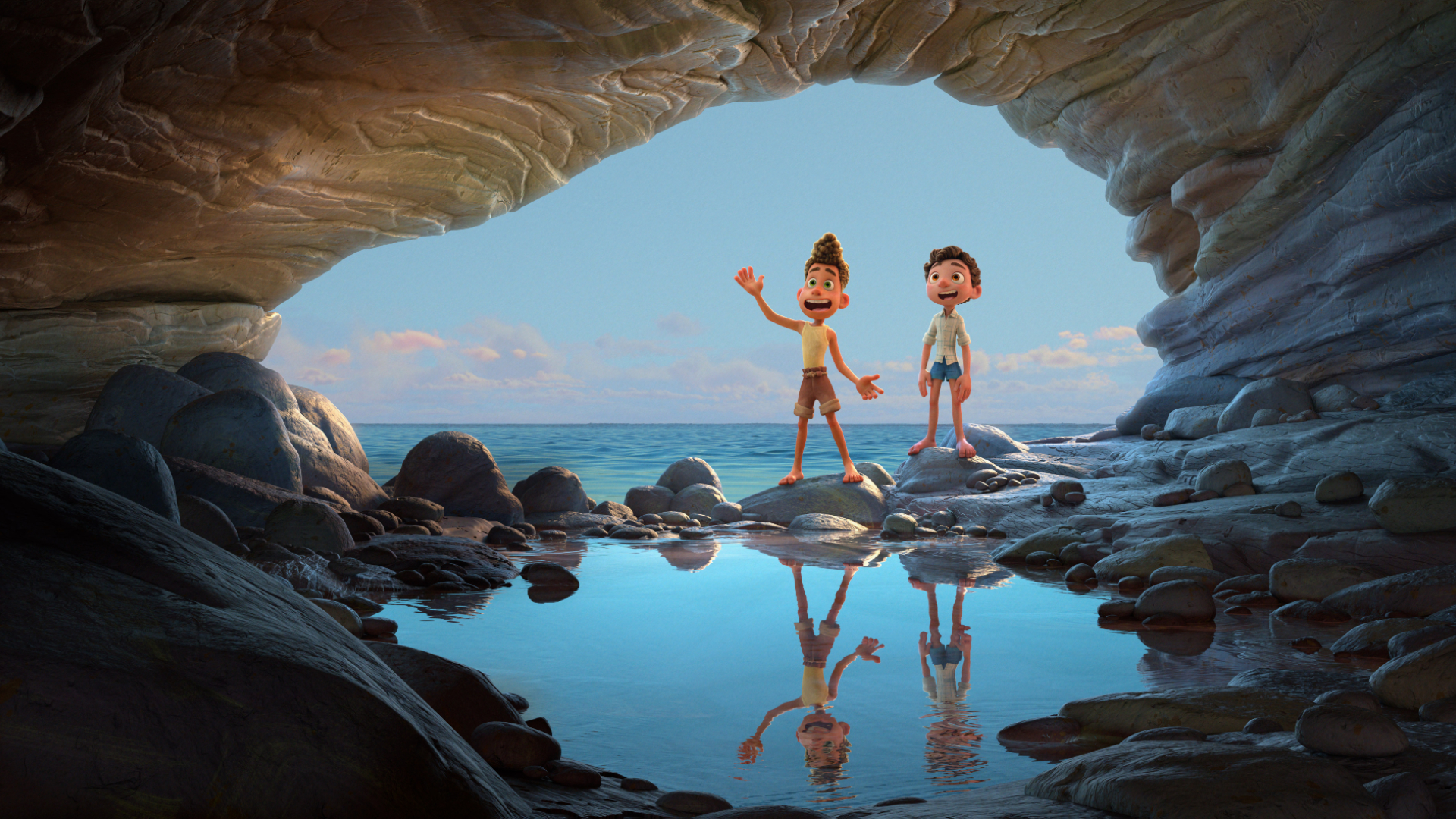
To begin the process of creating Luca's world, the Pixar team embarked on a research process that included an exploration of Italian myths, legends and lore – from tales of dragons to the story of a bell-ringing octopus that saved a village from a band of pirates. "Some of these tales were actually made up by fishermen," says the film's director Enrico Casarosa. "They'd find a great fishing spot, and they didn't want anyone to take it over, so they'd make up scary stories."
To create the look of the sea monsters, artists studied medieval depictions of creatures that appeared in the Carta Marina – a Renaissance map dating back to 1539 – as well as sea monster sculptures throughout Italy, seen on fountains and benches, even mosaicked on the ground.
Designing sea creatures
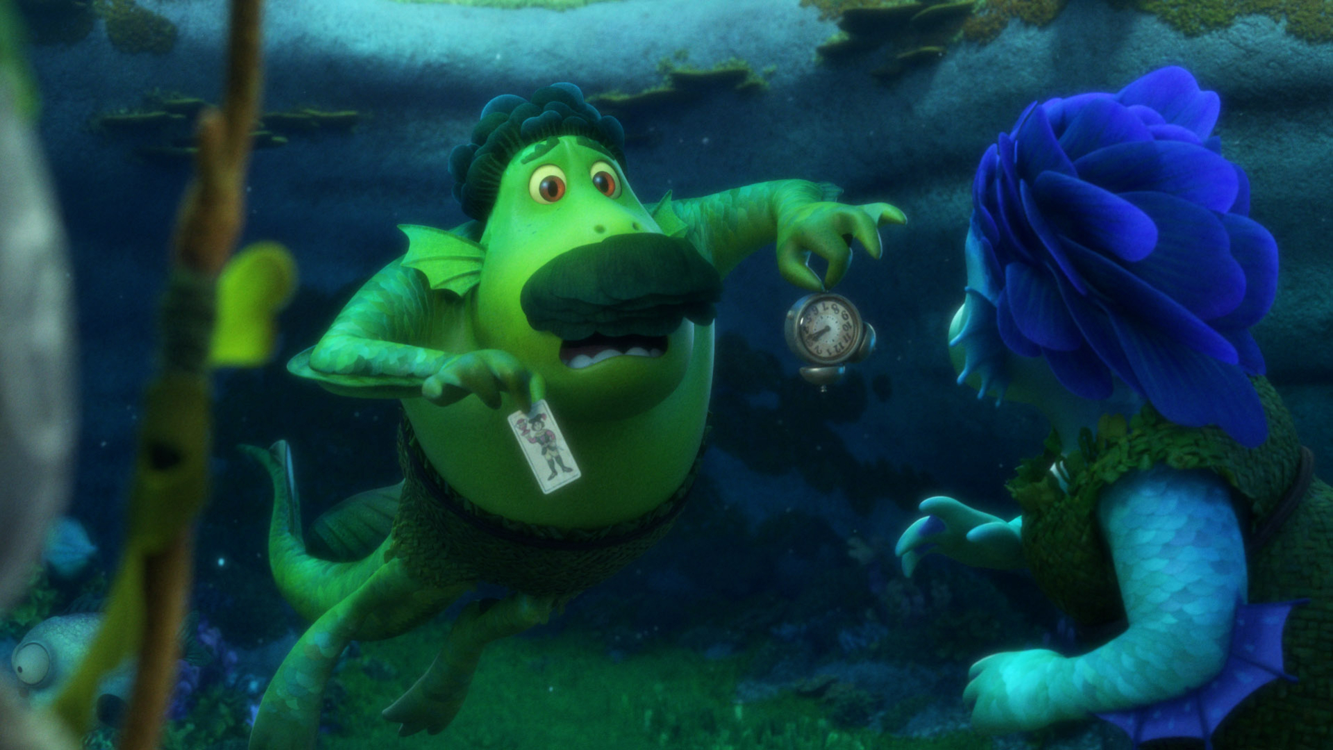
"I really wanted these designs to be unique, a departure from their medieval depictions," says Deanna Marsigliese, the film's art director, of Luca's sea creatures. "However, I also wanted to stay true to their decorative origins. You'll notice beautiful, irregular scale patterns – as if carved by hand. You'll see different kinds of facial fins, scalloped crests, sharp spines and webbing, and curlicues within the tails. And as our sea monsters age, these features only grow bigger and bolder. They're beautiful creatures and combined with their iridescence and gorgeous colours, could pass for pieces of costume jewellery."
Colour and shading art director Chia-Han Jennifer Chang adds that, "On all of the sea creatures, we played with lots of patterns like scallops with their scales. They have a handmade quality. In terms of colour, they represent the Mediterranean sea – the blues and turquoises – with an iridescent quality." Chang says the sea monster colour palette is as bold and saturated as that of the human world, "but on the opposite side of the spectrum."
Finding friends on the surface
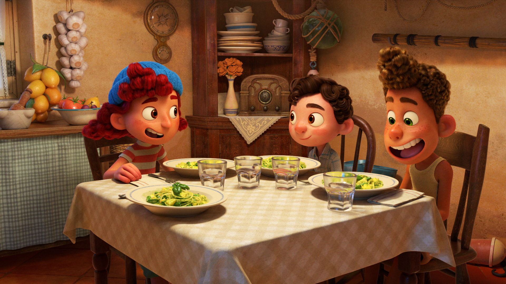
At the centre of this fantasy story is the friendship between three young characters in the town of Portorosso and Marsigliese notes that each character embodies a unique short-hand, paired with a hero feature, one that represents how the character engages with the world around them. "Luca is a circle with large, searching eyes," she says. "Alberto is a bean with an over-active mouth. Giulia is a fiery triangle, led by a sharp nose. Strong, simple foundational shapes provide the perfect canvas for our fine details and rich textures."
Get the Creative Bloq Newsletter
Daily design news, reviews, how-tos and more, as picked by the editors.
Enriching the visual design of the film was the way in which the animators embraced Casarosa's love of Japanese animation. "We were able to explore a different style that's less physically based and more playful, caricatured movement," says animation supervisor Michael Venturini. "For our characters on land, it's big, graphic poses and faster timing. That's a contrast to what we do in the water where you can't ever hold still. There's a little more poetry to the motion underwater, which is fun to watch."
Visualising the seabed
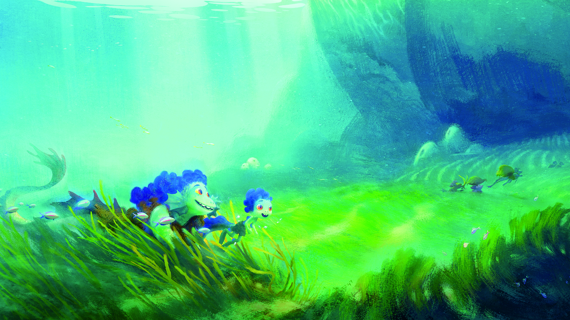
Sets art director Paul Abadilla explains that, "The underwater world shape language is mostly round, curvy, and organic. For example, the way vegetation is dressed around the home is motivated by wavy water currents. We don't see rectilinear shapes until we go to Portorosso." Beyond Luca's abode, says Abadilla, is the meadow, which plays an important role. "The underwater meadow is really the threshold for Luca," he says. "It symbolises him living in two worlds. Anything beyond the meadow is unknown – forbidden. So it's like his last safe space – the rocky walls that encircle the open field of seagrass provide him a place to hide."
Building on that idea, director of photography David Bianchi's team used only two wide-angle lenses for all underwater shots. But they still needed to convey motion in the shots, so they dove into the project – literally, creating the actual motion of the camera by tracking themselves in the Pixar pool. "We rented gear, built trackers, filmed ourselves and put it into the computer," he says. "Two lenses and a repetitive shot pattern give way to a completely different approach when Luca emerges from the water."
Initiating a spectacular transformation
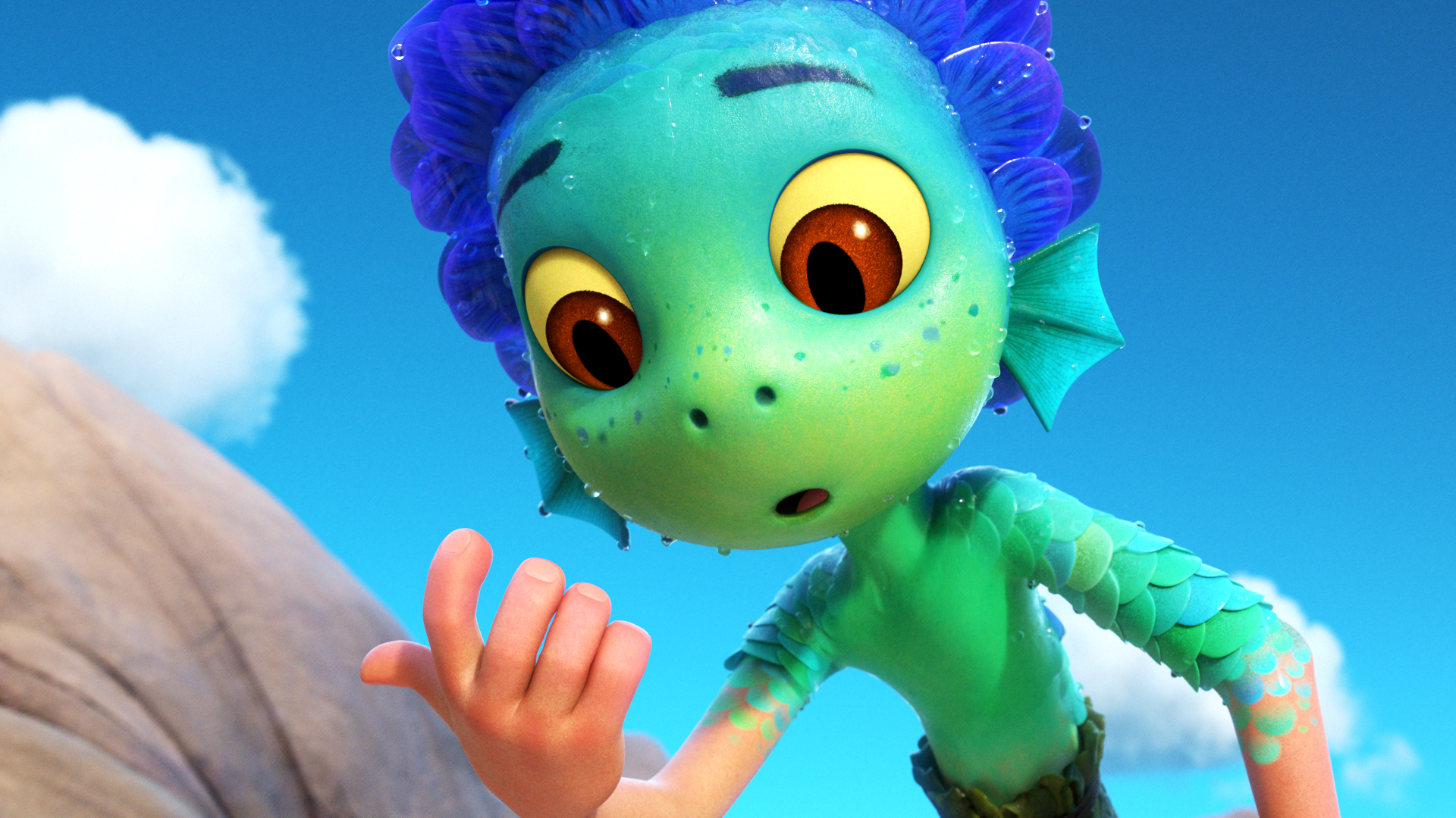
Key to the entire movie are moments of transformation for the characters. The filmmakers had to figure out how to showcase the incredible transformation from sea monster to human and back in a fun and organic way. They were inspired by how squids and octopuses change the colour of their skin.
"We had to develop specialised technology on this film to make that happen," says Venturini. "Those shots, on a technical level, are complex, so we had to be mindful of when we'd show the transformation." Coordinating models were created and rigged for both versions of the character – sea monster and human – so each transformation could begin with one and end with the other. Character supervisor Sajan Skaria adds that the tail posed some challenges since it only appears on one version of the character.
According to character supervisor Beth Albright, the transformation had to be both physical and, at times, emotional. "Enrico wanted the transformation to be something that's happening to the character, rather than a suit that slides on or off," she says. "It had to be internal – something that the character would react to – but nothing that felt creepy. We opted for a transformation that would ripple through the body."
"Once we realised that it comes from the inside of the body – it's not an external thing – everything came together," adds Skaria, "we started, with the octopus reference and built on that. We were able to do it so that animators could see it happening in real-time as they're animating."
Handcrafting splashes
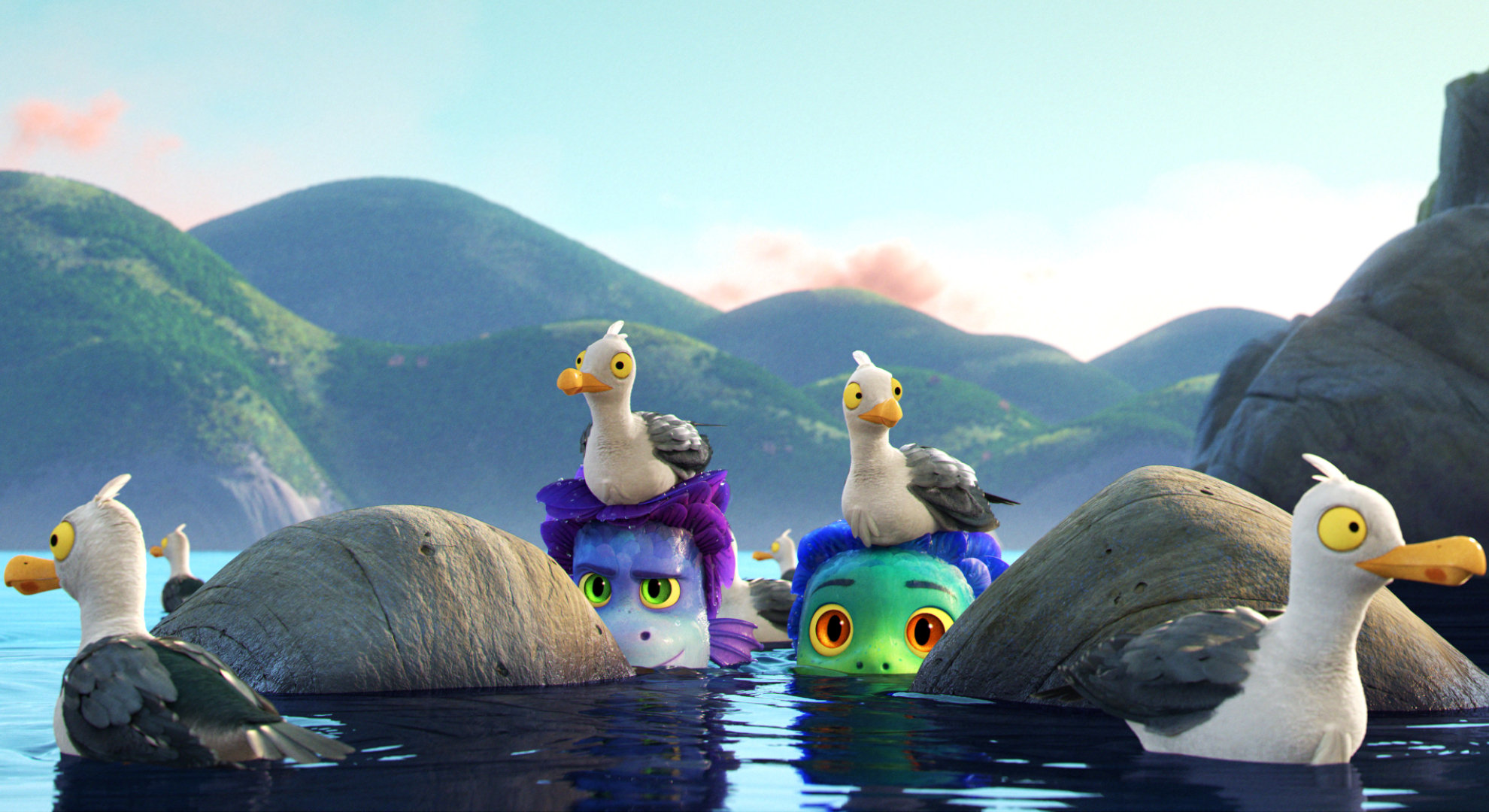
Throughout Luca, the water above the surface was so stylised, filmmakers ultimately created a look that Pixar had never done before. "It was a really involved process," says effects supervisor Jon Reisch. "We had to first find the look of the ocean, then decide how to push the stylisation of the water when it interacted with characters and with splashes." adds visual effects supervisor David Ryu, "We wanted to handcraft splashes that could be pasted on the simulated water surface." The lighting team tackled the look of the reflections on the surface of the water as well. "We tried to capture the simplified and sinuous shapes of the reflections that we found in Japanese woodblock prints," says director of photography Kim White.
The end result targets specific areas for detail. It's not supposed to look photoreal because it’s meant to be Luca's memory of the water versus actual water. Ryu says the effects and lighting teams had to figure out how to coerce a water surface into the desired shapes. "We wanted to create a more illustrative picture," he says. "That boiled down to building layers of stylised water looks. The effects and lighting teams developed a technique that would allow artists to control the detail in a reflection, allowing for a simpler, more stylised look."
"We also wanted to incorporate the patterns we see in the ocean due to wind or underwater formations," Ryu continues. "A patch of turbulent water here and a band of calm there – artists can use those elements as a compositional tool. Our team developed a few recipes – choppy water that pushes triangular shapes, calm water with curved shapes. We could paint big swaths in the frame like brush strokes to compose an ocean pattern."
This article was originally published in 3D World, the world's best-selling magazine for CG artists. Subscribe to 3D World.
Read more:

Thank you for reading 5 articles this month* Join now for unlimited access
Enjoy your first month for just £1 / $1 / €1
*Read 5 free articles per month without a subscription

Join now for unlimited access
Try first month for just £1 / $1 / €1

James has written about movies and popular culture since 2001. His books include Blue Eyed Cool: Paul Newman, Bodies in Heroic Motion: The Cinema of James Cameron, The Virgin Film Guide: Animated Films and The Year of the Geek. In addition to his books, James has written for magazines including 3D World and Imagine FX.
