The 15 biggest logo designs of 2016
From the controversial to the inspiring, we take a look back at the biggest logo designs of 2016.
2016 was the year of redesigns. From the controversial to the clever, brands took a gamble with flat design, colour and everything inbetween. Here we round-up the biggest logo designs of 2016. Let us know your favourite in the comments box below.
01. DELL
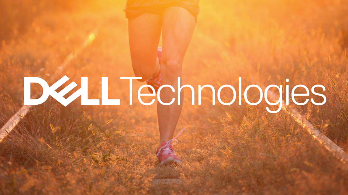
Created in partnership with strategy and design agency Brand Union, the Dell Technologies logo sees as subtle tweak to the existing Dell wordmark. Famous for its canted 'e', the Dell logo was an instantly recognisable design which Brand Union were keen to respect in their rebrand.
02. Taco Bell
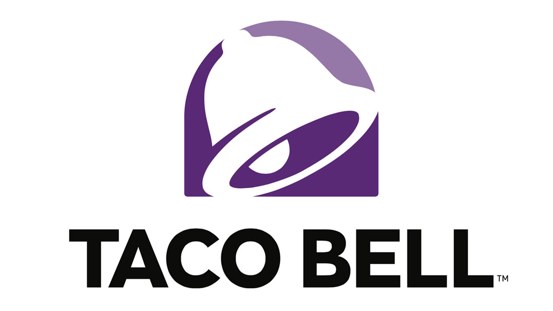
Developed by creative consultancy Lippincott and Taco Bell's internal design group, TBD, the revamped logo simplifies existing imagery in an attempt to connect with young diners.
Rather than creating something entirely originally, the new logo tweaks and streamlines the familiar bell image associated with the restaurant chain. Gone is the palette of gaudy blues, pinks and yellows which might have been trendy in the mid '90s, replaced instead with a regal purple complete with a subtle gradient shading.
03. Natwest
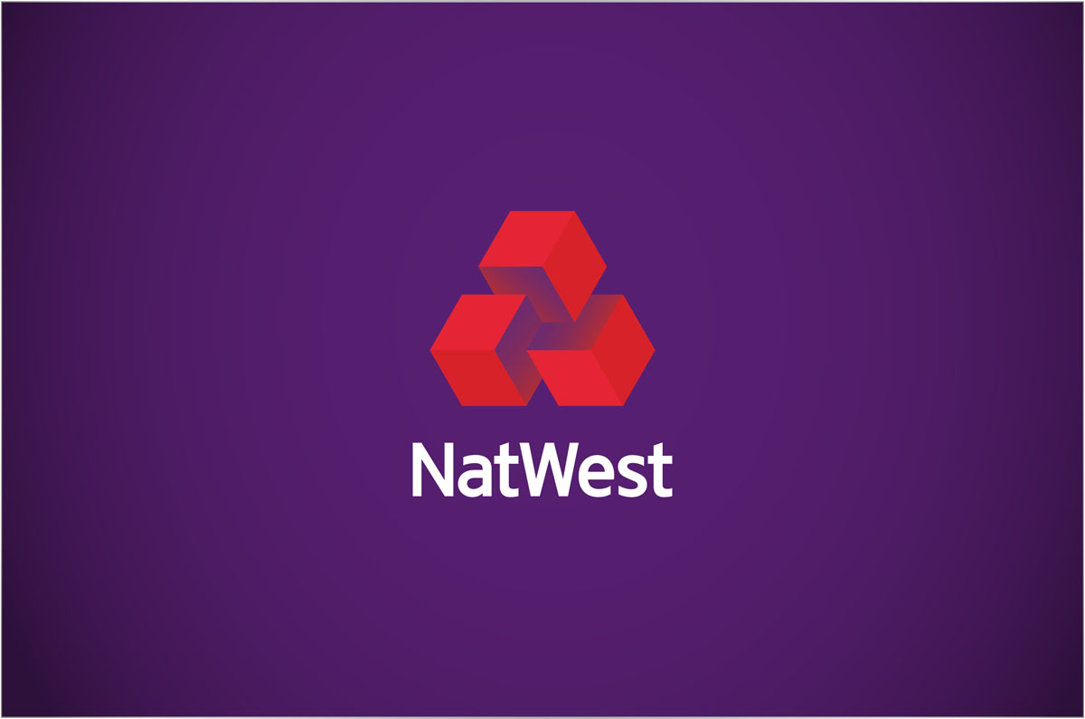
Made up of three interlocking cubes, the NatWest logo represents the coming together of the National Provincial Bank, Westminster Bank and District Bank. The cubes originally appeared in the company's 1968 brand guideline manual, and have formed the basis of the new graphic system.
- Also read: Why we should be wary of the retro trend
Creating an approachable and lively identity is no easy feat, especially when it comes to banking. However the team at Futurebrand are confident that the logo, along with vibrant illustrations and a unique 3D typeface, will create an engaging identity that will stand out both on the high street and online.
04. WeTransfer
Cloud-based file sharing service WeTransfer revealed its first new identity, website and logo design since launching back in 2009. Deciding to go back to basics and build up from scratch, the new identity sees the company drop the word 'transfer' from the logo and focus instead on refining the wordmark symbol.
Get the Creative Bloq Newsletter
Daily design news, reviews, how-tos and more, as picked by the editors.
The new logo retires the roots in the typeface that could be found in the previous design iteration. WeTransfer's in-house creative director Laszlito Kovacs began drafting concepts and ideas before working with Bold Monday's Paul van der Laan to hone the details. The result is a cute new logo which Thijs Remie, vide president of design at WeTransfer, says is "well-balanced and exudes its personality at a small size."
05. Kodak
To coincide with their return to the consumer products market, Kodak polished off their iconic camera-shutter logo design and waved goodbye to the rather uninspiring text based branding they introduced back in 2006. As well as featuring the instantly recognisable red and yellow colour scheme, this latest iteration of the Kodak logo also includes a new typeface and layout which calls to mind perforations found on the edges of old film stock.
06. Mastercard
Mastercard has gone back to basics with their latest logo redesign by Pentagram. The overlapping red and yellow circles form one of the most instantly recognisable logo designs in the world – and this recent update simply tightens the image to work for an increasingly digital landscape.
Whereas the previous iteration saw the colourful circles slotting together like a jigsaw, the new version sees them blending together like a Venn diagram and creating an orange section in between. This evolution of the design represents the simple and optimised services Mastercard offers.
07. Instagram
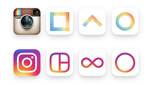
With over 400 million users, and 80 million photos and videos uploaded to the app every single day, Instagram's redesign is sure to cause a few waves in the online photography community. The company itself says it reflects how "vibrant and diverse your storytelling has become".
Gone too is the distinctive blue background, replaced instead with a crisp white. Instagram says this change hopes to put more focus on the user's photos and videos. "We wanted to create a look that would represent the community's full range of expression – past, present, and future," they added.
The new logo is the result of a redesign that has been in the works since last year. Instagram's supporting apps, including Boomerang, Layout and Hyperlapse, have all been given an overhaul with a similar colour scheme.
08. Guinness
Beer brands don't come more recognisable than the Guinness harp. So when it came to updating the black stuff's logo design, London firm Design Bridge had to tread a fine line between creating something new and staying true to the established look. But by moving away from the trend of flat designs they've created a contemporary logo that reflects the brand's history.
09. Co-op
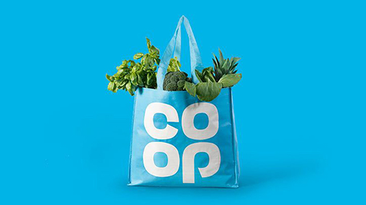
The Co-op has taken its identity back in time by reviving its distinctive clover-leaf logo design, which originally represented the brand from 1968. Created in collaboration with design studio North, the new identity proudly helps the chain go back to 'Being Co-op'.
North's founding partner Sean Perkins suggests that reprints of the NYCTA and NASA graphics standards manuals made the studio consider reviving the classic design. "It's a symbol and a wordmark and that's impossible to beat for a graphic designer. It's never dated," he explains.
10. Bing
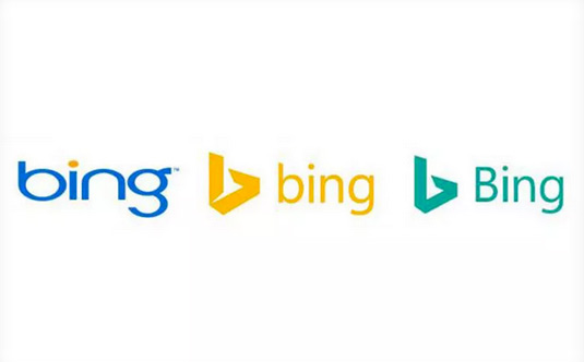
Building on the angular logo that was at the centre of its 2013 rebrand, this new design has an easier to read pine green palette paired with an upper case 'b' for the wordmark itself.
The polished design also reflects the improving performace of the search engine itself. "We expect Bing to continue to grow and are thrilled with our trajectory," says Rik van der Kooi, Microsoft's corporate VP of advertiser and publisher solutions.
"We are the only search engine that is experiencing steady, consistent growth and have increased our share for 26 consecutive quarters. And we’re not slowing down," he adds.
11. Gumtree

With one in four people in the UK using Gumtree at least once a month, it's important for the giant classifieds site to have a clear, simple brand image that cultivates an online community. Thanks to help from Koto, that's exactly what they've now got.
Its new site design and branding is based on three core principles: modern, simple and digital. "I think it had been very clear the previous logo had divided a lot of opinion," explains head of Koto James Greenfield. "They’d done a lot of consumer research and I think it’s fair to say that it wasn’t liked that much," he adds. "No one knew the reason Gumtree had started so the meaning had become quite lost.”
12. HP
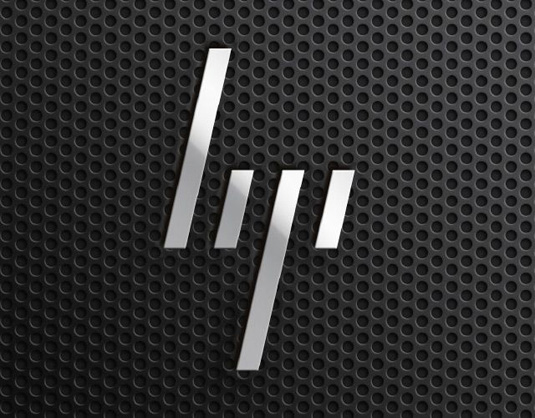
To set its high-end products apart from the rest, HP's premium laptops will be adorned with a minimalist new logo made up of four slanted lines. The sleek design was announced alongside the release of the ultra-thin Spectre 13 laptop, but the logo has taken five years to represent the brand.
Originally submitted in 2011 by Moving Brands, the not-so-new logo was apparently rejected by HP. However it seems time has caught up with the futuristic design and the rectangular creation will replace the traditional HP logo and script.
13. Premier League
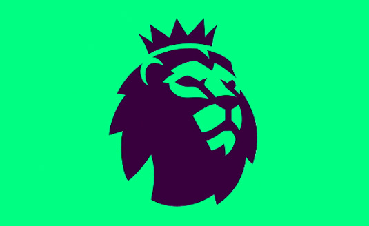
Created in collaboration with DesignStudio and Robin Brand Consultants the new logo was designed to reflect the Premier League's shift from title sponsorship. It's clean, crisp, and perfect for digital platforms.
14. Metropolitan Museum
Wolff Olins, the agency behind the controversial logo for the 2012 London Olympics were responsible for this rebrand.
The redesign kicks out the museum's previous logo, a monogram based on a 16th century woodcut by a collaborator of Leonardo da Vinci's, and replaces it with a bold typographic treatment that merges flare serifs together.
15. Uber
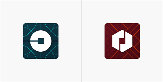
Controversially, the company removed the familiar 'U' element of the design (or knocked it on its side), just months after the largest tech brand in the world, Alphabet, made the 'G' a more prominent part of the Google logo.
Uber founder and CEO, Travis Kalanick, wrote on Uber's blog: "The old Uber was black and white, somewhat distant and cold.
"This belied what Uber actually is – a transportation network, woven into the fabric of cities and how they move. To bring out this human side – the atoms – we've added color and patterns."The team has spent months researching architecture, textiles, scenery, art, fashion, people and more to come up with authentic identities for the countries where Uber operates."
Related articles:

Thank you for reading 5 articles this month* Join now for unlimited access
Enjoy your first month for just £1 / $1 / €1
*Read 5 free articles per month without a subscription

Join now for unlimited access
Try first month for just £1 / $1 / €1

The Creative Bloq team is made up of a group of art and design enthusiasts, and has changed and evolved since Creative Bloq began back in 2012. The current website team consists of eight full-time members of staff: Editor Georgia Coggan, Deputy Editor Rosie Hilder, Ecommerce Editor Beren Neale, Senior News Editor Daniel Piper, Editor, Digital Art and 3D Ian Dean, Tech Reviews Editor Erlingur Einarsson, Ecommerce Writer Beth Nicholls and Staff Writer Natalie Fear, as well as a roster of freelancers from around the world. The ImagineFX magazine team also pitch in, ensuring that content from leading digital art publication ImagineFX is represented on Creative Bloq.
