Websites are a company’s main calling card – and for none more so than for creative agencies, which use them both to tell potential clients about their style and values, and to showcase exactly what they can do.
Of course, you can go too far down the latter road: feature too many flashy digital tricks and you risk making it difficult for people to find the information they’re looking for.
These agency websites, all new or newly redesigned for 2017, manage to strike the right balance between showing that they can innovate to provide original work and remaining accessible to potential customers – which is surely what every potential client will be looking for.
01. Johnson Banks
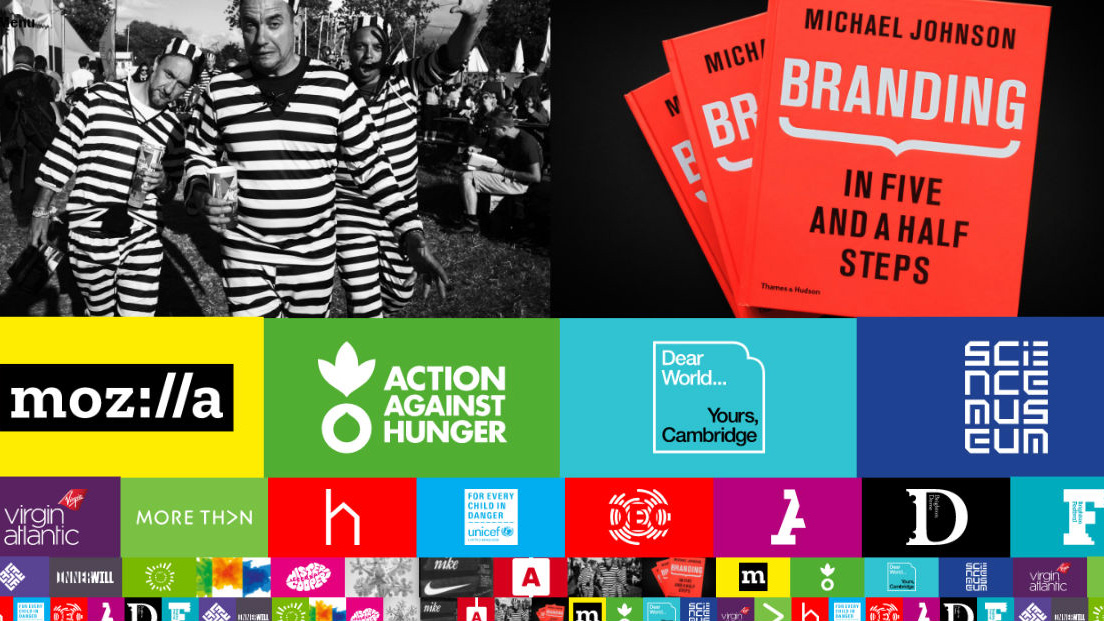
Founded by Michael Johnson in 1992, Johnson Banks is a relatively small London agency that nevertheless has garnered some huge clients and a stellar reputation. Specialising in visual identity and branding systems, and with a strong focus on the non-profit and charity sectors, it states that “We don’t just help brands change. We help them change the world.”
In April, it also changed the rules of how an agency website functions, with a new site created in collaboration with Bong International. The two things that hit you immediately are the eye-wateringly colourful design – which carefully straddles the line between stylish and gaudy – and the defiantly experimental scrolling system.
Pull the scrollbar down and the projects scroll across the screen rather than downwards. This seems to break one of the fundamental rules of usability: stick to what people know. But somehow, it’s so intuitive in use that it’s surprisingly delightful rather than annoying.
02. Ustwo
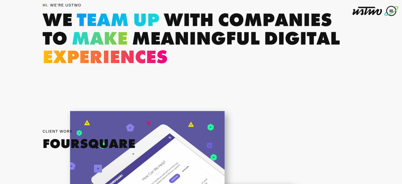
Ustwo is a global digital product studio with branches in New York, Malmö, London and Sydney. Like Johnson Banks, it made our 2016 list of the 30 best design studios, and for good reason. Founded by two best friends in 2004, the agency continues to bring a real sense of creativity and originality to its mobile games, apps and websites.
Get the Creative Bloq Newsletter
Daily design news, reviews, how-tos and more, as picked by the editors.
This May saw Ustwo launch a striking new website design, dominated by kaleidoscopic colours that seem to pop out of the screen. That mild sense of craziness, though, is balanced by a calming and measured use of whitespace, while extra interest is provided by cleverly positioned videos and oh-so-subtle use of transitions and animations.
A great showcase, then, for what Ustwo does best: creating fun, functional and attractive digital experiences.
03. Ueno

Founded in 2014, Ueno describes itself as a “full-service, all-singing, all-dancing, flame-haired, fun-loving, not-quite-bohemian agency, busy designing and building beautiful digital products, brands, and experiences.” With offices in San Francisco, New York, LA and Reykjavík, its clients include Airbnb, Medium, Lonely Planet, Google, Reuters and Dropbox.
What we love about its new website, launched this month, is its tongue-in-cheek sense of fun. So when the homepage loads, rather than a spectacular loading animation, we get a bathetic slice of text stating, drily, “Hi I’m preloader”. Then once you’ve scrolled down the first page, the footer is dominated by a series of ‘Meet the Team’ videos, where the staff are attacked by balloons, tennis balls and more, again with a cool sense of understated irony.
Sensibly, the site avoids going overboard with these quirky bits of comedy, and the presentation of the client work itself is beautifully composed, with some lovely flurries of subtle movement that you only catch out of the corner of your eye, and which are all the more effective for it.
04. Herman-Scheer
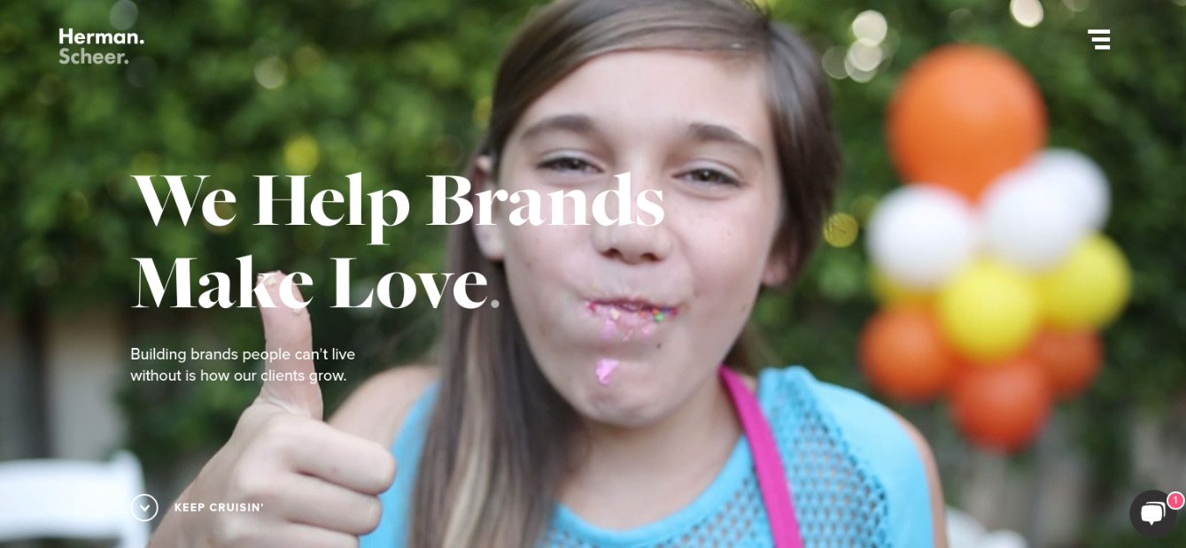
Founded in 2010, Herman-Scheer is a creative agency based in LA, specialising in branding, website design, video production and digital marketing. Or, in its own words, “a galvanized group of strategists, designers, developers, and writers with a contagious case of fire under the ass”.
This is clearly not a group of people, then, who communicate in an overly formal manner. And this casual style of talking like real people rather than business robots comes across clearly in its new website, launched in May.
For instance, the background video when you visit the homepage presents a series of real, relatable people rather than the airbrushed models you might expect. Also when you click on the ‘chat’ button out of office hours, you get a photo and message that sounds like it was written by a real person, not an automated chatbot... hurrah!
Want to become a client? Click through and you’re greeted with, “Let’s talk – who are you and how should we help?” Want a job? Their message is: “Hey, we should meet.” Getting the right brand voice in your microcopy can really boost conversion rates, and it looks like Herman-Scheer is doing everything right on that score here.
05. Random Studio
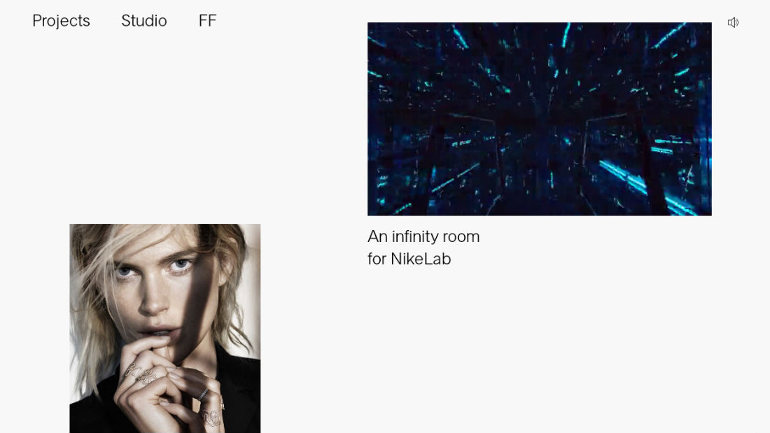
Random is an experience design studio based in Amsterdam with clients including Chanel, Tommy Hilfiger and Nike. Its staff are comprised of visual artists, strategists and engineers who constantly blur the boundaries between art, design and technology in new and interesting ways.
When you’re pushing at boundaries like this, you don’t want the design of your website to look dull. At the same time, you don’t want to move so far from convention that people find it difficult to use. With it new website, launched this month, Random has managed to strike the perfect balance.
The layout of projects is arty and contemporary, with generous use of whitespace providing a beautiful sense of flow, while the friendly typography and carefully sparing use of video make scrolling and clicking through to individual projects both alluring and addictive.
06. Norgram Studio
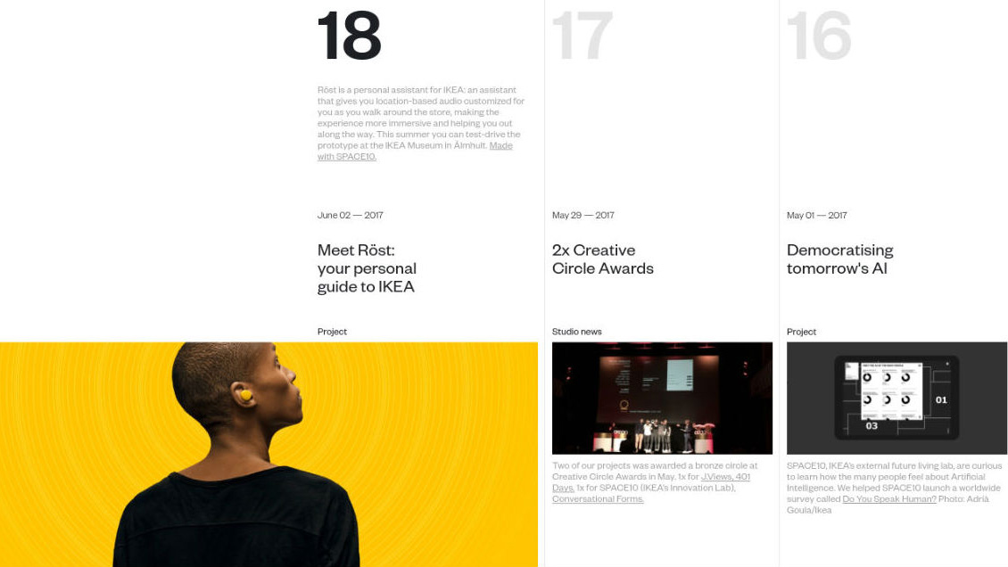
Norgram is a two-person Danish design studio consisting of award-winning design directors Sebastian Gram and Mathias Høst Normark. Founded in 2016, the duo are firmly focused on design collaborations and in progressing the next generation of digital brands and experiences. And their new website, launched in 2017, is also pretty innovative in its own right.
Design agency websites normally divide all the things they’ve been doing into different categories, so you have to click through a number of different sections to find out everything they've been up to. Norgram does away with all of that, and brings everything the agency has been up to, day by day, using a visual, horizontally scrolling calendar.
It’s beautifully put together, both in terms of aesthetics and its functionality. And it’s a device that would work well for any new agency with a range of diverse activities to talk about.
07. P22
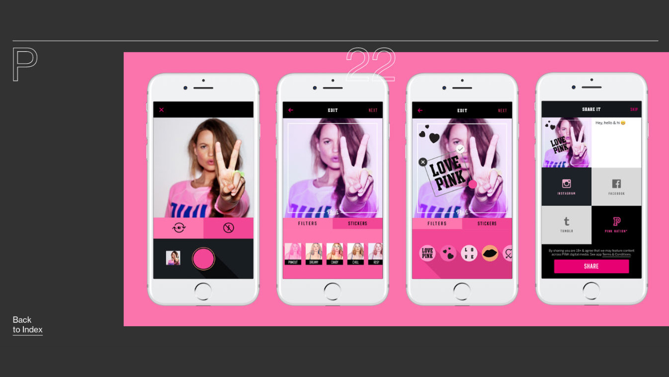
P22 is a product studio focusing on early-stage ideas. Founded in 2016, and with team members in New York, Sydney and Auckland, New Zealand, it produces its own innovative in-house ventures as well as working alongside other teams on theirs.
The way P22 Studios showcases its projects online is pretty innovative. At first glance, it’s all cool monochrome minimalism, with funky fonts and acres of laid-back whitespace. Hover over any of the projects, though, and you get an immediate, colourful full page-takeover of what’s to come when you click through.
In short, it’s not quite like anything we’ve seen before, and the effect is pretty darned cool.
08. Bukwild
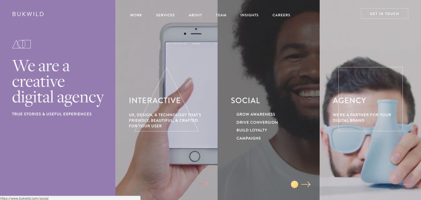
A digital creative agency founded in 2001 and based in Sacramento, California, Bukwild is another business that avoids business jargon and marketing speak like the plague. Its ‘About Me’ page, for instance, begins: “We talk to you like we talk to our friends. We tell the truth. No bullshit.” And that’s a spirit that continues throughout its new site, which was launched this April.
There are also some pretty jazzy transitions, web animations and little videos as you wander around the site. But it’s not about clever technology as such – more the clever and artful use of those technologies.
We love, for example, the way that line drawings of simple geometric shapes have been used as an organising design feature. This helps to make what is a potentially confusing mass of information and different services into a logical, aesthetically pleasing whole.
09. WONDR.io
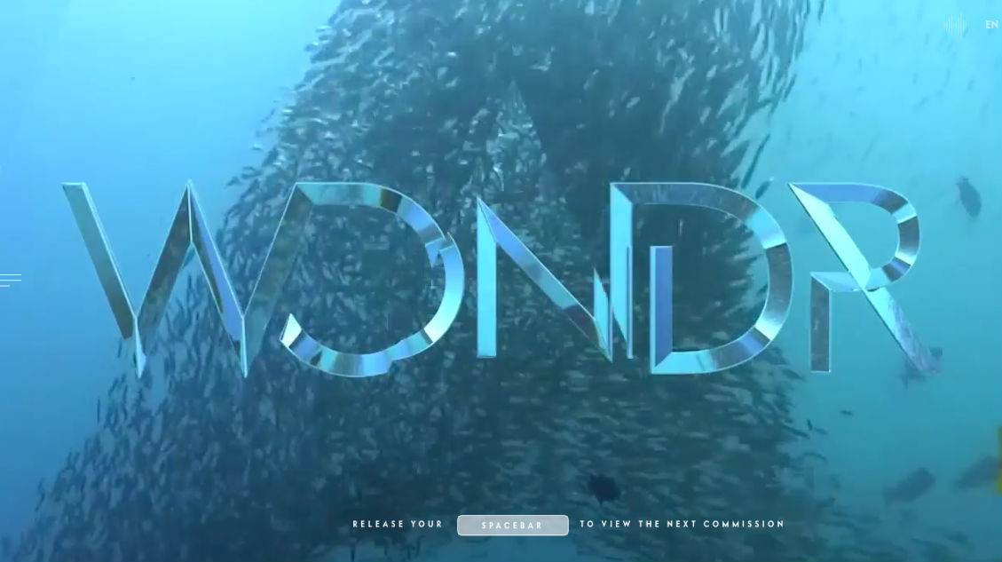
WONDR.io is a digital architecture and creative agency based in Dublin, Ireland. Founded by Dermot O'Shea and Sébastien Sicot in 2014, it launched a new website in March that feels more like a trailer for a blockbuster movie than a design agency.
If you want to see how far you can take cinema-quality graphics and video in the presentation of your work, then you need to head here (preferably on a high-powered desktop computer), and turn on the sound.
Admittedly, it’s a little disappointing that when you click through to individual projects, there are no case studies, just the websites themselves. But we’ll forgive the agency this once, because sometimes it’s just nice to see people push the boat out with something quite mesmerising and different.
10. Team Arnold
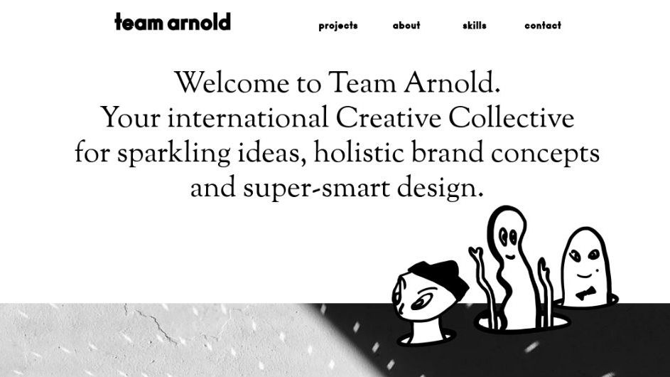
Team Arnold has ‘Team’ in its name for a reason. Rather than work within a traditional big company bureaucracy, Hamburg-based leader Melanie Arnold instead runs a global collective of freelance creatives, planners, consultants and producers.
The idea is that this structure offers a greater degree of flexibility to create the right team for each client. And Team Arnold’s new website, launched in May, does a lot to convey the appropriate sense of approachability and friendliness.
The cartoon figures and comic-style typography, the low-fi bursts of animation, the on-trend arty layout and the relaxed use of whitespace all suggest these are the kind of people that any hip young brand would want to work with. Not to mention the many other brands who’d like to be seen as a bit younger and hipper themselves.

Thank you for reading 5 articles this month* Join now for unlimited access
Enjoy your first month for just £1 / $1 / €1
*Read 5 free articles per month without a subscription

Join now for unlimited access
Try first month for just £1 / $1 / €1

Tom May is an award-winning journalist and editor specialising in design, photography and technology. Author of the Amazon #1 bestseller Great TED Talks: Creativity, published by Pavilion Books, Tom was previously editor of Professional Photography magazine, associate editor at Creative Bloq, and deputy editor at net magazine. Today, he is a regular contributor to Creative Bloq and its sister sites Digital Camera World, T3.com and Tech Radar. He also writes for Creative Boom and works on content marketing projects.
