A beginner's guide to shading theory
This introduction to shading theory teaches you the basics of shading simple shapes, and teaches you how to transfer these skills onto more complex references.
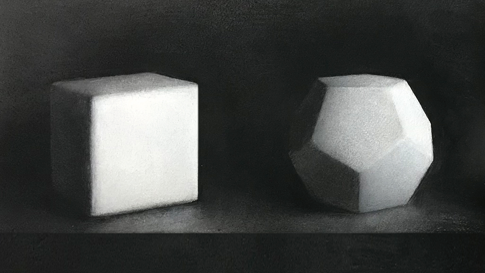
One of the most fascinating topics in any artist’s journey is shading. As artists we are always working with light and, as such, it will always be a fundamentally important topic of study. In fact, light is the only way we can see anything at all. A truly powerful understanding of light will inspire our audience and lend our work more majesty.
However, when approaching this topic it is easy to feel intimidated and overwhelmed as it can seem complex and hard to tackle. Most often this difficulty occurs because students attempt overly complex subjects without properly understanding the most fundamental and simple of forms. Often, knowledge of these forms is taken for granted.
Thankfully for us, the majority of the most taxing problems when it comes to shading can be solved with serious study of these simple shapes. Going through this study process is not to be underestimated.
As our understanding of these simple forms grows, our control over light will exponentially increase. The most simple of these forms are the cube and the sphere. Below, I have compiled a few applications, notes and tips that we can take into account from their study. For more tips and tricks, see Creative Bloq's roundup of how to draw tutorials, and also make sure you have the best pencils for the task.
01. Examine the cube
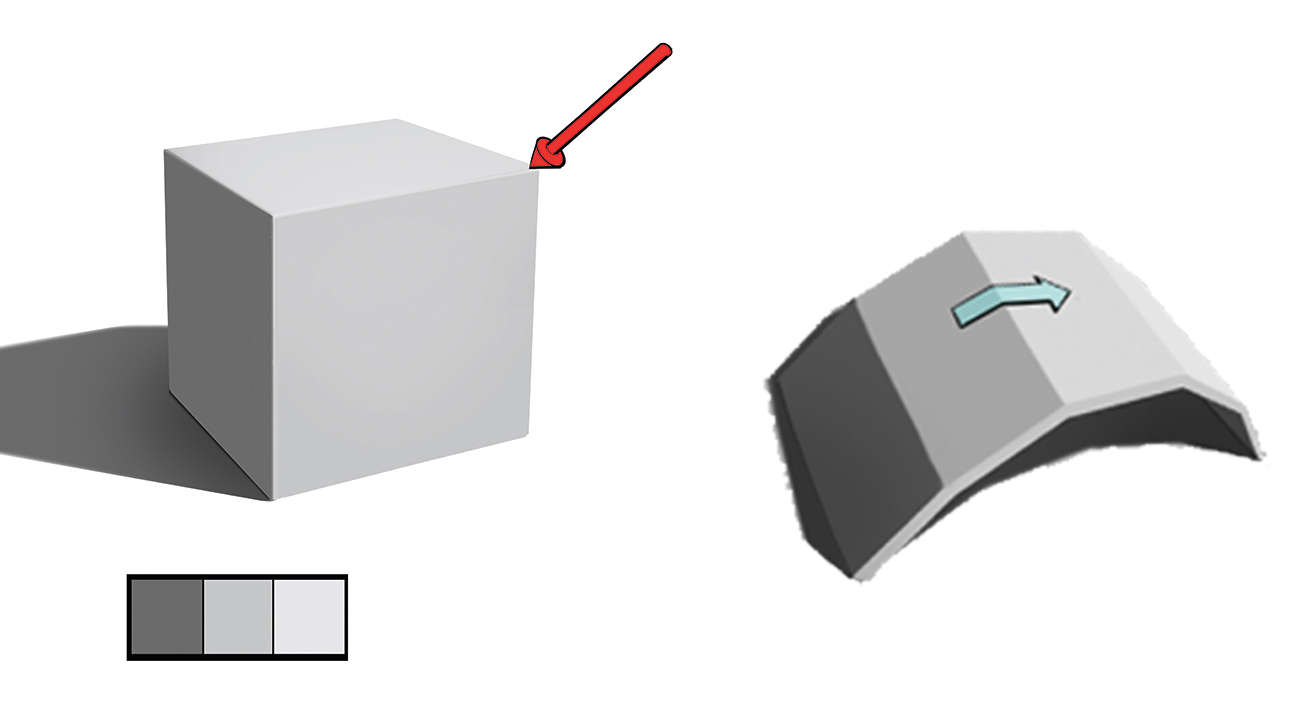
Starting with the cube, we can talk about the most fundamental idea in all of shading, the value of a plane will vary depending on its position relative to the light source. It will be at its lightest when facing the light source, and as the planes turn away from the source they will gradually become darker until finally falling into shadow when they are missed by the light.
This means that each plane will have a specific value relative to the light. This can broadly be stated as a plane change resulting in a value change on the shape.
The cube has three of these planes visible at any given time, which leads us to another lesson. These three planes will have three values associated with them, and this is the simplest way that any form can be represented and appear three-dimensional. This is called a ‘three-value’ read and every subject can be simplified down to it. So when tackling more complex subjects, always first approach them through their most simple three values before getting into more complexity.
02. Examine a sphere
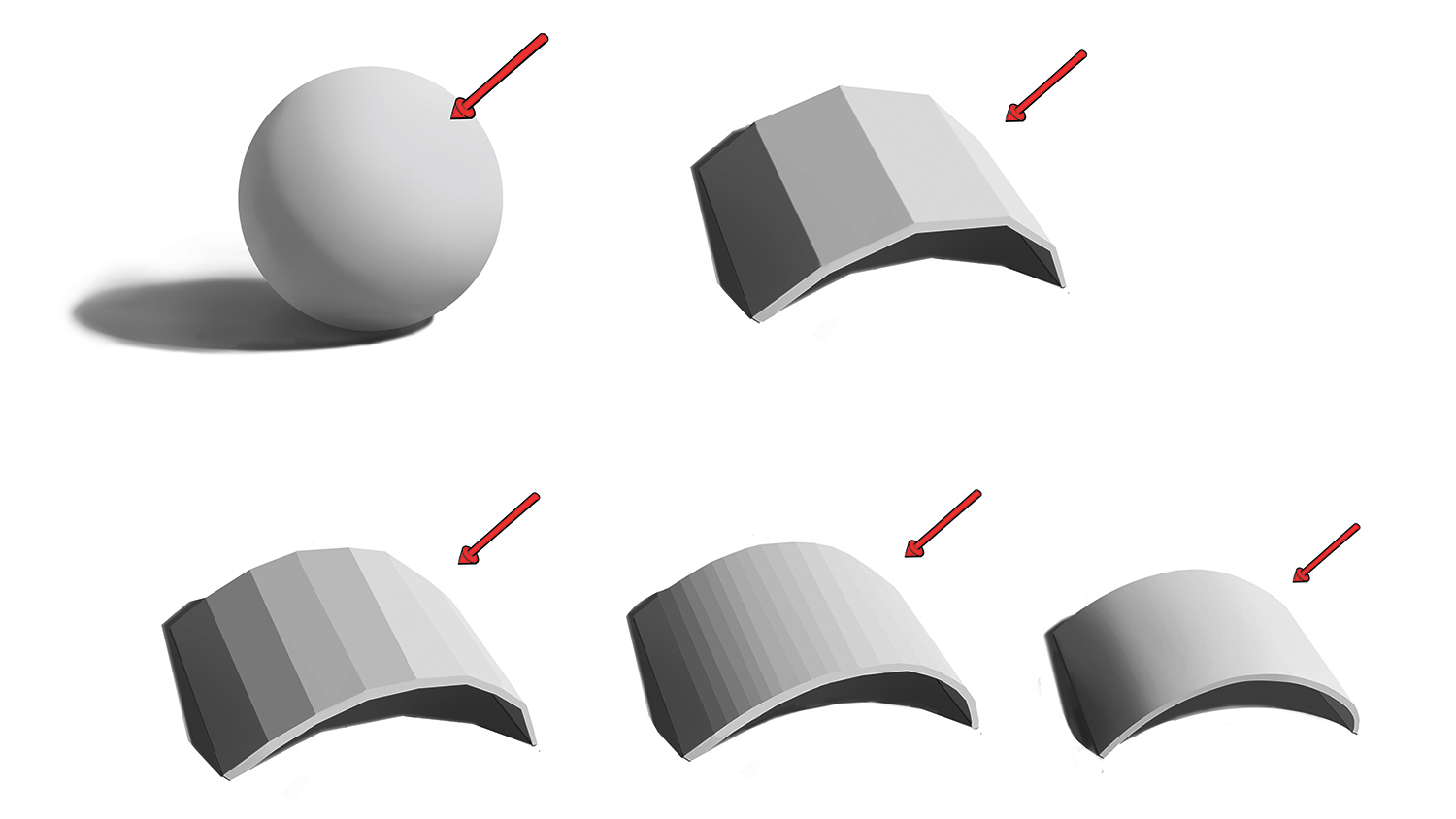
If we move on to the sphere with these lessons in mind we can learn more interesting ideas about the rounding of forms. While the appearance of a sphere may be considerably different from a cube, it fundamentally runs on the same basic idea. As its planes turn to the light they are lit more and lose value as they turn away.
If we examine for a moment a single strip of this sphere (seen above), we can begin to learn the fundamental difference that causes the appearance of roundness to the eye. As you can see, if I begin with the simplified three-value planar aspect of this strip and gradually increase the middle planes’ values, the appearance of more and more roundness gradually emerges.
This leads us to an important truth: rounded forms are truly the result of more and more planes. A perfectly round form would have infinite planes and be made up of infinite values, or a gradient of values.
While no forms in real life will quite match these two perfect forms, much of the complexity in shading lies between the dichotomy of how rounded or planar each object is. Exploring this will be of fundamental importance in all subjects. The fundamental lesson of the sphere is that how much it sways either way is truly a question of how many values lie between the light and the shade.
03. Think about value transfer
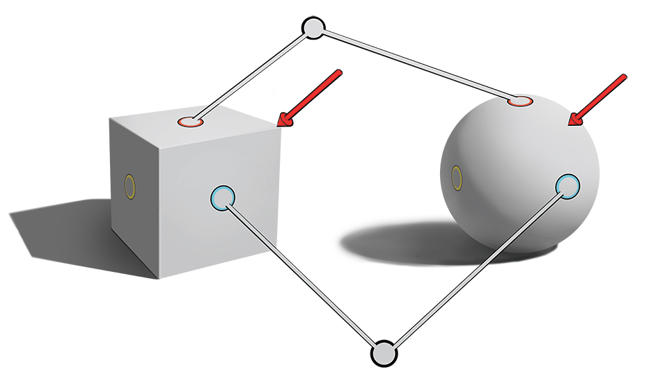
One of the useful relationships to understand about how the cube and sphere relate lies in how we can use the sphere to plan the lighting of each plane of the cube.
The sphere as a form contains every angle of plane possible for our eyes to see, since it turns away in every direction simultaneously. Since each plane’s value is a result of its orientation to the light and the sphere has each of these planes contained within it, we can transfer the value of any plane to the corresponding value on the cube (seen above).
The reason this is so useful for us is that, while the lighting on a cube and other planar objects may vary a lot and get quite confusing at times, the lighting on a sphere is relatively predictable and simple. There is so little variation in the lighting of spheres that each variation can easily be committed to memory.
The best thing about this method is that it works for almost any form. Once we have the lighting of the sphere clear in our minds, we can use this value transfer technique to light the planes on any form.
04. Understand planes and spheres
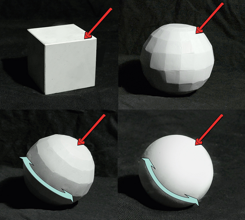
Another incredibly useful element to understand from these simple forms is how they contribute to the way tonal shapes are created on forms. This is most clearly seen if we use a planar version of our sphere.
As you can see on its left side, the shapes of the various values follow the shapes of its planes. This may seem like stating the obvious, but it is a profound effect of light. No matter how I rotate the light source around the cube, these shapes will never change fundamentally. They will merely change in value, getting lighter or darker, but their presented shapes will not change.
We can see that this is also the case for our more complex planar sphere when it is orientated away from the light. However, something interesting happens when we orientate this planar sphere directly to the light source. As you can see on its left, many of the planes take on exactly the same value and a series of concentric rings appear. The shapes are now organised to the light. This can only happen in one orientation for the planar sphere.
For the sphere proper, we see this same orientation of concentric rings of value organised to the light. Contrasting to the planar objects, the rings will form perpendicular to the light and their shape is entirely decided by the light’s position. The reason for this is that the sphere can be thought of as being orientated in all directions at once, given its shape.
This orientation that was special for the planar object is in fact commonplace for the sphere. What this leads us to is a useful idea about light shapes. The light shapes of the object are revealed in the planes, and the direction of the light by the rounded forms.
To put it simply, planes give shape, spheres give the light direction.
05. Apply knowledge to study reference
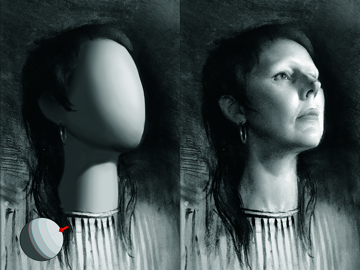
Of course, no object in the real world is so strictly and perfectly rounded or planar. Everything we will see in reality lies somewhere in between these two extremes. However, if we want to build a strong understanding of the reasons why lighting occurs the way it does, these become extremely useful lenses to look at objects through.
Next time you draw a reference, try to extrapolate out these two extremes, a faceted planar construction and a rounded version. Pictured here, you can see a version of this I made to understand this portraiture study. While this is incredibly useful for the human form, I also want you to realise this kind of study is bigger than that. It teaches the way light fundamentally works. Do it from any and all references you can think of and watch your own understanding grow!
06. Use the same exercise to change the reference
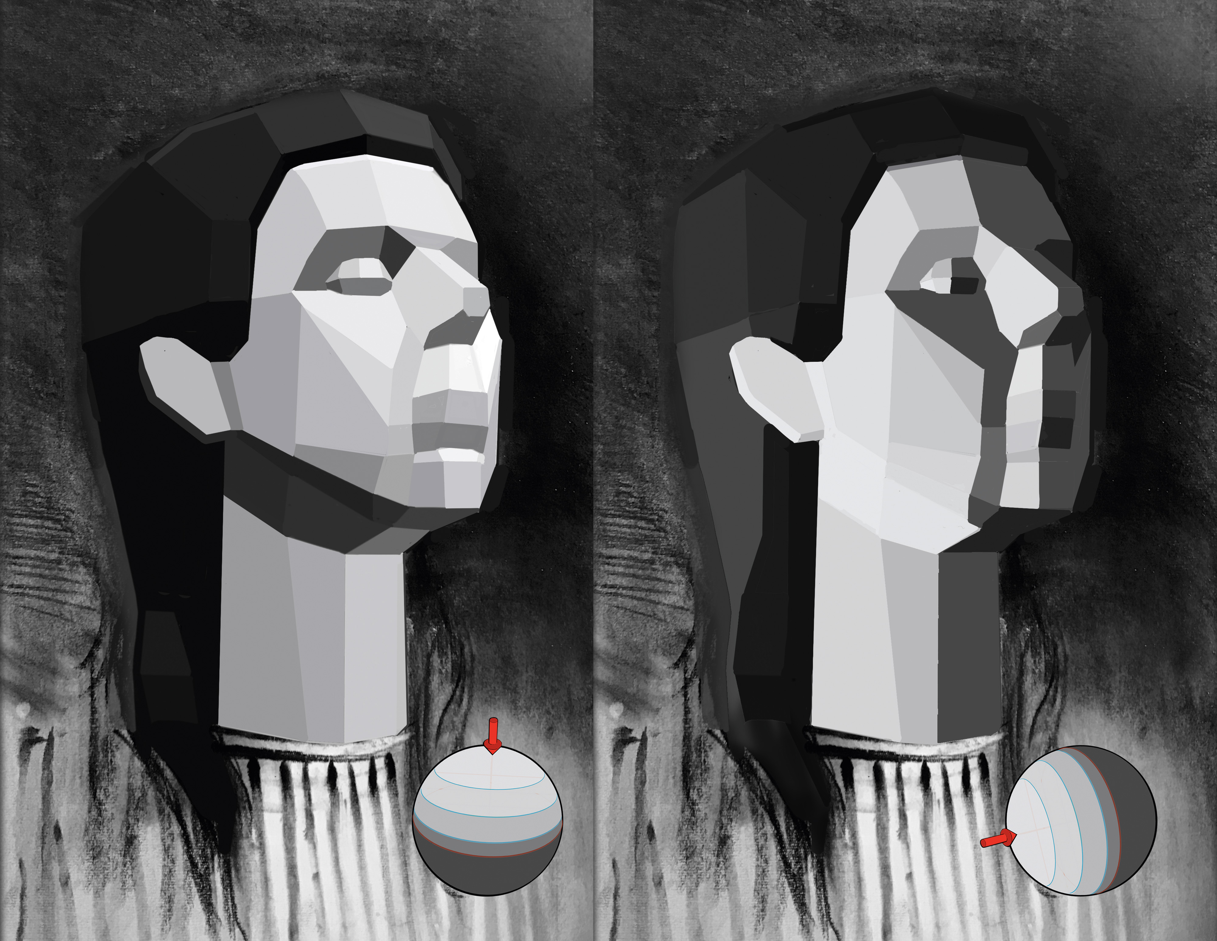
While this will make you much better at understanding and replicating reference, the true power of this exercise lies in its application to manipulating and inventing lighting on references and imaginary drawings. We want to move beyond merely being copying machines and be able to manipulate and invent lighting to our own creative ends.
The best way to take our first steps is to manipulate references using this method. Use a sphere to change the lighting direction, then use value transfer to create this lighting on your reference studies. See how many different moods you can evoke by moving the lighting.
Next, try using this method to apply lighting to your own invented paintings. Proper application can be the key to grounded, consistent light that will improve any painting.
This article originally appeared in ImagineFX magazine, the world's leading magazine for digital artists. Subscribe here.
Get the Creative Bloq Newsletter
Daily design news, reviews, how-tos and more, as picked by the editors.

Thank you for reading 5 articles this month* Join now for unlimited access
Enjoy your first month for just £1 / $1 / €1
*Read 5 free articles per month without a subscription

Join now for unlimited access
Try first month for just £1 / $1 / €1
Charlie Pickard is a classically trained fine artist and illustrator. Recently awarded the Philip de László Award for Excellence, Charlie continues to work, exhibit and teach out of his studio based in London.

