Serif vs sans serif in logo design
Decide between serif and sans-serif for your next logo design.
Your choice of typeface can have a significant impact on the look and feel of a logo design, as well as helping to define the personality of the brand in question. We’ve already explored the psychological impact that your choice of colour and shape can have, but when it comes to selecting a typeface to work with, there are two main choices: serif or sans-serif, see our serif vs sans-serif guide for the differences between them.
Over the last 15 years or so, sans-serif typefaces have dominated many sectors of branding, providing a bold, no-nonsense, clean and minimalist style. A glut of major corporations have gone ‘sans’ in their rebrands, from Gap to Google – although the former famously reverted to its serif predecessor in the face of universal criticism.
This is partly for aesthetic reasons, but also partly for practical reasons. Until fairly recently, serifs were difficult to render crisply at small sizes on digital screens, and legibility suffered.
With the proliferation of retina displays, this is less of a concern and brands can make typographical decisions on a more even playing field. And for certain brands, the heritage and confidence of a serif is becoming increasingly inviting.
Read on to discover six examples of brands that have made the choice, with varying levels of success – and what you can learn from them…
01. Google upgrades from serif to sans serif
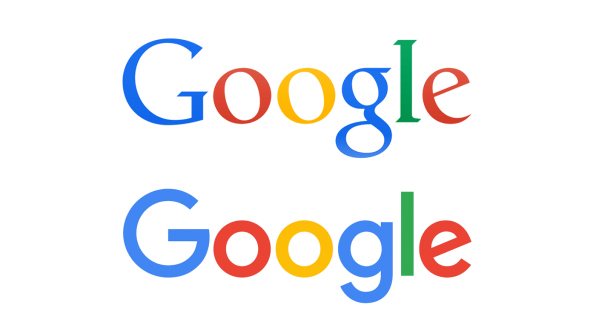
One of the most high-profile brands to ditch its distinctive serifs was Google in 2016, coinciding with the reveal of its new parent company, Alphabet.
It’s clean, versatile, and – taken in the context of the wider identity scheme – feels like a typographical reflection of the very real back-end evolution of the global tech giant.
Get the Creative Bloq Newsletter
Daily design news, reviews, how-tos and more, as picked by the editors.
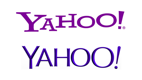
By contrast, the Yahoo! rebrand in 2013 – which removed the slab-serifs that had defined the brand since 1995, and had a 30-day build-up to ‘the big reveal’ - was widely criticised for putting style (or lack of it) over substance.
The lesson here? Always focus on the why, not just the what. Google is the master of combining minimalism with playful character, after all, and everything is there (or not there) for a reason.
02. Canon holds onto its edgy serif heritage
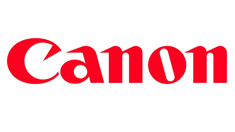
One of the most pronounced examples of serifs in the logo design world, the Canon logo has retained its serifs ever since the 1930s.
The inward-twisting serif on the C was particularly modern-looking for its time, and the razor-sharp serifs on the ‘a’ and ’n’ characters speak to values such as precision engineering and accuracy in a distinctive, timeless way.
Were Canon to have blindly followed the trend for shaving off serifs in favour of clean minimalism, it would have sacrificed all that heritage – and the flourishes also set its logo apart from closest rival Nikon's italicised sans-serif mark.
03. Calvin Klein puts the sans-serif caps lock on
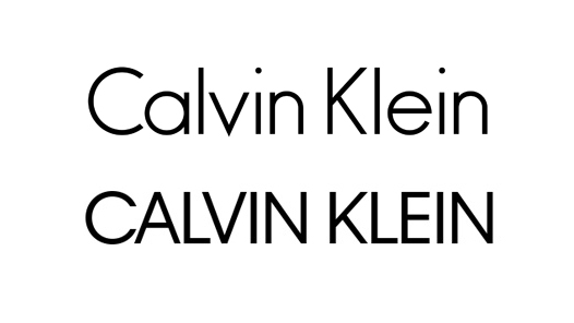
For many fashion brands, thin and stylish serifs are the epitome of class and sophistication. Gucci, Vera Wang, Giorgio Armani and Prada all sport them, for instance.
Calvin Klein has historically been one of the exceptions, and until recently also bucked the trend of sans-serif fashion rivals such as Dolce & Gabbana, Chanel and Louis Vuitton by being sentence-case in a sea of all-caps.
Its 2017 rebrand, a collaboration between CK's incoming creative director Raf Simons and Peter Saville, arguably lost that distinction by joining the world of upper-case sans serifs.
Historically, however, the brand has managed to embrace the best of both worlds by employing its slick serif ‘cK’ monogram alongside the main sans-serif logotype, so it doesn't have to be a binary choice.
04. Honda endures with a trustworthy slab-serif
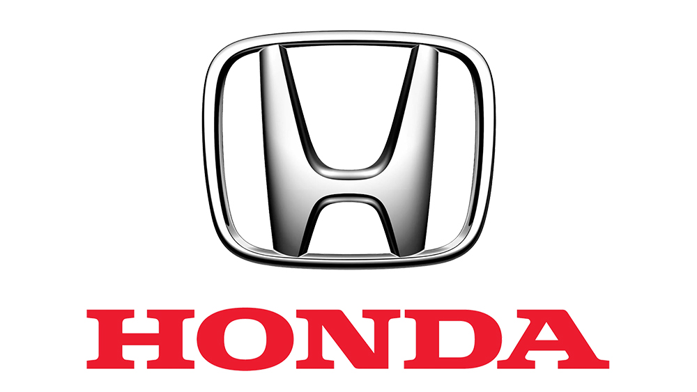
While many brands in the fashion sector benefit from the flourish of a serif, the automotive industry is largely dominated by blunt, functional sans-serifs that accompany brands' graphic badges.
One notable exception is Honda, which makes use of a bold, chunky slab-serif in its word mark that adds a sense of durability and trustworthiness, alongside the more dynamic curves of its badge.
The slab-serif was first introduced in the 1970s, when Honda had a wing graphic as part of its logo – and is an great example of typographic heritage that has endured even when the rest of the logo has evolved.
05. eBay’s sans serif is clean, simple and neutral
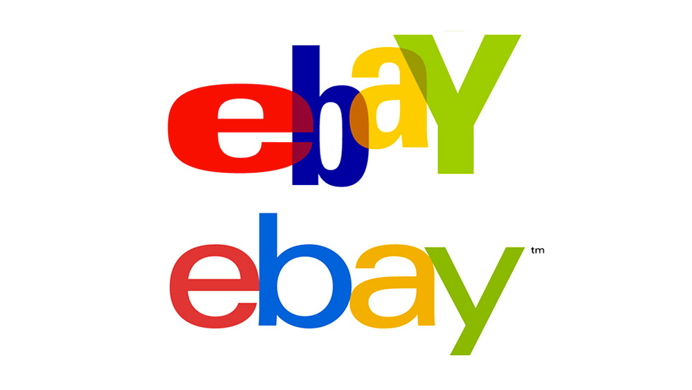
For its much-discussed 2012 rebrand, eBay retained its distinctive red, blue, yellow, green colour scheme, while swapping its eclectic overlapping mixed-case letters for a clean, uniform, sans-serif word mark.
eBay was certainly on-trend at the time – 2012 was also the year of Pentagram’s ultra-minimalist Microsoft sans-serif rebrand, after all.
But like some of the other examples on this list, Lippincott’s rebrand attracted its fair share of criticism for stripping out some of the much-loved brand’s personality, especially when compared with Google’s more versatile and better-executed brand toolkit.
06. HSBC establishes authority with its serif
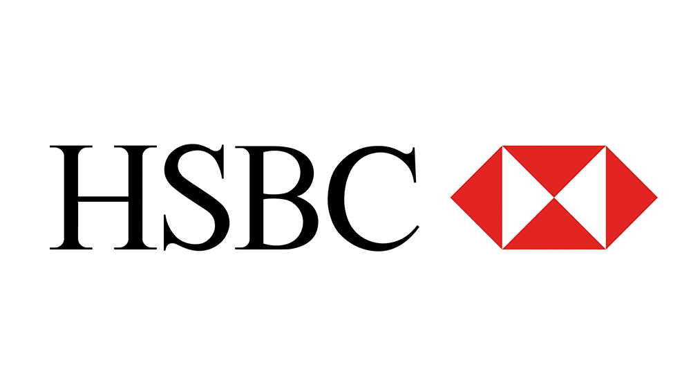
HSBC has clung to its traditional serif typeface in a market that’s filling up with challenger brands with a modern, friendly sans-serif tone such as First Direct and Virgin Money.
Lloyds rebranded with a more playful sans-serif in 2013 when it split from TSB, while Barclays only sports very subtle serifs, its letter terminals tapered to sharp points. For HSBC, they're crisply defined and defiantly old-school.
Although HSBC in its current form has only been in existence since the early ’90s, the upper-case serif of its word mark feels confident, authoritative and long-established, befitting of its roots in Shanghai in the 1860s.
Enter your best branding to the Brand Impact Awards
If you’ve already mastered the craft of branding, submit your best work to Computer Arts’ international awards scheme.
The Brand Impact Awards celebrate the very best branding work from all around the world. Deadline for 2017 entries is 9 June. Find out more at www.brandimpactawards.com.

Thank you for reading 5 articles this month* Join now for unlimited access
Enjoy your first month for just £1 / $1 / €1
*Read 5 free articles per month without a subscription

Join now for unlimited access
Try first month for just £1 / $1 / €1

Nick has worked with world-class agencies including Wolff Olins, Taxi Studio and Vault49 on brand storytelling, tone of voice and verbal strategy for global brands such as Virgin, TikTok, and Bite Back 2030. Nick launched the Brand Impact Awards in 2013 while editor of Computer Arts, and remains chair of judges. He's written for Creative Bloq on design and branding matters since the site's launch.
