Sculpt a dynamic creature pose
Discover how to sculpt a fantasy creature in pose from start to finish.
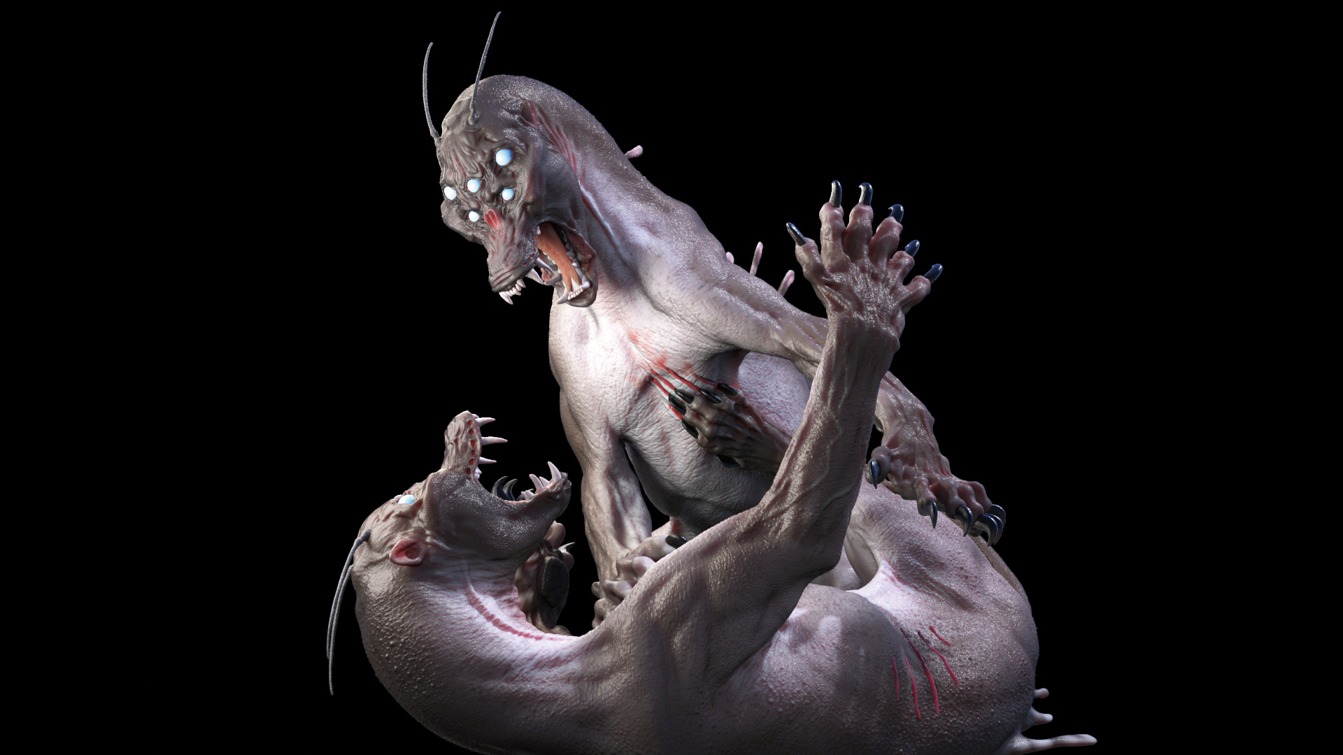
This 3d art tutorial is about sculpting believable creatures in a dynamic pose without symmetry. I know for a lot of people sculpting in pose is a scary proposition. I will try to break it down so it is not so daunting and hopefully you’ll find it’s something that you might actually like to do!
Why sculpt in pose? I think you get a better feel for the piece, instead of trying to fight a t-pose into shape, you can get more nuanced. I think all digital sculptors should do some in-pose pieces every now and then just to keep up their skills. I know from personal experience I get lazy when I use symmetry too often, my skills start to atrophy.
The competition for quality jobs is getting tougher so any way you can stand out from the crowd can’t hurt
The competition for quality jobs is also getting tougher so any way you can stand out from the crowd can’t hurt. I also almost never use layers; I try and keep the process as much like traditional clay as possible, which means extensive use of DynaMesh.
Using this piece, that was made from scratch for this tutorial, I will focus mainly on anatomy and pose. Coming from a traditional background, sculpting in pose is natural to me: I know it might be frustrating for some of you who don’t have that kind of background, but keep trying as it’ll get easier each time.
Gathering reference and learning anatomy can help ease you into sculpting in pose. I use my anatomy books as reference for this tutorial. Even though we are creating a made-up creature, understanding anatomy is essential for believability. I also look at YouTube for reference of animals fighting and posing, to ensure I get an accurate model.
01. Zsphere armature
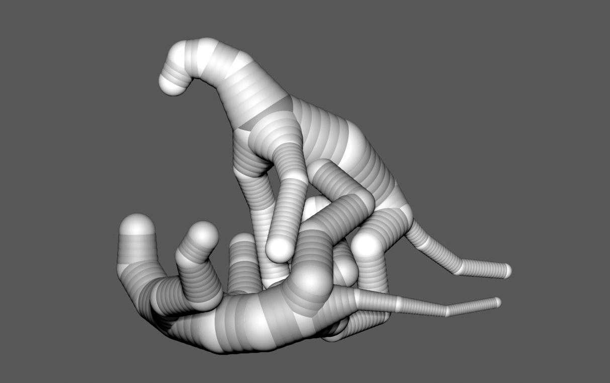
I tend to use Zspheres to start sculptures as it gives me more control than the ZBrush mannequin or static pose models, and it’s the closest thing to building an armature for a clay piece. Keep the Zspheres basic, we’re not worried about mass or form at this point. Focus on working on the interaction between the animals, getting the feel and energy – does it have movement and a natural flow making sure it doesn’t look stiff or forced?
02. Blocking in basic forms
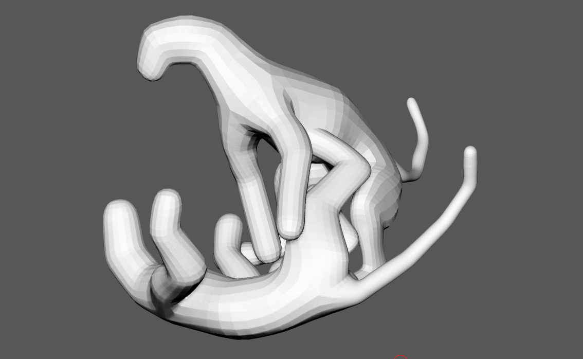
When I have the basic pose down, I convert the Zspheres into polymeshes by clicking the Make Polymesh3d button in the Tool menu. At this point the mesh has different polygroups, which could be problematic later on in the process, so I merge each sculpture into one polygroup using Ctrl+W (or under Polygroups, click Auto Groups). Finally, I then DynaMesh to about 20 to 30 thousand polygons; just enough to build forms.
Get the Creative Bloq Newsletter
Daily design news, reviews, how-tos and more, as picked by the editors.
03. Building mass
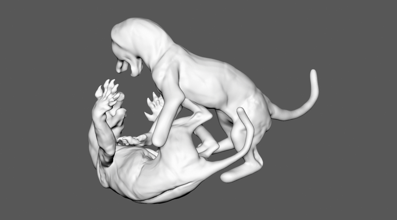
I now start to block in the forms and basic masses always thinking of the anatomy that’s creating them. My brushes at this point are the Move Topological, Inflate and Clay brush. Before I start using my brushes, one tweak I do is go to the Stroke menu and click Modifiers and change Roll Distance to about 3.5, this smooths out your strokes. I also turn off LazyMouse at this point. I will turn it back on occasionally as the piece progresses.
04. Develop the face
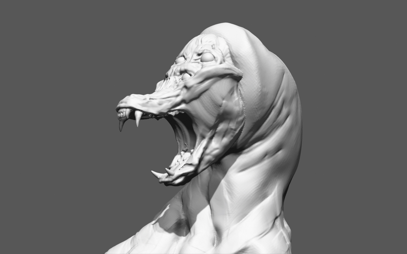
I sculpt a head separately from the body so I don’t have to keep DynaMeshing the whole piece. For speed, I have Symmetry turned on at the start. I sculpt faces with Symmetry on and then turn it off when I’m about half or three quarters of the way through. I go through five iterations before deciding on a face I like, and then I transfer it onto the body. At this point, I keep sculpting without the Symmetry so it feels more natural.
05. Keep creating shapes
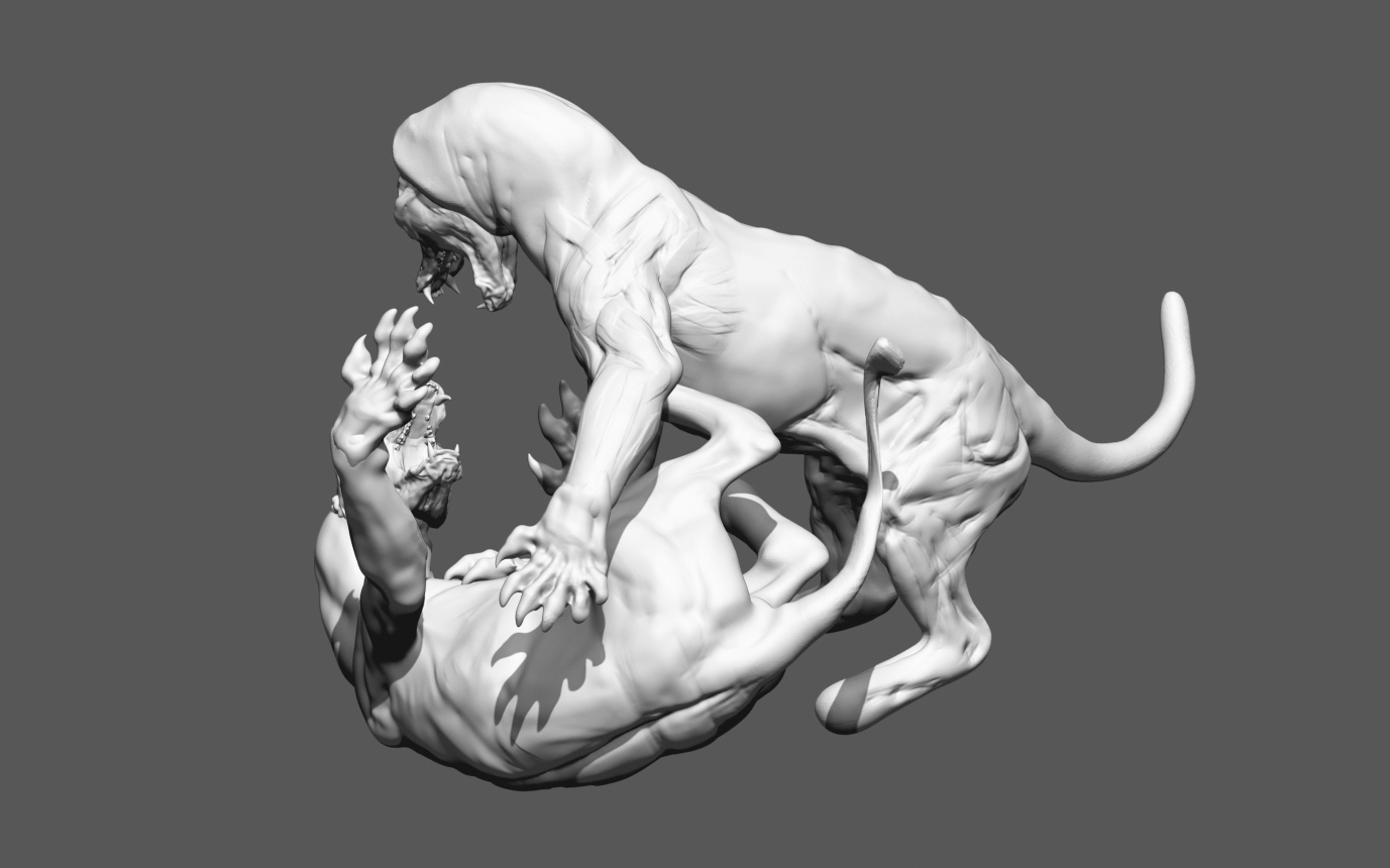
I continue refining the piece, moving it to check angles: moving legs, necks and whatever needs to be changed. I regularly use DynaMesh when my polygons get too stretched. I’m constantly changing things at this point; if I have an area that’s starting to look okay, but it needs to be moved for the sake of the overall piece, I don’t have a problem trashing it and starting over. I use Masking along with the Rotate, Move and Scale buttons to move parts around.
06. The silhouette is key
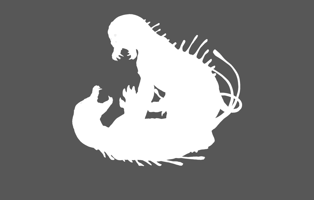
I use the ClayTubes brush and incorporate the Standard brush (I change Roll Distance and turn off LazyMouse). I’m still not too worried about the details, I’m more concerned with overall shapes. I start thinking about the sculpture’s silhouette. Why is the silhouette important? It’s the first thing the eye reads when you look at the piece. The overall shape will become increasingly important as the piece progresses, so it’s good to think about it at this stage.
07. Deciding on the musculature for your creature
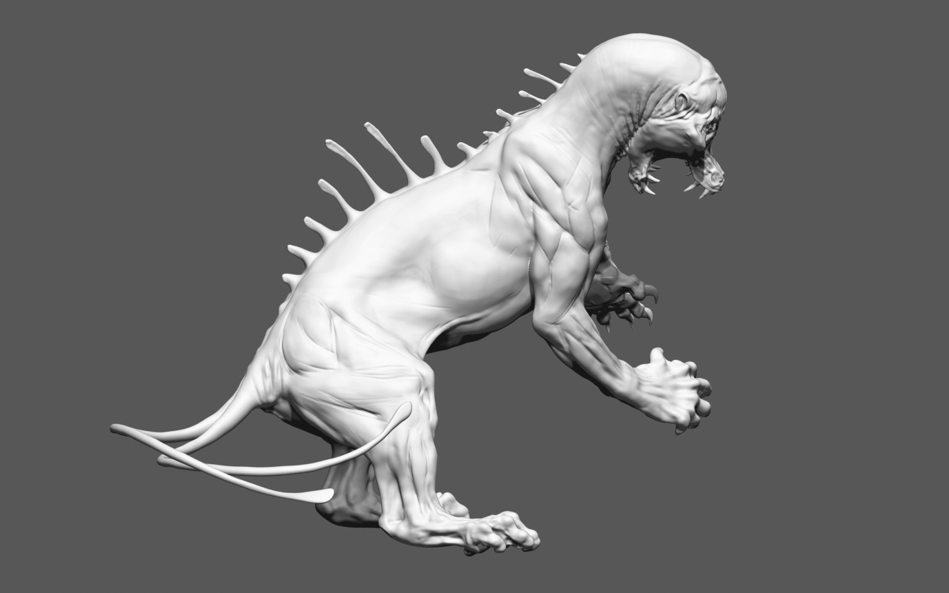
Now I start to think more about the musculature and the bony landmarks of the creatures. The bony landmarks are things like the knees, elbows, iliac crest, point of hip and hock. However, since we are creating a fantasy creature your anatomy does not need to be exact to any animal, but it needs to make sense. If you plan on straying far from existing anatomy I suggest you have a firm grip on anatomy in general or things could get out of hand fast.
Having a deep understanding of where muscles connect, for example, insertions and origins, is very important. I recommend An Atlas of Animal Anatomy for Artists and Animal Anatomy for Artists, by Eliot Goldfinger. (You can build your library from there.) So, it’s time to start sculpting muscle: I start to scribe in basic muscle and bone forms using a Standard brush I modified with Alpha 39 and change Focal Shift to sharpen the point a little bit.
08. Refining musculature
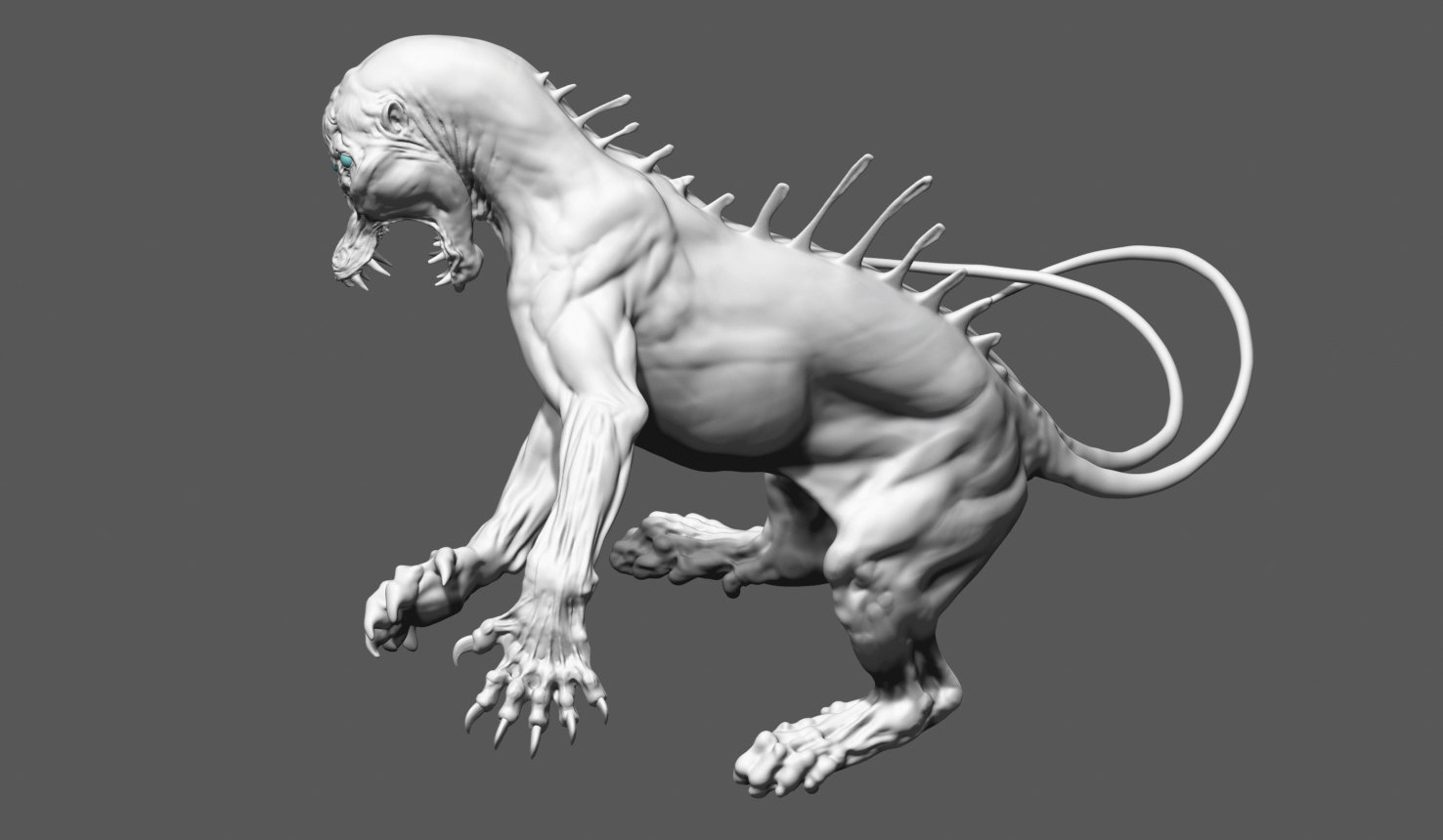
Continue to refine the sculpt. You should concentrate on the placement of the muscle and the transitions between the muscle groups. I also measure the legs, wrists and paws to see if they are the same lengths and sizes. Use the Move tool and drag it over the area you wish to measure; it shows the length in units on the upper left of screen. I also put a flexible clear plastic ruler up to screen, I know it’s archaic, but it works for me.
09. Adding the textures
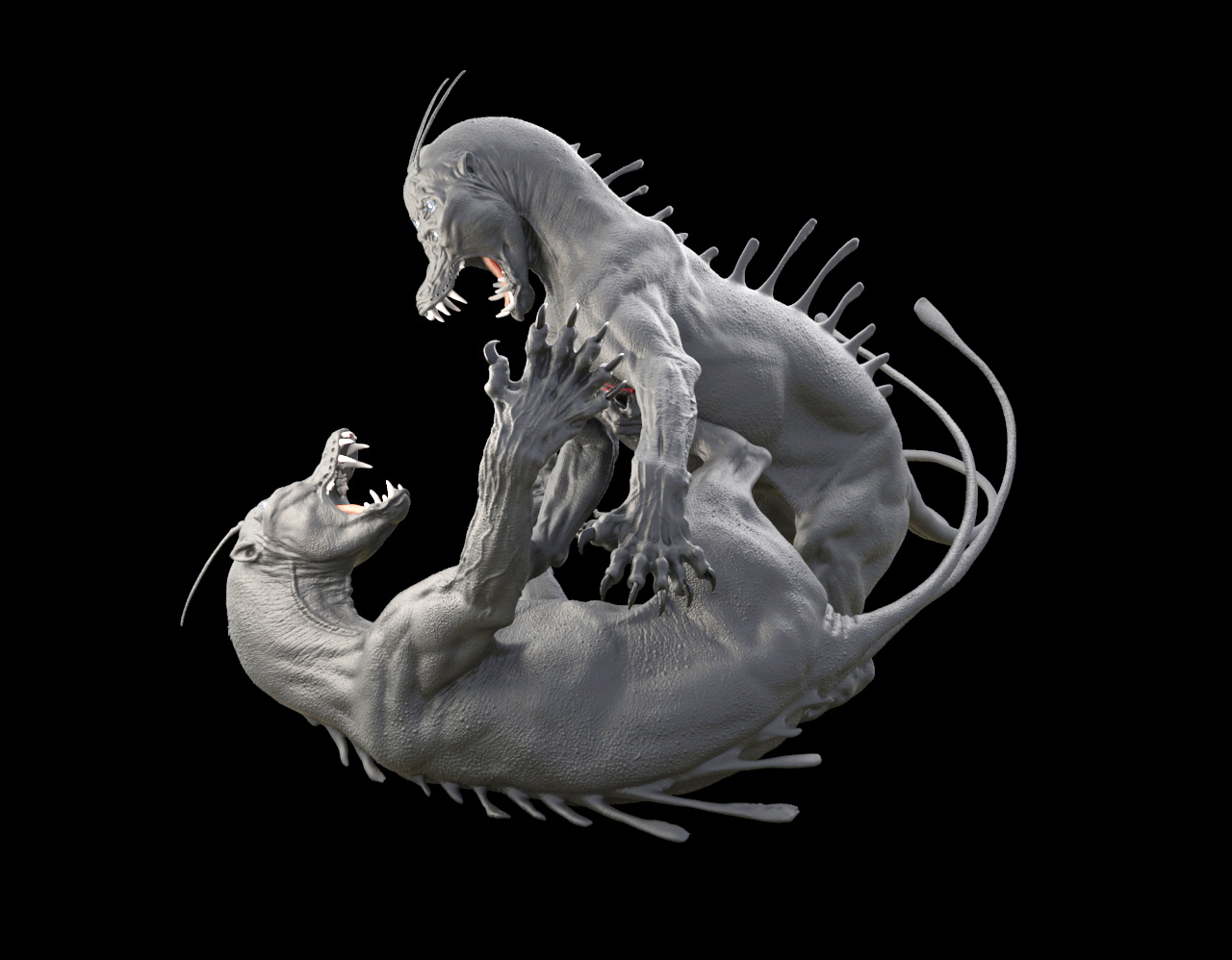
Now that I have a basic form, I start adding texture. For this piece, I use alphas and work with the damStandard and ClayTubes brush. The alphas I use are mostly right out of the box, so to speak, you can find them on the Pixologic site. I go back and forth between the different alphas using DragRect stroke and Spray. As a tip, I use the Layer brush for my alphas as it flattens out the alpha.
10. Overall refining
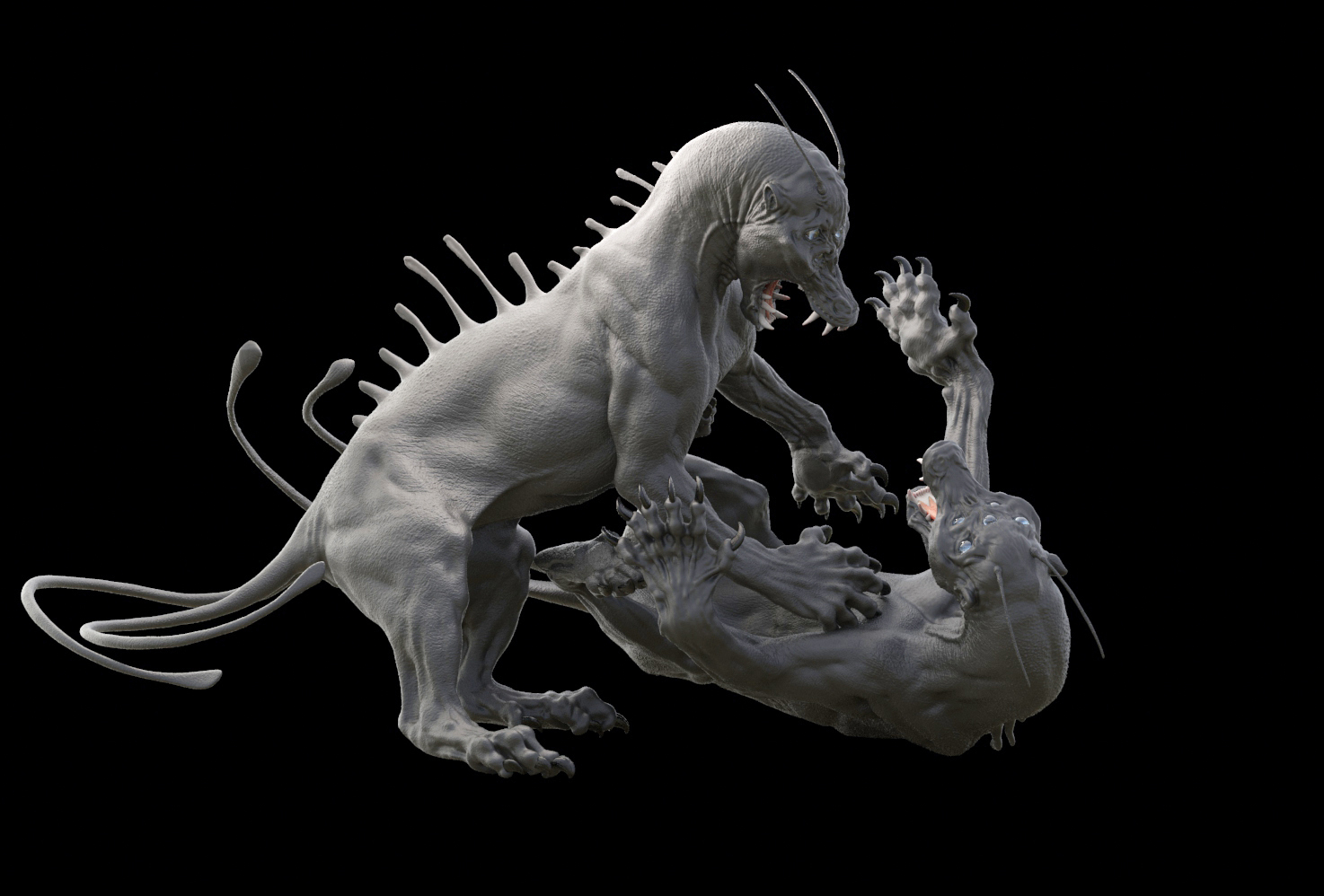
I continue refining the forms. I basically rinse and repeat all the above instructions over and over again until I get to a point where it’s acceptable to me. This is a thankless task as you’re simply working and reworking the same workflow until the sculpt slowly takes shape. Having an idea of your end goal really helps here. For example, I want it to feel like there is real skin, and bone and muscle with blood pumping through these creatures.
11. Adding colour
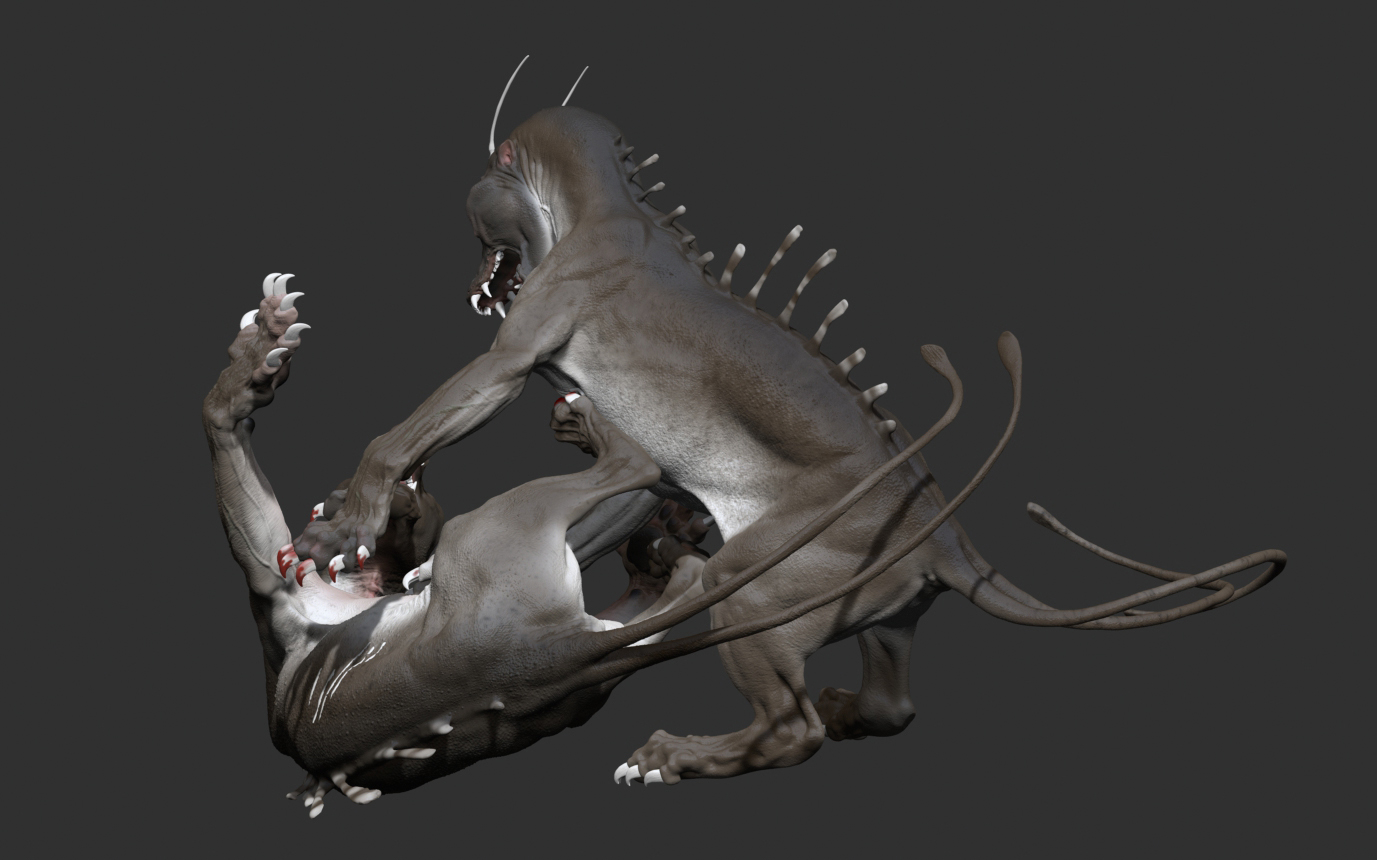
With the sculpt and pose set, it’s now time to add colour and bring the whole project to life. I want to keep the colour palette muted for this piece so it doesn’t distract from all of the sculpting work. I want to be able to see the marks, muscle forms and textures on both of the creatures here. I like the two-tone with speckles fading into the darker area as this reminds me of an eel with the shiny specular highlights.
12. Render in KeyShot
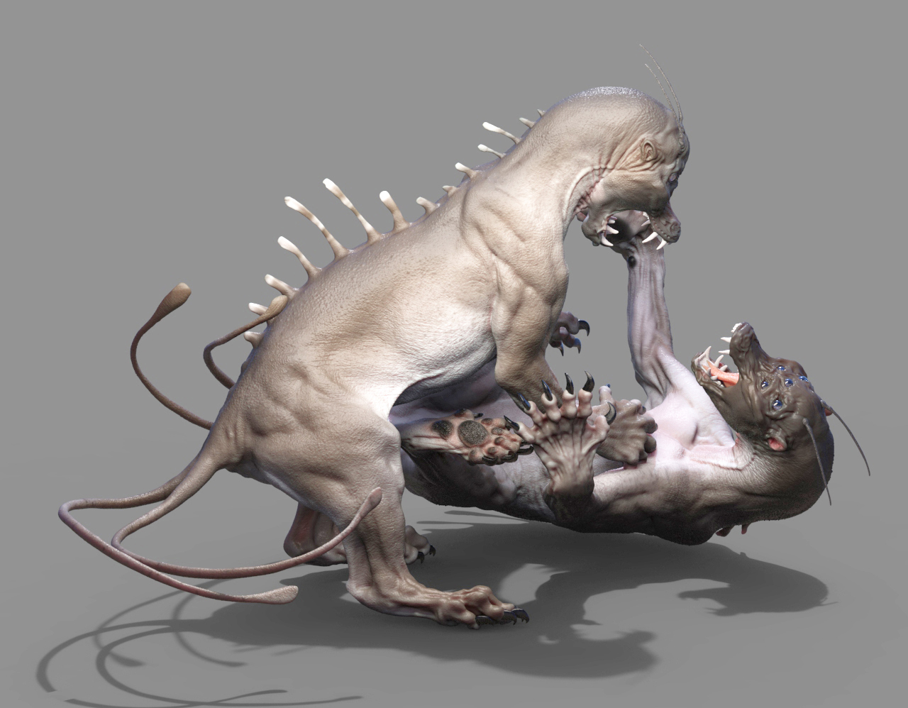
KeyShot for ZBrush can handle much higher polycounts than other renderers, so I use it here. I simply experiment with the sliders until I get something I like. The Human Skin Material can be very versatile; I use it for a lot of things. Here I use it for tongue, skin and teeth. I try something new for lighting; I use blobs for lights since you can create a light out of any object. The environment I use is in Outdoor and is called hdri-locations_urban_4k.
13. Tweaks in Photoshop
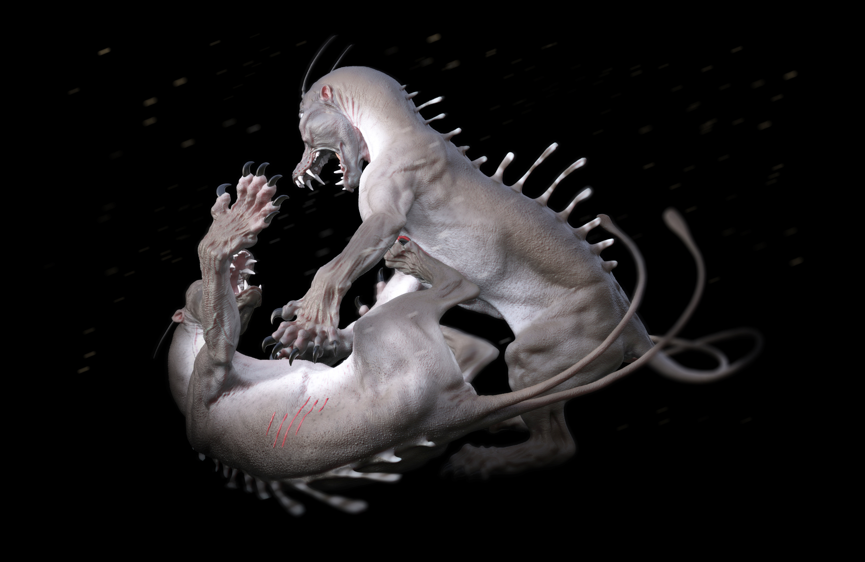
I use Photoshop minimally in this project; I just use it to create some slight depth of field and use the Color Overlay layer to enhance the image. KeyShot does have several advanced camera settings for fine-tuning the appearance of your visuals, and while you could do these simple adjustments in KeyShot, it can take a long time; sometimes it’s quicker and easier to fake it in Photoshop.
This article was originally published in 3D World magazine issue 209. Buy it here.

Thank you for reading 5 articles this month* Join now for unlimited access
Enjoy your first month for just £1 / $1 / €1
*Read 5 free articles per month without a subscription

Join now for unlimited access
Try first month for just £1 / $1 / €1
