How to revitalise your old art using the XPPEN Artist Pro 16 (Gen 2) and Photoshop
Put your art skills to the test by vamping up an old piece of art with new equipment.
As artists, it’s common practice to branch out and explore different avenues and equipment. I’ve always been a fan of both digital art and traditional painting, but each avenue has its limits. I was lucky enough to get an advance look at the brand new XPPEN Artist Pro 16 (Gen 2), and I thought this was the perfect time to combine my love for both digital and traditional art to create a truly unique piece – and I’m going to take you along for the journey!
XPPEN is a big name in the digital art world; rivalling other brands like Wacom and Apple when it comes to quality. Alongside fantastic tech, XPPEN is also notably considered one of the more affordable alternatives on the pen and display tablet market. This makes it great for both new artists and pros looking for a high-end product that won’t break the bank.
I’ve been using various brands of digital art products for a few years now, but when it comes to ease of use and quality for money there’s no arguing that XPPEN consistently impresses. It’s no wonder the brand sits in our top three choices for the best budget drawing tablets.
1. Getting started
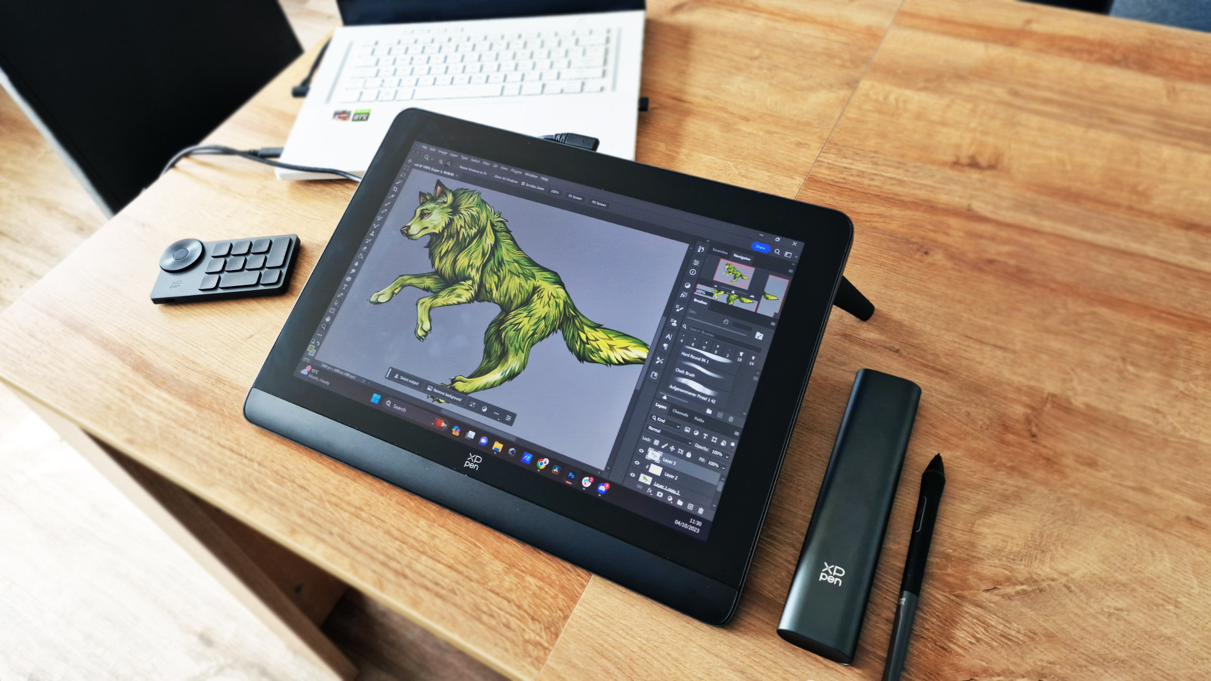
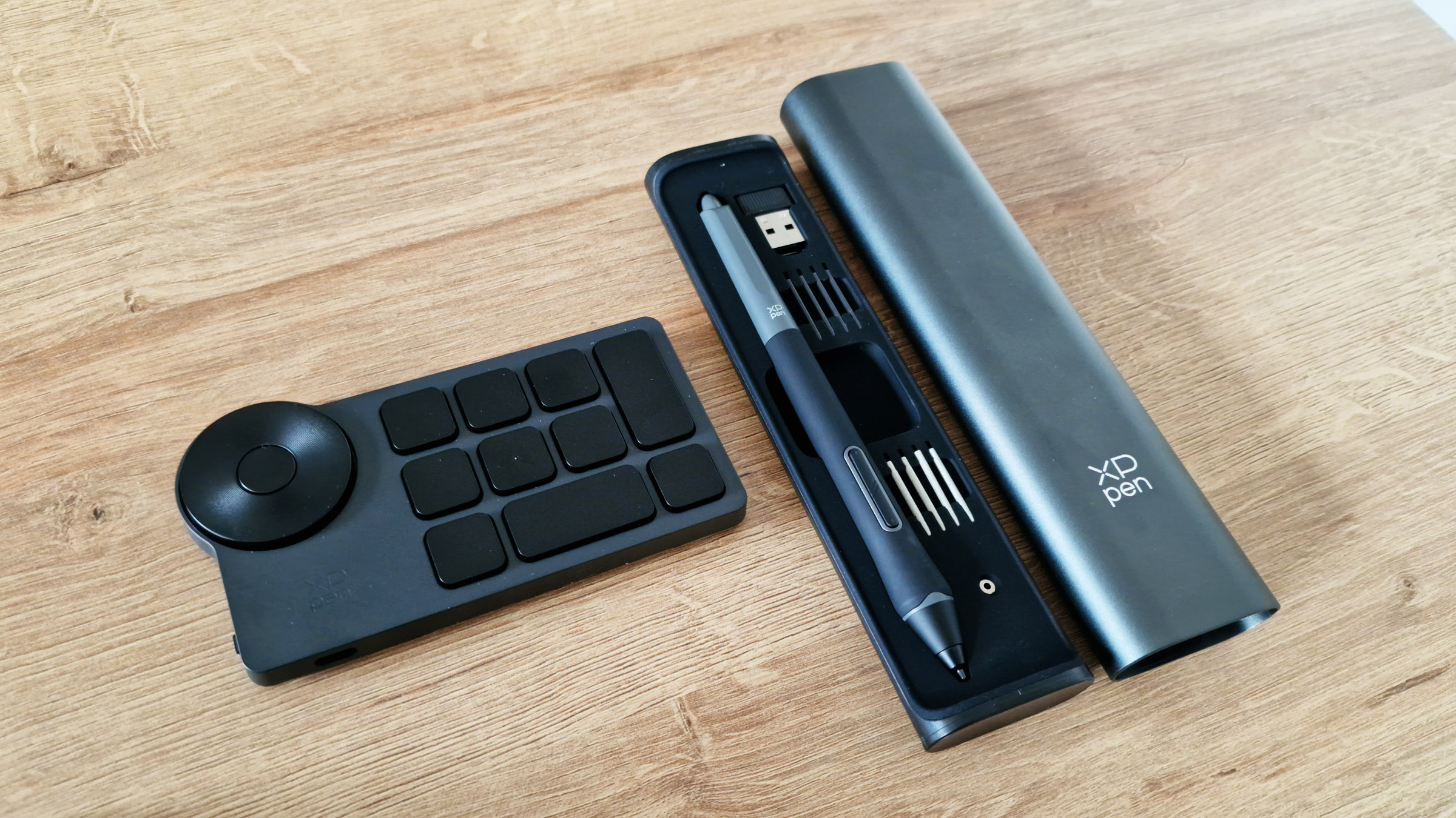
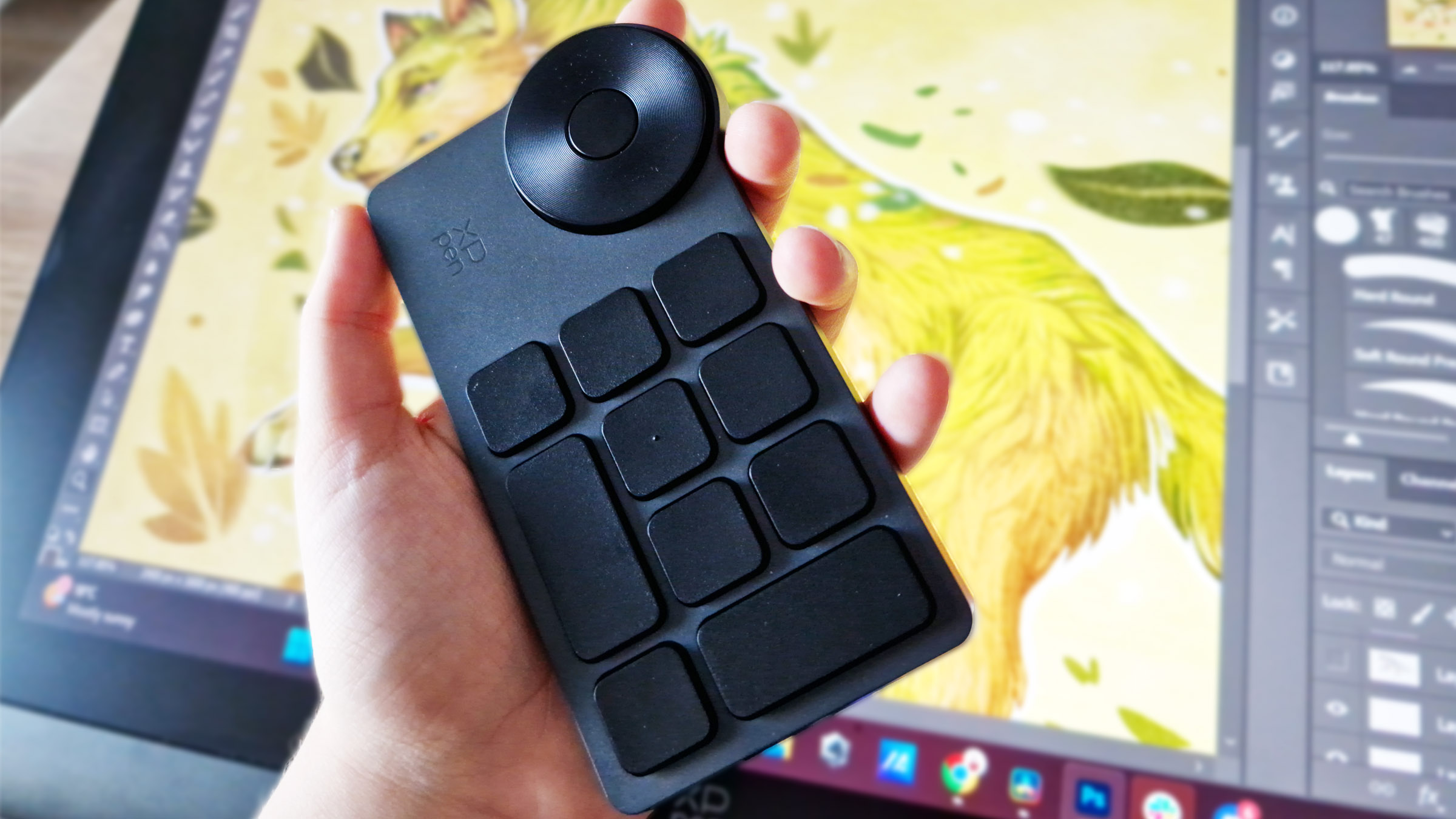
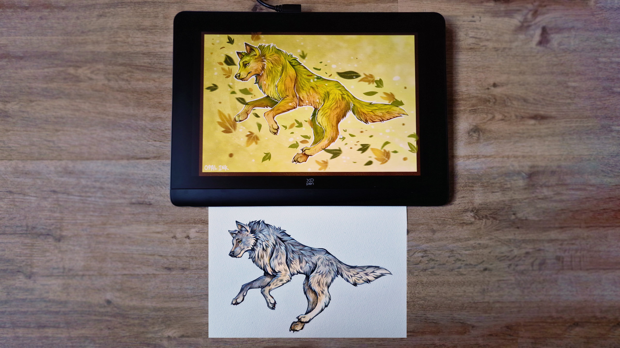
I decided to take an old watercolour painting of a wolf and digitally transform it using the XPPEN Artist Pro 16 (Gen 2) and Photoshop. Before touching any kind of painting, one of the first steps was getting set up with the tablet. The Gen 2 Artist Pro 16 comes with a handy wireless shortcut remote – this separate panel includes eleven customisable buttons as well as a rotating dial to easily assign your favourite shortcuts.
The XPPEN software made it easy to get set up with all my favourite quick commands, which would later speed up my creative process when working on an external tablet. I like to work in a few different areas at home, so I was especially appreciative that I could connect the controller via a USB dongle to make it wireless for my varying workstations. The tablet itself has no buttons on the body, which not only keeps the design clean and unobtrusive but also prompts artists to use the remote.
2. Digital adjustments
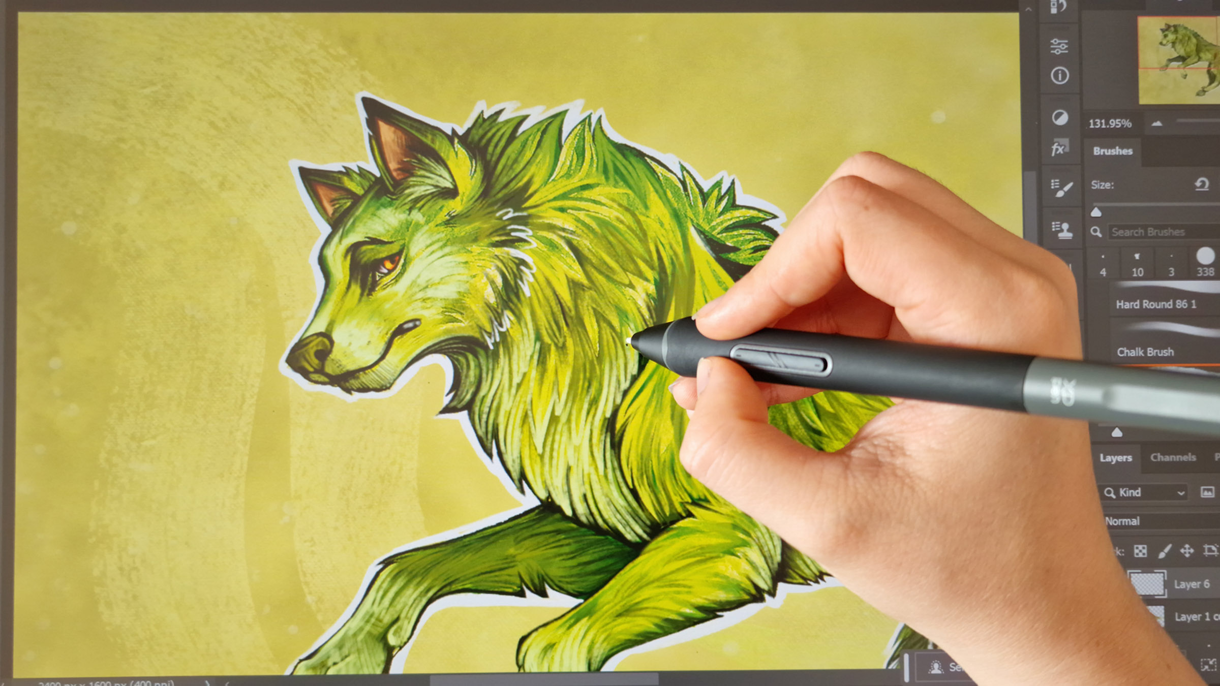
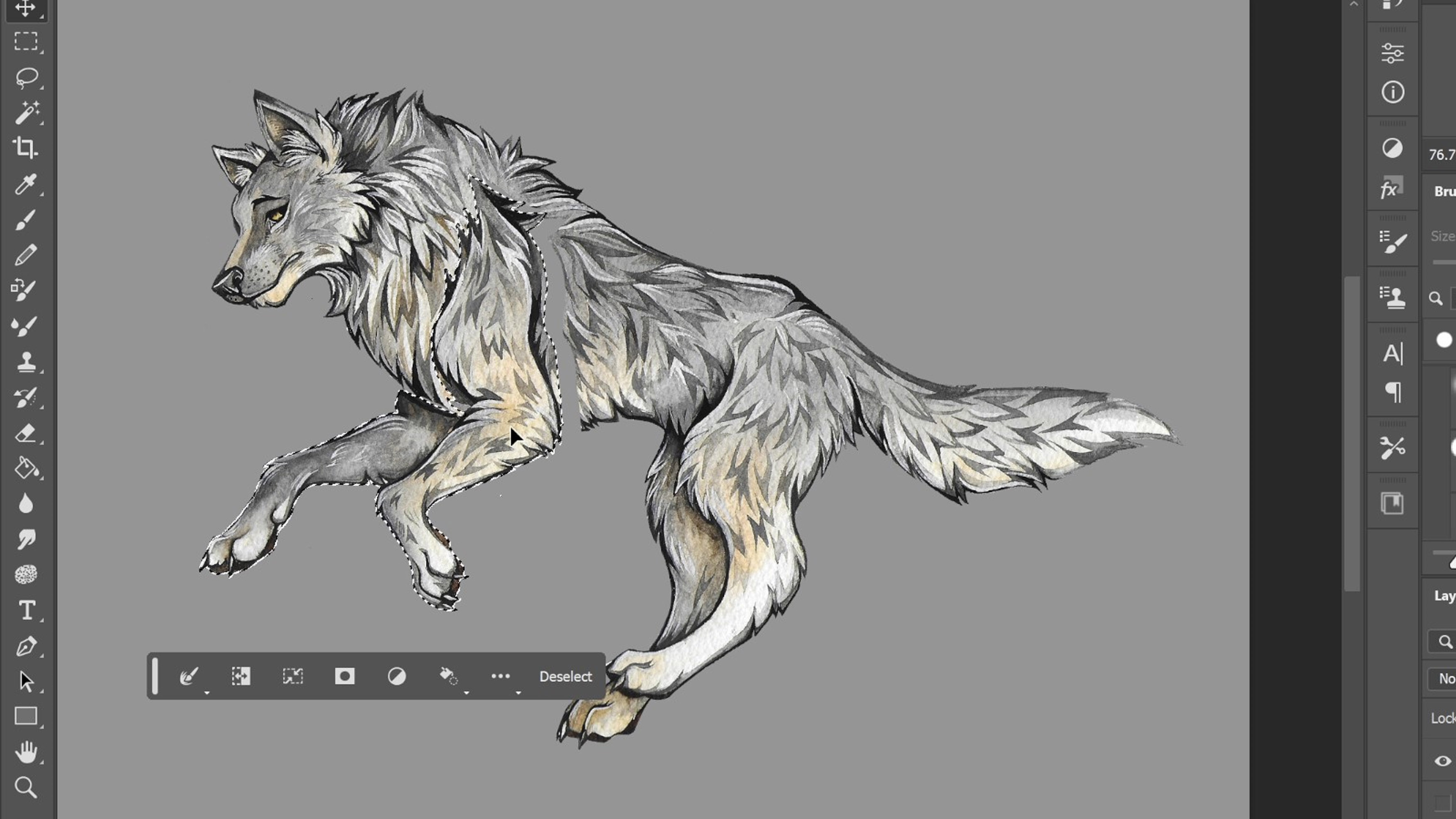
One of the joys of transferring traditional work into digital format is being able to fix those little mistakes you may not have noticed at the time. Once the painting was scanned into Photoshop, I decided to fix some anatomy issues. The X3 Pro Smart Chip Stylus boasts 16k pressure levels and is 20% more accurate than previous models, meaning pen strokes are true-to-life and precise, which is perfect for more fiddly work. The high-end tech of the stylus made it easy to accurately remove the original background and change the positioning of the legs to look more natural and create a clearer silhouette to work from.
3. Painting
Once the base illustration had been adjusted, it was time to get creative with this piece utilising both the tablet and Photoshop. I wanted to turn this painting into something more fantastical with an autumnal vibe. With this in mind, the first step was to change the base colouring using a variation of gradient maps, saturation adjustments, and overlays. Luckily this tablet features the stunning X-Nature Display to accurately depict the sRGB spectrum, meaning colours are both true-to-life and bold. This was a vital addition while painting as I used vivid tones that could easily blend into one another on a less accurate display, which was especially important to consider if I wanted to print this design.

My painting process was both easy and fast thanks to the XPPEN setup – the quick remote meant I had easy access to all of my favourite shortcuts while not having to touch my laptop keyboard. The stunning matte-finish 16-inch display made it feel like I was traditionally painting again, while having the advantage of being able to zoom in and use ctrl-Z! I used a wide variety of custom PhotoShop brushes to give the piece plenty of texture so it still had an illustrated aesthetic to it, and it was a great opportunity to revisit my older watercolour work and build upon it with skills I’ve learnt in recent years.
4. Detailing
With the main painting complete, it was time to move on to finalising colours and details. For the background, I used a variety of textured brushes and layers to create a simple gradient that drew focus to the character – but I still felt like the concept as a whole felt empty.
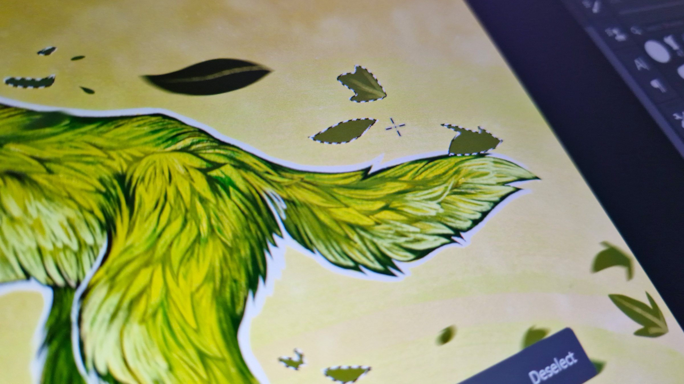
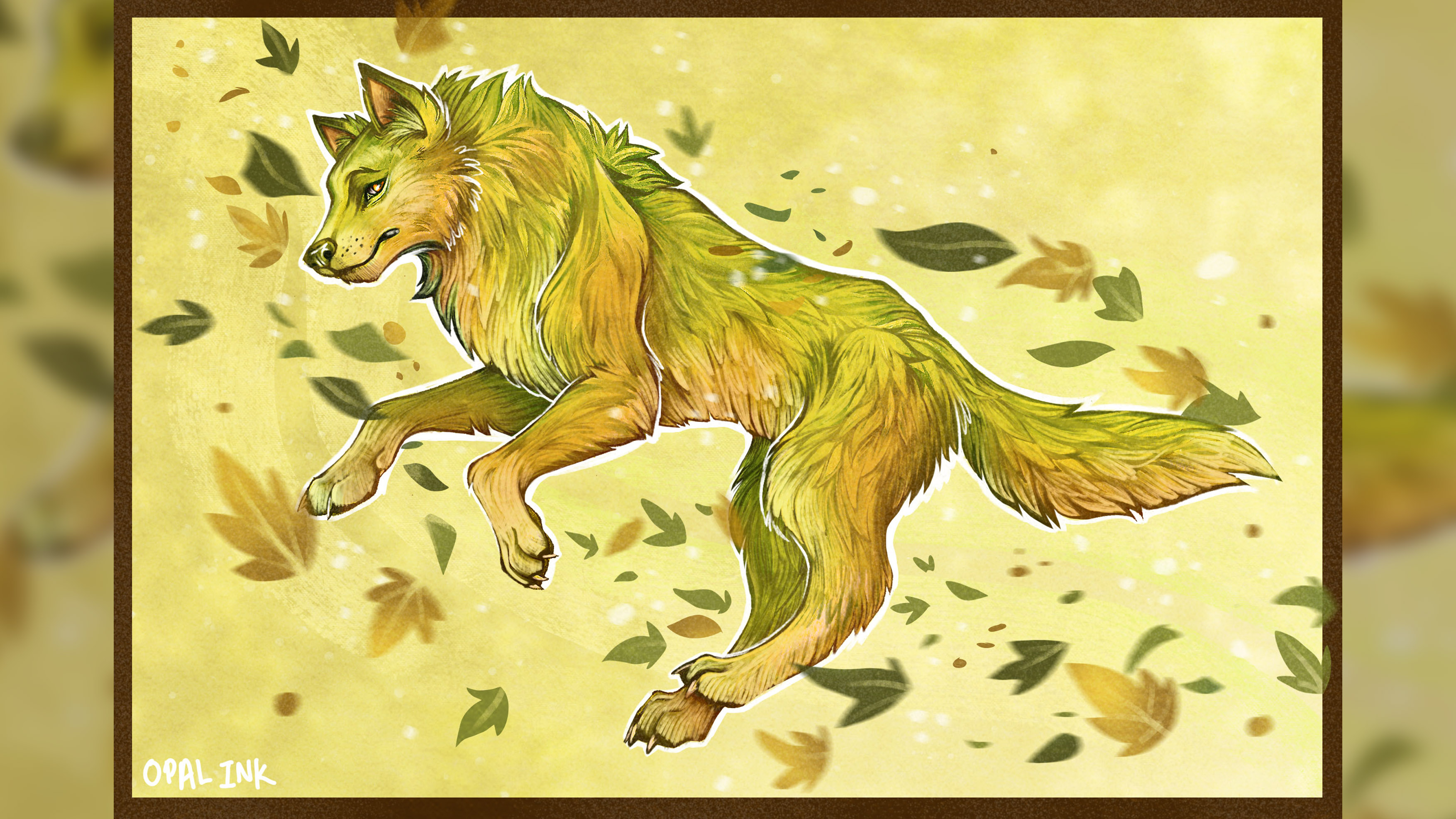
To play into the autumn theme and make the illustration more visually interesting, I utilised the lasso and fill tool to create some simple leaves and foliage with random shapes. These were done very quickly and very basically, but once I’d applied light blurring filters and painted some colour variation, I think the final result was effective and an example of how a simple shape can convey something more complicated without having to put in too much effort.
5. Gradient maps
By this point, the piece was starting to take shape but I knew I didn’t want to add much more detail in fear of making it too busy. Getting to see it up close on the Gen 2 Artist Pro tablet screen was incredibly beneficial during these last stages as I could easily decipher what needed touching up.
With the leaves added, I realised I wanted more colour variation on the wolf itself to play more into the autumnal vibe. With digital art, it becomes easy to lose a character to the background when working with a limited color palette – so it was time to make some tweaks to make the image more striking!
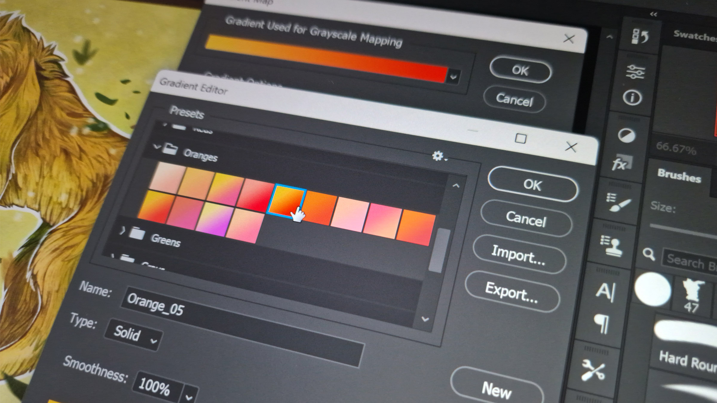
I dipped into the gradient map tool again and flicked through a few presets before I settled on an orange and yellow variation to complement the warmer autumn theme. Gradient maps are a fantastic way to add flair and variation to an art piece to really transform it, whatever point you’re at in the process. Gradient maps work by overlaying the chosen colours over the layer below while still keeping the original layer’s values. It’s a tool I enjoy playing with and highly recommend every artist fully explore it.
My final step for this piece was to add some defining texture using a few layers of paper stock images and noise filters to achieve that painterly aesthetic. This truly brought the illustration to life while staying true to its traditional beginnings, and I’m really happy with the final result that you can see below.
6. Reflection
And with that, the piece is finished… Again! It was really fun to tackle an older illustration to give it a second life, and doing this kind of exercise is a great way to reflect on what skills you have learned and how transferable they are when experimenting with mixing media.
I’m a huge advocate for trying new things and using a graphics tablet and digital art program is a fantastic entry point into this as they are so forgiving. Getting to utilise the XPPEN Artist Pro 16 (Gen 2) tablet was also a particular delight – as previously mentioned, I’ve used many different drawing tablets before, but this one has to be in my top three.
The 16-inch screen size is perfect for working on details without being too overwhelming size-wise. The clean surface, with no buttons and ergonomic curved design, is comfortable for long drawing sessions, and the included wireless shortcut remote is perfect for speeding up workflow by making your favourite shortcuts easily accessible.
It’s clear to see that this tablet has been designed with artists in mind – putting both comfort and ease of use at the forefront. I would highly recommend it for any creative on the market for a new tablet display, especially if you’re like me and usually prefer to work traditionally on paper.
I hope you’ve enjoyed seeing my process for this piece as much as I enjoyed working on it. As artists, we’re constantly improving and learning new techniques, so it’s a lot of fun to go back and revise older pieces and it’s an exercise I would highly recommend you have a stab at!

Thank you for reading 5 articles this month* Join now for unlimited access
Enjoy your first month for just £1 / $1 / €1
*Read 5 free articles per month without a subscription

Join now for unlimited access
Try first month for just £1 / $1 / €1
Get the Creative Bloq Newsletter
Daily design news, reviews, how-tos and more, as picked by the editors.
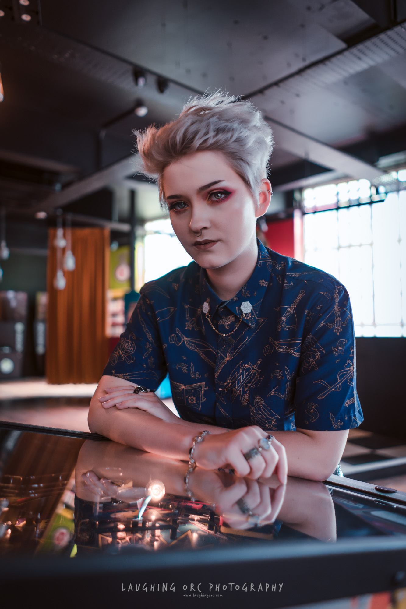
Abi Le Guilcher previously worked as Creative Bloq’s former ecommerce writer. With a Bachelor of Arts in Creative Design for Game and Film, Abi enjoys almost anything creative and will either be found crafting or gaming in her spare time. Her previous experience as a retail assistant at CeX means she has a wide range of knowledge in both technology and media and loves to keep up to date with the latest tech. Abi is an avid cosplayer and has most recently worked with PlayStation and Santa Monica Studio on a promotional campaign for the release of God of War Ragnarök.
