The art of reimagining iconic characters
Rebooting a much-loved character? Do them justice with this expert advice.

We've all had that moment, when the announcement comes in that your favourite movie from yesteryear is getting a remake. How can they do it? How can they mess with your favourite characters?
I've been there too, but I've also been on the other end, being responsible for the designs of reimagined much-loved characters such as Shredder and Turtles from TMNT, Pinhead from Hellraiser, the BETAS from Videodrome and many more sworn to secrecy. If done right, a reboot of a character design can add to the richness of the franchise, but if done wrong, it can kill any future plans of expanding the world and evoke a mass of fan hatred.
The one thing to get right, above all else, above any detailing or fundamental design elements, is the tone. If you nail the tone early on, that's half the battle, so you need to ask yourself a few questions before you start.
The one thing to get right, above all else, is the tone.
If reimagining characters for a movie, are you creating this for a film you would go and see now, or a movie you would have seen when you were 14 or so? What are the iconic elements that made this character so appealing in the first place? Break them down to their fundamental basics. Finally, how far are you willing to push it?
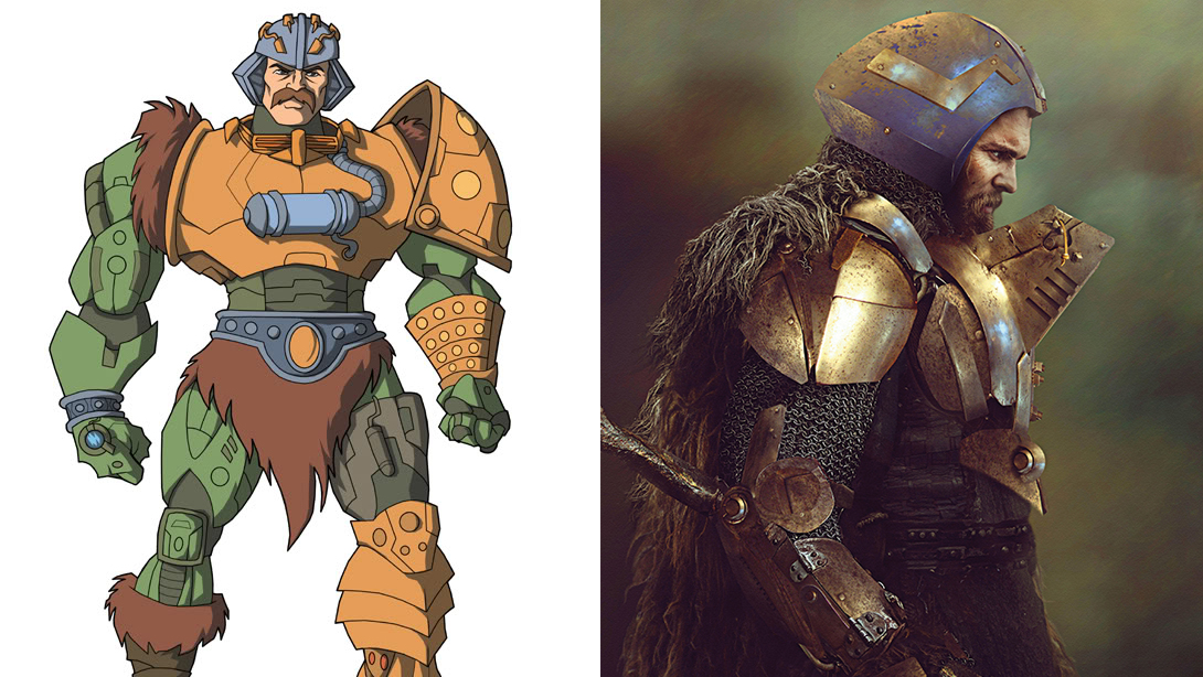
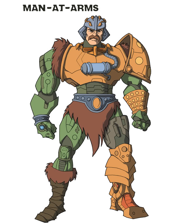
To put my process to the test I set out to reimagine a whole series of characters that were due a major update – characters I admired for the sheer imagination and bold design elements. To make it as challenging as possible I chose cartoon characters, specifically those from popular 1980’s cartoon series. I started with Man-At-Arms, one of the main protagonists from Masters of the Universe.

Consider tone
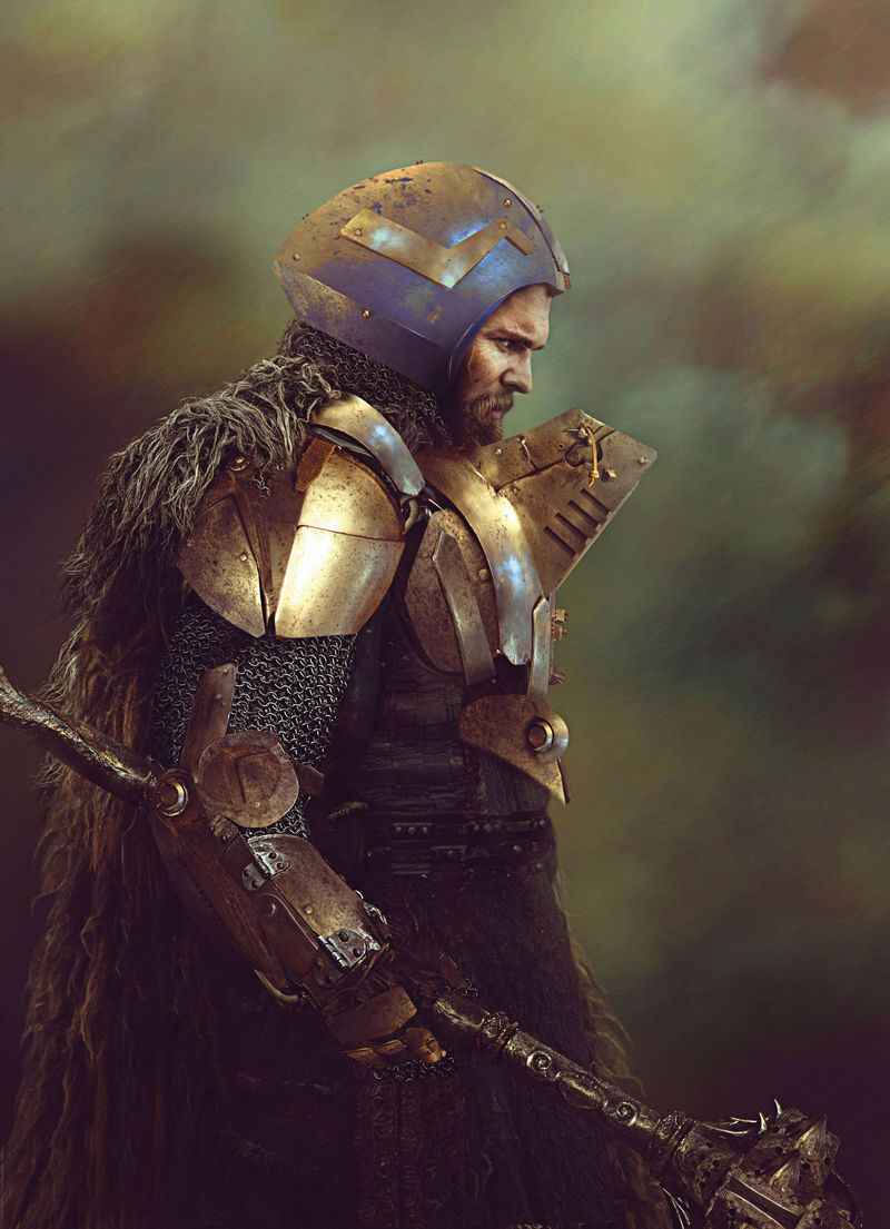
For this piece I decided the tone would need to fit the essence of the character, not the spectrum of its initial audience. So it would no longer appeal to children, but would more than likely appeal to fans of Game of Thrones, Conan the Barbarian (1982 version), Star Wars, Batman and so on. Yet I didn’t want a superhero look; he should retain the medieval feel of the character mixed with its own unique technological style. You are in essence world-building with an initial image.
The iconic elements broke down to the helmet shape and armour colour (although I muted the colours somewhat to add realism). An older face, war torn, the face of experience and knowledge. To add more to the ‘older’ feel I moved away from a superhero pose, instead adopting a poignant contemplation piece. This in itself adds to the tone and brings out his personality.
Get the Creative Bloq Newsletter
Daily design news, reviews, how-tos and more, as picked by the editors.
Other iconic elements were the chest piece and mouth guard, both now given function as well as form. They serve as defence elements and you see how each piece of armour works in conjunction with the tech. The fur on his back is a nod to the medieval vibe the cartoon often portrayed.

You start with a tone piece, and from here you can go back and start to design full profile shots, costume design details and so on and so fourth. As long as your tone is right and you have a mood image like this from the get-go, it will keep you on track going forward.
This article originally appeared in 3D World, the best-selling magazine for CG artists. Subscribe to 3D world here.
Related articles:

Thank you for reading 5 articles this month* Join now for unlimited access
Enjoy your first month for just £1 / $1 / €1
*Read 5 free articles per month without a subscription

Join now for unlimited access
Try first month for just £1 / $1 / €1
