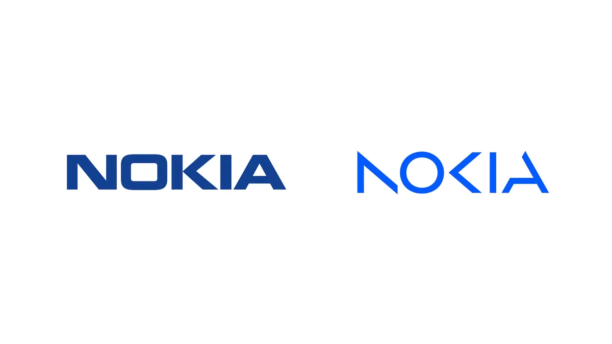
Logo redesigns. They give companies a fresh look and a new face. But sometimes these creative endeavours don't quite hit the mark, and in recent creative news, Nokia's latest logo rebrand is dividing opinion (maybe even more so than that disappointing Kia logo that uses a similar style). I was curious to know what other famous logos might look like if they adopted the Nokia/Kia approach of cutting out seemingly random parts of letters, so I decided to put my Photoshop skills to the test.
The old Nokia logo (left) vs the new version (right) (Image credit: Nokia)
We asked our readers for their honest thoughts on the tech brand's new look, and it's pretty clear that opinions are divided. Some love it, claiming that the simpler font is a great way to modernise the brand with a clean and sharp aesthetic. However, a lot of people have pointed out that the logo doesn't clearly communicate the name and could easily be mistaken for AOCIA if viewers aren't already familiar with the brand. So the question is – does this method of redesign translate well to other brands? Well, see for yourself below and let us know what you think.
Samsung. Or should that be Sansuvg? (Image credit: Samsung)
The logos are definitely still recognisable, but that feels mostly down to either the colouring or if you're already familiar with the brands. It's easy to mistake certain letters for those that are similar, which is why Samsung is now apparently Sansuvg.
Latest Videos From Creative Bloq
(Image credit: Microsoft)
Okay, I kind of love the Xbox logo (even if it could read as ay yboy). The simplicity plays into the sharp design of the latest Xbox consoles, and I like the idea that the first and last 'x' join together to make a full letter. Call me up for your next rebrand, Microsoft.
(Image credit: FedEx)
Not too shabby if I do say so myself, however FedEx is pretty simplistic already so cutting out key parts feels a little overboard. But hey, it's still readable so I consider it a success.
(Image credit: Google)
Google isn't quite as translatable, and if you took away those iconic colours I'm sure you'd be asking "who is Cooglc?" But hey, who wouldn't recognise those familiar bold colours? If you don't fancy the Nokia approach but want to make your own trademark, check out our guide on how to design a logo for some unique branding ideas.
Read more:
Get the Creative Bloq Newsletter
Daily design news, reviews, how-tos and more, as picked by the editors.
Abi Le Guilcher previously worked as Creative Bloq’s former ecommerce writer. With a Bachelor of Arts in Creative Design for Game and Film, Abi enjoys almost anything creative and will either be found crafting or gaming in her spare time. Her previous experience as a retail assistant at CeX means she has a wide range of knowledge in both technology and media and loves to keep up to date with the latest tech. Abi is an avid cosplayer and has most recently worked with PlayStation and Santa Monica Studio on a promotional campaign for the release of God of War Ragnarök.