Push your character designs further with this workout
Artists reveal the secrets to strong character design.

At the heart of any creative project is communication and storytelling. Whether that’s something as intangible as a wordless comic strip, a single illustrated figure conveying an emotion, a TV ad telling us to buy something, or a government campaign poster advising us how best not to get run over, characters can be a powerful tool to bring that story to life.
Today, we’re more familiar with – and bombarded by – character design than ever. We've even got a collection of cracking character design tips for you to enjoy. All of this means that the Jolly Green Giants and SpongeBobs of yesteryear are no longer the preserve of big ad agencies or professional image-makers, thanks to the democratisation of software and proliferation of free tools.
Lars Denicke and Peter Thaler have been running the Pictoplasma festival for character design for the past 15 years, and over that time Denicke says he’s seen a huge change in the way illustration and character design have become a "stronger voice" in our wider visual landscape.
According to Denicke, part of the reason for starting Pictoplasma Character Face-Off contest was in reaction to the "terrible, vulgar" animation style of the time, as he puts it. "Now, as a genre, character design is everywhere: gaming culture is huge, and editorial illustration has changed so much. The image is not just there to illustrate an article; people like Christoph Niemann, Jean Jullien and Laura Callaghan are telling the story just through an image. That’s changed the way they’re pitching and how they’re briefed, too."
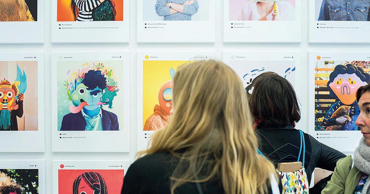
The festival’s focus has naturally shifted as technology has rapidly evolved. "When we started we were looking for very graphical and reduced – almost typographic – work without too much detail," he says. "Digital media was so slow at the time. It was still the era of dialling into a modem, so there was no room for photography, moving images and so on. Instead it was things like pixel graphics, simple graphics… maybe flash animation."
Style-wise, Denicke says things have shifted from a time in the early 2000s when "everyone wanted to be a street artist"; to a time around seven years ago where animation was popularised by the increasing affordability of software; to today, which he describes as "anything goes." Denicke explains: "We’re a bit post-digital now. Even if you’re working in oil painting, digital informs what everyone does, whether you’re using it 20 per cent or 100 per cent of the time."
Use your personality to stand out
Digital in 2019 is a part of life that’s so pervasive that it’s unremarkable. The impact that’s had on character design is not to be underestimated. "The divide between us and the object was far stronger 15 years ago," says Denicke. "Now, the lines are blurred. Characters still function as a way to take us by the hand as the reality of the virtual has become more normal for us. Not as directly as Clippy in Microsoft, for instance, but we’re used to interactivity with characters. These days, you can take a character into any context and the audience doesn’t ask ‘why’, or question the reality or the function."
Get the Creative Bloq Newsletter
Daily design news, reviews, how-tos and more, as picked by the editors.
The flipside of our widespread acceptance of, and familiarity with, characters is the pressure placed on the designer. It’s all the more imperative that they create something which is unique, smart and striking.
"I like to believe that when one loves what they do and one pursues that constantly, it shows and stands out automatically," says animator Elenor Kopka. Of course, passion and a sense of creative authenticity are all well and good, but these attributes alone don’t make for a successful, impactful piece of design.
There has to be personality, too and to a certain degree, a mastery of your medium. This can be complex commercial digital art programs, free open-source software, monochrome GIFs or decidedly analogue processes such as collage and crochet.
We spoke to some of our favourite practitioners about how they work, the importance of having an ownable style, when you know you’ve hit on the perfect character and more; and garnered some practical tips on how they do what they do.
Find your designator

The work of Julian Glander is instantly recognisable: pastel hues, cute, strange, occasionally blobby character designs that are entirely his own. For him, a signature style is crucial.
"It’s important to have something that’s a designator, whether that’s the visual style, the sense of humour, or the way they play with the forms or mediums they’re working with. There are artists who reinvent themselves and do something new with every project, but being a chameleon is a style, too. Having a continuity online is nice, so that people know it’s you. Having a signature visual style means I can focus on the writing, and what’s happening to my characters, not just what they look like."
For Glander, the beauty of using Blender to work in 3D is that once you’ve made the models, you can work pretty quickly. "You can get the characters in as many angles and poses as you like without redrawing them. I have a whole pipeline figured out that’s very specific: part of my focus and practice is making that [process] really quick, so I’m always looking for shortcuts."
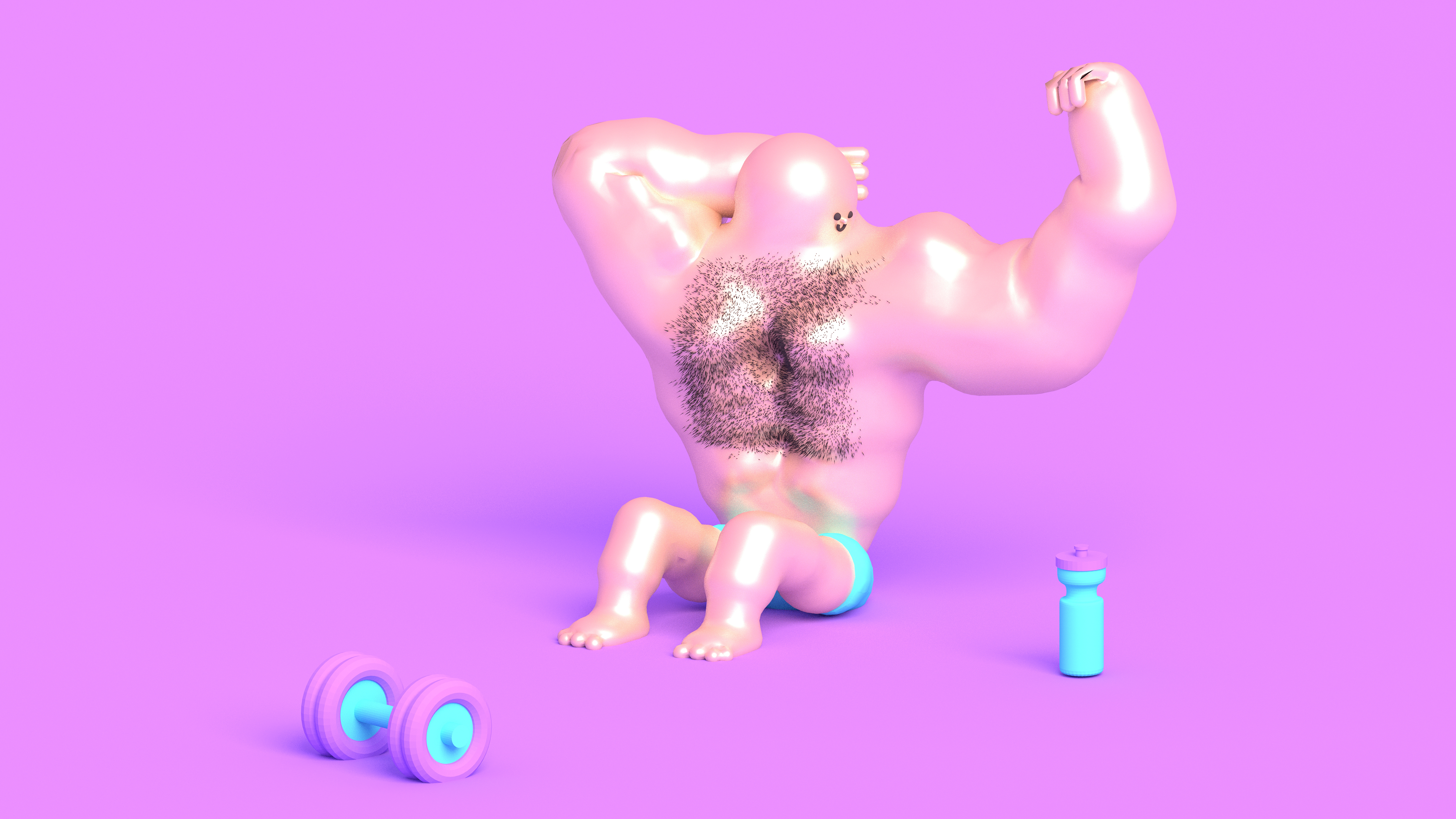
So what makes an effective character artist today, in a world of characters and images? Glander recommends that to make things stand out, "a big face is good: the classic baby stuff like big eyes or a simple silhouette." He adds: "I don’t want to sound like an expert in character design as I’m very instinctive. I think about what they have to have: so if someone is going to pick something up, I’ll give them hands; if they’re walking, they’ll have feet. Otherwise they might just be a floating head."
"I know I’ve hit on something good when a bell goes off in my head. I might put a triangle on a character’s head, and that doesn’t work; then I put a square there instead and it does. I follow my instincts. I’m just completely goofing around. I have no proper experience."
Trust your instincts and learn to let go

Elenor Kopka has carved a highly unusual, very original approach to animation and illustration, using grainy textures and shades of black, white and grey to delineate characters that are both simple and incredibly expressive.
Kopka’s distinctive style isn’t something she says she does "on purpose or tactically," although the artist reckons it makes life easier when working with commercial clients, because "it certainly makes them trust you a bit more, when they see what they can expect of you. It makes people reach out to you, that already like what you do so they know right away that it will go well with whatever mission they have in mind," Kopka says.
"Nobody ever contacts me when they look for an animator who does neon-coloured vector-based infographics, and that’s great because I would be terrible at that."
Her process, while technically adept, is largely based on instinct. Her characters are deceptively complex: how else could something like, say, an egg with a line for a mouth and two inky black dots for eyes feel so alive? "Sometimes I get a character right on the first sketch, sometimes it takes ages for me to feel happy," Kopka says.

"It’s hard to tell exactly why it works when it works, but I believe that I need to feel some connection to the character. It might feel alive or like it’s coming from a ‘real’ place. When it finally feels right, it’s undeniable and I know that I don’t want to change it any more."
A few years back, Kopka founded computer games studio Ghostbutter with her brother Konstantin. She’s learned a lot from gaming for her multidisciplinary approach: "Things have to be thought through in literally all directions [in gaming]. There can’t be any gaps or holes in the systems because the player will find them all," she says. "You can’t get too attached to pretty visuals – if something doesn’t work in the gameplay, it just gets thrown out again."
"So overall I learned how to let go of a bit of control about how my graphics look once they’re in the game. Then I started to really enjoy the surprises that can occur, once all graphics are implemented and suddenly get combined in an unexpected way."
Think of characters as brands
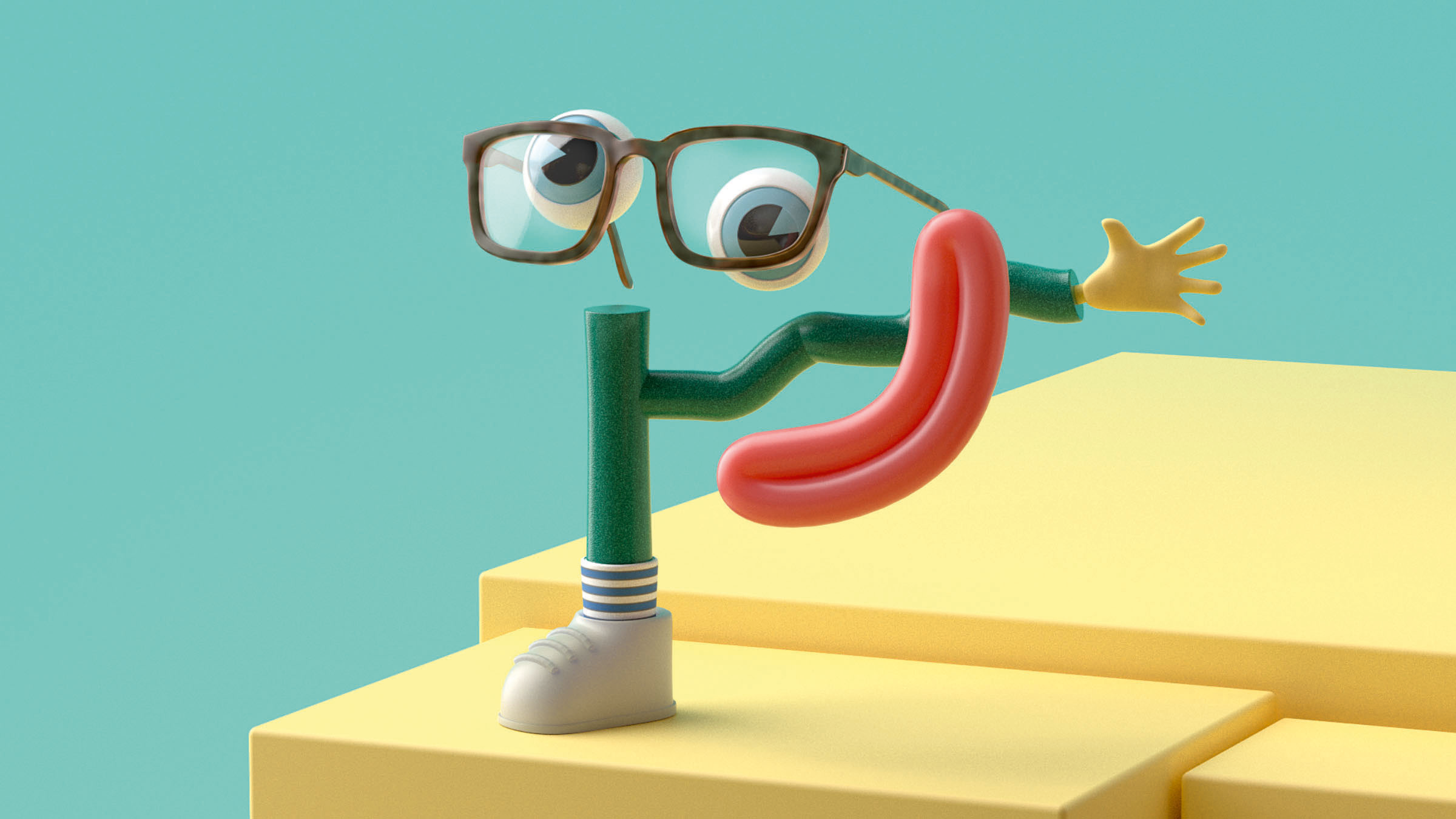
While much of the character design world is dominated by those working on editorial projects or self-initiated designs (albeit those that likely lead on to commercial commissions), certain branding projects often benefit hugely from the addition of a character-based approach.
Last year, design and motion studio ManvsMachine worked on a campaign for prescription glasses retailer EyeBuyDirect, with one half based on lifestyle-leaning photography, and the other on a character that was used to discuss the specific benefits of the service.
According to Michaeljohn Day, associate creative director at ManvsMachine, a character works for brands that "don’t take themselves too seriously," and which appeal to a "switched-on, modern and youthful audience." Day reckons that the use of characters has changed with the proliferation of images we all now encounter every day.
Audiences outside the world of design and illustration are just as likely to encounter character design, for instance, and as such, mascot or brand personification feels far less jarring or cartoonish that it might once have.
"We’re used to seeing more content, and not just curated by ad agencies and companies – everyone has access to Instagram, for example," Day says.
Keep things simple
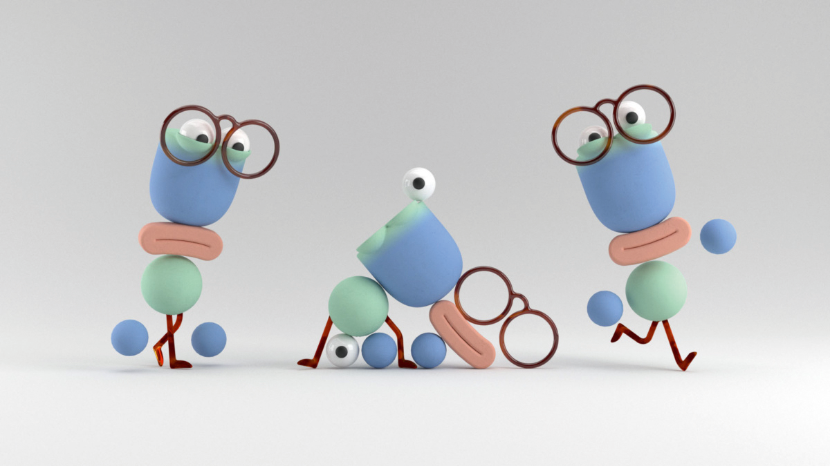
The designs for EyeBuyDirect aimed to feel "designed, not cartoony," Day adds. "It’s simplified and reductive. Do they need arms and legs, for instance? That simplification keeps it premium and makes sure it’s fed into the whole style of the campaign, which is a contemporary campaign for a fashion brand."
The project was created entirely in Cinema4D, and Day recommends with any such project that you create a "set of rules you use to define the world you’re working in. Then you always have something to refer to, so you know what’s working and what’s not. Those parameters might be something like, ‘we wanted the designs to be like sculptures or ornaments,’ and that guides the way you design a character."
Day adds: "Keeping this simple was really good for us. We’d never done characters before, so we’d never worked with things like rigging, so we animated almost in a stop-motion fashion, which turned out to be a lot more interesting. Don’t feel like you have to know everything about character design when you use Cinema4D: you can approach things in lots of different ways. There’s often 10 ways of doing the same thing, and I think that’s helpful for developing a style."
Stay true to your story
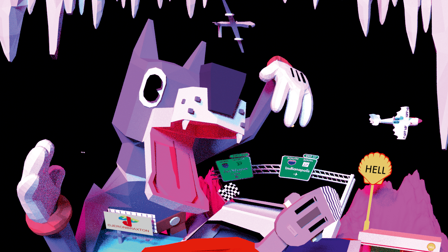
Jeron Braxton is entirely self-taught in the world of animation and visual arts, yet at just 24 years old he’s already made a name for himself through work that’s both nonlinear yet somehow familiar. At last year’s Sundance Film Festival, he took home the Short Film Jury Award for Animation for his brilliant short Glucose: an occasionally surreal, always powerful exploration of police violence, our relationship with the digital world, and internet culture and the loneliness it can engender.
Braxton got into animation as a teenager when he wanted to make videos for the music he was making. "I was always drawing for as long as I could remember and I sort of stuck with it," he says.
"Not to say I was a good drawer, but I was always drawing comic books. I’d create these robust worlds with all these characters." He decided against going to art school, taking one semester as he was already "five years deep" into creating animation. "[Art schools] turn their noses up at anything commercial or palatable, but I’m not about to get penalised for making the art that I wanna make," he says.
Tell the stories you want to tell that are important to you
Jordan Braxton
Where Braxton’s work is often so compelling is in his explorations of big, difficult issues: things like the Black American experience through more accessibly playful, colourful, dynamic animations.
"With Glucose, I wanted to make something that was sweet on the surface, but with dark undertones," he says. "For a lot of people some of these themes are a hard pill to swallow, so the animation and style makes it more palatable. If you’re captivated by the design and by the movement, you’re more receptive to the message. Even though my work has a political message, I think back to the happy-go-lucky 2D stuff I like."
Braxton’s advice to people getting into animation is to "tell the stories you want to tell that are important to you. You need to stay inspired to be creative and if you’re not then you probably shouldn’t do it. You’ll have to invest a lot of time: it doesn’t matter if people are unfamiliar or uncomfortable with the story. If you wanna tell it, tell it."
Escape the uncanny valley
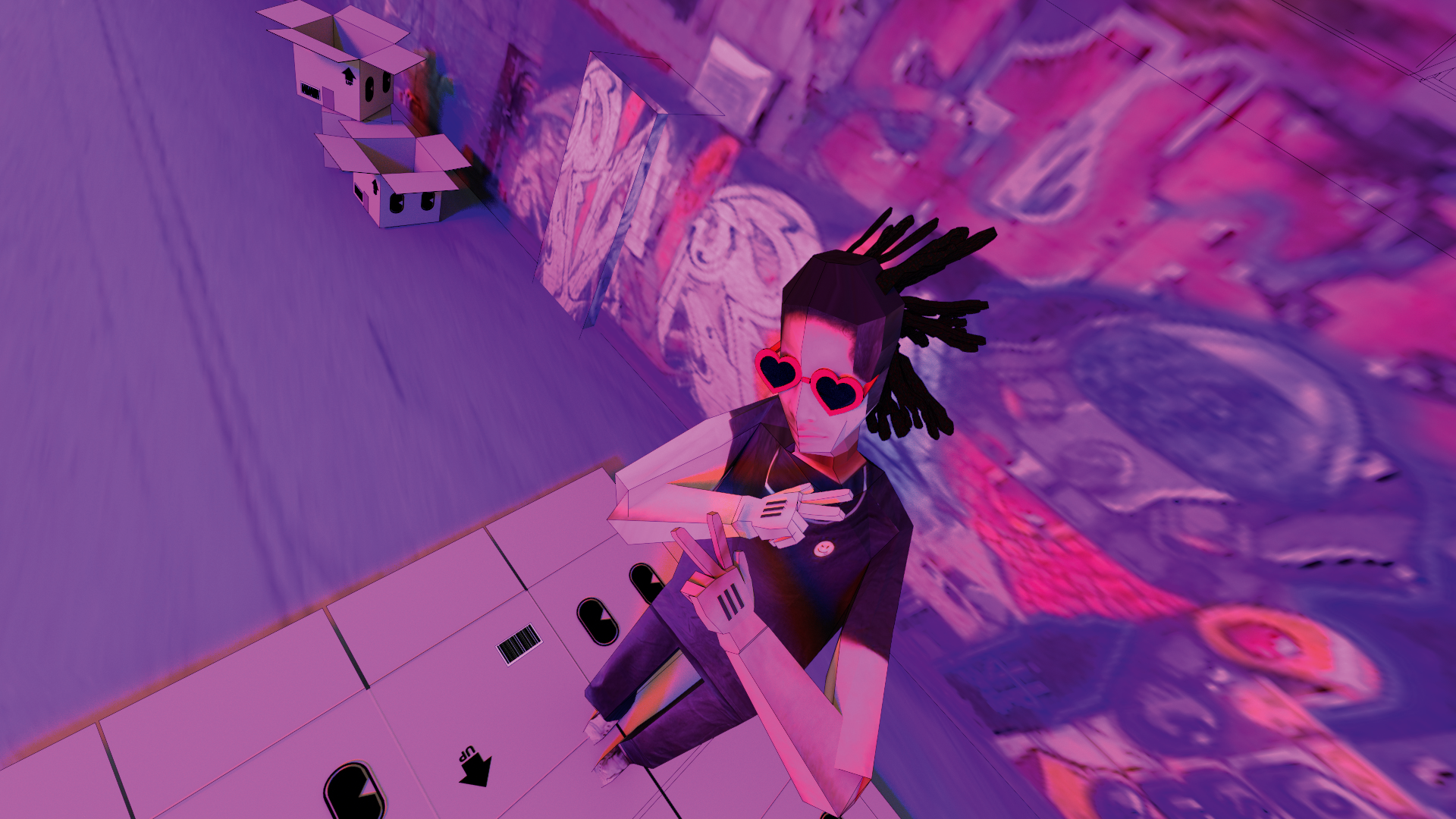
Braxton learned all he knows about his choice of software, Blender, through internet tutorials on sites like instructables. His advice for those using digital tools for character design is to "get out of the uncanny valley," he says.
"If you’re making stuff that feels creepy and you have some skill in drawing you should use image tracing: you take an image and 3D model around that to get a more stylised look."
Braxton adds that it’s crucial not to fall into the trap of believing that as an artist, you should constantly be on to the next thing. "I feel like at times, we creatives think that once we produce one idea, we have to move on and do something new, especially with 3D modelling where you feel like once you make a character, it’s locked in."
"But if you create something and it’s not quite there, or your skill evolves, it’s okay to revisit it. What’s not okay is to settle and get stuck. You can always revise things, which means you continue to explore and evolve your style."
Explore handmade mediums

Philippa Rice works across an impressive range of media, from comics, illustration and animation, to model-making and crochet. As such, her style isn’t dependent on her tools, but a more innate commonality in her work that runs through all her work, from her stop-motion crochet character shorts to her books that draw on real-life relationships.
Rice studied animation as a degree, and used the skills she learned to start creating her collage-based webcomic My Cardboard Life about a year after graduating, moving on to creating animated GIFs and longer animations. Currently, she’s particularly enjoying the crochet side of her practice: "Even though it takes a long time, the final result is always worth it," she says.
"I love completing a real, 3D object that I can hold in my hands!" Her work often appears incredibly tactile, something she favours for its "immediacy and sense of realness: it gives you a feeling of connection to the work." Rice adds: "I find comics more rewarding than fun, because it’s a chance to share a story."
The unusual techniques she uses are both clearly something she enjoys, but also a smart way of making her work stand out. "I think a signature style can develop naturally by making the things that interest you, using the tools you enjoy, and telling the stories you want to tell," she says. "Your signature style is already within you, but you have to make the work first to see it."
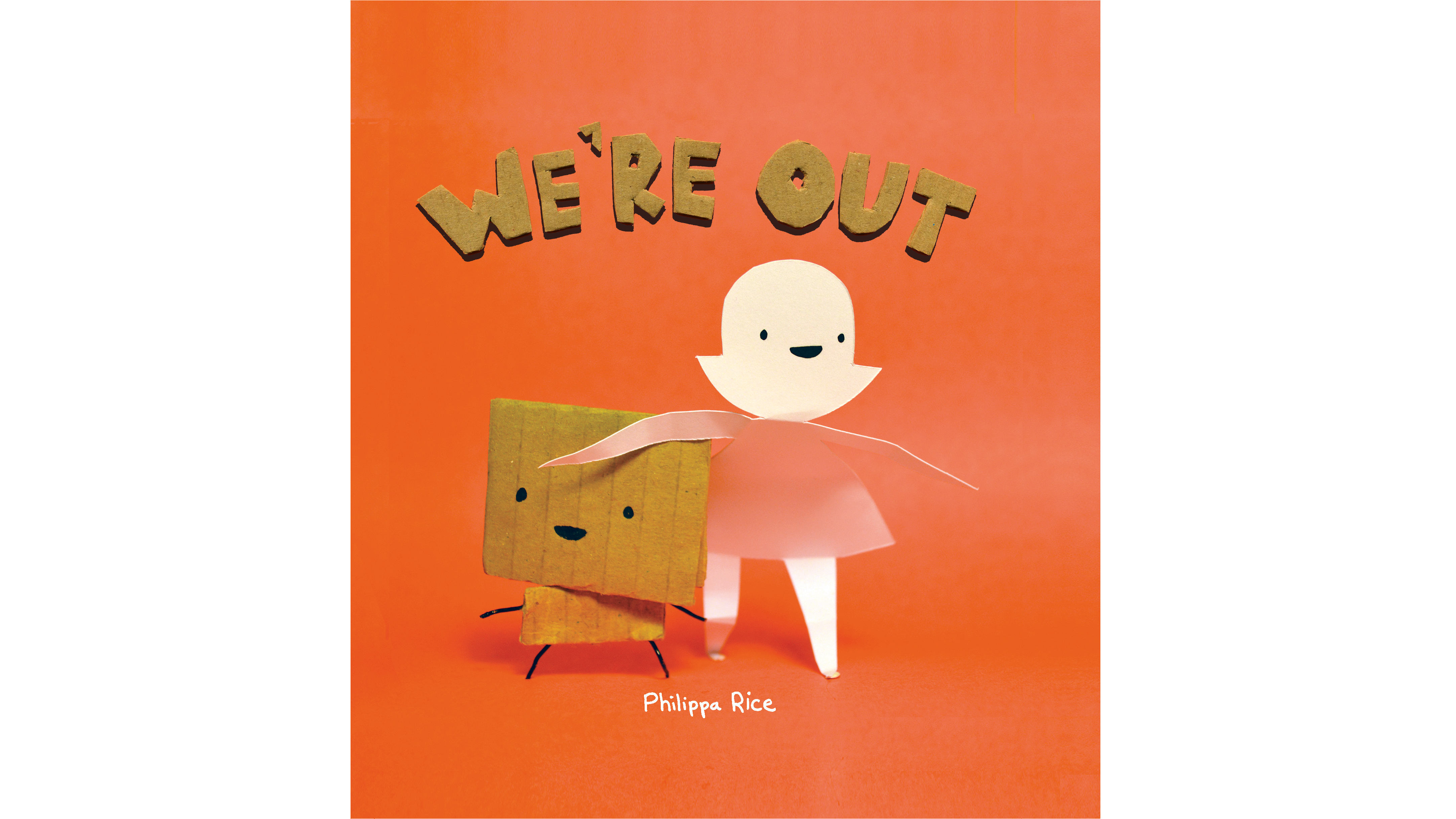
Rice knows when she’s hit on a good character when it begins to naturally take on a life or personality of its own. However, many of her comics are partly autobiographical, or about her family, partner and daughter.
"For fictional characters and situations I often base them on real life too," she says. "With fictional characters I often make them rude or obnoxious, or any other bad personality traits that I feel like I’m not allowed to have in real life myself."
Rice continues: "I think you just need to get across a feeling of realness that people can relate to. Maybe not directly, but if we believe that a character can have real thoughts and feelings, then I think that makes it a successful design."
This article was originally published in issue 293 of Computer Arts, the world's best-selling design magazine. Buy issue 293 or subscribe to Computer Arts.
Related articles:

Thank you for reading 5 articles this month* Join now for unlimited access
Enjoy your first month for just £1 / $1 / €1
*Read 5 free articles per month without a subscription

Join now for unlimited access
Try first month for just £1 / $1 / €1

Emily Gosling is a freelance art and design journalist currently writing for titles including Creative Review, Eye on Design, Creative Boom and People of Print. She’s previously worked at Elephant magazine, It’s Nice That and Design Week, and was editor of Type Notes magazine. Her book Creative Minds Don’t Think Alike was published by Ilex Press in 2018, and she also plays bass as one-quarter of the eight-titted beast, Superstation Twatville.
