The future: Zoe Gillenwater on new web technologies
The UX designer talks new web technologies, the power of Flexbox and the need for parent-friendly conferences.
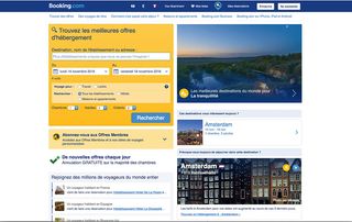
Born in Chicago but based in Amsterdam, Zoe Gillenwater is a senior UX designer at Booking.com. She's also a regular conference speaker who most recently appeared at Generate Sydney (where she discussed her current web passion, Flexbox) and the author of two books on flexible web design and CSS3, with a third in the pipeline.
Here Gillenwater talks about life in the Netherlands, the need for A/B testing and the challenges of balancing a life in web design with motherhood.
Tell us a bit about your background ...
I first started making websites in high school and as a hobby, but when I was in college I decided I wanted to turn it into a job. The problem was that this was 1999 and there was no 'web design' major back then – you could basically do graphic design or computer science. So I got a degree in journalism and mass communication, with an emphasis on visual communication and multimedia.
While I was in college I continued making websites, and learned a lot as I went. Afterwards, I worked for a bit at an agency, where I was their first 'webmaster' as well as doing some print work, and then I got a job as an in-house designer at a university research centre.
What's life like in Amsterdam?
It's pretty easygoing. It's really not a big city, though it has tons of museums, events, and that sort of thing. I like the bicycling culture; it creates a nice feeling of community since everyone is mixing around together outside rather than being shut away in their individual cars. And I love that every time it's sunny, every single person is outside biking, picnicking, laying in parks, sitting beside canals. They appreciate the good weather here because we don't get it often!
Get the Creative Bloq Newsletter
Daily design news, reviews, how-tos and more, as picked by the editors.
Could you tell us about your job at Booking.com?
The UX designer role here is pretty unique because we get so much ownership over our work, from beginning to end. I'm responsible with coming up with ideas for customer experience improvements, based on data as well as the extensive user testing we do. Then I design solutions, build the HTML and CSS, roll out code, set up A/B tests to evaluate my solutions, and analyse the data from those tests.

Has it changed your approach to UX design at all?
Working here was my first time doing A/B testing, and I'm hooked on it. I love being able to know if my work really is helping people, rather than never knowing if or how my work is used. I could never go back to just assuming I always know best, because I'm the supposed expert. We're wrong all the time, but that just gives us more things to try.
What are the UX challenges for a site like Booking.com?
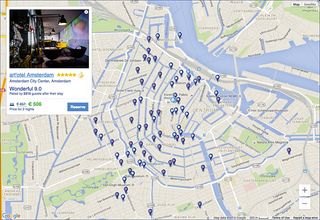
It can be hard to design for such a huge variety of properties and users. We don't just have hotels, we also have apartments, holiday homes, villas, boats, and so on. All of these property types have different things that make them great and different ways they're configured, and we have to convey all this content in a clear, effective way for our users.
And these users come from all over the world, speaking all sorts of languages (we support 43 of them), looking for different sorts of things in their holiday accommodation, and having different cultural expectations that play into the UX and interface design.
What have you been working on recently?
I'm on a team that works on customising and improving the experience for anyone who's booking with more than one or two adults – so, a family with kids or a group of friends. A lot of my UX work for these users is about guiding them to make good choices that will fit their whole group, adding clarity, and reassuring them when they are on the right path. I'm also working on designing features to show off the family-friendliness of properties, to help reassure families that both they and their kids will enjoy staying there.
You're a big Flexbox evangelist. Are people getting the message?
I think so! It seems like a lot of people are using it in production work now, which is great. I still would like to see it used more for progressive enhancement, though. It's not too hard to provide a simple inline-block or float layout for old IE, and then layer Flexbox on top as an enhancement.
One thing I think people still don't completely understand is that Flexbox is not a grid system. A lot of people use it in a way that is almost identical to float-based grids, without taking advantage of Flexbox's strengths and abilities. I'd love to see it used more on components, for different types of layouts than the same old ones we've been building for years.

Are there any interesting new web technologies you're keeping an eye on?
CSS Grid Layout and container queries. Both are going to be fantastic for responsive design. Combined with Flexbox, they'll make creating flexible layouts much easier and give us so many more possibilities for how we can arrange things on the screen.
You've published two books; do you have another in you?
Yes, I'm working on it! I can't say that I like writing books – it's a ton of hard work – but I like having written books, and this is a subject I feel like I have a lot to share with. It was the same when I wrote my first book, Flexible Web Design; there just wasn't much information out there about designing and building sites that weren't fixed-width. This was 2008, two years before responsive web design got a name, and creating flexible sites was something I was (and am) passionate about and wanted to share with others. I was proud of that book and hope my next one comes out the way I envision it.
How do you balance your work life and being a mother?
ZG: People ask me this sometimes, so I feel like I ought to have a good answer, but I really don't! It's hard, but somehow it all works out. I have to be willing to let go of some things, such as side projects that I would like to work on, and could have in the past, but don't have the time for now. You can't compare yourself to other people, especially not people without kids, and how much they're able to accomplish, because it's unrealistic and makes you feel bad about yourself.
My husband makes being a working mom a lot easier – he's a part-time stay-at-home dad and takes care of a lot of the kid and house stuff. But I never work overtime, won't commute further than 30 minutes, and miss lots of meet-ups outside working hours, because my kids come first and I want to maximise my time with them.
You built movingtomotherhood.com; can you tell us about that?
It was actually a swap arrangement with my doula for my second pregnancy. She helped me have a baby, and I built her a website! It's a few years old now. I used a float and negative margin technique to combine a fixed-width sidebar with a fluid-width main content area, which allowed me to combine units of measurement and still keep the main content first in the HTML.
If I was building it now, I would probably make things simpler by using Flexbox. I'm not an advocate for using Flexbox for overall page layout in general, but I think it's fine for very simple layouts, such as a brochure-style site like this.
You've spoken about trying to set up a parent-friendly conference; is that still something you'd like to do?
Yes, though I have no idea where to start. I think it will be my next project after I finish this book. It can be really hard for parents to take time away from their kids to travel to and attend a conference, so providing childcare and space to breastfeed could be a way to allow more parents to participate. I think if we want more women in tech, we have to make it easy for them to stay in tech if they have kids, and a mom-friendly tech conference is one tiny way I could contribute to this.

How did you find your recent trip to Generate Sydney?
It was great! I thought the talks were really interesting, diverse, and not the same stuff you hear over and over again. The venue was great – it's so much more comfy and personal getting to sit at a table than crammed in a big auditorium. Plus, being in Sydney for the first time was just fantastic. It's a cool city, and I had fun exploring around.
You're a regular conference speaker; what makes a good conference?
I like a good mix of practical and inspiring talks. It's great when they're not too big, so the audience doesn't feel intimidated to ask questions or chat with the speakers in the social events. And speaking of conference social events, my favourites are those that aren't just about drinking and networking, but have other fun things to do too, like games or photo walks. Finally food. I like food. Conferences get mega bonus points for interesting, local, good food.
Finally, what do you most love about your work?
Getting to help real people. Using the web is a big part of most people's lives now, so when it's hard, it has a genuine impact on their life and how they feel. You can make or break someone's day. When I can make using the web easier for someone, especially if that contributes to them having an even better holiday, then I'm happy.
This article was originally featured in net magazine issue 288; buy it here.
Related articles:

Thank you for reading 5 articles this month* Join now for unlimited access
Enjoy your first month for just £1 / $1 / €1
*Read 5 free articles per month without a subscription

Join now for unlimited access
Try first month for just £1 / $1 / €1
Jim McCauley is a writer, performer and cat-wrangler who started writing professionally way back in 1995 on PC Format magazine, and has been covering technology-related subjects ever since, whether it's hardware, software or videogames. A chance call in 2005 led to Jim taking charge of Computer Arts' website and developing an interest in the world of graphic design, and eventually led to a move over to the freshly-launched Creative Bloq in 2012. Jim now works as a freelance writer for sites including Creative Bloq, T3 and PetsRadar, specialising in design, technology, wellness and cats, while doing the occasional pantomime and street performance in Bath and designing posters for a local drama group on the side.
