Not everyone likes the NASA logo: we explore the logo's controversial history.
(Image credit: Future)
The NASA logo is probably the most controversial thing about the organisation. Millions in the US and around the world follow NASA’s story religiously, and it enjoys a position as one of America’s best-loved government agencies. It has helped underpin the country’s global scientific leadership and its superpower status.
On 21 July 1969, Commander Neil Armstrong was the first person to step onto the surface of the Moon – the highest moment in the history of America’s space programme. Now, 50 years later, NASA is marking the occasion with events around the world under the strapline ‘Next Giant Leap’ (image below). Many in the design community would argue that to fulfil this forward-looking sentiment NASA could do with revamping its comms, starting with a new logo. (If you need logo help, too, see our guide to logo design.)
If NASA is ever to regain the optimism that helped blast the Apollo 11 crew all the way to the moon, a trawl through the history of NASA’s logo points to the need for something new. Let's explore...
Latest Videos From Creative Bloq
The breaking dawn – or is it a sunset? – is also a theme in this design commemorating 50 years since the first moon landing (Image credit: NASA)
The National Aeronautics and Space Administration was formed in 1958 in response to the Soviet Union’s successful launch of the satellite, Sputnik. Well, we say formed, but NASA really evolved out of the National Advisory Committee on Aeronautics.
With roots dating back to 1915, the NACA didn’t have a logo per se, but used a variety of insignia based around a pair of eagle’s wings, along with a shield to signify its military potential. In the 1950s, the wings and shield were merged together to form an outline that surrounded the letters NACA in a tidy lock-up which probably had some bearing on how NASA’s future graphics would be approached.
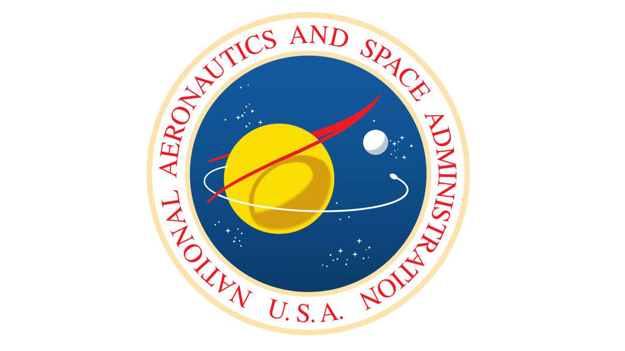
As a federal agency, once NASA was founded it needed an official seal. Federal seals are sometimes used in the same way as logos, but also hold heraldic and ceremonial significance. Working with other artists in NASA’s Lewis Research Center (now the Glenn Research Center), James Modarelli, head of the Research Reports Division, developed the NASA seal.
The shadow the wing drops onto the planet cleverly gives it a three-dimensional aspect
Illustrative in nature, the key element of the NASA seal is a stylised pair of wings based on a supersonic wing concept designed by aeronautical engineer Clint Brown. Linking back to the NACA emblem, the wing shape straddles a spherical planet, which is orbited by an object, with a moon and stars in the background. Although they look like they might be constellations, the star patterns are artistic embellishments. The shadow the wing drops onto the planet cleverly gives it a three-dimensional aspect.
Get the Creative Bloq Newsletter
Daily design news, reviews, how-tos and more, as picked by the editors.
After various officials within NASA had given their input, the seal went through several layers of stakeholder approval – something anyone who works in corporate branding can identify with. Firstly, it went to the Heraldic Branch of the Army Office of the Quartermaster General. Then to the Fine Arts Commission. At this stage, Clint Brown noticed that his wing design had been drawn upside down, so the artwork was sent back for amendments. After second looks by the Heraldic and Fine Arts bodies, the NASA Administrator Dr T Keith Glennan approved the design and it was sent to President Eisenhower for final sign-off.
Because the official seal is only really used on letterheads, awards and on NASA’s ceremonial, you might be wondering why we’ve gone into so much detail on its design. The reason is that rather than have a fresh logo designed for everyday communications, Glennan asked Modarelli to simplify the seal.
This process took place alongside the development and approval of the seal and resulted in a design with a circular blue background (Pantone 286) to represent a planet, with the wing configuration central in red (Pantone 185) signifying aeronautics. This time, the wing straddles the acronym NASA in a high contrast serif type with stars in the background representing space and an orbiting object to symbolise space travel.
NASA usually refers to this logo as an insignia, which gives it a bit of a military flavour. It was on Neil Armstrong’s space suit when he stepped onto the moon 50 years ago, and has appeared on spacecraft, airplanes, buildings, ground vehicles, signage and so on – never mind the fact that, with its little stars, it's tricky to render at small sizes and on certain media.
In 1974 the controversy began. NASA’s leadership decided that the Agency needed a more contemporary look. The idea didn’t just come out of the blue. Between 1972 and 1981 nearly 50 government agencies looked at their identities and made changes with support from the Federal Graphics Improvement Program and the National Endowment for the Arts.
NASA engaged the New York identity design firm Danne & Blackburn to create a more modern logo. They analysed the Agency and how the logo needed to be used. Danne & Blackburn noted that the round emblem really reflected an old fashioned sci-fi take on the space programme, and didn’t chime with the real science that NASA stood for.
The fluid curving of the letters represented continuity, and there’s something aerodynamic about the design
There is nothing pictorial about the modernist design Richard Danne and Bruce N Blackburn came up with. Their single width lettering symbolised the unity of NASA and of the US in general. The fluid curving of the letters represented continuity, and there’s something aerodynamic about the design. Without their horizontal strokes, the 'A's have a sense of vertical thrust.
Though the actual changeover took years to implement, the way it was communicated may have been the reason why some NASA employees dug in an fought against what they called the ‘worm’ logo. Federal agencies are almost like feudal states and because news of the new logotype arrived on paper headed with the new, as yet unseen logotype, it landed as something of a surprise for middle managers across the organisation. It came with a 90-page standards manual, which is available to read on the NASA website. Younger staff tended to like the new logo, older staff didn’t.
Danne & Blackburn’s logotype was implemented in 1975, with NASA Administrator Dr James C Fletcher commenting on how the Agency believed in progressive design. With its sleek, geometric logo and rigorous visual standards NASA won the 1984 Presidential Award for Design Excellence.
Return of the meatball – 1992 to present
Perhaps the battle lines were drawn when Frank ‘Red’ Rowsome, Head of Technical Publications at NASA, referred to the original round insignia as a ‘meatball’ during the introduction of the ‘worm’ logo. Or it could be that with the Challenger disaster in 1986 and other setbacks morale was low and something needed to change. Possibly, pressure from older employees was the main factor.
Whatever the case, on his first day in the job in 1992, the new administrator Daniel S Goldin took the snap decision to reinstate NASA’s original logo. The move was just as controversial as the introduction of the logotype in 1975 and was the subject of widespread debate.
The argument rages on to this day, and like so many issues at the moment it polarises progressive and conservative viewpoints. Debate was reignited in 2017 when NASA, for the first time, licensed the ‘worm’ logo to fashion firms to use on their products. This revived interest in the modernist logo.
Perhaps, with some calling for NASA to keep its current logo, others saying the logotype should be reinstated, and the Agency looking like it needs fresh impetus, now is the time for a brand new NASA logo… the next giant leap.
Garrick Webster is a freelance copywriter and branding specialist. He’s worked with major renewable energy companies such as Ecotricity and the Green Britain Group, and has helped develop award-winning branding and packaging for several distilleries in the UK, the US and Australia. He’s a former editor of Computer Arts magazine and has been writing about design, creativity and technology since 1995.