Mid-century modernism: 15 iconic examples
A designer’s guide to mid-century modernism.
Mid-century modernism enjoyed its heyday between the 1940s and 1960s. However, the influential design movement never dropped out of favour, and today continues to confound critics by remaining on-trend in a big way.
Interest in the aesthetic is fuelled by the success of cult dramas such as Mad Men, driving demand for mid-century modern items at vintage stores, furniture fairs and online marketplaces such as Etsy.
What is mid-century modernism?
Mid-century modernism is a practical, clean-lined design movement spanning architecture, interior design, furniture, product and graphic design created during the middle of the 20th century. The exact dates are open to debate: some place mid-century modernism between 1933 and 1965, while others claim the time period was smaller – from 1947 to 1957.
What is the mid-century modern style?
Mid-century modernism is as functional, simple and straightforward as its rather literal name. Mid-century modern design is full of clean, sculptural lines, simple, organic shapes and neat proportions, as well as vibrant colour palettes – an evolution of earlier Modernist styles such as Bauhaus, which is 100 years old this year.
Read on to discover 15 iconic examples of mid-century modernism across furniture, architecture, products and graphics...
01. Eames Lounge Chair
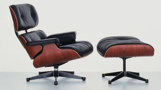
Many mid-century modern designers opted for a deliberately artificial aesthetic, rather than trying to imitate wood grain or other more traditional materials. Metal, glass, vinyl and plywood were commonly used.
Perhaps the most famous example of mid-century modern furniture is the Eames Lounge Chair and Ottoman, designed for Herman Miller in 1956, which combine curved outer shells in moulded, veneered plywood with soft leather.
Get the Creative Bloq Newsletter
Daily design news, reviews, how-tos and more, as picked by the editors.
Up until this point, Charles and Ray Eames had designed affordable products for mass-production, and this was their first attempt at high-end luxury. It has been in production continuously ever since, and is part of MoMA's permanent collection.
02. Helsinki University of Technology
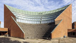
Finnish designer Alvar Aalto was hugely versatile and multi-skilled. His work encompassed architecture, furniture, textiles and glassware, as well as sculptures and paintings.
Aalto's so-called 'redbrick period' of architecture began with a student dormitory called Baker House at Massachusetts Institute of Technology, completed in 1949. Its undulating form gave each resident the best possible view of the Charles River.
On his return to Finland, Aalto applied a similar mid-century modern approach to the striking Helsinki University of Technology campus in 1950, as well as Säynätsalo Town Hall (1952) and Helsinki House of Culture (1958).
03. Linen Type postcards
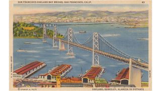
In the USA, mid-century modernism was reflected in the design of Linen Type postcards, which largely comprised national view-cards of American cities, buildings and monuments.
Curt Teich in Chicago was the most prolific publisher of these postcards, and pioneered lithographic printing in the process. Produced on paper with a high rag content, they had a fabric-like feel.
One of Teich's clients was California-based photographer Stanley A. Piltz, whose Linen Type postcards depicted scenic views of the San Francisco Bay Area, as well as the 1939 Golden Gate International Exposition.
04. Coupe pottery
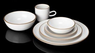
American pottery designer Edith Heath founded Heath Ceramics in 1948, which went on to produce an extensive range of mid-century modern ceramic tableware, as well as architectural tiles.
Like the Eames Lounge Chair, Heath Ceramics' most famous Coupe line has stayed in constant demand since it was released, with only occasional changes to the texture and colour of the glazes used.
05. Farnsworth House
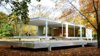
Another icon of mid-century modern architecture is Ludwig Mies van der Rohe's Farnsworth House, completed in 1951.
A one-room weekend retreat commissioned by prominent Chicago nephrologist Dr. Edith Farnsworth, the 1,500 square-foot steel and glass construction can be found 50 miles outside of Chicago, just south of Plano, Illinois.
Having joined the National Register of Historic Places in 2004, the Farnsworth House was designated a National Historic Landmark in 2006 and is currently operated as a historic house museum.
06. Paul Rand's logo designs

Something of a legend in graphic design circles, Paul Rand is also a pioneer of mid-century modern graphic design, applying the principles of bold geometric shapes, clean lines and graphic symbolism to his logos for the likes of IBM, UPS and ABC.
Modern-day revivals of this aesthetic include the flat design movement, and minimalism in general: mid-century modern graphic design was all about distilling complex concepts into the simplest visual forms.
07. Egg chair
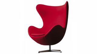
Designed by Arne Jacobsen in 1958 for the Radisson SAS hotel in Copenhagen, the Egg chair is an iconic example of mid-century modernism. Making use of state-of-the-art materials at the time, it was thought to be inspired by Eero Saarinen's Womb chair.
Jacobsen was fond of naming his creations, and his chair portfolio includes the Swan, the Ant, the Cigar, the Pot, the Drop and the Giraffe.
The Egg in particular enjoyed a return to the limelight in 2000: it was used as the diary room chair in the first UK series of Big Brother.
08. Palacio da Alvorada
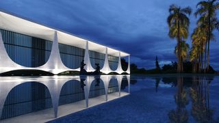
Located in Brasília, Oscar Niemeyer's design for the Palacio da Alvorada – the official residence of the President of Brazil – is another standout example of mid-century modernist architecture.
Completed in 1958, it has been the residence of every Brazilian president since Juscelino Kubitschek and is a National Historic Heritage Site.
09. Lucienne Day's pattern work
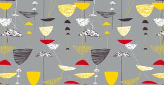
Mid-century modern colour palettes are distinctive. They often include light, bright and vivid hues such as sunshine yellow, mint and fuchsia, as well as warm, rich and earthy hues such as gold, paprika red and olive green.
Lucienne Day's graphic pattern work was hugely influential on the mid-century moderism aesthetic, and was applied to everything from wallpapers and carpets to ceramics and mosaics.
One of Day's best-known pieces, Japanese-influenced design Sunrise uses a sophisticated palette of gold, pumpkin and petal pink.
10. PH Artichoke Pendant
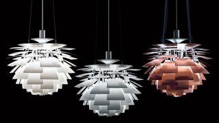
Danish architect and designer Poul Henningsen is perhaps best-known for his contribution to lighting design, with one standout example in the mid-century modern style being the PH Artichoke Pendant.
Constructed from interlocking geometric 'leaves', the distinctive fixture features a chrome inner diffuser, and is available in copper, white or brushed stainless steel. It's so heavy, it needs steel aircraft cables to support it.
11. MIT Chapel
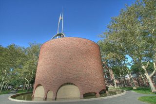
Eero Saarinen's design for the non-denominational chapel on the campus of Massachusetts Institute of Technology (MIT) can be found next to the Kresge Auditorium and Kresge Oval – which Saarinen also designed.
A striking windowless brick cylinder set inside a shallow concrete moat, topped by an aluminium spire, the chapel is widely celebrated as a successful example of architectural mid-century modernism. Saarinen created texture by deliberately selecting bricks that were rough and imperfect.
12. Rudolph de Harak book covers
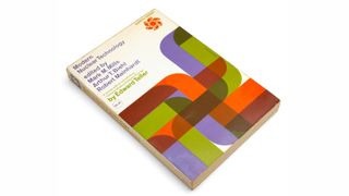
Rudolph de Harak was another leading exponent of mid-century modernism in graphic design. Like Lucienne Day, he combined distinctive colour palettes with simple geometric shapes to communicate a message in a stylised, graphic way.
His book cover designs for McGraw-Hill Paperbacks are standout examples of this style, communicating diverse and complex topics. His illustrations for Modern Nuclear Technology, for example, and Personality and Psychotherapy, use simple, graphic, overlapping shapes – a characteristically mid-century modern technique.
13. Tulip chair
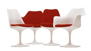
As well as architecture, Eero Saarinen was also a talented industrial designer. Designed in 1955 to complete his Tulip dining table, the classic Tulip chair has an unmistakably 'space age' vibe, and features the distinctive smooth curves and experimental materials characteristic of mid-century modern design.
Although Saarinen had originally planned to produce the chair from a single piece of moulded fibreglass, the material proved unable to support the weight and so the base was constructed from cast aluminium instead, then painted to match the upper shell perfectly.
14. Stahl House
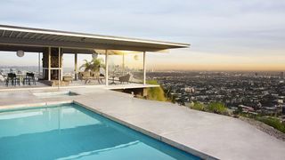
Many mid-century modern houses were designed as private residences, and Pierre Koenig's iconic Stahl House is one such example. It was built in 1959 as part of the Case Study Houses program – and is also known as Case Study House #22.
Located in Hollywood Hills, Los Angeles, the house was made famous by a Julius Shulman photograph showing two women sitting in one corner, with an awe-inspiring panoramic view behind them through its floor-to-ceiling glass walls. It has since been used in numerous fashion shoots, films, and advertising campaigns. It was listed as a Los Angeles Historic-Cultural Monument in 1999.
15. Saul Bass title sequences
Like Paul Rand, Saul Bass is an undisputed icon of mid-century modernism in graphic design – and his corporate identity work for clients such as Bell System and Continental Airlines was some of the most memorable of the era. His movie title sequences and film posters were arguably even more groundbreaking, however, using simple, graphic visuals to evoke the essence of the subject.
Bass worked for all the greats of the time, including Stanley Kubrick, Martin Scorsese and Alfred Hitchcock. His title sequences for North by Northwest and Psycho are among his most famous – as well as Otto Preminger, whose 1959 film Anatomy of a Murder featured a title sequence that used hand-cut type and rough, cut-out shapes to communicate the message in true mid-century modern design style.
Related articles:

Thank you for reading 5 articles this month* Join now for unlimited access
Enjoy your first month for just £1 / $1 / €1
*Read 5 free articles per month without a subscription

Join now for unlimited access
Try first month for just £1 / $1 / €1

Nick has worked with world-class agencies including Wolff Olins, Taxi Studio and Vault49 on brand storytelling, tone of voice and verbal strategy for global brands such as Virgin, TikTok, and Bite Back 2030. Nick launched the Brand Impact Awards in 2013 while editor of Computer Arts, and remains chair of judges. He's written for Creative Bloq on design and branding matters since the site's launch.
