Meet the artist who designed the Iron Throne
Where many artists failed, Marc Simonetti succeeded. Here he reveals how he drew the most recognisable chair in fiction.
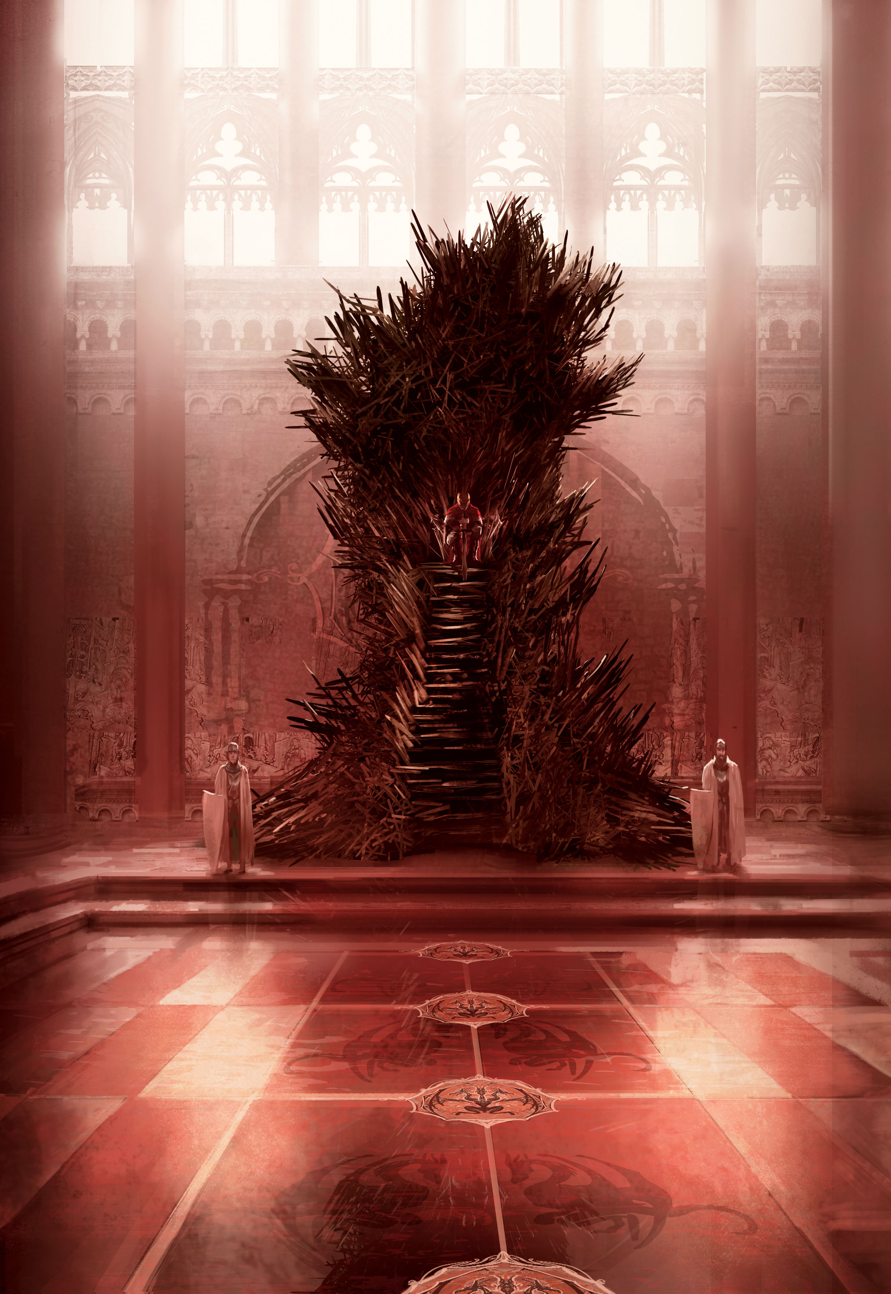
Marc Simonetti received a very detailed commission from an author. It described a throne – now perhaps the most famous throne not just in fantasy, but in fiction as a whole. In the past, many artists attempted to illustrate this throne (including Simonetti) but nobody had yet got it quite right.
The Iron Throne is a grotesque thing, described as being built using a thousand twisted steel blades. It’s big, too. So big that the king must climb steps to sit on it. Up to now, Simonetti had drawn the throne in silhouette. Then he came up with a new idea: he’d set the ugly throne against a beautiful background. The author, George RR Martin, liked what he saw.
“The Iron Throne worked once I did the background,” says the French illustrator. “Because picturing that big throne in a strong, beautiful environment balances out its ugliness. I just had to correct a few things and clean the piece. Martin said: ‘This is this one!’”
The Game of Thrones author was so impressed with the 2014 illustration – eventually published in companion book The World of Ice & Fire – that he suggested anyone who draws the throne in future should first consult Simonetti's drawing. Martin said the French artist got it “absolutely right”.

“With some commissions,” Simonetti says, “I read the whole book and then submit an idea. On others, I attempt to answer a brief. But I always try to have at least one small thing that makes the illustration pop. I can see when an illustration is beginning to acquire a special kind of visual interest, because it starts to vibrate.”
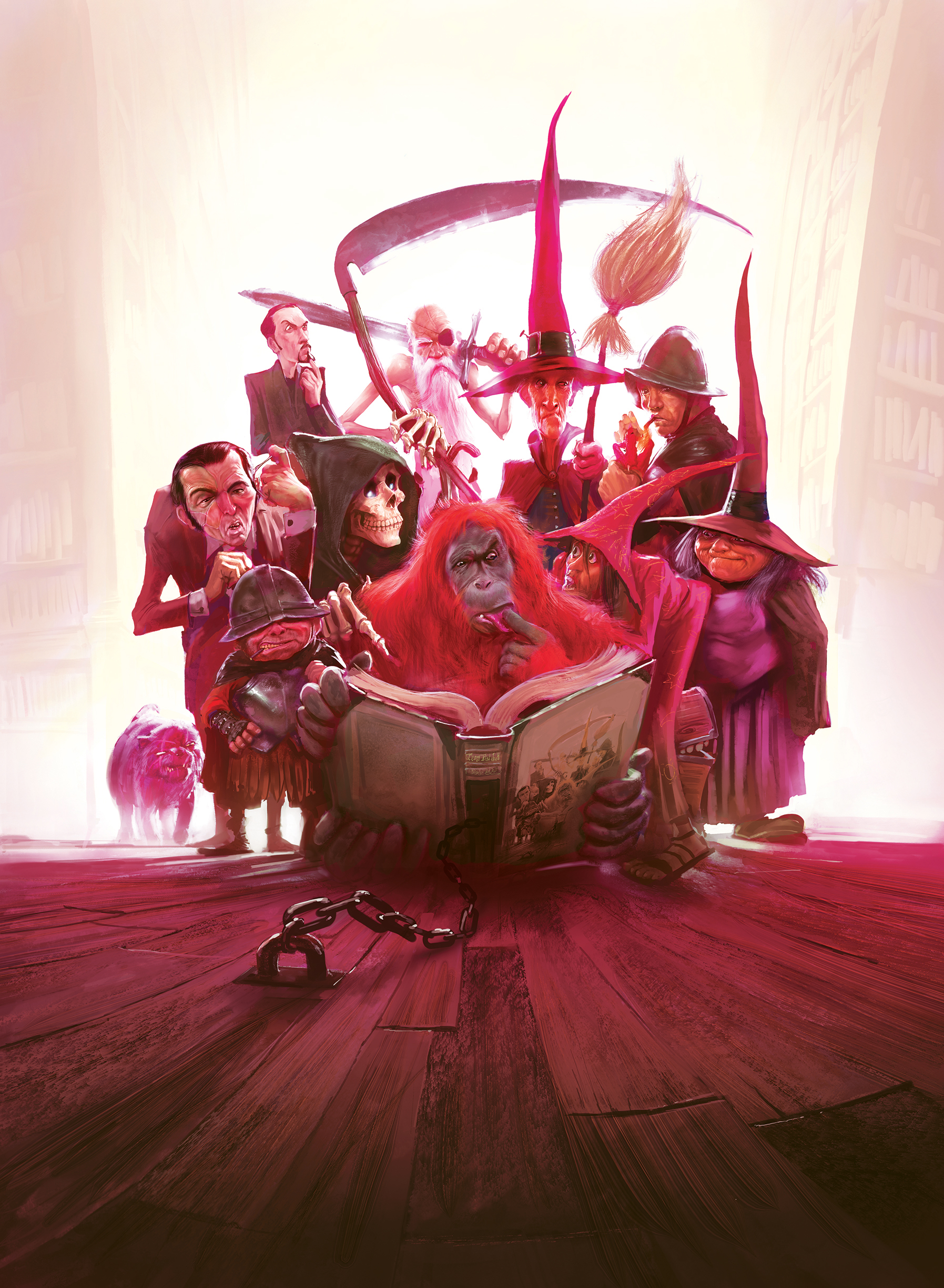
Simonetti is best known for his work on George RR Martin’s A Song of Ice and Fire fantasy novels. He’s also illustrated Terry Pratchett’s Discworld, Terry Goodkind’s Sword of Truth and the Farseer trilogy by Robin Hobb. Beyond his book illustrations, the Frenchman has created concept art for EA, Ubisoft and Activision. More recently, he moved into feature films.
“Sometimes I think I’m just a random geek,” he says, “a fan of comics, fantasy and science fiction. My illustrations have something that uses that generic language. Most of my ideas come from books, from my visual library. When I make an illustration, my only goal is to visually translate the feeling I have.”
Get the Creative Bloq Newsletter
Daily design news, reviews, how-tos and more, as picked by the editors.
Da Vinci was an engineer

Simonetti studied at two art schools at two very different times in his life. He attended the first – in French Alpine town Annecy – between eight and 14 years old. But art was just a hobby back then; really, he wanted to be an engineer. “Engineering looked kind of interesting, from a child’s point of view. But, for me, Leonardo da Vinci was an engineer.”
He found his career as an engineer a bit different to Da Vinci’s. So Simonetti signed up to the art college Emile Cohl School in Lyon.
“I attended for one year, to change my professional life. I was 25 years old then. I didn’t like my work as an engineer, so there was a lot at stake. I learnt as much as I could in that year, but my personal work was even more intense than the work done for the school.”
The Frenchman joined a video games company straight out of art school, but it took over five years before he made a decent living from his art.
Big talk
Simonetti always strives to make his paintings closely resemble the text he’s illustrating for, as with Martin’s Iron Throne. But there are a couple of characteristics that tie Simonetti’s work together. “Fetishes,” he calls them. He loves perspective, especially perspectives that look a bit wrong, a little twisted.
One of the problems George had with past illustrations of the Iron Throne was the scale. They simply weren’t big enough. No one does big quite like Simonetti.

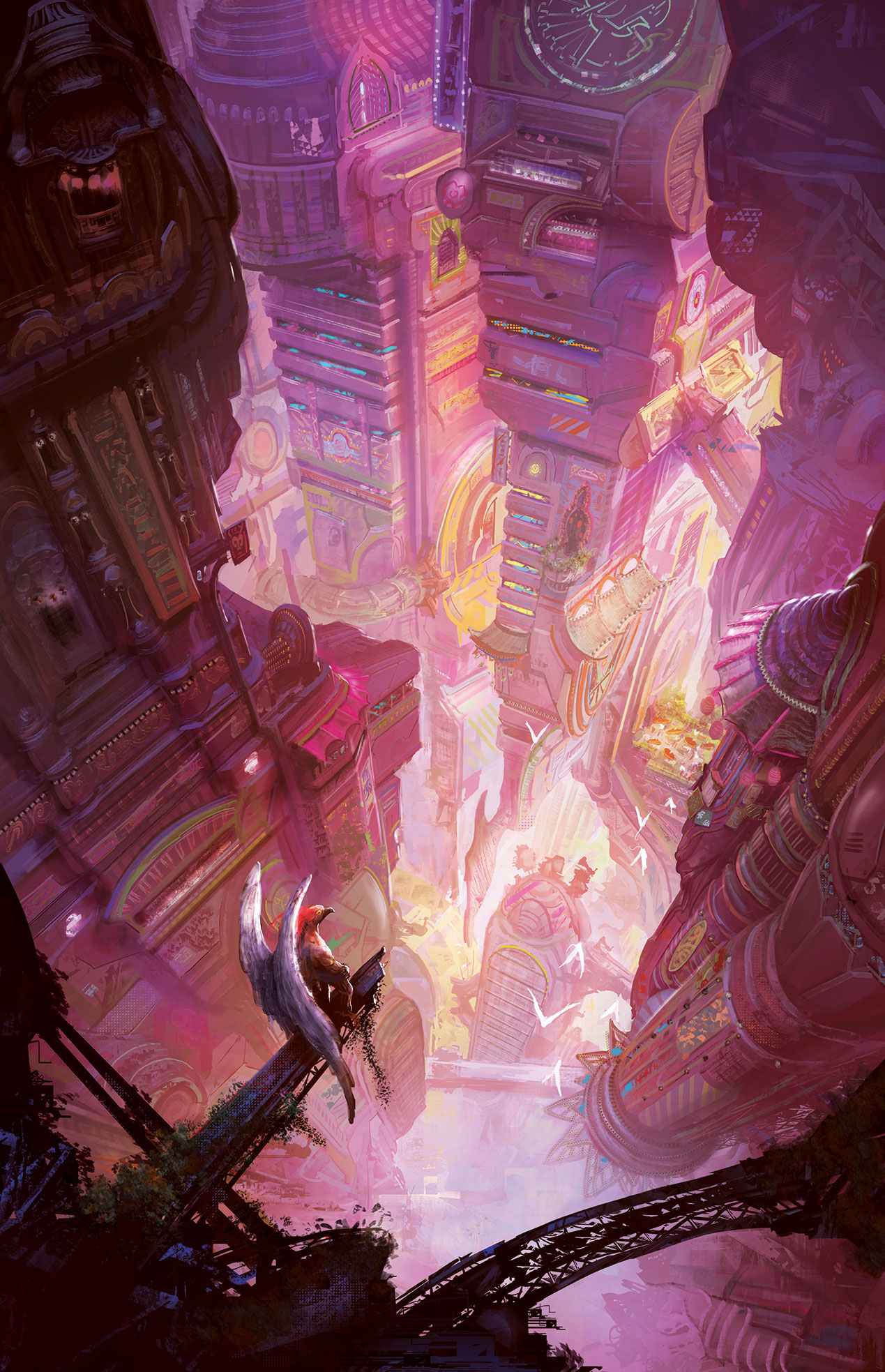
His environments go off into the distance and straight over the horizon for thousands of miles. His people are often dwarfed by the places in which he draws them.
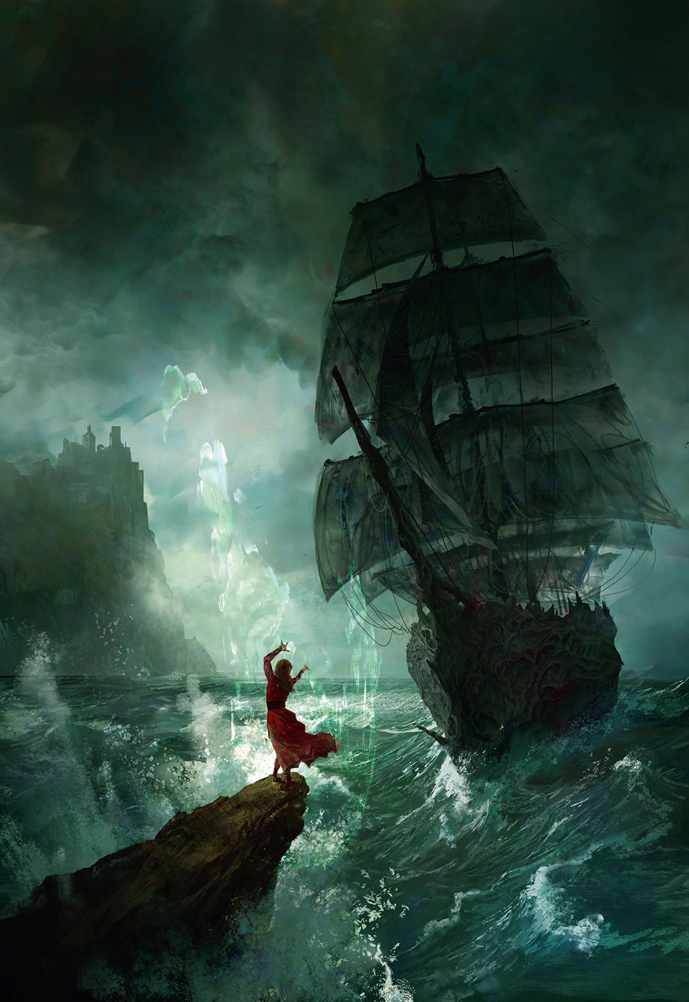
He loves colours, using them to create depth and mood. Some illustrations he gets right first time. Others, he has to start over again and again.
“At the end of the day, only my name will be at the bottom of the illustration, so I have to give my best each time. If I have to change a part of the picture that kills the composition or the colour scheme, I adjust the rest to make it work again. Most of the time it’s for the best. A good art director can really help make a great illustration.”
Artistic routine
Simonetti rents a small flat above his apartment, which he uses as a workspace. He sits at a big desk – two screens, Cintiq 27QHD graphics tablet – and works mainly in Photoshop. He also uses Modo, ZBrush, 3D-Coat and Cinema 4D. An average illustration project takes him between two and five days to complete.
“My only routine,” he says, “is to work every day, the whole day, whether I have a lot of work or none at all. To be training or working constantly makes the progression, and to get better every day is vital. A perfect workday is the day I can finally finish a picture that I love, then begin a new project that I’m very excited about.”

Simonetti is currently working on two projects that offer the kind of creative freedom he enjoys most. He’s drawing interior illustrations and cover art for the Shannara trilogy by Terry Brooks and Frank Herbert’s Dune Messiah. He always reads the book he’s illustrating – not all artists do. He also does a lot of extra research to ensure these illustrations are accurate.
As a working artist, his goal is always to please the client. But until the image is finished, he doesn’t think about anyone but himself. Whether working freely or within a more strict commission, Simonetti says that what comes out on the page is always a product of what’s already inside him.
Creative freedom
“There’s more freedom illustrating a small sci-fi novel: I just have to be faithful to the text and make a beautiful picture to sell the book. When I do concept art for games or movies, my goal isn’t to make a final product. It’s all about solving problems: how the mood should be, how to design some props, how some parts could work. So I have to be faithful with the visual identity of the game or movie. I’m just a small part of a team, so all my assets have to be clean and crystal clear to make them usable in 3D later on.
“I like constructive criticism, but I don’t know how to handle compliments. I’m perfectly okay with people expressing themselves. Not everyone has to like my stuff. But you can take any of my illustrations, keep the same composition, lighting and colours, but change the setting – say, from fantasy to steampunk – and it will still work. I try to adapt myself to each book and each theme, but I can only work with my own personality, my own feelings, my own choices.”
This article was originally published in ImagineFX magazine issue 143. Buy it here.
Related articles:

Thank you for reading 5 articles this month* Join now for unlimited access
Enjoy your first month for just £1 / $1 / €1
*Read 5 free articles per month without a subscription

Join now for unlimited access
Try first month for just £1 / $1 / €1
Gary Evans is a journalist with a passion for creative writing. He's recently finished his Masters in creative writing, but when he's not hitting the books, he loves to explore the world of digital art and graphic design. He was previously staff writer on ImagineFX magazine in Bath, but now resides in Sunderland, where he muses on the latest tech and writes poetry.
