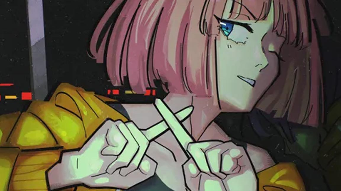
Meet the artist: Kenneth Anderson
Artist Kenneth Anderson has worked for Nick Jr., Sesame Workshop and CBeebies; he tells Dominic Carter about his career and offers advice for new illustrators.

Location US
Favourite artists Bill Watterson, Nick Park
Software & media Photoshop, Procreate, Col-Erase pencils
Website
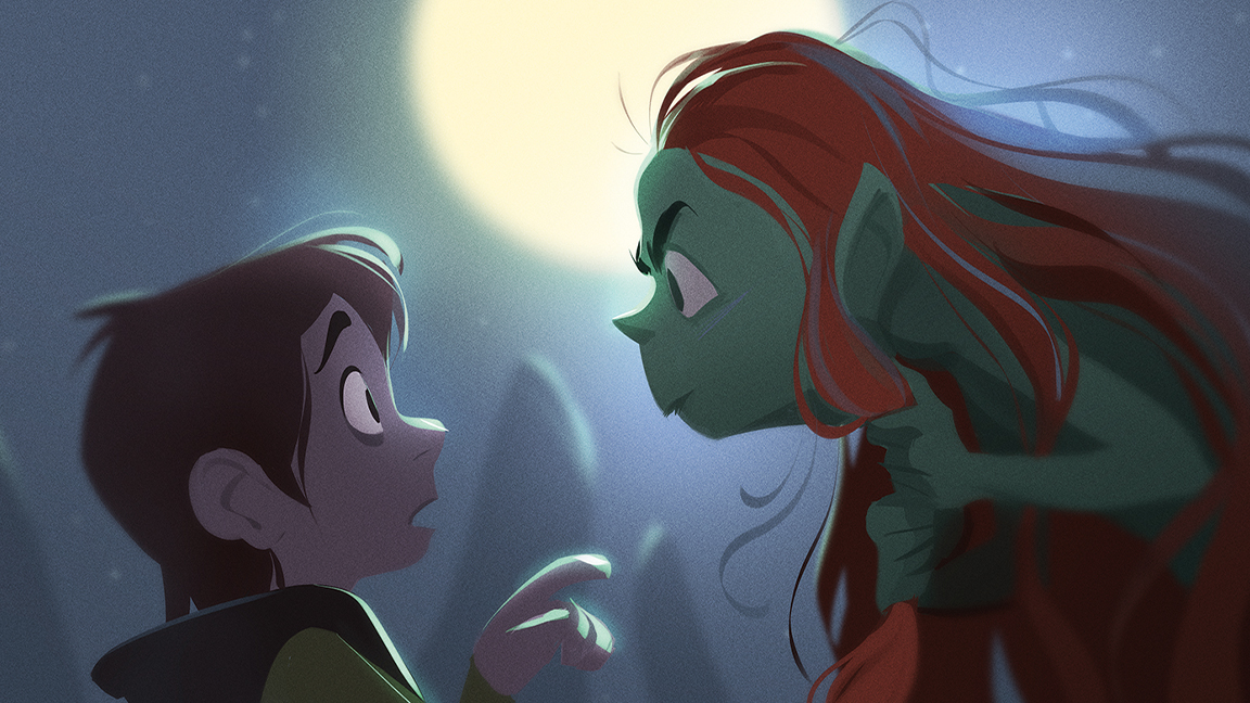
Working out of his business Character Cube, Kenneth Anderson has created character designs and illustrations for the likes of Nick Jr., Sesame Workshop and CBeebies.
The accomplished illustrator tells us how his characters and stories work together, and how he captures both in a single image. Sitting down with our writer the artist shares insights into his process and how he approaches his projects.
If you want to follow Kenneth Anderson's career and take up digital art, then take a look at our guide to the best digital art software for illustration, the best drawing tablets available now, and pick up some advice in our collection of tutorials for Photoshop.
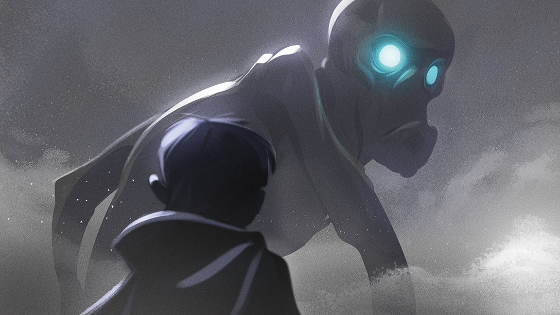
Kenneth Anderson Q&A
How did you get started, and what has your career been like so far?
I’ve been working as an artist since around 2005 and I’ve just realised that’s almost 20 years ago. I didn’t realise it’s been so long! I always knew I wanted to draw for a living and to work in animation in some capacity, so I studied animation at university up in Dundee, Scotland. I was lucky enough to start working fairly quickly after graduating, but my first job was as a junior 2D artist in a local games company.
I’d never considered working within games previously, but it totally made sense. I was obsessed with character-driven video games such as Monkey Island and Day of the Tentacle while I was growing up!
My career so far has been quite varied. I tend to go with the flow and see what happens, giving it little nudges in certain directions from time to time. I’ve worked in video games, I worked as an animator early on in my career, I’ve been designing characters as a freelancer since 2009, and more recently I’ve been doing a lot more illustration. I like keeping it varied! But at the same time, everything I do is very character focused.

What made you want to specialise in creating character designs for children’s television?
While growing up, I was constantly drawing all sorts of weird characters. I remember in high school I wrote this stupid song, recorded it, burnt it to a CD, and then created a character as the singer for the sleeve art. I called him Jimmy Sausage; he was basically a cross between a sausage and Jimi Hendrix – I was going through a foodstuffs as characters phase at that point – and it was a big hit with a mate of mine. I think my current career as a character designer just evolved out of that impulse to create silly characters and bring them to life.
I didn’t realise, however, that I could actually get away with drawing characters as a living until I discovered Stephen Silver’s work. Realising that there were artists out there whose job it was to design characters was an epiphany for me. Before this I didn’t have a specific specialism in mind, but as soon as I realised that becoming a professional character designer was a thing, it all made sense.
The children’s television role kind of happened by accident, I didn’t really pursue it at all. But I think my style suits that medium well, so those clients gravitated towards me, and before I knew it the bulk of my work was coming from that world!
I have Dan Bays to thank for that. He was developing Bitz & Bob at the BBC at the time, and reached out to me for some character development. That became my first proper character design work for kids television and then things just snowballed from there. Thanks Dan!
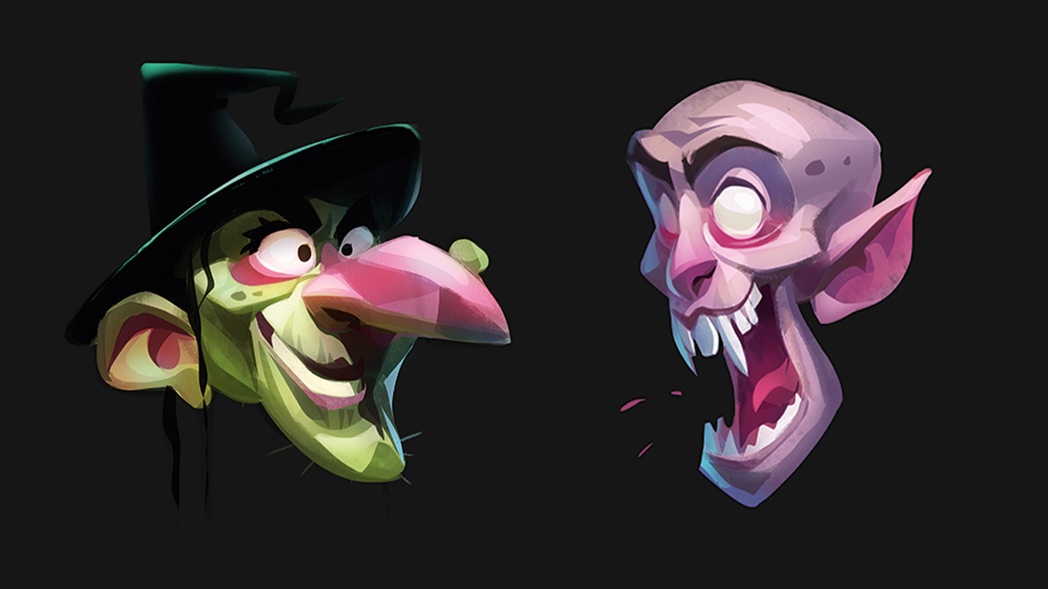
How is designing characters for younger audiences different to creating them for adults?
There are some obvious things you can’t do with characters for younger audiences: nothing sexualised, no smoking and drinking, avoid weapons and such, although that does depend on the age of the audience. With designing for adults, pretty much anything goes I guess, within reason.
From a pure design point of view, the younger audiences will generally respond best to certain design choices; cuter, softer, more colourful characters for example, with bigger heads. They seem to be the way to go! Basically, I think the younger the audience, the more stylised you can go with your designs; almost into pure abstraction. Almost but not quite.
When it comes to the adults, as a general rule, you want to design more realistic characters, which have more natural proportions, although they can still be stylised. But this will really depend on the nature of the story that’s being told. And of course you can subvert the younger audience style and adapt it for an adult audience, usually for comedic effect. Shows such as Happy Tree Friends and South Park do this well.
But from a personal point of view, I think I’m tapping into different parts of my psyche depending on the nature of the job. If I’m designing for kids, I’m definitely channelling my inner child, remembering my childhood, the things I used to do as a kid, the things that made me happy and bringing all of that into my work. If I’m ever designing stuff for adults, and I do dabble in personal work that has darker themes and energy, then I’m tapping into the different, darker experiences from my life, and the way I draw will reflect that.
You recently illustrated Clarity Jones and the Magical Detective Agency. What’s it like creating characters in collaboration with an author?
It’s fun! Chris Smith, the author, is great in that he always has a clear idea of what he imagines his characters look like. Then it’s up to me to try and represent that on the page while giving my own spin to it.
The thing I like is that an author seems mostly invested in finding the character from a story point of view, there’s something pure about that. Whereas in animation there’s often that voice saying, “Can this character be made into a mass-market toy?” So yeah, generally there are fewer restrictions or voices to please when designing a book character. There can be a bit of back and forth when trying to find the right design, but not as much as in animation.
Also, it’s freeing not having to worry about any technical restraints when designing for a book. There’s no need to worry about if the character is animatable or how long a design will take to model rig and render, so it’s really quite refreshing in that sense.
Tell us about the illustrations you draw every day on social media.
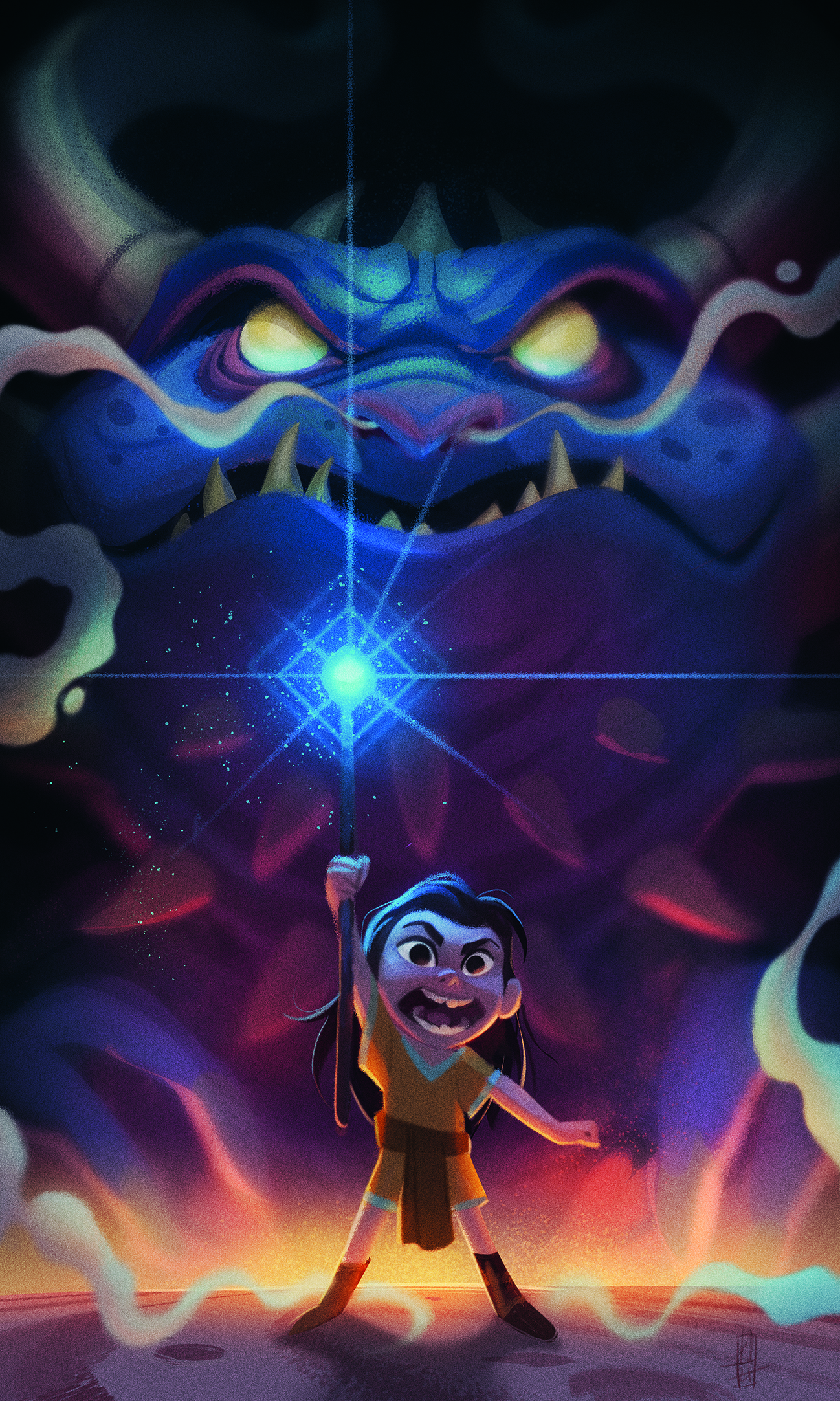
Basically, last year I posted like five times or something. I seem to be a man of extremes. So this year I said, “Right, I’m going to post more!” I knew if I aimed to do one drawing every week or so I would forget, lose track and fail. So I went all in and committed to a drawing a day, so it’s less easy to forget.
I really wanted to draw something every day just for me and nobody else; no clients giving me any feedback or asking for changes. My drawing, my rules. It’s important to have a creative outlet outside of work, and to just draw for fun.
Doing this, I’ve learned to let go a bit and not be a perfectionist. I know I’m not posting my best work every day. Some days I only have literally 30 seconds spare to draw something. But I realised I needed to take the pressure off myself to always be making great art. I would much rather be drawing something than nothing! It’s also a great outlet to experiment and try to synthesise new styles into my work. And I think that, just by drawing every day, I’ve started to improve my work in little ways too.
What’s the last character you saw that made you think, “I wish I’d designed that?”
Every time I scroll through Instagram I see a character that makes me think that, from so many different artists! James Woods’ characters usually have that effect on me.
I do love some of the dragon designs from How to Train Your Dragon, especially the Bewilderbeast. I’m a fan of Nico Marlet’s work. And I love the design of Gromit from Wallace and Gromit as well. He’s so simple yet so endearing and lovable and full of life.
Also, there is a piece of concept art out there on the web of the ghost pirate LeChuck from Monkey Island that I love. I don’t think the concept translated exactly into the video games, but it’s so cool; the shapes, the proportions, the upside down dead bird used as plumage in his pirate hat. LeChuck is the reason I draw so many pirate zombies.
What advice would you give to aspiring character designers who are hoping to follow in your footsteps?
Well, there have never been more opportunities to design characters for a living than you’ll find now. That said, I think it’s important to have a diverse skill set, as not all my work is pure character design. I do illustration, prop design, comics, whatever I need to do to pay the bills.
So I’d recommend building up your skill set, especially early on in your career. Be prepared for a long, hard slog, and start out by not doing your dream job. Everything is a stepping stone and will give you the experience that you can draw upon throughout the rest of your career.
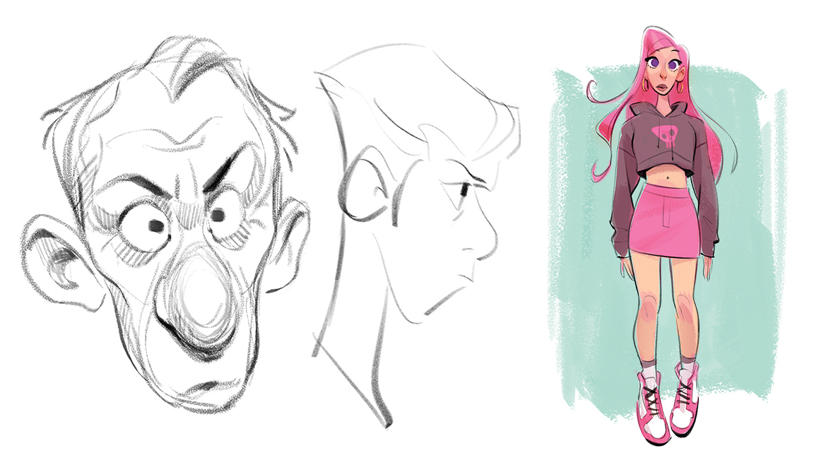
Also, don’t neglect the meat and veg of character design. The turnarounds, expression sheets and all the rest of the technical stuff are important skills for you to develop as a character designer. Part of the character designer’s job is to create and design for a specific purpose with technical restraints and a production pipeline.
Lastly, don’t give up! Don’t let hard work, turnarounds, or AI scare you out of becoming a character designer. Character design is about more than just creating something that looks pretty or cool. It’s about storytelling, it’s about putting a little piece of your soul into a drawing and bringing it to life, and touching the heart and mind of some little kid somewhere watching Saturday morning TV.

Kenneth Anderson's tips for character creation
01. Read the brief
Pay attention to what the author is asking for! Be sure to read the book or story you’re illustrating too, as it will help you to visualise the characters and their world.
02. Have fun
Have fun with the character designs! You’ll have far fewer technical restrictions to deal with working on an illustration, so make the most of that freedom.
03. Check your style fits
Always calibrate the style for the intended audience. Keep in mind the story and the world of the characters, and try to bring that into everything you draw.
04. Capture movement
Even though your characters aren’t moving, they need to feel like they’re performing. Try to capture them in the middle of an action, or anticipating one!
05. Get the basics right
Illustration still demands the same character design skills as any other medium. Remember the basics of creating a good design, such as playing with contrast or using pleasing shapes.
Advice for capturing story and character
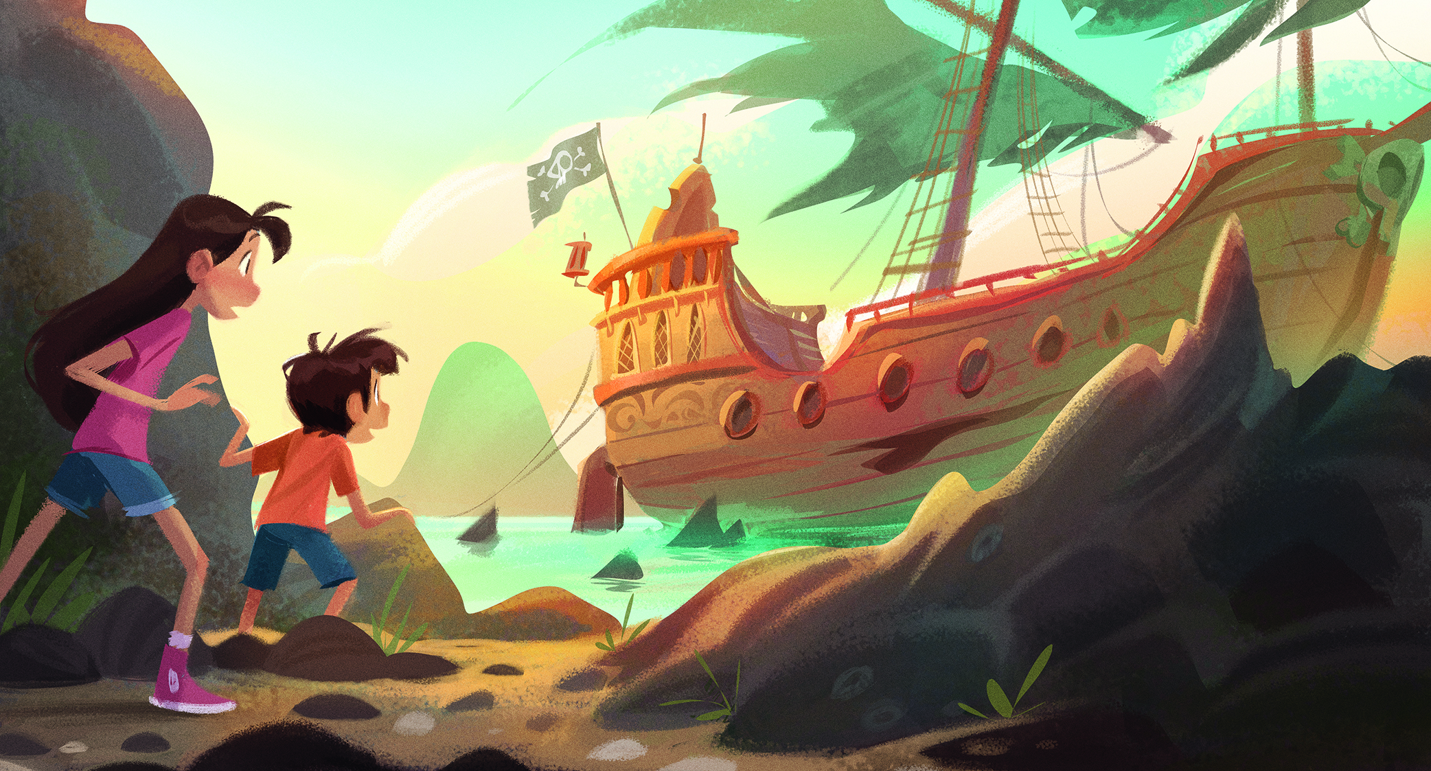
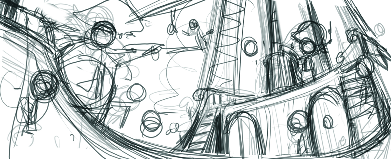
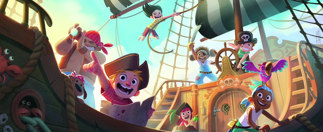
This piece took me three years! I drew this sketch one year and created, mostly by accident, a really cool composition with the boat. But I started painting into it and I think my skill level wasn’t ready for the image at the time. I got disheartened, distracted and forgot about it. I tried to get back into it a year later and failed again.
The following year I dusted it off and started again. I went back to the initial sketch and composition I loved, but re-problem solved the characters and the lighting, and then things started to flow better. Sometimes taking time to think is a necessary part of the process, so don’t be afraid to put an image aside and come back to it.
It was important to figure out a cool story moment for the piece, and in this case the composition dictated that. The only thing that made sense was the characters discovering a long lost island.
Once I had that idea in mind I drew everything to fit; the kid with the map pointing, them all looking off into the distance. The angle also added to the excitement and energy of the moment. I wanted all of the other characters to be supporting that main idea but all doing something different.
Get the Creative Bloq Newsletter
Daily design news, reviews, how-tos and more, as picked by the editors.
Again, the story also dictated the scene’s lighting. I wanted the warm, almost setting sun to be casting a warm glow over the characters. They made it!

This content originally appeared in Imagine FX. Subscribe to the magazine at Magazines Direct.

Thank you for reading 5 articles this month* Join now for unlimited access
Enjoy your first month for just £1 / $1 / €1
*Read 5 free articles per month without a subscription

Join now for unlimited access
Try first month for just £1 / $1 / €1

Dom Carter is a freelance writer who specialises in art and design. Formerly a staff writer for Creative Bloq, his work has also appeared on Creative Boom and in the pages of ImagineFX, Computer Arts, 3D World, and .net. He has been a D&AD New Blood judge, and has a particular interest in picture books.
