McDonald's and Burger King are two of the world's biggest fast-food giants, and that creates some rivalry. The so-called 'burger wars' began back in the 1970s when Burger King started mocking the size of McDonald's hamburgers, and the bouts have continued since then. But the digs have mainly been one way. McDonald's has generally shrugged off targeted ads, and it's remained the bigger brand.
On the face of it McDonald's and Burger King aren't hugely different propositions. Fast fatty, salty and sugary food that's conveniently ubiquitous. But while Burger King has won awards for attention-grabbing campaigns, McDonald's still stands out as the more assured brand with the clearer identity. So what is it that makes McDonald's ads so almost flawlessly brilliant? I think it boils down to these six factors (See our pick of the boldest McDonald's ads for more examples).
1) Nostalgia
One of the most powerful assets that McDonald's has is nostalgia. Both brands have a long history, and McDonald's is only a decade older, beginning life in the 1940s. But McDonald's has been the leader for a long time and it was an icon of the post-war boom years in the US. Burger King was inspired by McDonald's and it's never been able to get passed the fact the McDonald's led the way.
On the contrary, as we'll see, much of Burger King's advertising reaffirms McDonald's place as the market leader, whereas, McDonald's goes all in on leveraging the nostalgia value of its brand. That can be through something as subtle as the colour grading in the summer advert above or it can be as direct as bringing back Grimace for a social media takeover. Even the McDonald's logo itself evokes nostalgia, based as it is on the shape of the arches at early restaurants.
2) Brand recognition
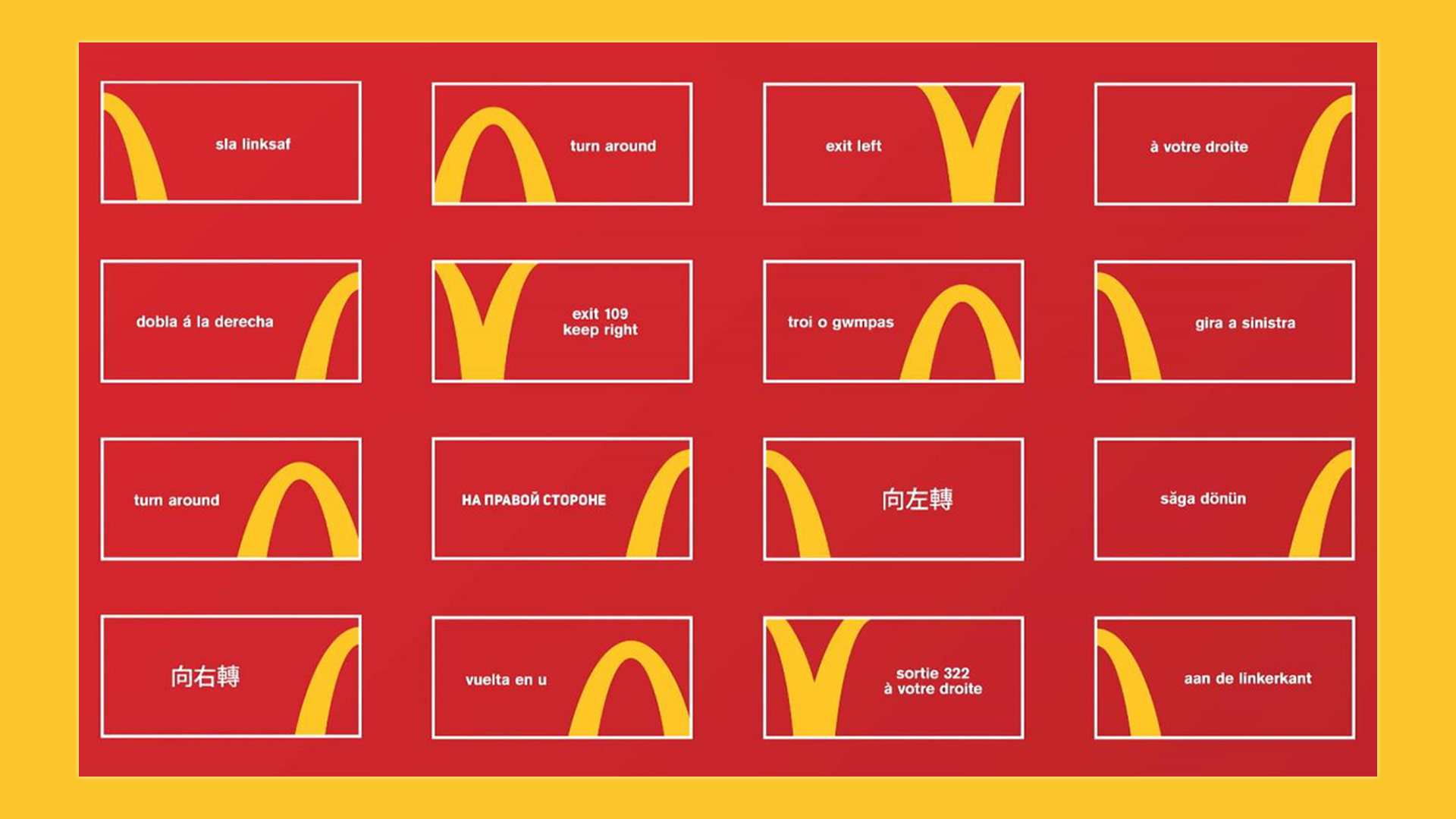
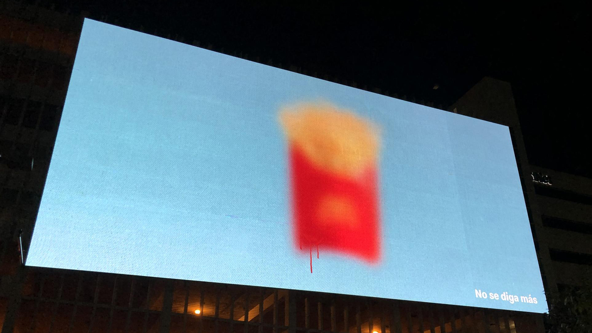
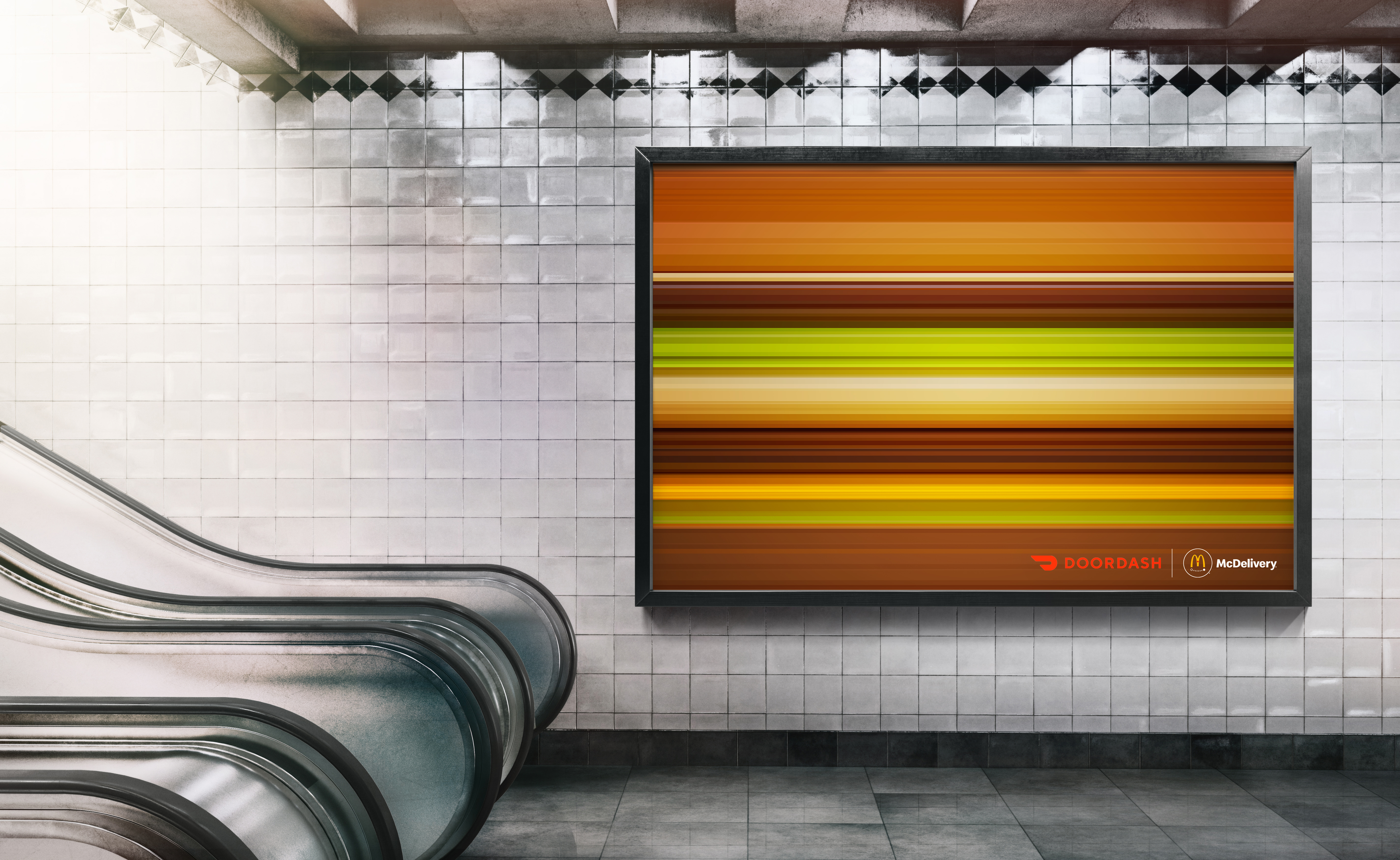
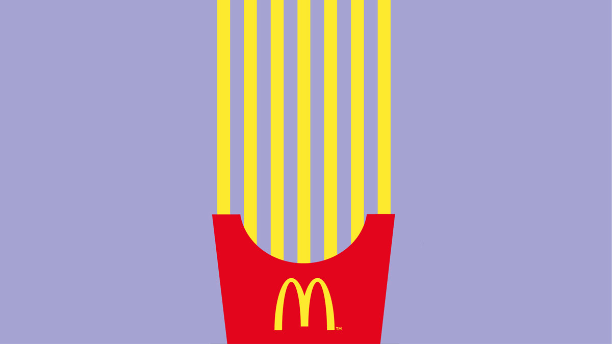
Speaking of the McDonald's logo, the power of its recognisability is immense, up there with the likes of Apple, Nike and Coca-Cola. That's partly because it's so distinct. The Burger King logo may be almost as ubiquitous, but it isn't as unique. The logo shows a burger, but Burger King doesn't own the burger. The Wimpy logo also looks like a burger, as do the logos of dozens of smaller brands.
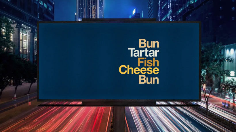
The same applies to the brand colours. They're not hugely dissimilar, but that particular shade of red and yellow are McDonald's. The Burger King shade of red and orange could be the old Pizza Hut, the old Wimpy or a generic brand. In its advertising, McDonald's has fully taken advantage of how recognisable its logo and its products are, producing countless campaigns that use minimalist visuals but leave no doubt as to who is speaking to us.
3) Celebrity
I think the power of celebrity in advertising can sometimes be overrated, but there's no doubt that high-profile campaigns featuring the likes of Justin Timberlake and LeBron James, or more recently, Travis Scott, Mariah Carey and BTS, or even the recent Hello Kitty McDonald's Happy Meals in Japan, have kept McDonald's firmly in the public eye.
Get the Creative Bloq Newsletter
Daily design news, reviews, how-tos and more, as picked by the editors.
It's not only the use of celebrity, but how they're used. McDonald's 'Famous Orders' campaign drew on celebrity culture but also invited customers to focus on their relationship with the brand too. Burger King has also turned celebs. There was the 'Keep It Real Meals' campaign a couple of years ago as part of its focus on non-artificial ingredients, but it was less personal.
4) Burger King's challenger status
Despite having around 18,700 locations in more than 100 countries, Burger King still almost feels more like a challenger brand, and it's own advertising is to blame. Instead of focusing on the customers' relationship with the brand, it tends to go in for 'look at me' attention-grabbing stunts. These can be powerful and win advertising awards but they don't tend to generate an emotional connection to the brand.
And a big part of these efforts over the years have been dedicated precisely towards goading McDonald's. Its delivered countless targeted campaigns to try to convince us that the Whopper is better than the Big Mac (Yes, that's a 4-year-old Sarah Michelle Gellar as Buffy the Big Mac slayer in the ad above).
The concept of its 'Be Your Way' tagline revolved around showing that it was more flexible that McDonald's, and even the striking, award-winning 'Moldy Whopper' ad (see below) was a response to the social media claims that Big Macs don't decay. Its Whopper detour advert could be seen as a response to McDonald's directions ads.
Rather than convincing the world that Whopper is the best burger, its advertising has reinforced the idea that it's McDonald's that leads and that Burger King wants to forever be the plucky underdog, which doesn't always gel when you're a massive global brand. Burger King has even rewarded customers for committing arson against McDonald's (virtually).
A post shared by Social Samosa (@officialsocialsamosa)
A photo posted by on
5) McDonald's doesn't get involved
Despite such obvious direct targeted advertising like the 'Whopper Detour' above, McDonald's has remained above such rivalry. Rather than respond to the baiting, it's tended not to bat an eyelid, continuing with its own creative campaign. It's always felt like McDonald's feels it doesn't need to grab attention or fight back because its confident in its status as leader. Much like Samsung vs Apple, another big brand rivalry that tends to see the punches thrown all in one direction, its makes Burger King seem almost petty.
6) McDonald's creates emotional connections
Ultimately a comparison of McDonald's vs Burger King advertising shows us that emotional connections beat attention grabbing stunts and factual product comparison, something that Apple understands so well.
We've already mentioned nostalgia. As well as this, McDonald's channels fun, friends and family, in everything from its colours to its choice of music to taglines like 'good time, great taste' in the 1980s or 'I'm lovin' it' in the noughties. Meanwhile, Burger King tries to get attention by shouting and using sarcasm and shock value. It feels abrasive and pits itself as the jealous rival.
Just compare, the brands' recent Christmas campaigns. McDonald's resurrected the eyebrows campaign and portrayed itself as a fun antidote to a boring office Christmas party. It was a relatable situation that people could connect to. Burger King? It went and ruined Christmas for children by calling Santa a 'whopper'.

Thank you for reading 5 articles this month* Join now for unlimited access
Enjoy your first month for just £1 / $1 / €1
*Read 5 free articles per month without a subscription

Join now for unlimited access
Try first month for just £1 / $1 / €1

Joe is a regular freelance journalist and editor at Creative Bloq. He writes news, features and buying guides and keeps track of the best equipment and software for creatives, from video editing programs to monitors and accessories. A veteran news writer and photographer, he now works as a project manager at the London and Buenos Aires-based design, production and branding agency Hermana Creatives. There he manages a team of designers, photographers and video editors who specialise in producing visual content and design assets for the hospitality sector. He also dances Argentine tango.
