Making Star Wars: Visions Volume 2
We meet the artists behind the nine animated shorts created for Making Star Wars: Visions Volume 2, including Aarman, Cartoon Saloon and Triggerfish.
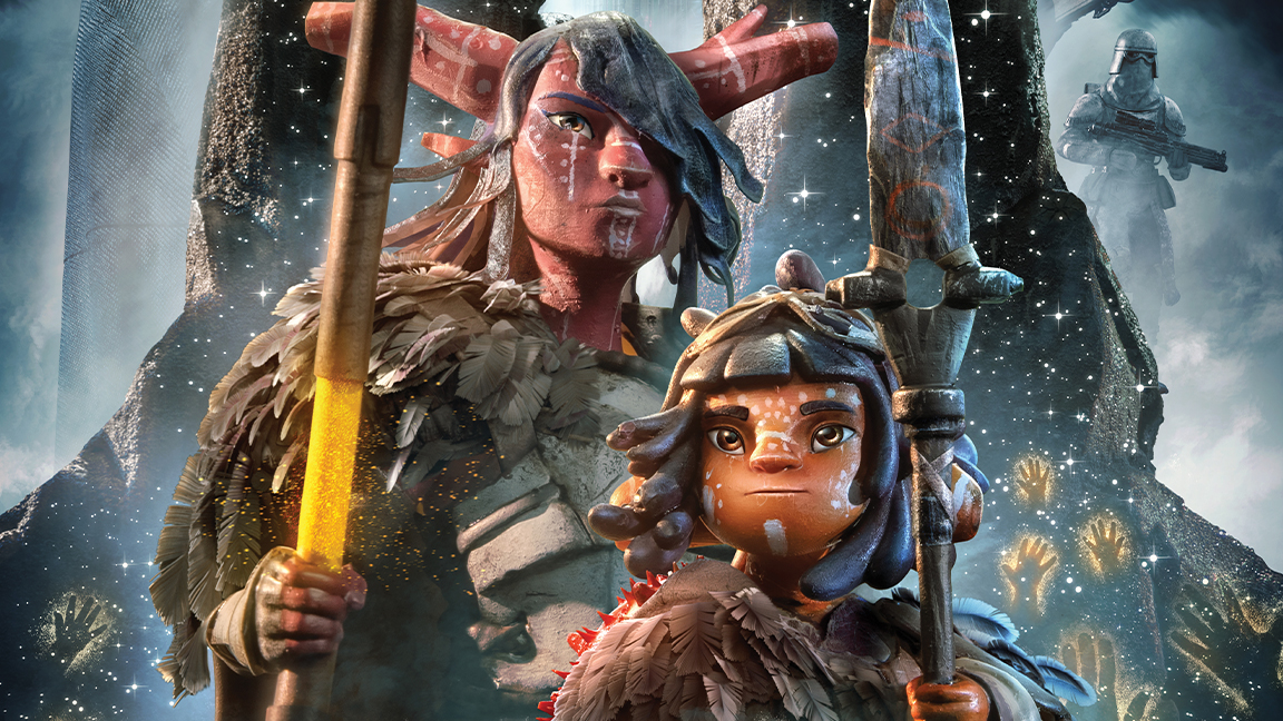
Many will argue of the post-George Lucas age that animated anthology series Star Wars: Visions, streaming on Disney+, has been the best in capturing his innovative spirit and telling stories that expand the universe populated by Jedi, Sith, droids and Wookiees.
Going beyond the boundaries of Japan, Star Wars: Visions Volume 2 provides a platform to showcase the artistic and narrative talent of studios situated in South Africa, France, the UK, Ireland, India, Spain, Chile and South Korea that make use of techniques ranging from stop-motion to 2D and 3D animation.
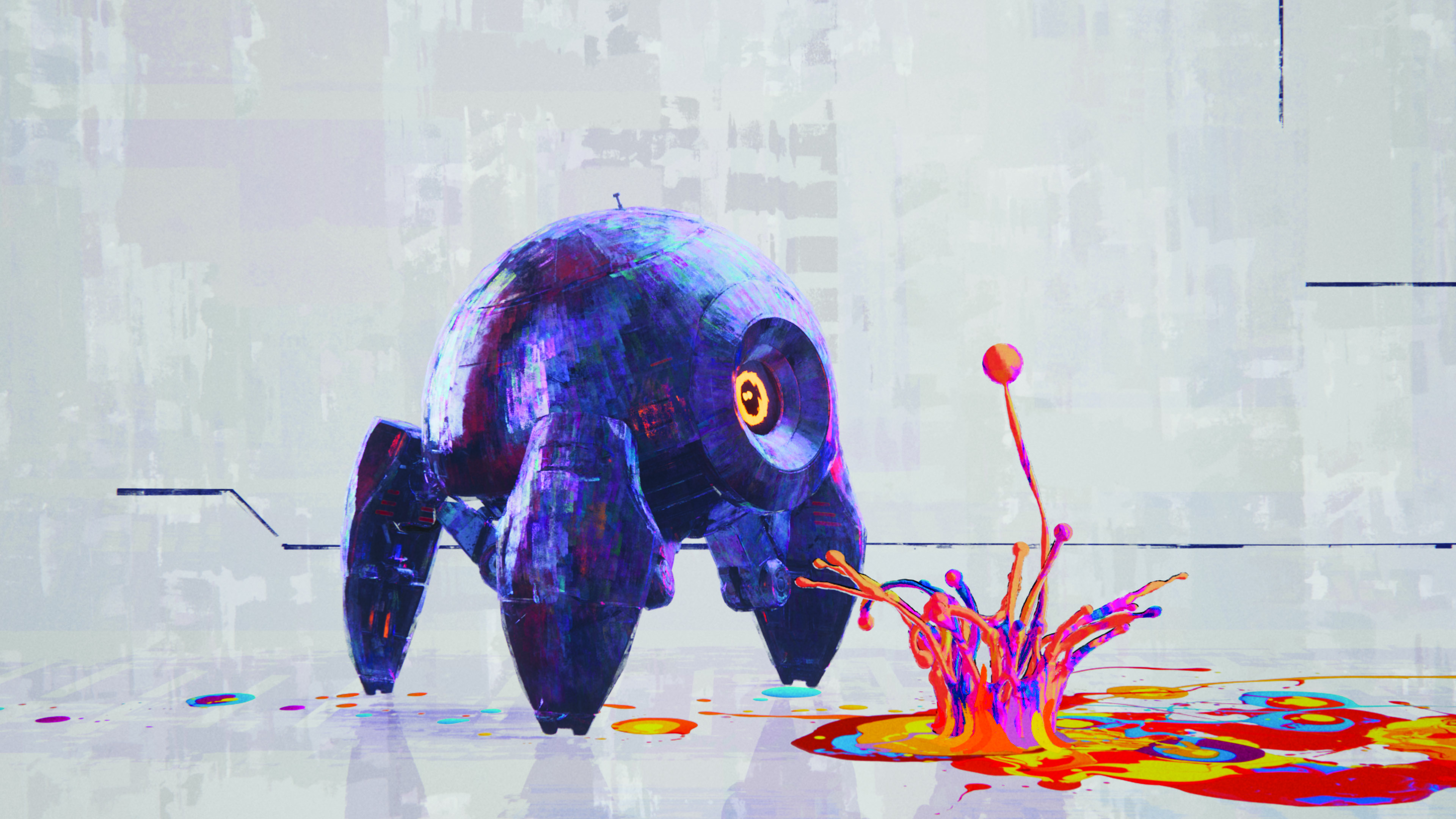
Starting things off is the painterly episode Sith from Madrid-based El Guiri Studios. "The graphic and pictorial approach of the short film makes perfect sense," believes Carlos Salgado, the art director. "Lola uses the Force to create her own art, and her own world; that is the way we seek to represent it, where the abstract and the most realistic could co-exist. It's where we visually represent the fight between the light and darkness."
Making Star Wars: Visions Volume 2
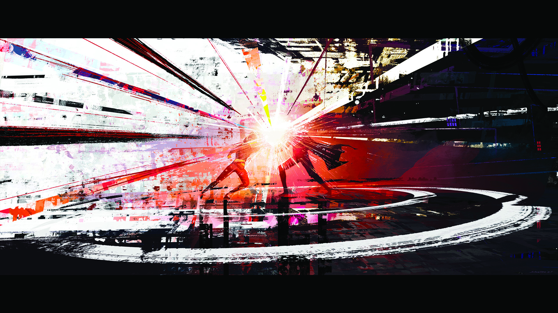
Certain iconic visual elements from the Star Wars franchise were incorporated. "I had a bucket list of things I've always wanted to design with our team," states Rodrigo Blaas, the director, and founder of El Guiri Studios. "Lightsabers with a Spanish medieval aesthetic, a circular speeder bike, our own version of an X-Wing called Ala Roja, a Sith Master and his slayer droids, and of course a Star Wars droid that could have a magnetic personality. I knew the animators would have a lot of fun working with all of these elements."
Motion played a major role in giving Lola’s faithful droid E2 an endearing personality. "One of the things that we wanted to avoid with E2 was it not moving or feeling reminiscent of a spider, and it being able to feel like a being that’s closer to her pet," remarks Salgado. "The eye is also an important part of the droid's expressiveness, and it helped considerably to achieve that."
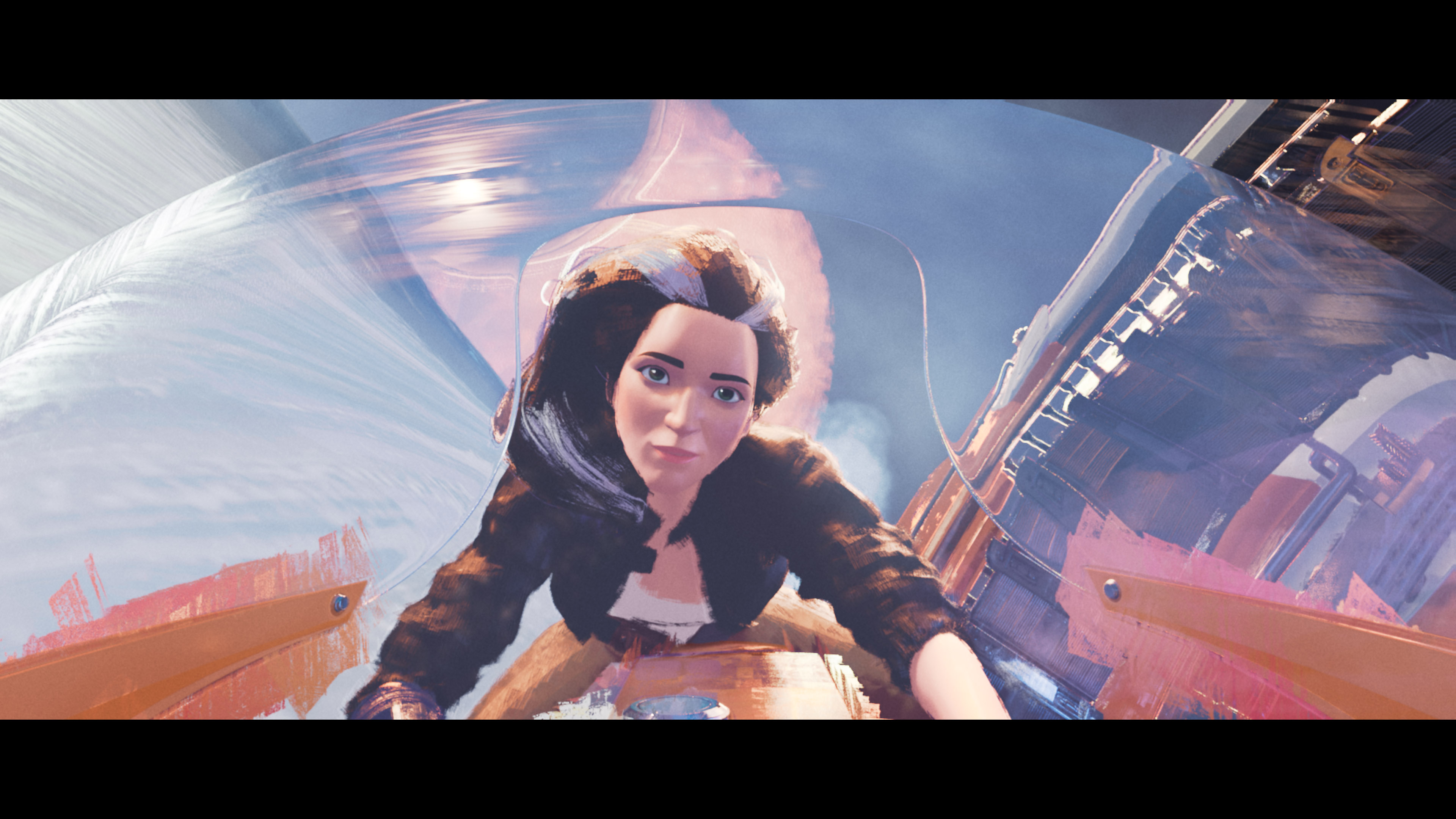
Meanwhile, channeling Irish folklore is Kilkenny-located studio Cartoon Saloon for Screecher's Reach. "The Banshee of the myth is to be a visual representation of pure darkness, rage," observes the art director, Almu Redondo. "She is a force of madness gone wild, never controlled or precise, unpredictable and wild, erratic. We skipped frames in her animation, she snaps from stillness to a fast movement, she has twitches, twists, changes in angles, ticks, asymmetry; all the craziness we could conjure."
The lightsaber had to be an extension of the ghost and owner. "We infused the effects design with all the rage we that could master," Redondo adds. "I painted and scanned many layers of dry ink that I would then flicker digitally, adding an explosive splatter here and there to add the uncontrollable nature.
Get the Creative Bloq Newsletter
Daily design news, reviews, how-tos and more, as picked by the editors.
"Then, digitally, I animated the smears and light spills when the lightsaber moves fast, stylising it with illustrative brushstrokes that would blend with the style. In compositing, Morgan Fontana, one of our compositing leads, added distortion and time echo to the ghost as well as beautiful and terrifying plays of darkness in some shots that enhanced the whole look."

A classical approach was adopted for the camera. "We tend to favour a stiller camera style and carefully compose the shot to tell the story, rather than relying on a lot of motion in the camera," says director Paul Young. "This for sure comes from our drawing background, and definitely favours hand-drawn animation."
Embracing the dual themes of environmental destruction and sisterhood is the episode In the Stars by Punkrobot, which calls the Chilean capital Santiago home. "The objective was to explore the protagonists' fundamental connection with nature," remarks director Gabriel Osorio. "To achieve this, the most suitable technique was to scan natural elements and create handmade sets to attain an organic, less digital, and more human look.
Another technical challenge that we faced was in our decision to work everything as if we were in a stop-motion set
Gabriel Osorio, director, Punkrobot
"The final result is a combination of CG elements, real elements, and handmade models. In that way, the connection with the nature that's so important in the story for the main characters helped us to define the best visual aesthetic for the film."
The flood at the end was simulated. "The main challenge was achieving the miniature look that integrated correctly with the rest of the elements and didn't feel out of scale," reveals Sebastian Espinoza, the CG supervisor. "For this, the challenge was mostly in the shapes and art, as being larger masses that resembled resin. The visual effects artist needed to take care of the shape and composition of these masses at all times, as well as seamlessly integrating the collapse of an entire factory!
"Another technical challenge that we faced was in our decision to work everything as if we were in a stop-motion set, meaning we had all these effects interacting in the scene at the same time. It was quite technically demanding, but provided us with a more cohesive result where everything coexisted correctly with the environment lighting, and all the effects were actually occurring where they would in real life."
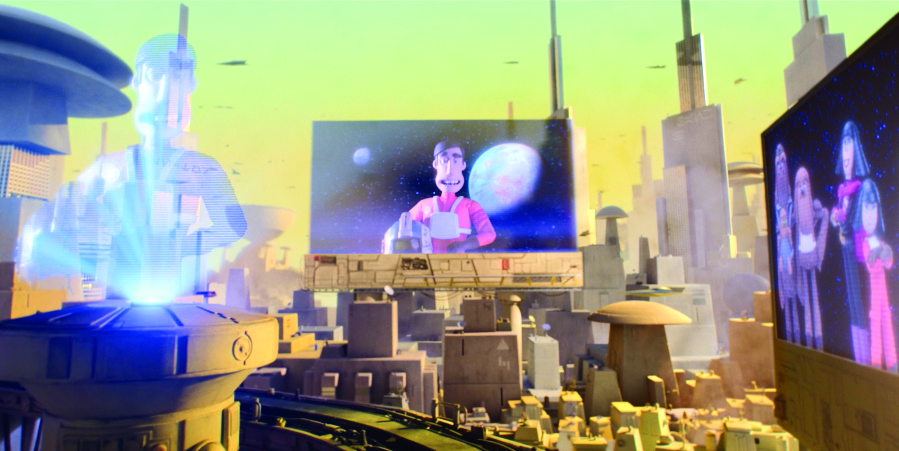
In typical tongue-in-cheek Aardman fashion, the Bristol-based animation company created I Am Your Mother. "We sculpted the main characters in clay and in ZBrush," says director Magdalena Osinska. "Both processes fed, informed and bounced ideas from each other. The final sculpts were made in Maya and printed out with 3D printers. They gave us the texture and grain I was after on the faces of the characters.
"The lip-sync was then also done in CG; a first for Aardman. I was a bit apprehensive to start with as I wasn’t keen on not being able to see the whole facial emotion while the animators were animating on the studio floor, but I quickly realised that it was a beneficial process and it gave us more possibilities for expressions and more flexibility."
The lip-sync was then also done in CG
Magdalena Osinska, director, Aardman
The school building and city were entirely constructed in 3D. Osinska says: "In certain shots we'd have a part of the set, usually the foreground, physical, but the rest would be CG. Lighting the 3D parts played a huge role in bringing together these two techniques; this actually goes both for the sets in general, but also the mouths. Our lighting lead Tessa Mapp did an amazing job on it."
The animators were flying as blind as characters Anni and Kalina flew through 3D space. "Each shot at the briefing stage, we tried to determine how it would be moving so that I could add that in," remarks Laurie Sitzia, the lead animator and key stop-motion animator. "This would sometimes be just gentle movement on the chairs and lekku, at other times more frenetic jolts to include body movement and occasionally a more specific action to mimic a particular lift, turn or dip of the tugboat."
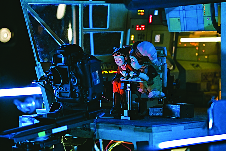

In the heart of Paris is Studio La Cachette, which did not use any 3D animation for The Spy Dancer. "We wanted the laser beams to feel right in terms of rhythm and colour," says director Julien Chheng. "It's an element that is so iconic in the Star Wars universe! And since we are in 2D, we painted all the halos around the beams and the highlights on the characters by hand, with a special painterly texture."
The storyboards, layout and animation were done with TVPaint. "Photoshop was used for the background colour and After Effects for compositing," the director adds. "It's a pretty classical 2D pipeline. What's specific about our approach on the film, that I like to do, is optimise every department.
"Storyboarding was rough. We figured out a lot of the design elements and choreography during layout, while animation adds more depth to the movement. At the colour stage, the shadows are added and the colour fills the gap between our lines. Each step elevates the final look, without over-prepping at early stages."
The White Flower Dance was inspired by the dance style of Loie Fuller. "But we expanded it and elevated it to a point where our character Loi’e can shapeshift, and even disappear," Chheng says. "For the Fire Dance, I wanted her to look like a demon, waking up from the heart of a volcano. I even pushed the design idea of her veils twirling to look like real flames. These two approaches for her dance needed to feel opposite; one is soft and eerie, where the other screams revenge and brutality."
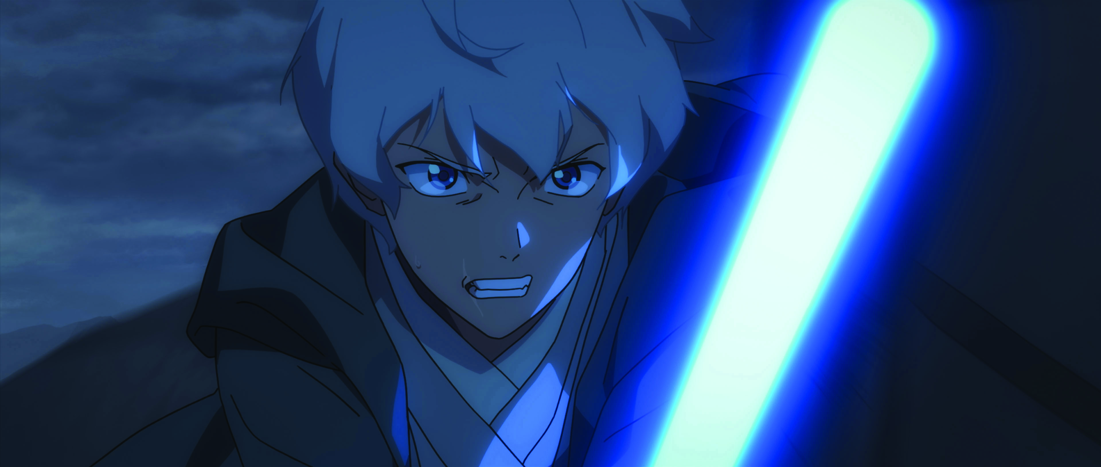
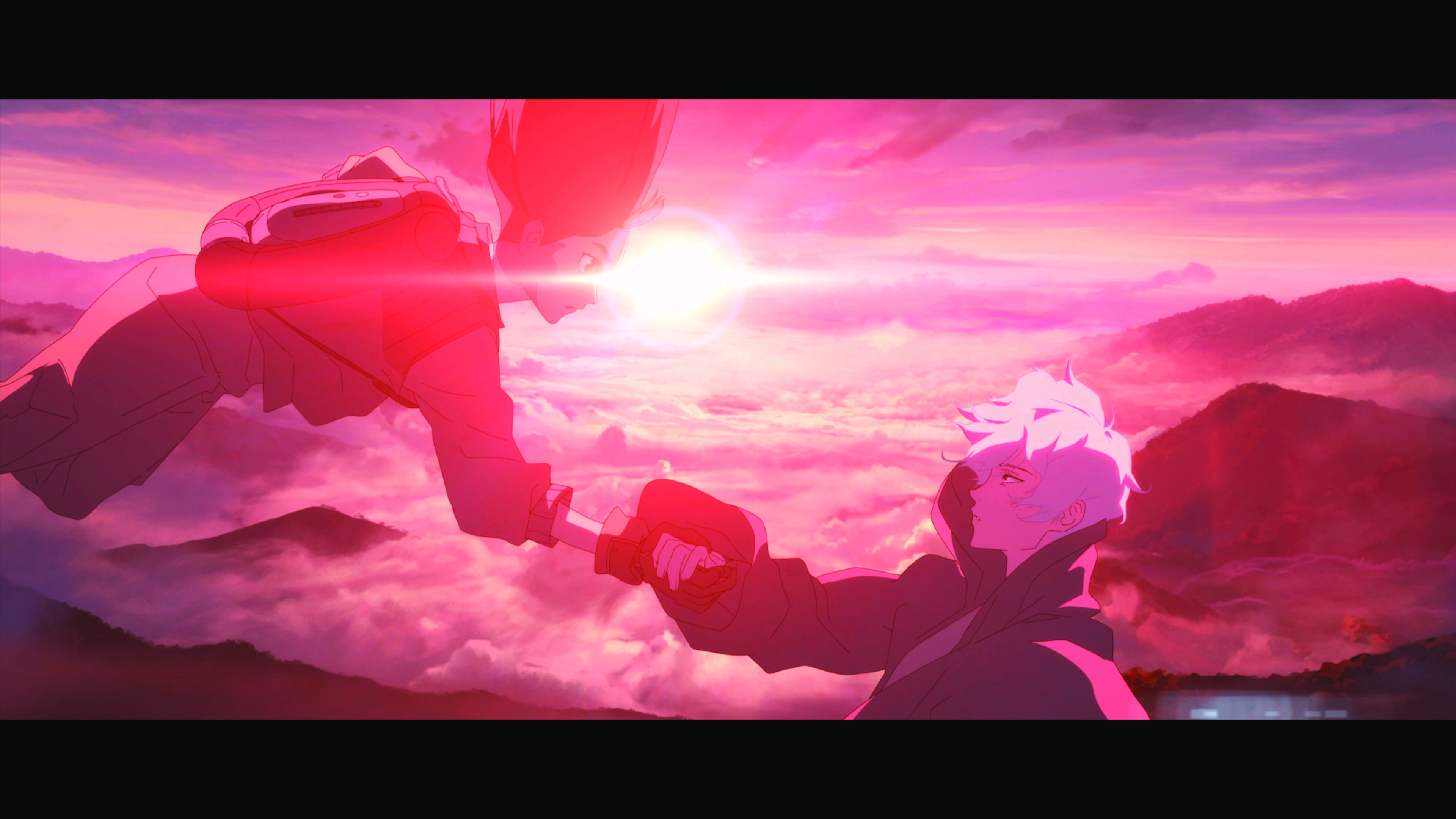
Exploring the mining of kyber crystals under inhumane conditions is The Pit animated by D'Art Shtajio, which is found in Tokyo. "The animation industry often blends 2D and 3D animation to save time and build complex objects," observes Arthell Isom, the lead production designer and executive producer. "We utilised CG to assist in building Crystal City. We first designed the city in 2D and then modelled it in 3D, allowing for a range of viewing angles to enhance the storytelling.
"This 3D model was used to create the 2D layouts of the city and when Crux first approaches it after escaping The Pit. Originally, the sequence was done solely in 2D, but we switched to the 3D model to add transport vehicles moving between the buildings and a more subtle parallax effect. We painted the model as we would a background painting to maintain the 2D texture look of the rest of the production."
A significant theme is light, which had to be hand-drawn. "Throughout the animation, we employ various light sources, such as the sun, hand-held torches, heaters, flashlights, and city lights, to serve as characters that help to convey the story," Isom explains. "For instance, when the lights are switched off in The Pit, we’re given insight into the Empire's decision regarding the prisoners' fate. Similarly, the light from lightning strikes is used to deliver the news of Crux's sudden descent. Some other effects were elemental like the dust and smoke. When creating an animation, it's the small things that often go unnoticed that really matter."
Making Star Wars Visions Vol. 2: Aau’s Song
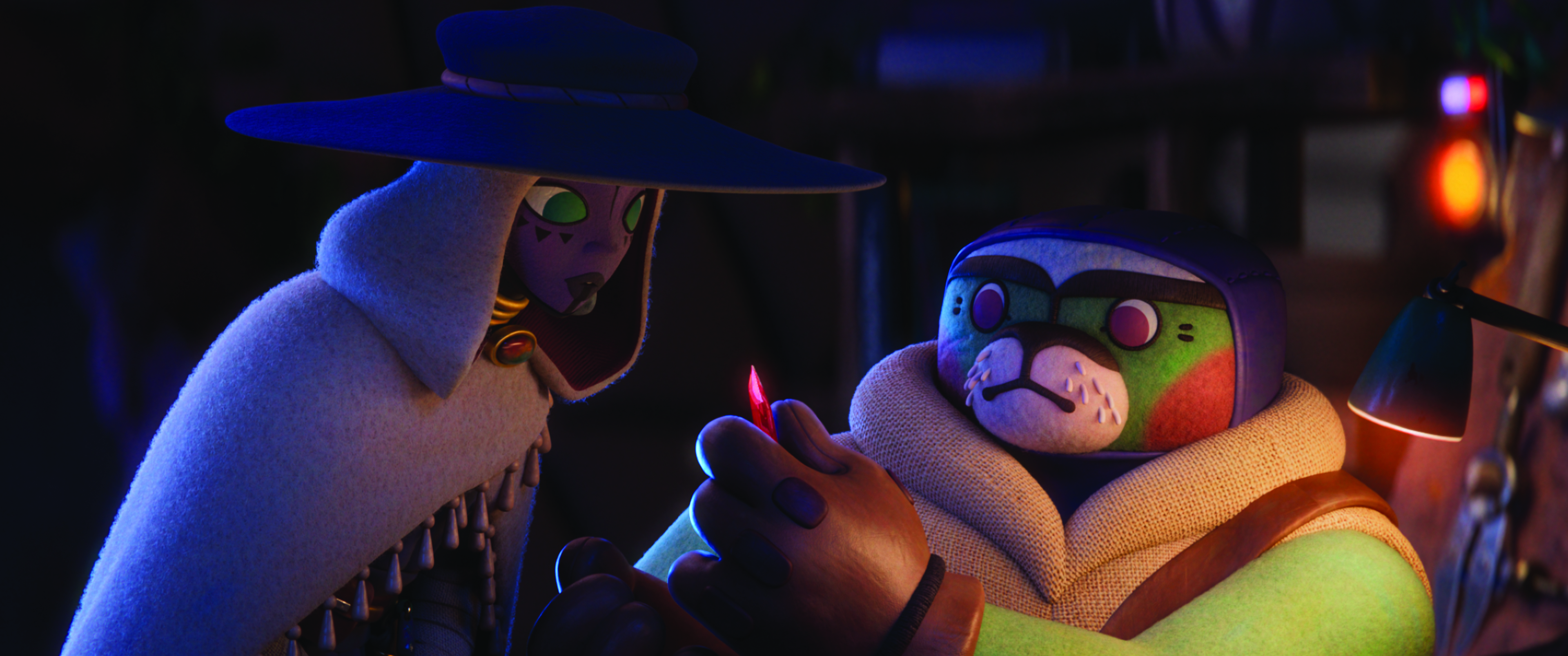
Nestled in Cape Town and Galway is South African studio Triggerfish, which unleashes the power of the kyber crystals in Aau’s Song.
"Daniel Clarke [writer, director] had fun painting snapshots of Korban life, and envisioning the landscapes," states Nadia Darries, the writer and director alongside Clarke. "We then jumped into layout, building a rudimentary poly version of all the sets in a single Maya scene to get a good sense of the scale of the world. It took a lot of fiddling to get the scale relationships right.
"The rock spires and cave were actually built in a sort of LEGO-block manner. We used 3D scans of real rocks and artists assembled the world rock by rock. Our lead modeller, Armand, eventually knew every rock by heart! The cave was particularly challenging because it had to make sense as a dome structure that was formed by volatile events long ago."

Originally there was to be no 2D animation. Clarke says: "Due to time and budgetary restriction, Nadia and I found that it was often much faster and cheaper for us two to create 2D elements, Nadia in After Effects and me in Photoshop using AnimDessin, and hand them over to comp rather than trying to create compelling visual effects in a 3D package. For example, all the wind and debris effects as well as the crystal’s wide shots [and the close-up transformation shot] were plates and mattes that Nadia and I created, sometimes building the whole shot between the two of us."
The kyber crystals found in the Force Space were visually challenging elements. "It had to walk a delicate line between scary, mysterious and beautiful, as well as the abstract and literal," notes Clarke. "We ended up hiring motion graphics artists who worked in After Effects, as the look we were aiming at was stylised and somewhat graphic, which would have taken much longer to achieve in the more straightforward 3D pipeline. Nadia and I also worked on a lot of the crystal singing shots using Photoshop and After Effects."
Making Star Wars Visions Vol.2: The Bandits of Golak
Consisting of facilities in Mumbai, Bengaluru, Hyderabad and Toronto, 88 Pictures was the studio responsible for the Indian-infused brother-sister tale The Bandits of Golak.
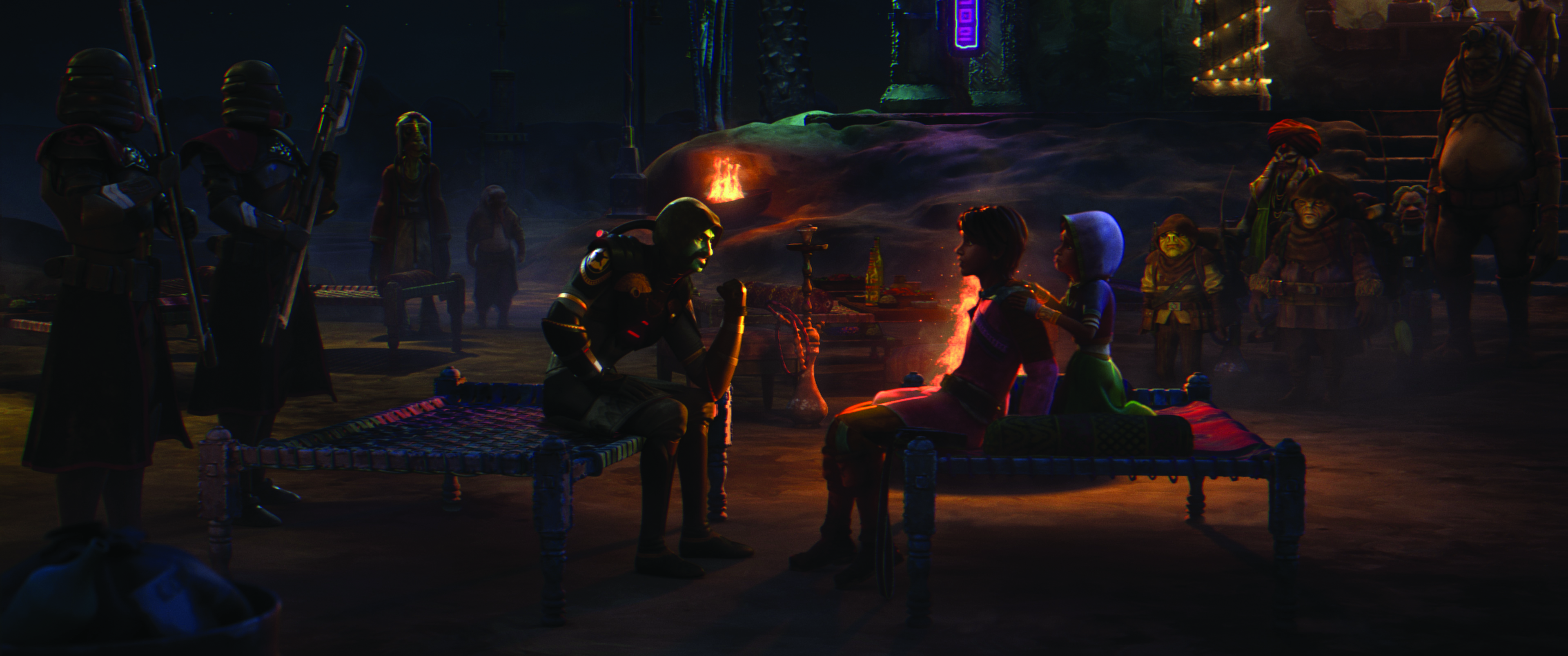
"India is an extremely family-oriented country, where almost everything is rooted towards family bonding," notes director Ishan Shukla. "Most of our stories, rivalries and even myths revolve around family dynamics. It overlapped with the classic Star Wars themes as well. If I mention that we have a roadside restaurant for truckers, you wouldn’t think much of it.
"But an Indian roadside restaurant on a remote highway can actually be a colour splattered oasis. And that holds true for our apparel, architecture, music and even food. This festive aspect drove the overall aesthetic in a big way."

The project was ambitious. "Our first goal was to make this film look like a hand-painted canvas if you stop at any frame,” remarks Milind D. Shinde, the executive producer, founder and CEO of 88 Pictures.
"This required us to go deep in developing the texture maps and the shaders that should justify the final look. The whole train sequence is a long, continuous sequence that needed a heavy set to be built with moving cameras that required optimised scenes at every step.
"The chase has dust, smoke, ambers, bullet shooting, crashing; everything you ask for. Then the last fight where the dust storm kicks in and increases, and all the characters start to get in a melee, we had to make sure the dust storm for every shot is increasing, so no same dust storm effects could be used for the next shot."
This content originally appeared in 3D World magazine. Subscribe to 3D World at Magazines Direct.

Thank you for reading 5 articles this month* Join now for unlimited access
Enjoy your first month for just £1 / $1 / €1
*Read 5 free articles per month without a subscription

Join now for unlimited access
Try first month for just £1 / $1 / €1

Trevor Hogg is a freelance video editor and journalist, who has written for a number of titles including 3D World, VFX Voice, Animation Magazine and British Cinematographer. An expert in visual effects, he regularly goes behind the scenes of the latest Hollywood blockbusters to reveal how they are put together.
