The 12 best London Underground posters
Our pick of the most iconic tube posters of the last century.
The London Underground is celebrating its 160 year anniversary this year, making it the oldest underground railway system in the world. It also has some of the most iconic branding ever created, including the roundel, map and London Underground posters. But things weren't always this way. At the turn of the 20th century, the London Underground was considered overcrowded and dirty, and was in desperate need of a makeover in public perception.
Enter Frank Pick, creator of the London Underground brand strategy. Pick was appalled at the previous marketing strategy of the tube and in 1908 was given publicity as one of his responsibilities.
Pick integrated the London Underground branding design, commissioning the typeface, roundel and Harry Beck's tube map. He began working with prominent artists to create beautifully designed London Underground posters that showcased graphic design and emerging artistic styles of the era. He even organised public exhibitions of London Underground posters to showcase the cutting-edge design.
Pick realised the key to success was to focus less on the journey itself and more on the places and events that London had to offer a traveller. The London Underground posters and campaign rebranded the tube as a warm and bright way to reach the cultural highlights of the city.
We have selected the best London Underground posters from each decade since the turn of the 20th century to showcase the success of Pick's approach, and the iconic branding that is celebrated worldwide. And if that's not enough to get your creative juices flowing, we've also got this beautiful selection of poster designs to inspire you.
Click on the icon at the top-right of the image to enlarge it.
01. Golders Green: 1908

Golders Green is the first in a series of London Underground posters that was vital in shaping the expansion of the city. The design offers idyllic country living, in easy reach of the city as shown by the train and station displayed in the background.
Get the Creative Bloq Newsletter
Daily design news, reviews, how-tos and more, as picked by the editors.
This London Underground poster artwork and use of poetry by William Cowper cleverly sells a lifestyle to the London commuter, and it was totally successful in its approach. In 1903 Golders Green was just a country crossroads and within a decade it had transformed into a bustling suburban community with the rail terminus at its centre.
02. The Swiftest way to Pleasure: 1913
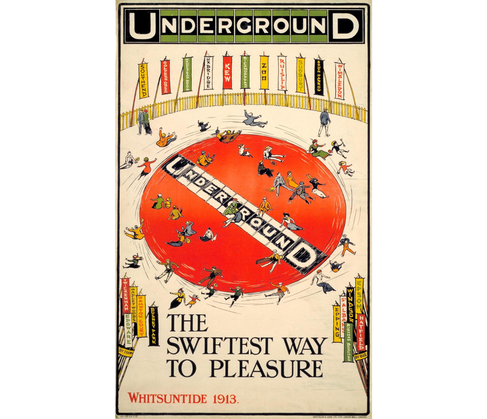
Charles Sharland designed this poster to encourage people to get out and about during their leisure time. The in-house designer combined the idea of a joy wheel, a popular fairground ride from the time, with the Underground symbol.
According to the London Transport Museum blog, the Underground ‘bull’s-eye’ symbol in the centre was part of the Underground’s corporate identity. In 1916, the calligrapher Edward Johnston was asked to adapt his typeface to fit in a new roundel logo, which has become the logo we know today.
The highly stylised people in this poster are falling off the joy wheel, heading towards the diverse locations accessible by tube.
03. Seeing / Hearing / Touching / Smelling / Tasting The Riches of London: 1927
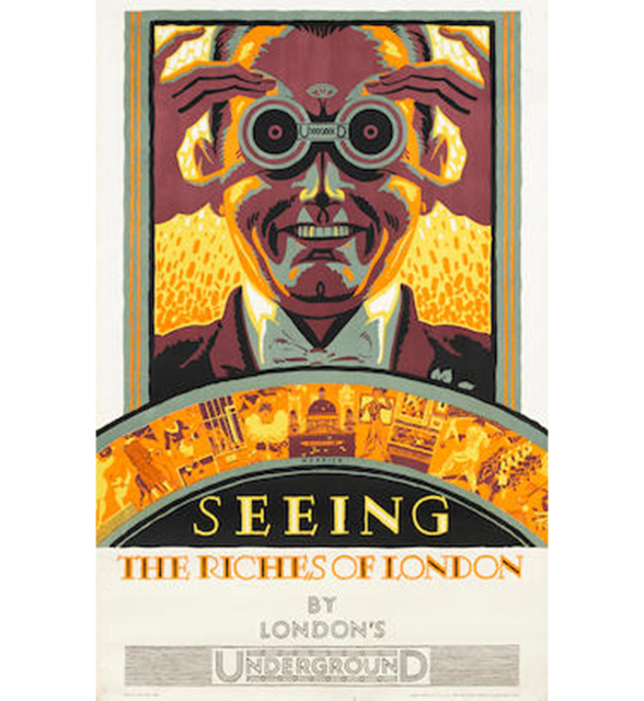
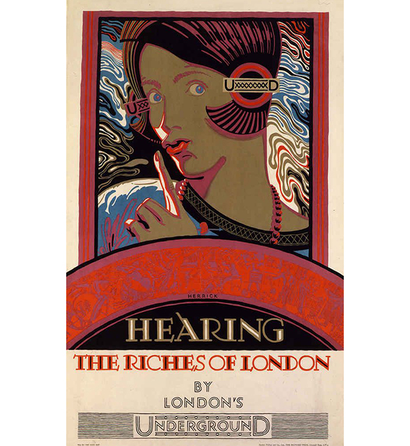
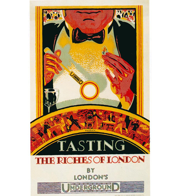
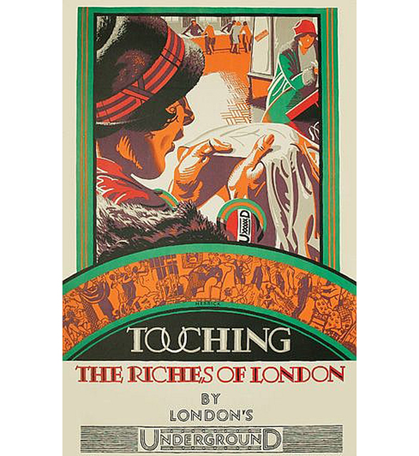
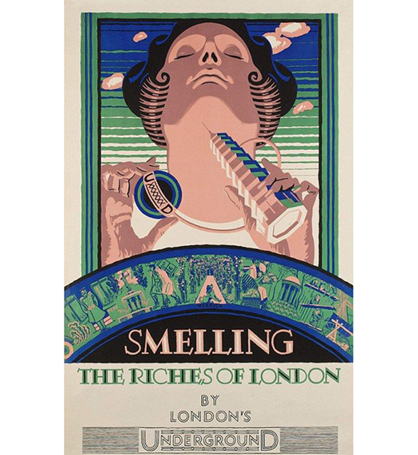
London Underground posters often run in series. And Frederick Charles Herrick's poster series from 1927 is a stunning example of the Art Deco opulence that is so important in the history of tube design (check out these amazing Art Deco stations).
One side of Pick's marketing strategy focused on individual places and events but the other approach was to reflect the cultural excitement of the city as a whole. These posters are a multi-sensory bombardment of modern city pleasure, highly intense and incredibly exciting. The intricate graphic design is bold and complex, with different elements of the city represented more specifically in the banners. They work so well as a quintet that we couldn't pick just one to include.
04. Power, the Nerve Centre of London's Underground: 1931
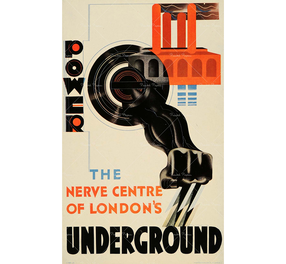
Edward McKnight Kauffer designed 140 posters for London Underground and this example projects his bold, modernist style. With clear design influences from Futurism and Bauhaus, this London Underground poster enforces the ideology of man and machine that was so prevalent at the time. The bold geometric shapes signify his move away from traditional poster design and into graphic design.
05. Please stand on the right of the escalator: 1944
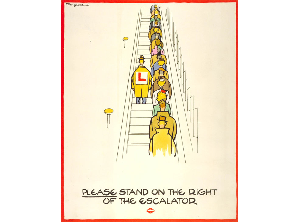
London Underground etiquette is the reason the system is able to run so efficiently. With millions of commuters and tourists packed into its tunnels everyday, without the social niceties and rules, things would quickly descend into chaos.
London Underground posters enforces these social regulations through a series of campaigns that are still running today. Our favourite of the 1944 collection by Fougasse (Cyril Kenneth Bird) depicts perhaps the most well-known rule: to always stand on the right when using the escalator. Any tourist standing on the left will know the wrath of the Londoners running up the stairs behind them, tutting loudly.
Fougasse's design brings a comic strip style and observational humour to the situation that will hopefully evoke feelings of empathy for the unknowing passengers daring to defy convention.
06. Royal London: 1953
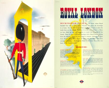
The 1950s saw regeneration across London. The post-war strategy was to encourage tourism and show that Britain was recovering and open for business. A poster campaign began, comprised of a beautifully designed picture representing an element of London sightseeing, and a paired poster packed full of information.
These campaigns were run by London Transport as a whole, uniting the different modes of transport under the banner of tourism. We've chosen this example for its iconic Beefeater, brought bang up to date with its stylised design. The Royal London series took full advantage of London's royal history and present, with some picture design as modern as this, and others echoing an age long since past.
07. London After Dark: 1968
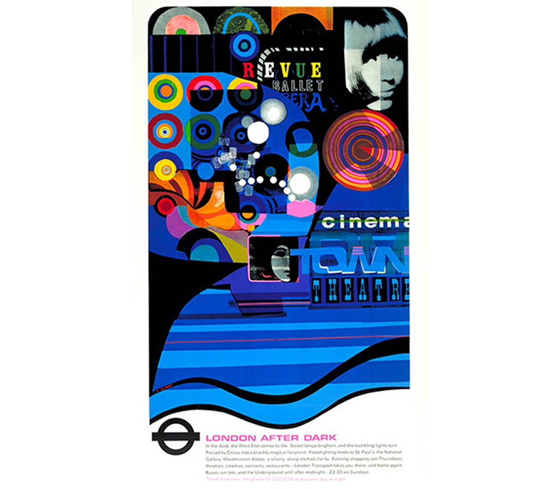
The swinging '60s are perfectly encapsulated in Fred Millet's London Underground poster design. The Pop Art graphics entice Londoners and tourists alike to indulge in the magic of the West End after dark, and of course to use the tube to get there.
08. London Zoo: 1976
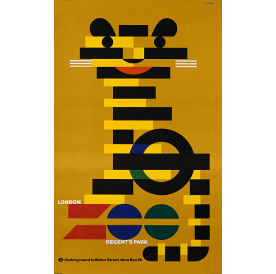
This stunning tiger is archetypal 1970s in its block formation and clashing retro colours. The mustard yellow is a classic central colour from the era. Abram Games designed this graphic London Underground poster to encourage people to visit London Zoo.
London Zoo has had some beautiful posters throughout the last century, for example this wonderful 1930s elephant design.
09. Keep your personal stereo, personal: 1987
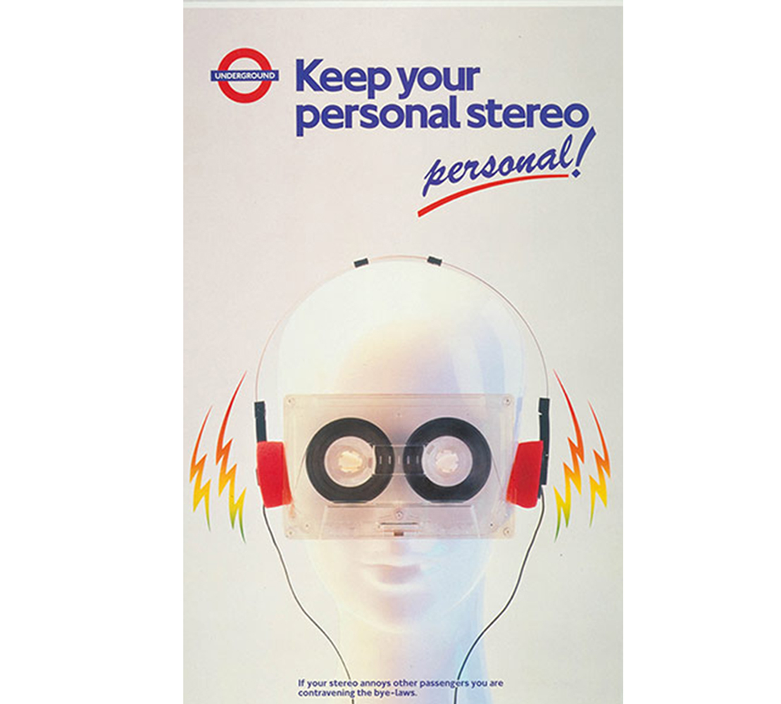
This digital-age etiquette poster had to make the list for its attention grabbing '80s graphic design. After all, what could be more '80s then a Walkman on a mannequin made to look like a robot?
The rainbow lightening bolts and the cassette tape for eyes pack a bold punch. You can just imagine rows of commuters wearing shoulder pads and neon eyeshadow bobbing their heads along to their own cassette tapes.
10. Simply Showbiz: 1998
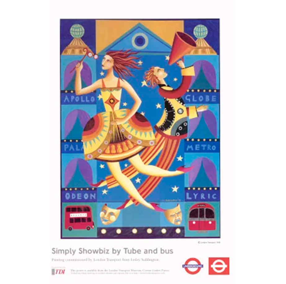
Britpop had firmly put London on the showbiz map during the 1990s and London was a hot ticket destination. Lesley Saddington created this London Underground poster design as part of the Simply poster series. Saddington is inspired by Ballet Russes (1900-1929) and Marc Chagall, an artist of the modernist movement. These influences result in a design that has echoes of past tube design but with a contemporary twist.
Simply Showbiz has a distinctly '90s colour palate (imagine '90s Saturday night TV and you'll know what I mean), and the fluidity and form of the figures is typical of the artist who often works with collage.
11. Spring Summer Autumn Winter: 2006
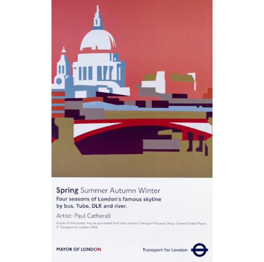
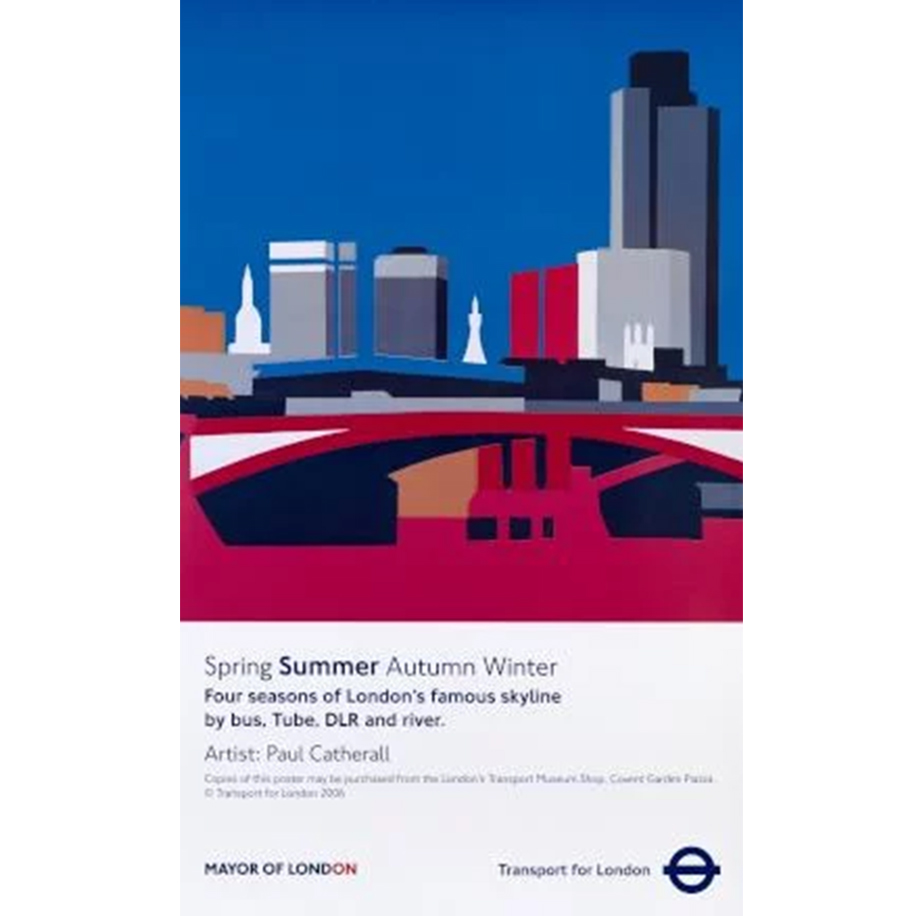
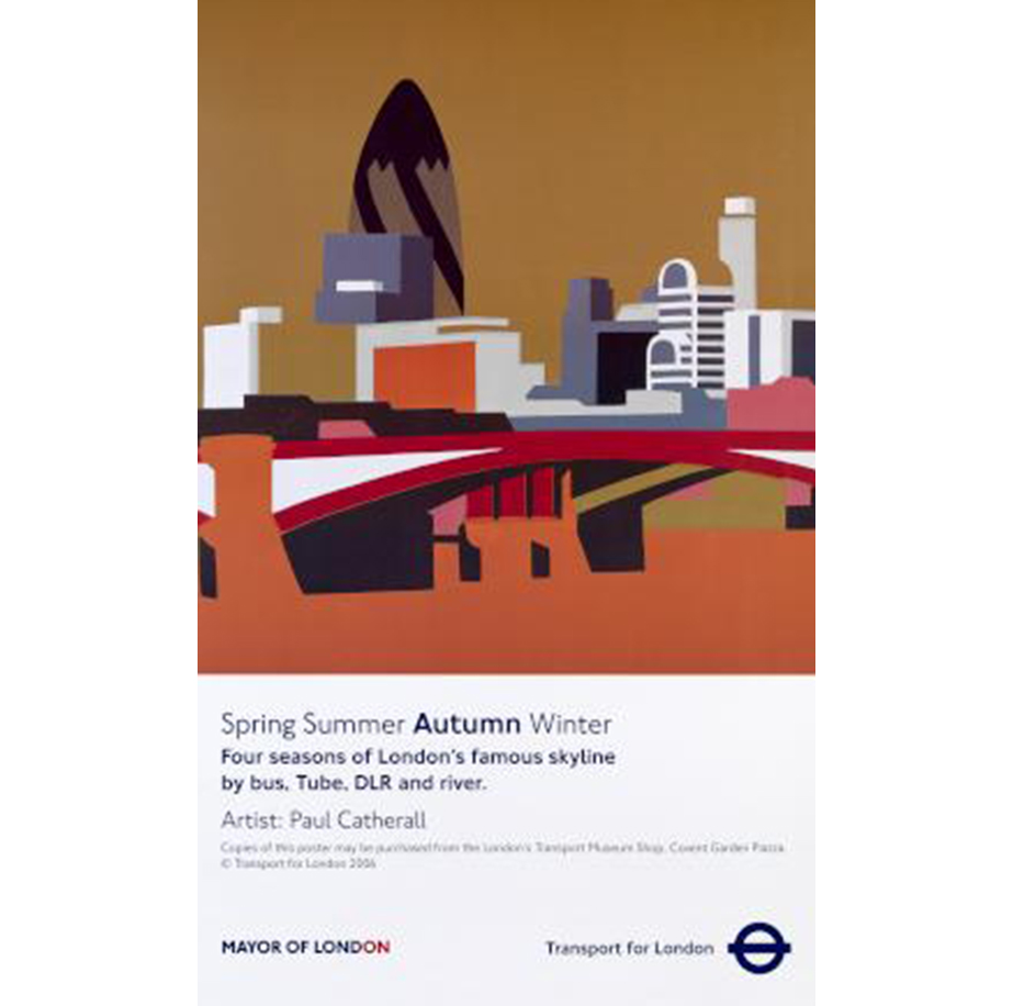
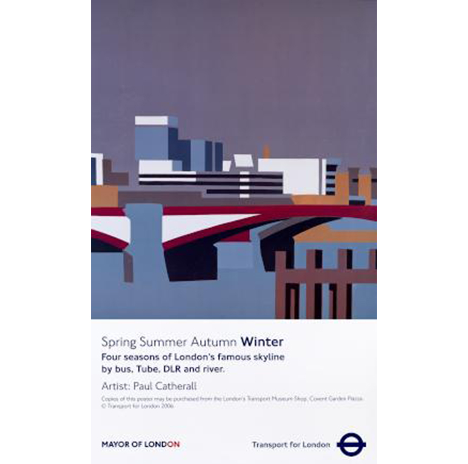
This four part series by Paul Catherall shows different parts of the London skyline in each of the four seasons. The sharp, clean cut outs are super-modern and are what the artist has become known for. We love the evocative colour palates as the seasons change, and the bold block uses of colour.
12. Brightest London (reimagined): 2016
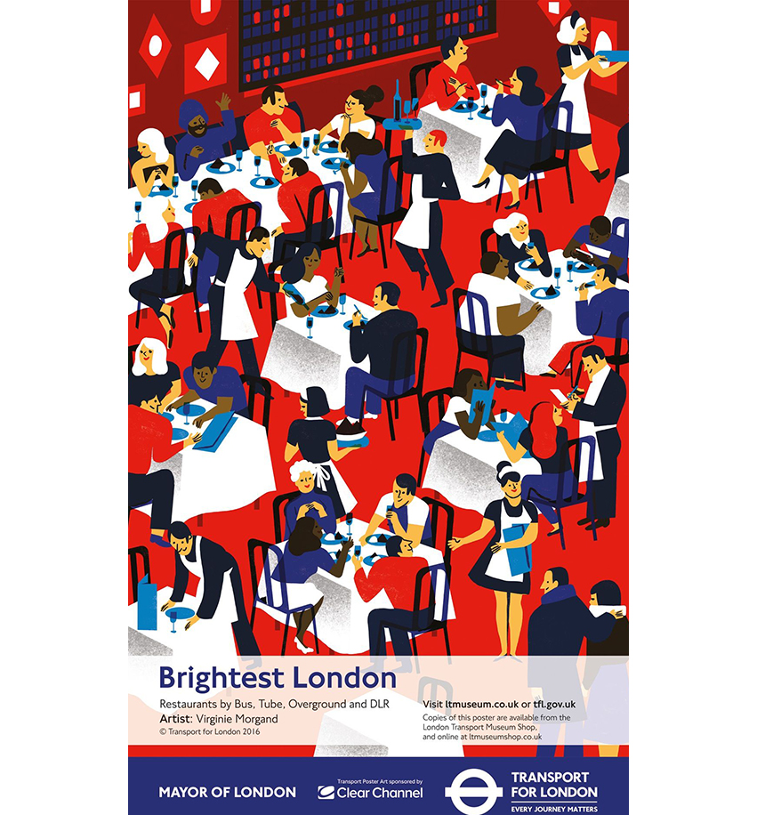
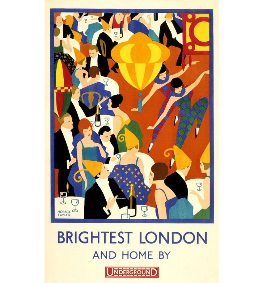
The original Brightest London design was a top contender for our 1920's pick. Beautiful and boldly Art Deco in style, the original graphic design cemented the tube's new branding as a warm, welcoming and bright part of London's cultural scene.
In 2016 it was reimagined for the modern age by Virginie Morgand. We love how similar the graphics and styling is and yet it is totally up-to-date in its depiction of a London restaurant scene.

Thank you for reading 5 articles this month* Join now for unlimited access
Enjoy your first month for just £1 / $1 / €1
*Read 5 free articles per month without a subscription

Join now for unlimited access
Try first month for just £1 / $1 / €1

Georgia is lucky enough to be Creative Bloq's Editor. She has been working for Creative Bloq since 2018, starting out as a freelancer writing about all things branding, design, art, tech and creativity – as well as sniffing out genuinely good deals on creative technology. Since becoming Editor, she has been managing the site and its long term strategy, helping to shape the diverse content streams CB is known for and leading the team in their own creativity.
