One of the golden rules of logo design is that a logomark or wordmark should be memorable. But just how memorable can a logo be? Studies have tried to find out, often with quite amusing results.
One measure of memorability is to test whether people can recall the brand by showing them a logo, and asking who it represents. We've seen plenty of studies that have done just that. But another approach has been to give respondents a brand name and ask them to draw the logo from memory. And that's where things often end in disaster.
See our pick of the best logos of all time to see some of the designs that are most likely to pass muster. In the meantime, we'll recall below four studies that showed how difficult it can be to draw a logo from memory.
01. Car logos drawn from memory
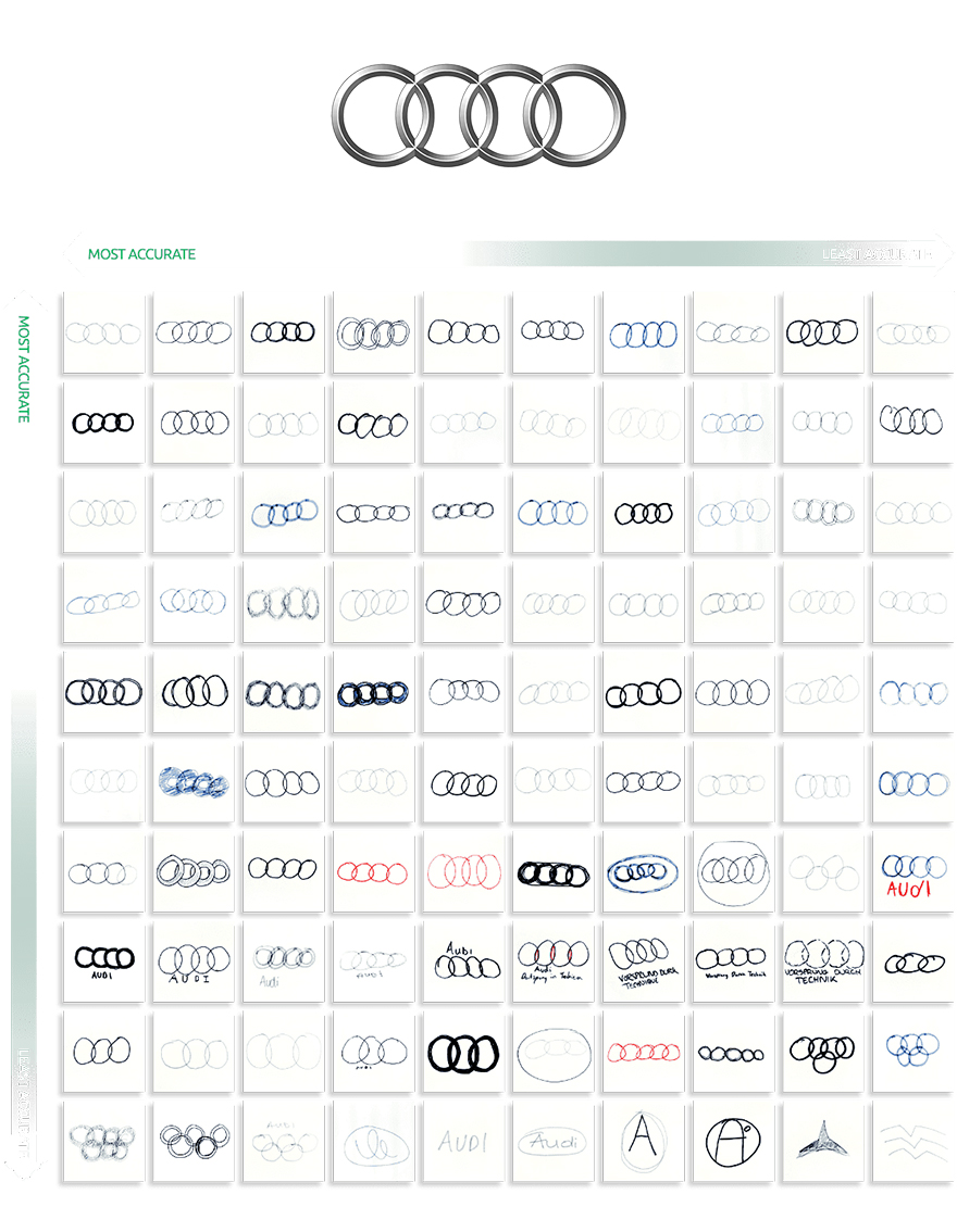
Vanmonster asked 100 members of the British public to draw famous car logos from memory, and the results range from spookily precise to quite hilarious failures. You might think the Audi logo with its four intersecting rings would be hard to get wrong, but even that relatively simple design saw some curious interpretations in the study. Some people seemed to have confused Audi with the Olympics and even The Avengers.
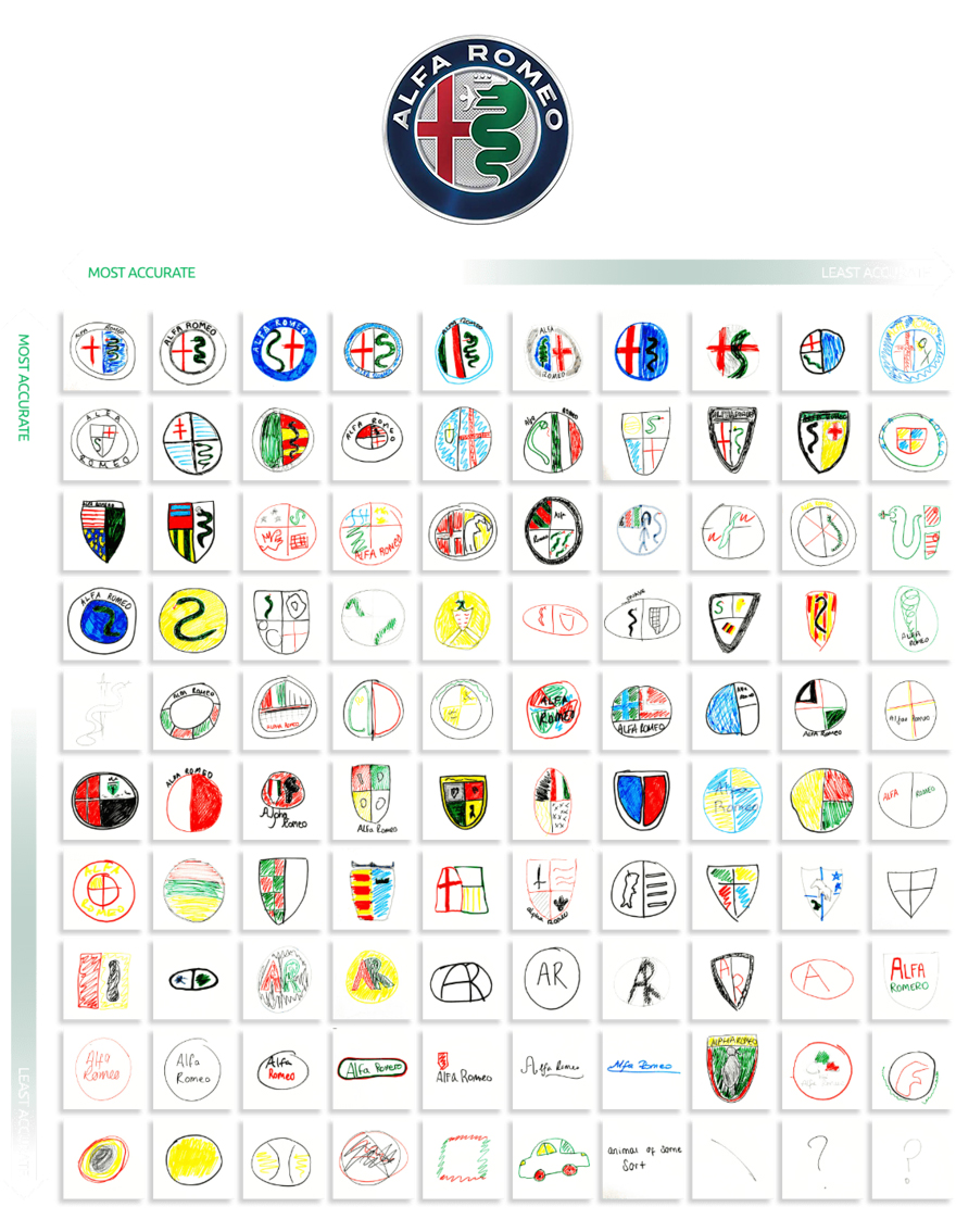
Jump to a more complex logo design like that of Italy's Alfa Romeo, and things get even more challenging (see the results below, and see our pick of the best car logos on the road for successful car logo designs).
02. The Apple logo drawn from memory
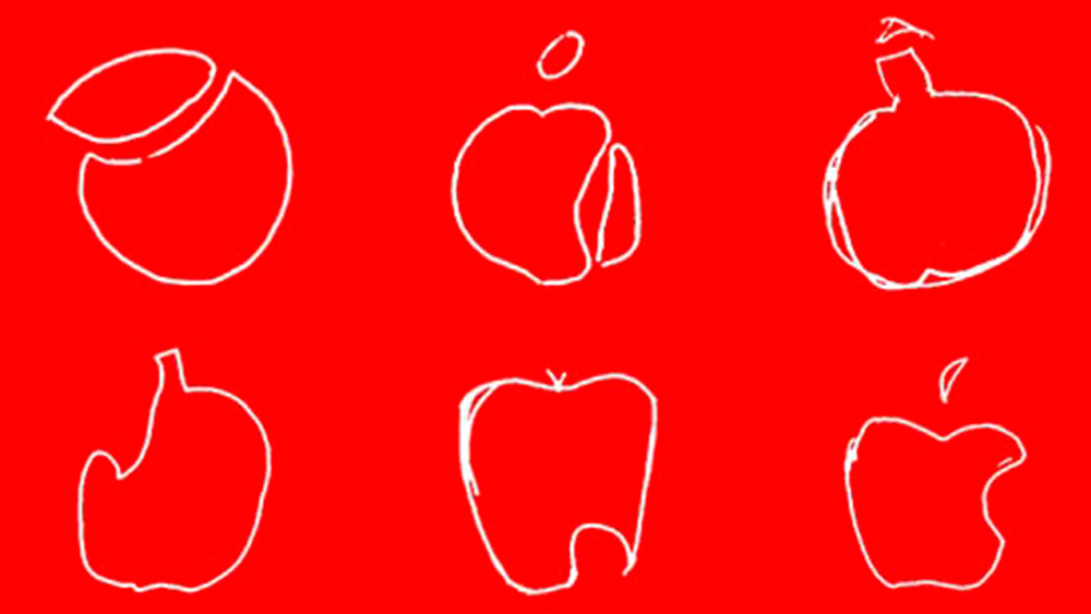
The Apple logo is easy to remember, right? But even though it's one of the most recognised logos in the world, that doesn't mean people are good at recalling the specifics.
In a study published in the Quarterly Journal of Experimental Psychology, 85 undergraduate students at the University of California (UCLA) were asked to draw the Apple logo from memory on a blank piece of paper. Only one could do so accurately, and some of the attempts looked more like explosive devices than fruit.
Get the Creative Bloq Newsletter
Daily design news, reviews, how-tos and more, as picked by the editors.
Of course, not everyone is an artist, but it's notable that it wasn't only a lack of artistic ability that was affecting the designs – key features of the design, such as the bite mark, appeared in various locations, suggesting people hadn't really taken in the specifics of the design. This was backed up by a second part of the study which found that fewer than half of the students could identify the correct version of the Apple logo when they were then shown several variations.
Researchers suggested that although we see the logo frequently, our brains may have learned that it's not important to remember the details. "An efficient memory system does not need to store the details of a corporate logo, except perhaps to distinguish counterfeit products," they concluded.
03 Football club logos drawn from memory
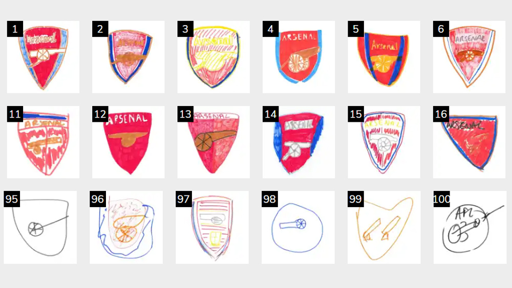
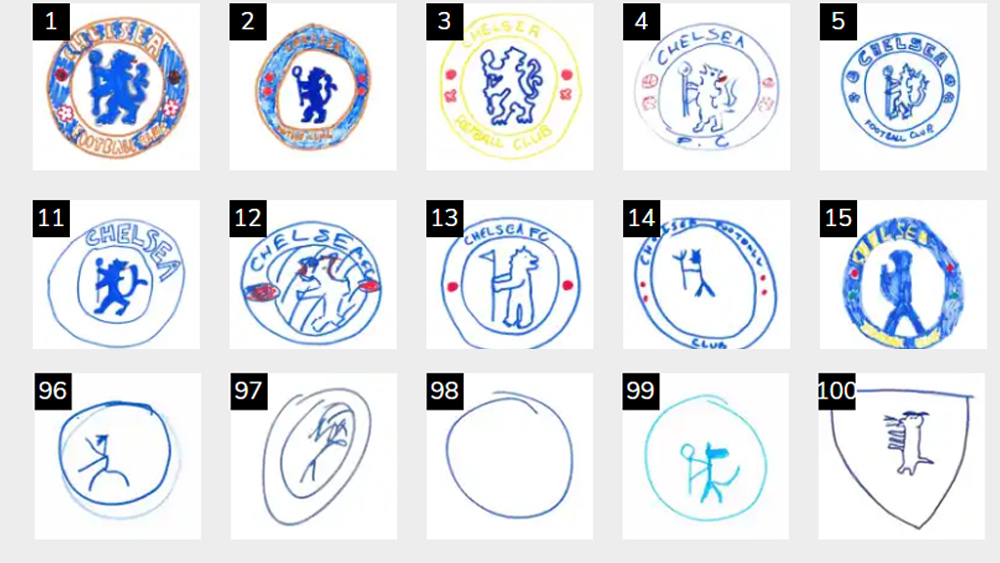
Football club logos can be tricky because there are often some small details going. Most participants did quite well in this study by Betsperts, who asked 100 fans to draw football badges from memory. At least the main elements of the the Arsenal logo and Chelsea logo are there, although some people weren't sure about the shape of the Arsenal badge, while with Chelsea one person could only recall that the logo is round.
04. Music logos drawn from memory
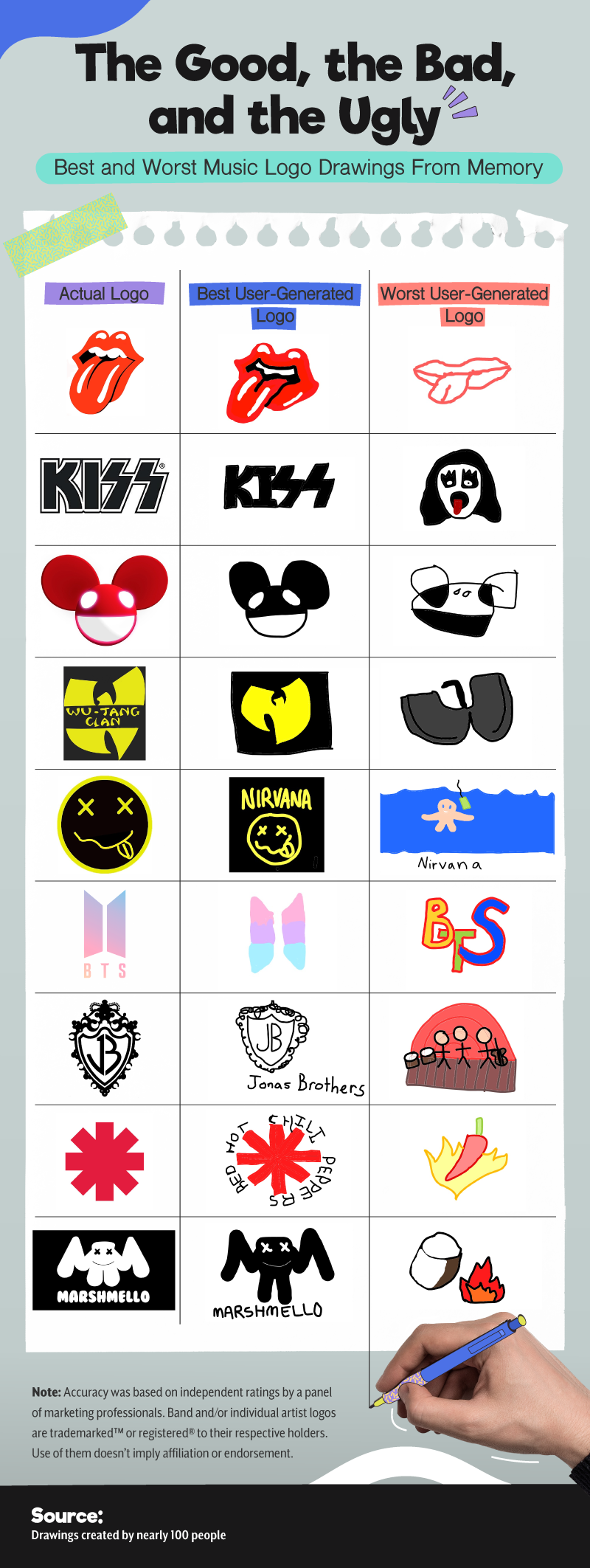
Finally, the online ticket marketplace TickPick asked over 100 members of the public to draw various music-related logos, and again the results range from impressively accurate to hilariously off the mark. In this case artistic ability was certainly one issue affecting the results, with some of the attempts clearly leaning in the right direction but held back by the execution.
However, for some of the bands and musicians it seems that respondents recalled other parts of their visual identity, suggesting that the logos are not as memorable as particular album covers, for example. In some cases, it seems respondents weren't taking the study entirely seriously.
Wondering how to ensure maximum recall for your own logo designs? See our comprehensive guide to how to design a logo. You might also want to see our pick of the best new logos for inspiration.

Thank you for reading 5 articles this month* Join now for unlimited access
Enjoy your first month for just £1 / $1 / €1
*Read 5 free articles per month without a subscription

Join now for unlimited access
Try first month for just £1 / $1 / €1

Joe is a regular freelance journalist and editor at Creative Bloq. He writes news, features and buying guides and keeps track of the best equipment and software for creatives, from video editing programs to monitors and accessories. A veteran news writer and photographer, he now works as a project manager at the London and Buenos Aires-based design, production and branding agency Hermana Creatives. There he manages a team of designers, photographers and video editors who specialise in producing visual content and design assets for the hospitality sector. He also dances Argentine tango.
