5 of Jony Ive's best ever designs, and 2 of his worst
Here are the best (and worst) Jony Ive designs of all time.
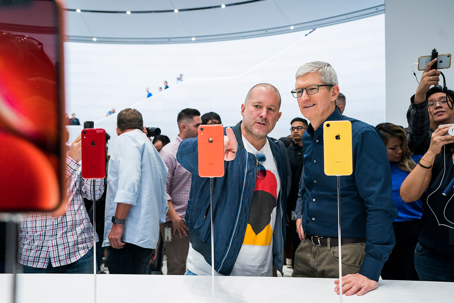
Since its foundation in 1976, few companies have shaped the design world like Apple. The main man behind the products that established it as a powerhouse was Jony Ive, Apple’s design guru for 27 years until he left in 2019. Paired with the obsessive perfectionism of Steve Jobs, the two of them created some of the most iconic tech products of the day, many of which you can still buy today (with the help of some nifty Apple deals).
Instead of focusing on finding the best Amazon Prime Day Apple deals, though, today we are going for a trip down memory lane to look at five of the best products Jony Ive designed over the years. But even someone of his stature makes mistakes, and Ive had his fair share of misses too. After all, no one is perfect. Read on for the best and worst designs Ive ever made.
The best Jony Ive designs
01. The iMac G3 (1998)
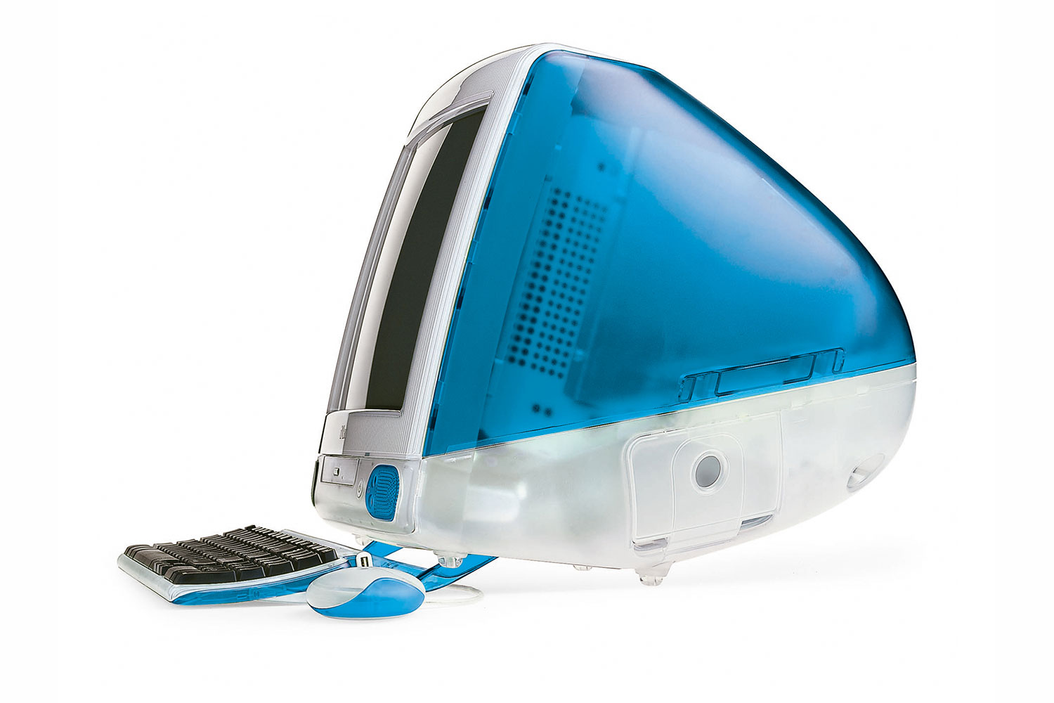
In the 1990s, Apple was lost in the weeds and on the brink of bankruptcy. Then along came the iMac G3, the bright, colourful computer that saved the company and helped Steve Jobs make a name for himself all over again.
But the G3’s impact went far beyond simply saving Apple – it changed the entire computer industry. Amid a sea of bland beige boxes, the iMac G3’s popping colours and translucent shell were friendly and approachable. The whole idea was to take the fear factor out of computing for ordinary people – hence Ive’s idea to place a handle on top so people would be encouraged to touch it. With the iMac G3, Ive’s genius was to show that good design can change perceptions.
02. The iPod (2001)
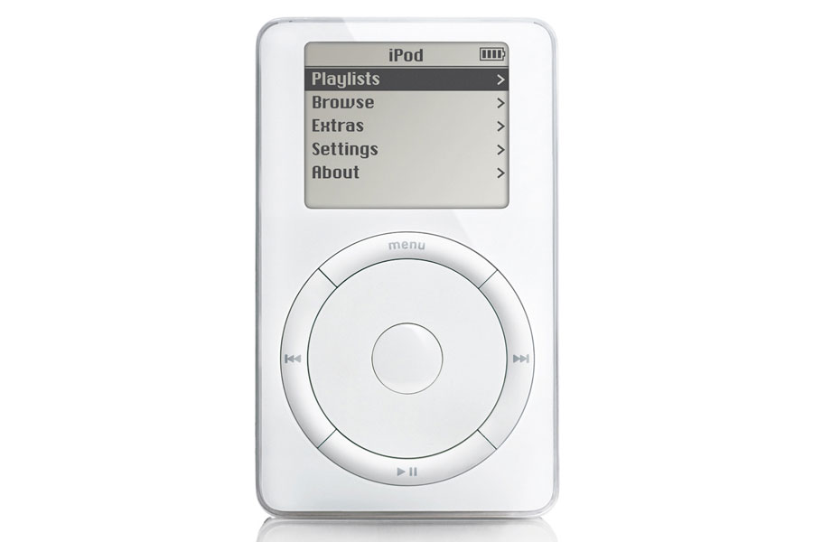
Steve Jobs once famously said that design is "not just what it looks like and feels like. Design is how it works." Of all of Jony Ive’s designs, perhaps the one that most perfectly illustrates this idea is the original iPod.
Central to that was its iconic click wheel. This allowed for a naturalistic way of navigating huge libraries of songs that was completely intuitive, even to novices. Not only did it look great, but it worked amazingly well, validating Jobs’ famous axiom. Its design was heavily inspired by the 1958 Braun T3 radio by Dieter Rams, one of Ive’s chief inspirations, but the iPod was utterly forward thinking. Like so many of Ive’s designs, it forced everyone else to play catch-up.
03. The iPhone (2007)
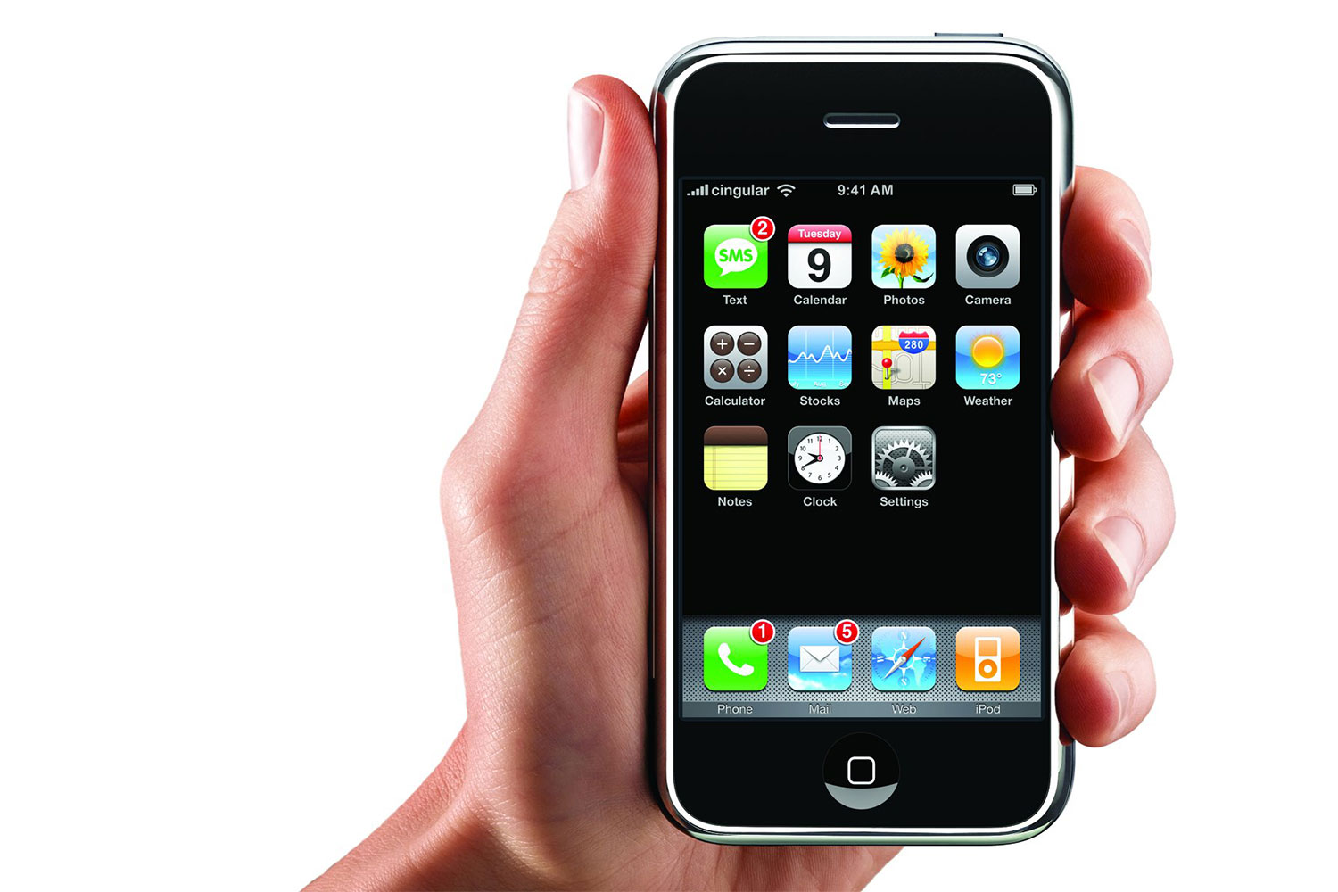
When Apple launched the iPhone in 2007, Google was hard at work on its own phone. Yet when it saw what Jony Ive had designed, Google knew it had to start over. “As a consumer I was blown away. I wanted one immediately. But as a Google engineer, I thought, 'We’re going to have to start over…' What we had suddenly looked just so… nineties,” is how Google engineer Chris DeSalvo put it later.
Get the Creative Bloq Newsletter
Daily design news, reviews, how-tos and more, as picked by the editors.
Back then, every smartphone had a huge hardware keyboard. Yet as Jobs explained at the time, this was a clunky, unimaginative design. Instead, Apple’s Ive-designed phone was all screen, something that seemed at once so obvious yet so outlandish. This was one of Ive’s gifts while at Apple: Taking a futuristic idea and making it real.
If you're more interested in later iterations of the iPhone, then see our iPhone 12 deals post.
04. The Apple Watch (2015)
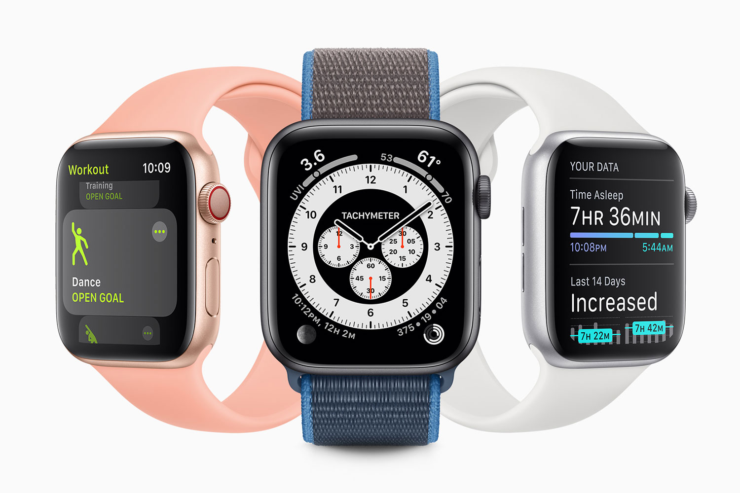
These days, the Apple Watch is undoubtedly the best smartwatch you can buy. Yet when it was first released, questions were raised about its design. How would you navigate such a tiny screen? Would you be able to see things clearly without squinting? And why was it rectangular? Everyone knows watches should be round, right?
As it turns out, Jony Ive’s design was too forward-thinking for most of us to immediately realise how great it was. The Digital Crown let you quickly scroll through lists or zoom in and out, while the square-ish design permitted a lot more screen content than the Watch’s rounded competitors. Far from ugly, its design is now iconic and instantly recognisable (see our best Apple Watch deals to nab yourself one). Maybe we should have trusted Ive’s intuition a little more.
05. Apple Park (2017)

If you thought Jony Ive just designed computers and phones while at Apple, think again. Apple’s current headquarters, Apple Park, was designed by Ive. It may not be your typical Jony Ive design thematically, but his fingerprints are all over it.
All of Jony Ive’s designs tried to consider the entire product as a whole, not just its constituent parts, and that is clearly seen in Apple Park. Its exterior walls are floor-to-ceiling glass. Unsightly car parks are hidden underground. The entire building is curved into a circular, spaceship-like footprint. The result is that no matter where you are in the building, you get stunning views right from your desk. The holistic end result was the goal of the design, and everything else fit into place.
2 of Jony Ive's worst designs
01. The first-generation Siri Remote (2015)
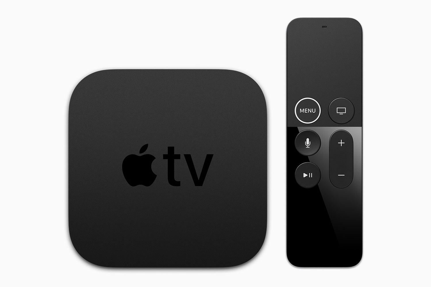
Apple recently updated the Apple TV and its accompanying Siri Remote, but the first-generation of its remote was not one of Jony Ive’s finest ideas. It was small and lightweight, but its black buttons on a black body made it hard to find your way around it in darkened rooms – a familiar situation for watchers of a set-top boxes like the Apple TV.
Worse, it was useless for gaming, despite Apple trying to promote Apple TV as a casual gaming platform. Jony Ive has always extolled the virtues of simplicity in design, but perhaps the first Siri Remote’s overt minimalism was one instance where a little more complexity would have been welcome.
02. The iMac G3’s “hockey puck” mouse (1998)
Jony Ive designs great flagship products, there is no doubt about that. Accessories? That is more open to question. Aside from the Siri Remote and the infamous upside-down-charging Magic Mouse 2, the iMac G3’s “hockey puck” mouse deserves a place in the Jony Ive hall of shame.
Like the first-gen Siri Remote, the hockey puck mouse was hard to orient. It was completely circular, so you could not clearly discern its front or back just by touch, meaning you would have to keep looking away from your screen to make sure you were holding it right. The iMac G3 was revolutionary, but its mouse is better left forgotten.
Read more:

Thank you for reading 5 articles this month* Join now for unlimited access
Enjoy your first month for just £1 / $1 / €1
*Read 5 free articles per month without a subscription

Join now for unlimited access
Try first month for just £1 / $1 / €1

Alex Blake is a freelance tech journalist who writes for Creative Bloq, TechRadar, Digital Trends, and others. Before going freelance he was commissioning editor at MacFormat magazine, focusing on the world of Apple products. His interests include web design, typography, and video games.
