Is your design retro… or just dated?
There's a tenuous line between retro cool and cringy.
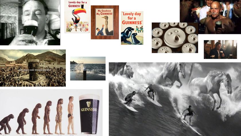
Leave a design to age long enough and you may find it does not dissolve into obscurity, but rises from the ashes of its own datedness, crowned with a brand new descriptive: retro. Retro design is aesthetically dated – so uncool it’s cool again, so to speak.
The concept is growing in popularity. Vinyl sales hit a 25-year high this year, cassette tape sales grew by 74 per cent, and remakes of classic 80s and 90s films now roll into our cinemas on a regular basis.

Graphic design is not exempt from the trend, either. At Quinnstheprinters.com, the print shop where I work, we've seen a great deal of retro-inspired designs come through for print. If you look to today’s creations across print and the web, it won’t take you long before you come across a pixelated image reminiscent of old Game Boy graphics, or gaudy 90s-style lettering that straddles a tenuous line between being cringey and ironic.
Why is graphic design looking backwards?
The main reason graphic designers draw inspiration from the past is simple: people are nostalgic about the past. With the benefit of hindsight, there is certainty in the past, a sureness to its course and reasoning, and yet enough distance that ugly realities can blur and fade. It’s comfortable in a way that new designs are not – a dependable escape from the confusing present.
The difficulty for designers is how to get this style pitch-perfect – to be just ugly enough to pass for ironic
Even seemingly ‘edgy’ designs that borrow from 80s and 90s styles are comforting reminders of corny sitcoms and times when today’s youth were too young to understand what was happening on the news.
As well as that, old styles can be a welcome divergence from contemporary trends – provided you use them right. In the same way a child is wowed by a Polaroid camera or a vinyl record, the tried-and-tested typefaces, shape sets and colour palettes that passed out of the limelight long ago can be exciting to a generation that has not yet experienced them.
Get the Creative Bloq Newsletter
Daily design news, reviews, how-tos and more, as picked by the editors.
The difficulty for designers is how to get this style pitch-perfect – to be just ugly enough to pass for ironic, or aged enough to seem wise rather than boring. We have five questions you should ask yourself to make sure you hit the mark.
01. Does your product fit a retro look?
The first thing to consider is what it is you're trying to promote. Does the product or service your designing for lend itself to being tied to a vintage style? For example, a wedding boutique fits well with older designs because it is typically linked to tradition, family and long-established notions of happily-ever-after.
A clothing store that carries styles from the 60s and 70s or a coffee shop with a family heritage can also benefit from a retro design because it is part of the product. It feels authentic.
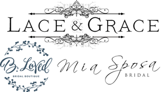
Some products simply will not work with retro designs, and you should never try to force them together (unless your client is very, very insistent). Digital startups, for one, rarely work with floral script or funky 70s typefaces. These are businesses based on progress and innovation – drawing inspiration from a time without internet or even computers is too jarring.
Similarly, if you have a brand new product or a service based on innovation, it is typically better to search for contemporary trends or to attempt to break the mould altogether.
02. What is your brand’s tone?
Not all retro designs are equal. There is a big difference between a vintage clothing retailer that primarily stocks floral tea dresses, and another selling restored biker jackets from the 1970s. One may make use of flowing script or elegant patterns, and the other might decide to for a scratchy, neon typeface reminiscent of 80s rock album covers.
There is also a big difference between an accountancy firm that would like to be considered strong and stoic with classic typefaces similar to Times New Roman, and another that would prefer to be more personable and approachable, with injections of colour or design flourishes.
Typically, the further back you go in time, the more reputable you can appear, so words like elegance, luxury, trusted, upmarket and quality may be tossed around. On the other hand, a younger retro design will typically attract descriptors such as fun, quirky or creative.
You can also subvert this and go for a more ironic tone by employing something like a 1950s-style illustration to promote a modern-minded brand, but it takes skill to really make this work.
03. Who is your audience?
Typically, we do not find a time period ‘cool’ if we have lived through it as an adult, or it is still too recent to be blurred into an aesthetic. For example, baby boomers may find very little to admire stylistically about the 80s or 90s, but millennials are often attracted to the styles they were too young to wear, enjoy or replicate while growing up. Therefore, if you’re going retro, make sure it’s the right era to be retro for your target audience.
04. Is anyone else doing it?
If you’re still not sure, look to your competitors. You want to stand out, but if you’re the only one going down the retro route, consider why that might be. Is there something you’ve missed? Are you just trying something different? Make sure you haven’t strayed too far from what your audience will respond positively to.
Alternatively, if every other brand in your industry is using a similar logo or design, you know that the design at least works. But in this environment, will you stand out or fade into a mass of other crests and badge-style logos? Do your competitor research to make an informed decision.
05. How long does your design have to last?

Some trends die quickly. The edgy styles of the 90s may be just a few years away from becoming the next 80s neon-tutu-and-sweatbands costume at your local Halloween store. If you're creating a logo or any aspect of design that depends on longevity, therefore, either make plans for a design shift in five years’ time or dial back the retro influence.
Typically, your sensible typefaces and layouts are classic for a reason and you have little to fear. If your design is what you would call ‘out there’ then proceed with caution – trends change fast and nobody wants to fall behind.
If your design is only meant to last a few months to a year, though, you can obviously afford to be a more experimental with your vintage design.
06. Do you need to rethink?

Let’s face it: Sometimes, retro doesn’t work. A retro design risks ageing an already old product, instead of giving it new life, or straying into the realm of kitschy or stereotypical.
If reverting to contemporary designs isn't an option for your brand, you could try implementing only certain aspects of retro designs. For example, an old-fashioned, black and white photograph with a bold, bright typeface can marry the two concepts stylistically.
Similarly, a vintage floral design turned neon, or classic typeface paired up with a bold use of shapes, can be a great way to compromise on a truly retro design.
Read more:

Thank you for reading 5 articles this month* Join now for unlimited access
Enjoy your first month for just £1 / $1 / €1
*Read 5 free articles per month without a subscription

Join now for unlimited access
Try first month for just £1 / $1 / €1
