Implement beautiful typography in Sketch
Discover three hidden typographic techniques that can be used in Sketch and on your website.
As designers and developers, we know that great typography is more than just choosing a pleasant font. But what are the practical techniques we can use to take our text to the next level? And how do we execute those techniques in a design tool like Sketch, or implement them on a website?
In this article, I’m going to cover three techniques to boost your typography game: text on a path, hidden OpenType font features, and special characters. These techniques are exciting because few people know how to use them in Sketch, and they can help make your work look more professional. I’ve accompanied this article with a dedicated web page of resources and a gallery of beautiful examples for you to pull inspiration and code from. Need some great typography? See our roundup of the best free fonts.
Text on a path
‘Text on a path’ is when a string of text no longer sits on a flat line but instead wraps around a custom line or shape. This is most effective when the path is a perfect circle or a very subtle arc. The more complex or curved your path is, the more likely your text will look childish – it’s easy to overdo this feature!
In Sketch, text on a path is an old and slightly finicky feature that can be confusing to figure out on your own. The key is to understand how vector paths work under the hood, which applies to both lines and closed shapes. Every vector path has a start point and an end point, and a direction for the computer
to move in while drawing that path.
When you use Sketch’s Vector tool (aka the Pen tool), it’s easy to remember where you began drawing and in which direction you drew your custom path. But for shapes like a circle – which appear to be a continuous path – there’s no obvious way to know the start point or path direction.
Enter Edit mode by selecting the path layer, then hitting the return key. Sketch automatically selects a vector point along the path, and that’s your start point. If you hit the tab key, Sketch will select the next vector point, moving along (and therefore revealing) the path’s direction.
This is important for text on a path because the direction of the path is the direction your text moves in. If the path isn’t moving left-to-right, your text will appear upside down. To reverse the direction of your path, go to ‘Layer > Paths > Reverse Order’ in the menu bar.
Get the Creative Bloq Newsletter
Daily design news, reviews, how-tos and more, as picked by the editors.
Now your path is ready, it’s time to connect it with your text layer. The text layer must be directly above the path layer in the Layers list, and I suggest grouping the two layers to ensure this doesn’t change. Select your text layer, then go to ‘Type > Text on Path’. Next, drag to reposition the text layer around your canvas until the text sits exactly where you’d like it to along the path.
Top Tips
This can take a little time, as the position of the text layer can seem to have little relation to where it appears along the path. Furthermore, Sketch’s rendering engine can stumble when working with text on a path, appearing to crop the text in strange places. A quick zoom in and out again will typically fix this rendering bug.
One last tip for working with Text on a Path: I’ve found that the feature performs best when the path is open like a line, instead of being closed and continuous like a circle. Sketch’s Scissors tool will help you there, and I’ve written a whole article about how to use it.
On your website, you can implement text on a path by using SVG’s element. Sketch doesn’t currently support this feature in exported SVGs, but it couldn’t be easier to add the element yourself. On the resources page you’ll find a CodePen template that will make this easy.
Fancy font features
When you choose a font and start typing, you’re only seeing a fraction of what the font is capable of. Small caps, discretionary ligatures and alternate characters – often known as OpenType features – are just a few of the hidden capabilities.
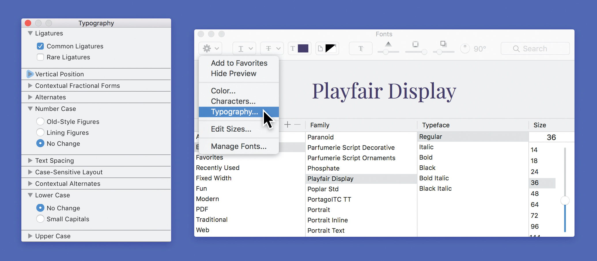
Most people don’t know that OpenType features are available in Sketch, and even other apps on macOS like iWork. Using Sketch, enter Edit mode on your text layer and ‘Select All’. Next, open the default macOS Fonts panel by going up ‘View > Show Fonts’. The toolbar within the Fonts panel contains a gear icon menu near the left, featuring a mysteriously named ‘Typography...’ option. That’s where the magic happens!
The Typography panel reveals which fancy font features are available for your selected text. For example, at the top you’ll often find a checkbox for ‘Rare Ligatures’ that enables more ornamental letter combinations like ‘Qu' or 'ity'.
There are tons of exciting typographic features that can be included in a font, but here is one more of my favourites: small caps. Small caps are a set of miniature capital letters that are typically the same height as a lowercase letter ‘x’. Using the Typography panel you can convert all lower case letters into small caps, which look great for short captions or the first line of an article.
Things to remember
Although these font features are accessible from within Sketch, they can be slightly finicky. Here’s what you need to be aware of: First, when you are turning features on and off in the Typography panel, you may need to wait a moment or hover over the selected text before the changes take place.
Second, if you change the font size or weight using Sketch’s Inspector, any fancy typographic features will be reset to their defaults; I suggest adjusting these two attributes in the Fonts panel instead. Changing other font-related attributes (such as colour, character spacing or line height) in Sketch’s Inspector won’t affect your typographic features.
Implementing these fancy font features on your website is as easy as adding a few CSS properties, now supported by all major browsers.
Special characters
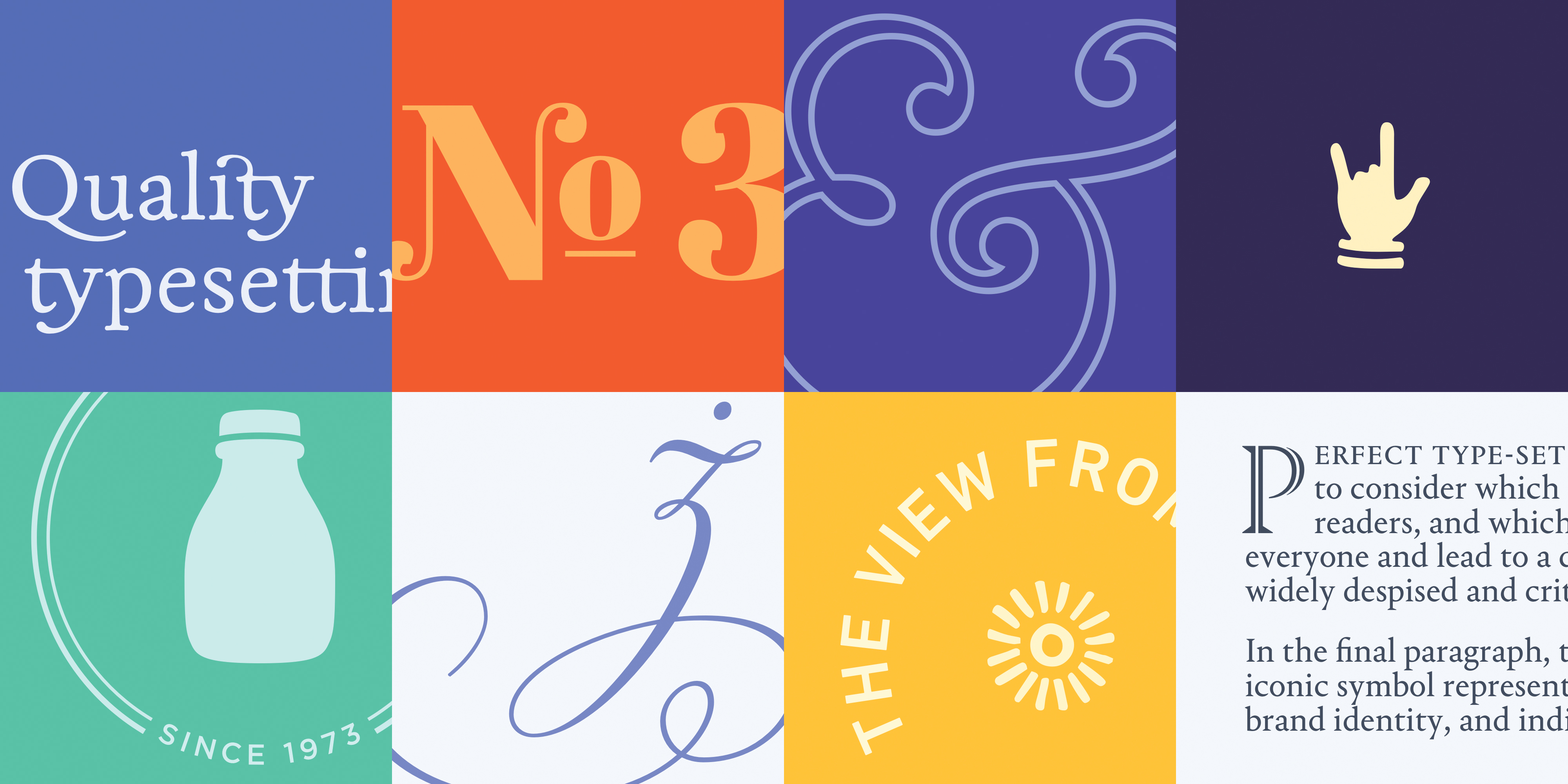
In addition to fancy features like ligatures and small caps, many fonts contain special characters like dingbats, flourishes and symbols. In the opening image for this article, the bottle, sun icon, and hand gesture are all part of various fonts.
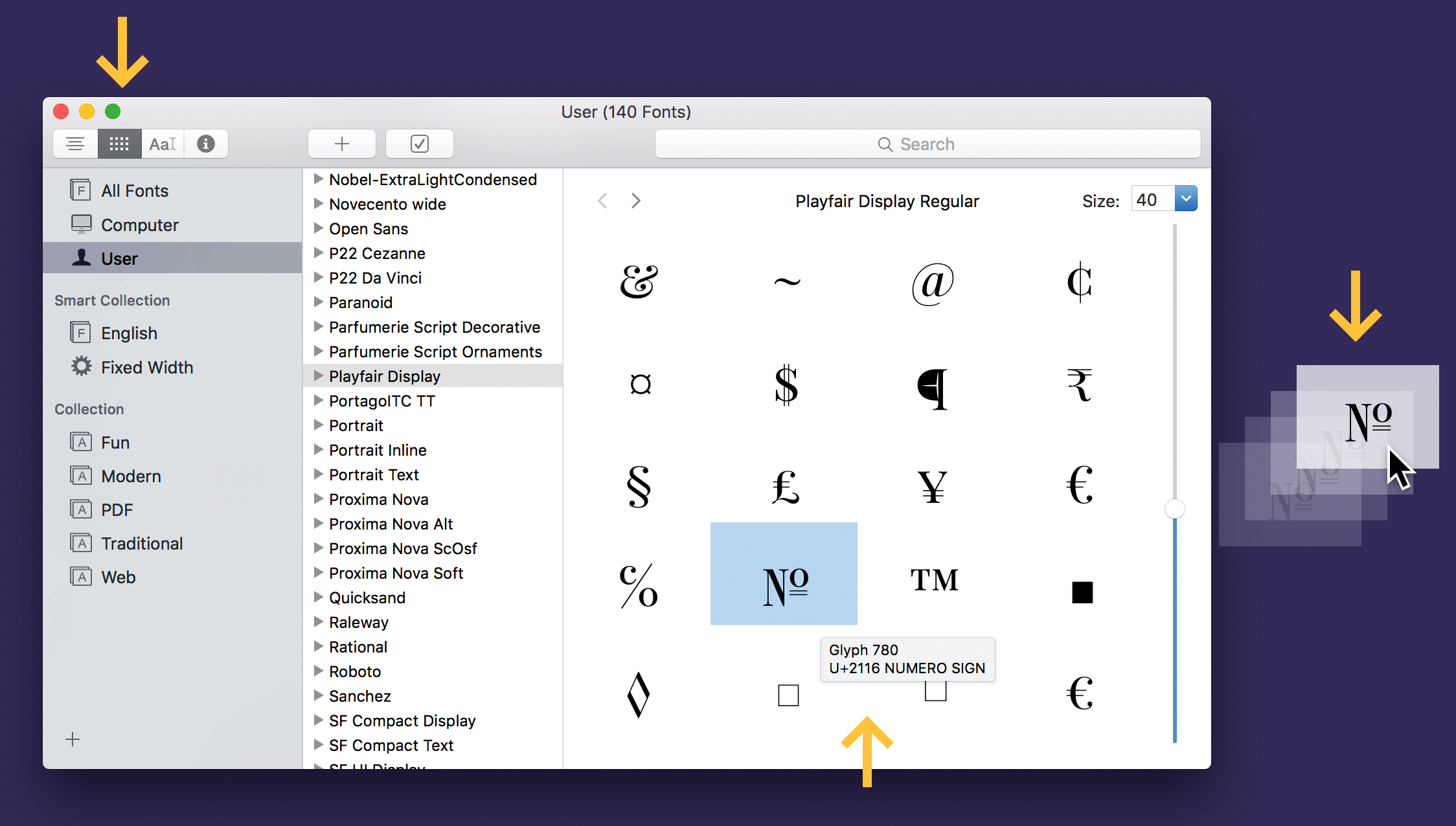
When working on your design, there are two ways to access the special characters that have been included in a font. The first is to use Apple’s built-in Font Book app, which allows you to view each font’s ‘Repertoire’ (a grid of letters and glyphs) by clicking on the grid icon in the toolbar. As you scroll past the most common characters (A-Z), you’ll start to see the extended set of ligatures, small caps, diacritics (accent marks), and special symbols that the type designer has lovingly created for nerds like us.
When you hover your cursor over a character, you’ll see a little tooltip with the character’s name and Unicode value. Best of all, you can drag that character out of Font Book and into any other app (like Sketch) where you’re editing text. Just make sure that in Sketch your text layer is in Edit mode – denoted by a blinking text cursor – before you drag and drop.
The Characters panel
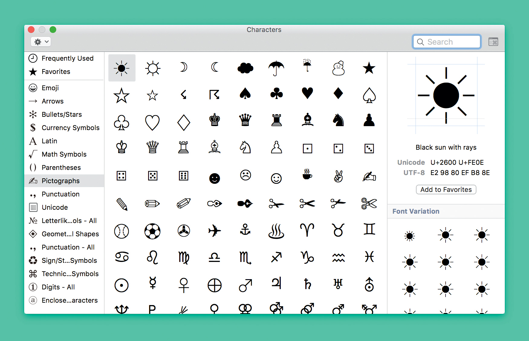
Font Book isn’t the only way you can access these special characters; most of them can be inserted through the Characters panel. This panel can be accessed within Sketch and throughout macOS, at the bottom of the Edit menu in the menu bar (it’s now called ‘Emoji & Symbols’). If the Characters panel looks small, click the little icon in the top- right corner that looks like a window with the '⌘' symbol inside – this toggles between a compact and expanded panel.
The expanded Characters panel is powerful, giving you access to countless symbols, punctuation marks and pictographs. Simply double-click one of these characters to insert it alongside your text. A personal favourite of mine is the numero (‘No’) which is far more elegant than a ‘#’ and more compact than writing ‘Number:’.
Click on the gear icon at the top of the Characters panel to customise the list of categories in the sidebar. You can even add Unicode to the list, which allows you to browse every single one of the thousands of Unicode-compliant characters. In other words, this gives you access to pretty much every character you could ever imagine! I also find it useful to drag special characters that I use frequently into the Favorites list, which eliminates the need to search for that character every time you want to use it.
When it comes to implementing your design on the web, inserting special characters is easy. Any Unicode character can be used on a website by either referencing the character’s corresponding HTML value or using CSS-generated content with the character’s Unicode hex value. On the resources page I’ve linked to a great website for quickly finding these values for any character, and another website explaining how to implement them in CSS.
Conclusion
As you can tell, this article merely skims the surface of each topic. That’s why I’ve made so many mentions of the resources page! It includes a gallery of beautiful examples, selected free fonts packed with OpenType features to try out, my own Sketch project files to pick apart, and many other helpful websites and templates. Happy typesetting!
This article was originally published in net magazine issue 284. Buy it here.

Thank you for reading 5 articles this month* Join now for unlimited access
Enjoy your first month for just £1 / $1 / €1
*Read 5 free articles per month without a subscription

Join now for unlimited access
Try first month for just £1 / $1 / €1
