In a creative industry where trends rise and fall at lightning speed, it's often difficult to get a rounded view of what illustration clients are currently looking for. Yes, we're all surrounded by visual media, so it's likely you'll spot at least some of the latest trends without trying. But given how diverse and splintered our culture is becoming, and how much time we spend in our own echo chambers, it's also easy to miss some of the biggest trends entirely, or at least underestimate their importance.
To help you out, we've canvassed some leading voices in the creative community to get their take on what the biggest illustrations are right now. We also share some examples of these trends out in the wild, so you can see what they look like in practice.
We're not suggesting, of course, you abandon your own distinctive illustration style, or follow trends blindly. But at the same time, it's good to know what's out there, and you might find the latest illustration trends give you some fresh inspiration, angles and ideas for your own projects. Plus at the very least, it's good to know the trends fellow creatives are talking about, so you don't get left behind during meetings or in conversations at events. Also on that note, see our top graphic design trends piece.
01. A shift to hand-drawn in packaging
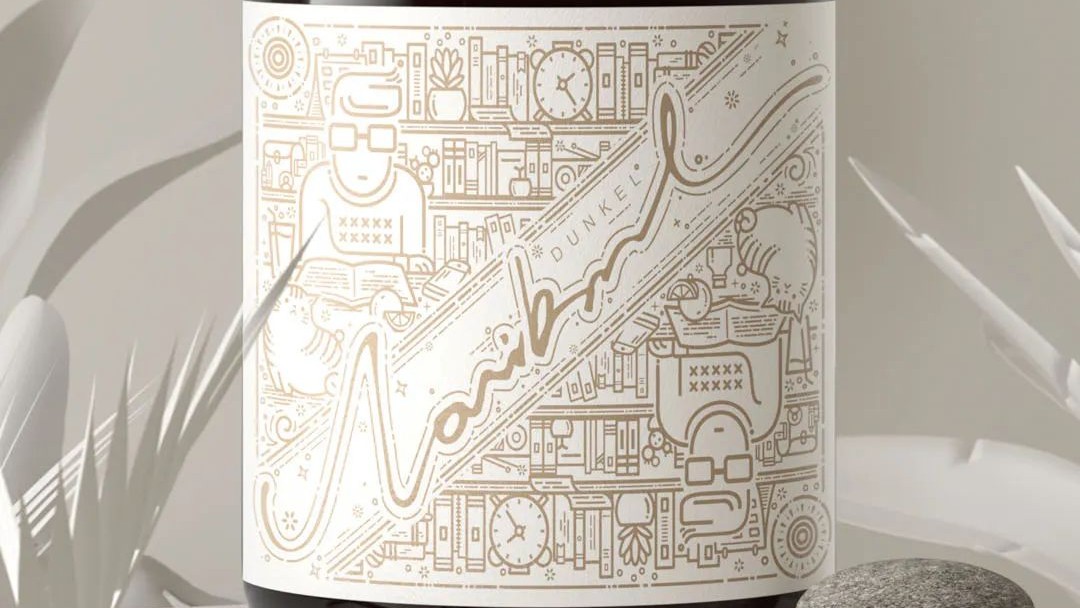
As project and marketing manager at Pentawards, the global packaging design platform, Jennifer Clements has a birds-eye view of how illustration trends are evolving in the packaging industry. And lately, she says, "I've seen a definite rise in hand-drawn illustrations or notes, evoking a sense of personalisation and human connection directly with the brand in question."
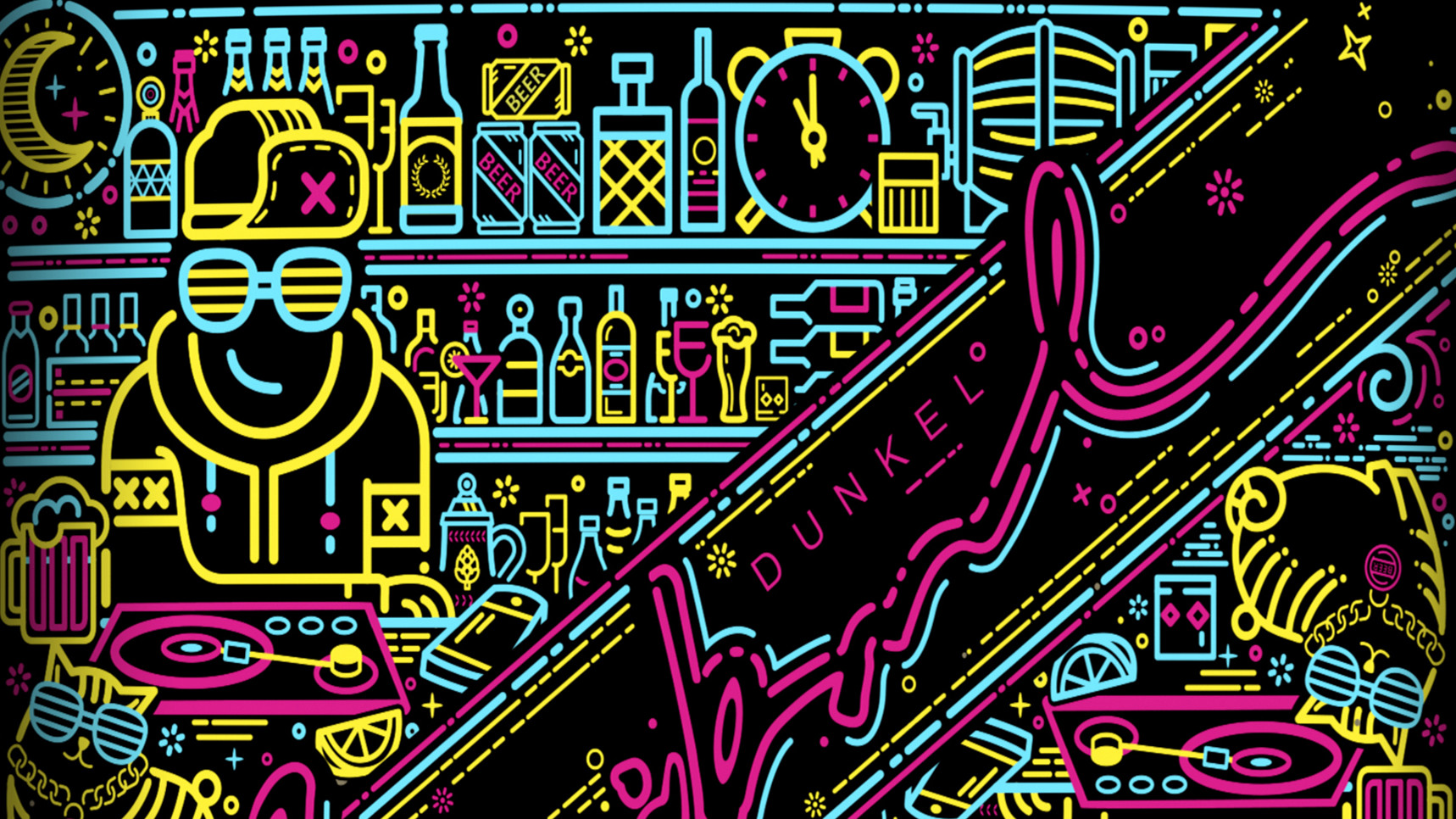
Clements suggests this reflects the increased uptake of hobbies such as writing and drawing in the lockdown era, as well as the associated desire for a feeling of collectiveness. She gives the example of Lovibond (shown above), a new beer by Snow Beer targeted at young adults. "Created by ShenZhen Lingyun Creative Packaging Design Co, this design features engaging illustrations on the label in luminous ink depicting two different scenes: a peaceful quiet illustration for the daytime, and a more hip-hop vibe for the evening."
And here's another. "The hand-written message on Vouni Panayia Winery's limited edition Untitled wine bottle, created by Lefki Savvidou and Marios Karystios, sends a playful and category-disrupting message that conveys a sense of togetherness," says Jennifer. "With a bold statement, it confronts what is perhaps a universal 'mood' of the times: 'We are not drunk enough to survive the 21st century'." For more on the latest packaging design, check out Pentawards' latest Trends Report.
02. Child-like styles
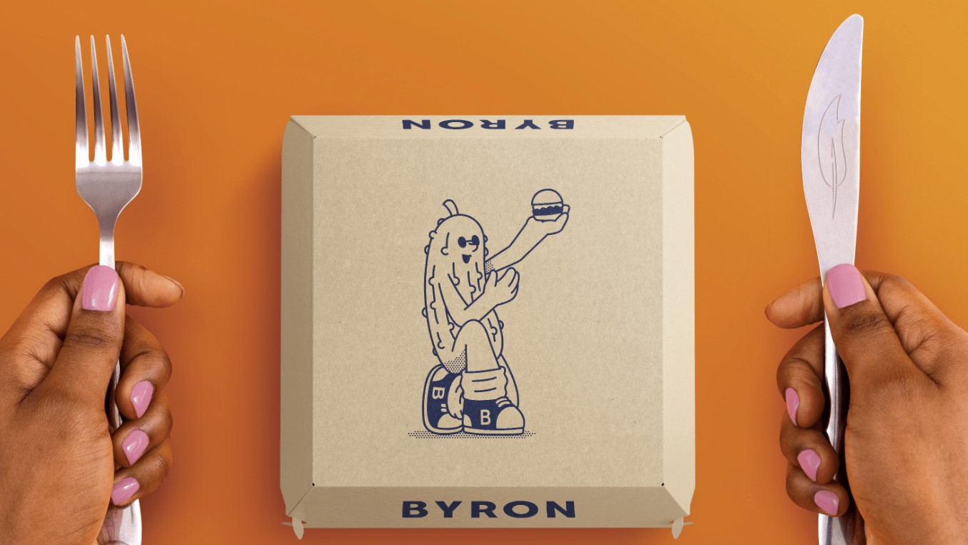
Lockdown reminded many of us of the simple pleasures of childhood. And so it's not surprising that there's been a recent trend for visibly 'sketchy', child-like line art across all forms of commercial illustration.
Get the Creative Bloq Newsletter
Daily design news, reviews, how-tos and more, as picked by the editors.
"This approach seem to have become quite popular recently," says freelance illustrator Harry Sussams. "It covers a wide range of styles, but the general look of rough/bold line-work leads to pretty fresh and energetic illustrations. And personally, it's something I enjoy seeing."
This style can be seen in the work of Katie Cottle, Annix and Harry Wyld, while commercial uses include Taxi Studio's branding for Byron Burgers (shown above) and Everland's work for food startup La Vie.
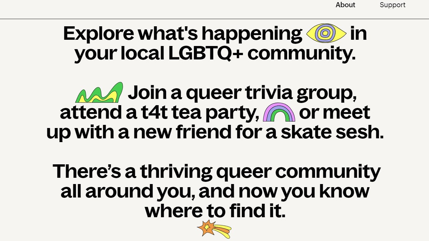
Continuing the theme of childhood, the use of sticker-style illustrations have exploded across the internet in recent months. Take a look at the web pages of design tool Figma and LGBTQ+ community site Lex (shown above) for examples.
"As more aggressively stripped-back and Brutalist-inspired designs have taken over, we’ve recently seen sticker-style illustrations being introduced, to add warmth back into the design," says Elliott Holman, design director at This Place. "These graphics often use bold, black borders and flat colours to reflect the pared-back nature of the wider design, while giving a more quirky, human touch."
03. Pixel art
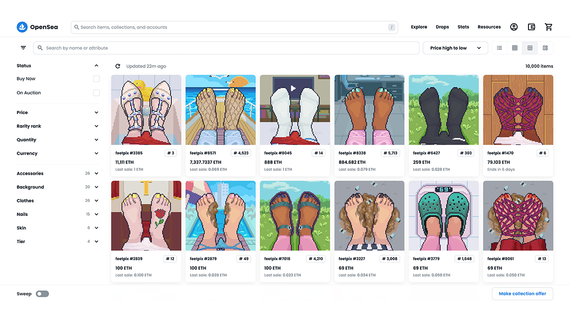
We've long been big fans of pixel art at Creative Bloq, but as with most illustration styles, it tends to swing in and out of fashion. Right now though, it's back on the march, in a way that fits neatly in with the other trends we've mentioned so far. Not least because it's used in some of the most sought-after NFTs, such as Feetpix (shown above).
"As someone who also works in this way sometimes, I've noticed that pixel art as an aesthetic has made a big comeback in the game design world over recent years," says Sussams. But that's only one half of the equation.
"Artists are also producing amazing pixel art for its own sake, separate from the world of video games," he adds. "And the use of limited resolution in a very digital world can lead to some interesting simplification of images and ideas". For great examples of the trend, check out the work of Waneella and Norma2D.
04. AI art
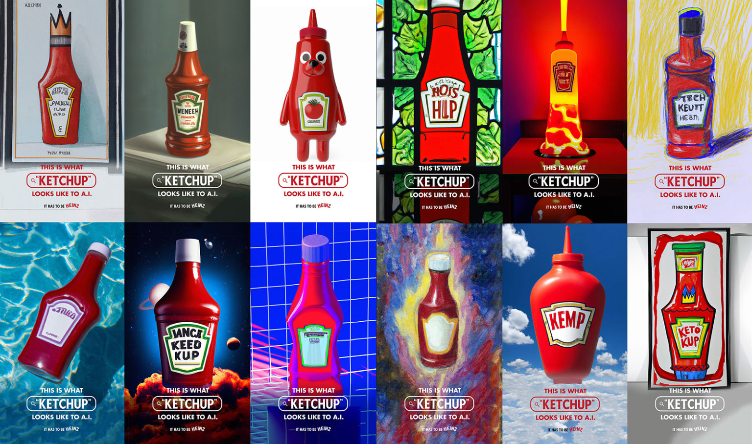
It's a subject that's likely to make most illustrators' blood boil. It's led to the creation of some very weird art. And it still has a real problem with drawing hands. But there was no way we couldn't include AI on a list of current illustration trends.
Sussams speaks for many when he says: "The conversation around AI 'art' is disconcerting but is definitely taking up a lot of the discourse at the moment. I just hope the wider industry, and world, reject this AI trend in favour of supporting actual artists who create art with their own hands."
Others, however, are taking a more positive tack. For example at last October's Adobe Max, Scott Belsky, executive vice president of Creative Cloud, said that rather than fearing AI as potential replacement for creatives, we should see it as a useful tool; "your co-pilot in creative endeavours", as he put it.
Whichever side of the fence you sit, the current rise of AI does seem unstoppable. "The recent proliferation of AI tools like Dall-e 2 and Mid Journey are producing some truly incredible results," says Billy Woods, creative director at GLOCK. "All it takes is a creative mind, some carefully picked phrases and the ability to work with the abstract.
"It will be interesting to see how widely this gets adopted," he continues, "as the technology develops and people become more comfortable working with the platforms that are available. But whether you’re designing furniture and interiors, album covers and posters, or surrealist photography to turn heads, AI looks set to be a big part of the future."
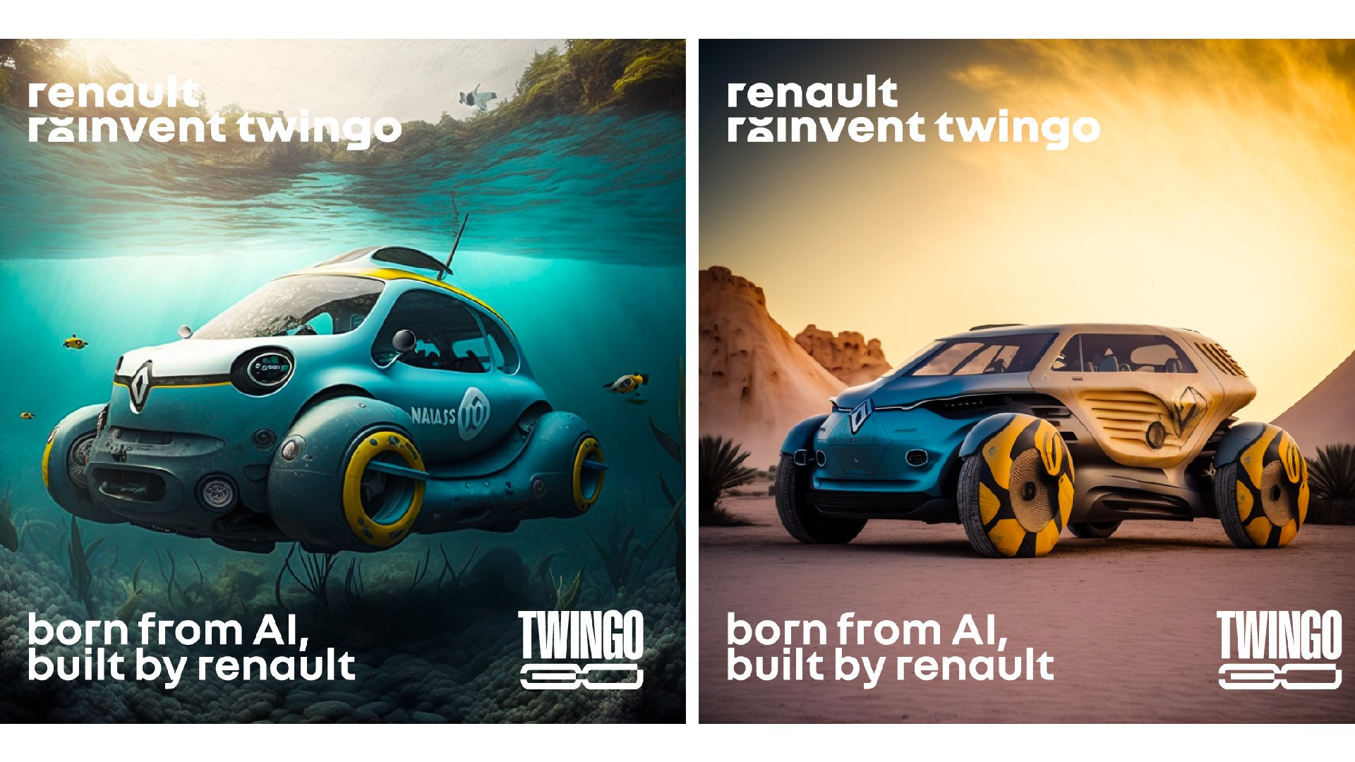
Matt Taylor, senior designer at Free The Birds, agrees. He points to the fact that big brands are already experimenting with AI, and fully expects this to continue in 2023.
"Renault, for example, is celebrating the 30th birthday of its iconic Twingo by generating otherworldly and eye-catching concept visuals with AI, depicting the little car as a campervan, submarine and even a planetary explorer," he notes. "Heinz has also entered the matrix and asked DallE to ‘draw ketchup’ to a surprisingly successful outcome, and played with a lot of different styles. The human-made iconic bottle and label remained recognisable throughout, so we aren’t all out of a job just yet."
Taylor also cites Georgia Perry and Luke Stephenson as creatives doing interesting things with the trend.
05. A new approach to sustainable imagery
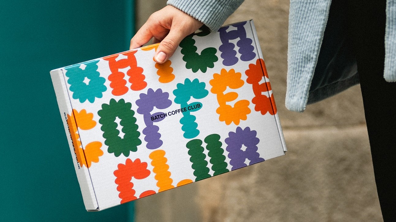
Imagery denoting sustainability has been a big trend for many years. But banalities such as earth tones and natural imagery are now looking a bit tired, believes Duncan Anderson, mid-weight graphic designer at Echo.
"Potentially as a result of this trend, brands – particularly smaller ones – have moved away from these clichés," he explains. "So many are now swaying towards bolder and more vibrant – sometimes neon – aesthetics, often combined with organic, handmade patterns." Examples include Marx Design's packaging for the chocolate brand Loving Earth and Requena's work for Batch Coffee Club.
06. Merging text and imagery
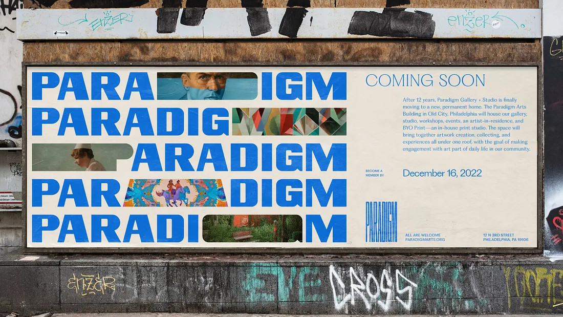
Our final trend could have also fitted into our review of the latest graphic design trends, as it's basically a mashup of the two disciplines.
As Elliott Holman puts it: "We’re seeing an increase in the inclusion of images amidst large-scale typography, adding richness and texture to bold messaging. Imagery can help to illustrate and add impact to a bold statement visually, without detracting from the typography and message." Examples of the trend can be seen in the work of Smith & Diction and B-Corp, and the website of event planner Pro Loco Di Castrovillari.
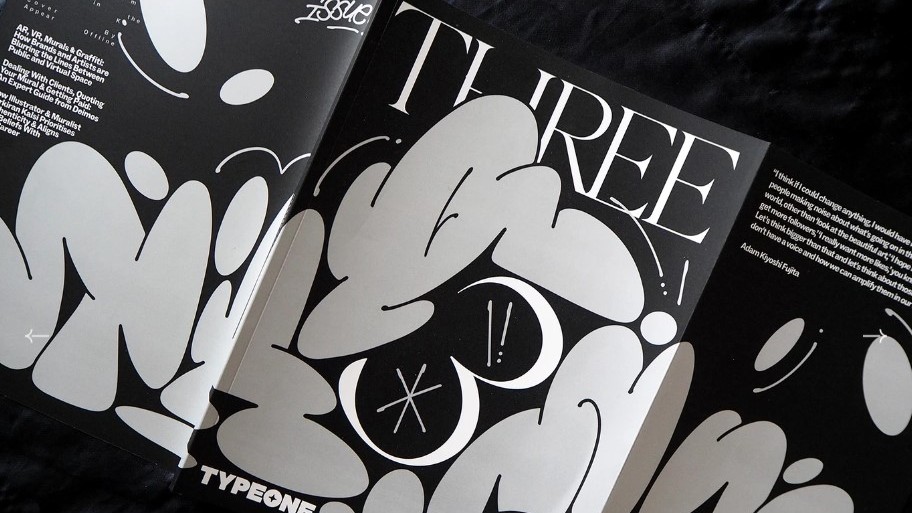
And we'll end with a related trend, identified by David B. Cohen, creative director at brand consultancy BLVR. He describes it as "the genre-bending use of graffiti with traditional and elegant typefaces. Coupled with Neo Hippie and Y2K influences, this brand of typography is truly representative of modern street culture." Check out Siyana Studios and Appear Offline for some brilliant examples of this trend in practice.
Read more:
- Monotype's hot typography trends for are here
- 10 NFT trends that could change the world
- 'Psychic waves' new trend for, predicts Adobe

Thank you for reading 5 articles this month* Join now for unlimited access
Enjoy your first month for just £1 / $1 / €1
*Read 5 free articles per month without a subscription

Join now for unlimited access
Try first month for just £1 / $1 / €1

Tom May is an award-winning journalist and editor specialising in design, photography and technology. Author of the Amazon #1 bestseller Great TED Talks: Creativity, published by Pavilion Books, Tom was previously editor of Professional Photography magazine, associate editor at Creative Bloq, and deputy editor at net magazine. Today, he is a regular contributor to Creative Bloq and its sister sites Digital Camera World, T3.com and Tech Radar. He also writes for Creative Boom and works on content marketing projects.
