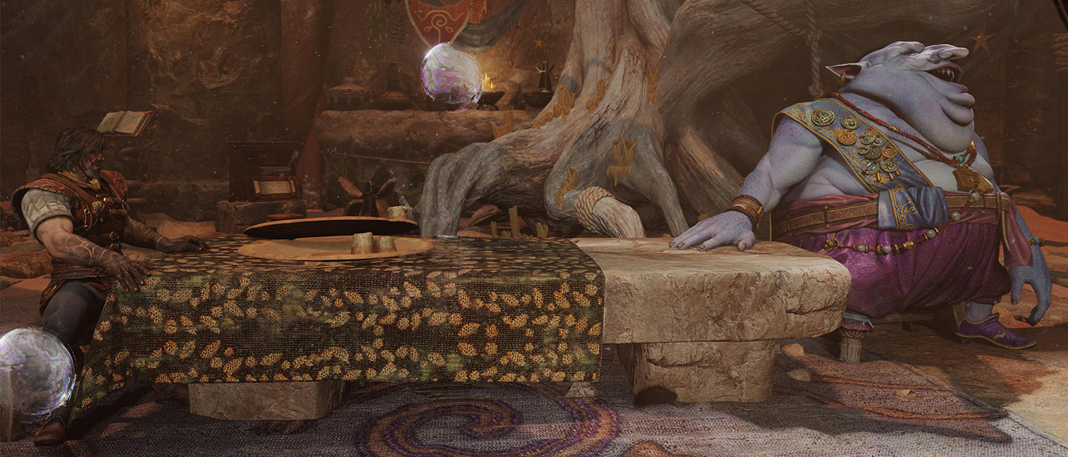
Hey, look: we’re just a few weeks away from a brand new decade! Which seems like the ideal time to cast an eye over the last year’s illustration trends and get some clues about where we’re headed in 2020 and beyond.
Last week we took a close look at the graphic design trends set to shape the next 12 months, and today we're focussing on illustration. Here, leading artists and designers in the industry share the trends they’ve spotted recently and their predictions on what will be popular in the year to come. Of course, no one’s saying you have to follow these trends, but it’s certainly good to know what they are.
01. Flat colour and limited palette
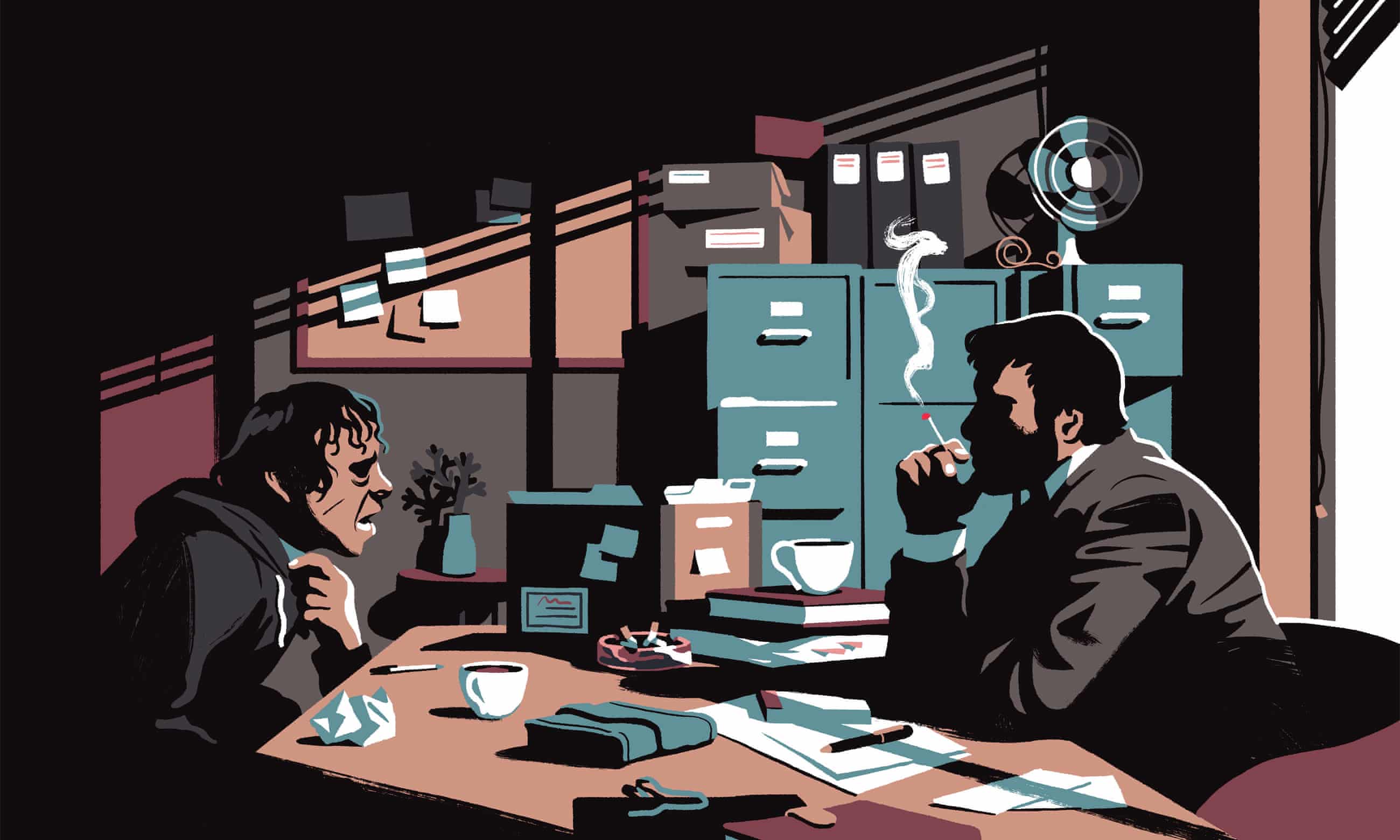
When it comes to illustration, sometimes less is more. Or as Jamie Clarke, a freelance designer and illustrator specialising in lettering and display, puts it: “Working within a set of restrictions, be they self-imposed or from a client’s brief, is often a good way of keeping an idea focused.”
That’s the thinking behind one of the year’s biggest illustration trends: flat colour and a limited palette. “Reducing the colour palette to its essentials also adds an air of sophistication to an illustration,” explains Clarke. “Stir in some light and shadows and you have a cocktail that's becoming ever more popular.” Examples of the trend can be seen in the work of Malika Favre and Bruno Mangyoku.
02. Atmospheric gradients

Gradients have been a big trend throughout the 2010s, but recently their use has become a lot more sophisticated, believes Jamie Clarke. “Lately I’ve been seeing more and more big, seductive, gradient illustrations,” he reports. “In the right hands, this techniques can produce a variety of moods, from euphoria to brooding menace.
"As in the above image, an illustration by Marly Gallardo for an article on sustainability in Barron's Magazine, there is a trend for maintaining tight control over the palette which seems to increase the image’s impact," he adds. "Another good example of the trend can be seen in Karolis Strautniekas’ illustration for Honorific London."
03. Blurring the lines between illustration and animation
A post shared by Lucas Zanotto (@lucas_zanotto)
A photo posted by on on Dec 5, 2019 at 7:41am PST
Social media has represented an important new market for illustrators across the 2010s. But with more and more competition for eyeballs, we’re likely to see increasing demands for that illustration work to become interactive as we enter the 2020s.
Get the Creative Bloq Newsletter
Daily design news, reviews, how-tos and more, as picked by the editors.
“Shorter attention spans mean work by illustrators like Malika Favre and Christoph Neimann are being revisited and animated to add a level of interactivity to them,” says Charlie Smith, creative director at Charlie Smith Design. “Thanks to the GIF, the line between moving image and illustration is getting ever greyer. 2020 may well continue to see bright and bold patterns, and hypnotic loops like the works of Lucas Zanotto and Matthieu Braccini as they change our perception of the medium and what it can be used for.
"Creative technologies are also enabling fantastic new ways for us engage with illustration in real-world environments," she adds. “Digital animation is playing a greater role in AR, as seen in magazine covers that come to life with sound and movement through a phone camera lens. Interactive illustrations, like this mad interactive wall art for MailChimp, have the potential to reinvent communication and education tools.”
04. 3D surrealism
A post shared by BUILDERS CLUB (@buildersclub_london)
A photo posted by on on Nov 29, 2019 at 6:56am PST
We’ve been seeing a lot of weird and wonderful 3D work lately, and that’s likely to continue into the 2020s, believes Ryan Teixeira, design director at Wieden+Kennedy London. "The increasing availability of advanced 3D software will continue to fuel the creation of mind-bending surrealistic imagery at an ever faster rate,” he explains. “When combined with full motion video and sound design, these sorts of thumb-stopping visuals are perfectly suited to the world of social media.”
Teixeira offers some examples of what that looks like in practice. "Have you ever seen a rock seamlessly transform into a piece of silk? A VW Beetle bend and wobble like it was made of jelly? Beautiful flowers made of impossible futuristic rubber-like materials? A quick jump onto Instagram and you can. Easy access to high quality 3D scanned assets, advanced procedural systems, as well as AR and VR provide artists endless opportunities for experimentation and play. Studios leading the way with this trend include Builders Club, Man vs. Machine and Tomorrow Bureau.”
That said, it’s important not to get carried away with tech for its own sake. "Just as it was with traditional illustration techniques, the goal of communicating engaging ideas and stories is still at the core of this bleeding edge style," Teixeira stresses.
05. Printmaking
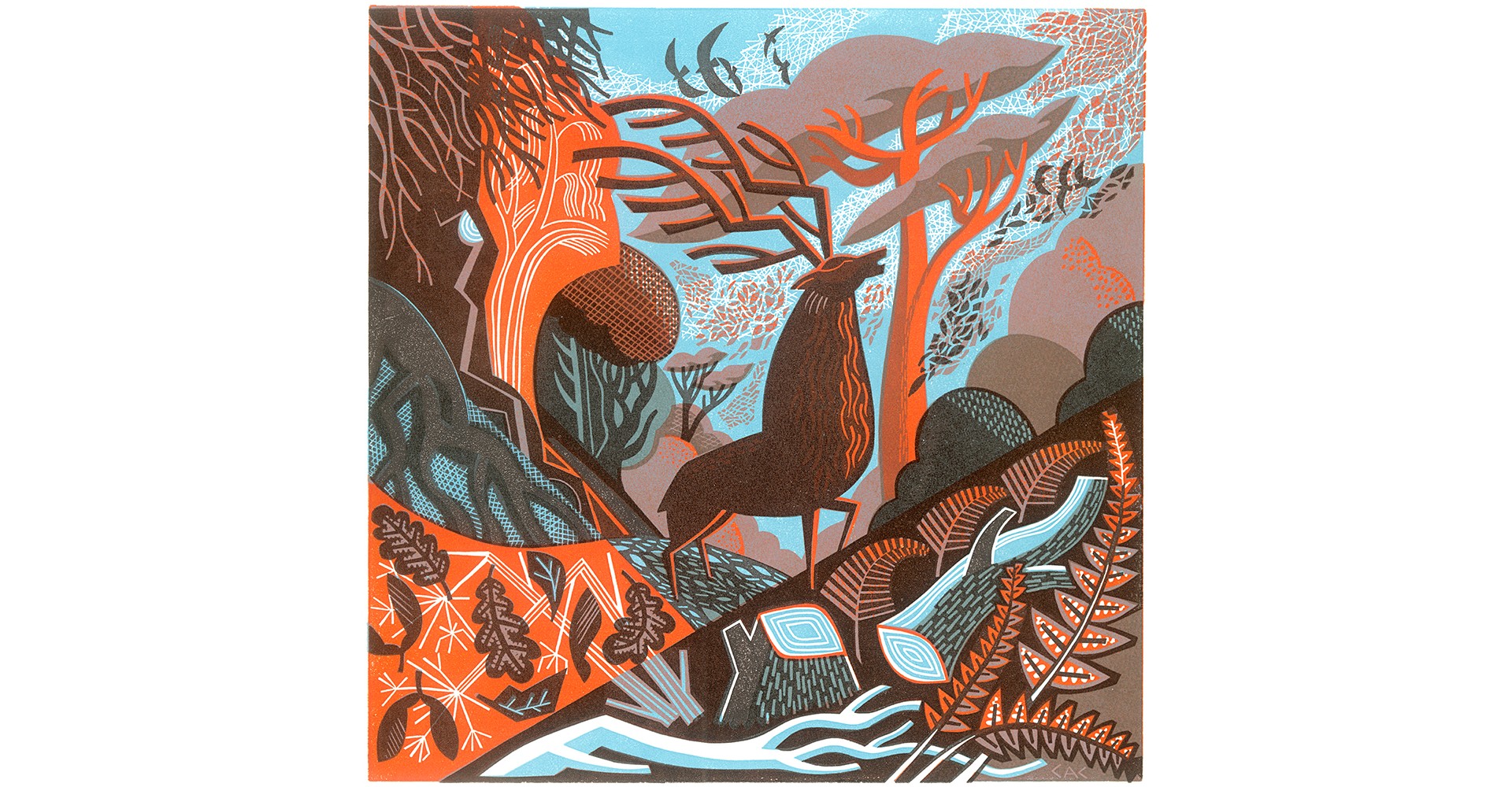
While digital illustrations can sometimes feel a little cold and impersonal, a counter-trend can be seen in the increasing call for physical and traditional techniques. “The warm, tactile quality achieved from lino, silk screen, letterpress or from a skilfully applied digital texture is still in high demand,” says Jamie Clarke. “I suspect there will always be a premium placed on imagery produced by manual means.” Examples of the trend can be seen in the work of Clare Curtis and Tom Frost.
06. Body positivity
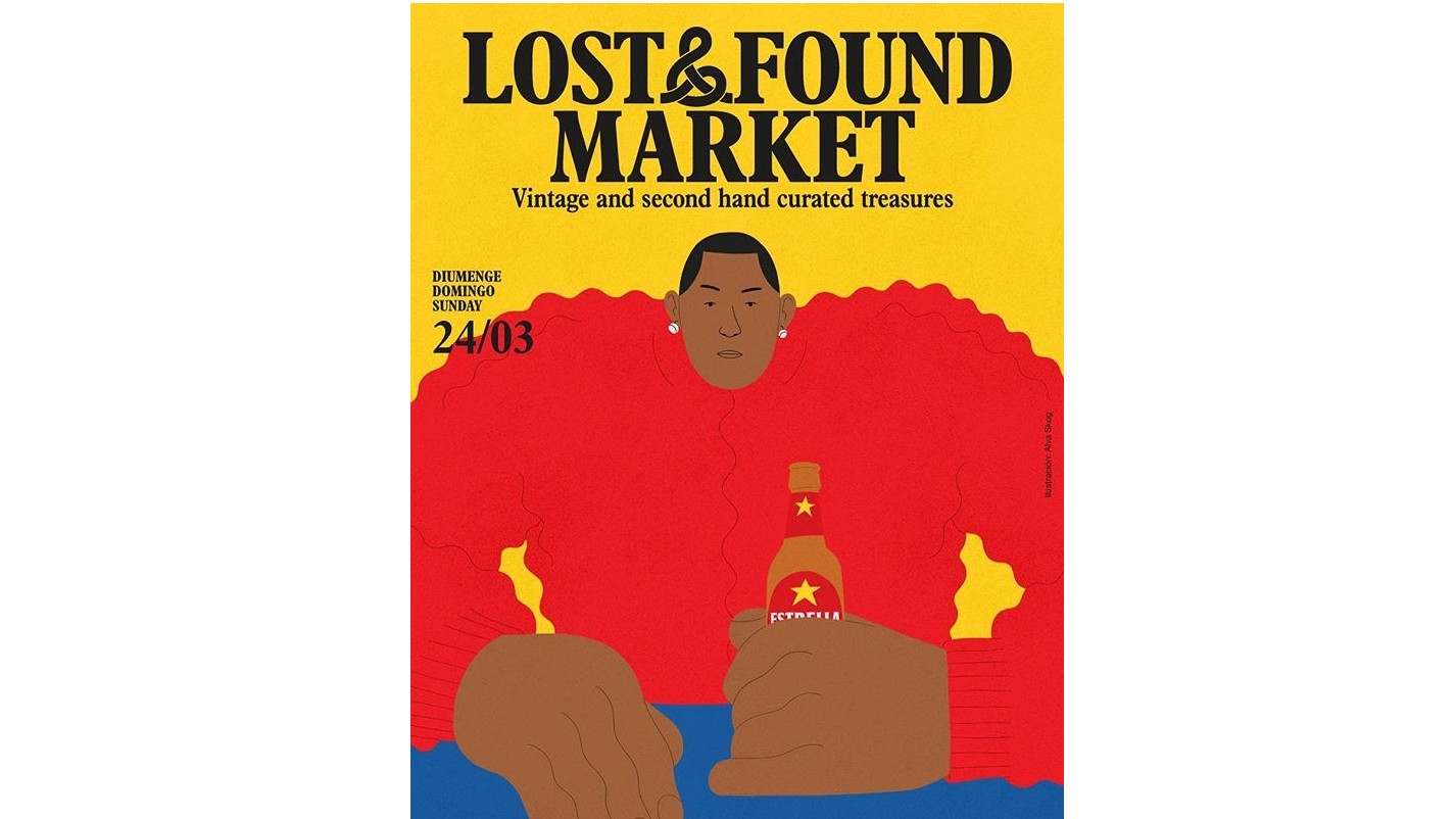
The 2010s have seen a big movement away from ‘body shaming’ and towards celebrating our physical appearance, whatever we may look like, and the profession is increasingly following suit. “Illustrators are continuing to express how we and our bodies are seen and perceived in wacky and wonderful ways,” says Charlie Smith. “Imperfect brush strokes and wobbly lines are being used to create playful caricatures that explore ideals of proportions and anatomic ratios. See work by Amber Vittoria, Lucas Wakamatsu, Kevin Sabo and others.”
07. Illustrative lettering
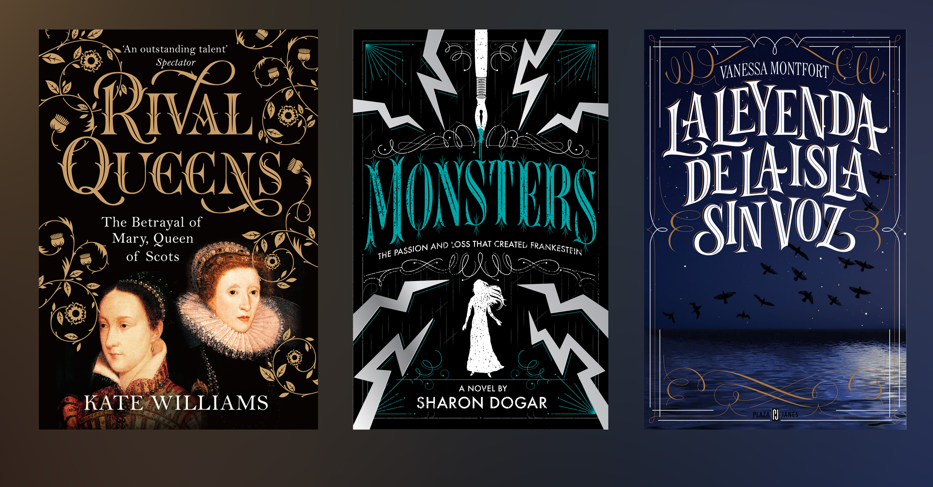
Hand-lettering, custom lettering, illustrative lettering... whatever you call it, it’s thriving right now, says Jamie Clarke, and for good reason. “No matter how large the range of available typefaces becomes, sometimes lettering is the only way to magically blend a particular illustration style into an image,” he explains. Great examples to follow include the book cover designs of Martina Flor and Karl James Mountford.
08. The return of detail

Although minimalism has dominated throughout the 2010s, we’re now seeing a lot more realism and detail creeping back into illustration, says Alex Halfpenny, design director at Elmwood. He argues that the previous trend for reductive design was driven largely by the need to improve visibility on mobile devices; but improvements in technology are now pushing things in the opposite direction.
“The reality of a high definition screen in everyones’ pockets can lend itself to more detail, more richness, more interest, more sensorial experience and ultimately more engagement,” he explains. “As software and hardware improve, the line between digital illustration and hand-drawn will likely become more blurred, as a human touch continues to be desired over clean, digital graphics."
Jamie Clarke agrees. “We’re seeing small, wonderfully crafted illustrations lift a product to a new height of luxury,” he notes. “They can be seen adorning all sorts of media including packaging, books and branding. The intricate linework and attention to detail often tell a story about the brand’s heritage and aspirations. Examples of the trend can be seen in Anthony Millard’s illustrations for Johnnie Walker’s new limited edition Black label series and Tom Lane’s bottle detail for the Brisbane Distillery Company.”
09. Geometric patterns
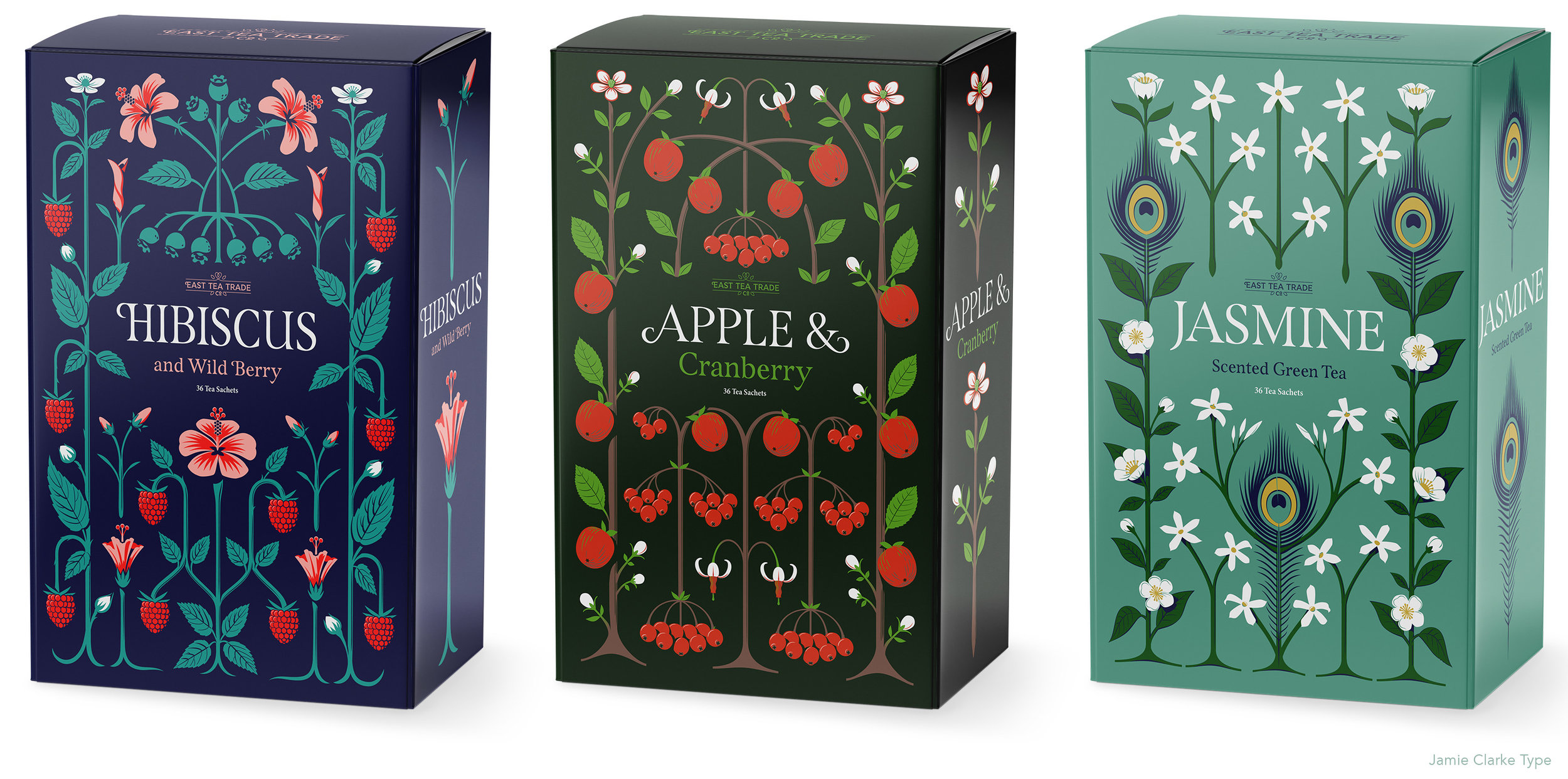
Geometric patterns can be seen everywhere in illustration right now, says Jamie Clarke. ”Whether wrapped in soft organic forms or revealed in their mathematical glory, patterns, grids and geometric shapes are in,” he says. “Not confined to the domain of graphic designers grids and patterns are increasingly used to divide and decorate illustration work. Examples of the trend can be seen the work of RETOKA and Dana Tanamachi.”
10. Illustration eclipses photography for big brands

Perhaps more important than any individual visual trend is how the business of illustration is evolving in general. Marie Therese Cassidy, executive creative director of FutureBrand, gives her take on the issue.
“One of the biggest trends emerging this year, and one which I believe is here to stay, is the move towards a more artful aesthetic which leaves traditional category codes behind,” she says. “This trend was initially led by boutique independent brands in categories such as chocolate (the MAST brothers) and alcohol (the craft beer movement and localised gin brands) as a way of distinguishing themselves from the larger corporations.
“Not surprisingly, the bigger brands have cottoned on to this to be more appealing and to stay relevant to their consumers. It's expressed in different ways but we're seeing illustration play a much bigger role than photography right now, as it helps brands bring their story to life in a more human way. A great example is McDonalds. Their new visual identity aims to make every brand interaction a feel-good moment and they have adopted a more playful, pared-down design to bring this to life and honour the company's feelgood roots.”
Of course, not every company has the deep pockets of a brand like McDonalds, and so Roly Grant, co-founder and creative director of Without, points to a countertrend: “The ubiquity of vector-based stock illustration skewing client perceptions of how quickly and cheaply quality illustration can be produced.” It’s not that Grant is against stock illustrations per se: “On an editorial level, using stock is a necessary and viable option, where headlines can be tweaked and tailored to match visuals,” he says. “However, for branding, where we look to tell specific, original and, crucially, ownable stories, illustration needs to be created from scratch.”
Explaining this process and value to clients is becoming more important, he believes. “When markets become saturated with familiar material, styles and voices, the best brands find a way to break out. Illustration for the best clients may therefore get a lot weirder in 2020.”
And if that need does arise, then happily there’ll be an increasingly larger and more diverse pool of illustrators to meet it, believes self-taught art director and concept artist Skeeva. “More and more people are becoming illustrators thanks to a huge number of courses and incentives," he reports. "Everyone, regardless of gender, sexual orientation or the country in which he or she lives, can easily become an original, self-taught illustrator, bringing fresh, new and unique trends to art.”
Read more:

Thank you for reading 5 articles this month* Join now for unlimited access
Enjoy your first month for just £1 / $1 / €1
*Read 5 free articles per month without a subscription

Join now for unlimited access
Try first month for just £1 / $1 / €1

Tom May is an award-winning journalist and editor specialising in design, photography and technology. Author of the Amazon #1 bestseller Great TED Talks: Creativity, published by Pavilion Books, Tom was previously editor of Professional Photography magazine, associate editor at Creative Bloq, and deputy editor at net magazine. Today, he is a regular contributor to Creative Bloq and its sister sites Digital Camera World, T3.com and Tech Radar. He also writes for Creative Boom and works on content marketing projects.
