Creating the official retro-style Stranger Things poster
Discover how this illustration brings composition to the fore in the official poster for Netflix's Stranger Things.

The agency Contend asked me to produce an illustrated poster for Netflix’s ratings topping show Stranger Things. The brief was to create a striking image reminiscent of classic, hand painted film artwork found in vintage posters from the 1980s.
I began by studying some of the most iconic poster designs from this era and then experimenting in Photoshop, looking at ways to paint in a traditional style. I worked with Contend’s art director Nate Sherman to explore composition ideas and story elements. I did my sketch work using Procreate on an iPad Pro with an Apple Pencil. I used the standard 6B Pencil brush in this app to do all of the line work and shading for the poster.
I then exported the final sketch into Photoshop where I upscaled the artwork to a higher resolution and used the Lasso tool to cut up the elements into layers. I applied the Multiply Blend mode to all of the sketch layers and blocked the basic colours underneath using the standard Photoshop airbrush. I reduced the Opacity of the sketch layer as the colour work progressed and then merged these layers together.
The final stage was to export these layers back into Procreate, where I used the Splatter and Pencil brushes to add texture to the artwork. I reimported each layer separately back into Photoshop and used the airbrush to blend the colours into one cohesive image.
01. Develop the sketch
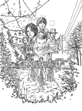
This is the preliminary outline sketch. Using Blend modes and Transparency throughout, this sketch will show in the final artwork. Therefore it’s important to spend time adding as much detail as possible. I use varied line width to define what’s important.
02. Tone and emphasis
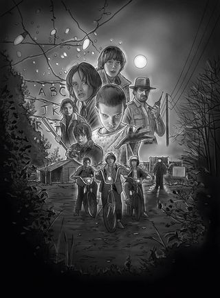
During this stage I establish the total values for the painting. The most important things for me to think about here are first, where the light is coming from; and second, where the overall emphasis should be when the viewer first looks at the image.
03. Colour layers
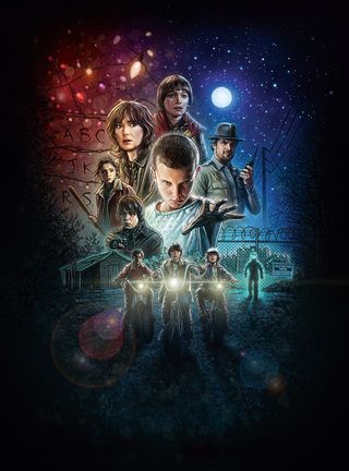
Here, along with Blend modes and Transparency, I use the colour layers to tint the artwork. I use additional layers on top of everything else, to add texture with a Pencil or Splatter brush. I also vary the Opacity to blend elements together in a subtle way.
Get the Creative Bloq Newsletter
Daily design news, reviews, how-tos and more, as picked by the editors.
This image was originally published in ImagineFX magazine issue 140. Buy it here.
Related articles

Thank you for reading 5 articles this month* Join now for unlimited access
Enjoy your first month for just £1 / $1 / €1
*Read 5 free articles per month without a subscription

Join now for unlimited access
Try first month for just £1 / $1 / €1
