How to paint explosive environments
Colours are the key to this composition as retro spaceships soar above a futuristic city.

For this workshop I want to show how to paint a scene in the style of 70s sci-fi artists like John Berkey, Peter Elson and Chris Foss. Back in their time, there weren’t computers to make the amazing photorealistic renderings that we can achieve today. I really miss that painterly style, with the bright and vivid colours they used in their works. That’s why the ImagineFX team and I decided to tap into those colours and spaceship designs, and create an image with the same feel – but using today’s digital techniques.
To produce this kind of image there are two key things to keep in mind: bold shapes and vibrant colours. As you’ll see in this tutorial, most of my workflow for this kind of design is based on experimenting with different shapes and positions, using randomness as a tool to find ideas that I wouldn’t otherwise have achieved in a more logical way. I hope to share my understanding of how colour can be used as a tool to make a composition work, and how important it is to find a balance between big and simple shapes, and detailed elements.
I’ll also introduce you to basic ZBrush and Cinema 4D modelling and KeyShot rendering, which can speed up your workflow and highlight plenty of possibilities for your compositions.
01. Composition rough sketch
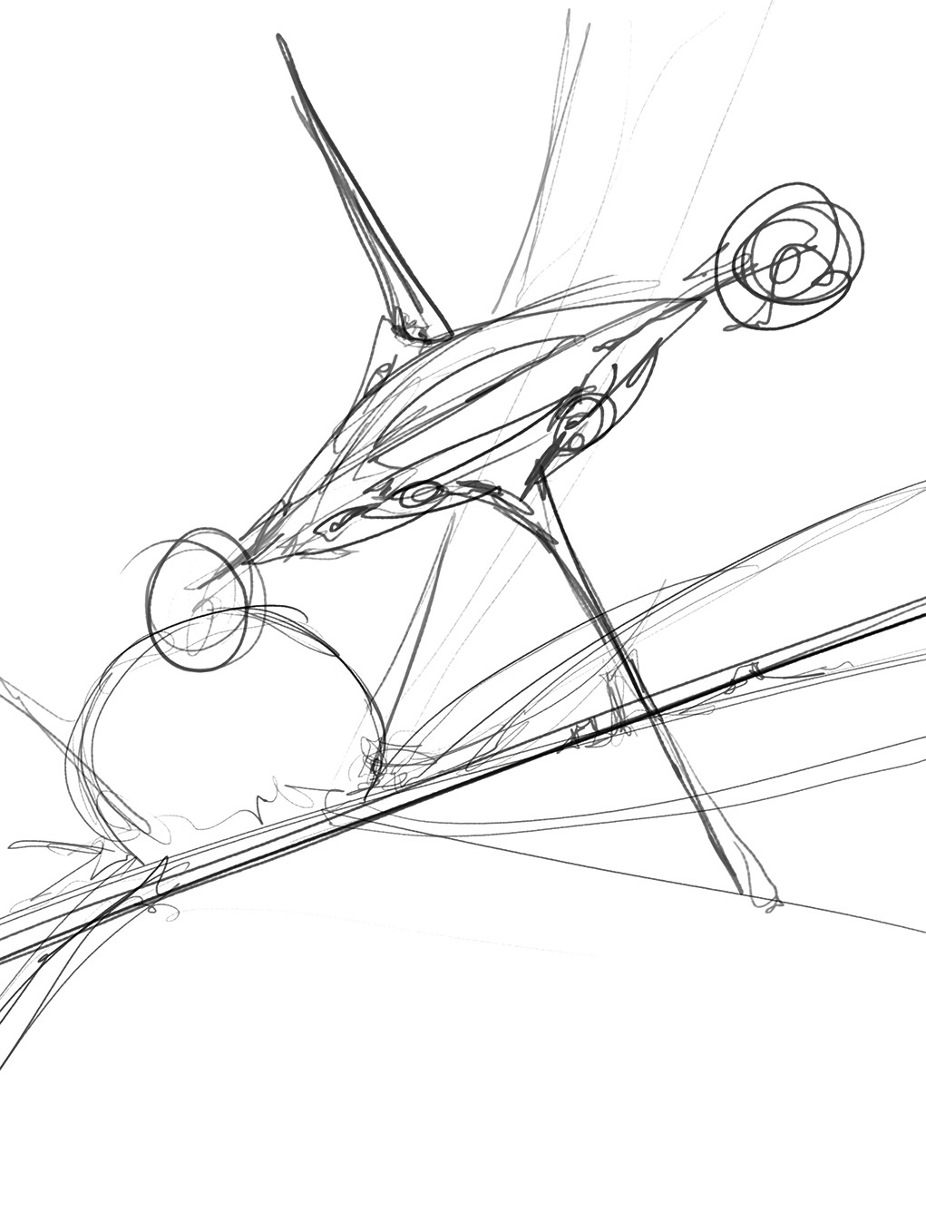
The first thing I do when I start a new piece is to try and figure out what the composition will be, by making some sketches. After coming up with some ideas, I cast my eye over my ideas and settle on a final design. In this case, the scene represents a big spaceship flying away from a city that has just been damaged in a bombing run.
02. Modelling the spaceship
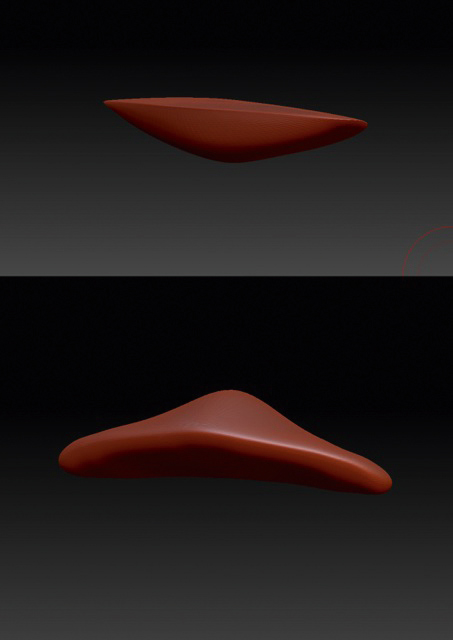
Next, I jump into ZBrush and start designing the spaceship. I take the Sphere 3D tool, make a polymesh and start wrapping and deforming it using the Move brush. I save the shapes that I like, separated in .obj format, which means that I can import them later into Cinema 4D.
03. Creating the spaceship
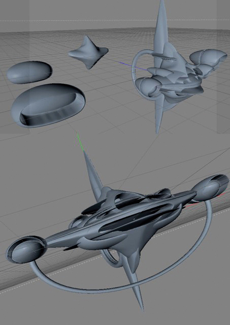
Once the different elements are imported into Cinema 4D, I start experimenting, mixing them in ways that will work well for my spaceship design. I’m inspired by John Berkey’s spaceships, and put together a design with some holes in the front with thin lines between them. To depict the city I just use simple cylinders and boxes.
04. Composing the rendering
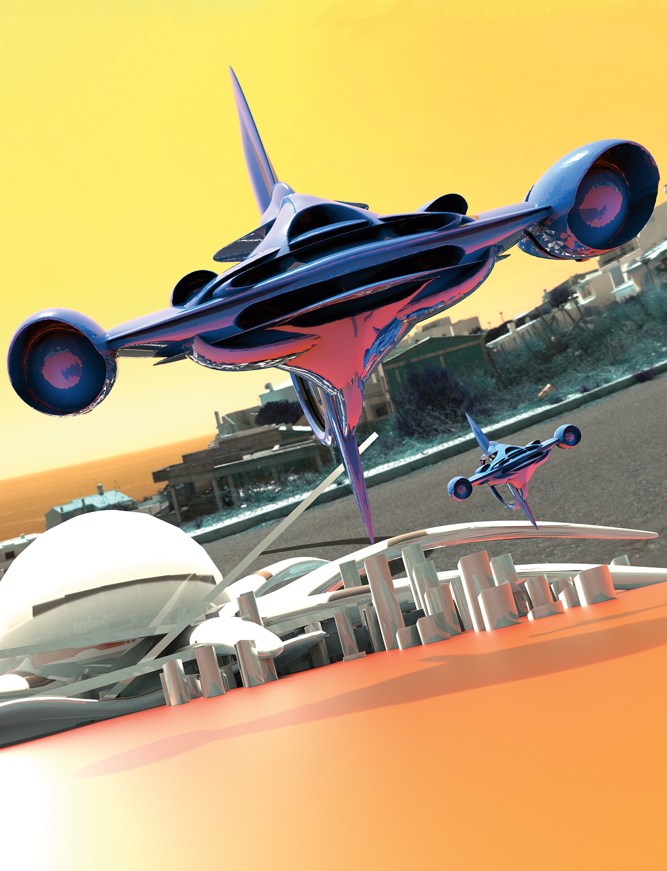
Once the spaceship and city are finished, I use KeyShot to apply colour and light. I want to generate an oversaturated environment with a Martian feeling, so I change the tone of a normal blue sky to make it yellow and orange. I use a metallic blue for the spaceship, and make the red soil reflect on the ship’s chrome base to produce a vibrant purple colour.
Get the Creative Bloq Newsletter
Daily design news, reviews, how-tos and more, as picked by the editors.
05. Panting the sky
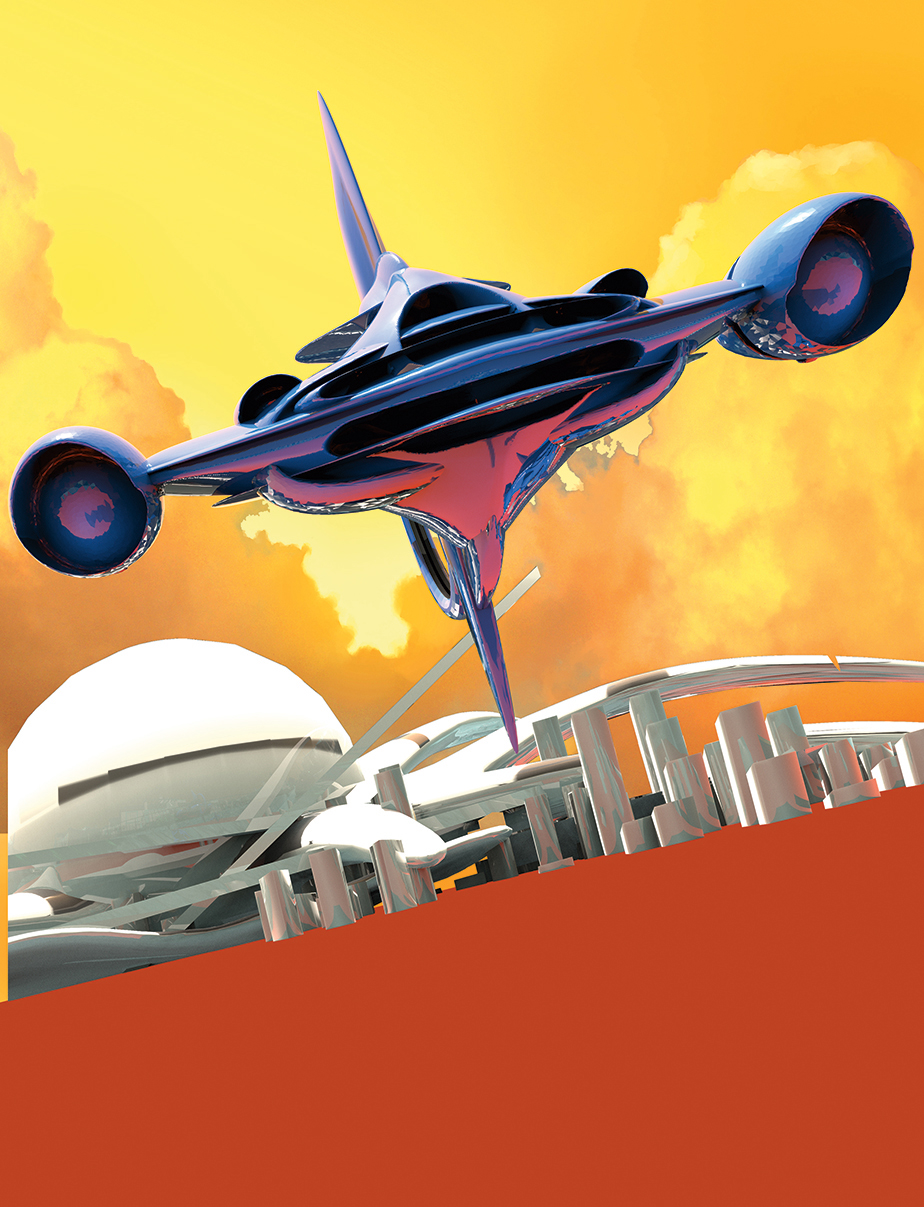
When I have the rendering done, it’s time to move finally to Photoshop and start painting. I begin by giving some depth to the sky with a colour gradient between yellow and orange, and then adding clouds, using some photos and changing the colour balance and tone, to make them fit in with the background.
06. Adding colour to the city
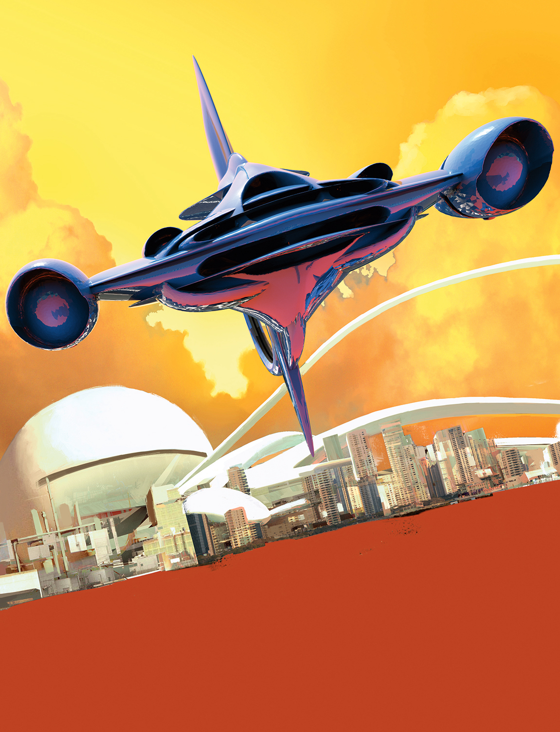
To make the city, I start doing some photobashing with building reference photos. When I have them placed on the canvas, I start playing with the Layers mode and set them to Darken mode, so only the darkest parts will be seen. Then I continue painting over them until I find a level of detail that I consider works well for the background.
07. Enhancing the Martian surface
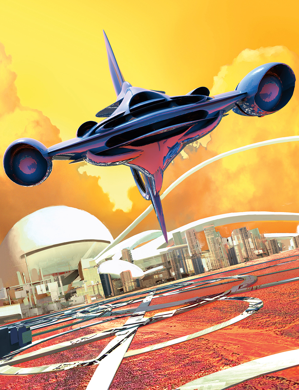
This step is pretty similar to the last one, but it’s important to bear in mind that the photographs used must fit the perspective. To make them work with the depth of the painting, I distort them to make the details look smaller in the distance. I also slightly boost the colour of the ground, by altering the Color Balance and the Saturation.
08. Photobashing the ship
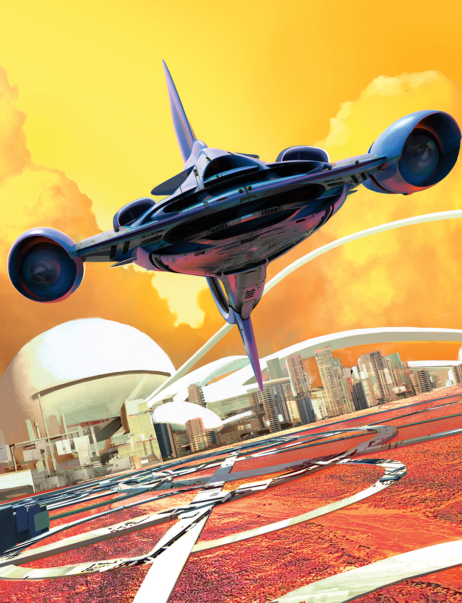
Now I turn my attention to the ship. I look for photographs of aircraft details that I can use to add texture to my spaceship. I set them to Darken mode and start playing around, finding shapes that I find interesting for my design.
09. Details on the ship
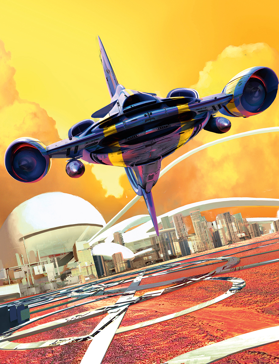
After completing the photobashing stage, I paint small details on the spaceship, such as the light inside the motors and the yellow patterns. To make these patterns I make a mask and change the tone and colour balance just in that area. When it’s finished, I continue painting over the ship, to try and define the reflections and lights.
10. Introducing the background spaceships

To add more story to the image, I put a couple of small spaceships chasing the big one, to suggest that they’re defending the city. These ones are fully painted, just using a colour as a base and then a mask to create the light and details over them.
11. Painting the explosion
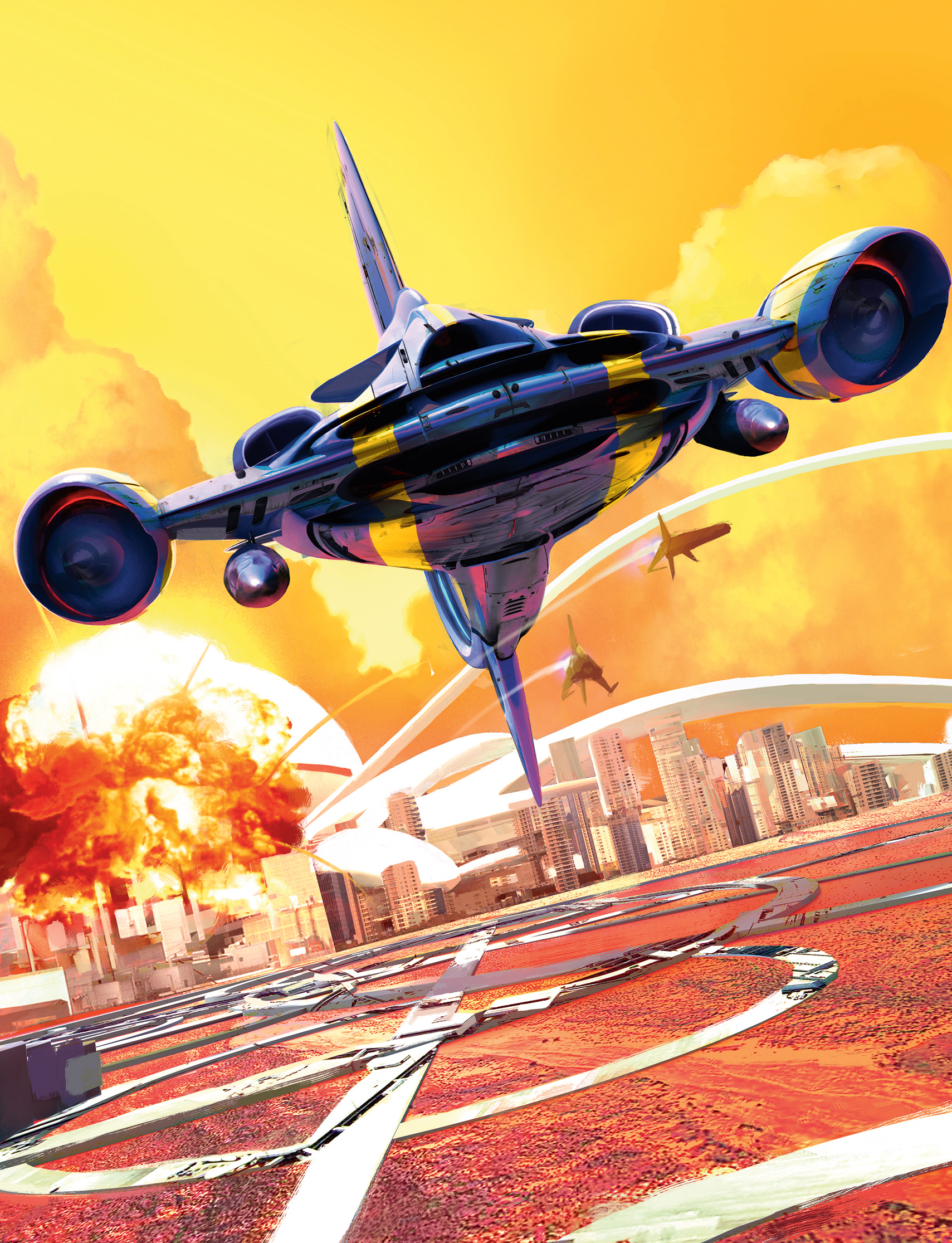
To create the huge explosion in the background I use some photographs of fire and put them on a Screen Mode layer. This will make the lights brighter and the dark tones disappear. I also paint in some aerial perspective to the city and make it fit with the distance and the colour of the sky.
12. Painting trails and smoke
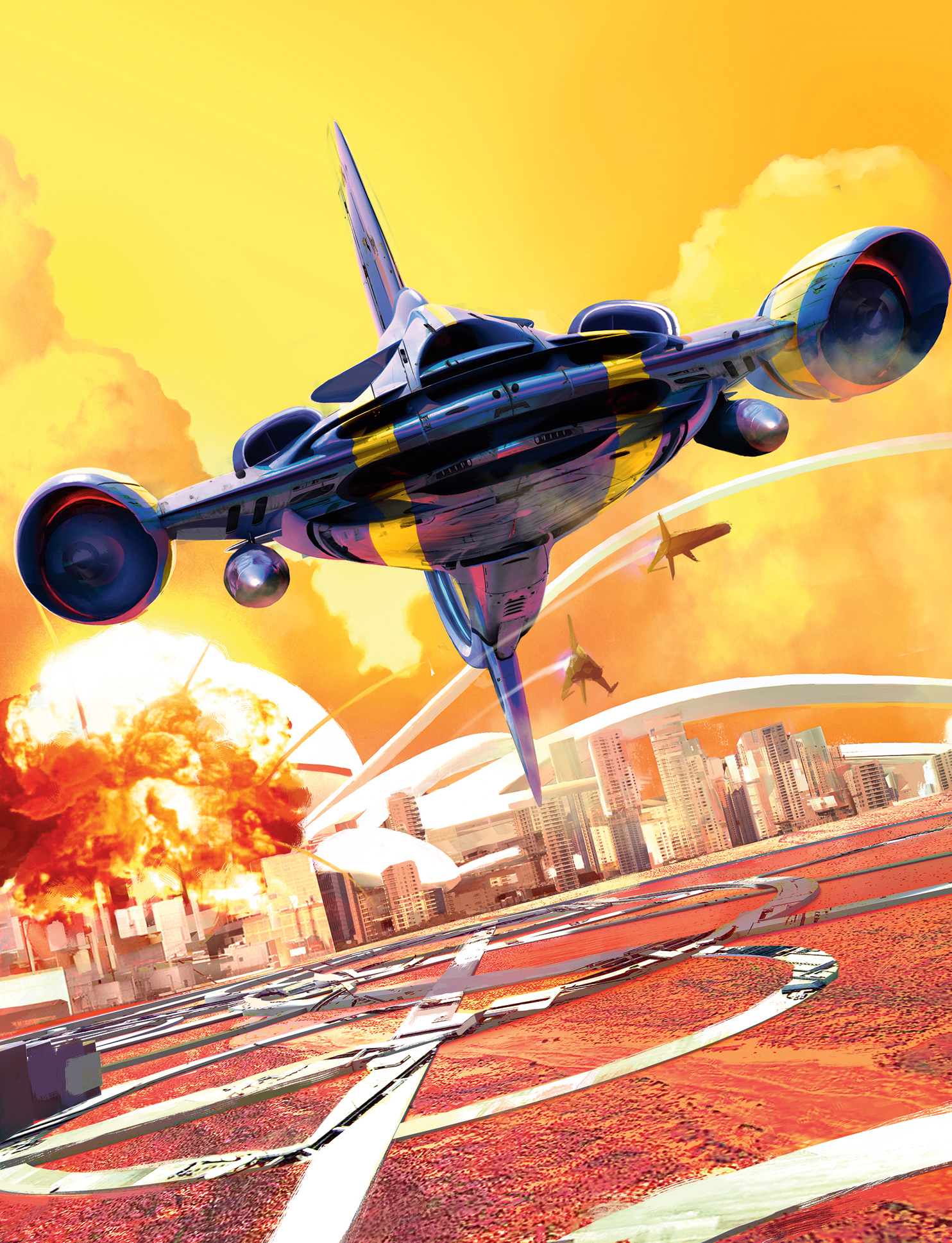
I add details, such as little clouds, in the foreground to blend the spaceship with the colours of the sky. I also paint trails to give more depth to the image and further tie the ships into the scene. When painting smoke, remember that it has depth and volume like other objects and materials: I make a mask over it to create some shadows and lights.
13. Applying filters
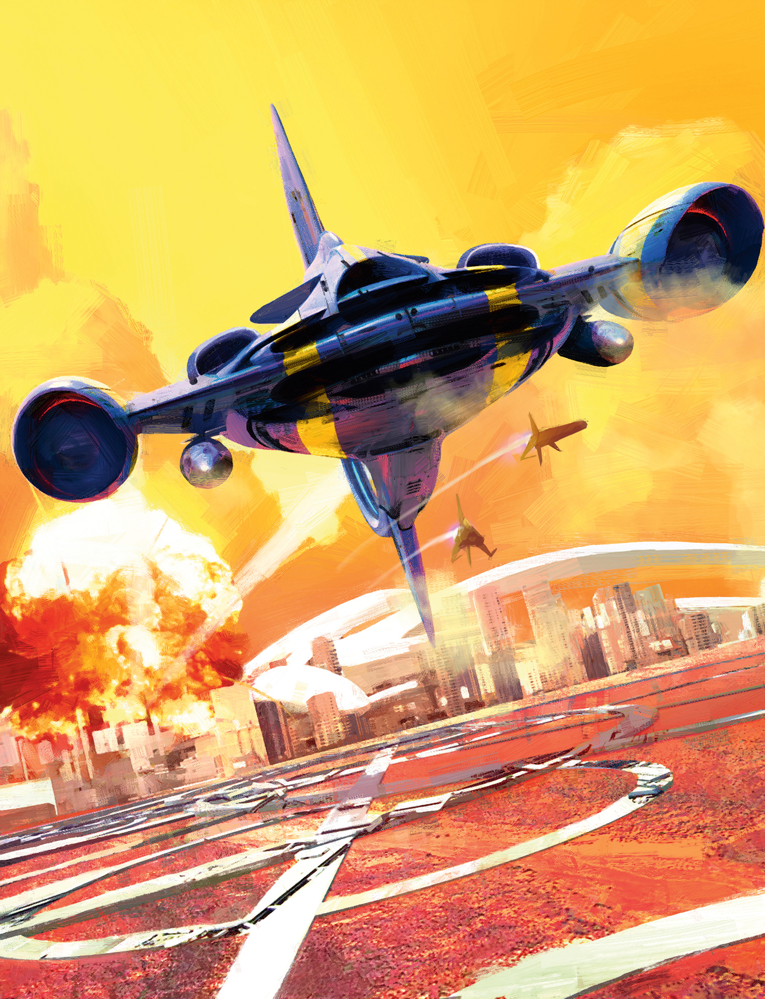
I want to give the image a strong painterly feel, but notice that some of the edges are looking too sharp and there are no brush strokes. To achieve this, and to reduce a bit of detail in the photobashed areas, I use AKVIS to add an oil effect and make some parts of the painting appear loose and messy.
14. Finishing the piece

I continue mixing the edges to lose some of the detail, using the Smudge Tool and a texture brush, which also helps to create some brush strokes, add motion blur and merge the ship with the background. Finally, ImagineFX ask me to adjust the ground, the lighting on the main ship and remove the smaller ships in the background, to give the cover greater impact.
This article was originally published in ImagineFX magazine issue 139. Buy it here.
Related articles

Thank you for reading 5 articles this month* Join now for unlimited access
Enjoy your first month for just £1 / $1 / €1
*Read 5 free articles per month without a subscription

Join now for unlimited access
Try first month for just £1 / $1 / €1
