How to make your logo stand out in the digital age
Experts reveal how to make your logo shine across multiple platforms.
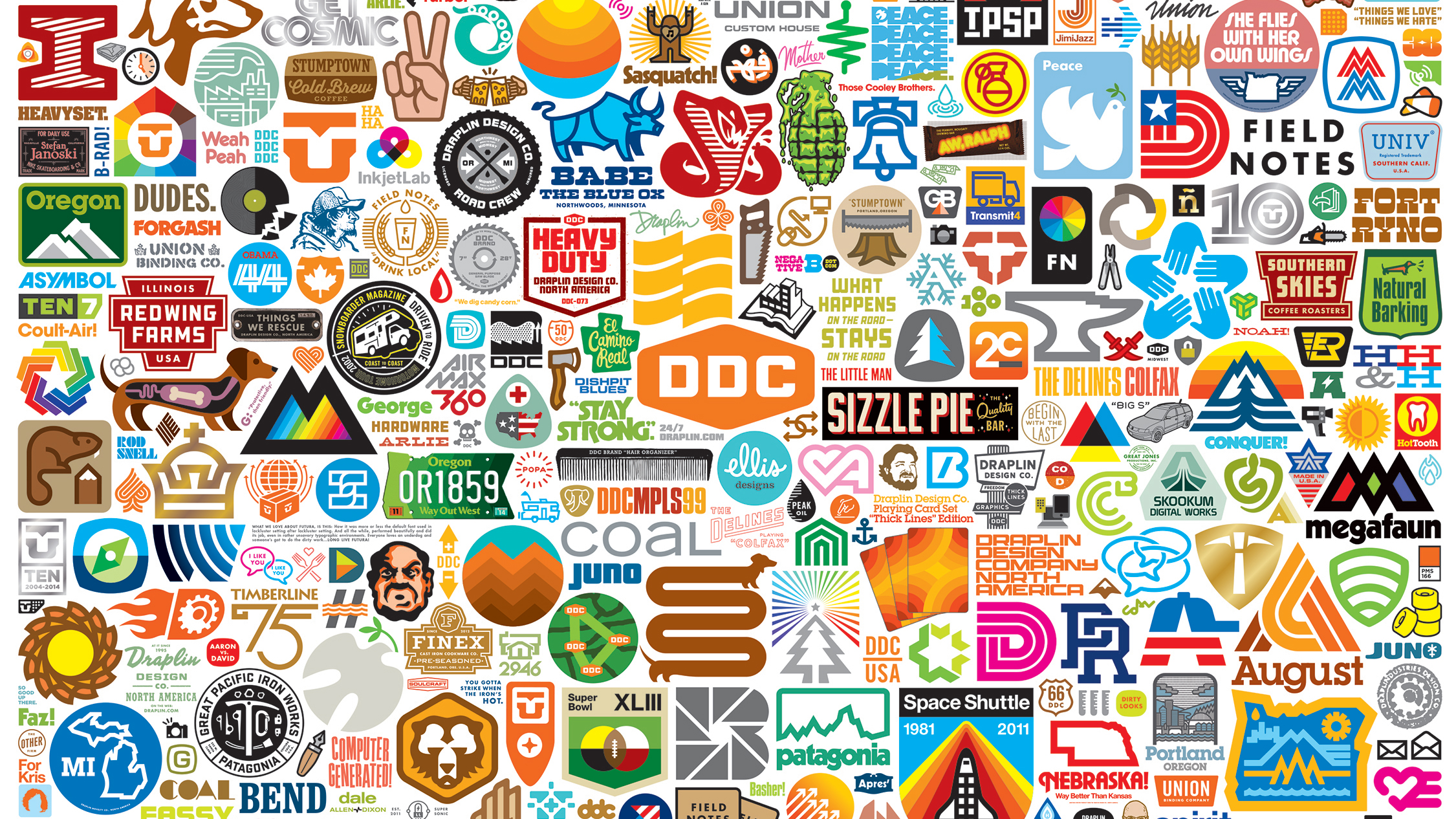
"We're all living on phones – that's the first thing you touch in the morning and the last thing you touch while you're sacking out," laments graphic designer Aaron Draplin. "We're these little cyborgs – phones are appendages, our babies are being born now with their hands clamped around these things."
While Draplin might have some pretty original takes on biological evolution, his broadside underscores a point much more relevant to his trade: where tiny screens are our primary interaction with a company, product or person. That obviously has big implications for the people branding them. Logos have to work smaller today than ever – which means they have to work a lot harder, too.
“In the ‘good old days’ a logo was always printed, and might make it onto TV, but that’s not the starting point today,” says James Sommerville, who recently left his role as VP of global design at Coca Cola.
Pocket-sized logos
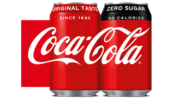
“The starting point is usually in our pocket, on a screen. The successful logos work across all of those surfaces. The challenge for many heritage brands is that they were never designed to move – Coca Cola was never designed to animate. For new brands, they have to give a sense of longevity – show consumers that they’re not just here today, gone tomorrow, but also grab attention.”
The importance of scalability in logos is, of course, nothing new. Since the dawn of corporate branding, logo designers have had to consider that their creations must look as great on a business card as a billboard, as recognisable on a candy wrapper as on the side of a bus.
“If it doesn’t scale well, then you’re in big trouble,” reinforces Draplin. “That’s what I was taught by Saul Bass and Paul Rand when I was a kid – that’s effective communication.”
But what’s different now to in Rand and Bass’ day is the scope of what these logos can, and have to do: onscreen, they can move, perhaps make sound, shape shift. Yet they still have to sing on boring old 2D too.
Sign up to Creative Bloq's daily newsletter, which brings you the latest news and inspiration from the worlds of art, design and technology.
New systems and touchpoints
An even bigger shift isn’t just the basic idea of how and where a logo’s applied, but what it stands for. Alex Johns, creative director at DesignStudio, points out that how we interact with a brand is “way more nuanced” today, even compared to five years ago.
“With the rise of devices like iPhones, our relationships with a brand are way more personal and our interactions with them more frequent," he says. "A logo used to be a shorthand for a brand: today it’s a key part of a holistic system.”
With all these newfound possibilities – not to mention the software to create them – it would make sense to assume that today’s graphic designers are gleefully ripping up the precedents set by their forebears and running wild. So are 21st century logos a reflection of the possibilities of experimentation and adventure that designers have at their fingertips? Many would argue very much the opposite.
Designing for the digital age
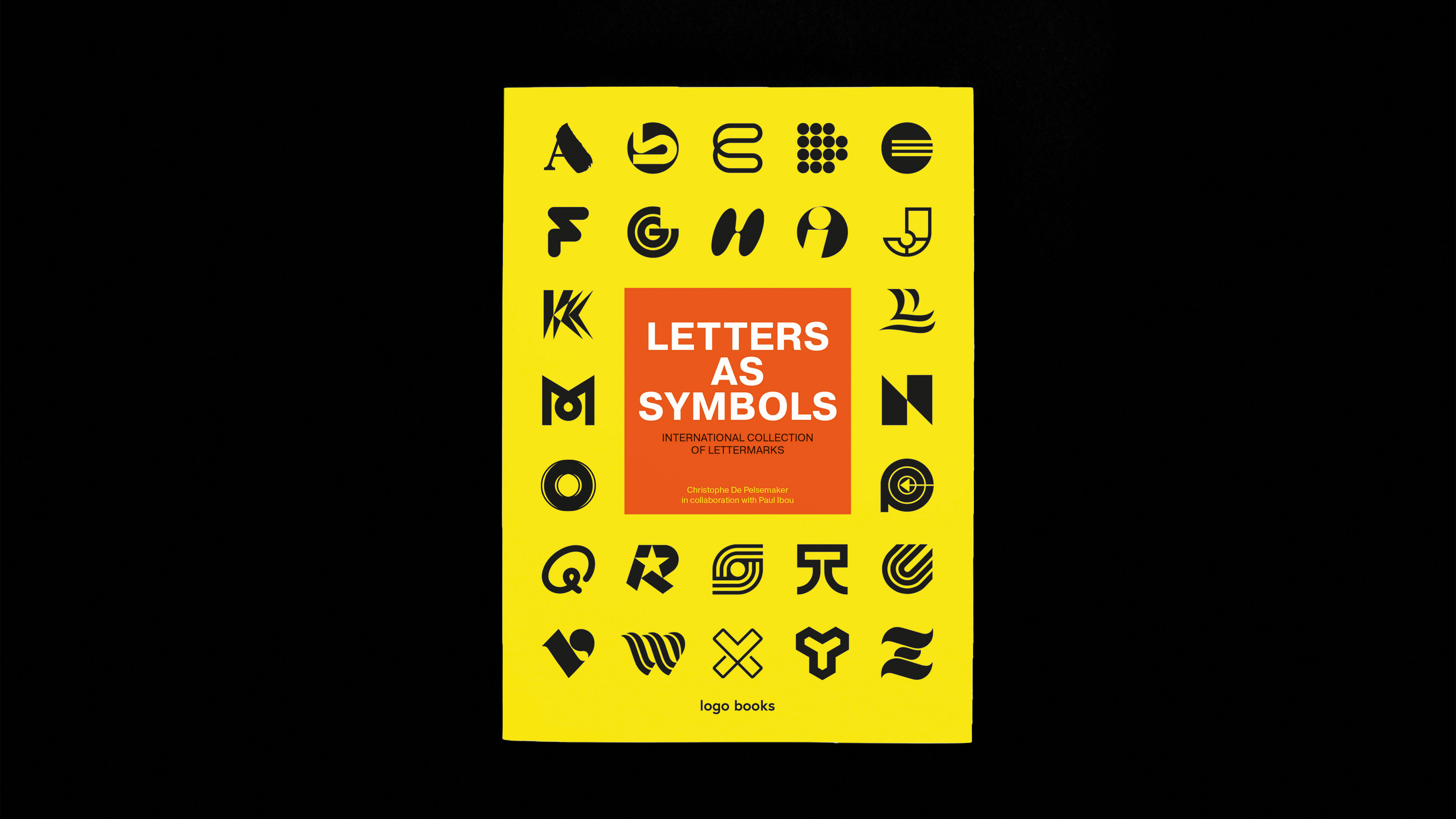
Christophe De Pelsemaker, a Belgium-based graphic designer who recently co-authored the (as yet unpublished) book Letters As Symbols with Paul Ibou, sees technology as a hindrance rather than a help when it comes to creating a smart logo design.
"A computer enables you to make more mistakes," he says. "That’s not necessarily a bad thing, but it isn’t a good thing either. Now, we just put something on the screen and if we don’t like it, we erase it. Back in the day, a designer really had to think about the concept before they drew a line on a paper."
"Without a concept, you cannot create something good. Now, with the help of computer, a lot of designers skip the conceptualisation, or thinking phase. That's why, I think, good logo design isn’t as common today."
Sommerville agrees. "I think some of the craft has gone," he says. "Now that things are so fast and it's so easy to iterate, it feels like there's less longevity in logos. Identities have a short fuse now that everything’s so disposable. A great design is one that has the time to live its own life."
Belief systems and responses to logos
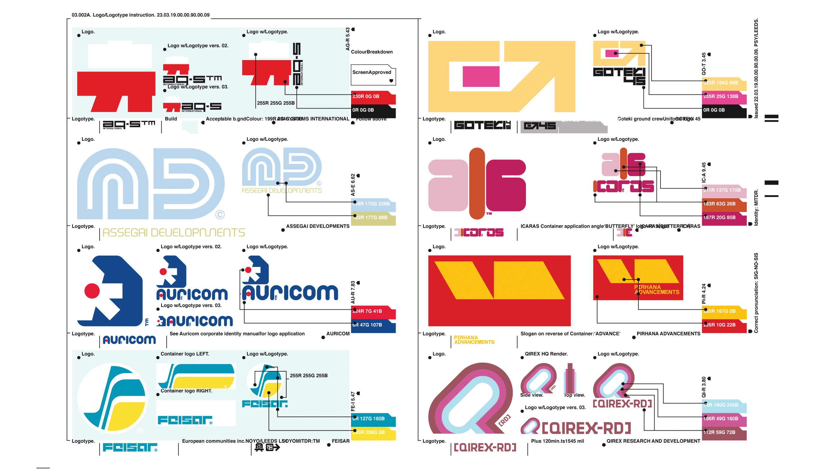
This emphasis on story and meaning in logo design is by no means unusual. Ian Anderson, founder of The Designers Republic, is famously non-design-school educated (he studied a philosophy degree instead), and his work’s conceptual underpinnings may well have a lot to do with that.
“My interest has always been in people, and understanding what people do or don’t do, and why,” says Anderson. “My work is informed by belief systems – why do people believe in god, and not in fries that live at the end of the garden? Why do we act on what we believe? That all feeds into logo design."
"We tend to hop past that now and straight into the funfair of branding. My interest in graphic design is only based on what it can communicate and how it can provoke responses."
He suggests that having not been to design school might have meant he’s less "easily seduced by form", or by particular trends: "When you're just interested in impressing other designers, it will always be more about surface. I want a design to look good and work well for a reason."
Indeed, some of the classic logos we hold up as embodying wit and greatness are those we’ve spent time with and with rigorous underpinnings – think the FedEx hidden arrow designed in 1994 by Lindon Leader for Landor Associates.
Not only was this sort of design born of a time with more limited software possibilities than we have today, but as Sommerville suggests, the likes of Alan Fletcher – perhaps most famous for his Victoria and Albert Museum (V&A) logo – likely worked with different agency structures.
Logos doing it all
"A lot of those iconic logos are a diffusion between great design work and great advertising, combined in one logo. There's a storytelling approach to something like [Fletcher’s] V&A logo: you see that alone on a poster and it's an ad itself."
The other side of the coin is quite the opposite. Now that identity systems have to be and do so much, designers have to be many-trick ponies. You can’t just draw a logo and be done with it: you have to think about how that animates, how different people first encounter it – might they see a TV ad? An icon in the app store? (See examples of stunning IOS app icons here.)
An animated website header? A moving billboard? The designers making the most interesting – and, crucially, the most effective – logos are surely the ones considering the impact it has not just as a drawn thing on the page, but also a moving one that sits beautifully within the various lives of consumers.
Keeping it simple
Of all the trends that have dominated branding in recent times, there’s one that trucks along more doggedly than any other: simplicity. Flatness. ‘Paring back’. Last year, we surmised that “simplicity has been king for a while" And it seems that crown isn’t set to slip any time soon.
Take last year’s Moonpig redesign: the (albeit quite hideous) little piggy was given the boot (as was, finally, the ‘dot.com’) in favour of a flat, simple, yet still rather kids’ party-esque new look and feel.
Before that, Pentagram’s redesign of the Mastercard logo stripped things right back to their most basic components – just two, flat, overlapping circles and a new all lower-case word mark in safe, tasteful sans serif FF Mark. And it makes total sense that a primary consideration was the logo’s optimisation across multiple digital platforms. In 2019, Pentagram has simplified things further still by removing the wordmark entirely.
“It’s become a homogeneous gloop of graphics really,” says Anderson. “That’s not any one design or designer’s fault, but it’s the reality. If you’re simplifying everything there’s only so many shapes, forms and colour combinations before you begin to get repetition.”
Simplicity is not inherently a bad thing: some of the logo designs held up as among the best of the past decades are incredibly restrained
He acknowledges that where “smart designers” can flatten a logo design to “communicate the brand message, brand values, the product or whatever,” such a style is all too easy to approximate by “half-arsed designers. So there’s a lot of repetition of ideas, and a lot of it is quite lazy.”
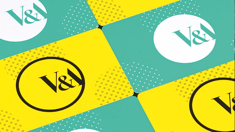
Simplicity is not inherently a bad thing: some of the logo designs held up as among the best of the past decades are incredibly restrained. Vitally, such pieces are incredibly smart, too – a prime example being that V&A logo, which elegantly forms its A from the classic yet bulbous ampersand. It’s little surprise that the design has remained unchanged since it was created in 1990, and it still looks as fresh and confident as ever.
“The brief stipulated the design should only comprise three characters (V&A), should be functional, dateless, memorable and appropriate,” said Fletcher of the piece. If its enduring use in the Museum’s present campaigns is anything to go by, he certainly nailed it.
The perfection of the logo also means that for designers working with the logo today, it’s both a dream and something of a delicate balance. Chris Curran, cofounder of The Studio of Williamson Curran, recently worked on a campaign for the museum’s The Future Starts Here exhibition.
“The consistent use of the V&A logo over the campaign in both scale, position and colour was always central to our thinking when designing across both print and screens,” says Curran. “The V&A logo and exhibition title all picked out in the same colour, and the choice of typeface was a shorthand for the tone of the exhibition and struck a good balance with the V&A logo.”
Judging logos

Recently though, simplicity could be said to rarely pack such a well-aimed punch. Eye on Design managing editor Liz Stinson recently coined the term “millennial minimalism” to sum up the trend over the past few years in commercial graphics centred around sans serifs, monochrome palettes and “flat photography”.
As she puts it, it's a trend born of digital-focused strategies and, "years of seeing some variation of the same minimalist logo again, and again, and again". The result, many in the industry surmised, is sameness.
Such accessions of homogeneity may be slightly unfair though – are we judging a brand on the outdated (slightly short-sighted) criteria of a single logo, where we should be looking at its modern counterpart – a moving, interactive, altogether more nuanced “system”?
Are we – Twitter-botherers, consumers, and the design industry at large – being a little too quick to judge?
Balancing nostalgia and innovation
If there’s a studio that knows a thing or two about what makes a good logo, it’s Amsterdam’s Studio Dumbar. Founded by Gert Dumbar in 1977, its portfolio takes in many projects held up as gold standards when it comes to corporate graphics, including work for Dutch Railways, Amsterdam’s NEMO science museum, the Dutch government and its National Police.
Yet while its history isn’t to be sniffed at, as the studio’s creative director Liza Enebeis points out, it’s unwise to indulge in misty-eyed remembrances of a so-called ‘golden era’ of design that may or may not exist.
"When you speak to your parents or grandparents, they’ll always say things were so much better in the past – usually when they were in their teens," she says.
"A lot of designers can look back and say how brilliant or better corporate design was in the 1960s, or the Modernist era, but now we have so many more possibilities. We can adapt logo and identity design to so many different platforms and media and redefine how we approach branding."
“That’s a huge challenge, obviously, but it means you really have to work hard to find a way to make the mark you create stand out,” she says.
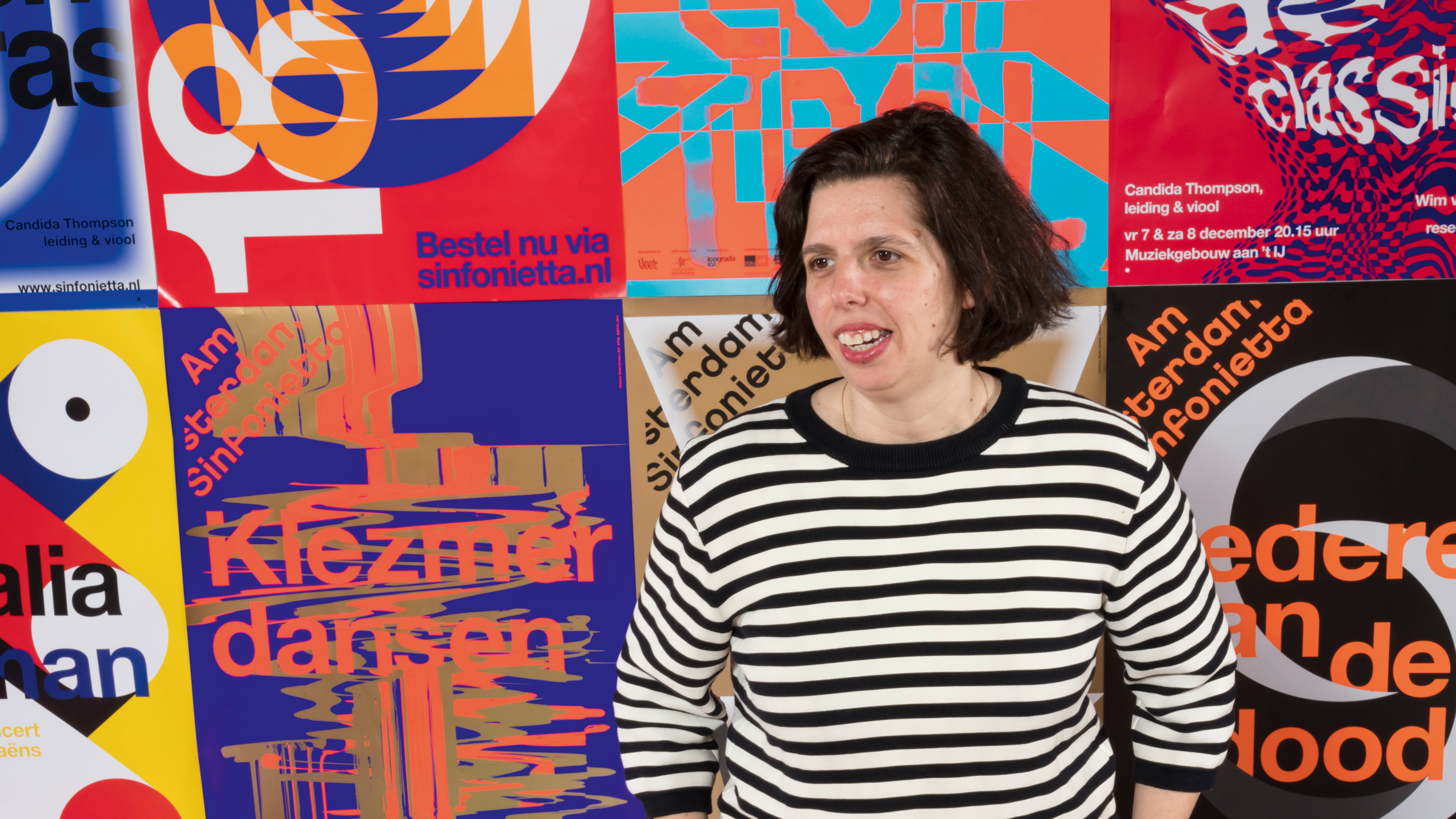
Motion plays a bigger part in logo design than ever before. This has dual consequences: on the one hand, a logo has to work harder than ever, and on the other, that logo takes a backseat as it becomes part of a far wider graphical outcome.
When you see a logo on a digital platform or within an app, behaviour and how it moves defines the identity. We never really had to consider that a few years ago
Lisa Enebeis
“The symbol is no longer everything,” says Enebeis. “When you see a logo on a digital platform or within an app, behaviour and how it moves defines the identity. We never really had to consider that a few years ago; now, it plays a huge role.”
Dumbar’s work for Jeugdfonds Sport & Cultuur (Youth Sport Foundation and Youth Culture Foundation) saw the studio begin by sketching in motion before distilling the movement into stills whenever needed.
“It was another way at looking at identity that’s all about movement,” says Enebeis. As a result, the designs are hugely energetic and radiate positivity: exactly what was needed for a brand that looks to promote the potential in the young people it works with, and is intended to speak directly and respectfully to a youth audience.
Such projects celebrate the potential of logos not as standalone entities, but part of far broader, more dynamic communication systems. Another Dumbar project proves that this approach need not just be for brands aimed at youth or playfulness, but for more traditional institutions.
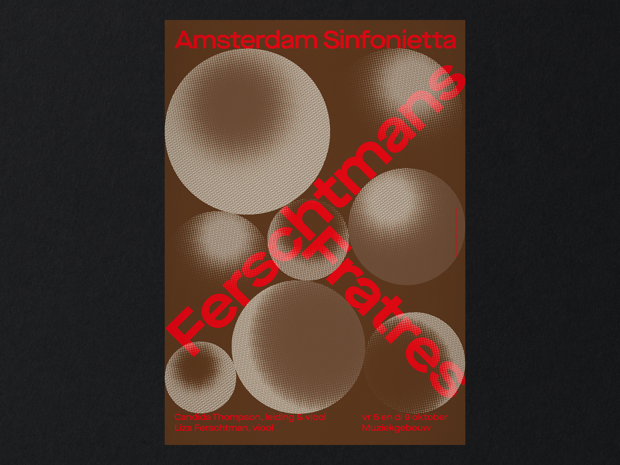
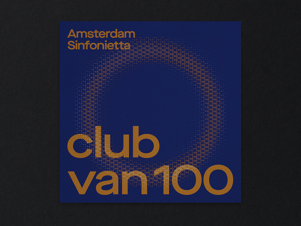
Its work for string orchestra the Amsterdam Sinfonietta, whose musical repertoire includes everything from baroque to contemporary, answered a brief to refresh public perceptions. Studio Dumbar’s solution was to take full advantage of today’s technical possibilities, creating an identity driven by a bold logotype and typographic palette but which evolves by responding graphically to each performance’s musical themes through reacting to sound.
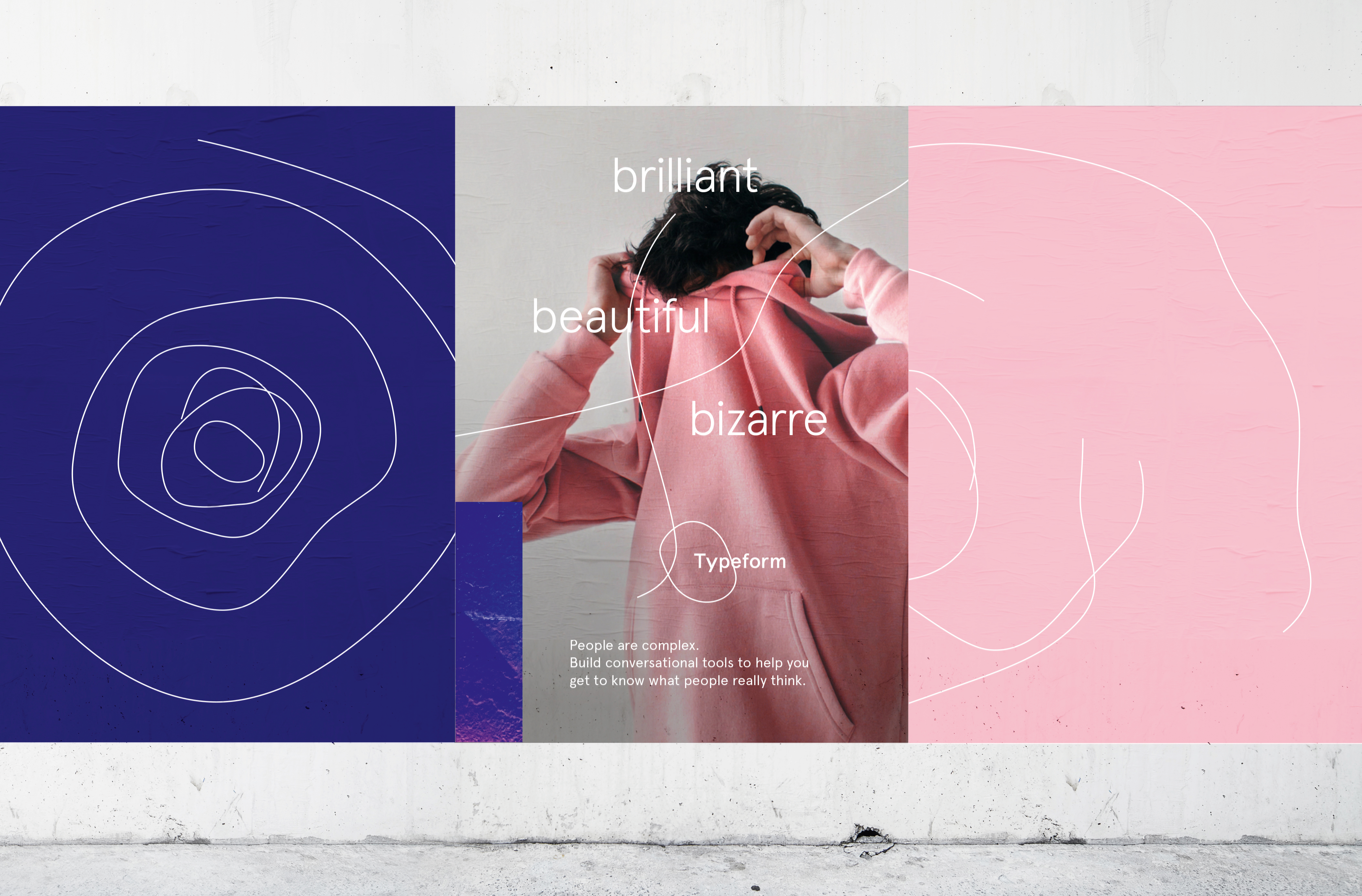
Back in 2018, DesignStudio created a new identity for Barcelona-based data start-up Typeform, inspired by Spanish artists including Picasso and Miró.
The identity eschews a traditional system that takes a logo at its heart, instead – again – looking to motion: the logo itself is “living” and mutable, taking on different forms according to factors including whether it’s representing complex data, or looking to express more abstract emotions.
“People are complex and challenging, and so clients are coming to us with more interesting challenges,” says Johns. “The world of design has changed: even five or 10 years ago, design was a colour palette, logo and typeface – now, it’s more about behaviour and interaction.”
He adds: “Where a logo was once a seal of approval or shorthand, now they can respond to interaction – to clicks, swipes and taps. That’s a very new thing. A logo has to wear many hats, and it can’t do that alone. Maybe the word logo has be to be reconsidered as we redefine this new vernacular.”
As such, a design system will still include a logo, but for many brands that are built to be used digitally over and above print campaigns, packaging and so on, sound and motion are as integral as a mark to be popped on a business card or even a website header. Agility is key.
Speaking to your audience
So what makes an irrefutably good logo design? As Draplin points out, truly timeless designs only become so for their refusal to kowtow to the hot new thing: “Try not to be led too hard by the latest trends or styles. Things rise and fall but clarity is an element that never really goes out of style.”
A lot of it simply comes down to doing the right thing for the right project. “Some people are interested in typographic forms, but what I’m more interested in is understanding the situation,” reinforces Anderson.
“Whether that’s music packaging or Coca Cola, you have to understand the target audience and the product, and how you intend to connect those two. Why have they made that album? Why has Coca Cola launched a new product, what are they trying to achieve? The problem solving aspect is trying to say that in a way the target audience best responds to.”
In his logo for Warp Records, for instance – a label known for its boundary pushing electronic music roster – the idea was to communicate something that was futuristic, but wouldn’t date.
“Things that look ‘futuristic’ date very quickly, as that version of the future will never happen,” says Anderson. “So I wanted to just have a logo and a colour that people would recognise.” The resulting mark is a stretched, gridded planet-like shape with a zig zag holding device that hits you like a comic book “ZAP!”, often used with a distinctive brand purple.
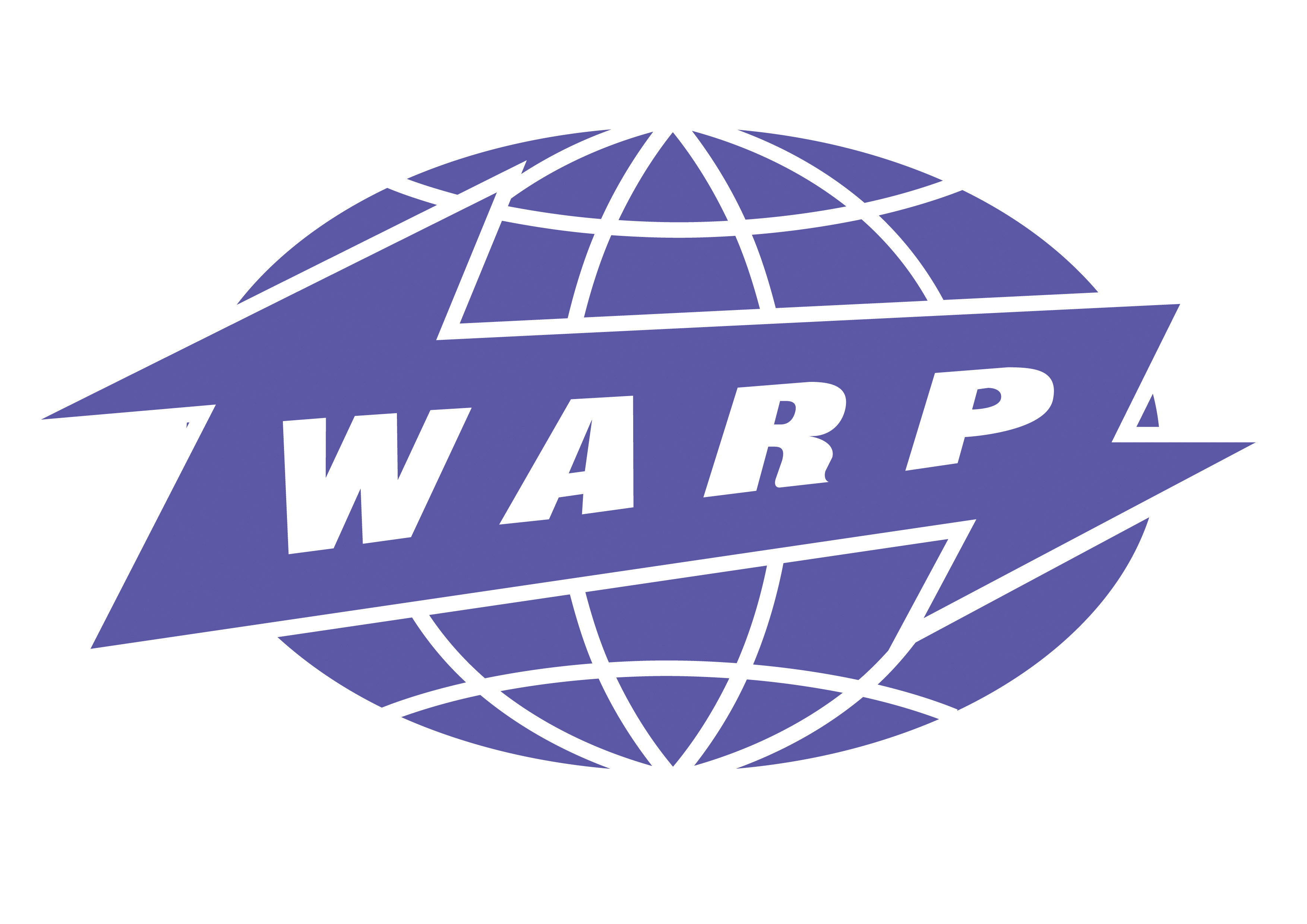
“There’s an old sci-fi, pulpy feel to it,” says Anderson. “A lot of those '50s and '60s sci-fi things have already dated as much as they’re going to: they’re locked into the future so they’re never going to date. With Warp, I was saying that you need to simplify it in order to communicate a complex message.”
Simplicity, as we’ve discussed, doesn’t mean boring: the sweet spot between dull minimalism and smart minimalism is in that ability to distil a brand’s essence in just one mark.
The success of a logo is, of course, a highly individual thing: it has to truthfully, potently speak of a brand’s essence
“In my opinion, good logo design is creating a simple, strong, recognisable symbol that communicates something about the company or brand or product,” says De Pelsemaker. “That might be through using an unusual or interesting space, or clever use of contrast and white space.”
The success of a logo is, of course, a highly individual thing: it has to truthfully, potently speak of a brand’s essence, whether that’s in a direct or more abstract way.
Finding logo design success
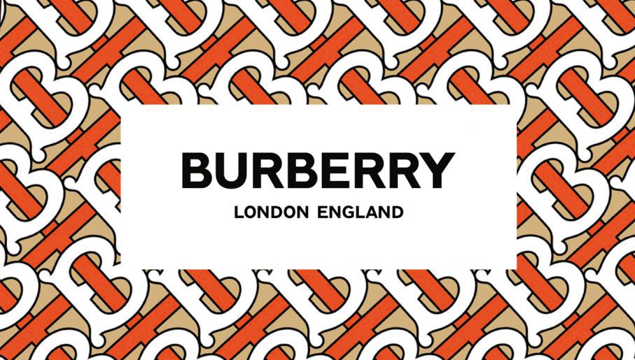
Take Peter Savile’s recent redesign of the Burberry logo, for instance: “it’s basically simplified, and you could argue that it’s a very simple logo,” says Enebeis, “but what’s brilliant is that Burberry is more than a logo, and it transcends that. You have to think about the core of the company to find the right answer.”
Chanel’s timeless interlocking ‘C’ mark achieves the same thing: it’s beautifully crafted, simple typography, but an utterly memorable distillation of the brand’s essence.
Away from fashion, think of the Saul Bass Bell System logo: “even if the brand isn’t around today [the company ceased operations in 1984], the logo still works,” says Draplin. “It’s just a bell in a little circle, but the clarity is just so perfect. Here comes the ‘c’ word, but corporate entities taught me a lot about letting restraint and simplicity tell a larger story.”
Today though, clarity need not solely refer to the simplicity with which we recognise or understand a static mark. That clarity can be born of recognising a brand through our interactions with it – through its wider values and place in the world, and how we engage with it on a far more personal level.

A design brief’s outcome is wildly different to what it was once expected to be – and there’s a lot of excitement and freedom in that. For Johns, a crucial part of DesignStudio’s ethos is in its belief that best practice is there to be confronted and pushed.
“When best practice means stagnation, you have to challenge it to move forward,” he says. “Consumers change, and designers have to change with them. A brief might come in to create a logo or a business card, but we take the time to live and breathe the brand and understand the proposition, then make recommendations on what the outcome should be. Just giving you a logo might not be the right answer.”
That’s where the danger in sites like 99Designs et al come in: a logo is not everything, for a start, and if you’re paying peanuts for a design, you’re going to get, well, a poor design. “If you’re paying $4.99 you’re rolling the dice on someone who’s going to sell you bullshit clipart art,” says Draplin. “Don’t lament to me ‘oh we paid $6 and got a stupid logo.’ What did you think you would get?”
Why does a logo have to mean something? Why can’t it just create a feeling, and be exciting and intriguing?
Alex Johns
Johns also puts forward an interesting counterpoint to the traditional argument that a logo must stand for something. “Why does a logo have to mean something?” he argues. “Why can’t it just create a feeling, and be exciting and intriguing? There can be space for poetry and fun in there too. A logo is no longer at the heart of a brand, it’s decentralised: the first touchpoint might not be a print campaign or product, it can be so many other things, and that’s really exciting.”
While it’s easy (and for many, fun) to wage keyboard-warfare until the cows come home about the sameness of today’s marks – especially those for digital start-ups – perhaps the most radical thing we can do is to sit back and really think about what we’re judging and why.
“If it’s ‘too flat’, who gets to be the judge?” says Draplin. “Don’t go looking for controversy and get all huffy. What’s the problem if you can nail the spirit in simple, flat shapes? But if it comes off looking like everything else, you have to go back to the drawing board.”
The best designers are the ones who respect the past, but also build for the now and look to the future
Alex Johns
Perhaps all the logo-bitching and cries that craft is dead are misguided for one simple reason: logo design isn’t stale or boring, we’re just judging with outmoded criteria.
“A brand is so much more than a logo,” says Johns. Sure, it’s wonderful to look at the greats – to pore over the hefty Standards Manual reissues, to worship at the altars of Rand, Fletcher, Chermayeff and others, but it’s vital for us in 2019 to consider that these weren’t created as neat black and white totems of ‘great design’, but as the boundary-pushers of their day.
“You don’t have to reject the past, but you do have to remember that people like Wim Crouwel, and Hamish Muir’s 8vo were pushing the envelope. Don’t just hold onto nostalgia, think about what they actually stood for. Of course, craft and quality have to be retained, but they also have to be applied to new problems. The best designers are the ones who respect the past, but also build for the now and look to the future.”
A shorter version of this article was originally published in issue 286 of Computer Arts, the world's leading graphic design magazine. Buy issue 286 or subscribe here.
Related articles:

Emily Gosling is a freelance art and design journalist currently writing for titles including Creative Review, Eye on Design, Creative Boom and People of Print. She’s previously worked at Elephant magazine, It’s Nice That and Design Week, and was editor of Type Notes magazine. Her book Creative Minds Don’t Think Alike was published by Ilex Press in 2018, and she also plays bass as one-quarter of the eight-titted beast, Superstation Twatville.

