Learning how to illustrate a children's book entails the development of unique skills and artistic approaches to capturing the energy of children's stories and appeal to young imaginations. Of course, children's books cover a wide array of genres and allow for a huge variation in styles of illustration. Creating artwork for children's books can take you in all kinds of directions, making it a fantastic specialism for artists who like to play with their creativity.
There are many things to consider, however. Children's book illustrations need to be accessible and easy to interpret. They also need to grab the attention of the particular age range that you're creating them for and must communicate the emotion of the story. And for very young children who cannot yet read, the illustrations in a children's book are everything and need to tell the story.
If you're not sure where to start or how to adapt your illustration skills for children's books, this guide will provide some tips. For more advice, see our 5 tips for illustrating children's books and our article on how to create colourful worlds that tell a story. Make sure you also see our roundup of how to draw tutorials and our pick of the best drawing tablets to work on.
- Need software for your creative work, then get Adobe Creative Cloud
How to illustrate a children's book: 6 tips for getting started
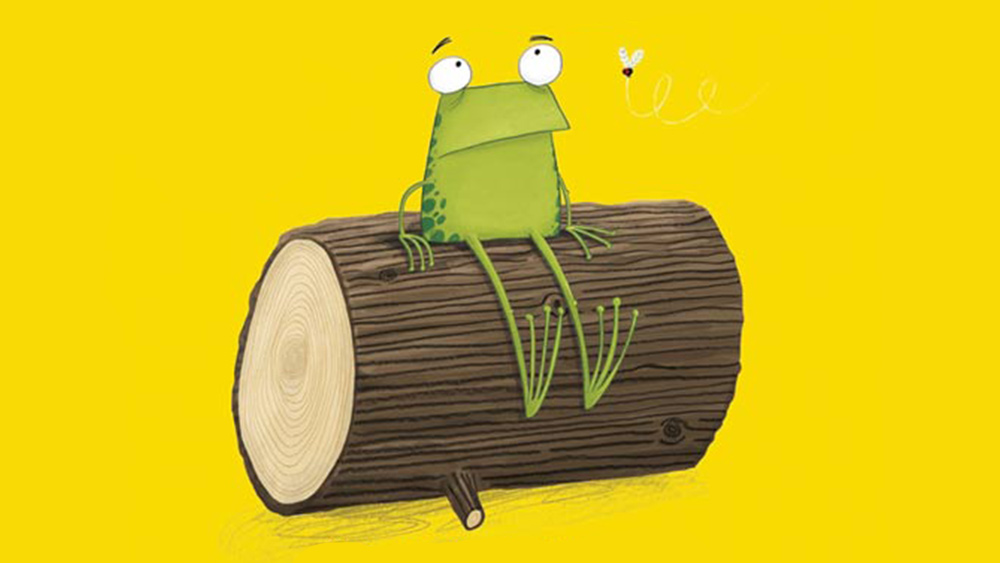
In this piece, we'll hear from children's book illustrator Jim Field, an expert in the area with years of experience and dozens of successful children's titles behind him, including Oi Frog! pictured above.
Field fell into illustrating children’s books almost by accident. He was working as an animation director and a freelance illustrator, but found that work was getting harder to come by as pitching became more and more competitive. An opportunity came up to illustrate a children’s book by Peter Bently – Cats Ahoy! published by Macmillan books in 2011. The book went on to win The Roald Dahl Funny Prize, changing the direction of Field's career as a result.
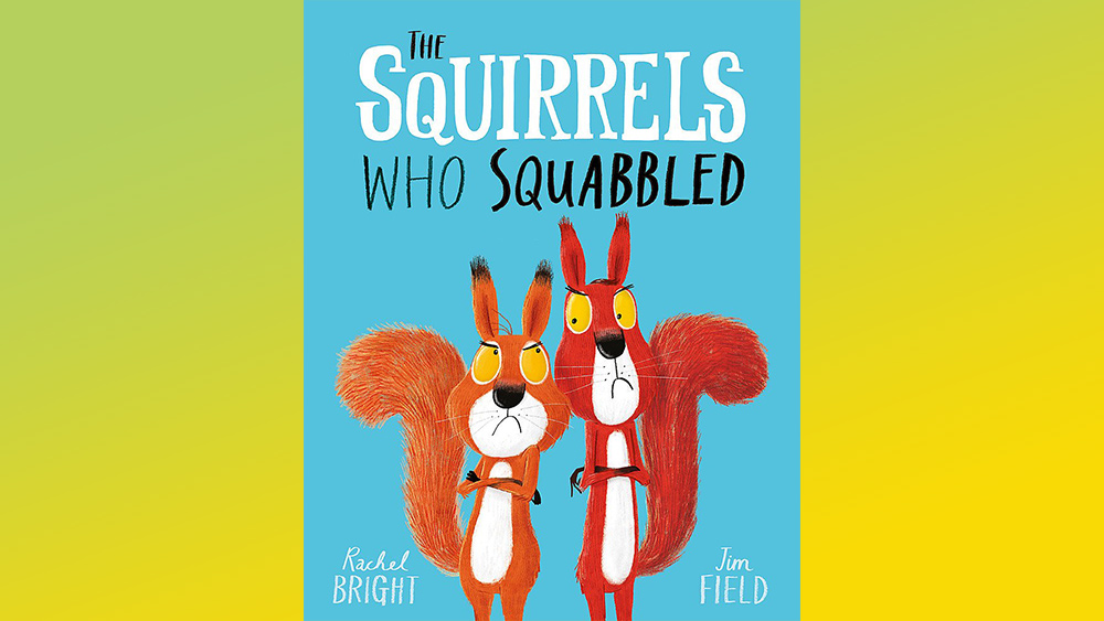
In the guide below, Field shares his own tips and tricks on how to illustrate a children's book with six pieces of advice for how to get started, accompanied by examples of his illustrations for the children's book The Squirrels Who Squabbled by Rachel Bright.
01. Find references
If you're wondering how to get started, Field suggests illustrators look at lots of references when figuring out how to illustrate a children's book. Inspiration could spring from anywhere, from a trip to a national park to a wildlife documentary, a film, or other illustrators’ and artists’ work.
Get the Creative Bloq Newsletter
Daily design news, reviews, how-tos and more, as picked by the editors.
"These things all help inspire my work," he says. "Sometimes I’ll find a reference photo of a landscape that inspires a composition, or it might be the dramatic lighting from a movie I’ve seen that helps me develop lighting in a composition.
"I gather lots of reference images from Pinterest that help me create a mood board for each book I’m working on. I refer back to these frequently throughout the process, so my head stays in the same place."
02. Mix analogue and digital
Field's second tip on how to illustrate a children's book is to mix analogue and digital creation. Field himself works on a MacBook Pro connected to an LG monitor, and he also uses a Wacom Intuos Pro tablet. He uses Photoshop for his final digital artwork, and uses a lot of Kyle T Webster’s brilliant Photoshop brushes – varying the opacity and flow to create different textures.
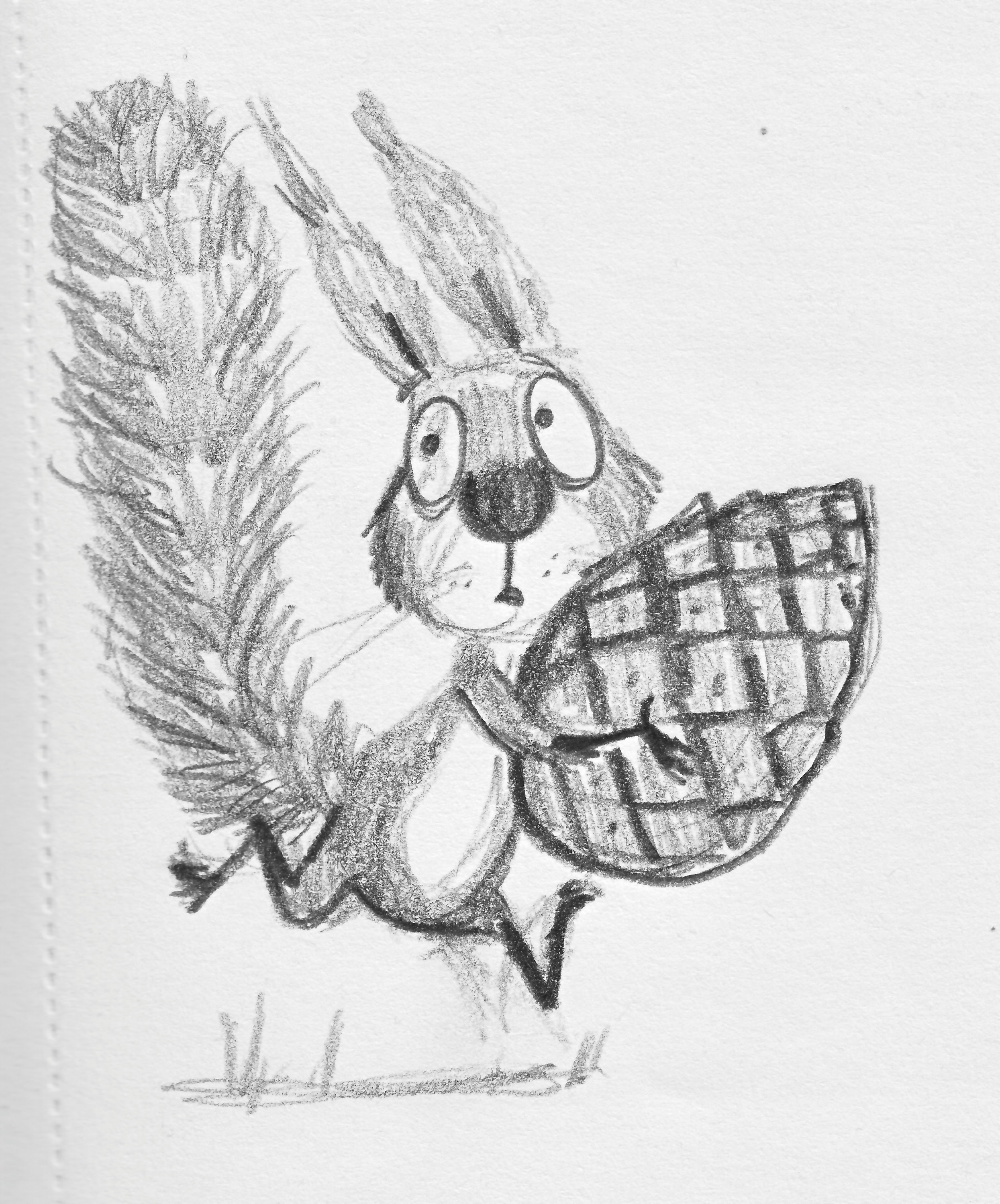
"I hop between digital artworking at my standing desk and a lightbox for the hand-drawn elements," he explains. "For the final artwork, the main characters and overall background layout are hand-drawn in pencil. I’ve tried to draw directly on the computer but it never has the same feel as by hand, it loses energy and spontaneity.
"My goal when artworking is to make my illustrations look as hand-painted as possible. I want to avoid them looking digital, so I avoid filters and limit my use of gradients and obvious blending mode effects where possible."
03. Map the story
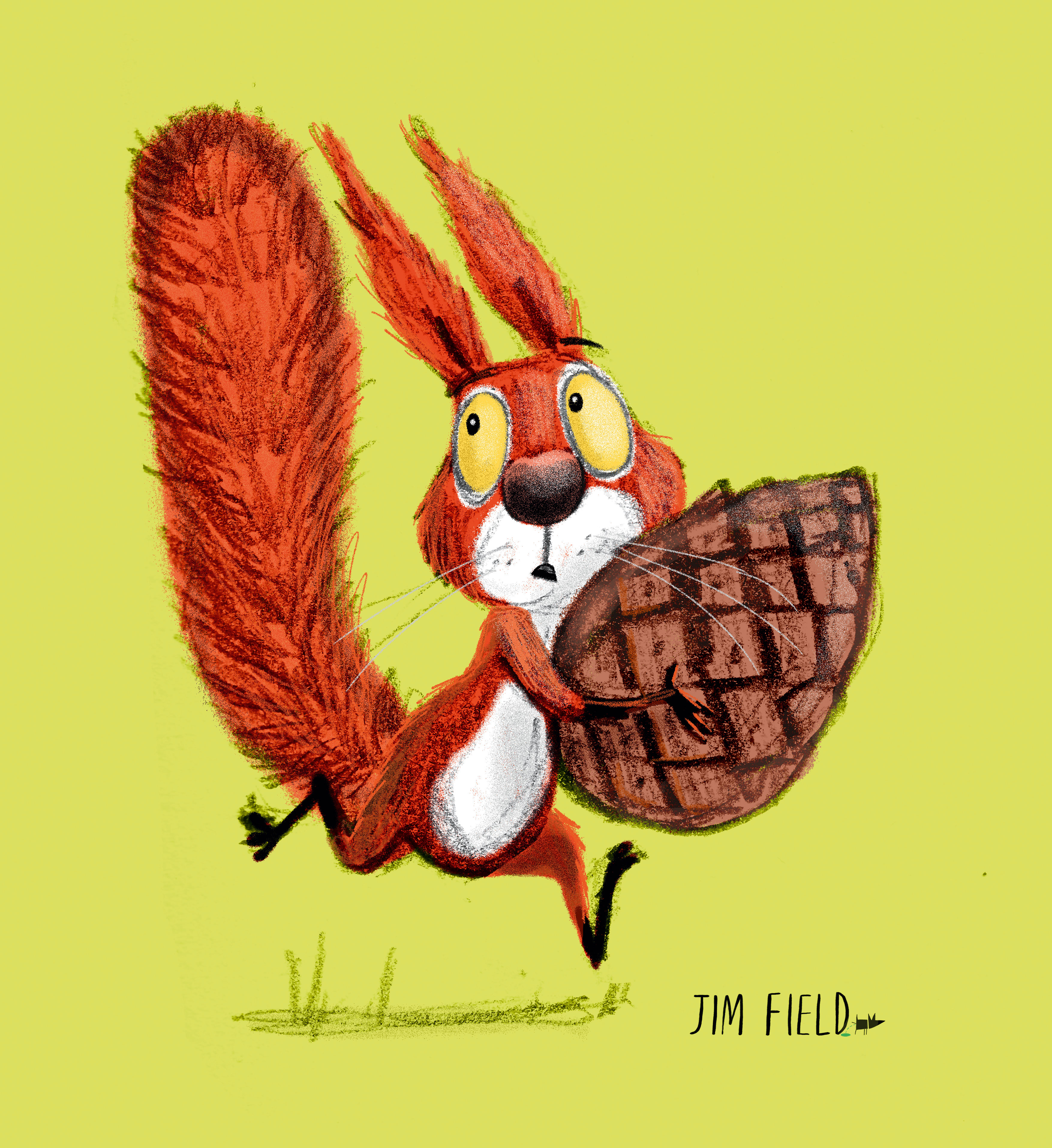
Field has an advantage here coming from an animation background. When he reads a story for the first time, he plays it through his head like a movie. He then 'stages’ the story, the same way he would an animated film.
The Squirrels Who Squabbled by Rachel Bright is about two squirrel characters, who are intent on claiming the last pine cone of the season. Each will do anything to get it. Cyril, our ‘hero’ character has partied his way through the season and has no food left. Bruce the ‘anti hero’ has planned ahead and has a mountain of bounty for the winter, but still feels he must have the last pine cone.
04. Create thumbnails
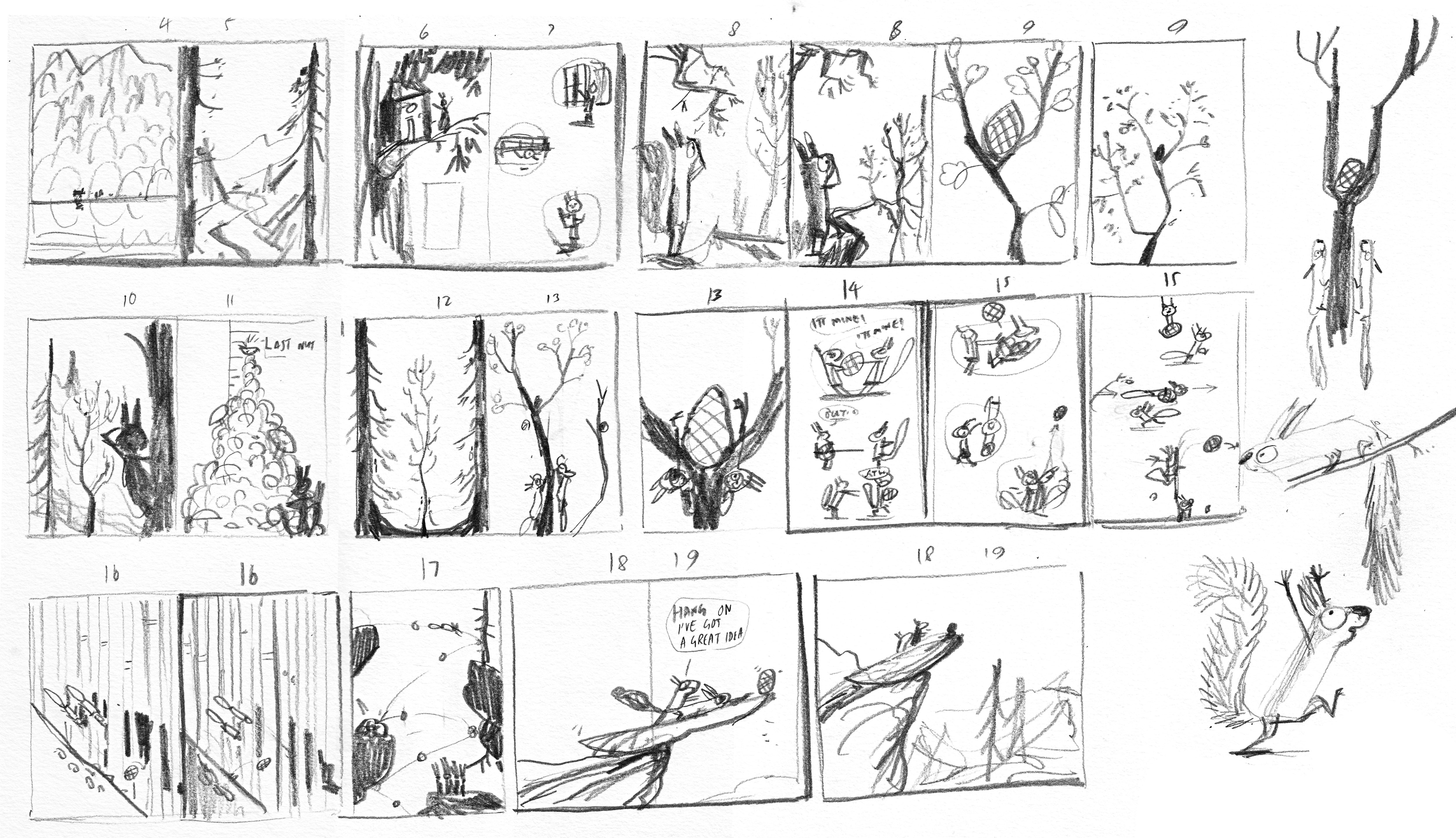
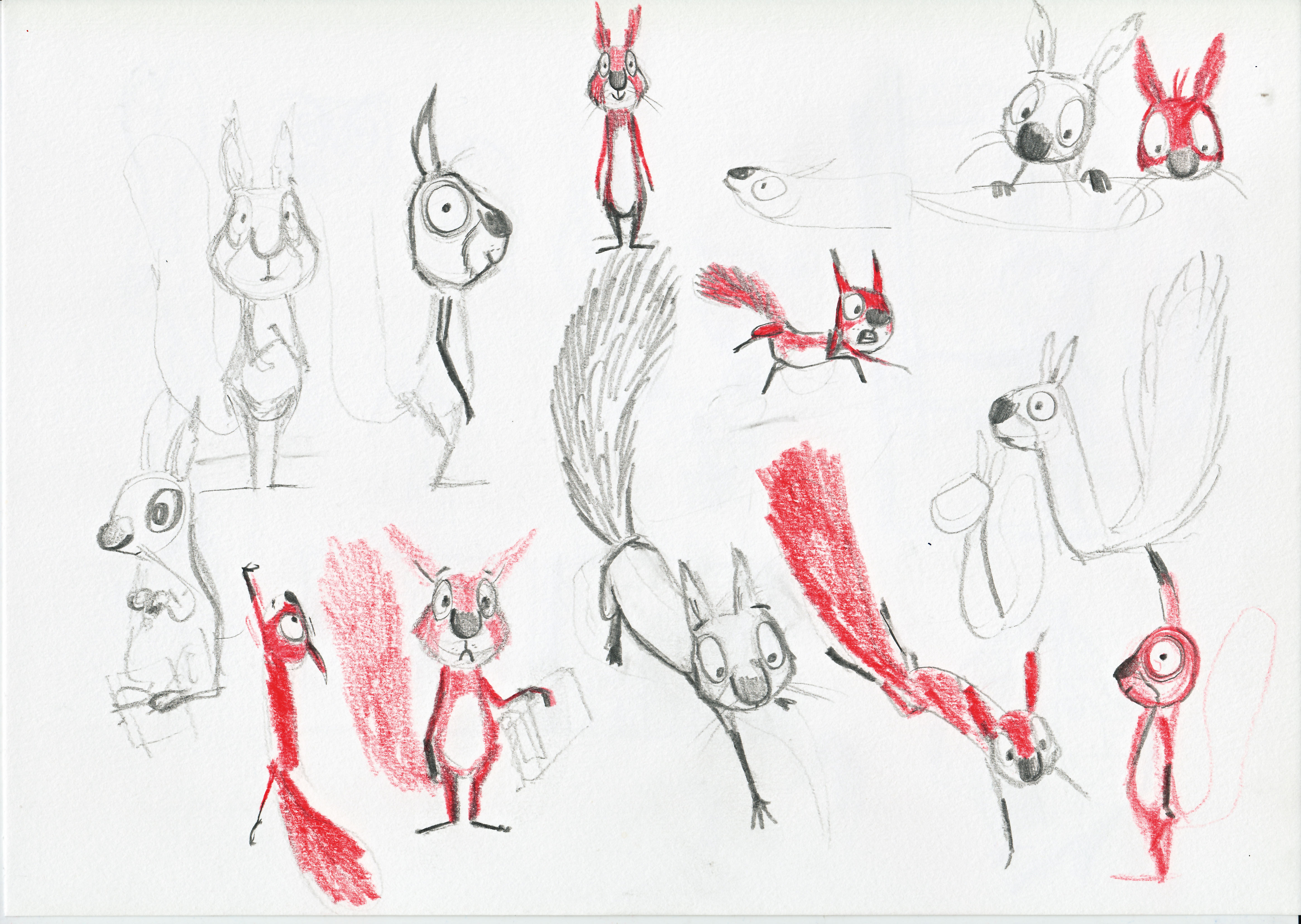
We've mentioned mixing analogue and digital, but Field says he always starts with a sketchbook and pencil. While reading the story over to himself, he makes lots of character doodles and sketches out thumbnail ideas.
"Some compositions come to me straight away," he says. "I know exactly how I feel they should be, and they rarely evolve much in terms of composition. Some, however, are very tricky and can take a long time to get right."
Once Field's built up a collection of thumbnails, he'll drop the best ones into InDesign with the text, so he can get more of an idea of how the book is flowing. Once he's happy, he'’ll share the document with the team for feedback.
"Getting the thumbnails right at this point is essential," he advises. "They're the backbone structure of the book. If there are flaws in the visual storytelling here, then making it pretty in colour at the final stage will be a waste of time."
05. Make roughs
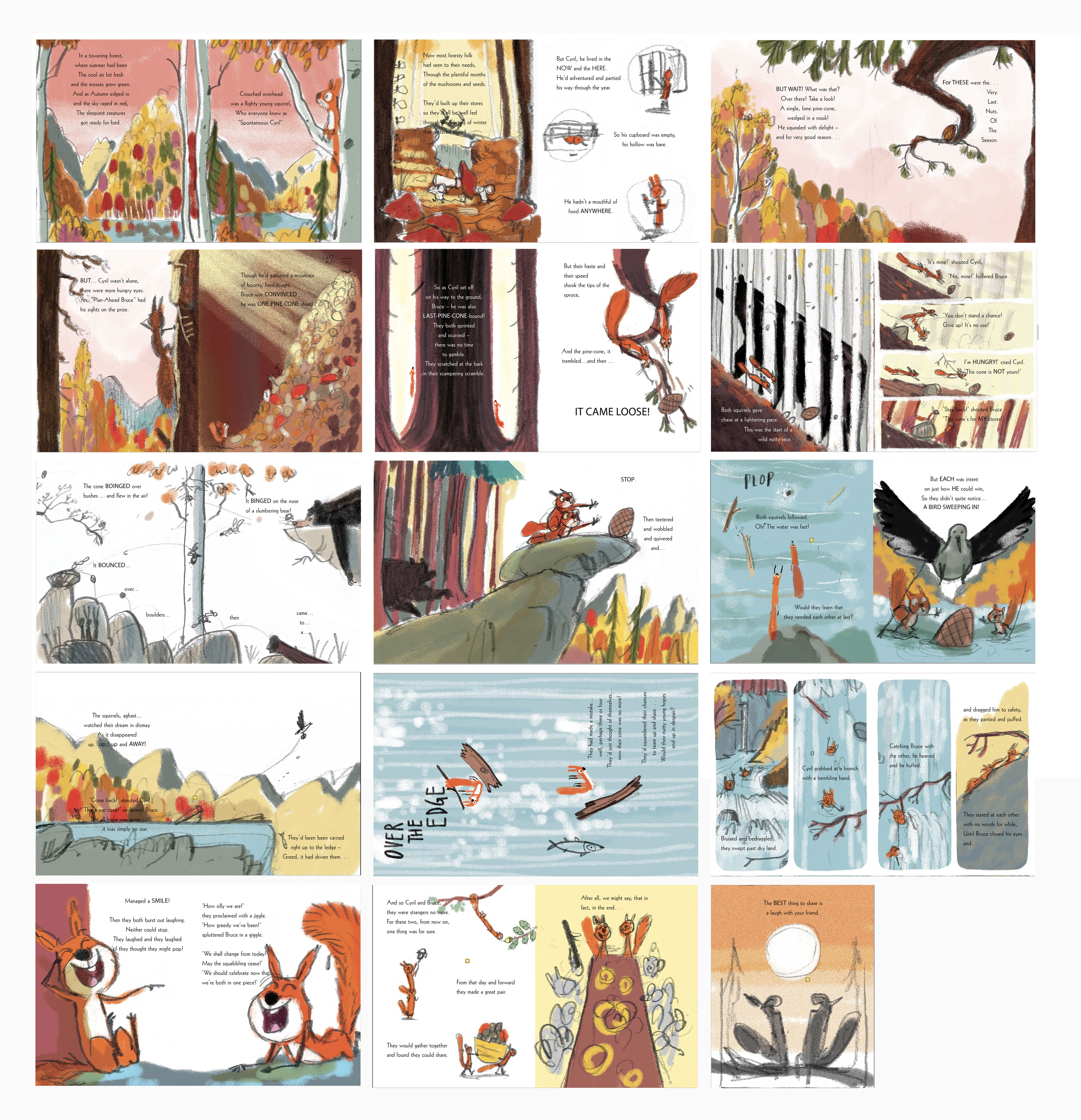
When everyone's happy with the thumbnails, Field will work them up to roughs, again working in pencil and paper. He'll then start introducing colour in photoshop. It’s at this stage that he starts to get more of a feel of the finished book.
Choosing the right colour palette for a book can be a challenge. "The Squirrels Who Squabbled is set in the last days of autumn, so I wanted lots of lovely oranges, reds and browns soaked in sunshine," Field says.
"At this point, I also start to think about the lighting in each spread, sketching in the shadows, so I can be consistent with the direction of the sun from scene to scene when it comes to the final art stage. These elements give the illustration a greater sense of realism."
06. Look for new challenges
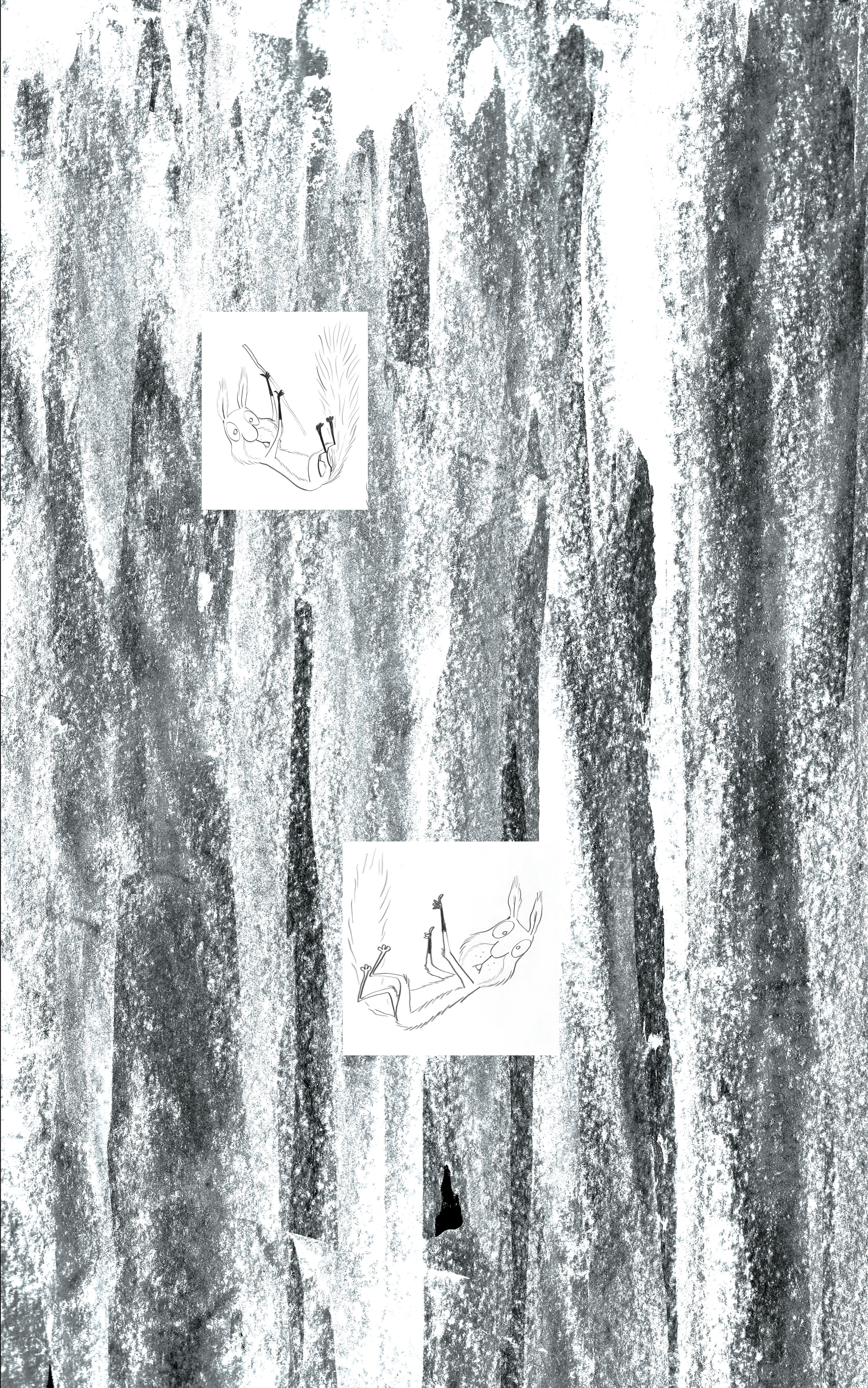

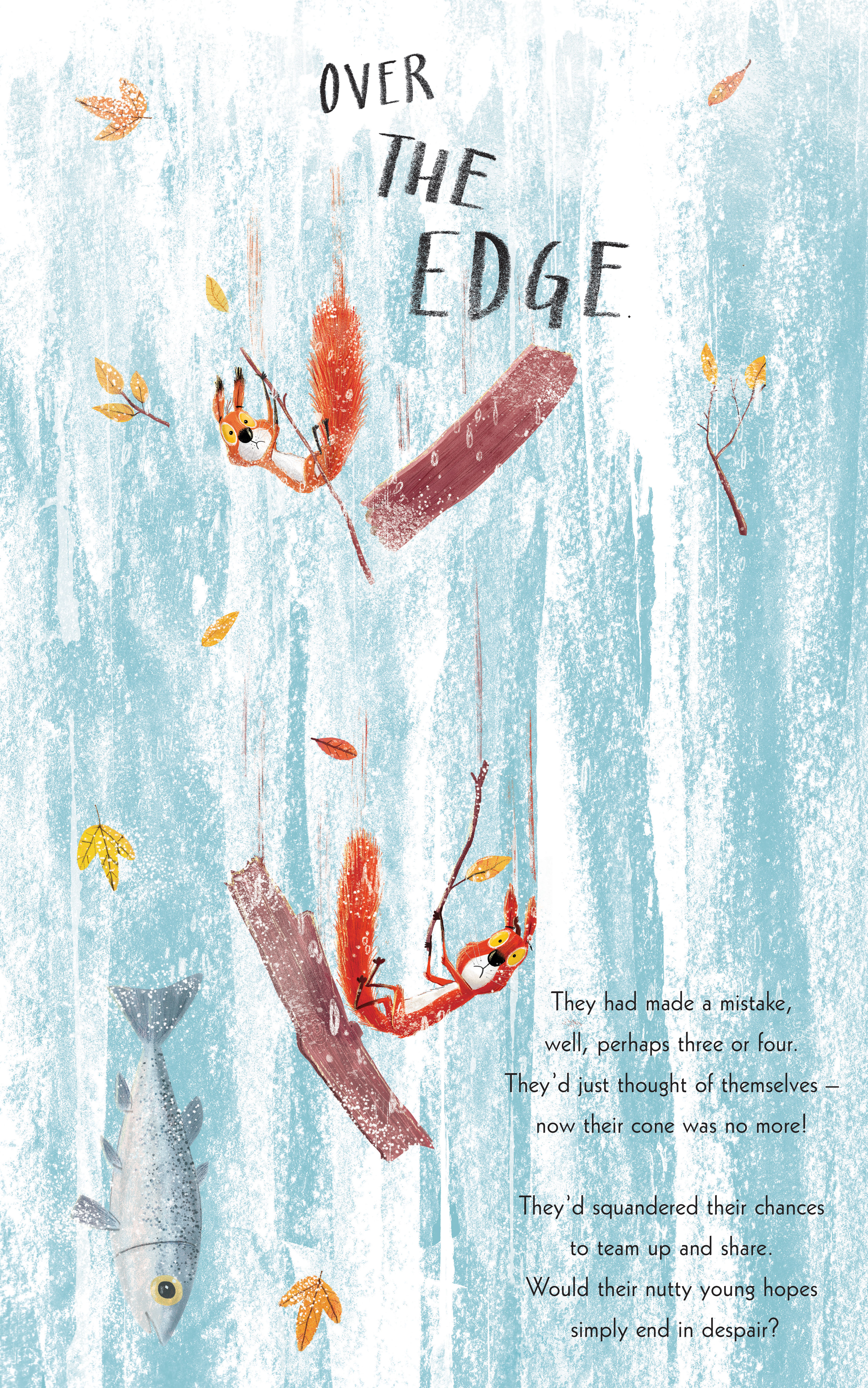
Always look for new ways or new approaches to how to illustrate a children's book. This is what helps you develop as an illustrator and avoid settling into a single fixed approach. In The Squirrels That Squabbled, there's a spread in the book (see the gallery above) that marks a turning point in the story. Field's art director Grahame Lyus suggested making it a vertical spread, so it would work better with the action and better suggest the turn of events to come.
"I think this stems from my animation background, but I see a picture book as the best 24 images from a film," Field says. "Each page must bring the text to life, communicate the story and I try to bring something else to the story visually. Each book is a new challenge to develop myself further as an artist."
Related articles:
- Best drawing tablets for kids: Get your little one drawing digitally
- Adobe Illustrator tutorials: Lessons to boost your skills
- Illustration vs photography: how do you decide?

Thank you for reading 5 articles this month* Join now for unlimited access
Enjoy your first month for just £1 / $1 / €1
*Read 5 free articles per month without a subscription

Join now for unlimited access
Try first month for just £1 / $1 / €1
