How to enhance photography on your website
Here are three techniques you can employ to enhance the use of photography on your site.
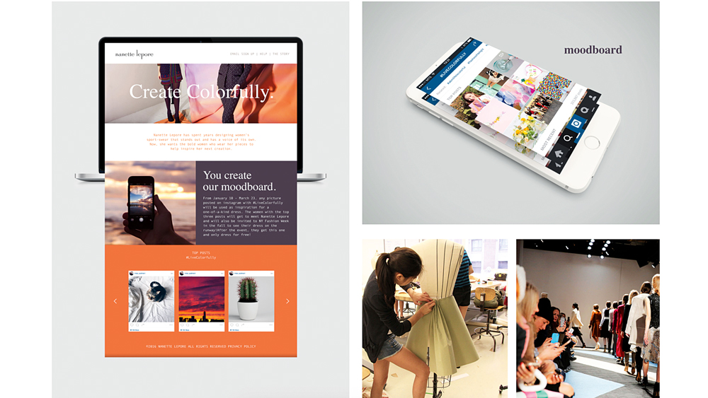
There are a plenty of new ways we can use design principles, CSS and JavaScript to change up our use of photography on the web. While some of what’s possible is still dictated by the browsers, one thing’s for sure: the days of static, boxy photos are gone.
The value of taking the time to edit photos so they match the tone of the site is sometimes underestimated. If photos come from different sources or cameras, or have been taken at different times of day, slight adjustments to brightness, contrast and cropping can go a long way in making them gel together. Using a photo editor or exploring some CSS3 effects can be a great way to spruce images up.
Grid systems can be used to help place images within a system and also break the columns as needed – and honestly, the web could use a bit more of that grid-breaking. Photos don’t have to always be full-width, with parent elements and child elements. And it’s not just photos that can break the grid: buttons, text and masks (although check CanIUse first) can all help you shift away from overused patterns.
Thoughtful use of lazy loaders and the <picture> element can be the final step in making photos work well. Having smaller versions for smaller screens and larger, crisper versions for big screens can help enhance the user experience. JavaScript libraries that load images on scroll rather than on page load can pique viewers’ curiosity as well.
Here are three sites that get their photography just right.
01. Double Eight
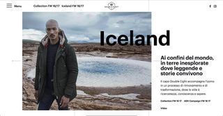
Italian clothing brand Double Eight doesn’t overuse grid structures and lets the type overlay the images. The images themselves are consistent in their contrast and composition.
02. StartupLab

StartupLab uses experimental CSS to mask imagery over large, thick sans-serif lettering.
Get the Creative Bloq Newsletter
Daily design news, reviews, how-tos and more, as picked by the editors.
03. Gabriel Ribes

Gabriel Ribes’ humorous portfolio site uses smooth CSS transitions and JavaScript to load content only when it’s needed. The subtle fade-in animations are a nice touch.
This article was originally published in net magazine issue 287. Buy it here.
Related articles:

Thank you for reading 5 articles this month* Join now for unlimited access
Enjoy your first month for just £1 / $1 / €1
*Read 5 free articles per month without a subscription

Join now for unlimited access
Try first month for just £1 / $1 / €1
Sam is a designer living in Austin, Texas, who speaks and writes extensively about web and product design, diversity, inclusion, and equity. In 2011, she wrote the first university course on the topic of Responsive Web Design. She is currently Design Director at thoughtbot, and serves on several design advisory boards in Austin.

