How to draw a gothic character
Illustrate a fairy tale with a dark twist by using these mixed media techniques.
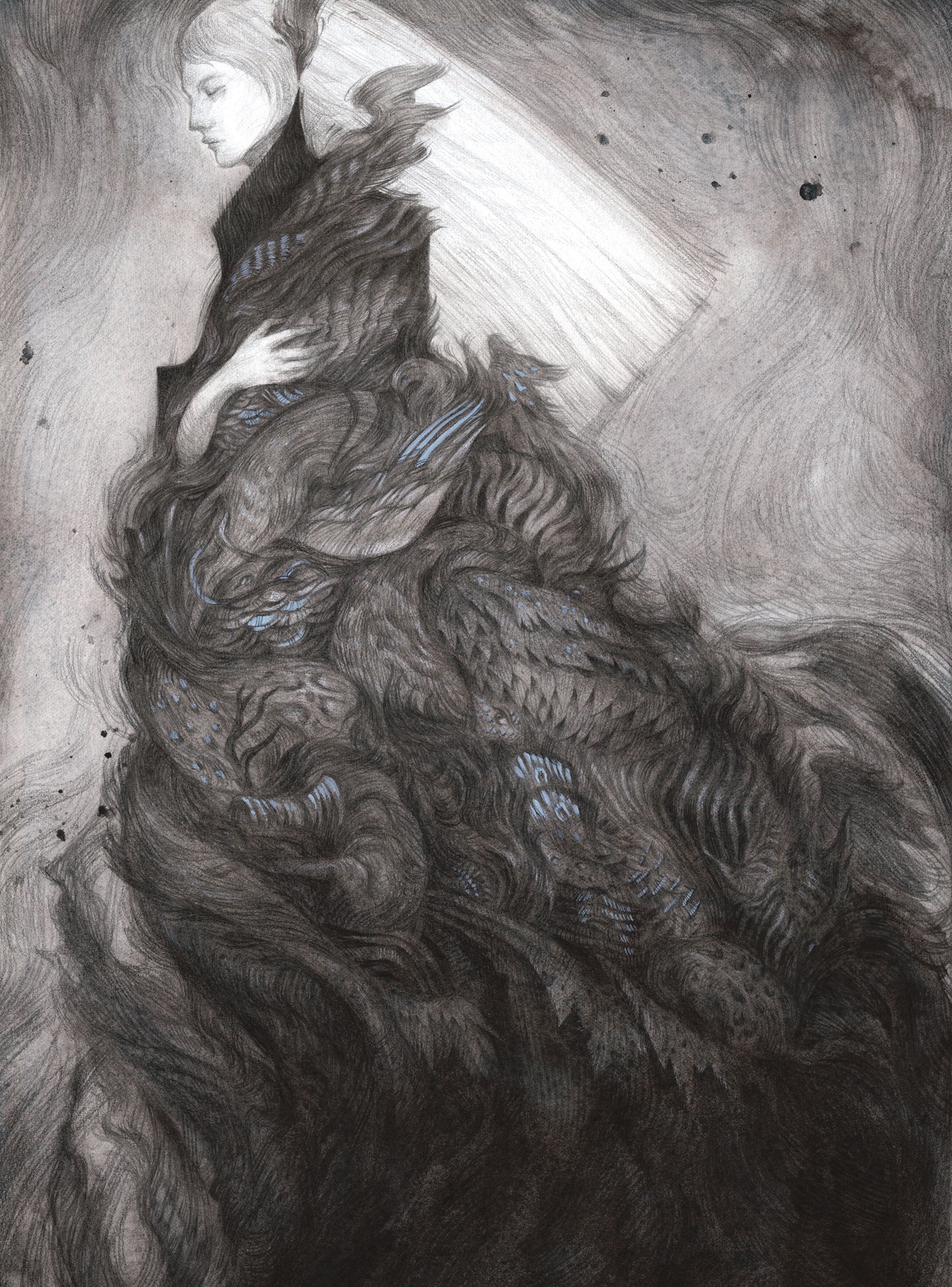
For this workshop I’m creating an illustration based on the Brothers Grimm fairy tale Thousandfurs. One of the key elements in the story is a cloak made of different kinds of fur and feathers. When I first read the story, I knew right away that I wanted to draw the cloak. There’s a lot of potential here for creating something just a little creepy and unusual with all those different animals.
I want the figure to be surrounded by an almost abstract mass made up of animals and textures. My aim is to create a strong silhouette shape, filled with smaller details when you look closer. Although the fairy tale describes the cloak as being made of different kinds of fur, I want to take it a step further and include subtle hints of recognisable animal parts as well, such as an eye or ear poking out here and there. I love adding these details for viewers to find; they’re like secrets hidden in plain sight.
My aim is to create a strong silhouette shape, filled with smaller details when you look closer
For inspiration, I’m looking at fashion designers like Alexander McQueen and Iris van Herpen. These designers create work with unique silhouettes, and often use textures inspired by nature. Their work is also slightly dark and creepy, which is just the kind of tone I’m looking to achieve in my own illustration. I’m not copying specific designs, but rather taking note of the silhouettes and materials they use. For actual reference, I’m using a collection of photos I’ve taken at various museums, giving me a wide range of animal patterns to refer to as I draw.
I’ll be using a combination of watercolour techniques and pencil drawings to create a monochromatic image, with highlights using gouache. The watercolour textures establish the mood and tone of the illustration, while the drawn lines create movement and details. My focus is on being experimental and letting the process inform my creative decisions.
This experimental approach means that the results can be unpredictable, and I never know exactly what textures or shapes I’ll produce when laying down the watercolour. Because this is a personal piece and not for a client or commission, it enables me to improvise and play with media without worrying about what the final will look like. Though I love working with the constraints of an illustration assignment, it’s fun to ‘let loose’ on these personal pieces. I often stumble across new techniques along the way that I can then take into commissioned work.
01. Produce a range of thumbnails
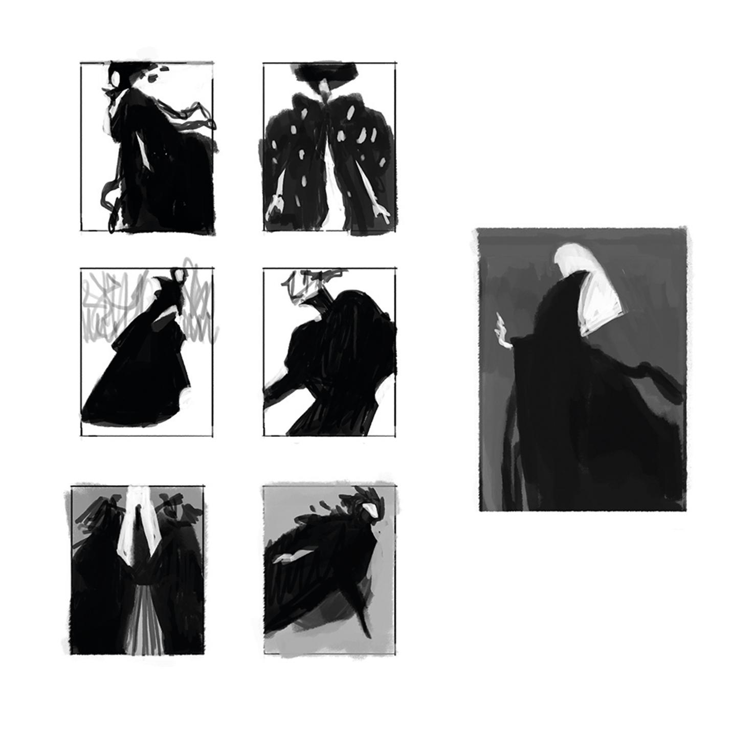
I start by creating some thumbnails digitally in Photoshop. At this early stage I’m focusing on simply finding interesting shapes and silhouettes, and not thinking too much about the details. They come later.
02. Work up a sketch
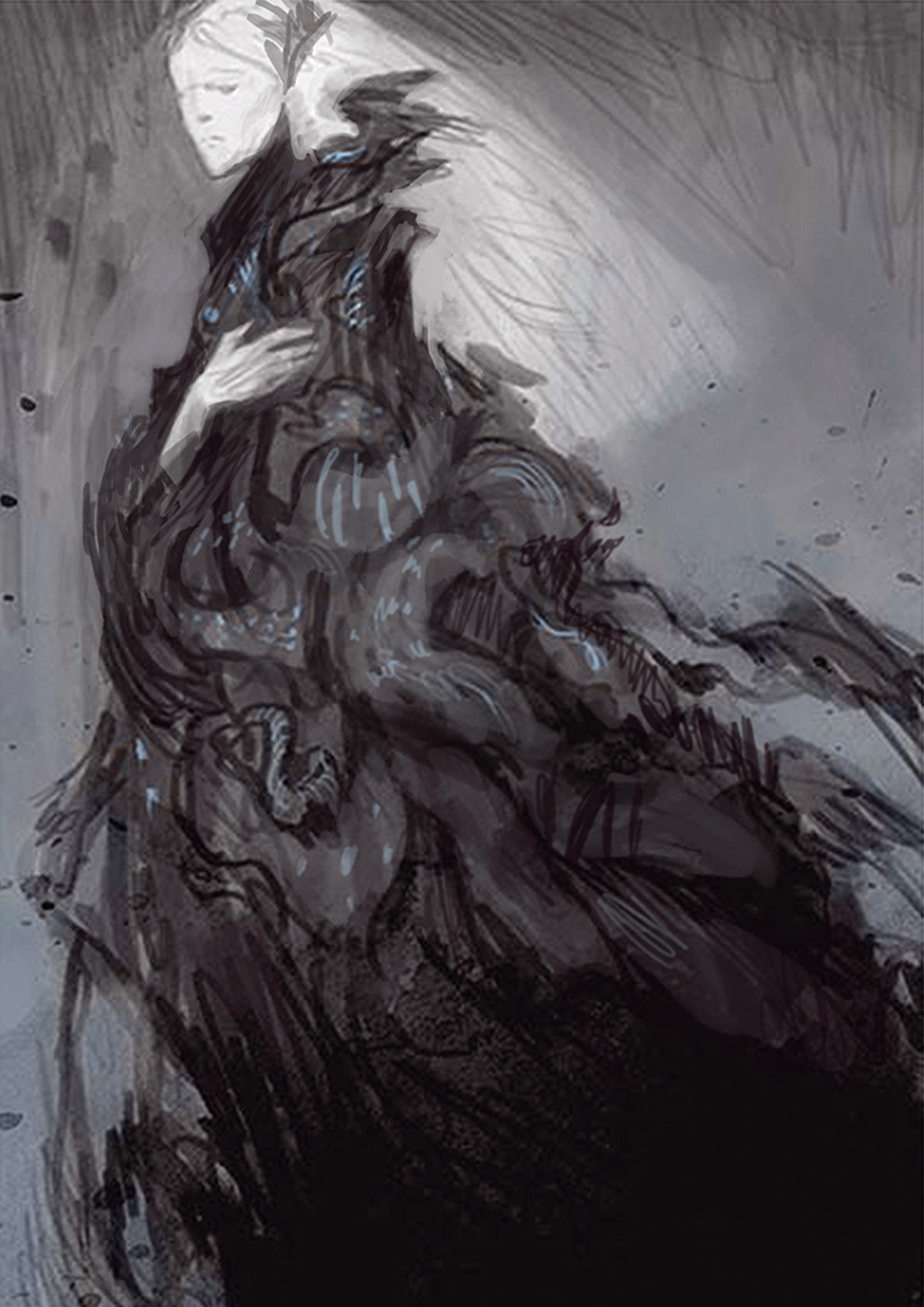
Still in Photoshop, I work up a more detailed sketch. I’m figuring out the overall composition and the value structure of the piece, working very loosely by blocking in shapes, and still not going into too much detail.
Get the Creative Bloq Newsletter
Daily design news, reviews, how-tos and more, as picked by the editors.
03. Pull together some reference photos
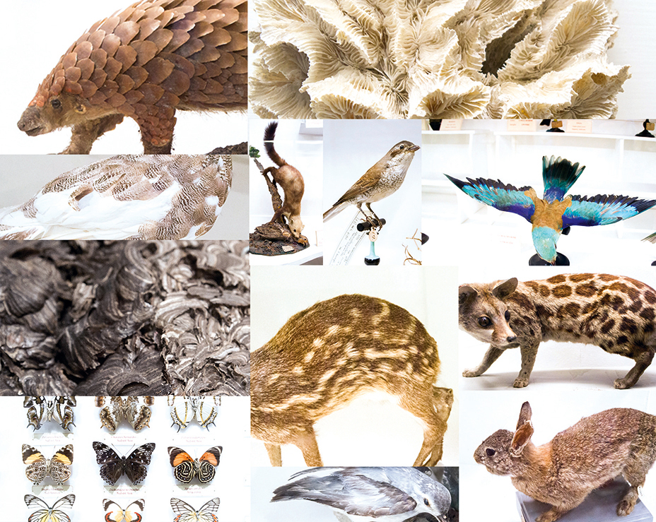
I also gather all the references I need. I’ve built up my own collection of photos, taken at various natural history museums over many years. They’re perfect for referencing different textures and fur patterns.
04. Create a line drawing
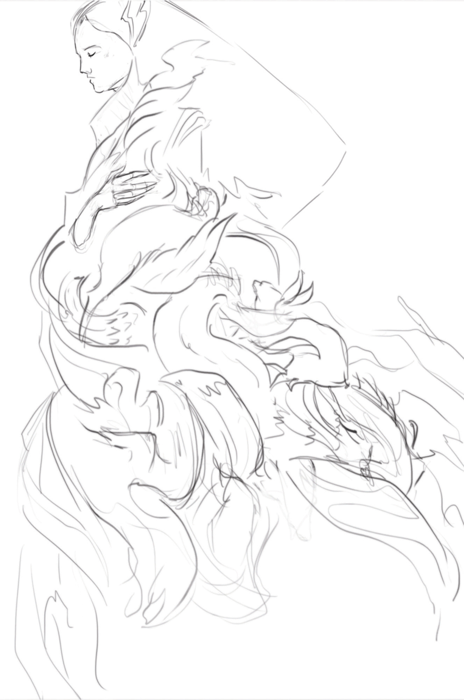
I trace around my digital sketch to create a line drawing. I then print this directly on to my drawing paper. Before printing, I blur and lighten the lines so that the print is subtle and will eventually be covered by the watercolours.
05. Apply a watercolour wash
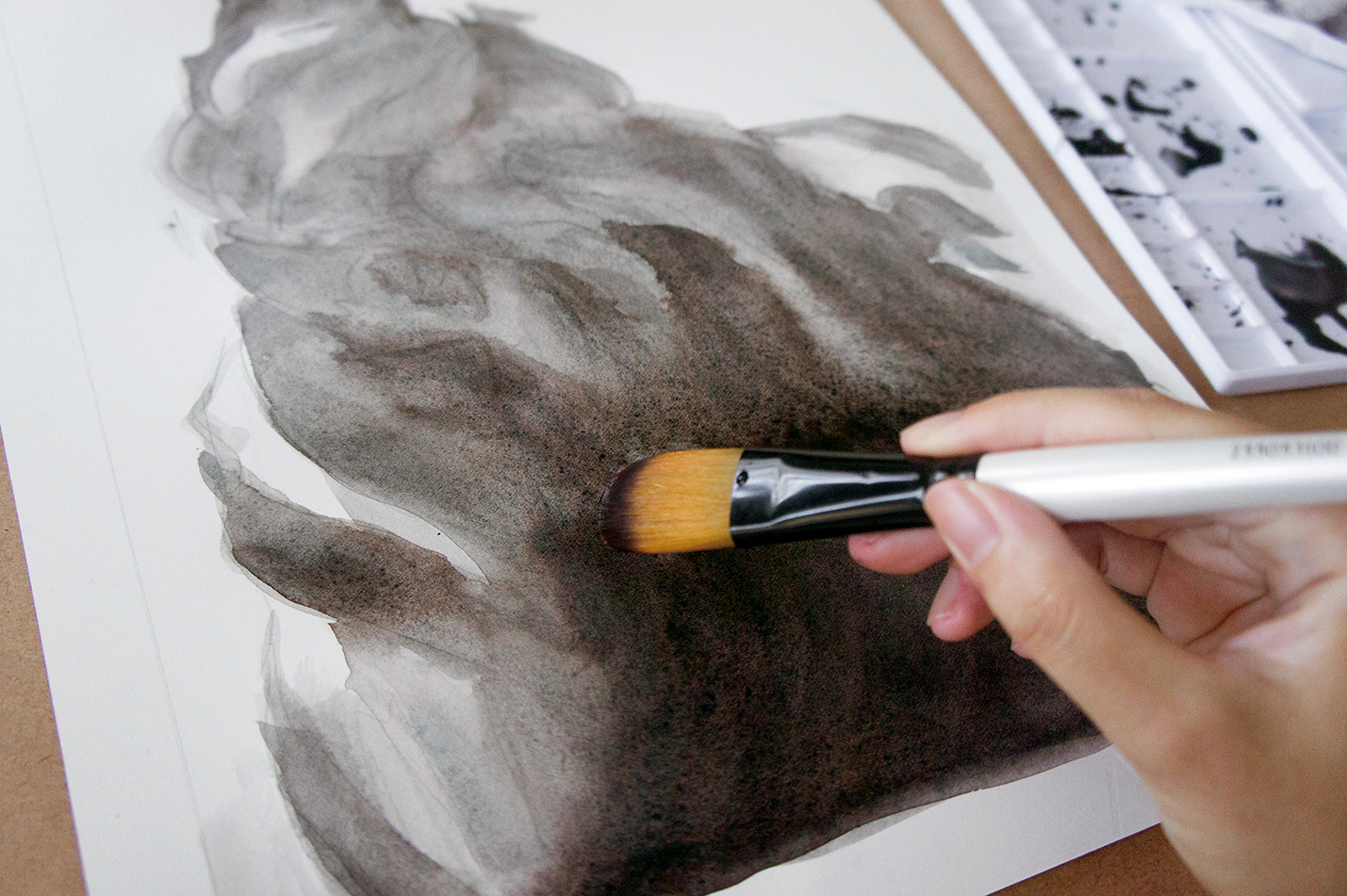
I begin laying down the watercolour wash. I start with the darkest part and block in the shapes guided by my printed lines. I add a lot of water to the pigment to create interesting textures and granulation effects.
06. Push a sense of depth
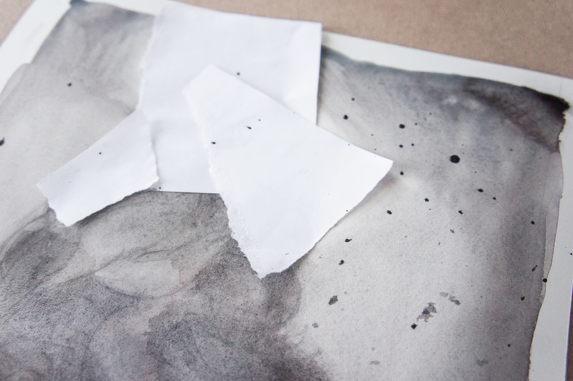
Once the first layer is dry, I add some paint splatters, making sure to cover the area around the head and hand with scrap paper. I also apply a second layer of wash to darken some areas of the composition.
07. Sketch animal shapes
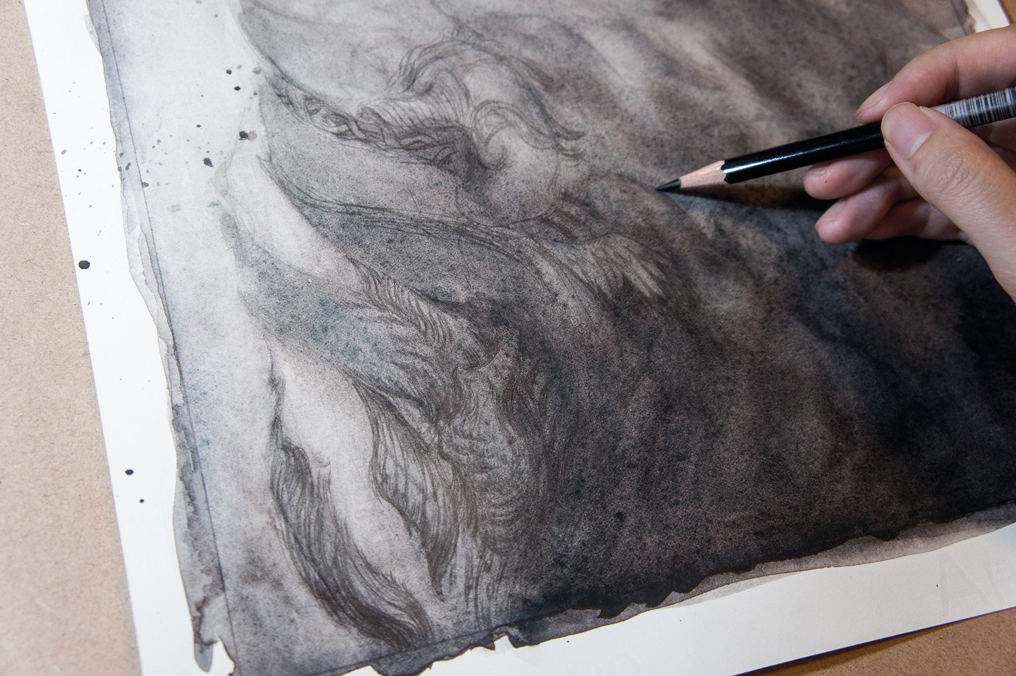
It’s time to begin drawing. I start by loosely sketching in the animals. I find shapes and edges within the watercolour texture to fit animals into, and look back at my photos for reference.
08. Introduce patterns and textures
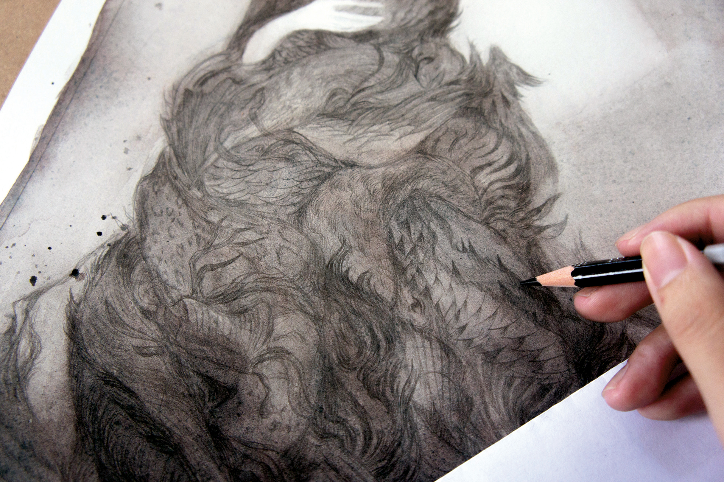
I turn my attention to the fur patterns. I make sure there’s a good variety of animals represented, and that similar patterns are spread out evenly. In addition to my collection of fur photographs, I’m also referencing elements such as coral patterns and fabric folds.
09. Refine the head and hand
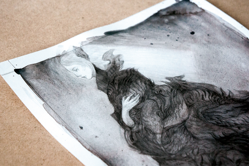
I start to add details to the character’s head and hand. I want her features to look quite delicate, so I’m using a very sharp pencil, and working lightly to gradually build up the shading on her skin.
10. Boost complexity and visual interest
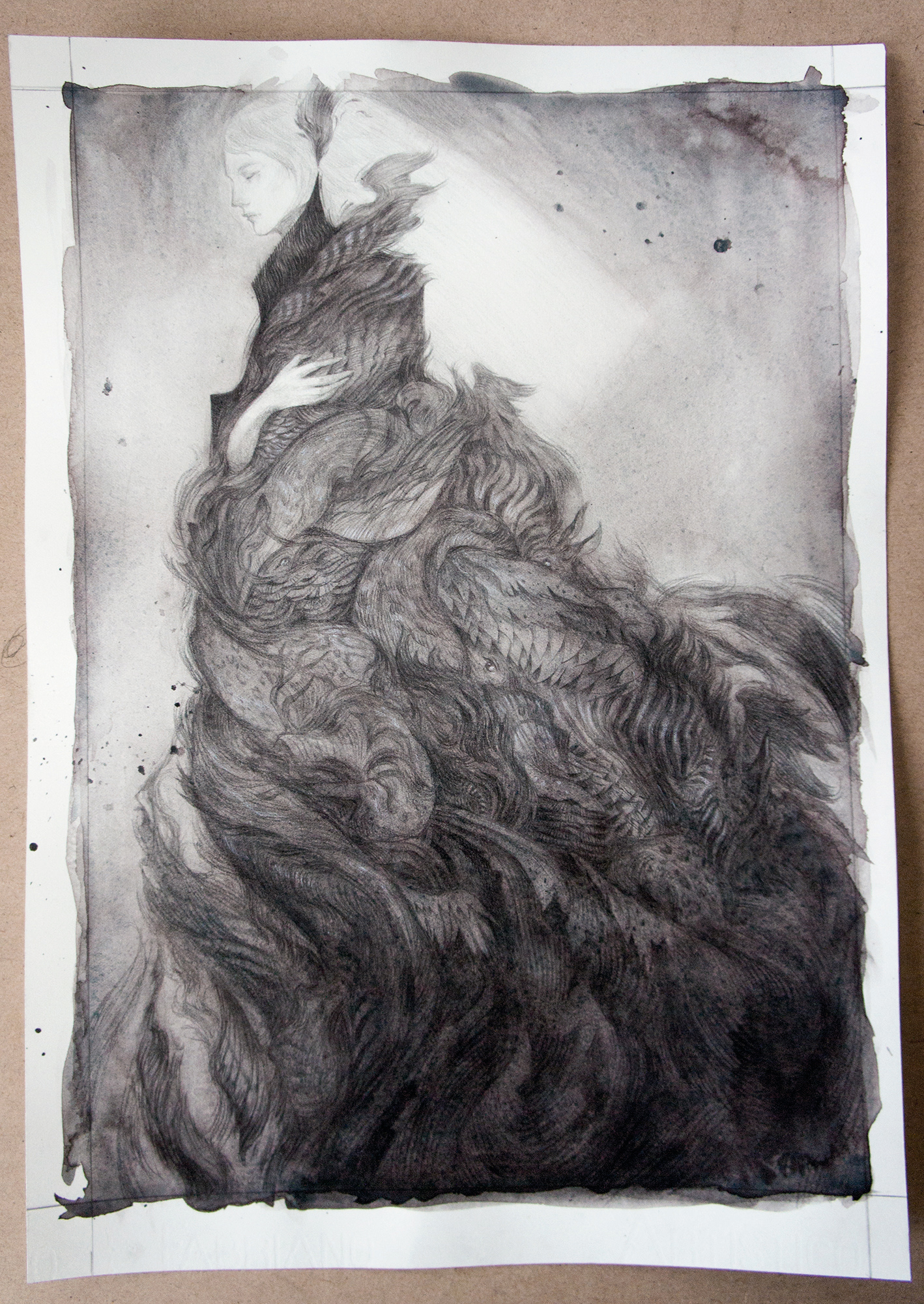
Now that I have a solid foundation down, I can finally focus on all the small details in the composition. I render out different textures, make certain shapes more complex, and darken the shadow areas.
11. Develop a sense of contrast
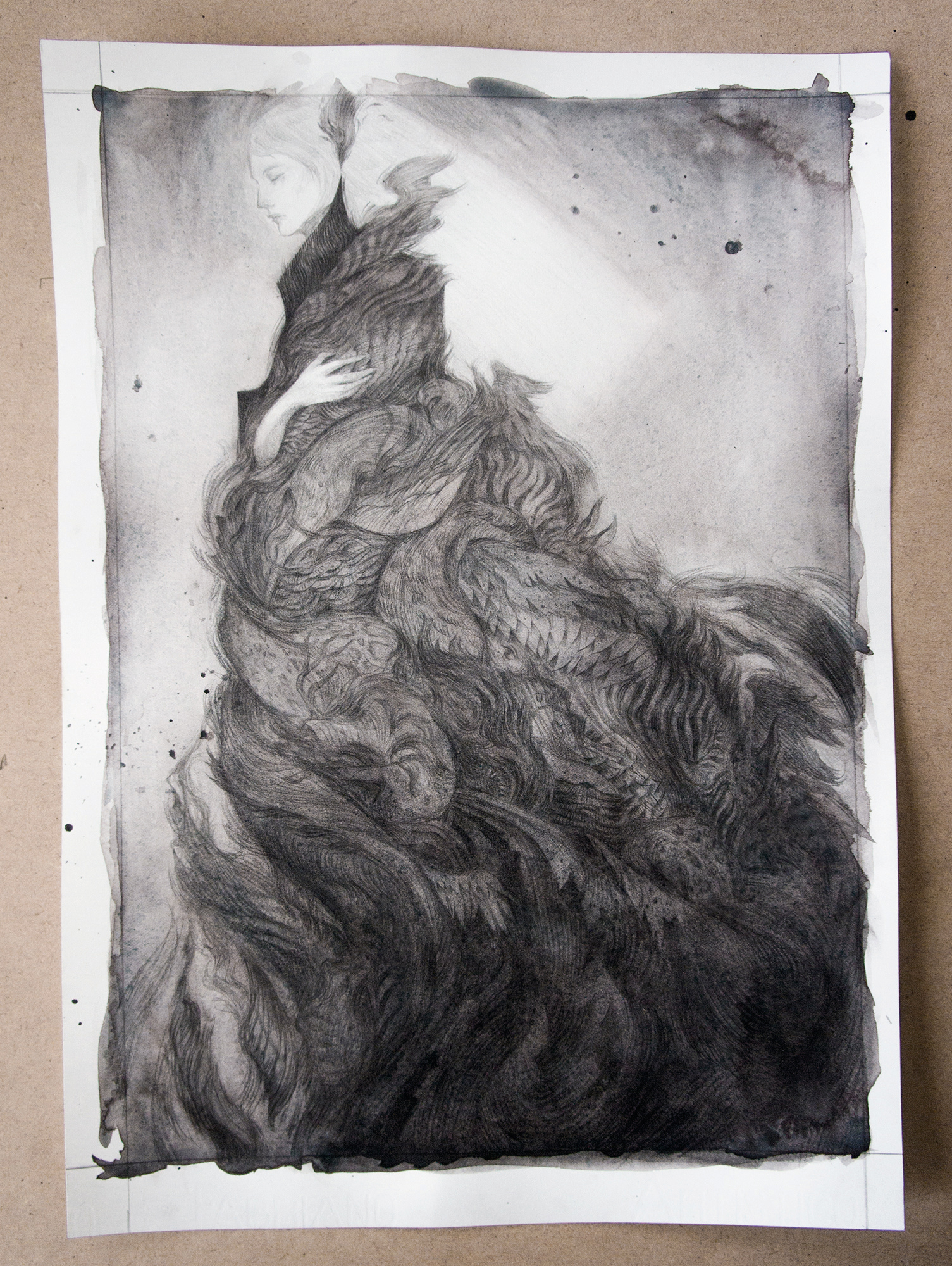
After building up my shading, I now want to pull out some highlights to create more contrast. I use a white pastel pencil to sparingly lighten some areas, and then use a clean dry brush to blend it in.
12. Paint gouache highlights
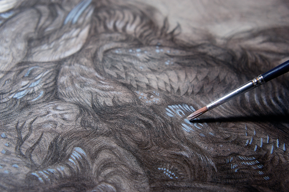
With the drawing mostly complete, I add in some decorative blue highlights using gouache. I then realise that my white highlights could be stronger, so I go back in and add another layer with white pastel pencil as well.
13. Enhance the hair and lines
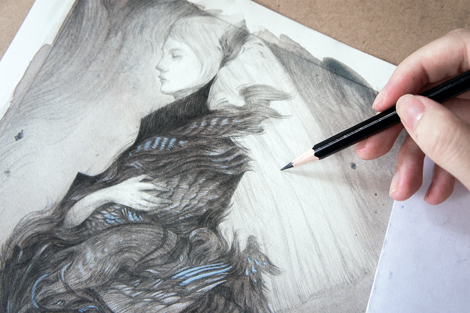
I had intended to leave the hair unshaded for a glowing look, but notice that it looks unfinished, so I add in some subtle shading. I also add small expressive lines all over the piece to loosen up the drawing and create movement throughout.
14. Flattening the paper
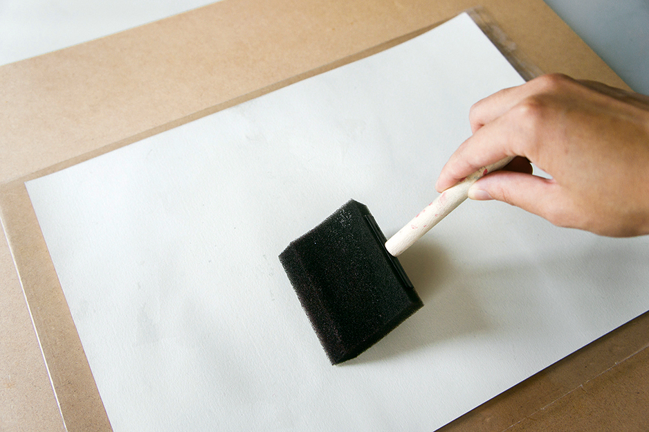
To remove warping from my paper, I cover the back with water using a foam brush, and sandwich it between two boards with a pile of heavy books on top. I then leave this to dry overnight.
15. Finishing touches
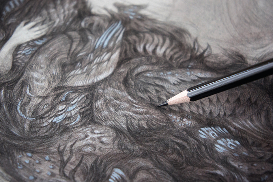
The following day, I give the composition one last detail pass: pulling out highlights, darkening shadows and making sure that everything is just right. I then spray it with fixative, and the piece is all done.
This article was originally published in ImagineFX magazine issue 136. Buy it here.

Thank you for reading 5 articles this month* Join now for unlimited access
Enjoy your first month for just £1 / $1 / €1
*Read 5 free articles per month without a subscription

Join now for unlimited access
Try first month for just £1 / $1 / €1
