How to design an accessible web
Discover how the Inclusive Design Principles make apps and sites more usable for disabled users.
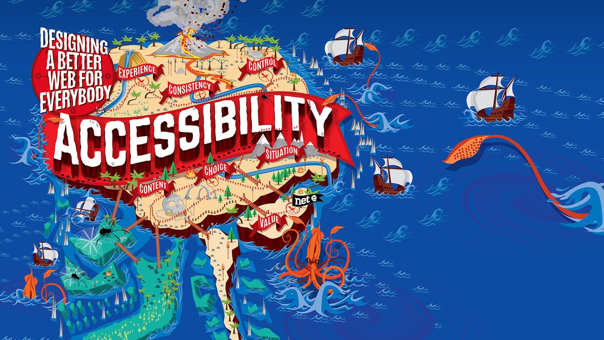
Inclusive design is about putting people first. It’s about designing for the needs of people with permanent, temporary, situational or changing disabilities, placing an emphasis on how disabled users might experience content.
- Christmas offer: Save up to 47% on a subscription to net
The Inclusive Design Principles are a set of seven considerations to help inform design thinking. They are not a set of ‘how tos’ but a framework that can be used alongside established accessibility guidelines to take products beyond compliance – to ensure all users can perceive, operate and understand content regardless of the hardware or software used to access a website or application.
These Principles remind us to put people, not their disability, first. We are not designing for stereotypes of ‘screen reader users ’, ‘voice input users’ or ‘keyboard users’ but for parents, colleagues, friends, children, students, teachers – you name it.
Products should adhere to the Web Content Accessibility Guidelines so that the output – code, styling and behaviour – is both accessible and compliant. It’s a technology-led approach to complex human experiences that places a greater emphasis on code over design, output over the final outcome and compliance over experience.
Disabled people access the web at home, in the office, while travelling, while under pressure, passing the time, or for the first time, or for the hundredth time. All of this has a big impact on how we interact with and utilise the web, regardless of disability.
So, let’s look at what the principles are, with examples of how they can be applied to make products both accessible and usable for disabled people.
Provide comparable experience
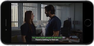
Ensure your interface provides a comparable experience for all, so people can accomplish tasks in a way that suits their needs without undermining the quality of the content.
Get the Creative Bloq Newsletter
Daily design news, reviews, how-tos and more, as picked by the editors.
This principle challenges us to really try to understand what the experience is for someone with a disability when using your product – not how accessible or compliant it is, but if it’s easy, usable and engaging rather than time-consuming, frustrating or confusing.
You may wonder why we use ‘comparable’ rather than ‘equivalent’. We questioned whether it was possible to provide an equivalent, like-for-like, experience for someone who cannot see or hear. Consider alternative formats such as alt text, Audio Description and subtitles (Closed Captions in the USA).
Is hearing alt text in place of seeing a cartoon a like-for-like experience? Is listening to an Audio Described horror movie ever going to be an equivalent to seeing the expressions on characters faces? Are subtitles ever going to be able to convey that sense of dread in a horror movie so expertly created by ominous music in the build-up to a gory climax?
Often an equivalent experience is rooted in well-crafted editorial for alternatives. When creating the logo for the Inclusive Design Principles we decided to give it alt text rather than consider the image decorative and hide it from people who use screen readers. If the logo is there to provide the visual look and feel, why shouldn’t it provide the ‘audible’ look and feel?

As Léonie Watson said: “I used to have sight so I appreciate descriptive alt text on decorative images because it evokes memories of things in my mind.”
We cannot assume that one disabled person’s experience is everyone’s. For this we have user research and usability testing – two key areas where the Inclusive Design Principles can be included and referenced in day-to-day project work.
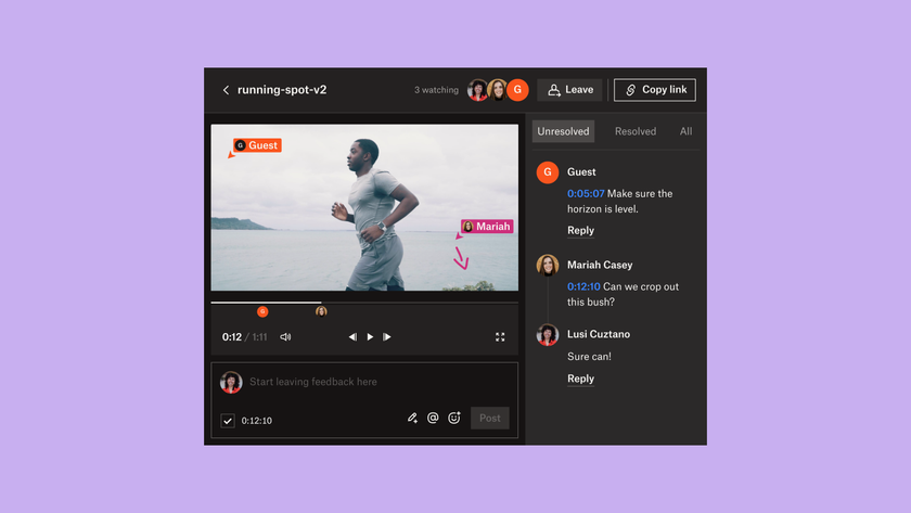
To be accessible to deaf people, audio in video must be subtitled and synchronised. If you did just those two things you would be meeting this WCAG requirement for captioning:
- 1.2.2 Captions (Pre-recorded): Captions are provided for all pre-recorded audio content in synchronised media, except when the media is a media alternative for text and is clearly labelled as such. (Level A)
While content complying with the WCAG checkpoint is accessible, is it usable for people who are deaf or hard of hearing? The BBC Subtitle Guidelines provides numerous guidelines around editorial and visual presentation for subtitles such as text size, style, positioning and colour coding for different speakers. All of these make subtitles easier to read and the editorial more comparable to the original experience. To pick just one example, colour coding different speakers makes following dialogue and understanding who said what much clearer.
Just because an exact equivalent experience can’t be provided, doesn’t mean you don’t aim for equivalence. This is a good example where accessibility is a champion of creativity and innovation rather than the enemy.
Consider the situation
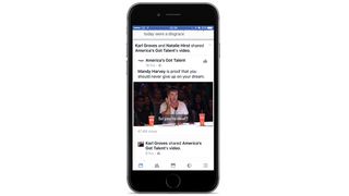
People use your interface in different situations. Make sure your interface delivers a valuable experience to people regardless of their circumstances.
We need to consider how disability impacts an individual’s situation as well as how people's situation might impact usability. For example, mobile is disabling due to small screens, glare from the sun and small fonts, noise and so on. Our dexterity can be reduced due to rain on the screen, or using devices one handed. Our hearing is reduced due to noisy environments and no headphones.
To accommodate a lack of hearing due to the situation an individual is in, content providers are now producing more subtitled video. Facebook automatically shows subtitles on the assumption that most users will not have sound available.
This is a good example of how meeting the needs of disabled people solves issues around situational disability for all.
Be consistent
Use familiar conventions and apply them consistently. This principle cuts across design, editorial, hierarchy, structure, functionality and behaviour.
As a result, it’s the principle most often referenced when I am reviewing designs and proposed functionality for accessibility. Heydon Pickering categorises consistency into two broad groups:
- Internal consistency - ensuring an interface is consistent within itself. For example, via an accessible pattern library.
- Cultural consistency - ensuring an interface is consistent with the external design patterns across the web.
The Web Accessibility Initiative Accessible Rich Internet Applications Authoring Practices Guide (WAI ARIA APG) describes approaches to making widgets, navigation and behaviours accessible using WAI-ARIA roles, states and properties. The APG is primarily aimed at developers, however, designers should have a level of familiarity with this document in order to design and document features that are consistent with both internal and external design patterns. This ensures that the keyboard behaviour for widgets, such as a tab panel, behaves consistently with tab panels internal and external to the website.
This is important so that people with a screen reader, keyboard or other non-mouse input device don’t have to work out how to use different tab panels. Editorial consistency for text alternatives is a crucial way of supporting people who use screen readers, such as people who are blind, low vision or have reading or cognitive impairments.
If you have a website, iOS and Android app using the same editorial for linked images, buttons and controls, it has the dual effect of making the website and app sound more familiar as well as providing audio branding much in the same way that visual design does.
Give control
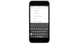
Ensure people are in control. People should be able to access and interact with content in their preferred way.
Control is about functionality. It’s about avoiding content changes that have not been initiated by the user unless there is an obvious way to control it. It’s also about not taking away platform settings that give the user control over content.
Seemingly simple things such as fixed screen orientation on a mobile device can prevent access. Fixed orientation is not covered by WCAG 2.0, and yet not supporting changes in orientation renders content completely inaccessible for someone in a wheelchair with no upper body movement who has a tablet fixed in portrait mode on the front of their chair.
This is a good example of where WCAG, which was written before mobile took off, overlooks key features on mobile that can be broken by design. The Mobile Accessibility Taskforce have proposed this for inclusion in WCAG 2.1:
- 3.4.1 Orientation: Orientation of the content is not locked to landscape or portrait, except where orientation is essential.
You can see more details on Mobile Accessibility WCAG Extension.
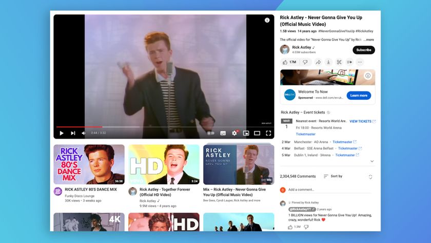
Auto playing video is another example of loss of control. Screen reader audio becomes drowned out by the video audio. People using screen magnification software may not see the video if it’s located off screen. People who are deaf may miss the opening subtitles.
However, it’s wrong to assume all blind, low vision and deaf people will not want auto playing video. This is where considering the situation in which a user is consuming content has an impact.
When I worked on BBC iPlayer blind screen reader users requested auto playing content for catch up TV. They were frequent iPlayer users who understood the site and what to expect. They wanted to activate a link to a programme and watch it. They didn’t want to open the page, navigate to the media player, and find the play button.
To balance the conflicting needs of screen reader users who are frequent iPlayer users with the needs of first-time users who may not want auto play, the solution is to provide a setting to opt in and out of auto play. This means the content is both accessible and a better user experience for disabled users.
Offer choice
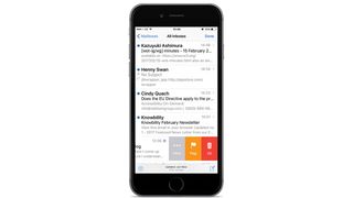
Consider providing different ways for people to complete tasks, especially those that are complex or non-standard.
While not limited to features, this principle has a huge impact on what features are provided and how they are implemented. As we know one size does not fit all, even when highly accessible.
The iOS Mail app is built with choice in mind. Via the inbox, you can either swipe to flag, delete or perform more actions. Alternatively you can tap an email to open it and reach the same functionality. The impact for end users is significant. Some people with dexterity issues find swiping difficult, others with shaking hands may find tapping buttons accurately problematic. Equally, while swipe to delete is a standard iOS function, there is no visual affordance. This means people who are not familiar with the feature may miss it entirely if no alternative is provided.
When layouts are complex, giving the user control over the page can help. People with reading or learning difficulties might find a grid layout with large images easier to negotiate than a listings page with more text. When designing screens with listings consider adding a button to switch between a grid and list layout as well as filters to remove unwanted results.
Prioritise content


Help users focus on core tasks, features and information by prioritising them within the content and layout.
Prioritising content is about editorial, layout and presentation. As a disabled user, it’s likely you must work harder to understand the landscape of a screen and what the editorial is telling you. This impacts us all, but if key content is not prioritised pages can become verbose, diluting what people with screen readers need to hear or people with learning difficulties can read.
It’s also a significant overhead for people with alternative input devices such as speech, head or foot switches or sip and puff to navigate to content when it’s low down in the content order.
Extraneous content such as banner ads, especially video, are an inconvenience for all users, but they can stop people with cognitive or learning difficulties going any further. They are too distracting and easily confused with the main content, which prevents people getting to the content they want.
People with cognitive or learning impairments who are more familiar with the tools available in the browser often zoom into content so they can minimise the amount of secondary information they are otherwise forced to see.
Zooming content can make the issue worse for some, however. The Channel 5 website has a banner ad at the top of the page followed by navigation underneath and an image. When the page is not zoomed the only priority content you see is the navigation, which is not much. When zoomed 300% only a small portion of the banner ad is visible.
This makes locating priority content particularly challenging if you are low vision or use zoom due to cognitive or learning impairments. Editorial for links, headings and paragraphs should also prioritise primary content at the start.
Add value
Consider the value of features and how they improve the experience for different users. Adding value is where you can get creative. This is less about the content and functionality of your product and more about utilising the brilliance of features available in the platform.
Everyday tasks such as logging in and filling out forms can be a real struggle. Autocomplete is hugely beneficial if you have dexterity issues, struggle with a keyboard, or use an alternative input device such as voice. It also helps people with learning or cognitive disabilities as well as non-native English speakers. But why stop there? Consider adding support for voice search – this also supports the principle of providing choice.
Inputting passwords is particularly difficult as they require text input but cannot be seen. James Williamson, a web design and development author who has Amyotrophic lateral sclerosis (ALS) explains the problem he and many other users will face when trying to access certain data.
“Whether I’m using voice dictation or a single finger on my keyboard, precise input is extremely difficult. This difficulty is increased when you introduce special characters and many of the requirements found in passwords. Not being able to see what I’ve input equates to a high degree of failure when entering passwords.”
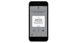
Including the ‘show password’ feature allows people to check their entry before continuing, therefore minimising mistakes that can take time to correct, adding a frustrating delay to what should be a straightforward process. Offering Touch ID as well as the ‘show password’ feature provides further choice and an alternative for those who have the dexterity to use it.
We need to shift our thinking away from ‘making things accessible’ to enabling people by design. Integrating the Inclusive Design Principles early on in projects can help teams to better understand who will be using their products and how.
Referencing the principles when writing personas, user stories, building prototypes and in user research will all help teams to build better features that will be able to properly support all disabled audiences.
This article originally appeared in issue 297 of net, the magazine for professional web designers and developers – offering the latest new web trends, technologies and techniques. Buy net issue 297 here or subscribe to net here.
Special Christmas offer: Save up to 47% on a subscription to net for you or a friend for Christmas. It's a limited offer, so move quickly...
Related articles:

Thank you for reading 5 articles this month* Join now for unlimited access
Enjoy your first month for just £1 / $1 / €1
*Read 5 free articles per month without a subscription

Join now for unlimited access
Try first month for just £1 / $1 / €1
